Prompts · for Wix
AI website build-prompts for Wix
Feed a Meez prompt to Wix's AI site builder and it scaffolds the layout, sections and styles from your brief — a real starting point instead of a stock template. The exact type scale, color system and motion notes carry through, so you spend your time refining the site in Wix rather than describing it from scratch.
How to use a Meez prompt in Wix
- Pick a prompt below (4 on this page are free) or browse the full library — every prompt is a complete art-direction spec: fonts, layout, color system, motion and real asset URLs.
- Copy the whole prompt and paste it into Wix's AI site builder. Don’t trim it — the detail is what stops Wix from defaulting to a generic layout.
- Let it build, then iterate: swap the copy, point the asset URLs at your own media, and ship. The sites you build are yours, commercially.
Free prompts to try in Wix right now
Wellbeing OSHero Section · free prompt · copy-paste
Create a fullscreen hero section for a SaaS product called "flowpath" using React, Tailwind CSS, and Lucide React icons. The section should be a single `<section>` filling the viewport (`h-screen w-full overflow-hidden`).

**Background:**
- A looping, muted, autoplaying `<video>` element covering the full section with `object-cover`. Video URL: `https://meez.design/web/media/ext/00e8673d6c0cdef2.mp4`
- A subtle dark overlay on top of the video: `bg-black/10`

**Font:**
- Use "Helvetica Now Text" as the primary font, loaded from: `(self-host this face — no free CDN; substitute a close match if unavailable)`
- Fallback stack: `-apple-system, BlinkMacSystemFont, 'Segoe UI', Roboto, sans-serif`
- Applied globally via `* { font-family: ... }` in CSS

**Navigation (top, not fixed/sticky):**
- Full-width with responsive horizontal padding (`px-5 sm:px-6 md:px-12 lg:px-16`) and vertical padding (`py-4 sm:py-5`)
- Logo: An inline SVG diamond shape (28x28) with two overlapping diamond paths at 0.9 and 0.5 opacity, followed by the text "flowpath" in white, `text-lg sm:text-xl font-medium tracking-tight`
- Desktop nav (hidden on mobile): horizontal flex with items "Product" (dropdown: Connections, Workflows, Insights), "Solutions" (dropdown: Guides, Use cases, API reference), "About" (dropdown: Our story, Open roles, Reach us), "Plans" (no dropdown)
- Nav buttons: `text-white/90 hover:text-white text-sm font-medium`, with a `ChevronDown` icon (3.5x3.5) that rotates 180 degrees when dropdown is open
- Dropdowns open on hover (onMouseEnter/onMouseLeave), positioned `absolute top-full left-0`, using a custom `.liquid-glass` class, `rounded-xl py-3 px-2 min-w-[160px] shadow-xl`. Dropdown items: `text-white/80 hover:text-white text-sm rounded-lg hover:bg-white/5`
- Desktop CTA: "Log in" link (`text-white/90 hover:text-white text-sm font-medium`) and "Try it free" button using `.liquid-glass rounded-full px-5 py-2 text-white text-sm font-medium`
- Mobile menu button: animated toggle between `Menu` and `X` icons with rotation/scale/opacity transitions (duration-300)
- Mobile menu: absolutely positioned below nav, slides in with `cubic-bezier(0.16,1,0.3,1)` easing over 400ms. Background: `bg-[#2C221C]/95 backdrop-blur-xl rounded-2xl p-6`. Shows all nav items with sub-items indented, plus a bordered footer with Log in and Try it free

**Hero Content (below nav, top-aligned, not vertically centered):**
- Container: `flex-1 flex items-start justify-center` with `pt-16 sm:pt-20 md:pt-24` for spacing from the nav
- Text wrapper: `text-center max-w-3xl`
- Heading `<h1>`: `text-white text-3xl sm:text-4xl md:text-5xl lg:text-6xl xl:text-7xl leading-[1.05] tracking-[-0.02em]`
  - Content (with line breaks):
    ```
    Bridge the
    gaps. <span class="text-white/60">Ditch the</span>
    <span class="text-white/60">grindwork.</span>
    ```
- Subheading `<p>`: `text-white/80 text-sm sm:text-base md:text-lg leading-relaxed max-w-md mx-auto mt-6 sm:mt-8`
  - Text: "Flowpath unifies your complete wellness tools, so your crew spends less energy plugging gaps and more on real progress."
- Two CTA buttons side by side (`flex flex-wrap items-center justify-center gap-3 sm:gap-4 mt-6 sm:mt-8`):
  1. "Begin your journey" - solid white button: `px-5 sm:px-6 py-2.5 sm:py-3 bg-white text-gray-900 text-sm font-semibold rounded-full hover:bg-white/90`
  2. "See it live" - glass button: `px-5 sm:px-6 py-2.5 sm:py-3 liquid-glass rounded-full text-white text-sm font-semibold hover:bg-white/10`

**Custom CSS (`.liquid-glass` class):**
```css
.liquid-glass {
  background: rgba(255, 255, 255, 0.01);
  background-blend-mode: luminosity;
  backdrop-filter: blur(4px);
  -webkit-backdrop-filter: blur(4px);
  border: none;
  box-shadow: inset 0 1px 1px rgba(255, 255, 255, 0.1);
  position: relative;
  overflow: hidden;
}

.liquid-glass::before {
  content: '';
  position: absolute;
  inset: 0;
  border-radius: inherit;
  padding: 1.4px;
  background: linear-gradient(180deg,
    rgba(255,255,255,0.45) 0%, rgba(255,255,255,0.15) 20%,
    rgba(255,255,255,0) 40%, rgba(255,255,255,0) 60%,
    rgba(255,255,255,0.15) 80%, rgba(255,255,255,0.45) 100%);
  -webkit-mask: linear-gradient(#fff 0 0) content-box, linear-gradient(#fff 0 0);
  -webkit-mask-composite: xor;
  mask-composite: exclude;
  pointer-events: none;
}
```

**Additional CSS utilities:**
```css
@keyframes dropdown-in {
  from { opacity: 0; transform: translateY(-4px) scale(0.96); }
  to { opacity: 1; transform: translateY(0) scale(1); }
}
.animate-dropdown { animation: dropdown-in 0.2s ease-out; }
.duration-400 { transition-duration: 400ms; }
```

**Important notes:**
- Dropdown elements need `!absolute` (Tailwind important modifier) to override the `position: relative` from `.liquid-glass`
- The entire section is fully responsive with breakpoints at sm, md, lg, xl
- No external UI libraries beyond Lucide React for icons
- Tailwind config is default with no extensions
Scaling PlatformSaaS · free prompt · copy-paste
# Prompt: Recreate the Targo hero + about sections

Build a single-page site with exactly two sections. Font: **Quantico** (Google Fonts, weights 400 + 700), fallback 'Arial Narrow', sans-serif. Accent color: **#15BCDF** (hover #3fd0ef, border #0fa3c2). Page/body background: **#F2F1F0**. Text colors: headings #2b3033, nav links #3a3a3a, body gray #6b6f72. All headings uppercase, letter-spacing 0.01em, line-height 0.98.

## Section 1 — Hero (min-height: 100svh, background #F2F1F0, overflow hidden)

**Background video** (absolutely positioned, pointer-events none, no crop — objectFit: contain, height auto):
`https://meez.design/web/media/ext/91c8885f71aa1e73.mp4`
- Desktop: top 0, right -20%, width 99%.
- Mobile (≤700px): top 0, left -12%, width 119%.
- Attributes: autoplay, muted, loop, playsinline, preload auto. Robustness: retry `video.play()` every 1s and on first document click/touchstart (always set muted before play, swallow rejections).
- Desktop only: a scrim overlay on the left 70% of the section, `linear-gradient(90deg, #F2F1F0 0%, #F2F1F0 55%, rgba(242,241,240,0.85) 78%, rgba(242,241,240,0) 100%)`, no scrim on mobile.

**Navbar** (relative, flex, wrap, gap clamp(20px,5vw,56px), padding clamp(20px,3vw,38px) clamp(20px,4vw,48px) 0):
- Logo: 38px dark (#111) circle containing a white 20×8px ellipse rotated -25°, next to lowercase word "targo" (font-size clamp(22px,5vw,30px), weight 400, color #111, letter-spacing -0.5px).
- Links HOME / ABOUT / CONTACT US: bold 700, font-size clamp(12px,2.4vw,15px), letter-spacing 0.06em, color #3a3a3a, nowrap, gap 34px. Hidden on mobile.
- Right-aligned "Contact us" button (desktop only): transparent, **no border**, white text, uppercase, letter-spacing 0.14em, padding 14px 26px, chamfered corners via `clip-path: polygon(0 0, calc(100% - 12px) 0, 100% 12px, 100% 100%, 12px 100%, 0 calc(100% - 12px))`, with a white stroked mail-envelope SVG icon (17×13, stroke-width 1.4). Hover: background rgba(255,255,255,0.14).
- Mobile: hamburger button (3 white 22×2px bars, gap 5px) replacing links + contact button; tapping toggles a stacked menu of the 3 links (dark #1a1c1e, bold, gap 18px).

**Headline** (h1, 6 staircase lines, uppercase, weight 700):
```
SCALING
THE
PLATFORM
        FOR
        YOUR
        BUSINESS   ← this line in #15BCDF
```
Last three lines indented by `min(238px, 28vw)`.
- Desktop: padding `min(clamp(40px,9vw,120px),9vh) 20px min(clamp(24px,4vw,44px),5vh) clamp(20px,9vw,118px)`; font-size `min(clamp(34px,7.6vw,80px), 9.2vh)` (vh caps keep headline + button inside 100vh on short monitors).
- Mobile: margin-top 360px (text sits below the video), padding `0 20px 28px 20px`, font-size `clamp(34px,10vw,56px)`.

**CTA button** "GET STARTED" under the headline, left edge aligned with the FOR/YOUR/BUSINESS indent (left padding `calc(clamp(20px,9vw,118px) + min(238px,28vw))`, bottom padding `min(clamp(36px,6vw,80px),7vh)`). Style: background #15BCDF, border 1px solid #0fa3c2, dark text #1a1c1e, uppercase, weight 700, letter-spacing 0.14em, padding 18px 34px, font-size clamp(13px,2.2vw,16px), chamfered corners `clip-path: polygon(0 0, calc(100% - 16px) 0, 100% 16px, 100% 100%, 16px 100%, 0 calc(100% - 16px))`, glow `box-shadow: 0 0 0 1px rgba(21,188,223,0.35), 0 10px 30px -12px rgba(15,163,194,0.6)`, trailing 22×1px dark line. Hover: background #3fd0ef, stronger glow.

## Section 2 — About (flex, wrap, align center, gap 40px)

Background: `linear-gradient(180deg, #F2F1F0 0%, #F7F6F8 18%, #F7F6F8 100%)` (smooth handoff from hero). Padding: `clamp(60px,10vw,140px) 0 clamp(30px,5vw,70px) clamp(20px,9vw,118px)` — **no right padding** so the media touches the right screen edge.

**Left column** (flex 1 1 420px, min-width 300px):
- h2, two staircase lines: "ABOUT" then "BUSINESS" in #15BCDF indented by `min(160px,18vw)`. Font-size clamp(34px,6.5vw,72px), weight 700, uppercase.
- Paragraph (max-width 520px, margin 32px 0 0 min(160px,18vw), font-size clamp(14px,1.6vw,17px), line-height 1.7, color #6b6f72), text verbatim:
  "Targo builds the testing infrastructure modern teams rely on. From automated pipelines to full-scale QA audits, we make sure your software ships fast and breaks nothing. Hundreds of releases, zero surprises."
- "LEARN MORE" button, identical style to the hero CTA, margin 36px 0 0 min(160px,18vw).

**Right column** (flex 1 1 360px, min-width 280px, justify-content flex-end, position relative):
- Video, width 100%, max-width 644px, height auto, flush to the right edge:
  `https://meez.design/web/media/ext/8244e1a58b5e3d46.mp4`
  Same attributes + autoplay-retry logic as the hero video.
- Overlay rectangle exactly covering the video (absolute, top 0, right 0, width 100%, max-width 644px, height 100%): background **#15BCDF** with `mix-blend-mode: hue`, pointer-events none, z-index 1 (tints the video cyan).

## Global
- `body { margin: 0; background: #F2F1F0; }`; links: color #3a3a3a, no underline, hover #000.
- Mobile breakpoint: 700px (JS-driven via window.innerWidth + resize listener, or media queries).
- No other sections, no footer.
Signal IDTechnology · free prompt · copy-paste
Recreate this exact full-viewport dark hero landing page for “ECHOID” — a voice-identity product for the E network. Match every detail below precisely. Do not invent extra sections, cards, stats, or decorative overlays. Desktop composition: full-bleed cinematic background video on the left/center with a right-aligned signup panel; black negative space on the left; UI pinned top (nav), right (form), and bottom (legal).

═══════════════════════════════════════
PAGE META
═══════════════════════════════════════
- Document title: ECHOID — Your voice ID to the E network
- Lang: en
- Pure black page background (#000)
- Antialiased text
- Single full-viewport section only (no other page sections)

═══════════════════════════════════════
EXACT MEDIA URLS (CloudFront — use these verbatim)
═══════════════════════════════════════
Background video (MP4):
https://meez.design/web/media/ext/ef332df5da921818.mp4

Poster / fallback still (PNG):
https://meez.design/web/media/ext/71d89c5b89d722c9.png

Video attributes: autoPlay, muted, loop, playsInline, preload="auto"
Video CSS: width/height 100%, object-fit: cover, object-position: center
Media layer: position absolute, inset 0, z-index -1, black background behind video
Preconnect to: https://meez.design

Video content (for reference): dark cinematic AI/surreal face sequence — abstract metallic/glass facial forms, cool dark palette, motion graphic identity vibe. Full-bleed edge-to-edge; never inset, never in a card.

═══════════════════════════════════════
FONTS (exact Google Fonts)
═══════════════════════════════════════
Load from Google Fonts:
family=Sora:wght@200;300;400
family=JetBrains+Mono:wght@300;400;500
display=swap
Preconnect fonts.googleapis.com and fonts.gstatic.com

CSS stacks:
--font-display: "Sora", "Helvetica Neue", Helvetica, Arial, sans-serif
--font-mono: "JetBrains Mono", ui-monospace, "SF Mono", "Cascadia Mono", Menlo, Consolas, monospace

Usage map:
- Sora 200: nav logo “ECHOID”, hero H1 “ECHOID”
- Sora 300: email input, legal footer text
- JetBrains Mono 400: nav links, JOIN UP CTA, chip, buttons, referral link, mobile menu links/CTA
- JetBrains Mono 300: tagline “YOUR VOICE ID TO THE E NETWORK.”

═══════════════════════════════════════
DESIGN TOKENS
═══════════════════════════════════════
--bg: #000000
--text: #ffffff
--text-dim: rgba(255,255,255,0.62)
--text-dimmer: rgba(255,255,255,0.42)
--line: rgba(255,255,255,0.14)
--line-strong: rgba(255,255,255,0.26)
--fill-ghost: rgba(255,255,255,0.05)
--fill-solid: rgba(255,255,255,0.10)
--gutter: clamp(20px, 5vw, 100px)
--ease-premium: cubic-bezier(0.16, 1, 0.3, 1)

═══════════════════════════════════════
LAYOUT SHELL
═══════════════════════════════════════
.hero:
- position relative, width 100%
- height: 100vh AND 100svh
- min-height: 640px (if max-height ≤640px, min-height becomes 100svh)
- overflow hidden
- CSS grid: grid-template-rows: auto 1fr auto
- isolation: isolate

Row 1 = navbar
Row 2 = right-aligned form body (flex end / center on mobile)
Row 3 = legal footer

═══════════════════════════════════════
SCRIM (dual gradient overlay on video)
═══════════════════════════════════════
Desktop (≥721px) — two stacked linear-gradients:
1) to right:
   transparent 0% → transparent 45% → rgba(0,0,0,0.45) 72% → rgba(0,0,0,0.72) 100%
2) to bottom:
   rgba(0,0,0,0.55) 0% → transparent 22% → transparent 78% → rgba(0,0,0,0.65) 100%

Mobile (≤720px) — single bottom gradient:
rgba(0,0,0,0.6) 0% → rgba(0,0,0,0.25) 30% → rgba(0,0,0,0.75) 100%

═══════════════════════════════════════
NAVBAR (top)
═══════════════════════════════════════
Flex space-between, align center, gap 32px
Padding: clamp(20px, 2.4vw, 34px) horizontal gutter; respect safe-area insets

LEFT — Logo link “ECHOID”
- Sora 200
- font-size: clamp(20px, 1.75vw, 30px)
- letter-spacing: 0.16em
- white, no underline, line-height 1

RIGHT — nav cluster (gap clamp(24px, 3.2vw, 62px)):
A) Desktop links (≥901px): Story, Platforms, Identity, Contact
   - JetBrains Mono 400
   - font-size: clamp(11px, 0.78vw, 14px)
   - letter-spacing: 0.18em
   - text-transform: uppercase
   - white; hover → --text-dim
   - transition color 0.25s ease
   - link gap: clamp(20px, 2.8vw, 56px)
   - hrefs: #story #platforms #identity #contact

B) Desktop CTA “Join up” (renders as JOIN UP via uppercase)
   - same mono type as links
   - padding: clamp(12px,1vw,17px) clamp(20px,1.8vw,32px)
   - border: 1px solid --line-strong
   - hover: background --fill-ghost, border-color rgba(255,255,255,0.5)
   - transition background+border 0.25s ease
   - href #join

C) Mobile hamburger (≤900px only; desktop links+CTA hidden)
   - 44×44 hit target, 3 bars 22px wide × 1px tall, white
   - bars at top 16/22/28px, centered with translateX(-50%)
   - Active (X morph): bar1 rotate(45deg) to top 22px; bar2 opacity 0 + scaleX(0); bar3 rotate(-45deg) to top 22px
   - transition: transform 0.45s --ease-premium, opacity 0.25s ease

═══════════════════════════════════════
MOBILE MENU OVERLAY
═══════════════════════════════════════
Fixed fullscreen, z-index 50 (nav is 60)
Background: rgba(4,4,6,0.94)
backdrop-filter: blur(28px) saturate(140%)
Closed: clip-path circle(3% at calc(100% - 42px) 42px), opacity 0, pointer-events none
Open: clip-path circle(150% at same origin), opacity 1, pointer-events auto
Transition: clip-path 0.7s --ease-premium, opacity 0.45s ease
Centered column of uppercase mono links (Story/Platforms/Identity/Contact) then bordered “Join up”
Link size: clamp(20px, 5.5vw, 28px), letter-spacing 0.14em
CTA: letter-spacing 0.22em, padding 16px 40px, border 1px --line-strong
Stagger entrance: each item starts opacity 0 + translateY(16px); when open → opacity 1 + translateY(0)
Delay: calc(180ms + var(--i) * 70ms) where i = 0..3 for links, i=4 for CTA
Transition on items: opacity 0.4s ease, transform 0.5s --ease-premium
Escape closes; click backdrop closes; body.menu-open { overflow:hidden }; restore focus; auto-close at ≥901px

═══════════════════════════════════════
RIGHT PANEL (voice entry signup)
═══════════════════════════════════════
hero__body: flex align center, justify flex-end (center on ≤720px), horizontal gutter, min-height 0, overflow-y auto

.panel desktop: width min(34vw, 620px), min-width 380px, column flex-start
≤1100px: width min(70vw, 520px), min-width 0
≤720px: width 100%, stretch; chip stays flex-start

Elements in order:

1) CHIP: “[ Voice entry ]” displayed as uppercase “[ VOICE ENTRY ]”
   - JetBrains Mono 400
   - font-size: clamp(11px, 0.72vw, 14px)
   - letter-spacing: 0.2em
   - background: rgba(255,255,255,0.09)
   - padding: clamp(9px,0.8vw,14px) clamp(14px,1.1vw,20px)
   - line-height 1
   - NO rounded pill — sharp rectangle

2) H1: “ECHOID”
   - Sora 200
   - font-size: clamp(54px, 6.2vw, 118px)  [≤380px: clamp(44px,15vw,64px)]
   - letter-spacing: 0.03em
   - line-height: 0.95
   - margin-top: clamp(28px, 3vw, 52px)
   - Brand-first: this is the dominant hero word; nothing larger

3) TAGLINE: “Your voice ID to the E network.”
   - JetBrains Mono 300, uppercase via CSS
   - font-size: clamp(11px, 0.94vw, 17px)
   - letter-spacing: 0.14em
   - color: --text-dim
   - margin-top: clamp(14px, 1.4vw, 24px)
   - line-height 1.4

4) FORM (noValidate, prevent default submit):
   margin-top: clamp(38px, 4.6vw, 82px)
   column gap: clamp(14px, 1.3vw, 22px)
   width 100%

   a) Email field
      - Visually-hidden label “Email”
      - Transparent input, no side borders, bottom border only 1px --line-strong
      - border-radius 0
      - padding: 0 2px clamp(12px,1.1vw,18px)
      - Sora 300, clamp(16px,0.95vw,18px), white text
      - placeholder “Email” color --text-dim
      - focus: bottom border rgba(255,255,255,0.85); placeholder → --text-dimmer
      - transition border-color 0.25s ease

   b) Button “Proceed using email” (.btn--ghost)
      - full width, border-radius 0, no border
      - padding: clamp(17px,1.6vw,27px) 20px
      - JetBrains Mono 400, uppercase, letter-spacing 0.22em
      - font-size: clamp(11px,0.78vw,14px)
      - background --fill-ghost, color --text-dimmer
      - hover: bg rgba(255,255,255,0.09), color white

   c) Button “Access” (.btn--solid)
      - same type/padding as above
      - background --fill-solid, color white
      - hover: bg rgba(255,255,255,0.17)

5) Referral link (centered under form): “I've got an invite key”
   - JetBrains Mono 400, uppercase via CSS
   - font-size: clamp(11px, 0.74vw, 14px)
   - letter-spacing: 0.18em
   - margin-top: clamp(26px, 2.6vw, 46px)
   - align-self: center
   - href #invite
   - hover: --text-dim + underline, underline-offset 4px

═══════════════════════════════════════
LEGAL FOOTER
═══════════════════════════════════════
border-top: 1px solid --line
padding: clamp(18px,1.7vw,30px) gutter; safe-area bottom
text-align center
Copy exact:
“Opening an e.xyz account signals that you accept our Privacy Notice and Service Contract.”
- Sora 300, clamp(12px,0.82vw,16px), color --text-dim, line-height 1.5
- “Privacy Notice” and “Service Contract” are white underlined links (underline-offset 3px, thickness 1px), hrefs #privacy-notice and #service-contract
- link hover → --text-dim

═══════════════════════════════════════
FOCUS / A11Y
═══════════════════════════════════════
Focus-visible outline: 1px solid rgba(255,255,255,0.7), offset 3px on buttons, CTA, toggle, referral, input, mobile links
Mobile menu: role=dialog, aria-modal, aria-label="Site menu", aria-hidden when closed, inert when closed
Toggle: aria-expanded, aria-controls="mobileMenu", aria-label Open/Close menu

═══════════════════════════════════════
REDUCED MOTION
═══════════════════════════════════════
prefers-reduced-motion: reduce → hide video; show poster as cover background-image on .hero__media; crush all animation/transition durations to 0.01ms

═══════════════════════════════════════
SHORT-HEIGHT COMPRESS (max-height: 640px)
═══════════════════════════════════════
Tighter nav padding; smaller H1 (clamp(36px,7vw,64px)); smaller form margins/gaps; thinner buttons; smaller legal (11px); tighter mobile menu

═══════════════════════════════════════
MOTION SUMMARY (what animates)
═══════════════════════════════════════
1. Background video continuous loop (primary presence)
2. Hover color/background transitions at 0.25s ease on links, CTAs, buttons, input border
3. Hamburger ↔ X morph 0.45s premium ease
4. Mobile menu circular clip-path expand 0.7s premium ease + opacity 0.45s
5. Mobile menu items staggered fade/slide-up with 70ms index delay
NO entrance animation on desktop panel. NO floating badges over video. NO cards, pills, glow, purple, or multi-shadow chrome. Sharp rects only. Aesthetic: black / white / translucent white glass, terminal-mono UI over cinematic face video.

═══════════════════════════════════════
STACK / IMPLEMENTATION NOTES
═══════════════════════════════════════
React + plain CSS (or equivalent). No Tailwind utility look required — custom properties as above. Form action="#" method="post" but preventDefault. Page is the hero only.
```

---

**Media URLs to keep verbatim:**

- Video: `https://meez.design/web/media/ext/ef332df5da921818.mp4`
- Poster: `https://meez.design/web/media/ext/71d89c5b89d722c9.png`
- Fonts: **Sora** (200/300/400) + **JetBrains Mono** (300/400/500)
Space planet3D · free prompt · copy-paste
Build a single, self-contained HTML file: a full-viewport space-themed hero section
for a site called "SpaceEdu". No build step, no frameworks, no external JS. All CSS in
one <style> block in <head>, all JS in one <script> block before </body>. It must be
pixel-faithful to the spec below and fully mobile responsive.
════════════════════════════════════════════════════════════════════════
1. CONCEPT
════════════════════════════════════════════════════════════════════════
A cinematic hero. A looping video of a single planet fills the whole viewport as the
background. Centred over it: eyebrow "PLANET", a huge serif planet name, a short cyan
rule, a paragraph, and a glossy white pill button. Flanking the button, cropped by the
left and right screen edges, sit two transparent planet cut-outs with serif labels.
Three planets exist: EARTH, VENUS, MARS. Exactly one is "featured" (its clip is the
background, its name is the headline). The other two occupy the left and right slots.
Clicking a side planet makes it featured; the two slots then re-fill with the other
two. Earth is featured on load. The rotation is fully reversible.
════════════════════════════════════════════════════════════════════════
2. ASSETS — use these exact URLs
════════════════════════════════════════════════════════════════════════
Background clips (10s, 16:9, 1276x720, silent, loop):
EARTH https://meez.design/web/media/bg-videos/222_1-1.mp4
VENUS https://meez.design/web/media/bg-videos/224_1niceimage.mp4
MARS https://meez.design/web/media/bg-videos/225_38.mp4
Poster / still for each clip (also used as the .sky background-image fallback):
EARTH https://meez.design/web/bg-previews/201_95.jpg
VENUS https://meez.design/web/bg-previews/128_Motion-Background-16.jpg
MARS https://meez.design/web/bg-previews/129_Motion-Background-17.jpg
Transparent planet cut-outs, 2048x2048 PNG with alpha (the side-slot artwork):
EARTH https://meez.design/web/bg-previews/151_Motion-Background-031045.jpg
VENUS https://meez.design/web/bg-previews/178_Thermal-Glow.jpg
MARS https://meez.design/web/bg-previews/162_Background-5.jpg
Favicon: use the Earth cut-out URL above, type image/png.
════════════════════════════════════════════════════════════════════════
3. FONTS — load from Google Fonts
════════════════════════════════════════════════════════════════════════
<link rel="preconnect" href="https://fonts.googleapis.com">
<link rel="preconnect" href="https://fonts.gstatic.com" crossorigin>
Load: Prata 400; Hanken Grotesk 400,500,600,700; Poppins 500,600.
Stacks:
--font-serif : 'Prata', Georgia, serif
--font-body : 'Hanken Grotesk', system-ui, -apple-system, 'Segoe UI', sans-serif
--font-logo : 'Poppins', sans-serif
Body text uses --font-body. Headline and the two planet labels use --font-serif.
The wordmark uses --font-logo.
════════════════════════════════════════════════════════════════════════
4. DESIGN SYSTEM — the single most important rule
════════════════════════════════════════════════════════════════════════
The layout is NOT built from rem/%/flex guesswork. It is a fixed composition measured
from a 1353 x 1163 reference, expressed in ONE custom property --u = one design pixel.
EVERY length in the file is calc(N * var(--u)). Do not substitute px values.
*, *::before, *::after { box-sizing:border-box; margin:0; padding:0 }
:root{
--dw:1353; --dh:1163; --gutter:25;
--u:max(min(.72px, calc(100vh / 700)), min(calc(100vw / 1353), calc(100vh / 1163)));
--dh-px:calc(1163 * var(--u));
--vshift:calc(max(0px, (100vh - var(--dh-px))) * .42);
--ink:#ffffff; --cyan:#79dce8; --cyan-logo:#5fd0e1;
--rule:rgba(255,255,255,.23); --btn-ink:#071227;
}
@supports (height:100dvh){
:root{
--u:max(min(.72px, calc(100dvh / 700)), min(calc(100vw / 1353), calc(100dvh / 1163)));
--vshift:calc(max(0px, (100dvh - var(--dh-px))) * .42);
}
}
html,body{height:100%}
body{background:#04101f; color:var(--ink); font-family:var(--font-body);
-webkit-font-smoothing:antialiased; -moz-osx-font-smoothing:grayscale;
text-rendering:geometricPrecision; overflow:hidden}
--vshift pushes everything below the nav down on taller-than-design viewports so the
composition stays balanced. --gutter offsets the content column left by half its value
so the optical centre sits at x=664, not 676.
════════════════════════════════════════════════════════════════════════
5. MARKUP
════════════════════════════════════════════════════════════════════════
<div class="stage"> position:fixed; inset:0; overflow:hidden;
isolation:isolate
<div class="sky"> absolute; inset:0; z-index:0;
background-image:url(EARTH STILL);
background-size:cover; background-position:center;
background-repeat:no-repeat
3 x <video data-planet="earth|venus|mars">
Earth: class="is-active" autoplay muted loop playsinline preload="auto"
src=EARTH CLIP poster=EARTH STILL aria-hidden="true"
Venus & Mars: muted loop playsinline preload="none"
data-src=CLIP (NOT src) poster=STILL aria-hidden="true"
</div>
<div class="ui"> absolute; inset:0; z-index:3
<header class="navbar">
<div class="navrow">
<a class="logo" href="#">space<i>edu</i></a>
<nav class="links" id="site-nav">
<a href="#" aria-current="page">Planets</a>
<a href="#">Tution</a> (keep this spelling)
<a href="#">Tutorials</a>
<a href="#">Blog</a>
<a class="enroll" href="#">Enroll</a>
</nav>
<button class="burger" type="button" aria-label="Open navigation"
aria-expanded="false" aria-controls="site-nav">
<span></span><span></span><span></span>
</button>
</div>
</header>
<div class="copy">
<div class="col eyebrow"><span class="ent-mask"><span class="ent-line">PLANET</span></span></div>
<h1 class="col title"><span class="ent-mask"><span class="ent-line">EARTH</span></span></h1>
<div class="col rule"><span></span></div>
<p class="col lede">Learn more about the fascinating details that we call our home,
Planet Earth. Course enrollment <br>starts today. Early Bird tickets typically
last a week, don’t miss out!</p>
<div class="col cta">
<button class="planet planet-l" type="button" data-slot="l">
3 x <img data-planet="earth|venus|mars" alt="" src="CUTOUT URL">
</button>
<button class="planet planet-r" type="button" data-slot="r">
3 x <img data-planet="earth|venus|mars" alt="" src="CUTOUT URL">
</button>
<a href="#">GET STARTED</a>
<span class="label label-l"></span> (empty — filled by script)
<span class="label label-r"></span>
</div>
</div>
</div>
<button class="scroll" type="button" aria-label="Scroll to next section">
<svg viewBox="0 0 26 33" fill="none" aria-hidden="true">
<path d="M13 1.5 V31.5 M1.9 20.4 L13 31.5 L24.1 20.4" stroke="#ffffff"
stroke-width="3" stroke-linecap="square" stroke-linejoin="miter"/>
</svg>
</button>
</div>
CRITICAL: all three cut-outs are present in BOTH slots as sibling <img> tags. Switching
reveals one with a class — it must never reassign img.src, or the browser keeps painting
the old planet until the new 2048px file downloads.
════════════════════════════════════════════════════════════════════════
6. CSS — exact values
════════════════════════════════════════════════════════════════════════
BACKDROP
.sky video{position:absolute; inset:0; width:100%; height:100%; object-fit:cover;
display:block; opacity:0; transition:opacity .22s linear}
.sky video.is-active{opacity:1}
@media (prefers-reduced-motion:reduce){ .sky video{display:none} }
SIDE PLANET SLOTS (two slots, not two planets)
.planet{position:absolute; z-index:-1; padding:0; border:0; background:none;
-webkit-appearance:none; appearance:none; line-height:0; cursor:pointer;
pointer-events:auto; /* .copy disables pointers wholesale */
transition:transform .45s cubic-bezier(.22,1,.36,1)}
.planet img{display:none; width:100%; height:auto}
.planet img.is-shown{display:block}
.planet:hover{transform:scale(1.045)}
.planet:active{transform:scale(.99)}
.planet-l{width:calc(143 * var(--u)); left:calc(-69.5 * var(--u)); top:calc(-38.3 * var(--u))}
.planet-r{width:calc(143 * var(--u)); right:calc(-64.7 * var(--u)); top:calc(-40.6 * var(--u))}
@media (prefers-reduced-motion:reduce){
.planet{transition:none} .planet:hover,.planet:active{transform:none} }
(The cut-outs fill ~97% of their square canvas; these box sizes make the rendered
sphere 139u across with its centre 2u from the left edge / 6.8u from the right.)
LAYOUT
.copy{position:absolute; inset:0; transform:translateY(var(--vshift)); pointer-events:none}
.copy a{pointer-events:auto}
.col{position:absolute; left:0; right:calc(var(--gutter) * var(--u)); text-align:center}
NAV
.navbar{position:absolute; top:0; left:0; right:0; z-index:6; height:calc(88 * var(--u))}
.navbar::after{content:""; position:absolute; left:calc(25 * var(--u));
right:calc(49 * var(--u)); top:calc(86 * var(--u)); height:calc(2 * var(--u));
background:var(--rule)}
.navrow{position:absolute; left:calc(25 * var(--u)); right:calc(49 * var(--u)); top:0;
height:calc(86 * var(--u)); display:flex; align-items:center; justify-content:space-between}
.logo{font-family:var(--font-logo); font-weight:600; font-size:calc(18.4 * var(--u));
letter-spacing:calc(-0.15 * var(--u)); line-height:1; color:#fff; text-decoration:none;
white-space:nowrap; position:relative; top:calc(-1 * var(--u))}
.logo i{font-style:normal; color:var(--cyan-logo)}
.burger{display:none; position:relative; width:calc(46 * var(--u)); height:calc(46 * var(--u));
padding:0; border:0; background:none; cursor:pointer; flex-direction:column;
align-items:center; justify-content:center; gap:calc(6 * var(--u)); flex:none}
.burger span{display:block; width:calc(24 * var(--u)); height:calc(2 * var(--u));
border-radius:calc(2 * var(--u)); background:#fff;
transition:transform .28s cubic-bezier(.4,0,.2,1), opacity .18s linear}
.navrow[data-open="true"] .burger span:nth-child(1){transform:translateY(calc(8 * var(--u))) rotate(45deg)}
.navrow[data-open="true"] .burger span:nth-child(2){opacity:0}
.navrow[data-open="true"] .burger span:nth-child(3){transform:translateY(calc(-8 * var(--u))) rotate(-45deg)}
.links{display:flex; align-items:center}
.links a{position:relative; display:flex; align-items:center; height:calc(86 * var(--u));
font-size:calc(18.4 * var(--u)); font-weight:400; line-height:1; color:#fff;
text-decoration:none; padding:0 calc(17.5 * var(--u));
letter-spacing:calc(-1 * var(--u)); white-space:nowrap}
.links a[aria-current="page"]::after{content:""; position:absolute; left:0; right:0;
top:calc(83.5 * var(--u)); height:calc(4 * var(--u)); background:var(--cyan);
border-radius:calc(1 * var(--u))}
.links a:nth-child(3){letter-spacing:calc(-1.75 * var(--u))}
.links a:nth-child(2){margin-left:calc(24 * var(--u))}
.links a:nth-child(3){margin-left:calc(26 * var(--u))}
.links a:nth-child(4){margin-left:calc(27 * var(--u))}
.links a.enroll{margin-left:calc(28.5 * var(--u)); width:calc(107 * var(--u));
height:calc(38 * var(--u)); border-radius:calc(19 * var(--u)); display:flex;
align-items:center; justify-content:center; font-size:calc(17 * var(--u));
font-weight:600; letter-spacing:calc(-0.75 * var(--u)); line-height:1;
color:var(--btn-ink); text-decoration:none; padding-top:calc(2 * var(--u));
background:linear-gradient(180deg,#ffffff 0%,#d8ecfe 9%,#dceefe 72%,#f4f9ff 100%);
box-shadow:0 calc(3 * var(--u)) calc(14 * var(--u)) rgba(255,255,255,.22),
inset 0 0 0 calc(1.5 * var(--u)) rgba(255,255,255,.92);
flex:none}
HERO COPY
.eyebrow{top:calc(188.8 * var(--u)); font-size:calc(30.45 * var(--u)); font-weight:500;
line-height:1; letter-spacing:calc(4 * var(--u)); text-indent:calc(4 * var(--u)); color:#fff}
h1.title{top:calc(268 * var(--u)); font-family:var(--font-serif); font-weight:400;
font-size:calc(112.4 * var(--u)); line-height:1; letter-spacing:calc(2 * var(--u));
text-indent:calc(2 * var(--u)); color:#fff}
.rule{top:calc(405.5 * var(--u)); height:calc(5 * var(--u)); font-size:0; line-height:0;
padding-right:calc(2 * var(--u))}
.rule span{display:inline-block; vertical-align:top; width:calc(100 * var(--u));
height:100%; border-radius:calc(2.5 * var(--u)); background:var(--cyan)}
p.lede{top:calc(433.2 * var(--u)); font-size:calc(18.36 * var(--u)); font-weight:400;
line-height:calc(30 * var(--u)); color:rgba(255,255,255,.95)}
CTA ROW
.cta{top:calc(597 * var(--u)); height:calc(66 * var(--u)); isolation:isolate}
.cta a{display:inline-flex; align-items:center; justify-content:center;
width:calc(216 * var(--u)); height:calc(66 * var(--u)); border-radius:calc(33 * var(--u));
font-size:calc(17 * var(--u)); font-weight:700; letter-spacing:0; text-indent:0;
line-height:1; color:var(--btn-ink); text-decoration:none; padding-top:calc(2 * var(--u));
background:linear-gradient(180deg,#ffffff 0%,#d6e8f8 4%,#d9ecfe 72%,#ffffff 100%);
box-shadow:0 calc(10 * var(--u)) calc(18 * var(--u)) calc(-8 * var(--u)) rgba(255,255,255,.50),
0 0 calc(26 * var(--u)) rgba(255,255,255,.18),
inset 0 0 0 calc(2 * var(--u)) rgba(255,255,255,.9)}
.label{position:absolute; top:calc(33 * var(--u)); font-family:var(--font-serif);
font-weight:400; font-size:calc(17.8 * var(--u)); letter-spacing:calc(4.6 * var(--u));
line-height:1; color:#fff; white-space:nowrap}
.label.label-l{left:calc(111 * var(--u))}
.label.label-r{right:calc(104 * var(--u))}
SCROLL CONTROL
.scroll{position:absolute; z-index:4; left:50%;
margin-left:calc((-48 - (var(--gutter) / 2)) * var(--u)); bottom:calc(68 * var(--u));
width:calc(96 * var(--u)); height:calc(96 * var(--u)); border-radius:50%;
background:rgba(24,30,42,.70); -webkit-backdrop-filter:blur(calc(6 * var(--u)));
backdrop-filter:blur(calc(6 * var(--u))); border:0; display:flex; align-items:center;
justify-content:center; cursor:pointer}
.scroll svg{width:calc(20 * var(--u)); height:calc(25 * var(--u)); display:block}
FOCUS
.scroll:focus-visible,.links a:focus-visible,.enroll:focus-visible,
.cta a:focus-visible,.logo:focus-visible{
outline:calc(2 * var(--u)) solid var(--cyan); outline-offset:calc(3 * var(--u))}
.planet:focus-visible{outline:calc(2 * var(--u)) solid var(--cyan);
outline-offset:calc(6 * var(--u)); border-radius:50%}
════════════════════════════════════════════════════════════════════════
7. RESPONSIVE — six tiers, in this exact source order
════════════════════════════════════════════════════════════════════════
A) NAV COLLAPSE @media (max-width:1030px), (max-height:620px)
Threshold is derived: below ~1030px the desktop labels fall under ~14px with sub-40px
touch targets. The SAME <a> elements re-compose into a panel — never duplicate markup.
.navrow{left:calc(25 * var(--u)); right:calc(25 * var(--u))}
.burger{display:flex}
.links{position:absolute; top:calc(96 * var(--u)); right:0; z-index:5;
width:min(calc(324 * var(--u)), calc(100vw - 50 * var(--u)));
flex-direction:column; align-items:stretch; padding:calc(12 * var(--u));
border-radius:calc(20 * var(--u)); background:rgba(9,21,42,.84);
backdrop-filter:blur(calc(18 * var(--u)));
border:calc(1 * var(--u)) solid rgba(255,255,255,.14);
box-shadow:0 calc(18 * var(--u)) calc(44 * var(--u)) rgba(2,8,20,.55);
opacity:0; visibility:hidden; transform:translateY(calc(-10 * var(--u)));
transition:opacity .24s ease, transform .28s cubic-bezier(.4,0,.2,1), visibility .28s}
.navrow[data-open="true"] .links{opacity:1; visibility:visible; transform:none}
.links a:nth-child(n){margin-left:0; height:auto; justify-content:flex-start;
padding:calc(14 * var(--u)) calc(16 * var(--u)); font-size:calc(19 * var(--u));
letter-spacing:calc(-.6 * var(--u))}
.links a + a{border-top:calc(1 * var(--u)) solid rgba(255,255,255,.08)}
.links a[aria-current="page"]::after{top:auto; bottom:calc(9 * var(--u));
left:calc(16 * var(--u)); right:auto; width:calc(26 * var(--u)); height:calc(3 * var(--u))}
.links a.enroll{margin:calc(14 * var(--u)) 0 calc(2 * var(--u)); width:100%;
height:calc(46 * var(--u)); border-radius:calc(23 * var(--u)); justify-content:center;
padding-top:calc(2 * var(--u)); font-size:calc(18 * var(--u));
letter-spacing:calc(-.4 * var(--u)); border-top:0}
.links a.enroll::after{content:none}
B) TABLET @media (min-width:580px) and (max-width:1030px) and (min-height:621px)
The hero is a centred symmetric composition — it is re-proportioned, NOT stacked. The
flanking planet / button / planet row is the section's signature and must survive.
:root{--gutter:0;
--u:min(max(min(.85px, calc(100vh / 780)), min(calc(100vw / 900), calc(100vh / 1163))), 1.15px);
--dh-px:calc(1120 * var(--u));
--vshift:calc(max(0px, (100vh - var(--dh-px))) * .38)}
(repeat inside @supports (height:100dvh) with 100dvh)
.navbar::after{left:calc(25 * var(--u)); right:calc(25 * var(--u))}
p.lede br{display:none}
p.lede{max-width:calc(620 * var(--u)); margin-left:auto; margin-right:auto; text-wrap:pretty}
.label.label-r{right:calc(116 * var(--u))}
C) PHONE @media (max-width:579px), (max-height:620px)
Below the nav the interface FLOWS (flex column) instead of being absolutely pinned, so
it adapts to however many lines the copy wraps onto.
:root{--gutter:0;
--u:max(min(.92px, calc(100vh / 620)), min(calc(100vw / 430), calc(100vh / 880)));
--dh-px:calc(880 * var(--u));
--vshift:calc(max(0px, (100vh - var(--dh-px))) * .34)}
(repeat inside @supports (height:100dvh))
.navbar{height:calc(76 * var(--u))}
.navbar::after{left:calc(24 * var(--u)); right:calc(24 * var(--u)); top:calc(74 * var(--u))}
.navrow{left:calc(24 * var(--u)); right:calc(24 * var(--u)); height:calc(74 * var(--u))}
.links{top:calc(84 * var(--u))}
.copy{top:calc(76 * var(--u)); display:flex; flex-direction:column; align-items:center;
padding:calc(56 * var(--u)) calc(26 * var(--u)) 0}
.col{position:static; width:100%; right:auto}
.eyebrow{font-size:calc(20 * var(--u)); letter-spacing:calc(5 * var(--u)); text-indent:calc(5 * var(--u))}
h1.title{font-size:calc(86 * var(--u)); margin-top:calc(15 * var(--u))}
.rule{margin-top:calc(20 * var(--u)); height:calc(5 * var(--u)); padding-right:0}
.rule span{width:calc(84 * var(--u))}
p.lede{margin-top:calc(19 * var(--u)); font-size:calc(15.5 * var(--u));
line-height:calc(26 * var(--u)); max-width:calc(400 * var(--u)); text-wrap:balance}
p.lede br{display:none}
.cta{top:auto; margin-top:calc(32 * var(--u)); height:calc(60 * var(--u)); position:relative}
.cta a{width:calc(190 * var(--u)); height:calc(60 * var(--u)); border-radius:calc(30 * var(--u))}
.label{top:50%; transform:translateY(-50%); font-size:calc(16 * var(--u));
letter-spacing:calc(4 * var(--u))}
.label.label-l{left:calc(56 * var(--u))}
.label.label-r{right:calc(60 * var(--u))}
.planet-l{width:calc(89 * var(--u)); left:calc(-44.5 * var(--u)); top:calc(-17 * var(--u))}
.planet-r{width:calc(89 * var(--u)); right:calc(-44.5 * var(--u)); top:calc(-18.3 * var(--u))}
.scroll{width:calc(74 * var(--u)); height:calc(74 * var(--u));
margin-left:calc(-37 * var(--u)); bottom:calc(49 * var(--u))}
.scroll svg{width:calc(15.5 * var(--u)); height:calc(19.5 * var(--u))}
D) @media (max-height:660px){ .scroll{display:none} } /* no room for it */
E) SHORT @media (max-height:620px)
:root{--u:max(min(.85px, calc(100vh / 470)), min(calc(100vw / 640), calc(100vh / 560)));
--dh-px:calc(560 * var(--u)); --vshift:0px}
.copy{padding-top:calc(26 * var(--u))}
h1.title{font-size:calc(64 * var(--u)); margin-top:calc(8 * var(--u))}
.rule{margin-top:calc(12 * var(--u))}
p.lede{margin-top:calc(12 * var(--u))}
.cta{margin-top:calc(20 * var(--u))}
.label{top:50%; transform:translateY(-50%); font-size:calc(15 * var(--u))}
.label.label-l{left:calc(58 * var(--u))}
.label.label-r{right:calc(58 * var(--u))}
@media (min-width:821px) and (max-height:660px){ .copy{transform:none} }
F) NARROW PHONE @media (max-width:500px) — declared LAST so it wins inside tier E
Below ~500px the label / button / label triad can no longer share a line, so the two
labels drop to their own band beneath the button, still left- and right-anchored.
.label{top:calc(100% + 34 * var(--u)); transform:none; font-size:calc(15 * var(--u))}
.label.label-l{left:calc(6 * var(--u))}
.label.label-r{right:calc(6 * var(--u))}
@media (prefers-reduced-motion:reduce){ .links,.burger span{transition:none} }
════════════════════════════════════════════════════════════════════════
8. ENTRANCE ANIMATION — runs once, then deletes itself
════════════════════════════════════════════════════════════════════════
Motion language: DRAW hairlines scale from centre · REVEAL type rises out of a mask ·
RISE copy lifts a short distance · SETTLE pills arrive with a small scale resolve ·
FADE the full-bleed backdrop resolves in (it fades, never translates — a translate
would drag a bare edge into frame).
In <head>, BEFORE the stylesheet, a blocking inline script so the opening frame is
composed rather than flashing the finished page:
(function(){try{
if(!window.matchMedia||!matchMedia('(prefers-reduced-motion: reduce)').matches){
document.documentElement.classList.add('anim');
}
}catch(e){}})();
@keyframes ent-reveal{from{transform:translateY(115%)}to{transform:translateY(0)}}
@keyframes ent-rise{from{opacity:0;transform:translateY(var(--rise,10px))}to{opacity:1;transform:none}}
@keyframes ent-settle{from{opacity:0;transform:translateY(var(--rise,8px)) scale(.965)}to{opacity:1;transform:none}}
@keyframes ent-draw{from{transform:scaleX(0)}to{transform:scaleX(1)}}
@keyframes ent-fade{from{opacity:0}to{opacity:1}}
.anim{--e-expo:cubic-bezier(.16,1,.3,1); --e-quint:cubic-bezier(.22,1,.36,1);
--e-slow:cubic-bezier(.4,0,.2,1)}
.ent-mask,.ent-line{display:block}
.anim .ent-mask{overflow:hidden; padding-top:.18em; margin-top:-.18em}
.anim .ent-line{transform:translateY(115%); will-change:transform}
.anim .navbar::after,.anim .links a[aria-current="page"]::after,.anim .rule span{transform:scaleX(0)}
.anim .logo,.anim .links a,.anim .burger,.anim p.lede,.anim .label,.anim .cta a,
.anim .scroll,.anim .sky{opacity:0}
.anim .sky{will-change:opacity}
Sequence (all `both` fill):
.anim.play .sky ent-fade 1.6s --e-slow .25s
.anim.play .navbar::after ent-draw .9s --e-expo .12s
.anim.play .logo --rise 8u ent-rise .6s --e-quint .20s
.anim.play .links a --rise 8u ent-rise .55s --e-quint
nth-child(1) .26s · (2) .31s · (3) .36s · (4) .41s
.anim.play .links a.enroll, .burger --rise 8u ent-settle .6s --e-quint .46s
.anim.play .links a[aria-current]::after ent-draw .55s --e-expo .60s
.anim.play .eyebrow .ent-line ent-reveal .75s --e-expo .30s
.anim.play h1.title .ent-line ent-reveal .95s --e-expo .44s
.anim.play .rule span ent-draw .65s --e-expo .78s
.anim.play p.lede --rise 12u ent-rise .7s --e-quint .86s
.anim.play .label.label-l --rise 8u ent-rise .6s --e-quint 1.04s
.anim.play .label.label-r --rise 8u ent-rise .6s --e-quint 1.10s
.anim.play .cta a --rise 8u ent-settle .7s --e-quint 1.14s
.anim.play .scroll ent-settle .6s --e-quint 1.42s
Driver script: if <html> lacks .anim, return. Otherwise wait for document.fonts.ready
(with a 500ms guard timeout so a font stall cannot block the page), then two nested
requestAnimationFrame calls, then add .play. After 2150ms remove BOTH .anim and .play,
leaving the page in its authored static state with no timers or residual transforms.
════════════════════════════════════════════════════════════════════════
9. PLANET SWITCHER — JS behaviour
════════════════════════════════════════════════════════════════════════
const ORDER = ['earth','venus','mars'];
Per planet store: name (uppercase), cut-out URL, still URL, and lede HTML:
earth: "Learn more about the fascinating details that we call our home, Planet Earth.
Course enrollment <br>starts today. Early Bird tickets typically last a week,
don’t miss out!"
venus: "The hottest world in our solar system, wrapped in clouds of sulfuric acid.
Course enrollment <br>starts today. Early Bird tickets typically last a week,
don’t miss out!"
mars: "The rust-red desert world, home to the tallest volcano we know of. Course
enrollment <br>starts today. Early Bird tickets typically last a week,
don’t miss out!"
show(next):
1. bail if unknown or already featured
2. for each clip: if it is `next` and has no src but has data-src, assign src from
data-src (first-use fetch). Toggle .is-active on the matching clip; .play() it
(catch the rejected promise); .pause() every other clip.
3. set .sky background-image to that planet's still — keeps reduced-motion users,
who never see the clip, on the correct planet
4. set the h1's .ent-line textContent to the planet name
5. set p.lede innerHTML to that planet's lede
6. rest = ORDER minus `next`; slot L gets rest[0], slot R gets rest[1]. For each slot:
toggle .is-shown on the img whose data-planet matches — DO NOT touch img.src —
set the button's data-planet, set aria-label "Show <NAME>", set the label text.
warm(planet): if that clip has no src but has data-src, set preload='auto', assign
src, call load(). Bind it to pointerenter AND focus on both buttons so the fetch starts
on intent rather than on click. After first paint, requestIdleCallback(warm all,
{timeout:4000}) — fall back to setTimeout 2500ms — to pull the remaining clips down.
Bind click on both buttons -> show(this.dataset.planet). Call show('earth') once at the
end of setup to establish the initial state.
════════════════════════════════════════════════════════════════════════
10. BURGER MENU — JS behaviour
════════════════════════════════════════════════════════════════════════
set(open) writes navrow.dataset.open, the button's aria-expanded, and its aria-label
("Open navigation" / "Close navigation"). Initialise with set(false). Toggle on button
click (stopPropagation). Close on: a document click outside the menu and button, Escape
(then return focus to the button), and any click on a link inside the menu.
════════════════════════════════════════════════════════════════════════
11. ACCESSIBILITY
════════════════════════════════════════════════════════════════════════
· Side planets are real <button type="button"> with a dynamic aria-label — keyboard
operable, focus-visible ringed in --cyan.
· Videos are aria-hidden="true", muted, playsinline (required for iOS autoplay).
· Cut-out <img> tags carry alt="" — they are decorative; the labels carry the meaning.
· prefers-reduced-motion: no entrance sequence at all (the .anim class is never added),
clips hidden in favour of the still, no planet hover/press transforms, no nav
transitions.
· .copy spans the whole frame with pointer-events:none so it can never swallow nav
clicks; only .copy a and .planet re-enable pointers.
════════════════════════════════════════════════════════════════════════
12. ACCEPTANCE CHECKS
════════════════════════════════════════════════════════════════════════
· Loads with EARTH featured, VENUS left, MARS right. Only the Earth clip has a src.
· Clicking a side planet swaps the visible cut-out in the SAME FRAME (measurable at
<2ms) — no flash of the previous planet.
· Earth -> Venus -> Mars -> Earth returns to the exact initial state.
· Backdrop crossfades in .22s; headline, lede, both cut-outs and both labels all update
together.
· body never scrolls horizontally at any width from 320px to 2560px.
· Entrance runs once; afterwards <html> carries neither .anim nor .play.
---
## HTML Code
<!DOCTYPE html>
<html lang="en">
<head>
<meta charset="UTF-8">
<meta name="viewport" content="width=device-width, initial-scale=1, viewport-fit=cover">
<title>SpaceEdu — Planet Earth</title>
<link rel="icon" type="image/png" href="https://meez.design/web/bg-previews/103_Animated-Background-134830.jpg">
<link rel="preconnect" href="https://fonts.googleapis.com">
<link rel="preconnect" href="https://fonts.gstatic.com" crossorigin>
<link rel="preconnect" href="https://meez.design/web/bg-previews/004_Motion-Background-12.jpg" crossorigin>
<link href="https://fonts.googleapis.com/css2?family=Hanken+Grotesk:wght@400;500;600;700&family=Poppins:wght@500;600&family=Prata&display=block" rel="stylesheet">
<script>
/* set before paint so the opening frame is composed, never a flash of
finished page. If scripting is unavailable the class is never added and
the site simply renders in its final state. */
(function(){try{
if(!window.matchMedia||!matchMedia('(prefers-reduced-motion: reduce)').matches){
document.documentElement.classList.add('anim');
}
}catch(e){}})();
</script>
<style>
/* ---------- design system ----------
Every length below is a measured design pixel from the reference
(1353 x 1163). --u is one design pixel, resolved against the viewport. */
*,*::before,*::after{box-sizing:border-box;margin:0;padding:0}
:root{
--dw:1353; /* design width */
--dh:1163; /* design height */
--gutter:25; /* right gutter -> content centre sits at x=664 */
--u:max(min(.72px, calc(100vh / 700)), min(calc(100vw / 1353), calc(100vh / 1163)));
--dh-px:calc(1163 * var(--u)); /* composition height at current scale */
--vshift:calc(max(0px, (100vh - var(--dh-px))) * .42);
--ink:#ffffff;
--cyan:#79dce8;
--cyan-logo:#5fd0e1;
--rule:rgba(255,255,255,.23);
--btn-ink:#071227;
--font-serif:'Prata',Georgia,serif;
--font-body:'Hanken Grotesk',system-ui,-apple-system,'Segoe UI',sans-serif;
--font-logo:'Poppins',sans-serif;
}
@supports (height:100dvh){
:root{
--u:max(min(.72px, calc(100dvh / 700)), min(calc(100vw / 1353), calc(100dvh / 1163)));
--vshift:calc(max(0px, (100dvh - var(--dh-px))) * .42);
}
}
html,body{height:100%}
body{
background:#04101f;
color:var(--ink);
font-family:var(--font-body);
-webkit-font-smoothing:antialiased;
-moz-osx-font-smoothing:grayscale;
text-rendering:geometricPrecision;
overflow:hidden;
}
.stage{
position:fixed;
inset:0;
overflow:hidden;
isolation:isolate;
}
/* ---------- layer 0 : backdrop ---------- */
.sky{
position:absolute;
inset:0;
background-image:url(https://meez.design/web/bg-previews/203_81.jpg);
background-size:cover;
background-position:center center;
background-repeat:no-repeat;
z-index:0;
}
/* One clip per planet, stacked. Only the featured one is opaque; the rest are
paused and transparent, so the swap is a crossfade rather than a reload. */
.sky video{
position:absolute;
inset:0;
width:100%;
height:100%;
object-fit:cover;
display:block;
opacity:0;
transition:opacity .22s linear;
}
.sky video.is-active{opacity:1}
@media (prefers-reduced-motion:reduce){
/* the still on .sky is swapped alongside the clip, so this stays in sync */
.sky video{display:none}
}
/* ---------- layer 1 : side planets ----------
Two slots, not two planets: whichever pair is not currently featured fills
them, so the artwork and label are set from script rather than authored. */
.planet{
position:absolute;
z-index:-1;
padding:0;
border:0;
background:none;
-webkit-appearance:none;
appearance:none;
line-height:0;
cursor:pointer;
pointer-events:auto; /* .copy switches these off wholesale */
transition:transform .45s cubic-bezier(.22,1,.36,1);
}
/* every planet is present in both slots and only revealed — swapping a src at
click time would leave the old planet on screen until the new file arrived */
.planet img{display:none;width:100%;height:auto}
.planet img.is-shown{display:block}
.planet:hover{transform:scale(1.045)}
.planet:active{transform:scale(.99)}
/* The cutouts sit tight in their canvas (97% fill), so the boxes are trimmed to
hold the sphere at the size the composition was drawn around: 139u across,
centred 2u from the left edge and 6.8u from the right. */
.planet-l{
width:calc(143 * var(--u));
left:calc(-69.5 * var(--u));
top:calc(-38.3 * var(--u));
}
.planet-r{
width:calc(143 * var(--u));
right:calc(-64.7 * var(--u));
top:calc(-40.6 * var(--u));
}
@media (prefers-reduced-motion:reduce){
.planet{transition:none}
.planet:hover,.planet:active{transform:none}
}
/* ---------- layer 3 : interface ---------- */
.ui{position:absolute;inset:0;z-index:3}
/* everything below the nav shifts down together on taller-than-design viewports,
so the composition stays balanced instead of stranding the copy at the top */
.copy{
position:absolute;
inset:0;
transform:translateY(var(--vshift));
pointer-events:none; /* it spans the frame — never swallow nav clicks */
}
.copy a{pointer-events:auto}
/* content column: centred, offset left by half the gutter */
.col{
position:absolute;
left:0;
right:calc(var(--gutter) * var(--u));
text-align:center;
}
/* ---------- navigation ---------- */
.navbar{
position:absolute;
top:0;left:0;right:0;
z-index:6;
height:calc(88 * var(--u));
}
.navbar::after{ /* hairline under the nav */
content:"";
position:absolute;
left:calc(25 * var(--u));
right:calc(49 * var(--u));
top:calc(86 * var(--u));
height:calc(2 * var(--u));
background:var(--rule);
}
.navrow{
position:absolute;
left:calc(25 * var(--u));
right:calc(49 * var(--u));
top:0;
height:calc(86 * var(--u));
display:flex;
align-items:center;
justify-content:space-between;
}
.logo{
font-family:var(--font-logo);
font-weight:600;
font-size:calc(18.4 * var(--u));
letter-spacing:calc(-0.15 * var(--u));
line-height:1;
color:#fff;
text-decoration:none;
white-space:nowrap;
position:relative;
top:calc(-1 * var(--u));
}
.logo i{font-style:normal;color:var(--cyan-logo)}
/* --- menu trigger: only ever visible once the desktop links stand down --- */
.burger{
display:none;
position:relative;
width:calc(46 * var(--u));
height:calc(46 * var(--u));
padding:0;
border:0;
background:none;
cursor:pointer;
flex-direction:column;
align-items:center;
justify-content:center;
gap:calc(6 * var(--u));
flex:none;
}
.burger span{
display:block;
width:calc(24 * var(--u));
height:calc(2 * var(--u));
border-radius:calc(2 * var(--u));
background:#fff;
transition:transform .28s cubic-bezier(.4,0,.2,1), opacity .18s linear;
}
.navrow[data-open="true"] .burger span:nth-child(1){transform:translateY(calc(8 * var(--u))) rotate(45deg)}
.navrow[data-open="true"] .burger span:nth-child(2){opacity:0}
.navrow[data-open="true"] .burger span:nth-child(3){transform:translateY(calc(-8 * var(--u))) rotate(-45deg)}
.links{display:flex;align-items:center}
.links a{
position:relative;
display:flex;
align-items:center;
height:calc(86 * var(--u));
font-size:calc(18.4 * var(--u));
font-weight:400;
line-height:1;
color:#fff;
text-decoration:none;
padding:0 calc(17.5 * var(--u));
letter-spacing:calc(-1 * var(--u));
white-space:nowrap;
}
/* the active marker is drawn by the link itself, so it can never drift away
from its label the way a separately-positioned bar would */
.links a[aria-current="page"]::after{
content:"";
position:absolute;
left:0;
right:0;
top:calc(83.5 * var(--u));
height:calc(4 * var(--u));
background:var(--cyan);
border-radius:calc(1 * var(--u));
}
.links a:nth-child(3){letter-spacing:calc(-1.75 * var(--u))}
.links a:nth-child(2){margin-left:calc(24 * var(--u))}
.links a:nth-child(3){margin-left:calc(26 * var(--u))}
.links a:nth-child(4){margin-left:calc(27 * var(--u))}
.links a.enroll{
margin-left:calc(28.5 * var(--u));
width:calc(107 * var(--u));
height:calc(38 * var(--u));
border-radius:calc(19 * var(--u));
display:flex;
align-items:center;
justify-content:center;
font-size:calc(17 * var(--u));
font-weight:600;
letter-spacing:calc(-0.75 * var(--u));
line-height:1;
color:var(--btn-ink);
text-decoration:none;
padding-top:calc(2 * var(--u));
background:linear-gradient(180deg,#ffffff 0%,#d8ecfe 9%,#dceefe 72%,#f4f9ff 100%);
box-shadow:0 calc(3 * var(--u)) calc(14 * var(--u)) rgba(255,255,255,.22),
inset 0 0 0 calc(1.5 * var(--u)) rgba(255,255,255,.92);
flex:none;
}
/* ---------- hero copy ---------- */
.eyebrow{
top:calc(188.8 * var(--u));
font-size:calc(30.45 * var(--u));
font-weight:500;
line-height:1;
letter-spacing:calc(4 * var(--u));
text-indent:calc(4 * var(--u)); /* cancel trailing tracking */
color:#fff;
}
h1.title{
top:calc(268 * var(--u));
font-family:var(--font-serif);
font-weight:400;
font-size:calc(112.4 * var(--u));
line-height:1;
letter-spacing:calc(2 * var(--u));
text-indent:calc(2 * var(--u));
color:#fff;
}
.rule{
top:calc(405.5 * var(--u));
height:calc(5 * var(--u));
font-size:0;
line-height:0;
padding-right:calc(2 * var(--u));
}
.rule span{
display:inline-block;
vertical-align:top;
width:calc(100 * var(--u));
height:100%;
border-radius:calc(2.5 * var(--u));
background:var(--cyan);
}
p.lede{
top:calc(433.2 * var(--u));
font-size:calc(18.36 * var(--u));
font-weight:400;
line-height:calc(30 * var(--u));
color:rgba(255,255,255,.95);
}
/* ---------- call to action row ---------- */
.cta{
top:calc(597 * var(--u));
height:calc(66 * var(--u));
isolation:isolate;
}
.cta a{
display:inline-flex;
align-items:center;
justify-content:center;
width:calc(216 * var(--u));
height:calc(66 * var(--u));
border-radius:calc(33 * var(--u));
font-size:calc(17 * var(--u));
font-weight:700;
letter-spacing:calc(0 * var(--u));
text-indent:calc(0 * var(--u));
line-height:1;
color:var(--btn-ink);
text-decoration:none;
padding-top:calc(2 * var(--u));
background:linear-gradient(180deg,#ffffff 0%,#d6e8f8 4%,#d9ecfe 72%,#ffffff 100%);
box-shadow:0 calc(10 * var(--u)) calc(18 * var(--u)) calc(-8 * var(--u)) rgba(255,255,255,.50), 0 0 calc(26 * var(--u)) rgba(255,255,255,.18), inset 0 0 0 calc(2 * var(--u)) rgba(255,255,255,.9);
}
.label{
position:absolute;
top:calc(33 * var(--u));
font-family:var(--font-serif);
font-weight:400;
font-size:calc(17.8 * var(--u));
letter-spacing:calc(4.6 * var(--u));
line-height:1;
color:#fff;
white-space:nowrap;
}
.label.label-l{left:calc(111 * var(--u))}
.label.label-r{right:calc(104 * var(--u))}
/* ---------- scroll control ---------- */
.scroll{
position:absolute;
z-index:4;
left:50%;
margin-left:calc((-48 - (var(--gutter) / 2)) * var(--u));
bottom:calc(68 * var(--u));
width:calc(96 * var(--u));
height:calc(96 * var(--u));
border-radius:50%;
background:rgba(24,30,42,.70);
-webkit-backdrop-filter:blur(calc(6 * var(--u)));
backdrop-filter:blur(calc(6 * var(--u)));
border:0;
display:flex;
align-items:center;
justify-content:center;
cursor:pointer;
}
.scroll svg{
width:calc(20 * var(--u));
height:calc(25 * var(--u));
display:block;
}
/* =========================================================
NAVIGATION TRANSFORMATION
Derived, not assumed: the desktop nav stays until its labels
would fall under ~14px with sub-40px touch targets, which is
--u < .761, i.e. a viewport narrower than ~1030px. Below that
the same <a> elements are re-composed into a panel — no second
copy of the markup, so the links and the CTA remain one source.
========================================================= */
@media (max-width:1030px), (max-height:620px){
.navrow{
left:calc(25 * var(--u));
right:calc(25 * var(--u));
}
.burger{display:flex}
.links{
position:absolute;
top:calc(96 * var(--u));
right:0;
z-index:5;
width:min(calc(324 * var(--u)), calc(100vw - 50 * var(--u)));
flex-direction:column;
align-items:stretch;
padding:calc(12 * var(--u));
border-radius:calc(20 * var(--u));
background:rgba(9,21,42,.84);
-webkit-backdrop-filter:blur(calc(18 * var(--u)));
backdrop-filter:blur(calc(18 * var(--u)));
border:calc(1 * var(--u)) solid rgba(255,255,255,.14);
box-shadow:0 calc(18 * var(--u)) calc(44 * var(--u)) rgba(2,8,20,.55);
opacity:0;
visibility:hidden;
transform:translateY(calc(-10 * var(--u)));
transition:opacity .24s ease, transform .28s cubic-bezier(.4,0,.2,1), visibility .28s;
}
.navrow[data-open="true"] .links{
opacity:1;
visibility:visible;
transform:none;
}
/* the row-spacing rules are a desktop concern; neutralise them here */
.links a:nth-child(n){
margin-left:0;
height:auto;
justify-content:flex-start;
padding:calc(14 * var(--u)) calc(16 * var(--u));
font-size:calc(19 * var(--u));
letter-spacing:calc(-.6 * var(--u));
}
.links a + a{border-top:calc(1 * var(--u)) solid rgba(255,255,255,.08)}
.links a[aria-current="page"]::after{
top:auto;
bottom:calc(9 * var(--u));
left:calc(16 * var(--u));
right:auto;
width:calc(26 * var(--u));
height:calc(3 * var(--u));
}
.links a.enroll{
margin:calc(14 * var(--u)) 0 calc(2 * var(--u));
width:100%;
height:calc(46 * var(--u));
border-radius:calc(23 * var(--u));
justify-content:center;
padding-top:calc(2 * var(--u));
font-size:calc(18 * var(--u));
letter-spacing:calc(-.4 * var(--u));
border-top:0;
}
.links a.enroll::after{content:none}
}
/* =========================================================
RESPONSIVE
The scene is anchored to the real viewport edges so it always
fills — never a blank band at top or bottom. Below 820px the
interface reflows.
========================================================= */
/* =========================================================
TABLET ARCHITECTURE (601–1030px, normal height)
The hero is a centred, symmetric composition, so it does not
want stacking — it wants to be re-proportioned. The scale is
re-based on a 900px design width so type returns to comfortable
size, the paragraph is released from its desktop line break to
wrap on its own measure, and the planet · CTA · planet row keeps
its flanking arrangement, which is the section's signature.
========================================================= */
@media (min-width:580px) and (max-width:1030px) and (min-height:621px){
:root{
--gutter:0;
--u:min(
max(min(.85px, calc(100vh / 780)),
min(calc(100vw / 900), calc(100vh / 1163))),
1.15px);
--dh-px:calc(1120 * var(--u));
--vshift:calc(max(0px, (100vh - var(--dh-px))) * .38);
}
@supports (height:100dvh){
:root{
--u:min(
max(min(.85px, calc(100dvh / 780)),
min(calc(100vw / 900), calc(100dvh / 1163))),
1.15px);
--vshift:calc(max(0px, (100dvh - var(--dh-px))) * .38);
}
}
.navbar::after{left:calc(25 * var(--u));right:calc(25 * var(--u))}
/* released from the desktop line break; wraps on its own measure */
p.lede br{display:none}
p.lede{
max-width:calc(620 * var(--u));
margin-left:auto;
margin-right:auto;
text-wrap:pretty;
}
/* the flanking labels sit symmetrically once the gutter is gone */
.label.label-r{right:calc(116 * var(--u))}
}
@media (max-width:579px), (max-height:620px){
:root{
--gutter:0;
--u:max(min(.92px, calc(100vh / 620)), min(calc(100vw / 430), calc(100vh / 880)));
--dh-px:calc(880 * var(--u));
--vshift:calc(max(0px, (100vh - var(--dh-px))) * .34);
}
@supports (height:100dvh){
:root{
--u:max(min(.92px, calc(100dvh / 620)), min(calc(100vw / 430), calc(100dvh / 880)));
--vshift:calc(max(0px, (100dvh - var(--dh-px))) * .34);
}
}
.navbar{height:calc(76 * var(--u))}
.navbar::after{left:calc(24 * var(--u));right:calc(24 * var(--u));top:calc(74 * var(--u))}
.navrow{left:calc(24 * var(--u));right:calc(24 * var(--u));height:calc(74 * var(--u))}
.links{top:calc(84 * var(--u))}
/* below the nav the interface flows instead of being pinned, so the block
adapts to however many lines the copy wraps onto */
.copy{
top:calc(76 * var(--u));
display:flex;
flex-direction:column;
align-items:center;
padding:calc(56 * var(--u)) calc(26 * var(--u)) 0;
}
.col{position:static;width:100%;right:auto}
.eyebrow{font-size:calc(20 * var(--u));letter-spacing:calc(5 * var(--u));text-indent:calc(5 * var(--u))}
h1.title{font-size:calc(86 * var(--u));margin-top:calc(15 * var(--u))}
.rule{margin-top:calc(20 * var(--u));height:calc(5 * var(--u));padding-right:0}
.rule span{width:calc(84 * var(--u))}
p.lede{
margin-top:calc(19 * var(--u));
font-size:calc(15.5 * var(--u));
line-height:calc(26 * var(--u));
max-width:calc(400 * var(--u));
text-wrap:balance; /* even line lengths — no stranded closing words */
}
p.lede br{display:none}
.cta{top:auto;margin-top:calc(32 * var(--u));height:calc(60 * var(--u));position:relative}
.cta a{width:calc(190 * var(--u));height:calc(60 * var(--u));border-radius:calc(30 * var(--u))}
.label{
top:50%;
transform:translateY(-50%);
font-size:calc(16 * var(--u));
letter-spacing:calc(4 * var(--u));
}
.label.label-l{left:calc(56 * var(--u))}
.label.label-r{right:calc(60 * var(--u))}
.planet-l{width:calc(89 * var(--u));left:calc(-44.5 * var(--u));top:calc(-17 * var(--u))}
.planet-r{width:calc(89 * var(--u));right:calc(-44.5 * var(--u));top:calc(-18.3 * var(--u))}
.scroll{
width:calc(74 * var(--u));height:calc(74 * var(--u));
margin-left:calc(-37 * var(--u));
bottom:calc(49 * var(--u));
}
.scroll svg{width:calc(15.5 * var(--u));height:calc(19.5 * var(--u))}
}
/* very short viewports (landscape phones, short desktop windows):
compress the stack and retire the scroll control, which has no room */
@media (max-height:660px){
.scroll{display:none}
}
@media (max-height:620px){
:root{
--u:max(min(.85px, calc(100vh / 470)), min(calc(100vw / 640), calc(100vh / 560)));
--dh-px:calc(560 * var(--u));
--vshift:0px;
}
.copy{padding-top:calc(26 * var(--u))}
h1.title{font-size:calc(64 * var(--u));margin-top:calc(8 * var(--u))}
.rule{margin-top:calc(12 * var(--u))}
p.lede{margin-top:calc(12 * var(--u))}
.cta{margin-top:calc(20 * var(--u))}
.label{top:50%;transform:translateY(-50%);font-size:calc(15 * var(--u))}
.label.label-l{left:calc(58 * var(--u))}
.label.label-r{right:calc(58 * var(--u))}
}
@media (min-width:821px) and (max-height:660px){
.copy{transform:none}
}
/* Narrow phones only: below ~500px the label / button / label triad can no
longer share a line without crowding, so the two labels drop to their own
band beneath the button — still left- and right-anchored, so the flanking
relationship the section is built on survives the change. Declared last so
it also wins inside the short-window tier. */
@media (max-width:500px){
.label{top:calc(100% + 34 * var(--u));transform:none;font-size:calc(15 * var(--u))}
.label.label-l{left:calc(6 * var(--u))}
.label.label-r{right:calc(6 * var(--u))}
}
@media (prefers-reduced-motion:reduce){
.links,.burger span{transition:none}
}
.scroll:focus-visible,.links a:focus-visible,.enroll:focus-visible,.cta a:focus-visible,.logo:focus-visible{
outline:calc(2 * var(--u)) solid var(--cyan);
outline-offset:calc(3 * var(--u));
}
.planet:focus-visible{
outline:calc(2 * var(--u)) solid var(--cyan);
outline-offset:calc(6 * var(--u));
border-radius:50%;
}
/* =========================================================
ENTRANCE — one sequence, once, then nothing.
Motion language, derived from the composition itself:
DRAW hairlines scale from their centre (three rules share it)
REVEAL primary type rises out of a mask (the title lockup)
RISE supporting copy lifts a short distance
SETTLE pills arrive with a small scale resolve
FADE the backdrop resolves in — the slow layer underneath
The planets live in the backdrop clip, which carries its own motion.
========================================================= */
.ent-mask,.ent-line{display:block}
@keyframes ent-reveal{from{transform:translateY(115%)}to{transform:translateY(0)}}
@keyframes ent-rise{from{opacity:0;transform:translateY(var(--rise,10px))}to{opacity:1;transform:none}}
@keyframes ent-settle{from{opacity:0;transform:translateY(var(--rise,8px)) scale(.965)}to{opacity:1;transform:none}}
@keyframes ent-draw{from{transform:scaleX(0)}to{transform:scaleX(1)}}
/* the backdrop is full-bleed, so it fades rather than rising — a translate
would drag a bare edge into frame */
@keyframes ent-fade{from{opacity:0}to{opacity:1}}
.anim{--e-expo:cubic-bezier(.16,1,.3,1);--e-quint:cubic-bezier(.22,1,.36,1);
--e-slow:cubic-bezier(.4,0,.2,1)}
/* resting states held before play, so nothing flashes unanimated */
.anim .ent-mask{overflow:hidden;padding-top:.18em;margin-top:-.18em}
.anim .ent-line{transform:translateY(115%);will-change:transform}
.anim .navbar::after,
.anim .links a[aria-current="page"]::after,
.anim .rule span{transform:scaleX(0)}
.anim .logo,.anim .links a,.anim .burger,.anim p.lede,
.anim .label,.anim .cta a,.anim .scroll,
.anim .sky{opacity:0}
.anim .sky{will-change:opacity}
/* --- the sequence --- */
.anim.play .sky{animation:ent-fade 1.6s var(--e-slow) .25s both}
.anim.play .navbar::after{animation:ent-draw .9s var(--e-expo) .12s both}
.anim.play .logo{--rise:calc(8 * var(--u));animation:ent-rise .6s var(--e-quint) .20s both}
.anim.play .links a{--rise:calc(8 * var(--u));animation:ent-rise .55s var(--e-quint) both}
.anim.play .links a:nth-child(1){animation-delay:.26s}
.anim.play .links a:nth-child(2){animation-delay:.31s}
.anim.play .links a:nth-child(3){animation-delay:.36s}
.anim.play .links a:nth-child(4){animation-delay:.41s}
.anim.play .links a.enroll,
.anim.play .burger{--rise:calc(8 * var(--u));animation:ent-settle .6s var(--e-quint) .46s both}
.anim.play .links a[aria-current="page"]::after{animation:ent-draw .55s var(--e-expo) .60s both}
.anim.play .eyebrow .ent-line{animation:ent-reveal .75s var(--e-expo) .30s both}
.anim.play h1.title .ent-line{animation:ent-reveal .95s var(--e-expo) .44s both}
.anim.play .rule span{animation:ent-draw .65s var(--e-expo) .78s both}
.anim.play p.lede{--rise:calc(12 * var(--u));animation:ent-rise .7s var(--e-quint) .86s both}
.anim.play .label.label-l{--rise:calc(8 * var(--u));animation:ent-rise .6s var(--e-quint) 1.04s both}
.anim.play .label.label-r{--rise:calc(8 * var(--u));animation:ent-rise .6s var(--e-quint) 1.10s both}
.anim.play .cta a{--rise:calc(8 * var(--u));animation:ent-settle .7s var(--e-quint) 1.14s both}
.anim.play .scroll{animation:ent-settle .6s var(--e-quint) 1.42s both}
</style>
</head>
<body>
<div class="stage">
<div class="sky">
<video data-planet="earth" class="is-active" autoplay muted loop playsinline preload="auto"
src="https://meez.design/web/media/bg-videos/227_82.mp4"
poster="https://meez.design/web/bg-previews/058_Aurora-Waves.jpg"
aria-hidden="true"></video>
<!-- the other two stay unfetched until their planet is chosen -->
<video data-planet="venus" muted loop playsinline preload="none"
data-src="https://meez.design/web/media/bg-videos/228_84.mp4"
poster="https://meez.design/web/bg-previews/074_Cosmic-Vortex.jpg"
aria-hidden="true"></video>
<video data-planet="mars" muted loop playsinline preload="none"
data-src="https://meez.design/web/media/bg-videos/229_96.mp4"
poster="https://meez.design/web/bg-previews/015_Background-086.jpg"
aria-hidden="true"></video>
</div>
<div class="ui">
<header class="navbar">
<div class="navrow">
<a class="logo" href="#">space<i>edu</i></a>
<nav class="links" id="site-nav">
<a href="#" aria-current="page">Planets</a>
<a href="#">Tution</a>
<a href="#">Tutorials</a>
<a href="#">Blog</a>
<a class="enroll" href="#">Enroll</a>
</nav>
<button class="burger" type="button" aria-label="Open navigation"
aria-expanded="false" aria-controls="site-nav">
<span></span><span></span><span></span>
</button>
</div>
</header>
<div class="copy">
<div class="col eyebrow"><span class="ent-mask"><span class="ent-line">PLANET</span></span></div>
<h1 class="col title"><span class="ent-mask"><span class="ent-line">EARTH</span></span></h1>
<div class="col rule"><span></span></div>
<p class="col lede">Learn more about the fascinating details that we call our home, Planet Earth. Course enrollment <br>starts today. Early Bird tickets typically last a week, don’t miss out!</p>
<div class="col cta">
<button class="planet planet-l" type="button" data-slot="l">
<img data-planet="earth" alt="" src="https://meez.design/web/bg-previews/014_Background-085.jpg">
<img data-planet="venus" alt="" src="https://meez.design/web/bg-previews/001_Motion-Background-10.jpg">
<img data-planet="mars" alt="" src="https://meez.design/web/bg-previews/002_Motion-Background-2.jpg">
</button>
<button class="planet planet-r" type="button" data-slot="r">
<img data-planet="earth" alt="" src="https://meez.design/web/bg-previews/006_Cosmic-Drift.jpg">
<img data-planet="venus" alt="" src="https://meez.design/web/bg-previews/007_Digital-Pulse.jpg">
<img data-planet="mars" alt="" src="https://meez.design/web/bg-previews/008_Liquid-Motion.jpg">
</button>
<a href="#">GET STARTED</a>
<span class="label label-l"></span>
<span class="label label-r"></span>
</div>
</div>
</div>
<button class="scroll" type="button" aria-label="Scroll to next section">
<svg viewBox="0 0 26 33" fill="none" xmlns="http://www.w3.org/2000/svg" aria-hidden="true">
<path d="M13 1.5 V31.5 M1.9 20.4 L13 31.5 L24.1 20.4"
stroke="#ffffff" stroke-width="3" stroke-linecap="square" stroke-linejoin="miter"/>
</svg>
</button>
</div>
<script>
(function(){
var row = document.querySelector('.navrow'),
btn = document.querySelector('.burger'),
menu = document.getElementById('site-nav');
if(!row || !btn || !menu) return;
function set(open){
row.dataset.open = open ? 'true' : 'false';
btn.setAttribute('aria-expanded', open ? 'true' : 'false');
btn.setAttribute('aria-label', open ? 'Close navigation' : 'Open navigation');
}
set(false);
btn.addEventListener('click', function(e){
e.stopPropagation();
set(row.dataset.open !== 'true');
});
document.addEventListener('click', function(e){
if(row.dataset.open === 'true' && !menu.contains(e.target) && e.target !== btn){ set(false); }
});
document.addEventListener('keydown', function(e){
if(e.key === 'Escape' && row.dataset.open === 'true'){ set(false); btn.focus(); }
});
menu.addEventListener('click', function(e){
if(e.target.closest('a')) set(false);
});
})();
/* ---- entrance: runs once, then removes itself entirely ---- */
(function(){
var root = document.documentElement;
if(!root.classList.contains('anim')) return;
var started = false;
function start(){
if(started) return; started = true;
requestAnimationFrame(function(){
requestAnimationFrame(function(){
root.classList.add('play');
/* when the last tween lands, drop every entrance rule so the page is
left in exactly its authored static state — no timers, no loops,
no residual transforms, nothing left running. */
setTimeout(function(){ root.classList.remove('anim','play'); }, 2150);
});
});
}
/* hold for the faces so the masked reveal runs on real metrics */
if(document.fonts && document.fonts.ready){
var guard = setTimeout(start, 500);
document.fonts.ready.then(function(){ clearTimeout(guard); start(); });
} else { start(); }
})();
/* ---- planet switcher ----
Three planets, one featured at a time. The featured planet is the backdrop
clip; the other two fill the left and right slots in a fixed order, so the
arrangement is a pure function of which one is featured. */
(function(){
var ORDER = ['earth','venus','mars'];
var PLANETS = {
earth:{
name:'EARTH',
still:'https://meez.design/web/bg-previews/010_Vapor-Trail.jpg',
lede:'Learn more about the fascinating details that we call our home, Planet Earth. Course enrollment <br>starts today. Early Bird tickets typically last a week, don’t miss out!'
},
venus:{
name:'VENUS',
still:'https://meez.design/web/bg-previews/065_Ember-Trail.jpg',
lede:'The hottest world in our solar system, wrapped in clouds of sulfuric acid. Course enrollment <br>starts today. Early Bird tickets typically last a week, don’t miss out!'
},
mars:{
name:'MARS',
still:'https://meez.design/web/bg-previews/059_Crystal-Bloom.jpg',
lede:'The rust-red desert world, home to the tallest volcano we know of. Course enrollment <br>starts today. Early Bird tickets typically last a week, don’t miss out!'
}
};
var sky = document.querySelector('.sky'),
clips = document.querySelectorAll('.sky video'),
title = document.querySelector('h1.title .ent-line'),
lede = document.querySelector('p.lede'),
slots = {
l:{ btn:document.querySelector('.planet-l'), label:document.querySelector('.label-l') },
r:{ btn:document.querySelector('.planet-r'), label:document.querySelector('.label-r') }
};
if(!sky || !clips.length || !title || !lede || !slots.l.btn || !slots.r.btn) return;
var featured = null;
function show(next){
if(!PLANETS[next] || next === featured) return;
featured = next;
/* backdrop: fetch the clip the first time it is asked for, then crossfade */
for(var i=0;i<clips.length;i++){
var clip = clips[i], on = clip.dataset.planet === next;
if(on && !clip.getAttribute('src') && clip.dataset.src){
clip.src = clip.dataset.src;
}
clip.classList.toggle('is-active', on);
if(on){ var p = clip.play(); if(p && p.catch) p.catch(function(){}); }
else { clip.pause(); }
}
/* keeps reduced-motion users, who never see the clip, on the right planet */
sky.style.backgroundImage = 'url(' + PLANETS[next].still + ')';
title.textContent = PLANETS[next].name;
lede.innerHTML = PLANETS[next].lede;
/* the two that are not featured, in their fixed order. Every planet is
already in the slot, so this reveals one rather than loading one. */
var rest = ORDER.filter(function(k){ return k !== next; });
['l','r'].forEach(function(side, i){
var key = rest[i], slot = slots[side];
var imgs = slot.btn.querySelectorAll('img');
for(var j=0;j<imgs.length;j++){
imgs[j].classList.toggle('is-shown', imgs[j].dataset.planet === key);
}
slot.btn.dataset.planet = key;
slot.btn.setAttribute('aria-label', 'Show ' + PLANETS[key].name);
slot.label.textContent = PLANETS[key].name;
});
}
/* Give a clip its source before it is asked for, so the click lands on
something already buffering instead of starting the download itself. */
function warm(planet){
for(var i=0;i<clips.length;i++){
var c = clips[i];
if(c.dataset.planet === planet && !c.getAttribute('src') && c.dataset.src){
c.preload = 'auto';
c.src = c.dataset.src;
c.load();
}
}
}
['l','r'].forEach(function(side){
var btn = slots[side].btn;
btn.addEventListener('click', function(){ show(this.dataset.planet); });
/* intent, well before the click */
btn.addEventListener('pointerenter', function(){ warm(this.dataset.planet); });
btn.addEventListener('focus', function(){ warm(this.dataset.planet); });
});
show('earth');
/* once the page has settled, pull the remaining clips down in the background */
function warmRest(){ ORDER.forEach(warm); }
if(window.requestIdleCallback){ requestIdleCallback(warmRest, {timeout:4000}); }
else { setTimeout(warmRest, 2500); }
})();
</script>
</body>
</html>
From the library
 Logo Carousel
 Glare Card
 Background Beams
 Squares Background
 Particles
 Theme Toggle
 Interactive Bento Gallery
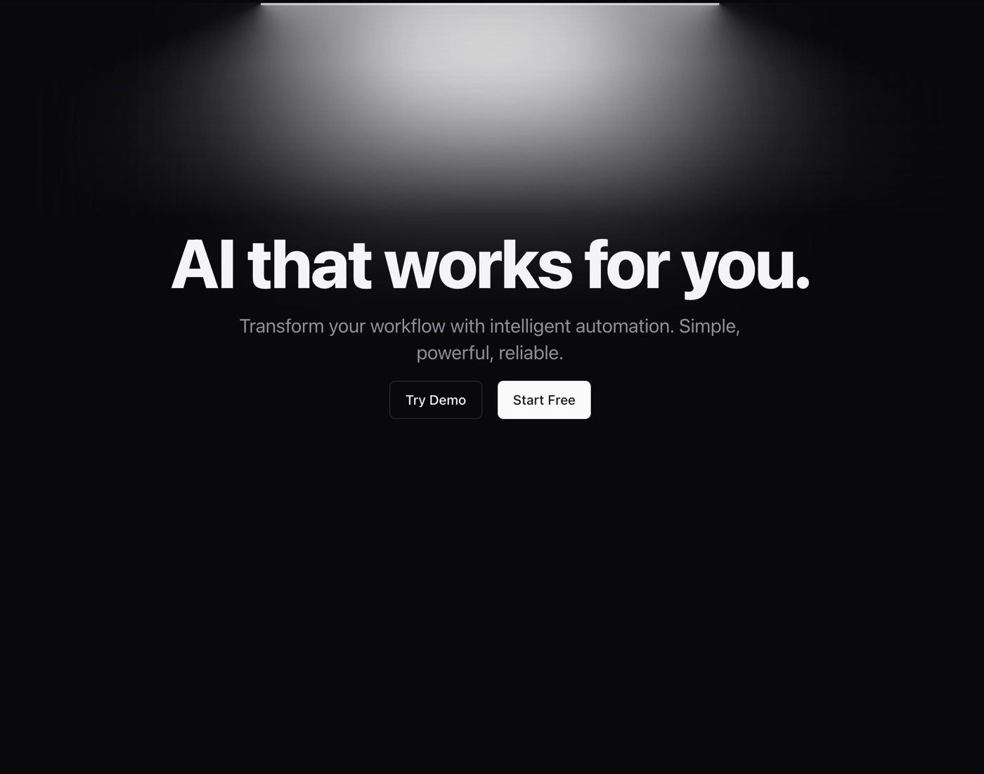 Hero
Hero
 Confetti
 Expandable Card
 Bento Grid
 Sparkles Text
 Animated Gradient With SVG
 Tilted Scroll
 AI Input With Loading
 Hero Video Dialog
 Interactive Icon Cloud
 Filters
 AI Input With Search
 Animated Gradient Background
 Animated Beam
 Dock
Dock
 Dotted Dialog
 Link Preview
 Chat Message List
 Input
Input
 Google Gemini Effect
 Activity Card
 Hero with Mockup
 Placeholders And Vanish Input
 Hero Highlight
 Text Generate Effect
Browse & preview free Unlock everything — from $49/mo
Frequently asked questions
Do Meez prompts work with Wix?
Yes. Every Meez prompt is a complete written spec — fonts, layout, color tokens, motion and asset URLs — so Wix can build it in one paste. The 62 free prompts on this site work exactly like the premium ones; copy one above and try it.
What does Wix generate from a prompt?
Wix's AI builder generates a hosted Wix site from a written brief — sections, styles and content you then refine in the Wix editor, with hosting, domains and business tools built into the platform. A Meez spec upgrades that first generation from a stock template to a directed design.
How do I use a Meez prompt in Wix?
Copy the full prompt text and paste it into Wix's AI site builder. Don't shorten it — the specificity is what keeps Wix from producing a generic layout. Then iterate: swap the copy and point the asset URLs at your own media.
How many prompts are free?
62 prompts are free to copy in full, no account needed. The other 579 unlock with Unlimited — $49/mo, $149/yr, or $299 once for lifetime — along with all 285 motion backgrounds.
Also for: Lovable · Bolt · v0 · Cursor · Claude · Replit · Windsurf · Framer · Webflow · ChatGPT · Figma Make · Gemini · GitHub Copilot
Not sure which tool? Lovable vs v0 vs Bolt vs Cursor, compared → · All free prompts on one page → · All prompt categories →