Prompts · for ChatGPT
AI website build-prompts for ChatGPT
Paste a Meez prompt into ChatGPT (or a GPT inside your editor) and it writes the full component — fonts, layout, gradients, sections and animation, matched to the spec on the first pass. The more precise the prompt, the less generic the output, and Meez prompts are about as precise as a website brief gets.
How to use a Meez prompt in ChatGPT
- Pick a prompt below (4 on this page are free) or browse the full library — every prompt is a complete art-direction spec: fonts, layout, color system, motion and real asset URLs.
- Copy the whole prompt and paste it into the ChatGPT message box. Don’t trim it — the detail is what stops ChatGPT from defaulting to a generic layout.
- Let it build, then iterate: swap the copy, point the asset URLs at your own media, and ship. The sites you build are yours, commercially.
Free prompts to try in ChatGPT right now
Cross-BorderMobile App · free prompt · copy-paste
Create a mobile-first logistics company landing page for "CARGOX GROUP" displayed inside an iPhone 15 Pro mockup frame. Use React, TypeScript, Tailwind CSS, and the `motion` library (motion/react) for animations. Use Vite as the build tool.

## Structure

The page is wrapped in a realistic iPhone 15 Pro mockup (aspect ratio 393:852) with:
- Dark frame (#1a1a1a) with 54px border-radius, 8px border (#2a2a2a), inset highlight (#3a3a3a)
- Dynamic Island (126x36px, centered at top, black, 20px border-radius, z-200)
- Home indicator at bottom (134x5px, white 30% opacity)
- Scrollable content area inside with hidden scrollbar and `container-type: size`

The body background is #111111. The scrollable container uses `container-type: size; container-name: phone;` for container queries.

## Fonts

- Import **Barlow Condensed 800** from Google Fonts
- Body font: Helvetica, Arial, sans-serif

## SECTION 1: Hero (full viewport height of the container using `100cqb`)

**Background:** Autoplaying, muted, looping video:
```
https://meez.design/web/media/ext/597d53d9b15f2d2d.mp4
```

**Navbar (absolute, top):**
- Left: "CARGOX" (white) / "GROUP" (yellow #ffda00) in Barlow Condensed 800, uppercase, clamp(22px, 6vw, 32px)
- Right: Hamburger menu icon (lucide-react Menu/X, 28px, white)
- Both slide in from left/right with 0.6s expo-out ease

**Mobile menu overlay:** Fixed, z-99, background #6682c2, centered nav items (Services, Industries, Company) in white 24px. AnimatePresence with scale + opacity transitions. Items stagger in from bottom.

**Hero content (bottom of section, z-10, padding 0 20px 24px):**
- Large headline in Barlow Condensed 800, uppercase, clamp(48px, 14vw, 72px), line-height 0.82:
  - "BEYOND" (white) - slides from x:-400
  - "BORDERS" (yellow #ffda00, text-align right) - slides from x:+400
  - "AND LIMITS" (white) - slides from x:-400
  - Staggered delays: 0s, 0.13s, 0.26s. Duration 0.85s, expo-out [0.16, 1, 0.3, 1]
- CTA Button: Custom SVG pill shape (fill #ffda00) with a circular end section containing a rotating arrow (white stroke, rotates from -135deg to -90deg on hover). Text "Get in touch" centered in the non-circle area. Font: Helvetica 20px, color #002a35. Hover: scale 1.08, y:-2. Tap: scale 0.97.

**Show hero content only after video `onCanPlay` fires** (fade in with AnimatePresence).

## SECTION 2: Info Card

**Background:** `linear-gradient(180deg, #C8C7B3 0%, #F0B172 50%, #EA7C58 100%)`
**Padding:** clamp(60px, 12vh, 120px) 20px

**Tagline** (scroll-triggered, slides from left):
- "LOGISTICS" in Barlow Condensed 800, white, clamp(44px, 13vw, 64px)
- "shaped by scale" / "powered by precision" in Helvetica, clamp(18px, 5vw, 26px), color #1a1a1a

**World Map:**
- Background map image: `https://meez.design/web/media/ext/f9ce5f887859208d.png`
- Aspect ratio 435/340, extends 20px beyond container edges
- SVG overlay (viewBox 0 0 299.037 142.509) at left:10%, top:18%, width:80% with 4 curved route paths in yellow (#FFDA00, 2.5 stroke):
  ```
  M128.161 74.6764C79.9989 130.001 71.9994 46.0005 20.9815 111.737
  M216.999 9.99985C260.499 12.4998 222.499 71.9998 291.999 58.9998
  M130.102 70.9998C144.499 -32.0002 183.852 70.2739 219.999 3.99985
  M14.4999 16.9998C111 20.9998 -53.0003 73.4998 21.4999 107
  ```
- Route lines animate with `pathLength` from 0 to 1, staggered
- Animated yellow arrow polygons (points="0,-4 8,0 0,4") using SVG `<animateMotion>` along each path, rotating automatically
- 5 stop dots at coordinates: [9.519,15.519], [289.519,59.518], [220.519,9.519], [125.518,78.519], [19.519,104.519] - each is a yellow circle r=9.519 with dark center r=3.389 (#002A35). They pop in with scale animation.
- 3 floating transport icons (white circle bg, 16% width, rounded-full, box-shadow):
  - Ship: `https://meez.design/web/media/ext/0d3cbcc042a65ea1.png` at left:26%, top:28.9%
  - Car: `https://meez.design/web/media/ext/457552dcad941164.png` at left:70.8%, top:15.6%, rotate(9.73deg)
  - Plane: `https://meez.design/web/media/ext/c4fe9416e8e5502f.png` at left:55.2%, top:52.1%, rotate(180deg) scaleY(-1)
  - Icons pop in (scale 0.5 -> 1), then continuously float up/down with infinite y animation

**Stats** (scroll-triggered, slide in from opposite sides):
- "3M+" white Barlow Condensed 800, clamp(50px, 14vw, 72px) + "tons of cargo / delivered / without delays" in #1a1a1a, clamp(14px, 3.8vw, 18px)
- "13+" same styling, indented left clamp(40px, 12vw, 90px) + "years of trusted / and reliable / operations"

## SECTION 3: Contact Us

**Background:** #0a1f2b
**Padding:** clamp(48px, 10vh, 96px) 20px clamp(32px, 6vh, 64px)

**Heading** (scroll-triggered fade+slide from bottom):
- "CONTACT " (white) + "US" (yellow #ffda00), Barlow Condensed 800, clamp(44px, 13vw, 64px)
- Subtitle: "Complete the form and our team will contact you soon." in #b0b8bc, clamp(14px, 3.8vw, 18px)

**Form fields** (scroll-triggered, stagger from bottom):
- 3 inputs (First Name, Last Name, E-mail): pill-shaped (40px radius), bg rgba(255,255,255,0.08), white text, clamp(14px, 3.5vw, 16px). On focus: bg brightens to 0.14, slight scale 1.01.
- "Send" button: pill, bg #FFDA00, color #0a1f2b, font-weight 700, clamp(16px, 4vw, 20px). Hover: scale 1.03, y:-2, bg #ffe84d. Tap: scale 0.97.

**Footer info:**
- Email: info@cargox-group.com
- Phone: +380 44 234-7890
- Color #b0b8bc, hover slides right 4px and turns white

**Social icons** (3 white circles 44x44, hover: scale 1.15, y:-3):
- Instagram, LinkedIn, Facebook (inline SVG icons, fill #0a1f2b)

**Scroll-to-top button** (right side): white 44x44 circle with up-arrow SVG, same hover animation.

**Copyright:** "(c) 2025. All rights reserved." in #6b7a80, clamp(12px, 3.2vw, 14px)

## Animation System

- Use `motion/react` (NOT framer-motion)
- Easing curves: EXPO_OUT = [0.16, 1, 0.3, 1], EASE_OUT = [0.25, 0.46, 0.45, 0.94]
- Scroll-triggered reveals using `useInView` from motion/react with `once: true` and margin: '0px 0px -40px 0px' or '0px 0px -60px 0px'
- All scroll animations fire only once
- Transport icons have infinite floating y-axis animation with varying durations (2.5-3.3s)
- Mobile menu uses AnimatePresence for enter/exit

## Dependencies

```json
{
  "motion": "^12.40.0",
  "lucide-react": "^0.344.0",
  "react": "^18.3.1",
  "react-dom": "^18.3.1"
}
```
Cyber LayerCybersecurity · free prompt · copy-paste
Build a **single self-contained `index.html`** that recreates this cybersecurity landing page **pixel-faithfully**. Fixed fullscreen black stage, left-locked typography, right-side looping video atmosphere, one-shot entrance choreography, and a mobile burger overlay. No frameworks. No scroll. No cards. No purple. No rounded pills.
---
## 1. Document shell
```html
<!DOCTYPE html>
<html lang="en">
<head>
<meta charset="utf-8">
<meta name="viewport" content="width=device-width, initial-scale=1, viewport-fit=cover">
<title>Security built into every system layer</title>
```
- `html, body { height:100%; background:#000; overflow:hidden }`
- `body { -webkit-font-smoothing:antialiased; text-rendering:geometricPrecision }`
---
## 2. Fonts (exact aliases from the original)
Embed two WOFF2 faces as `@font-face` with **`font-display:block`**:
| CSS family alias | Actual font | Role |
|---|---|---|
| `'SG'` | **Space Grotesk** (original embeds the Light cut as `SpaceGrotesk-Light`) | Headline, button labels, stat labels, mobile menu rows |
| `'JB'` | **JetBrains Mono Regular** (`JetBrainsMono-Regular`) | Nav links, subcopy, stat numbers, menu eyebrow/note/sublinks |
CSS weight usage (even if the embed is a single cut — match the original declarations):
- **SG**: `480` (buttons), `700` (h1 + mobile `.mrow`), `400` (stat labels)
- **JB**: `400` (nav, sub, menu), `480` (stat numbers)
Closest public substitutes if not copying the original base64: Google Fonts **Space Grotesk** + **JetBrains Mono**, still aliased as `'SG'` / `'JB'`.
---
## 3. Design tokens / scaling system
Three design canvases via `--s`:
**Desktop (default)**
```css
:root {
--s: min(100vw / 1505, 100vh / 700);
--red: #c81b1c;
--ink: #fff;
--sub: #e6e6e6;
--lab: #949494;
--bx:60; --by:36; --bs:44; /* burger box */
--h1y: -12.5;
--suby: 167.5;
--numy: 19;
--laby: 74;
}
```
**Tablet portrait** `@media (max-width:1023px) and (max-aspect-ratio:1/1)`
canvas **900×1200**:
```css
--s: clamp(0.82px, min(100vw / 900, 100vh / 1200), 1.25px);
--bx:56; --by:33; --bs:40;
--h1y:-10.25; --suby:137.4; --numy:15.6; --laby:60.7;
```
**Phone** `@media (max-width:599px)`
canvas **430×620**:
```css
--s: min(100vw / 430, 100vh / 620, 1.02px);
--bx:26; --by:21; --bs:34;
--h1y:-7.1; --suby:108; --numy:13; --laby:50;
```
Every layout value is `calc(N * var(--s))`. Do not use free rem/px layout outside this system.
---
## 4. Background video (mandatory exact URL)
Use this **exact** CloudFront URL everywhere a bg plate appears:
```
https://meez.design/web/media/ext/4a3f2c95c26203a8.mp4
```
**Three synced `<video>` instances**, each with:
`autoplay muted loop playsinline preload="auto"`
1. `.bg > video` — primary full-bleed plate
2. `.bg2 > video` — second pass, lifted lower half
3. `.menu-tex > video` — faint overlay inside mobile menu
CSS:
```css
.screen { position:fixed; inset:0; overflow:hidden; background:#000 }
.bg, .bg2 { position:absolute; inset:0; overflow:hidden; pointer-events:none }
.bg { filter: url(#grade) }
.bg video, .bg2 video {
position:absolute; inset:0; width:100%; height:100%;
object-fit:cover; object-position:center top; display:block;
}
.bg2 {
filter: url(#grade2);
mix-blend-mode: plus-lighter;
opacity: .35;
-webkit-mask-image: linear-gradient(180deg, transparent 21.5%, #000 100%);
mask-image: linear-gradient(180deg, transparent 21.5%, #000 100%);
}
```
**Tablet portrait video treatment**
- `.bg2 { display:none }`
- `.bg video { object-position:right top; transform:scale(1.18); transform-origin:right top }`
- `.bg` masked: `linear-gradient(180deg, #000 0 40%, transparent 64%)`
- `.scrim` ON: `linear-gradient(100deg, #000 26%, rgba(0,0,0,.74) 50%, rgba(0,0,0,.18) 76%, transparent 92%)`
**Phone video treatment**
- videos `object-position:78% top`
- `.bg2` shown again with mask `linear-gradient(180deg, transparent 10%, #000 60%)`
- `.scrim` ON vertical:
`linear-gradient(180deg, rgba(0,0,0,.10) 0%, rgba(0,0,0,.50) 24%, rgba(0,0,0,.86) 42%, #000 66%)`
**Video sync script**: master = first video; on `timeupdate`, if other videos drift `>0.12s`, set `currentTime` to master. If `prefers-reduced-motion: reduce`, pause all and remove `autoplay`.
**SVG color-grade filters** (required — applied to video containers):
### `#grade`
```xml
<filter id="grade" color-interpolation-filters="sRGB">
<feComponentTransfer>
<feFuncR type="table" tableValues="0.0018 0.0105 0.0154 0.0228 0.0307 0.0404 0.0485 0.0585 0.0719 0.0923 0.1205 0.1466 0.1657 0.1866 0.2197 0.2405 0.2485 0.2921 0.3362 0.3465 0.3472 0.3781 0.3781 0.4078 0.4199 0.4391 0.4604 0.4763 0.4798 0.5197 0.5473 0.5720 0.5995 0.6048 0.6232 0.6322 0.6483 0.6734 0.7201 0.7201 0.7410 0.7707 0.7707 0.7790 0.8084 0.8084 0.8390 0.8595 0.8707 0.8870 0.8993 0.9085 0.9132 0.9132 0.9162 0.9162 0.9162 0.9162 0.9162 0.9162 0.9162 0.9162 0.9162 0.9238 0.9300"/>
<feFuncG type="table" tableValues="0.0023 0.0106 0.0159 0.0250 0.0333 0.0445 0.0535 0.0620 0.0707 0.0827 0.0936 0.1063 0.1214 0.1402 0.1678 0.1727 0.2029 0.2176 0.2461 0.2757 0.2814 0.3050 0.3415 0.3692 0.3826 0.3884 0.4617 0.4617 0.4617 0.4643 0.4643 0.4808 0.5706 0.6005 0.6005 0.6390 0.6390 0.6390 0.6390 0.6390 0.6390 0.6390 0.6390 0.6390 0.6524 0.6664 0.6805 0.6945 0.7086 0.7227 0.7367 0.7508 0.7648 0.7789 0.7929 0.8070 0.8211 0.8351 0.8492 0.8632 0.8773 0.8913 0.9054 0.9195 0.9300"/>
<feFuncB type="table" tableValues="0.0021 0.0110 0.0187 0.0311 0.0377 0.0466 0.0584 0.0706 0.0791 0.0924 0.1039 0.1145 0.1316 0.1464 0.1614 0.1719 0.1887 0.2014 0.2247 0.2458 0.2954 0.2954 0.3089 0.3938 0.3938 0.3988 0.3988 0.4581 0.4581 0.4762 0.4762 0.4763 0.5374 0.5560 0.5813 0.5813 0.5813 0.5813 0.5835 0.5969 0.6104 0.6238 0.6373 0.6507 0.6642 0.6777 0.6911 0.7046 0.7181 0.7315 0.7449 0.7584 0.7719 0.7853 0.7988 0.8123 0.8257 0.8391 0.8526 0.8661 0.8795 0.8930 0.9065 0.9199 0.9300"/>
</feComponentTransfer>
</filter>
```
### `#grade2` (slightly darker lift pass)
```xml
<filter id="grade2" color-interpolation-filters="sRGB">
<feComponentTransfer>
<feFuncR type="table" tableValues="0.0016 0.0092 0.0136 0.0201 0.0270 0.0356 0.0427 0.0515 0.0633 0.0812 0.1060 0.1290 0.1458 0.1642 0.1933 0.2116 0.2187 0.2570 0.2959 0.3049 0.3055 0.3327 0.3327 0.3589 0.3695 0.3864 0.4052 0.4191 0.4222 0.4573 0.4816 0.5034 0.5276 0.5322 0.5484 0.5563 0.5705 0.5926 0.6337 0.6337 0.6521 0.6782 0.6782 0.6855 0.7114 0.7114 0.7383 0.7564 0.7662 0.7806 0.7914 0.7995 0.8036 0.8036 0.8063 0.8063 0.8063 0.8063 0.8063 0.8063 0.8063 0.8063 0.8063 0.8129 0.8184"/>
<feFuncG type="table" tableValues="0.0015 0.0069 0.0103 0.0163 0.0216 0.0289 0.0348 0.0403 0.0460 0.0538 0.0608 0.0691 0.0789 0.0911 0.1091 0.1123 0.1319 0.1414 0.1600 0.1792 0.1829 0.1983 0.2220 0.2400 0.2487 0.2525 0.3001 0.3001 0.3001 0.3018 0.3018 0.3125 0.3709 0.3903 0.3903 0.4153 0.4153 0.4153 0.4153 0.4153 0.4153 0.4153 0.4153 0.4153 0.4241 0.4332 0.4423 0.4514 0.4606 0.4698 0.4789 0.4880 0.4971 0.5063 0.5154 0.5246 0.5337 0.5428 0.5520 0.5611 0.5702 0.5793 0.5885 0.5977 0.6045"/>
<feFuncB type="table" tableValues="0.0013 0.0066 0.0112 0.0187 0.0226 0.0280 0.0350 0.0424 0.0475 0.0554 0.0623 0.0687 0.0790 0.0878 0.0968 0.1031 0.1132 0.1208 0.1348 0.1475 0.1772 0.1772 0.1853 0.2363 0.2363 0.2393 0.2393 0.2749 0.2749 0.2857 0.2857 0.2858 0.3224 0.3336 0.3488 0.3488 0.3488 0.3488 0.3501 0.3581 0.3662 0.3743 0.3824 0.3904 0.3985 0.4066 0.4147 0.4228 0.4309 0.4389 0.4469 0.4550 0.4631 0.4712 0.4793 0.4874 0.4954 0.5035 0.5116 0.5197 0.5277 0.5358 0.5439 0.5519 0.5580"/>
</feComponentTransfer>
</filter>
```
Hide defs: `.svgdefs { position:absolute; width:0; height:0; overflow:hidden }`
---
## 5. Exact copy & DOM structure
Layer tree inside `.screen`:
1. `.bg` (+ video)
2. `.bg2` (+ video)
3. `.scrim` (hidden on desktop)
4. `.frame` (flex column) containing:
- `header`
- spacer `.sp.sp-a`
- `section.hero`
- spacer `.sp.sp-b`
- `section.stats`
- spacer `.sp.sp-c`
5. `#menu.menu` overlay (mobile)
### Header
- **Logo**: 46×46 SVG, 4 chevron-arrows pointing inward (N/E/S/W), white stroke `#fff`, `stroke-width="3"`, butt caps. Paths per arm: `M23 0V19.5` + `M14 10.2L23 19.2L32 10.2`, rotated 0/90/180/270 around `(23,23)`. Desktop: left `60`, top `35`, size `45`.
- **Nav** (desktop only): `Home` · `Resources▾` · `Benefits▾` · `Contact`
- font JB 400 / `19.9` / white
- nav origin left `482`, top `32`, height `58`
- default sibling gap `40`; 2nd link margin-left `53`; 4th `37`
- chevron SVG 11×6, stroke `currentColor` 1.7, path `M1 1L5.5 5L10 1`, size `11.6×7.2`, margin-top `-2.6`
- **Burger** (≤1023px): 3 white bars; 3rd bar shorter (`.47` width) until open; open → X (`rotate ±45deg`, middle opacity 0). Aria: `Open menu` / `Close menu`.
- **Top CTA** `.btn.btn-top`: label **Secure system** + arrow SVG (`M0 9H20.1` / `M12.1 1L20.1 9L12.1 17`), left `1232`, top `30`.
### Hero
Exact headline (two masked lines):
```
Security built into
every system layer
```
Markup:
```html
<h1>
<span class="ln"><span>Security built into</span></span>
<span class="ln"><span>every system layer</span></span>
</h1>
```
- SG 700, size `68.7`, line `76`, tracking `-2.4`, left `73`, top `--h1y`
Subcopy (exact break):
```
Engineered to stay resilient, controlled,
and uncompromised under pressure.
```
- JB 400, size `18.7`, line `26`, tracking `-0.87`, color `--sub`, left `73`, top `--suby`
CTA `.btn.btn-cta` identical to top button, left `73`, top `248`.
### Buttons (shared `.btn`)
- Desktop: `212×58`, bg `--red`, padding L`18` R`22`, gap `11`
- Label SG 480 / `20.85` / tracking `-0.62` / translateY `1.5`
- Arrow `21.5×18`, white stroke 2
- Hover (hover-capable only): bg `#b01617`; arrow `translateX(3)`
- Tablet: `174×47.6`, pad `14.8/18`, gap `9`, label `17.1`
- Phone: `185×50`, pad `15.7/19.1`, gap `9.6`, label `17.5`
- Sharp corners (no border-radius)
### Stats
| Stat | Number | Label | left |
|---|---|---|---|
| s1 | `300+` | Clients | `70.4` |
| s2 | `99%` | Satisfaction | `213.1` |
| s3 | `$5M+` | Revenue | `392.6` (num offset `-4.4`) |
- Numbers: JB 480 / `33.45` / white
- Labels: SG 400 / `21.9` / tracking `-0.62` / `--lab`
- Vertical rules `.r1` @ `181`, `.r2` @ `356`, width `1.5`, gradient
`linear-gradient(180deg, rgba(255,255,255,.085), rgba(255,255,255,.21) 50%, rgba(255,255,255,.085))`
### Fluid spacers (desktop)
```
.sp-a flex 239 / .sp-b 194 / .sp-c 115
```
(Tablet 340/276/163 · Phone 106/92/56)
### Mobile menu (`#menu`)
- Fullscreen black plate + `.menu-tex` video at opacity `.4` with top fade mask
- Red top rule `.menu-rule` height `2`, scales X from 0→1 on open (`.55s`, delay `.04s`, cubic-bezier `.2,.7,.2,1`)
- Eyebrow: `MENU` style — JB, `11.5`, letter-spacing `.22em`, uppercase, `--lab`
- Rows: Home · Resources (accordion) · Benefits (accordion) · Contact
- Resources children: Documentation / Threat reports / Changelog
- Benefits children: Continuous monitoring / Access control / Incident response
- Footer CTA full-width `.btn-menu` + note: `300+ clients / 99% satisfaction`
- Open: body class `nav-open`; list items stagger fade/rise delays `.08/.14/.20/.26s`
- Accordion: only one open; Escape closes; link click closes; resize to desktop closes
Breakpoint: `@media (max-width:1023px)` hide `nav` + `.btn-top`, show burger + menu.
---
## 6. Entrance animation (exact choreography)
**Arm before paint** (inline in `<head>` after CSS): if WAAPI exists and motion is allowed, add class `intro` to `<html>` immediately so the finished page never flashes.
**Initial `html.intro` CSS state**
- logo / nav links / burger / sub / stats: `opacity:0`
- logo `scale(.9)`; nav `translateY(7)`; sub `14`; nums `12`; labs `10`
- rules `scaleY(0)` origin center
- `.btn-top` / `.btn-cta`: `clip-path: inset(0 100% 0 0)` (wipe draw, not fade)
- each `h1 .ln`: `overflow:hidden` + pad-bottom `6` / margin-bottom `-6` (protect SG descenders)
- inner spans start at `translateY(120%)`
**Master timeline** (absolute seconds; phone multiplies all durations/delays by `0.86`)
Easings:
- `EXPO = cubic-bezier(.16,1,.3,1)`
- `QUINT = cubic-bezier(.22,1,.36,1)`
- `QUART = cubic-bezier(.25,1,.5,1)`
- `TYPE = cubic-bezier(.22,.85,.24,1)`
| t | Action |
|---|---|
| 0.00 | Logo: opacity 0→1 + scale .9→1, dur `.70`, EXPO |
| 0.12 | Nav links rise `7`, dur `.62`, stagger `.055`, QUINT |
| 0.18 | Burger fade, dur `.55`, QUART |
| 0.28 | Top button wipe clip, dur `.66`, EXPO |
| 0.34 | Headline lines rise from 120%, dur `.98`, stagger `.09`, TYPE |
| 0.74 | Sub rise `14`, dur `.72`, QUINT |
| 0.90 | Hero CTA wipe, dur `.70`, EXPO |
| 0.98 | Rules scaleY 0→1, dur `.60`, stagger `.07`, QUART |
| 1.04 | Stat nums rise `12`, dur `.66`, stagger `.085`, QUINT |
| 1.10 | Stat labs rise `10`, dur `.62`, stagger `.085`, QUINT |
| ~1.9 | Complete |
**Completion rules**
- Wait for `document.fonts.ready` (backup `1000ms`), then `rAF` (+ `1200ms` backup) to start once.
- Measure `--s` via probe `width: calc(100 * var(--s))` because unregistered custom props don’t resolve in getComputedStyle.
- On finish: remove `intro`, **cancel** all animations (no residual inline styles). Hard deadline `4000ms`.
- Background video is **never** part of the entrance — it is already on stage.
- `prefers-reduced-motion: reduce`: no `intro` class; everything visible/static.
---
## 7. Interaction / a11y
- Hover only under `@media (hover:hover)`: nav → `--red`; buttons darken; menu rows/sublinks as specified
- Focus-visible: `2` white outline, offset `3`
- Reduced motion: kill transitions (`* { transition:none !important }`) and skip entrance
---
## 8. Non-negotiables for “exact”
1. Exact video URL above (all 3 instances)
2. Font aliases `'SG'` = Space Grotesk, `'JB'` = JetBrains Mono, `font-display:block`
3. Canvas scaler `--s` with 1505×700 / 900×1200 / 430×620
4. Dual graded video layers + exact LUT filters
5. Copy, line breaks, stats, menu tree character-exact
6. One-shot WAAPI entrance with absolute timing table above
7. Sharp red CTAs (`#c81b1c`), no border-radius
8. Single-file HTML, fullscreen, no scroll
Data SignalAnalytics · free prompt · copy-paste
Recreate this page **pixel-faithfully** as a single static `index.html` (inline CSS + JS, no framework). Match structure, copy, spacing tokens, glass, motion, fonts, and media exactly. Do not invent extra sections, stats, cards, or marketing blocks. Full-viewport dark landing only — no page scroll (`html, body { overflow: hidden; background: #000 }`).
## Product / brand
- Brand: **Vantage**
- Document title: `Stop Digging Through Dashboards`
- Theme color: `#000000`
- `color-scheme: dark`
- One composition: full-bleed cinematic background + left hero stack + bottom-right glass demo card. No inset hero media cards elsewhere.
## Exact background video (mandatory)
Full-bleed edge-to-edge background is a **`<video>`**, not an image:
```html
<video class="background" autoplay muted loop playsinline disablepictureinpicture aria-hidden="true">
<source src="https://meez.design/web/media/ext/4048e8b759e0669f.mp4" type="video/mp4">
</video>
```
CSS for `.background`:
- `position: absolute; inset: 0; z-index: -3; width/height: 100%; object-fit: cover; object-position: center; pointer-events: none; user-select: none`
Over video, add `.screen::before` vignette at `z-index: -2`:
```css
background:
linear-gradient(180deg, rgba(0,0,0,.03), transparent 24%, transparent 82%, rgba(0,0,0,.05)),
radial-gradient(ellipse at 44% 54%, transparent 30%, rgba(0,0,0,.055) 100%);
```
## Fonts (exact)
Embed / use these two variable fonts (not Inter/Roboto/system UI):
1. **Reference Sans** — `font-weight: 100 900` — default UI / body / nav / buttons
2. **Reference Display** — `font-weight: 400 900` — **headline only**
`:root { font-family: "Reference Sans", Arial, sans-serif; }`
**Headline (`.hero-title`)**:
- `font-family: "Reference Display", "Reference Sans", Arial, sans-serif`
- **`font-weight: 500` (medium)** — not bold, not semibold
- `font-optical-sizing: auto`
- `letter-spacing: -2.1px`
- `-webkit-text-stroke: .12px currentColor`
- `white-space: nowrap`
- `text-shadow: 0 2px 2px rgba(0,0,0,.44)`
Do **not** use Playfair Display.
## Exact copy (preserve wording, including grammar)
Headline (two lines):
1. `Stop Digging` — color `#fff`, `transform: scaleX(.775)` on `.line-one`
2. `Through Dashboards.` — color `rgba(211, 207, 207, .78)`, `transform: scaleX(.793)` on `.line-two`
Each line wrapped: `<span class="line line-one|line-two"><span class="line-reveal">…</span></span>` with `transform-origin: left center` on `.line`.
Body copy (exact, including “bring” not “brings”, and the three line breaks):
```
Your metrics are scattered across a dozen dashboards.<br>
Vantage bring them into one clear signal, so every<br>
decision is backed by data you actually trust.
```
- Color `rgba(226, 229, 228, .84)`
- `font-weight: 350`, `letter-spacing: .13px`
- width `clamp(390px, 31.67vw, 500px)`, `left: 1px`
- `text-shadow: 0 1px 3px rgba(0,0,0,.7)`
Buttons / chrome text:
- Nav: `Home` (active), `About`, `Services`, `Contact`
- Time panel label: `Timezone`
- Time panel value: `9:47 PM • 14 July 2026` (static string)
- Header CTA: `Sign Up`
- Primary CTA: `Get Started`
- Demo card: `Watch Demo` + play control `aria-label="Play demo"`
## Layout architecture
Fixed `.viewport` (`inset: 0; isolation: isolate; background: #000`). Inside: `.screen` centered with `left/top: 50%; transform: translate(-50%,-50%); width/height: 100%; background: #000`.
### Desktop CSS variables on `.screen` (exact)
```css
--gutter-start: clamp(36px, 4.177vw, 96px);
--gutter-end: clamp(36px, 4.04vw, 96px);
--header-top: clamp(20px, 2.264vh, 30px);
--hero-bottom: clamp(34px, 5.19vh, 64px);
--display-size: clamp(58px, 7.64vh, 88px);
--display-leading: clamp(72px, 9.34vh, 106px);
--copy-size: clamp(14px, 1.70vh, 19px);
--copy-leading: clamp(19px, 2.17vh, 24px);
--title-copy-gap: clamp(15px, 2.08vh, 24px);
--copy-cta-gap: clamp(24px, 3.11vh, 36px);
--cta-width: clamp(142px, 15.09vh, 168px);
--cta-height: clamp(38px, 3.96vh, 44px);
--compact-control-font-size: clamp(17px, 1.75vh, 19px);
--action-control-font-size: clamp(17px, 1.78vh, 19.5px);
--primary-control-font-size: clamp(17px, 1.77vh, 19.25px);
--control-inline-nudge: -1px;
--control-baseline-shift: clamp(1px, .19vh, 2px);
--copy-optical-shift: clamp(0px, .1vh, 1px);
--watch-baseline-shift: clamp(2px, .38vh, 4px);
--card-width: clamp(150px, 18.96vh, 215px);
```
### Header (top bar)
Absolute: `inset: var(--header-top) var(--gutter-end) auto var(--gutter-start); height: 48px; display: flex; align-items: flex-start; white-space: nowrap`.
1. **Brand** — 25×25 SVG disc logo (clipPath circle), light face with angular diamond shards (`#ededed` ground, `#050606` / `#737778` / `#fafafa` / `#0a0b0b` paths). `top: 10px`, drop-shadow `0 1px 2px rgba(0,0,0,.3)`. `aria-label="Vantage home"`.
2. **Nav** — `margin-left: clamp(36px, 3.03vw, 48px); gap: clamp(32px, 2.9vw, 43px); top: 9px`. Links: `font-size: 16px; font-weight: 430; letter-spacing: -.36px; color: rgba(229,229,230,.77); text-shadow: 0 1px 3px rgba(0,0,0,.55)`. Active: `#fff` + underline `::after` width `44px`, height `2px`, `background: rgba(255,255,255,.82)`. First link `top: -3px`; fourth `margin-left: 1px`.
3. **Time panel** — `margin-left: auto; width: 211px; height: 48px; padding-left: 8px; border-left: 2px solid rgba(230,230,230,.52)`. Label `15px / weight 420 / rgba(240,240,240,.77)`. Value `15px / weight 440 / rgba(255,255,255,.93)`.
4. **Sign Up** — white pill button `109×42`, `border-radius: 7px`, `background: #fff`, `color: #101010`, `font-weight: 460`, `letter-spacing: -.34px`, shadows `inset 0 1px 0 rgba(255,255,255,.72)` + `0 1px 5px rgba(0,0,0,.34)`, `margin-left: clamp(20px, 1.95vw, 29px)`.
5. **Menu toggle** — `display: none` on desktop; shown only in tablet/mobile breakpoints. Two-line hamburger SVG; morphs to X when `.header.menu-open`.
### Hero (bottom-left)
`.hero-content`: `position: absolute; left: var(--gutter-start); bottom: var(--hero-bottom); flex-column; align-items: flex-start`.
**Primary CTA** (white, not glass):
- size from `--cta-width` / `--cta-height`, `border-radius: 7px`, `background: #fff`, `color: #111`, `box-shadow: 0 1px 5px rgba(0,0,0,.38)`
- Label absolute at `left: 8.125%`, `font-weight: 450`, `letter-spacing: -.3px`
- Dark arrow box absolute `right: 3.125%; top: 14.286%; width: 20.625%; height: 71.429%; border-radius: 7px; background: #070909` with white stroke arrow SVG 14×14
### Demo card (bottom-right) — glass
`.demo-card` absolute `right: var(--gutter-end); bottom: var(--hero-bottom); width: var(--card-width); aspect-ratio: 201 / 265; container-type: inline-size`
Glass look (exact):
```css
border: 1px solid rgba(255,255,255,.13);
border-radius: clamp(12px, 1.52vh, 18px);
background: linear-gradient(145deg, rgba(24,22,20,.80), rgba(5,12,14,.86));
box-shadow:
0 2px 10px rgba(0,0,0,.44),
0 0 0 3px rgba(255,255,255,.035) inset,
0 0 0 1px rgba(0,0,0,.9);
backdrop-filter: blur(14px) saturate(108%);
```
Inside:
- `.demo-visual` square thumbnail area using `cqw` units (`left/top 3.5/4 cqw`, `92.5×92 cqw`, `border-radius: 4cqw`, bg `#101a1e`)
- Image: abstract red/blue smoke thumbnail (`alt="Abstract red and blue smoke"`), filter `brightness(.89) saturate(.93) contrast(1.03)` — use local `assets/watch-demo-thumbnail.png` or equivalent embedded asset
- Circular glass play button centered: `29cqw`, `border: 1px solid rgba(255,255,255,.34)`, `background: rgba(3,5,7,.47)`, `backdrop-filter: blur(4px)`, white play triangle SVG
- `.watch-button` full-width under visual: glass gradient `linear-gradient(145deg, rgba(26,34,36,.86), rgba(16,29,33,.9))`, border `rgba(255,255,255,.21)`, `font-weight: 430`, label `Watch Demo`
## Glass language (reuse consistently)
Dark translucent panels with:
- subtle white borders `~rgba(255,255,255,.13–.21)`
- dark teal/charcoal linear gradients ~145deg
- inset hairline highlights
- `backdrop-filter: blur(14–18px) saturate(108–110%)`
Used on: demo card, watch button, play button, tablet/mobile menu panel, menu toggle.
## Entrance motion (exact choreography)
On load (unless `prefers-reduced-motion: reduce`):
1. Head script immediately adds `motion-pending` to `<html>` and sets a **3500ms** fallback timeout to remove it.
2. While `.motion-pending`: header/nav/time/sign-up/copy/cta/card start `opacity: 0`; title lines clip with overflow hidden; `.line-reveal` starts at `translate3d(0,110%,0) skewY(2deg)`; copy/cta/card have slight downward + scale offsets.
3. Animations (easing / duration / delay):
| Element | Keyframes | Duration | Easing | Delay |
|---|---|---|---|---|
| brand | entrance-brand (fade + up 7px + scale .94→1) | 580ms | `cubic-bezier(.16,1,.3,1)` | 60ms |
| nav links | entrance-nav (fade + up 6px) | 480ms | same | 130 / 175 / 220 / 265ms |
| time panel | entrance-nav | 520ms | same | 180ms |
| sign up | entrance-action (fade + up 8px + scale .985) | 520ms | same | 220ms |
| menu toggle | entrance-action | 520ms | same | 140ms |
| title line 1 | entrance-line (110% + skewY 2° → 0) | 800ms | `cubic-bezier(.22,1,.36,1)` | 300ms |
| title line 2 | entrance-line | 850ms | same | 440ms |
| hero copy | entrance-copy | 620ms | `.16,1,.3,1` | 740ms |
| primary CTA | entrance-action | 560ms | same | 960ms |
| demo card | entrance-card (up 12px + scale .968, origin 82% 50%) | 920ms | `.22,1,.36,1` | **1040ms** |
4. On `.demo-card` `animationend`, remove `motion-pending` and clear fallback timeout.
5. Hover (if motion OK): `button, a { transition: filter/opacity 140ms }` → hover `filter: brightness(1.08)`.
6. Focus-visible: `outline: 2px solid #fff; outline-offset: 3px`.
## Responsive behavior (must match)
### Tablet
`@media (min-width: 620px) and (max-width: 790px), (min-width: 620px) and (max-width: 1100px) and (orientation: portrait)`:
- Collapse nav/time/sign-up into glass dropdown panel under hamburger (`#tablet-navigation`), closed by default (`opacity 0; visibility hidden; transform translateY(-8px) scale(.985)`), open via `.header.menu-open`.
- Menu toggle glass button 46×46, `border-radius: 11px`, `backdrop-filter: blur(14px)`.
- Dropdown: `blur(18px)`, `border-radius: 16px`, width `min(324px, calc(100vw - 2*gutter))`.
- JS: toggle `aria-expanded`, set `inert` on nav when closed (when toggle visible), Escape / outside pointer / link click closes; focus first link on open.
### Mobile
`@media (max-width: 619px)`: similar hamburger glass menu (`min(340px, …)`), hero bottom-anchored with `--mobile-gutter` / safe-area insets, tighter title scales (`scaleX(.78)` / `.55`), hide `<br>` in copy (`display:none`), demo card moves to upper-right (`top: clamp(176px, 32svh, 300px)`). Additional short-height and landscape-mobile overrides as in source.
## DOM skeleton (exact hierarchy)
```
main.viewport
section.screen#screen
video.background > source[CloudFront mp4 above]
header.header
a.brand > svg logo
div.header-actions#tablet-navigation
nav.nav > Home/About/Services/Contact
div.time-panel > label + value
button.sign-up
button.menu-toggle
section.hero
div.hero-content
h1.hero-title > two .line > .line-reveal spans
p.hero-copy
button.primary-cta > .label + .arrow-box
article.demo-card
div.demo-visual > img + button.play
button.watch-button
```
## Non-negotiables
- Use the **exact CloudFront MP4 URL** above for the background video.
- Headline font = **Reference Display at weight 500**.
- UI font = **Reference Sans** with the fractional weights listed (430/420/440/460/450/350 etc.).
- Glass demo card bottom-right; white primary CTA bottom-left under copy.
- One-shot entrance timeline with the delays/easings above.
- No scroll, no extra sections, no purple gradients, no Inter.
- Preserve static timezone string and the copy typo “Vantage bring”.
Implement as a polished production-ready single HTML file that looks identical to this Vantage landing page.
DeepThinkAI Assistant · free prompt · copy-paste
Recreate this page EXACTLY as a single static HTML file (no frameworks, no React, no Tailwind, no GSAP). Two full-viewport dark sections stacked vertically. Smooth scroll. Antialiased text. Reference canvas feel: polished AI product landing, near-black #0c0c0c.

════════════════════════════════════
EXTERNAL ASSETS (ONLY THESE)
════════════════════════════════════
Fonts (must load exactly):
- Preconnect: https://fonts.googleapis.com
- Preconnect: https://fonts.gstatic.com (crossorigin)
- Stylesheet: https://fonts.googleapis.com/css2?family=Inter:wght@400;500;600&display=swap

Section 1 font stack: "Inter","Helvetica Neue",Arial,system-ui,sans-serif
Section 2 font stack: -apple-system,BlinkMacSystemFont,"Helvetica Neue","Segoe UI",Arial,sans-serif

NO external images, videos, favicons, JS libraries, or CDN icon packs. All marks are inline SVG. Logo rays are generated at runtime with JS (24 radial lines).

════════════════════════════════════
PAGE TITLE / META
════════════════════════════════════
<title>Think clearly. Decide confidently</title>
viewport: width=device-width, initial-scale=1, viewport-fit=cover
html lang="en", base font-size 16px, scroll-behavior:smooth (auto if prefers-reduced-motion)

════════════════════════════════════
GLOBAL / BODY
════════════════════════════════════
body background #0c0c0c, color #fff
body.menu-open { overflow:hidden } when mobile menu open

════════════════════════════════════
SECTION 1 — HERO (class section-one, id="home")
min-height: 100dvh, background #0c0c0c
CSS variables (exact):
--bg:#0c0c0c
--box:#111111
--hairline:rgba(255,255,255,0.065)
--heading:#fafafa
--subtitle:#9e9e9e
--nav:#bcbcbc
--placeholder:#aeaeae
--chip-fill:rgba(255,255,255,0.028)
--chip-border:rgba(255,255,255,0.30)
--chip-edge: linear-gradient(135deg,
  rgba(255,255,255,1) 0%,
  rgba(255,255,255,0.94) 22%,
  rgba(255,255,255,0.44) 38%,
  rgba(255,255,255,0.28) 50%,
  rgba(255,255,255,0.11) 63%,
  rgba(255,255,255,0.04) 75%,
  rgba(255,255,255,0.02) 100%)
--icon:#e8e8e8
--mic:#e1e1e1
--strip:#5c5c5c
--grad: linear-gradient(90deg,
  rgba(255,232,120,0) 0%, #ffe776 6%, #ffd400 26%, #ffd000 42%,
  #c9c93c 60%, #86ca8a 74%, #78d0cd 88%, rgba(120,208,205,0.55) 100%)
--grad-solid: linear-gradient(90deg,
  #ffe776 0%, #ffd400 22%, #ffd000 40%, #c9c93c 60%, #86ca8a 76%, #78d0cd 100%)

Layout shell (.page):
min-height 100dvh, flex column
padding: clamp(14px,1.55vw,26px) clamp(16px,1.7vw,28px) 0

–––– NAV TOPBAR ––––
3-column grid: 1fr auto 1fr (desktop)
LEFT: logo link href="#home" aria-label="Home"
Logo SVG viewBox="0 0 52 52":
- empty <g class="rays" stroke="#f4f4f4" stroke-width="1.4" stroke-linecap="round">
- white circle cx=26 cy=26 r=7.4 fill="#fbfbfb"
JS fills rays: 24 lines, center 26,26, inner radius 10.4, outer 22.6, angles from -π/2 around full circle
Logo size: clamp(34px,3.1vw,52px)

CENTER nav links (ul.nav-links), gap clamp(1.6rem,2.63vw,2.75rem):
Features → #features
Benefits → #benefits
Pricing → #pricing
FAQ → #faq
Link style: color #bcbcbc, weight 400, size clamp(1rem,1.435vw,1.5rem), letter-spacing 0.005em, hover #f2f2f2, transition color .18s ease

RIGHT: white pill button "Start Free"
bg #ffffff, text #0c0c0c, weight 500, border-radius 999px,
padding clamp(0.55em,0.9vw,0.62em) clamp(1.1em,2vw,1.35em),
hover bg #ededed, active scale(.98)

Burger (≤1024 only): 3 hairline bars, morphs to X when aria-expanded=true

–––– HERO COPY ––––
Centered flex column
H1 (weight 500, color #fafafa, line-height 1.04, letter-spacing -0.021em,
font-size clamp(2rem,5.263vw,5.5rem); desktop ≥1025: clamp(3.25rem,4.6vw,4.75rem)):
TWO masked lines (NOT a single br):
  Line1: "Think clearly."
  Line2: "Decide confidently"
Structure each line as:
<span class="hl-mask"><span class="hl-line">…</span></span>
.hl-mask: display block; padding-bottom 0.16em; margin-bottom -0.16em
(during entrance overflow:hidden on mask)

Subtitle (data-enter), color #9e9e9e, weight 400,
size clamp(0.95rem,1.435vw,1.5rem), line-height 1.3, letter-spacing 0.004em,
margin-top clamp(1.1rem,2.9vw,3rem):
"An AI workspace that structures your reasoning,<br>not just your answers."
(On ≤680px: hide the <br>, width min(100%,22rem))

–––– COMPOSER CARD ––––
.composer-shell: full width, centered, isolation:isolate, transform translate3d(0,0,0)
.composer: width clamp(300px,55vw,913px) (desktop ≥1025: clamp(560px,52vw,820px); tablet: clamp(320px,72vw,760px); mobile: 100%)
margin-top clamp(1.2rem,2.9vw,3.05rem)
bg: linear-gradient(180deg,rgba(255,255,255,0.028),rgba(255,255,255,0) 42%), #111111
border 1px solid rgba(255,255,255,0.065)
radius clamp(14px,1.32vw,22px)
box-shadow: 0 2px 40px rgba(0,0,0,0.45), inset 0 1px 0 rgba(255,255,255,0.04)
padding clamp(16px,1.9vw,32px)
min-height clamp(150px,17.2vw,288px) (desktop: clamp(170px,15vw,250px))
flex column

INSIDE composer:
1) .composer-glow (absolute, z-index -1, behind card but above section via isolation):
   left/right/top 0, bottom calc(-1 * clamp(3px,0.35vw,6px))
   border-radius inherit, background --grad-solid, filter blur(0.4px), opacity 0.95
   Creates yellow→teal underglow hugging bottom edge of composer

2) Placeholder text: "Break down a decision, problem, or idea…"
   color #aeaeae, size clamp(0.95rem,1.435vw,1.5rem)

3) Controls row (margin-top auto, flex, gap clamp(8px,1.08vw,18px)):
   a) ROUND + chip button (aria-label "Add attachment"):
      size clamp(38px,3.23vw,54px), circle, white + icon SVG path M12 5v14M5 12h14, stroke 1.9
      chip fill + masked 1px gradient ring via ::before with --chip-edge (mask-composite xor/exclude); flat border fallback
   b) DeepThink pill chip: lightbulb SVG + label "DeepThink"
      height same as round, radius 999, padding 0 clamp(12px,1.4vw,23px), text white ~clamp(0.9rem,1.316vw,1.375rem)
   c) spacer flex 1
   d) Mic button (no chip ring): mic SVG, color #e1e1e1
   e) SEND button (the only continuous ambient motion):
      size clamp(40px,3.35vw,56px), circle
      --send-ring: clamp(1.1px,0.092vw,1.53px)
      padding = ring thickness; outer bg --grad-solid
      ::before absolute inset 0 circle with same --grad-solid (animated layer)
      INNER .send-inner: flex 1, circle, bg #141414, up-arrow SVG stroke #fafafa ~44% size
      hover: filter brightness(1.08); active: scale(.95)
      AFTER hero entrance completes (html.hero-ready): animate ::before with
      @keyframes send-ring-sweep { from rotate(0) to rotate(360) }
      10s linear infinite — gradient light sweeps around ring; button body never moves

–––– TRUST LOGOS FOOTER ––––
4 brands in a row (≤600px: 2×2), color #5c5c5c, gap clamp(1.6rem,5.6vw,5.9rem)
Each: small SVG mark + word "logoipsum" (2nd has ® superscript)
All placeholder logoipsum marks (inline SVG only — no logo URLs)

–––– MOBILE NAV OVERLAY (≤1024) ––––
Fixed fullscreen dialog #navOverlay
bg: radial yellow/teal tint + dark translucent gradient
backdrop-filter: blur(22px) saturate(120%)
opacity 0 / hidden → .open: opacity 1, transition .34s
Links: Features, Benefits, Pricing, FAQ — huge type clamp(2rem,9vw,3.4rem) weight 500
Staggered fade+lift on open (delays .08/.14/.20/.26s), ease cubic-bezier(.22,1,.36,1)
Hover underline grows with --grad (transparent→yellow→teal)
Footer: 2px --grad bar + full-width white "Start Free" CTA
Burger/Escape/resize>1024 closes menu

════════════════════════════════════
SECTION 2 — FEATURES (class section-two, id="features")
════════════════════════════════════
min-height 100dvh, bg #0c0c0c
padding: clamp(20px,3.2vh,42px) clamp(16px,6vw,91px) clamp(16px,2.4vh,32px)
On desktop ≥1025: padding-top clamp(130px,12.6vw,210px) — deliberate pause after logos
wrap max-width 1300px

Variables:
--heading:#ffffff
--subhead:#8b8b8d
--panel-bg:#0d0d0d
--bubble-bg:#1c1c1c
--msg-text:#efefef
--reason-text:#0b0c07
--green:#23d92c
--input-bg:#fdfdfd
--placeholder:#6b6b6d
--send-bg:#0c0c0c

H2 (weight 400, letter-spacing -0.02em, size clamp(1.6rem,4.1vw,3.3rem), line-height 1.11)
TWO masked lines:
  "Built for human thinking."
  "Powered by structured intelligence."

Subcopy (data-enter):
"Ask complex questions. Explore multiple perspectives.<br>Get structured, reliable answers — instantly."
color #8b8b8d, size clamp(0.82rem,1.25vw,1.125rem)
(hide on max-height 520px)

GRADIENT PANEL (.panel):
border-radius clamp(10px,1vw,14px)
EXACT multi-layer background:
radial-gradient(120% 150% at 9% 52%, #d2ae1a 0%, #bf9f28 22%, rgba(175,155,55,0) 56%),
radial-gradient(120% 150% at 95% 50%, #64a3a2 0%, #4d9494 34%, rgba(70,140,140,0) 64%),
radial-gradient(80% 110% at 42% 6%, rgba(150,160,55,.55) 0%, rgba(150,160,60,0) 42%),
linear-gradient(96deg, #c6a119 0%, #b0972a 32%, #7ba184 62%, #509393 100%)
::after vignette: radial-gradient(135% 120% at 50% 50%, transparent 58%, rgba(0,0,0,.30) 100%)

Inside panel:
- "Live reasoning" row: glowing green radial dot (box-shadow 0 0 6px rgba(45,220,55,.65)) + dark label #0b0c07
- Chat card max-width 814px, bg #0d0d0d, radius clamp(12px,1.4vw,18px)

Conversation (exact copy, alternating user/ai):
1 USER: "Should we expand into the European market next quarter?"
   User avatar: grey person SVG (circle head + shoulders path stroke #f2f2f2)
2 AI: avatar = circle with gradient linear-gradient(105deg,#f5c40a 0%,#dcae3f 40%,#6ac6a0 62%,#22c0cf 100%)
   Bubble:
   "Let's evaluate this across four dimensions:" + 0.75em gap
   "• Market demand & competition"
   "• Regulatory complexity"
   "• Operational cost impact"
   "• Long-term strategic value" + gap
   "Would you like to prioritize speed or profitability?"
3 USER: "Analyze the Q3 sales data. Why did revenue drop in August?"
4 AI: "I've reviewed the Q3 database. The drop in August correlates with a 15% decrease in enterprise renewals. I've drafted a retention strategy below."
5 USER: "Analyze our churn rate for February and draft a re-engagement email for inactive users"
   (no AI reply after this — ends on user message)

Bubbles: bg #1c1c1c, color #efefef, radius clamp(11px,1.1vw,15px), max-width 78%,
font-size clamp(0.8rem,1.12vw,1.06rem), line-height 1.42
User msgs justify end; AI msgs justify start

White pill input bar at bottom of chat:
placeholder "What should we build today?" color #6b6b6d
mic SVG (filled dark #111) + black circle send with white up-arrow SVG
height clamp(40px,4.4vh,48px), bg #fdfdfd, radius 999

════════════════════════════════════
ANIMATIONS — EXACT CHOREOGRAPHY
════════════════════════════════════
NO animation libraries. Use Web Animations API (Element.animate) + CSS.

HEAD SCRIPT (before paint):
If NOT prefers-reduced-motion: add classes html.entrance AND html.entrance-s2
Failsafe: remove .entrance after 3500ms
Under entrance: [data-enter] opacity 0; .hl-line opacity 0; .hl-mask overflow hidden
Under entrance-s2: same for section-two

Easing constants:
REVEAL = cubic-bezier(0.16, 1, 0.3, 1)
LIFT   = cubic-bezier(0.22, 1, 0.36, 1)
On mobile ≤680: multiply travel distances by D=0.7 (desktop D=1)

Wait for document.fonts.ready OR 400ms max before starting section-1 timeline
(Inter display:swap — avoid FOUT mid-tween)

SECTION 1 MASTER TIMELINE (once on load, ~1.8s then teardown):
0.00  logo: opacity 0→1, scale 0.92→1, dur 0.60s, LIFT
0.10  nav links: lift 10px, dur 0.50, stagger +0.05 each
0.16  burger (if visible): lift 10px
0.26  Start Free: lift 10px
0.20 / 0.29  headline lines: masked reveal —
      from {opacity:0, translateY(108%)} → opacity 1 at offset 0.14 → translateY(0)
      duration 950ms, delay 200+i*90ms, REVEAL
0.52  subtitle: lift 14px, dur 0.65
0.64  composer-shell: opacity 0→1, translateY(22*D) + scale(0.985)→1, dur 0.95, REVEAL
0.78  placeholder: lift 10px, dur 0.55
0.84+  control buttons: lift 10px, stagger 0.055
0.94  composer-glow: clipPath inset(0 40% 0 40%) → inset(0 0% 0 0%), opacity→0.95, dur 0.80, REVEAL
1.08  trust brands: lift 12px, stagger 0.06
COMPLETE → remove html.entrance, cancel all WAAPI fills, add html.hero-ready
         → starts send-ring-sweep 10s linear infinite

SECTION 2 ENTRANCE (once, IntersectionObserver rootMargin '0px 0px -20% 0px', threshold 0; disconnect after first play):
0.00 / 0.09  two h2 lines: same masked reveal as hero (delay i*90ms, no +200 base)
0.30  subhead: lift 14px, dur 0.65
0.40  panel: translateY(26*D)+scale(0.985)→identity, opacity 0→1, dur 1.00, REVEAL
0.68  Live reasoning: lift 10px
0.72  chat card: translateY(18*D)→0 ONLY (no opacity — inherits panel fade), dur 0.85
0.88+ messages: lift 10px stagger 0.065
1.24  inputbar: lift 10px
COMPLETE → remove entrance-s2, cancel animations; never replay on scroll back

REDUCED MOTION:
Do not arm entrance classes. Disable all transitions. Force visible. No send ring sweep.

════════════════════════════════════
RESPONSIVE BREAKPOINTS (exact architecture)
════════════════════════════════════
≥1025 desktop: quieter type scales; section-two large top padding
≤1024: hide center links + Start Free; show burger; composer wider clamp
≤680: tighter hero type, full-width composer, fixed control sizes ~44px
≤600: logos 2 columns
≤360: tighter chips
max-height 520: hide section-two subhead

════════════════════════════════════
INTERACTIONS
════════════════════════════════════
Chip hover: fill rgba(255,255,255,0.06)
Nav link hover: #f2f2f2
Mobile overlay open/close as specified
Composer is decorative UI (no real chat backend required)
All icons inline SVG as described — zero image URLs

════════════════════════════════════
OUTPUT
════════════════════════════════════
One self-contained index.html matching pixel-level layout, colors, gradients, typography, copy, SVGs, entrance timelines, ambient send-ring sweep, mobile overlay, and responsive clamps above. Do not invent extra sections, cards, stats, purple themes, or stock photography.
```

---
From the library
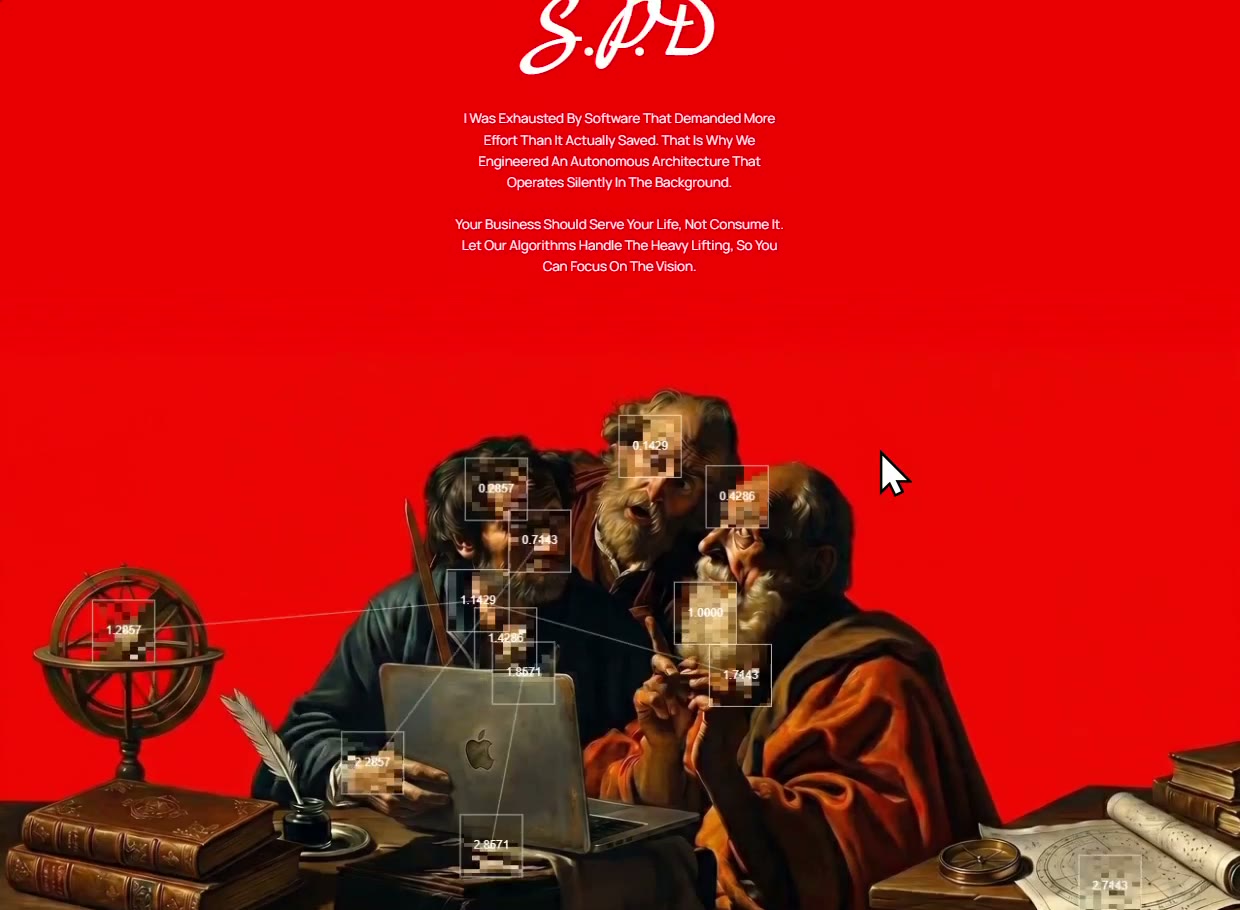 Tech-Noir About
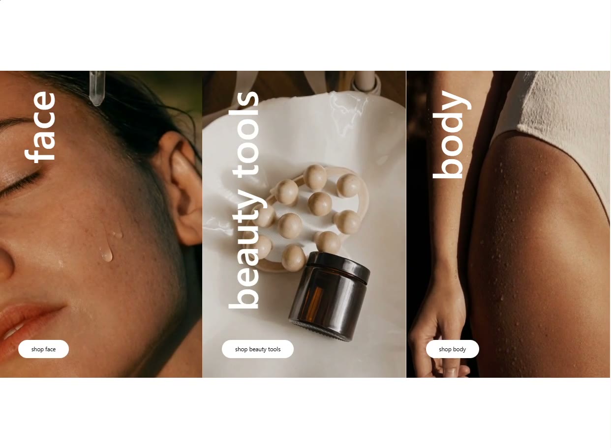 Beauty Categories
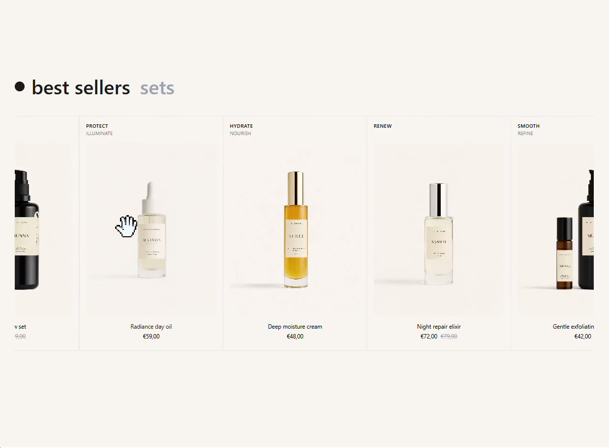 Beauty Products
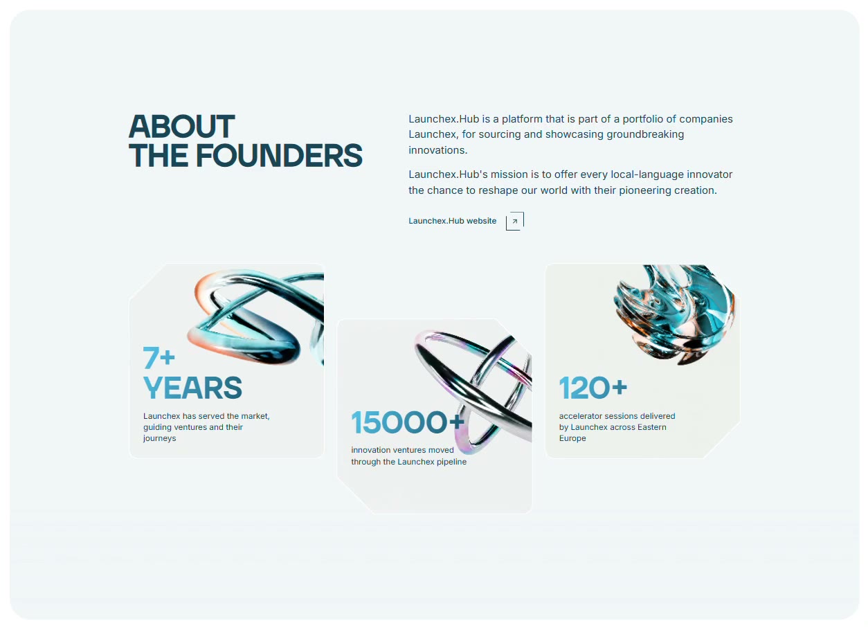 LaunchEx About
 LaunchEx Submissions
 Kova Features
 Rocket CTA
 Rocket FAQ
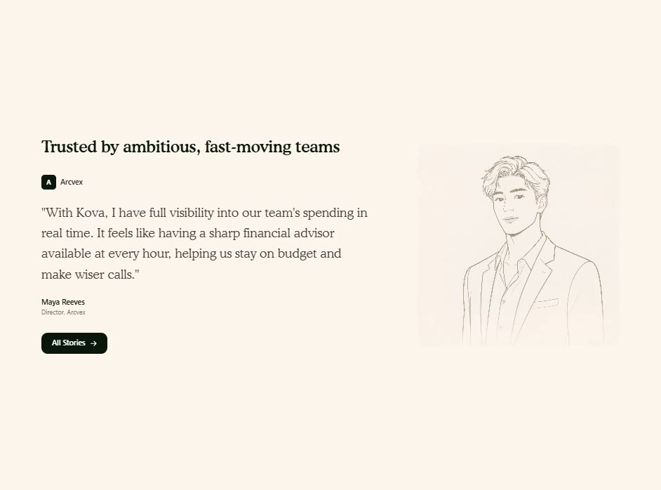 Kova Testimonial
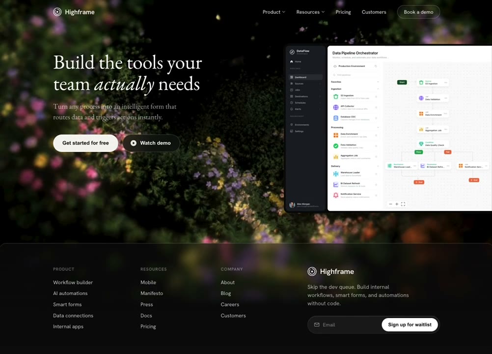 Global CTA Footer
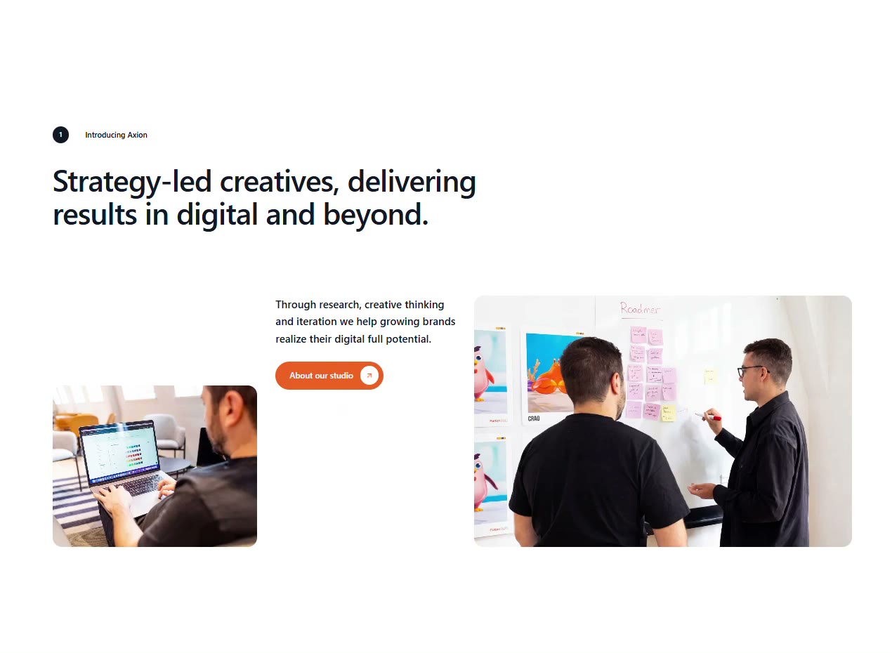 Axion About
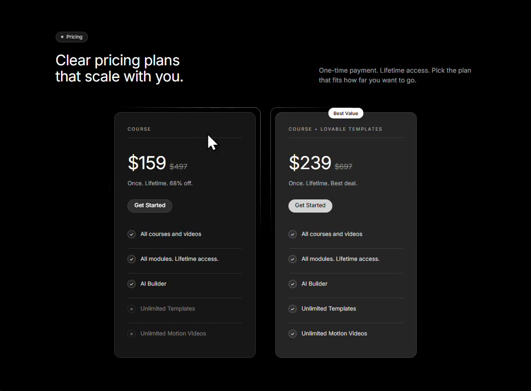 Rocket Pricing
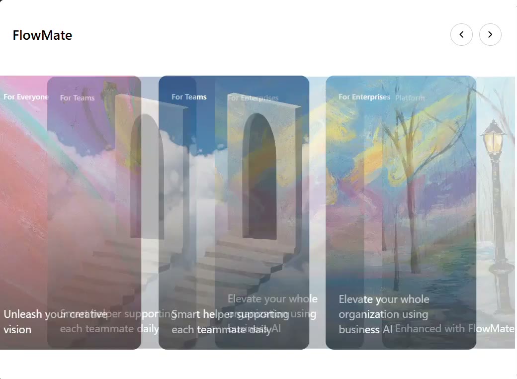 FlowMate Carousal
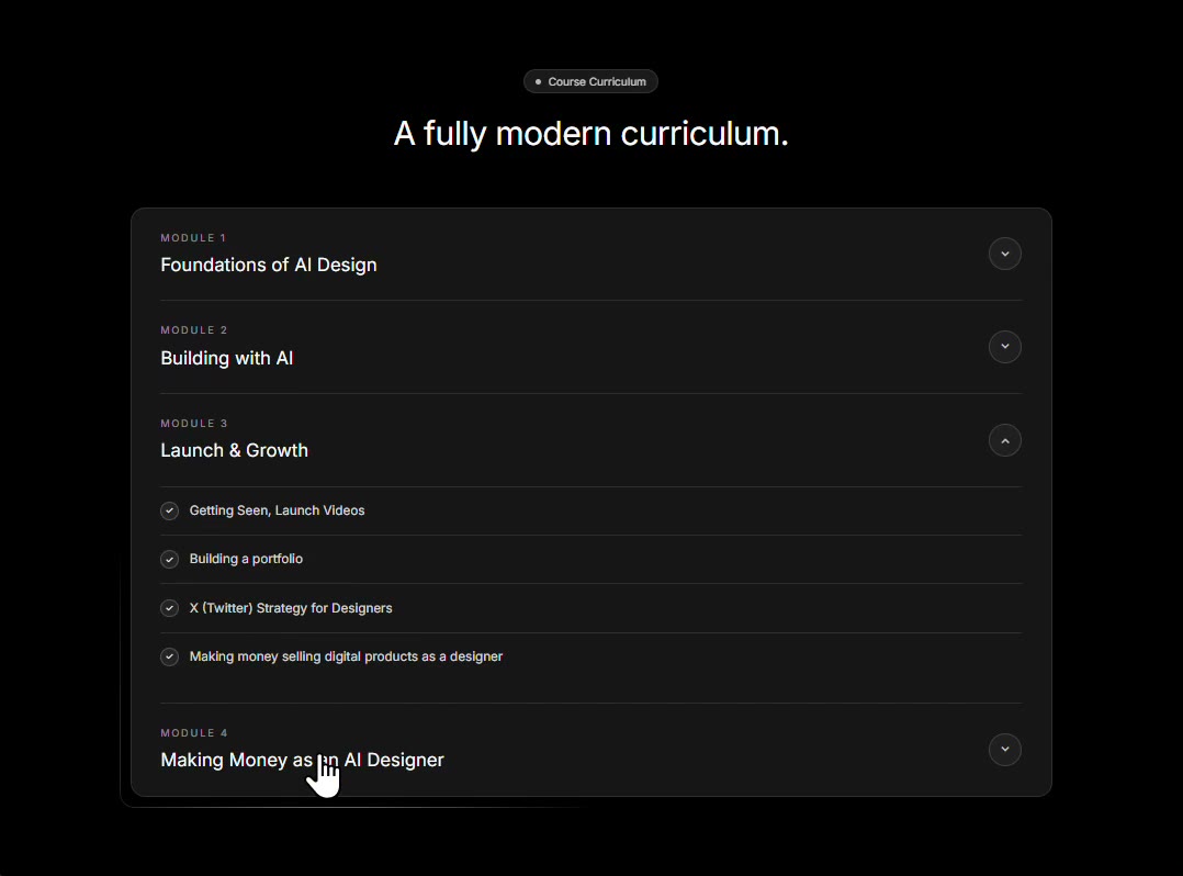 Apex Program Accordion
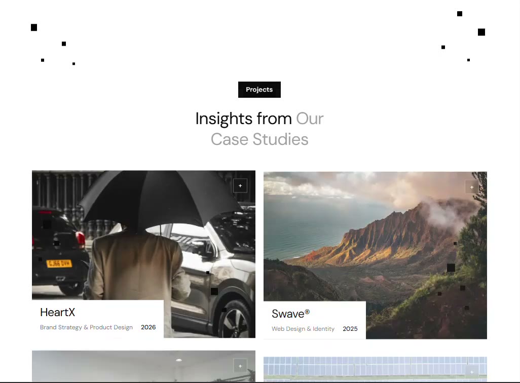 Pixel Grid Hover
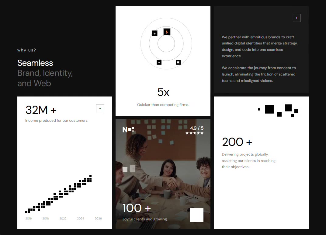 Bento Grid Stats
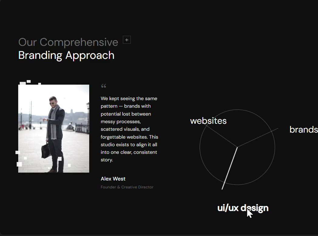 Radial Diagram
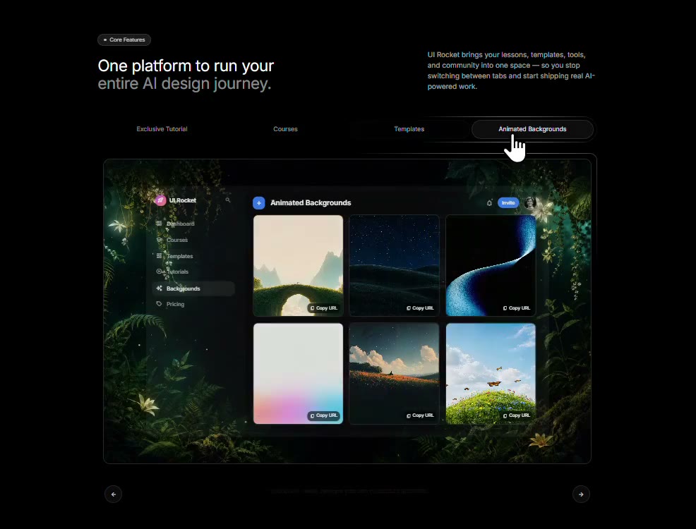 Glassmorphic Feature Tabs
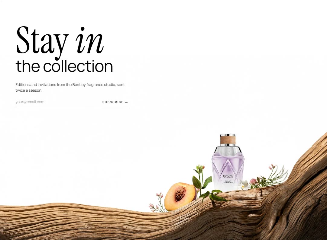 Editorial Collection CTA
 Botanical Shadow About
 Mouse Trail CTA
 Feedback Slider
 Stark Minimal Footer
 Media Card Carousel
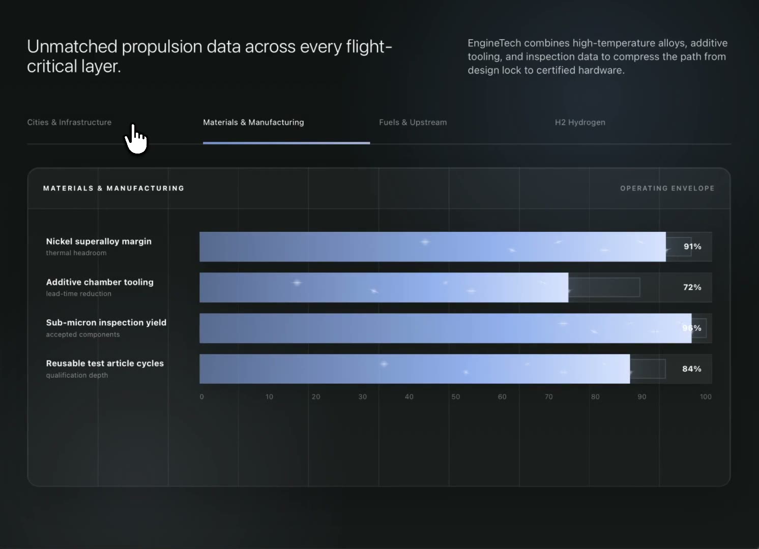 Technical Specifications
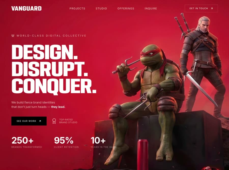 Bold Studio
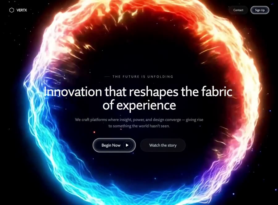 Cinematic Brand
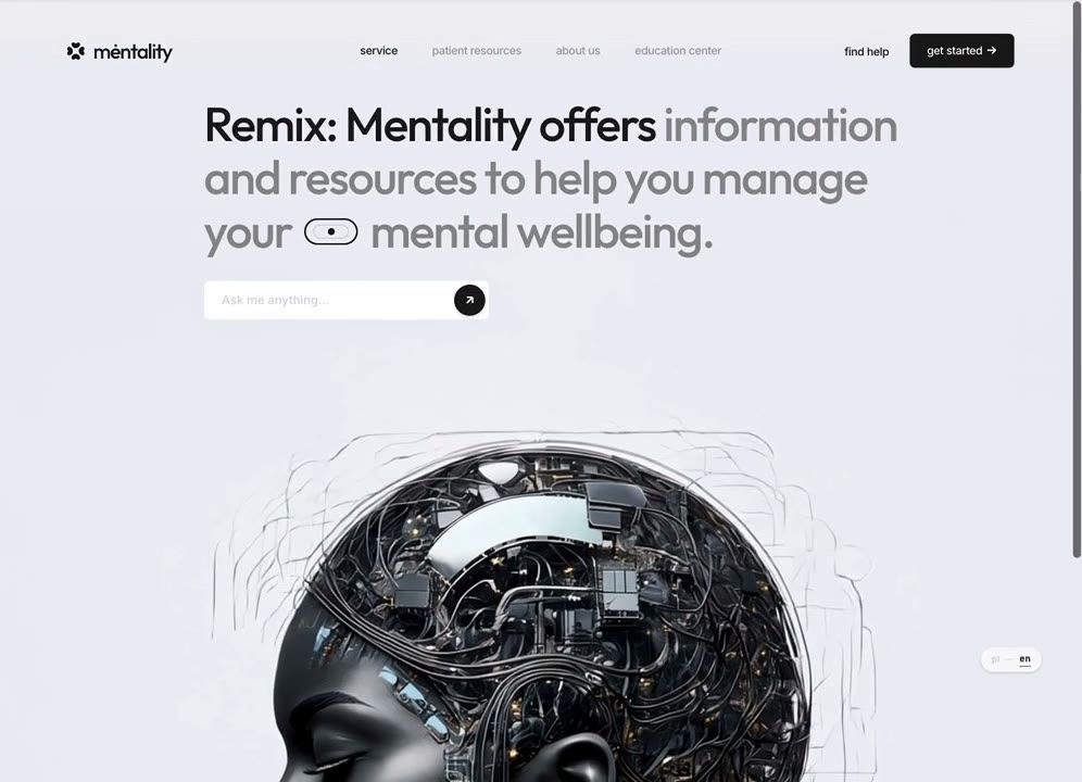 IntelligentX
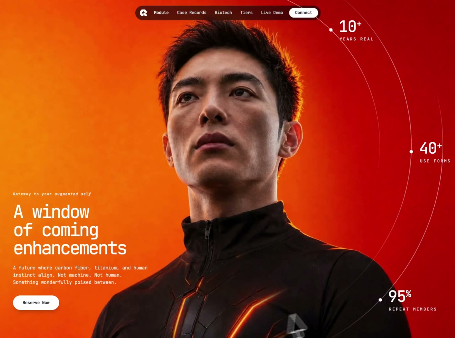 Cyberpunk Reveal
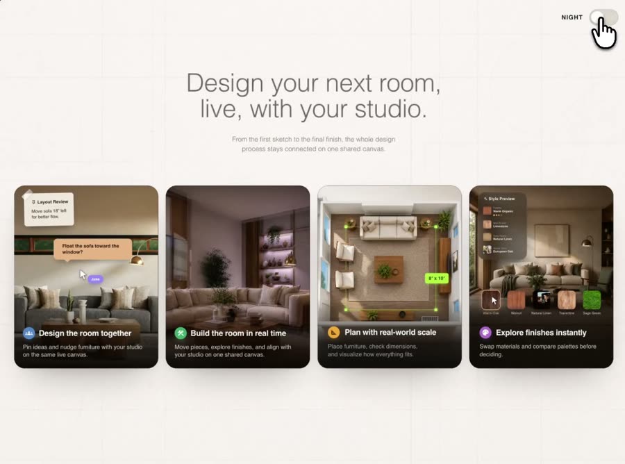 Interior Features
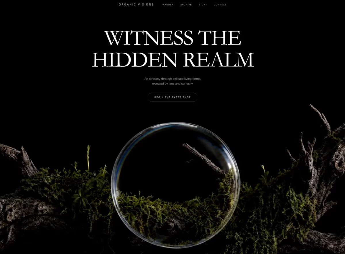 Organic Odyssey
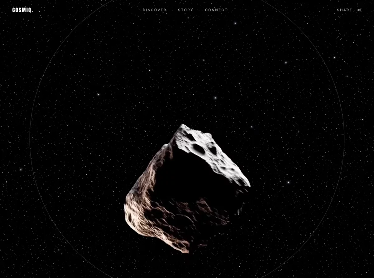 Cosmic
Browse & preview free Unlock everything — from $49/mo
Frequently asked questions
Do Meez prompts work with ChatGPT?
Yes. Every Meez prompt is a complete written spec — fonts, layout, color tokens, motion and asset URLs — so ChatGPT can build it in one paste. The 62 free prompts on this site work exactly like the premium ones; copy one above and try it.
What does ChatGPT generate from a prompt?
ChatGPT writes the code in-chat for whatever stack you name — a single HTML file, React components, or a full Next.js page — and you paste the result into your own project. Name the stack at the top of your message and the Meez spec below it; the output follows both.
How do I use a Meez prompt in ChatGPT?
Copy the full prompt text and paste it into the ChatGPT message box. Don't shorten it — the specificity is what keeps ChatGPT from producing a generic layout. Then iterate: swap the copy and point the asset URLs at your own media.
How many prompts are free?
62 prompts are free to copy in full, no account needed. The other 579 unlock with Unlimited — $49/mo, $149/yr, or $299 once for lifetime — along with all 285 motion backgrounds.
Also for: Lovable · Bolt · v0 · Cursor · Claude · Replit · Windsurf · Framer · Webflow · Figma Make · Gemini · GitHub Copilot · Wix
Not sure which tool? Lovable vs v0 vs Bolt vs Cursor, compared → · All free prompts on one page → · All prompt categories →