Prompts · for Webflow
AI website build-prompts for Webflow
Hand a Meez prompt to Webflow's AI site builder and it scaffolds the structure, styles and content from your spec — a real starting point in the Designer instead of a blank canvas or a stock template. The precise layout, fonts and motion notes carry through, so you spend your time refining rather than describing.
How to use a Meez prompt in Webflow
- Pick a prompt below (4 on this page are free) or browse the full library — every prompt is a complete art-direction spec: fonts, layout, color system, motion and real asset URLs.
- Copy the whole prompt and paste it into Webflow's AI site builder. Don’t trim it — the detail is what stops Webflow from defaulting to a generic layout.
- Let it build, then iterate: swap the copy, point the asset URLs at your own media, and ship. The sites you build are yours, commercially.
Free prompts to try in Webflow right now
Coffee RewardsMobile App · free prompt · copy-paste
Build a mobile coffee profile screen inside a phone mockup frame. Use vanilla HTML, CSS, and JS with Vite as the bundler. The design is dark/warm-toned, inspired by iOS profile screens with glassmorphic UI elements.

**Phone mockup:**
- 390x844px at zoom 0.78, black background, 44px border-radius, overflow hidden, strong drop shadow
- Internal `.screen` div with dark background (`#180a06`), vertical scroll, hidden scrollbar

**Hero section (top):**
- Full-width, 430px tall
- Contains a looping muted autoplay video: `https://meez.design/web/media/bg-videos/278_kv7e7ksvfd.mp4`
- Video covers the area with `object-fit: cover; object-position: center top`
- Bottom gradient overlay fading from transparent at 52% to the background color at 100%
- Top bar with two glass circle buttons (edit icon on left, X close SVG on right), positioned absolute top 18px

**Identity section (overlaps hero by -112px margin-top):**
- Centered name "Dasha" (28px, weight 500)
- Left and right laurel images flanking the name (local assets `/assets/images/laurel-left.png` and `laurel-right.png`), 73px tall, 0.6 opacity, positioned via `right: calc(50% + 66px)` / `left: calc(50% + 66px)`
- Subtitle "Plum Parfait Latte" below (15px, muted color `rgba(235, 220, 205, 0.55)`)

**Achievements pill (centered, 30px below identity):**
- Glass pill button, 54px tall, 225px wide, 27px border-radius
- Trophy icon (local `/assets/images/icon-trophy.png`, 18px) + text "12 achievements" (18px, weight 500)

**Stats grid (3 columns, 12px gap, 26px top padding, 16px horizontal padding):**
- Each card: semi-transparent background `rgba(255,255,255,0.06)`, 24px border-radius
- Card 1: coffee image `https://meez.design/web/bg-previews/239_bp8i93exbq.jpg` (84x84), number "154", label "drinks consumed"
- Card 2: sandwich image `https://meez.design/web/bg-previews/240_bwuyzzssak.jpg` (84x84), number "36", label "sandwiches eaten"
- Card 3: cafe image `https://meez.design/web/bg-previews/241_bwxlb9yeti.jpg` (84x84), number "12", label "cafes visited"
- Numbers: 25px, weight 500. Labels: 13px, color `#BAAA9A8C`

**Favorite card (12px below stats, 16px horizontal margin):**
- Same card background, 24px radius, 110px height, flex row with 16px gap
- Latte image `https://meez.design/web/bg-previews/242_byzm6mnvgu.jpg` (108x108, object-fit contain)
- Text column: "Favorite" (13px, weight 500), "Latte" (19px, weight 500), "Ordered 73 times" (13px, color `#BAAA9A8C`)
- Shuffle button on right (glass circle, local icon `/assets/images/icon-shuffle.png` 19px)

**Partial next card:** Same card style but only 34px tall with flat bottom corners (teaser for scroll)

**Glass button system:**
- Shared `.glass` class: no border, `rgba(255,255,255,0.03)` background, subtle inset box-shadows for edge highlights, `backdrop-filter: blur(2px) saturate(1.3)`, scale-down on `:active`
- `.glass.circle`: 58x44px, 22px radius
- `.glass.pill`: 54px tall, pill-shaped

**Fonts:**
- Primary: "Neue Haas Unica" (loaded from local `/assets/fonts/neue-haas-unica/stylesheet.css`)
- Also load "Helvetica Now Display" from `/assets/fonts/helvetica-now/stylesheet.css`
- Fallbacks: -apple-system, SF Pro Display, Inter, Segoe UI, Roboto

**Page background (behind phone):**
- Multiple warm-toned radial gradients over `#070402`:
  - `radial-gradient(ellipse 65% 55% at 15% 52%, rgba(168, 78, 10, 0.22))`
  - `radial-gradient(ellipse 52% 48% at 83% 26%, rgba(122, 52, 8, 0.17))`
  - `radial-gradient(ellipse 44% 52% at 56% 92%, rgba(98, 36, 5, 0.14))`
  - `radial-gradient(ellipse 30% 30% at 72% 75%, rgba(60, 20, 5, 0.10))`

**Entry animations (respects prefers-reduced-motion):**
- Hero: `heroReveal` - opacity 0 + scale(1.01) to normal, 1.9s, cubic-bezier(0.16, 1, 0.3, 1)
- Top bar buttons: `dropIn` from translateY(-10px), 0.7s, staggered 0.35s/0.42s
- Laurels: `fadeIn` 0.8s, delay 0.5s
- Name: `fadeRise` from translateY(16px), 0.7s, delay 0.5s
- Subtitle: same, delay 0.58s
- Achievements: same, delay 0.66s
- Stat cards: staggered at 0.74s, 0.80s, 0.86s
- Favorite card: delay 0.94s
- Next card: fadeIn delay 1.02s
- All use cubic-bezier(0.16, 1, 0.3, 1) except simple fadeIn which uses ease-out

**JavaScript (liquid glass effect):**
- Generates a displacement map canvas for each `[data-liquid]` element based on its dimensions and border-radius
- Uses SDF (signed distance field) of a rounded rectangle to compute refraction vectors
- Creates SVG `<feDisplacementMap>` filters and applies them as `backdrop-filter: url(#id) blur(0.3px) saturate(1.3)`
- Falls back to standard blur if SVG filter not supported

**CSS variables:**
```
--bg: #180a06
--card: rgba(255, 255, 255, 0.06)
--text: #ede4d8
--muted: rgba(235, 220, 205, 0.55)
--radius-card: 24px
```

**Responsive:** At 440px viewport, phone scales to zoom 0.6. Body flex-wraps at 900px.

---

## Source Code

<!DOCTYPE html>
<html lang="en">
<head>
  <meta charset="utf-8">
  <meta name="viewport" content="width=device-width, initial-scale=1">
  <title>Coffee Profile</title>
  <link rel="preconnect" href="https://fonts.googleapis.com">
  <link rel="preconnect" href="https://fonts.gstatic.com" crossorigin>
  <link href="https://fonts.googleapis.com/css2?family=Inter:wght@400;500;600;700&display=swap" rel="stylesheet">
  <style>
* { margin: 0; padding: 0; box-sizing: border-box; }

:root {
  --bg: #180a06;
  --card: rgba(255, 255, 255, 0.06);
  --text: #ede4d8;
  --muted: rgba(235, 220, 205, 0.55);
  --radius-card: 24px;
}

html, body { height: 100%; }

body {
  font-family: -apple-system, BlinkMacSystemFont, "SF Pro Display", "SF Pro Text", "Inter", "Segoe UI", Roboto, sans-serif;
  line-height: 1.2;
  background:
    radial-gradient(ellipse 65% 55% at 15% 52%, rgba(168, 78, 10, 0.22) 0%, transparent 65%),
    radial-gradient(ellipse 52% 48% at 83% 26%, rgba(122, 52, 8, 0.17) 0%, transparent 60%),
    radial-gradient(ellipse 44% 52% at 56% 92%, rgba(98, 36, 5, 0.14) 0%, transparent 58%),
    radial-gradient(ellipse 30% 30% at 72% 75%, rgba(60, 20, 5, 0.10) 0%, transparent 50%),
    #070402;
  display: flex;
  flex-wrap: nowrap;
  justify-content: center;
  align-items: center;
  padding: 36px 24px;
  color: var(--text);
}

.phone-mockup {
  position: relative;
  flex-shrink: 0;
  zoom: .78;
  width: 390px;
  height: 844px;
  background: #000;
  border-radius: 44px;
  overflow: hidden;
  box-shadow: 0 30px 80px rgba(0, 0, 0, .6);
}

.screen {
  position: relative;
  width: 100%;
  height: 100%;
  background: var(--bg);
  overflow-y: auto;
  overflow-x: hidden;
  scrollbar-width: none;
}
.screen::-webkit-scrollbar { display: none; }

@media (max-width: 900px) {
  body { flex-wrap: wrap; }
}
@media (max-width: 440px) {
  .phone-mockup { zoom: .6; }
}

.hero {
  position: relative;
  width: 100%;
  height: 430px;
}
.hero img,
.hero video {
  width: 100%;
  height: 100%;
  object-fit: cover;
  object-position: center top;
  display: block;
  user-select: none;
  -webkit-user-drag: none;
}
.hero::after {
  content: "";
  position: absolute;
  inset: 0;
  background: linear-gradient(to bottom,
    rgba(24, 10, 6, 0) 52%,
    rgba(24, 10, 6, 0.55) 78%,
    var(--bg) 100%);
  pointer-events: none;
}

.glass {
  border: none;
  cursor: pointer;
  font-family: inherit;
  color: var(--text);
  background: rgba(255, 255, 255, 0.03);
  backdrop-filter: blur(2px) saturate(1.3);
  -webkit-backdrop-filter: blur(2px) saturate(1.3);
  box-shadow:
    0 8px 22px rgba(0, 0, 0, 0.22),
    inset 0 0 0 0.6px rgba(255, 255, 255, 0.02),
    inset 1.5px 2px 0 -1px rgba(255, 255, 255, 0.3),
    inset -1.5px -2px 0 -1px rgba(255, 255, 255, 0.3),
    inset 0 0 12px 3px rgba(255, 255, 255, 0.0);
  transition: transform 0.16s cubic-bezier(0.34, 1.56, 0.64, 1);
}
.glass:active { transform: scale(0.92); }
.glass:focus-visible { outline: 2px solid rgba(255,255,255,0.7); outline-offset: 2px; }

.glass.circle {
  width: 58px;
  height: 44px;
  border-radius: 22px;
  display: flex;
  align-items: center;
  justify-content: center;
}
.glass.circle svg { width: 22px; height: 22px; }
.glass.circle img {
  width: 19px;
  height: 19px;
  object-fit: contain;
  display: block;
  user-select: none;
  -webkit-user-drag: none;
}

.top-bar {
  position: absolute;
  top: 18px;
  left: 18px;
  right: 18px;
  display: flex;
  justify-content: space-between;
  z-index: 3;
}
.top-bar .glass.circle {
  backdrop-filter: none;
  -webkit-backdrop-filter: none;
  background: rgba(255, 255, 255, 0.05);
}

.identity {
  position: relative;
  margin-top: -112px;
  z-index: 2;
  text-align: center;
  padding: 0 24px;
}
.name-row {
  display: flex;
  align-items: center;
  justify-content: center;
}
.laurel {
  position: absolute;
  top: 50%;
  transform: translateY(-50%);
  height: 73px;
  width: auto;
  opacity: 0.6;
  user-select: none;
  -webkit-user-drag: none;
  pointer-events: none;
  -webkit-mask-image: linear-gradient(to bottom, rgba(0,0,0,0.6) 0%, rgba(0,0,0,0.95) 45%, rgba(0,0,0,0.95) 100%);
  mask-image: linear-gradient(to bottom, rgba(0,0,0,0.6) 0%, rgba(0,0,0,0.95) 45%, rgba(0,0,0,0.95) 100%);
}
.laurel.left  { right: calc(50% + 66px); }
.laurel.right { left:  calc(50% + 66px); }
.name {
  font-size: 28px;
  font-weight: 500;
  letter-spacing: 0.01em;
}
.subtitle {
  margin-top: 6px;
  font-size: 15px;
  color: var(--muted);
  font-weight: 400;
}

.achievements-wrap {
  display: flex;
  justify-content: center;
  margin-top: 30px;
  padding: 0 24px;
}
.glass.pill {
  height: 54px;
  padding: 0 26px;
  border-radius: 27px;
  display: flex;
  align-items: center;
  gap: 10px;
  font-size: 18px;
  font-weight: 500;
  letter-spacing: 0.01em;
  width: 225px;
  backdrop-filter: none;
  -webkit-backdrop-filter: none;
  background: rgba(255, 255, 255, 0.05);
}
.glass.pill svg {
  width: 18px;
  height: 18px;
  flex-shrink: 0;
}

.stats {
  display: grid;
  grid-template-columns: repeat(3, 1fr);
  gap: 12px;
  padding: 26px 16px 0;
}
.stat-card {
  background: var(--card);
  border-radius: var(--radius-card);
  padding: 14px 8px 20px;
  display: flex;
  flex-direction: column;
  align-items: center;
  text-align: center;
}
.stat-card img {
  width: 84px;
  height: 84px;
  object-fit: contain;
  margin-bottom: 8px;
  user-select: none;
  -webkit-user-drag: none;
}
.stat-num {
  font-size: 25px;
  font-weight: 500;
  line-height: 1;
}
.stat-label {
  margin-top: 7px;
  font-size: 13px;
  line-height: 1.1;
  font-weight: 400;
  color: #BAAA9A8C;
}

.favorite {
  margin: 12px 16px 0;
  background: var(--card);
  border-radius: var(--radius-card);
  padding: 16px;
  display: flex;
  align-items: center;
  gap: 16px;
  height: 110px;
}
.favorite > img {
  width: 108px;
  height: 108px;
  object-fit: contain;
  flex-shrink: 0;
  margin-left: -4px;
  margin-right: 2px;
  user-select: none;
  -webkit-user-drag: none;
}
.fav-text { flex: 1; min-width: 0; }
.fav-eyebrow {
  font-size: 13px;
  font-weight: 500;
  color: var(--text);
  opacity: 0.9;
  padding-top: 2px;
  padding-bottom: 2px;
}
.fav-title {
  font-size: 19px;
  font-weight: 500;
  padding-top: 3px;
  padding-bottom: 3px;
}
.fav-sub {
  font-size: 13px;
  font-weight: 400;
  color: #BAAA9A8C;
  margin-top: 3px;
  line-height: 1.1;
}
.favorite .glass.circle {
  flex-shrink: 0;
  backdrop-filter: none;
  -webkit-backdrop-filter: none;
  background: rgba(255, 255, 255, 0.05);
}

.next-card {
  margin: 12px 16px 0;
  background: var(--card);
  border-radius: var(--radius-card) var(--radius-card) 0 0;
  height: 34px;
}

@media (prefers-reduced-motion: reduce) {
  .glass { transition: none; }
}

@media (prefers-reduced-motion: no-preference) {
  @keyframes heroReveal {
    from { opacity: 0; transform: scale(1.01); }
    to   { opacity: 1; transform: scale(1); }
  }
  @keyframes fadeRise {
    from { opacity: 0; transform: translateY(16px); }
    to   { opacity: 1; transform: translateY(0); }
  }
  @keyframes fadeIn {
    from { opacity: 0; }
    to   { opacity: 1; }
  }
  @keyframes dropIn {
    from { opacity: 0; transform: translateY(-10px); }
    to   { opacity: 1; transform: translateY(0); }
  }

  .top-bar .glass.circle:nth-child(1) {
    animation: dropIn 0.7s cubic-bezier(0.16, 1, 0.3, 1) 0.35s both;
  }
  .top-bar .glass.circle:nth-child(2) {
    animation: dropIn 0.7s cubic-bezier(0.16, 1, 0.3, 1) 0.42s both;
  }
  .hero img,
  .hero video {
    animation: heroReveal 1.9s cubic-bezier(0.16, 1, 0.3, 1) both;
  }
  .laurel.left, .laurel.right {
    animation: fadeIn 0.8s ease-out 0.5s both;
  }
  .name {
    animation: fadeRise 0.7s cubic-bezier(0.16, 1, 0.3, 1) 0.5s both;
  }
  .subtitle {
    animation: fadeRise 0.7s cubic-bezier(0.16, 1, 0.3, 1) 0.58s both;
  }
  .achievements-wrap {
    animation: fadeRise 0.7s cubic-bezier(0.16, 1, 0.3, 1) 0.66s both;
  }
  .stat-card:nth-child(1) {
    animation: fadeRise 0.7s cubic-bezier(0.16, 1, 0.3, 1) 0.74s both;
  }
  .stat-card:nth-child(2) {
    animation: fadeRise 0.7s cubic-bezier(0.16, 1, 0.3, 1) 0.80s both;
  }
  .stat-card:nth-child(3) {
    animation: fadeRise 0.7s cubic-bezier(0.16, 1, 0.3, 1) 0.86s both;
  }
  .favorite {
    animation: fadeRise 0.7s cubic-bezier(0.16, 1, 0.3, 1) 0.94s both;
  }
  .next-card {
    animation: fadeIn 0.6s ease-out 1.02s both;
  }
}
  </style>
</head>
<body>

<div class="phone-mockup">
  <div class="screen">

    <div class="hero">
      <video src="https://meez.design/web/media/bg-videos/281_mag4s8xjit.mp4" autoplay muted loop playsinline></video>
      <div class="top-bar">
        <button class="glass circle" type="button" aria-label="Edit profile">
          <svg viewBox="0 0 24 24" fill="none" stroke="currentColor" stroke-width="1.8" stroke-linecap="round" stroke-linejoin="round">
            <path d="M11 4H4a2 2 0 0 0-2 2v14a2 2 0 0 0 2 2h14a2 2 0 0 0 2-2v-7"/>
            <path d="M18.5 2.5a2.121 2.121 0 0 1 3 3L12 15l-4 1 1-4 9.5-9.5z"/>
          </svg>
        </button>
        <button class="glass circle" type="button" aria-label="Close">
          <svg viewBox="0 0 24 24" fill="none" stroke="currentColor" stroke-width="1.8" stroke-linecap="round" style="width: 26px; height: 26px">
            <path d="M18 6 6 18M6 6l12 12"></path>
          </svg>
        </button>
      </div>
    </div>

    <div class="identity">
      <svg class="laurel left" viewBox="0 0 40 80" fill="none" xmlns="http://www.w3.org/2000/svg">
        <path d="M38 75C34 65 30 55 28 45C26 35 26 25 30 15C32 10 35 6 38 3" stroke="#ede4d8" stroke-width="1" stroke-linecap="round" opacity="0.7"/>
        <path d="M36 70C30 62 26 52 25 42" stroke="#ede4d8" stroke-width="0.8" stroke-linecap="round" opacity="0.5"/>
        <ellipse cx="30" cy="18" rx="5" ry="8" fill="none" stroke="#ede4d8" stroke-width="0.8" opacity="0.6" transform="rotate(-15 30 18)"/>
        <ellipse cx="26" cy="30" rx="5" ry="8" fill="none" stroke="#ede4d8" stroke-width="0.8" opacity="0.6" transform="rotate(-10 26 30)"/>
        <ellipse cx="25" cy="43" rx="5" ry="8" fill="none" stroke="#ede4d8" stroke-width="0.8" opacity="0.6" transform="rotate(-5 25 43)"/>
        <ellipse cx="27" cy="56" rx="5" ry="8" fill="none" stroke="#ede4d8" stroke-width="0.8" opacity="0.6" transform="rotate(5 27 56)"/>
        <ellipse cx="32" cy="67" rx="4" ry="7" fill="none" stroke="#ede4d8" stroke-width="0.8" opacity="0.6" transform="rotate(10 32 67)"/>
      </svg>
      <svg class="laurel right" viewBox="0 0 40 80" fill="none" xmlns="http://www.w3.org/2000/svg">
        <path d="M2 75C6 65 10 55 12 45C14 35 14 25 10 15C8 10 5 6 2 3" stroke="#ede4d8" stroke-width="1" stroke-linecap="round" opacity="0.7"/>
        <path d="M4 70C10 62 14 52 15 42" stroke="#ede4d8" stroke-width="0.8" stroke-linecap="round" opacity="0.5"/>
        <ellipse cx="10" cy="18" rx="5" ry="8" fill="none" stroke="#ede4d8" stroke-width="0.8" opacity="0.6" transform="rotate(15 10 18)"/>
        <ellipse cx="14" cy="30" rx="5" ry="8" fill="none" stroke="#ede4d8" stroke-width="0.8" opacity="0.6" transform="rotate(10 14 30)"/>
        <ellipse cx="15" cy="43" rx="5" ry="8" fill="none" stroke="#ede4d8" stroke-width="0.8" opacity="0.6" transform="rotate(5 15 43)"/>
        <ellipse cx="13" cy="56" rx="5" ry="8" fill="none" stroke="#ede4d8" stroke-width="0.8" opacity="0.6" transform="rotate(-5 13 56)"/>
        <ellipse cx="8" cy="67" rx="4" ry="7" fill="none" stroke="#ede4d8" stroke-width="0.8" opacity="0.6" transform="rotate(-10 8 67)"/>
      </svg>
      <div class="name-row">
        <h1 class="name">Dasha</h1>
      </div>
      <p class="subtitle">Plum Parfait Latte</p>
    </div>

    <div class="achievements-wrap">
      <button class="glass pill" type="button">
        <svg viewBox="0 0 24 24" fill="none" stroke="currentColor" stroke-width="1.8" stroke-linecap="round" stroke-linejoin="round">
          <path d="M6 9H4.5a2.5 2.5 0 0 1 0-5H6"/>
          <path d="M18 9h1.5a2.5 2.5 0 0 0 0-5H18"/>
          <path d="M4 22h16"/>
          <path d="M10 14.66V17c0 .55-.47.98-.97 1.21C7.85 18.75 7 20.24 7 22"/>
          <path d="M14 14.66V17c0 .55.47.98.97 1.21C16.15 18.75 17 20.24 17 22"/>
          <path d="M18 2H6v7a6 6 0 0 0 12 0V2Z"/>
        </svg>
        12 achievements
      </button>
    </div>

    <div class="stats">
      <div class="stat-card">
        <img src="https://meez.design/web/bg-previews/243_c6rpndcf3k.jpg" alt="">
        <div class="stat-num">154</div>
        <div class="stat-label">drinks<br>consumed</div>
      </div>
      <div class="stat-card">
        <img src="https://meez.design/web/bg-previews/244_ca7j1h1ztr.jpg" alt="">
        <div class="stat-num">36</div>
        <div class="stat-label">sandwiches<br>eaten</div>
      </div>
      <div class="stat-card">
        <img src="https://meez.design/web/bg-previews/245_cyhp8jgs3b.jpg" alt="">
        <div class="stat-num">12</div>
        <div class="stat-label">cafes<br>visited</div>
      </div>
    </div>

    <div class="favorite">
      <img src="https://meez.design/web/bg-previews/246_d1scdtfz8a.jpg" alt="">
      <div class="fav-text">
        <div class="fav-eyebrow">Favorite</div>
        <div class="fav-title">Latte</div>
        <div class="fav-sub">Ordered 73 times</div>
      </div>
      <button class="glass circle" type="button" aria-label="Change favorite">
        <svg viewBox="0 0 24 24" fill="none" stroke="currentColor" stroke-width="1.8" stroke-linecap="round" stroke-linejoin="round">
          <polyline points="16 3 21 3 21 8"/>
          <line x1="4" y1="20" x2="21" y2="3"/>
          <polyline points="21 16 21 21 16 21"/>
          <line x1="15" y1="15" x2="21" y2="21"/>
          <line x1="4" y1="4" x2="9" y2="9"/>
        </svg>
      </button>
    </div>

    <div class="next-card"></div>

  </div>
</div>

<svg width="0" height="0" style="position:absolute" aria-hidden="true">
  <defs id="liquid-defs"></defs>
</svg>

<script>
const SVG_NS = 'http://www.w3.org/2000/svg';
const XLINK_NS = 'http://www.w3.org/1999/xlink';
const defs = document.getElementById('liquid-defs');
const mapCache = {};
let uid = 0;

function smoothstep(a, b, t) {
  t = Math.min(1, Math.max(0, (t - a) / (b - a)));
  return t * t * (3 - 2 * t);
}

function sdRoundedRect(px, py, hw, hh, r) {
  const qx = Math.abs(px) - hw + r;
  const qy = Math.abs(py) - hh + r;
  return Math.min(Math.max(qx, qy), 0) +
         Math.hypot(Math.max(qx, 0), Math.max(qy, 0)) - r;
}

function buildMap(w, h, radius) {
  const key = w + 'x' + h + 'r' + radius;
  if (mapCache[key]) return mapCache[key];

  const scale = 2;
  const canvas = document.createElement('canvas');
  canvas.width = w * scale;
  canvas.height = h * scale;
  const ctx = canvas.getContext('2d');
  const img = ctx.createImageData(canvas.width, canvas.height);
  const data = img.data;

  const hw = canvas.width / 2, hh = canvas.height / 2, r = radius * scale;
  const edgeBand = Math.min(16, Math.min(w, h) * 0.32) * scale;

  let i = 0;
  for (let y = 0; y < canvas.height; y++) {
    for (let x = 0; x < canvas.width; x++) {
      const px = x - hw, py = y - hh;
      const d = sdRoundedRect(px, py, hw, hh, r);
      const t = smoothstep(-edgeBand, 0, d);
      const strength = t * t;
      const len = Math.hypot(px, py) || 1;
      data[i++] = 128 + (px / len) * strength * 127;
      data[i++] = 128 + (py / len) * strength * 127;
      data[i++] = 128;
      data[i++] = 255;
    }
  }
  ctx.putImageData(img, 0, 0);
  mapCache[key] = canvas.toDataURL();
  return mapCache[key];
}

function attachGlass(el) {
  const rect = el.getBoundingClientRect();
  const w = Math.round(rect.width), h = Math.round(rect.height);
  if (!w || !h) return;
  const cs = getComputedStyle(el);
  let radius = parseFloat(cs.borderTopLeftRadius) || 0;
  radius = Math.min(radius, Math.min(w, h) / 2);

  const id = 'lg-' + (uid++);
  const filter = document.createElementNS(SVG_NS, 'filter');
  filter.setAttribute('id', id);
  filter.setAttribute('x', '-20%');
  filter.setAttribute('y', '-20%');
  filter.setAttribute('width', '140%');
  filter.setAttribute('height', '140%');
  filter.setAttribute('color-interpolation-filters', 'sRGB');

  const feImage = document.createElementNS(SVG_NS, 'feImage');
  const url = buildMap(w, h, radius);
  feImage.setAttribute('href', url);
  feImage.setAttributeNS(XLINK_NS, 'href', url);
  feImage.setAttribute('x', '0');
  feImage.setAttribute('y', '0');
  feImage.setAttribute('width', w);
  feImage.setAttribute('height', h);
  feImage.setAttribute('preserveAspectRatio', 'none');
  feImage.setAttribute('result', 'map');

  const feDisp = document.createElementNS(SVG_NS, 'feDisplacementMap');
  feDisp.setAttribute('in', 'SourceGraphic');
  feDisp.setAttribute('in2', 'map');
  feDisp.setAttribute('scale', '26');
  feDisp.setAttribute('xChannelSelector', 'R');
  feDisp.setAttribute('yChannelSelector', 'G');

  filter.appendChild(feImage);
  filter.appendChild(feDisp);
  defs.appendChild(filter);

  const value = `url(#${id}) blur(0.3px) saturate(1.3)`;
  el.style.backdropFilter = value;
  el.style.webkitBackdropFilter = value;

  const applied = getComputedStyle(el).backdropFilter ||
                  getComputedStyle(el).webkitBackdropFilter || '';
  if (!applied.includes('url')) {
    el.style.backdropFilter = 'blur(6px) saturate(1.4) brightness(1.08)';
    el.style.webkitBackdropFilter = 'blur(6px) saturate(1.4) brightness(1.08)';
    el.style.background = 'rgba(255,255,255,0.10)';
  }
}

requestAnimationFrame(() => {
  document.querySelectorAll('[data-liquid]').forEach(attachGlass);
});
</script>
</body>
</html>
Agent WaveAI · free prompt · copy-paste
Recreate this exact single-viewport landing page for **Vesper.ai**. Document title: `Vesper.ai — Operational AI Infrastructure`. `lang="en"`. One HTML file with inline CSS and a small IIFE for the menu + animation fallback. Pure black `#000000`. No extra sections, cards, forms, pricing tables, or footer beyond the three stats. Do **not** add a video, WebGL, Three.js, or Lottie. Do **not** invent a CloudFront URL.

Force black immediately so the page can never flash white:

- First CSS rule: `html, body { background: #000000 !important; color: #ffffff; }`
- Body attribute: `style="background:#000;color:#fff"`
- Then again: `html, body { background: #000000; background: var(--bg, #000000); color: #ffffff; color: var(--text, #ffffff); }`

---

### Fonts (exact)

Self-hosted WOFF2s sitting next to `index.html`:

```css
@font-face {
  font-family: "Inter";
  font-style: normal;
  font-weight: 100 900;
  font-display: swap;
  src: url("inter.woff2") format("woff2");
}
@font-face {
  font-family: "Instrument Serif";
  font-style: italic;
  font-weight: 400;
  font-display: swap;
  src: url("instrument-serif-italic.woff2") format("woff2");
}
```

Stacks:

- UI / logo / nav / buttons / badge / lede / stats: `"Inter", system-ui, -apple-system, BlinkMacSystemFont, "Segoe UI", sans-serif`
- **Only** the H1 words `AI agents`: `"Instrument Serif", "Times New Roman", Times, serif`

If those files are missing, load this exact Google Fonts CSS (Inter variable roman + Instrument Serif italic only):

```
https://fonts.googleapis.com/css2?family=Inter:ital,opsz,wght@0,14..32,100..900&family=Instrument+Serif:ital@1&display=swap
```

Body: `-webkit-font-smoothing: antialiased; -moz-osx-font-smoothing: grayscale; text-rendering: optimizeLegibility; overflow-x: hidden; position: relative`. `html { scroll-behavior: smooth }`. Universal reset: `box-sizing: border-box; margin: 0; padding: 0`. Links `color: inherit; text-decoration: none`. Buttons `font-family: inherit`.

---

### Image / asset URLs (exact — there are only these)

**1. Herovide obackgorumf 100% opacity no overlay**
Relative file, same folder as the HTML:

```
https://meez.design/web/media/ext/fcb85f8b52447bb5.mp4
```

**3. Favicon (exact data URI)** — same mark as the logo, white:

```
data:image/svg+xml,%3Csvg xmlns='http://www.w3.org/2000/svg' viewBox='0 0 24 24' fill='white'%3E%3Cg transform='rotate(-30 12 12)'%3E%3Ccircle cx='7.3' cy='3.2' r='1.45'/%3E%3Crect x='5.5' y='4.7' width='3.6' height='14.6' rx='1.8'/%3E%3Crect x='14.9' y='4.7' width='3.6' height='14.6' rx='1.8'/%3E%3Ccircle cx='16.7' cy='20.8' r='1.45'/%3E%3C/g%3E%3C/svg%3E
```

No other images. All other icons are inline SVG.

---

### Tokens (default / ~1440px)

```
--bg: #000000
--text: #ffffff
--muted: #9a9a9a
--stat: #d8d8d8
--border: rgba(255, 255, 255, 0.16)
--border-soft: rgba(255, 255, 255, 0.12)

--logo: 15.5px
--logo-mark: 22px
--nav: 14px
--nav-h: 40px
--btn: 13.5px
--btn-h: 40px
--hero-btn-h: 42px
--h1: 48px
--lede: 15.5px
--badge: 12.5px
--stat-size: 13.5px
--header-y: 22px
--header-x: 40px
--stats-x: 72px
--stats-y: 36px
--hero-gap: 85px
--copy-max: 860px
--lede-max: 470px
```

---

### Layer stack (back → front)

1. `html/body` black
2. `.hero-photo` + `::after` scrim
3. `.page` — `position: relative; z-index: 1; display: grid; grid-template-rows: auto 1fr auto; min-height: 100vh / 100dvh`
4. `.grain` at `z-index: 100`

Markup order inside body:

```
.grain
.hero-photo
.page
  .menu-backdrop
  header.header
  main.hero#top
  footer.stats
script
```

---

### Header — 3-column grid

`display: grid; grid-template-columns: 1fr auto 1fr; align-items: center;`
Padding: `var(--header-y) var(--header-x) 10px`. `z-index: 50; position: relative`.

**Left — logo** `a.logo.appear.appear--scale` → `#top`, `aria-label="Vesper.ai"`.
`display: inline-flex; align-items: center; gap: 9px; justify-self: start; font-size: var(--logo); font-weight: 600; letter-spacing: -0.03em; color: #fff`.

Mark SVG 22×22, `viewBox="0 0 24 24"`, `fill="currentColor"`, group `transform="rotate(-30 12 12)"`:

- `circle cx="7.3" cy="3.2" r="1.45"`
- `rect x="5.5" y="4.7" width="3.6" height="14.6" rx="1.8"`
- `rect x="14.9" y="4.7" width="3.6" height="14.6" rx="1.8"`
- `circle cx="16.7" cy="20.8" r="1.45"`

Wordmark: `Vesper` + `<span class="logo-suffix">.ai</span>` at `font-weight: 400`.

**Center — nav** `#site-nav`, `aria-label="Primary"`, `display: flex; align-items: center; gap: 8px; justify-self: center`.

| Label | href | appear class |
|---|---|---|
| Benefits | `#benefits` | `appear--scale` |
| How It Works | `#how-it-works` | `appear--soft` |
| FAQs | `#faqs` | `appear--scale` |
| Pricing | `#pricing` | `appear--soft` |

Each link is a **liquid-metal pill**: `height: var(--nav-h); padding: 0 18px; border-radius: 7px; overflow: hidden; position: relative;`
`border: 1px solid rgba(198,198,198,0.55)`
`background: linear-gradient(105deg, #050505 0%, #2a2a2a 48%, #4a4a4a 100%)`
color `#f3f3f3`, `font-size: var(--nav)`, weight 400, `letter-spacing: -0.01em`, `white-space: nowrap`.
Transition: `background / border-color / box-shadow 0.35s ease`.

Shine `::before`: `linear-gradient(115deg, transparent 30%, rgba(255,255,255,0.16) 50%, transparent 70%)`, idle `translateX(-120%)`, hover `translateX(120%)` over `0.6s ease`.

Hover: border `rgba(235,235,235,0.9)`, gradient `#111 → #3a3a3a 45% → #6a6a6a`, glow `0 0 18px rgba(200,210,230,0.18)`.

**Right — header CTA:** `a.btn.btn-solid.header-cta.appear.appear--scale` “Start for Free” → `#start`, `justify-self: end`.

**Burger** (hidden ≥901px, `display: none` → `display: grid` on phone): 42×42, `border-radius: 6px`, `border: 1px solid var(--border)`, `background: rgba(8,8,8,0.55)`, `z-index: 60`, `aria-controls="site-nav"`, `aria-expanded="false"`, label “Open menu”. Three white bars 16×1.5px, gap 5px, `border-radius: 1px`. Hover: border `rgba(255,255,255,0.32)`, bg `rgba(255,255,255,0.05)`. Open (`body.menu-open`): bar 1 `translateY(6.5px) rotate(45deg)`, bar 2 `opacity: 0`, bar 3 `translateY(-6.5px) rotate(-45deg)`, 0.25s / 0.2s.

---

### Buttons (shared liquid-glass language)

`.btn`: `position: relative; isolation: isolate; overflow: hidden; display: inline-flex; align-items: center; justify-content: center; height: var(--btn-h); padding: 0 16px; border-radius: 6px; font-size: var(--btn); font-weight: 500; letter-spacing: -0.02em; line-height: 1; white-space: nowrap; cursor: pointer`. Transitions 0.35s on background, border, shadow, color, filter.

Shine `::after`: `linear-gradient(115deg, transparent 20%, rgba(255,255,255,0.45) 48%, transparent 76%)`, idle `translateX(-130%)`, hover `translateX(130%)` in `0.65s ease`.

**Solid:**
`background: linear-gradient(180deg, #ffffff 0%, #e7e7e7 48%, #cfcfcf 100%)`
`color: #111; border: 1px solid #fff`
`box-shadow: inset 0 1px 0 rgba(255,255,255,0.95)`
Hover: `#fff → #f3f6ff 42% → #d5def2`, border `#f2f6ff`,
`inset 0 1px 0 #fff, 0 0 22px rgba(186,208,255,0.35), 0 8px 18px rgba(255,255,255,0.12)`

Hero solid hover glow is slightly stronger: `0 0 26px rgba(186,208,255,0.4), 0 8px 18px rgba(255,255,255,0.14)`.

**Ghost (header-level):**
`background: linear-gradient(135deg, rgba(255,255,255,0.1), rgba(0,0,0,0.45) 50%, rgba(160,175,200,0.08))`
`color: #fff; border: 1px solid rgba(198,198,198,0.45)`
`box-shadow: inset 0 1px 0 rgba(255,255,255,0.12)`
Hover: `rgba(210,225,255,0.18) → rgba(0,0,0,0.35) 48% → rgba(180,195,220,0.16)`, border `rgba(220,230,255,0.75)`,
`inset 0 1px 0 rgba(255,255,255,0.22), 0 0 20px rgba(170,200,255,0.22)`

**Hero ghost** (stronger frost):
`background: linear-gradient(135deg, rgba(255,255,255,0.12), rgba(0,0,0,0.5) 46%, rgba(150,170,200,0.1))`
`border: 1px solid rgba(198,198,198,0.55)`
`backdrop-filter: blur(16px); -webkit-backdrop-filter: blur(16px)`
Hover glow `0 0 24px rgba(170,200,255,0.28)`, border `rgba(220,230,255,0.8)`.

Hero action buttons: height `var(--hero-btn-h)`, padding `0 18px`.

---

### Hero (bottom-centered, NOT vertically centered)

`.hero`: `display: flex; align-items: flex-end; justify-content: center; padding: 8px 24px var(--hero-gap); min-height: 0`.

`.hero-copy`: `position: relative; z-index: 1; flex-direction: column; align-items: center; text-align: center; max-width: var(--copy-max); width: 100%`.

**Badge** `.badge.appear.appear--pop` — text `Operational AI Infrastructure`
`inline-flex; gap: 8px; margin-bottom: 22px; padding: 9px 15px; border: 0; border-radius: 5px`
`background: linear-gradient(90deg, #7d7d7d 0%, #2a2a2a 52%, #0a0a0a 100%)`
color `#f2f2f2`, `font-size: var(--badge)`, weight 400, `letter-spacing: -0.01em`.

Sparkle SVG 18×20, white, `filter: drop-shadow(0 0 3px rgba(255,255,255,0.45))`, path:

```
M12 2.6C12.55 2.6 12.88 3.15 13.08 4.7c.62 4.7 1.52 5.6 6.22 6.22 1.55.2 2.1.53 2.1 1.08s-.55.88-2.1 1.08c-4.7.62-5.6 1.52-6.22 6.22-.2 1.55-.53 2.1-1.08 2.1s-.88-.55-1.08-2.1c-.62-4.7-1.52-5.6-6.22-6.22C3.15 12.88 2.6 12.55 2.6 12s.55-.88 2.1-1.08c4.7-.62 5.6-1.52 6.22-6.22C11.12 3.15 11.45 2.6 12 2.6Z
```

**H1** two masked lines, Inter 500, `letter-spacing: -0.045em`, `line-height: 1.12`, `#fff`, column, centered:

- Line 1: `Train <em>AI agents</em> on your`
- Line 2: `workflows in minutes.`

`.headline-line`: `display: block; overflow: hidden; padding: 0.06em 0.15em 0.14em`.
`em`: Instrument Serif italic 400, `font-size: 1.08em`, `letter-spacing: -0.03em`, color **`#9a9a9a`** (not white).

**Lede** `.lede.appear.appear--soft`, `max-width: var(--lede-max)`, `margin-top: 18px`, color `#9a9a9a`, `15.5px`, weight 400, `line-height: 1.55`, `letter-spacing: -0.015em`:

`Deploy adaptive AI agents that learn, execute, and scale operational tasks across your business.`

**Actions** `.hero-actions`: flex, wrap, center, gap `10px`, `margin-top: 26px`.

1. Solid `.appear.appear--btn`: `Start for Free` → `#start`
2. Ghost `.appear.appear--side`: `See it in action` → `#demo`

---

### Stats footer

`.stats`: flex, `align-items: center; justify-content: space-between; gap: 24px;`
padding `0 var(--stats-x) var(--stats-y)` and `padding-bottom: max(var(--stats-y), env(safe-area-inset-bottom))`, color `#d8d8d8`.

Each `.stat.appear.appear--stat`: `inline-flex; align-items: center; gap: 14px; font-size: var(--stat-size); letter-spacing: -0.015em; white-space: nowrap`. Icon 20×20 (`#e8e8e8`). Wide avatar icon 38×21.

**1. Dual-pill / workflow icon** (`viewBox="0 0 24 24"`):
Left rect `x=3.4 y=2.6 w=7.2 h=18.8 rx=3.6` fill linear `#ffffff@0.38 → #3a3a3a@0.62` (`x1=3 y1=2 x2=14 y2=22`).
Right rect `x=13.4 y=2.6` same size, inverted `#3a3a3a@0.38 → #ffffff@0.62`.
Connector `x=9.2 y=10.9 w=5.6 h=2.2 rx=1.1` fill `#4a4a4a`.
Label: `4.2M+ workflows automated`

**2. Download tile:** white rounded square `x=2.4 y=2.4 w=19.2 h=19.2 rx=6.2` fill `#ffffff`. Arrow `#111` stroke-width `1.85` round: vertical `M12 7.1v7.4`, chevron `M8.15 12.35L12 16.2l3.85-3.85`.
Label: `92% reduction in manual operations`

**3. Three avatars** (`viewBox="0 0 40 22"`, class `stat-icon-wide`):
- Dark circle `cx=10.2 cy=11 r=9.2` `#2b2b2b` + pale ellipse face `cx=10.2 cy=12.1 rx=4.15 ry=3.7` `#f4f4f4` + two ear triangles + eyes `r=0.7` `#1a1a1a`
- White circle `cx=20.2` `#ffffff` + black eyes `r=1.7` + nose ellipse + smile path stroke `#111` width `1.2`
- Orange circle `cx=30.2` `#f26b1d` + white Inter 700 `e` at `x=30.2 y=15.1 font-size=12.5 text-anchor=middle`
Label: `180+ operational teams onboarded`

---

### Entrance motion (exact)

`.appear` resting opacity is **1** (so the page is never blank if animations fail).
`animation-duration: 1.05s; animation-fill-mode: both; animation-timing-function: cubic-bezier(0.16, 1, 0.3, 1); animation-delay: var(--d, 0.08s)`.
`both` applies the 0% keyframe during the delay, so they still hide then fade in when animations run.

On each element’s own `animationend`, add `.is-in` (`animation: none; opacity: 1; transform: none; clip-path: none; filter: none`). Same for `.hero-photo.is-in`.

JS fallback: after two `requestAnimationFrame`s, if `el.getAnimations()` has nothing `running` or `finished`, add `.is-in` to every `.appear` and `.hero-photo`.

| Element | Modifier | `--d` |
|---|---|---|
| Logo | `appear--scale` | 0.08s |
| Nav 1 Benefits | `appear--scale` | 0.16s |
| Nav 2 How It Works | `appear--soft` | 0.28s |
| Nav 3 FAQs | `appear--scale` | 0.40s |
| Nav 4 Pricing | `appear--soft` | 0.52s |
| Header CTA + burger | `appear--scale` | 0.34s |
| Badge | `appear--pop` | 0.22s |
| H1 line 1 | `appear--mask` | 0.42s |
| H1 line 2 | `appear--mask` | 0.62s |
| Lede | `appear--soft` | 0.82s, duration **1.25s** |
| Solid CTA | `appear--btn` | 0.96s |
| Ghost CTA | `appear--side` | 1.10s |
| Stat 1 | `appear--stat` | 1.12s |
| Stat 2 | `appear--stat` | 1.28s |
| Stat 3 | `appear--stat` | 1.44s |

Keyframes (all end at opacity 1 / identity transform):

- `in-scale`: `opacity 0, scale(0.84)` → 1
- `in-soft`: `opacity 0, translateY(14px)` → 0
- `in-mask`: `opacity 0, translateY(40%)` → 0 (clipped by `.headline-line` overflow)
- `in-pop`: 0 `scale(0.9)` → 70% `scale(1.03)` → 100% `scale(1)`
- `in-btn`: `translateY(18px) scale(0.94)` → rest
- `in-side`: `translateX(22px)` → 0
- `in-stat`: `translateY(20px)` → 0
- `in-star` on `.badge-star`, `0.9s`, delay `0.28s`, both: `scale(0.2) rotate(-50deg)` → 65% `scale(1.2) rotate(8deg)` → rest
- `in-em` on `h1 em`, `1.2s`, delay `0.72s`, both: `opacity 0.35; filter: blur(4px)` → sharp

`prefers-reduced-motion: reduce`: `transition: none !important; animation: none !important` on `*, *::before, *::after`. Force `.appear, .hero-photo, .hero h1 em, .badge-star` to `opacity: 1; transform: none; clip-path: none; filter: none`.

---

### Responsive (copy these breakpoints)

**≥1600:** logo 17 / mark 24 / nav 15 / nav-h 44 / btn 15 / btn-h 44 / hero-btn 48 / h1 **64** / lede 18 / badge 13.5 / stat 15 / header 28×64 / stats 96×44 / copy 980 / lede-max 540. Nav pad `0 20px`. Badge mb 26, lede mt 22, actions mt 30 gap 12. Icons 22, wide 45×24.

**≥1920:** logo 18 / mark 26 / nav 16 / nav-h 48 / btn 16 / btn-h 48 / hero-btn 52 / h1 **76** / lede 20 / badge 14.5 / stat 16 / header 32×80 / stats 120×52 / copy 1120 / lede-max 620. Nav gap 10, pad `0 22px`. Buttons pad `0 22px`. Badge pad `10px 15px`. Wide icon 48×26.

**≥2560:** h1 **88**, lede 22, header-x 120, stats-x 160, copy 1280, lede-max 680.

**1280–1599:** h1 54, lede 16, header-x 48, stats-x 80, copy 900.

**901–1279:** logo 15, nav 13, nav-h 36, btn 13, btn-h 38, hero-btn 40, h1 **42**, lede 15, badge 12, stat 12.5, header 16×28, stats 36×28, hero-gap 64, copy 760, lede-max 440. Nav pad `0 14px`. Badge mb 16, lede mt 14, actions mt 20.

**≥901 and max-height 850:** header-y 14, stats-y 24, hero-gap 48, h1 40; badge mb 12, lede mt 12, actions mt 16.

**≥901 and max-height 720:** h1 34, lede 14, hero-gap 32, stats-y 18, nav-h 30, btn-h 34, hero-btn 36, badge mb 8.

**≥901 desktop lock:** `html, body { height: 100%; overflow: hidden }`. `.page { height: 100vh / 100dvh; overflow: hidden }`. One frame, **no scroll**.

**≤900 phone:** no 100vh lock; `html/body` `height: auto; overflow-y: auto`. Header `grid-template-columns: 1fr auto auto`, gap 8, safe-area padding. Logo / CTA / burger `z-index: 80`. Burger shown.

Full-screen menu: `.menu-backdrop` `display: block; position: fixed; inset: 0; z-index: 40; background: rgba(8,8,8,0.42)`, idle `opacity: 0; visibility: hidden`. Open: opacity 1 + **`backdrop-filter: blur(24px)`**, 0.28s. Nav becomes full-viewport column, `z-index: 45`, transparent, centered, gap 12, padding `96px 22px 32px` with `padding-top: max(96px, calc(env(safe-area-inset-top) + 88px))`. Links full-width, height 56, `font-size: 19px`, `border-radius: 10px`. Escape / nav click / resize ≥901 closes. Toggle `aria-expanded` and label Open/Close menu. `body.menu-open { overflow: hidden }`.

Hero pad `20px 20px 64px`, still `align-items: flex-end`. Stats **column**, centered, gap 16, `white-space: normal`. Copy/lede max-width 100%. Tokens: logo 16, btn 15 / 46, hero-btn 48, h1 **36**, lede 16.5, badge 13.5, stat 15, header 16×18, stats 20×28, hero-gap 36.

**≤560:** h1 34, lede 16, header-x 16. Hero actions **column**, buttons `width: 100%`.

---

### JS (only this)

1. Each `.appear` → own `animationend` → add `is-in` (`once: true`).
2. If animations are not running after two rAFs, force `.is-in` on all `.appear` and `.hero-photo`.
3. Burger toggles `body.menu-open`.
4. Nav links and Escape close the menu.
5. Resize to `(min-width: 901px)` closes the menu.

---


---
AI RuntimeAI · free prompt · copy-paste
Rebuild this as a **single-viewport, full-bleed video-background landing page** using static **HTML + CSS + vanilla JS** (no framework). Match the current implementation exactly. File structure:

```
index.html
styles.css
main.js
assets/logo.webp
fonts/GeistPixel-Circle.woff2
```

Document title: `Intelligence Designed To Evolve`.
Body: black `#000`, `overflow: hidden`, height `100vh` / `100dvh`, Inter for UI, retro dot-matrix display font for headline + stat symbols. Antialiased text.

---

## Exact background video (required)

Full-viewport cover video behind all UI (`position: absolute; inset: 0; object-fit: cover; pointer-events: none; z-index: 0`).

```html
<video class="bg-video" autoplay muted loop playsinline>
  <source
    src="https://meez.design/web/media/ext/bad3dfa080f05e3f.mp4"
    type="video/mp4"
  />
</video>
```

Use this **exact CloudFront URL**. Parent `.bg` is black `#000`, absolute inset 0, `overflow: hidden`.

---

## Fonts (exact)

**1. Inter** (UI) via Google Fonts: weights `400`, `500`, `600`
`https://fonts.googleapis.com/css2?family=Inter:wght@400;500;600&display=swap`
Stack: `"Inter", "Segoe UI", system-ui, sans-serif`

**2. BubbledotICG-FinePos** (primary display — retro dot-matrix) via OnlineWebFonts CDN — **do not use local Bubbledot files**:
```html
<link
  href="(self-host this face — no free CDN; substitute a close match if unavailable)"
  rel="stylesheet"
/>
```
Family name exactly: `"BubbledotICG-FinePos"`

**3. Geist Pixel Circle** (fallback display only) local `@font-face`:
- `fonts/GeistPixel-Circle.woff2`
- weight 400, `font-display: swap`
- Display stack: `"BubbledotICG-FinePos", "Geist Pixel Circle", monospace`

**4. Font Awesome 6.5.2** (enterprise brand icons) from cdnjs:
```
https://cdnjs.cloudflare.com/ajax/libs/font-awesome/6.5.2/css/all.min.css
```
integrity:
`sha512-SnH5WK+bZxgPHs44uWIX+LLJAJ9/2PkPKZ5QiAj6Ta86w+fsb2TkcmfRyVX3pBnMFcV7oQPJkl9QevSCWr3W6A==`

---

## CSS variables (exact)

```css
--bg: #000000;
--text: #ffffff;
--muted: #8e8e8e;
--nav-text: #2e2e2e;
--pill-dark: #28282a;
--sign-in-text: #c8c8c8;
--nav-shadow: 0 4px 14px rgba(0, 0, 0, 0.16);
--trust-bg: #28282a;
--trust-border: rgba(255, 255, 255, 0.4);
--trust-text: #c4c2c3;
--font-sans: "Inter", "Segoe UI", system-ui, sans-serif;
--font-display: "BubbledotICG-FinePos", "Geist Pixel Circle", monospace;
```

---

## Layout composition (one viewport, 3 vertical regions)

`.page`: flex column, centered, padding `clamp(16px, 2.4vh, 28px) clamp(14px, 3vw, 32px)`, height `100vh`/`100dvh`, overflow hidden.

1. **Header** (top, shrink 0)
2. **Hero** (flex 1, centered)
3. **Stats footer** (bottom, shrink 0)

Header / hero / stats / mobile menu: `z-index: 1` above video.

---

## 1) Header (desktop)

Centered row, max-width `720px`, gap `clamp(18px, 2.8vw, 28px)`.

### Logo
- Circular button `clamp(40px, 4.4vw, 46px)`, `border-radius: 50%`
- **White background `#fff`**
- Soft shadow `--nav-shadow`
- Image: `assets/logo.webp` (alt empty; width/height attrs 52)
- Icon **inside** scaled to **72%** width/height, `object-fit: contain`, centered with CSS grid (circle size unchanged)
- Hover: `scale(1.04)`

### Nav pill (white)
- White `#fff` pill, height `clamp(44px, 5.2vw, 48px)`, max-width `430px`, flex 1, padding `4px 8px`, radius 999, same soft shadow
- Links: **Home** (active), **Product**, **Case Studies**, **Contact**
- Inter 500, size `clamp(13px, 1.4vw, 15px)`, letter-spacing `-0.01em`, color `#2e2e2e`
- Default opacity `0.5`; hover `0.75`; active `1`
- Active indicator: three 3×3px black dots under label via `::after` + box-shadow offsets `-5px` / `+5px`, bottom `5px`

### Sign in
- Dark pill `#28282a`, text `#c8c8c8`, same height as nav, radius 999, soft shadow
- Hover: bg `#323234`, text `#fff`, `translateY(-1px)`

### Entrance animation
Header: `slideDown 0.7s cubic-bezier(0.22, 1, 0.36, 1) both`
(from opacity 0, `translateY(-18px)` → settled)

---

## 2) Hero (center)

Column, text-center, max-width `900px`.

### Trust row (“Trusted by 2000+ Enterprises”)
- Inline flex; `--trust-size: clamp(36px, 4.5vw, 42px)` (34px at ≤420px)
- Margin-bottom `clamp(16px, 2.5vh, 26px)`
- Stagger delay `--d: 0.05s`

**Three overlapping avatar rings** (not full solid white disks):
- Outer ring: size `--trust-size`, bg `#28282a`, border `1px solid rgba(255,255,255,0.4)`, **padding `5px`**
- Inner white circle fills the padded area (`border-radius: 50%`, bg `#fff`)
- Icons (black `#111`) via Font Awesome brands, font-size `calc(var(--trust-size) * 0.34)`:
  1. `fa-brands fa-microsoft`
  2. `fa-brands fa-amazon`
  3. `fa-brands fa-google`
- Overlap: later avatars `margin-left: calc(var(--trust-size) * -0.42)`; z-index 1 / 2 / 4
- Hover lift: a1 `-2px`, a2 `-4px`, a3 `-2px` (0.35s)

**Trust pill** (overlaps last avatar):
- Same height as avatars, bg `#28282a`, border same as avatars, radius 999
- Left margin `-0.42 * trust-size`; left padding `0.58 * trust-size` so text clears overlap
- Text: `Trusted by 2000+ Enterprises` — Inter 500, `#c4c2c3`, size `clamp(12px, 1.4vw, 13.5px)` (12px on mobile)

### Headline
Exact two lines (each a `<span>` block):
```
Intelligence
Designed To Evolve
```
- Font: **BubbledotICG-FinePos** (retro dot-matrix) / Geist Pixel Circle fallback
- Solid **white** (NO gradient, NO shimmer/LED scan)
- Size desktop: `clamp(28px, 6.2vw, 80px)`
- Letter-spacing: **`-0.04em`** desktop; **`-0.08em`** ≤720px; **`-0.09em`** ≤420px
- Line-height 1.12 (1.05 / 1.04 on smaller breakpoints)
- `white-space: nowrap`, overflow hidden
- Per-line fade: opacity 0 + `translateY(14px)` → in via `headlineFade 0.85s cubic-bezier(0.22, 1, 0.36, 1)`
  delays: line1 `0.12s`, line2 `0.3s`
  (parent `.headline.anim` has no reveal animation itself)

### Subhead (exact copy)
```
Build applications that reason, adapt and collaborate using a modular
AI platform designed for production.
```
- Max-width `min(500px, 92%)`
- Font-size: `clamp(calc(13.5px + 2pt), calc(1.55vw + 2pt), calc(16.5px + 2pt))`  ← base + **2pt**
- Color `#d0d0d0`, **opacity `0.8`**
- Line-height 1.55, weight 400
- Delay `--d: 0.28s`

### CTA
- Text: `Get Started`
- White pill, black text, Inter 600, size `clamp(13.5px, 1.5vw, 14.5px)`
- Padding `clamp(11px, 1.6vh, 13px) clamp(22px, 3vw, 28px)`, radius 999
- Soft white glow:
  `0 0 0 1px rgba(255,255,255,0.15), 0 0 22px rgba(255,255,255,0.32), 0 0 44px rgba(255,255,255,0.12)`
- Hover: `translateY(-2px) scale(1.02)` + stronger glow
- Entrance uses `revealPulse` (not plain reveal); delay `--d: 0.4s`

---

## 3) Stats footer (exact 4 metrics)

Grid 4 cols (2×2 on ≤720px), max-width `920px`. Each: icon (display font white) → counting value → muted label.

| Icon glyph | Target | Suffix | Decimals | Label |
|---|---|---|---|---|
| `<` | 120 | `ms` | 0 | Inference Time |
| `%` | 99.99 | `%` | 2 | Platform Uptime |
| `*` | 24 | `/7` | 0 | Autonomous Runtime |
| `#` | 2.4 | `M` | 1 | Context Windows |

- Icon size `clamp(22px, 3vw, 33px)`, **BubbledotICG-FinePos**
- Value: Inter, white, `clamp(18px, 2.2vw, 26px)`, letter-spacing `-0.025em`, tabular-nums
- Label: `#8e8e8e`, `clamp(11px, 1.2vw, 12.5px)`
- Stagger delays: `0.5s`, `0.58s`, `0.66s`, `0.74s`
- Count-up JS: easeOutCubic, duration `1500 + i*80`ms, start offset `480 + i*90`ms, once via IntersectionObserver threshold `0.25`

---

## Shared entrance animation

`.anim` elements:
- Start: opacity 0, `translateY(22px) scale(0.98)`, `blur(6px)`
- Animate: `reveal 0.85s cubic-bezier(0.22, 1, 0.36, 1) forwards`
- Delay from inline `--d`

`prefers-reduced-motion: reduce`: kill animations; show final state; headline solid white.

---

## Mobile (≤720px) — exact behavior

- Hide desktop nav + desktop Sign in
- Header: space-between; logo 48×48 left; circular burger 48×48 right (`#28282a`, 3 white 18×1.5px bars)
- Burger open: white circle, bars → black X (translateY ±6.5px + rotate ±45°)
- Overlay: fixed full screen, `rgba(0,0,0,0.62)`, blur 6px, `overlayIn 0.28s`
- White sheet menu: centered under header, radius 28px, padding `22px 18px 20px`, shadow `0 20px 60px rgba(0,0,0,0.45)`, `menuIn 0.38s`
- Links: Home / Product / Case Studies / Contact + full-width Sign in; staggered `linkIn`; active three-dot indicator at bottom 8px
- JS: toggle `aria-expanded`, `hidden`, `body.menu-open`; close on overlay click, Escape, link click, resize >720
- Stats → 2 columns

Also: ≤420px headline/trust tweaks; ≤700px height tighten hero spacing.

---

## Visual / interaction constraints (do not deviate)

- **No cards** in hero; one composition; brand logo is a real circular mark, not text-only
- **No gradient animation** on headline — solid white only
- Display type is **BubbledotICG-FinePos** from OnlineWebFonts (retro dot-matrix), **not** local Bubbledot.woff/ttf
- Trust logos are **small white inner circles** inside dark padded rings (same size language as the old inner gradient dots), **not** full-bleed white outer circles
- Soft nav/logo shadow only: `0 4px 14px rgba(0,0,0,0.16)` (not heavy)
- Page must work on desktop and mobile; first viewport = header + trust + headline + subhead + CTA + stats over the looping CloudFront video

---

## Implementation stack

Plain `index.html` + `styles.css` + `main.js`. No React/build step required. Copy local `assets/logo.webp` and `fonts/GeistPixel-Circle.woff2`. Load **Inter**, **BubbledotICG-FinePos** (OnlineWebFonts), and **Font Awesome 6.5.2** from CDNs as specified. Use the **exact** CloudFront MP4 URL above for the background video.
Aurex FinanceFintech · free prompt · copy-paste
Build a **single full-screen hero section** for a DeFi / private-banking landing page called **LŪMEN // ÍNDEX**. Use **React 18 + TypeScript + Vite + Tailwind CSS**, with `lucide-react` for icons. The entire page is ONE component rendering ONE `<section>` that fills the viewport — no scrolling, no other sections.
## 0. Project setup
Dependencies: `react@^18.3.1`, `react-dom@^18.3.1`, `lucide-react@^0.446.0`. Dev: `vite@^5.4.2`, `@vitejs/plugin-react`, `tailwindcss@^3.4.1`, `postcss`, `autoprefixer`, `typescript@^5.5.3`.
`tailwind.config.js` — leave the theme completely unextended. Nearly every value in this design is an arbitrary-value class (`text-[13px]`, `bg-[#AFDDFF]`, `px-[35px]`), so no custom theme tokens are needed:
```js
/** @type {import('tailwindcss').Config} */
export default {
content: ['./index.html', './src/**/*.{js,ts,jsx,tsx}'],
theme: { extend: {} },
plugins: [],
};
```
`src/main.tsx` mounts `<App />` in `<StrictMode>` into `#root` and imports `./index.css`.
## 1. `index.html` — fonts and metadata
The page title is exactly `LŪMEN // ÍNDEX` (macron U, acute I). Load **two** font families in `<head>`, in this order:
```html
<!doctype html>
<html lang="en">
<head>
<meta charset="UTF-8" />
<link rel="icon" type="image/svg+xml" href="/vite.svg" />
<meta name="viewport" content="width=device-width, initial-scale=1.0" />
<title>LŪMEN // ÍNDEX</title>
<link href="(self-host this face — no free CDN; substitute a close match if unavailable)" rel="stylesheet">
<link href="https://fonts.googleapis.com/css2?family=Manrope:wght@400;500&display=swap" rel="stylesheet">
</head>
<body>
<div id="root"></div>
<script type="module" src="/src/main.tsx"></script>
</body>
</html>
```
- **Display font** — `Graphik LCG Regular Regular` (fallback stack `'Graphik LCG', sans-serif`). Used ONLY for the logo wordmark and the H1.
- **UI font** — `Manrope` weights 400 and 500. Used for everything else — nav items, wallet strip, node labels, body copy, CTA.
## 2. Design tokens
| Token | Value | Usage |
|---|---|---|
| Accent (ice blue) | `#AFDDFF` | nav numbers, `[ CONNECTED ]`, badge fills, CTA background, polygon stroke, link text |
| Accent hover | `#c8e8ff` | CTA hover background only |
| Page background | `#000` (pure black) | body + section |
| Primary text | `#FFFFFF` | |
| Muted text | `rgba(255,255,255,0.5)` (`text-white/50`) | node description paragraphs |
| Nav number tint | `#AFDDFF` at 80% (`text-[#AFDDFF]/80`) | the `01.` `02.` prefixes |
| Grid line | `rgba(255,255,255,0.04)` (`bg-white/[0.04]`) | full-bleed grid |
| Plus mark | `rgba(255,255,255,0.7)` (`bg-white/70`) | grid intersections |
| Node border | `rgba(255,255,255,0.8)` (`border-white/80`) | the three squares |
| Connector stroke | `rgba(255,255,255,0.25)` | SVG lines |
| Menu divider | `rgba(255,255,255,0.1)` (`border-white/10`) | mobile menu wallet block top border |
| Menu backdrop | `rgba(0,0,0,0.9)` + `backdrop-blur-md` | mobile overlay |
Two easing curves, used consistently:
- **Entrance animations:** `cubic-bezier(0.16, 1, 0.3, 1)` (expo-out)
- **Interactive transitions (menu, hamburger):** `cubic-bezier(0.76, 0, 0.24, 1)` (expo-in-out)
---
# 3. SPACING SYSTEM — read this before writing any markup
## 3.1 The global reset kills all defaults
```css
* { margin: 0; padding: 0; box-sizing: border-box; }
```
This means **every space visible on the page is explicitly declared.** There are no inherited paragraph margins, no default list spacing, no button padding from the UA stylesheet. If a gap exists, it comes from one of the values in the tables below. `box-sizing: border-box` also means all `w-[…]`/`h-[…]` values *include* padding and border.
## 3.2 The page gutter (most important rule)
The whole composition hangs off a **two-value gutter**: **20px below `md`, 35px at `md` and above.** Four separate elements independently declare this same gutter, and they must match exactly or the layout visibly breaks alignment:
| Element | Mobile | `md`+ (≥768px) |
|---|---|---|
| `<nav>` horizontal padding | `px-5` → 20px | `md:px-[35px]` → 35px |
| `<h1>` left offset | `left-5` → 20px | `md:left-[35px]` → 35px |
| Bottom row left offset | `left-5` → 20px | `md:left-[35px]` → 35px |
| Bottom row right offset | `right-5` → 20px | `md:right-[35px]` → 35px |
| Mobile menu panel padding | `px-5` → 20px | (menu is hidden at `lg`+) |
The nav uses **padding**, while the H1 and bottom row use **absolute `left`/`right` offsets** — different mechanisms, identical result. The wordmark, the H1's first character, and the CTA button's left edge all land on the same vertical line.
**Vertical gutter** is asymmetric — the nav's is 20/27px, the bottom row's is 20/35px:
| Element | Mobile | `md`+ |
|---|---|---|
| `<nav>` vertical padding | `py-5` → 20px | `md:py-[27px]` → 27px |
| Bottom row bottom offset | `bottom-5` → 20px | `md:bottom-[35px]` → 35px |
## 3.3 Complete spacing reference — every value on the page
Tailwind numeric classes used (1 unit = 4px):
| Class | Computed | Where |
|---|---|---|
| `px-5` / `py-5` | 20px | nav padding, menu panel horizontal padding |
| `left-5` / `right-5` / `bottom-5` / `top-5` | 20px | H1 offset, bottom row offsets, menu close button |
| `gap-5` | 20px | bottom row gap (mobile, stacked) |
| `gap-3` | 12px | mobile menu row: number ↔ label |
| `mb-3` | 12px | mobile menu wallet row 1 bottom margin |
| `gap-8` | 32px | mobile menu nav list vertical gap |
| `pt-10` / `pb-10` | 40px | menu wallet block top padding, menu panel bottom padding |
| `pt-24` | 96px | menu panel top padding |
| `mt-auto` | — | pushes menu wallet block to the bottom |
| `ml-auto` | — | pushes nav right group / hamburger to the right |
Arbitrary bracket values used:
| Value | Where |
|---|---|
| `2px` | vertical padding — `PRIME_MEMBER` chip, `NOT A BANK` badge |
| `3px` | gap between nav item number and label; chip border radius |
| `4px` | `mt-[4px]` above every node description paragraph |
| `5px` | horizontal padding — `PRIME_MEMBER` chip |
| `6px` | horizontal padding — `NOT A BANK — AN ECOSYSTEM` badge |
| `8px` | gap in mobile menu wallet row 2 (`STATUS:` ↔ chip) |
| `10px` | CTA button internal gap (star ↔ label); mobile menu wallet row 1 gap; badge bottom margin |
| `12px` | nav right-group gap; CTA vertical padding at `md`+ |
| `16px` | CTA horizontal padding on mobile |
| `18px` | `mb-[18px]` — info card paragraph bottom margin |
| `20px` | gutter; `ml-[20px]` before `STATUS:`; info card body padding `p-[20px]`; CTA horizontal padding at `md`+ |
| `27px` | nav vertical padding at `md`+ |
| `35px` | gutter at `md`+ |
| `40px` | nav left-group gap AND nav links gap; hamburger/close button box size |
## 3.4 Elements with NO padding or margin
Do not add spacing to these — they are positioned purely by absolute coordinates or flex:
- `<section>`, the `<video>`, the content layer `<div>`
- The mobile menu wrapper and backdrop (both `inset-0`)
- `<h1>` (positioned by `top`/`left` only)
- All grid lines and plus marks
- The `CentralNodes` container, all three squares, all connector SVGs
- Node label `<span>`s (only their sibling `<p>` has `mt-[4px]`)
- The info card outer wrapper (padding lives on the inner body div)
---
## 4. `src/index.css` — reset, font classes, keyframes
```css
@tailwind base;
@tailwind components;
@tailwind utilities;
* { margin: 0; padding: 0; box-sizing: border-box; }
body { background: #000; overflow-x: hidden; }
.font-graphik { font-family: 'Graphik LCG Regular Regular', 'Graphik LCG', sans-serif; }
.font-manrope { font-family: 'Manrope', sans-serif; }
@keyframes fadeUp { from { opacity: 0; transform: translateY(18px); } to { opacity: 1; transform: translateY(0); } }
@keyframes fadeIn { from { opacity: 0; } to { opacity: 1; } }
@keyframes slideInLeft { from { opacity: 0; transform: translateX(-20px); } to { opacity: 1; transform: translateX(0); } }
@keyframes slideInRight{ from { opacity: 0; transform: translateX(20px); } to { opacity: 1; transform: translateX(0); } }
@keyframes scaleIn { from { opacity: 0; transform: scale(0.85); } to { opacity: 1; transform: scale(1); } }
@keyframes drawLine { from { opacity: 0; stroke-dashoffset: 100; } to { opacity: 1; stroke-dashoffset: 0; } }
@keyframes gridReveal { from { opacity: 0; transform: scaleY(0); } to { opacity: 1; transform: scaleY(1); } }
@keyframes gridRevealH { from { opacity: 0; transform: scaleX(0); } to { opacity: 1; transform: scaleX(1); } }
.anim-fade-up { opacity: 0; animation: fadeUp 0.9s cubic-bezier(0.16,1,0.3,1) forwards; }
.anim-fade-in { opacity: 0; animation: fadeIn 0.8s cubic-bezier(0.16,1,0.3,1) forwards; }
.anim-slide-left { opacity: 0; animation: slideInLeft 0.8s cubic-bezier(0.16,1,0.3,1) forwards; }
.anim-slide-right { opacity: 0; animation: slideInRight 0.8s cubic-bezier(0.16,1,0.3,1) forwards; }
.anim-scale-in { opacity: 0; animation: scaleIn 0.7s cubic-bezier(0.16,1,0.3,1) forwards; }
.anim-grid-v { opacity: 0; transform-origin: top; animation: gridReveal 1.2s cubic-bezier(0.16,1,0.3,1) forwards; }
.anim-grid-h { opacity: 0; transform-origin: left; animation: gridRevealH 1.2s cubic-bezier(0.16,1,0.3,1) forwards; }
.anim-draw-line { stroke-dasharray: 100; stroke-dashoffset: 100; animation: drawLine 1s cubic-bezier(0.16,1,0.3,1) forwards; }
```
Note the animation transform distances are themselves a spacing decision: `fadeUp` travels **18px** vertically, the slide animations travel **20px** horizontally, and `scaleIn` starts at **0.85**. Every animated element starts at `opacity: 0` and uses `forwards` so it holds its end state. Stagger is driven purely by inline `style={{ animationDelay: 'Xms' }}`.
## 5. Root structure
```
<section class="relative w-full h-screen overflow-hidden bg-black"> ← no padding
├── <video> ← layer 0, absolute inset-0
└── <div class="relative z-10 w-full h-full"> ← content layer, no padding
├── <nav> ← absolute top strip, px-5/35 py-5/27
├── mobile menu overlay ← fixed inset-0 z-50
├── <h1> ← absolute, no padding
├── <GridLines /> ← 4 vertical + 2 horizontal + 8 plus marks
├── <CentralNodes /> ← 3 squares + 3 labels + 6 connector lines
└── bottom row ← absolute, inset 20/35px
```
## 6. Background video (layer 0)
Full-bleed autoplaying looped muted video, cover-fitted, fading in on load:
```jsx
<video
className="absolute inset-0 w-full h-full object-cover anim-fade-in"
src="https://meez.design/web/media/ext/59f3707c68f540a7.mp4"
autoPlay
muted
loop
playsInline
/>
```
Use that **exact CloudFront URL**. `muted` + `playsInline` are mandatory or iOS/Chrome will block autoplay. There is **no dark overlay or gradient scrim** over the video — text sits directly on it.
## 7. Top navigation
```jsx
<nav className="absolute top-0 left-0 w-full flex items-center px-5 md:px-[35px] py-5 md:py-[27px]">
```
**Nav spacing map:**
| Property | Mobile | `md`+ |
|---|---|---|
| Horizontal padding | 20px | 35px |
| Vertical padding | 20px | 27px |
| Total nav height | 20 + 21 + 20 = **61px** | 27 + 21 + 27 = **75px** |
(Content height is 21px — the wordmark's `leading-[21px]`, the tallest child.)
**Left group** — `flex items-center gap-[40px]`. The 40px gap separates the wordmark from the nav-links container.
1. **Wordmark** — literal string `LŪMEN // ÍNDEX`, class `font-graphik text-white text-[18px] md:text-[21px] leading-[21px] whitespace-nowrap anim-fade-up`, delay **200ms**. No margin or padding.
2. **Nav links** — `hidden lg:flex items-center gap-[40px]`. Another 40px, this time *between each of the four items*. Four `NavItem` components:
| number | label | delay |
|---|---|---|
| 01 | ECOSYSTEM | 350ms |
| 02 | LIQUIDITY_POOLS | 450ms |
| 03 | LUMEN_INDEX | 550ms |
| 04 | GOVERNANCE | 650ms |
`NavItem({ number, label, delay })` — wrapper `flex items-center gap-[3px] anim-fade-up`. The **3px gap** is deliberately tight so `01.` reads as attached to its label rather than as a separate item. Inside: a number span `font-manrope text-[#AFDDFF]/80 text-[13px] leading-[15.6px]` rendering `{number}.` (trailing period), then a label span `font-manrope text-white text-[13px] leading-[15.6px] cursor-pointer hover:text-[#AFDDFF] transition-colors`.
**Right group** — `hidden lg:flex items-center gap-[12px] ml-auto anim-slide-right`, delay **600ms**. `ml-auto` pushes it to the far right. A uniform **12px** gap separates all five children, with one exception:
| # | Child | Spacing notes |
|---|---|---|
| 1 | `<Wallet>` icon, `w-[15px] h-[15px]`, `strokeWidth={1.5}` | — |
| 2 | `0x71...f4e2` — `font-manrope text-white text-[13px] leading-[15.6px]` | 12px from icon |
| 3 | `[ CONNECTED ]` — same, `text-[#AFDDFF]` | 12px |
| 4 | `STATUS:` — white, **plus `ml-[20px]`** | 12 + 20 = **32px** effective — this breaks the strip into two visual clusters |
| 5 | `PRIME_MEMBER` chip | 12px |
**`PRIME_MEMBER` chip box model:** `bg-[#AFDDFF] rounded-[3px] px-[5px] py-[2px]` with `text-black text-[13px] leading-[15.6px]`. Rendered height = 2 + 15.6 + 2 = **19.6px**. This is the *only* rounded element on the entire page.
**Hamburger button** — `lg:hidden ml-auto relative w-[40px] h-[40px] flex items-center justify-center anim-fade-in`, delay **400ms**, `aria-label="Toggle menu"`, toggles `menuOpen`. **No padding** — it is a fixed 40×40 box centering a 22px icon, giving a 9px optical inset on each side and a comfortable tap target. It contains **two absolutely stacked spans** that cross-fade with rotation:
- Menu icon span: `opacity-100 rotate-0 scale-100` when closed → `opacity-0 rotate-90 scale-50` when open
- X icon span: `opacity-0 -rotate-90 scale-50` when closed → `opacity-100 rotate-0 scale-100` when open
- Both: `absolute transition-all duration-300 ease-[cubic-bezier(0.76,0,0.24,1)]`, icons `w-[22px] h-[22px] text-white` `strokeWidth={1.5}`
## 8. Mobile menu overlay
Wrapper: `fixed inset-0 z-50 lg:hidden transition-all duration-500 ease-[cubic-bezier(0.76,0,0.24,1)]`, toggling `visible` / `invisible` — visibility (not `hidden`) so the exit transition can play. No padding.
**Backdrop:** `absolute inset-0 bg-black/90 backdrop-blur-md transition-opacity duration-500 ease-[cubic-bezier(0.76,0,0.24,1)]`, `opacity-100` ↔ `opacity-0`, click closes the menu. No padding.
**Panel:** `relative h-full flex flex-col px-5 pt-24 pb-10 transition-all duration-500 ease-[...]`, animating `opacity-100 translate-y-0` ↔ `opacity-0 -translate-y-4` (16px).
**Panel spacing map:**
| Side | Value | Reason |
|---|---|---|
| Left / right | `px-5` → 20px | matches the page gutter |
| Top | `pt-24` → **96px** | clears the 61px nav plus the close button, so the first nav item starts well below the header |
| Bottom | `pb-10` → 40px | breathing room under the wallet block |
- **Close button:** `absolute top-5 right-5 w-[40px] h-[40px] flex items-center justify-center`, `aria-label="Close menu"`, containing an `<X>` at `w-[22px] h-[22px] text-white` `strokeWidth={1.5}`. The 20px top/right offsets align it with the hamburger it replaces.
- **Nav list:** `flex flex-col gap-8` → **32px between items**. Each row is `transition-all duration-500 ease-[cubic-bezier(0.76,0,0.24,1)]` animating `opacity-100 translate-x-0` ↔ `opacity-0 -translate-x-6` (24px), with **staggered `transitionDelay` of `${150 + i * 75}ms` when open, `0ms` when closing** (they cascade in, snap out together). Inner row: `flex items-center gap-3` → **12px** between number and label. Number: `font-manrope text-[#AFDDFF]/80 text-[14px] leading-[1]`. Label: `font-manrope text-white text-[28px] leading-[1.2] tracking-tight`.
- **Wallet block, pinned bottom:** `mt-auto pt-10 border-t border-white/10`. `mt-auto` absorbs all free space to push it down; **40px `pt-10`** sits between the divider rule and the first wallet row. Same 500ms transition, animating `opacity-100 translate-y-0` ↔ `opacity-0 translate-y-4` (16px), `transitionDelay` **450ms** open / 0ms closed.
- Row 1 — `flex items-center gap-[10px] mb-3`: **10px** between children, **12px** below the row. Contains Wallet icon (15px) + `0x71...f4e2` + `[ CONNECTED ]`.
- Row 2 — `flex items-center gap-[8px]`: **8px** between `STATUS:` and the `PRIME_MEMBER` chip (chip styling identical to desktop).
## 9. Main heading
Exact copy: **`Liquid Assets. Luminous Returns.`**
```
font-graphik text-white font-normal leading-[1em] absolute anim-fade-up
text-[32px] sm:text-[48px] md:text-[68px]
top-[140px] sm:top-[160px] md:top-[178px]
left-5 md:left-[35px]
max-w-[300px] sm:max-w-[420px] md:max-w-[554px]
```
Delay **400ms**. **No padding or margin** — position comes entirely from `top`/`left`.
**H1 spacing rationale:**
| Breakpoint | `top` | Nav height | Clear space below nav |
|---|---|---|---|
| < 640px | 140px | 61px | 79px |
| 640–767px | 160px | 61px | 99px |
| ≥ 768px | 178px | 75px | 103px |
`left` matches the page gutter exactly (20px → 35px). The tight `leading-[1em]` combined with `max-w` is what forces the wrap into three stacked lines — at `md` the 554px cap breaks it after "Liquid Assets." and again after "Luminous". Do not add letter-spacing.
## 10. Grid lines + plus intersections
A `GridLines` component. **No padding anywhere** — everything is percentage-positioned against the full viewport. Two hard-coded position arrays:
```js
const verticalPositions = ['12.6%', '37.5%', '61.9%', '86.2%'];
const horizontalPositions = ['32.7%', '71.4%'];
```
- **Vertical lines:** each `absolute top-0 h-full w-px bg-white/[0.04] anim-grid-v`, `style={{ left, animationDelay: `${600 + i * 100}ms` }}` → 600, 700, 800, 900ms. **1px wide, full viewport height, zero margin.** Wipe downward (`transform-origin: top`).
- **Horizontal lines:** each `absolute left-0 w-full h-px bg-white/[0.04] anim-grid-h`, `style={{ top, animationDelay: `${800 + i * 150}ms` }}` → 800, 950ms. **1px tall, full width.** Wipe rightward (`transform-origin: left`).
- **Plus marks:** nest the loops to place a mark at all **8** intersections. Wrapper `absolute anim-scale-in` at `{ top, left }`, delay `${1000 + (hi * 4 + vi) * 80}ms` → 1000, 1080, 1160, 1240, 1320, 1400, 1480, 1560ms. Two bars crossing at the exact point — the **`-translate-x-1/2 -translate-y-1/2` on both bars is what centers the plus on the intersection**; without it the mark hangs down-right of the crossing:
- horizontal bar: `absolute w-[10px] h-px bg-white/70 -translate-x-1/2 -translate-y-1/2`
- vertical bar: `absolute w-px h-[10px] bg-white/70 -translate-x-1/2 -translate-y-1/2`
Each plus is a **10×10px** cross. The grid stays visible at all breakpoints.
## 11. Central nodes — squares, labels, connectors
`CentralNodes` component: `absolute inset-0 pointer-events-none hidden md:block` — **the entire node system is hidden below `md` (768px)**, and has no padding.
Every square: `absolute w-[80px] h-[80px] lg:w-[100px] lg:h-[100px] border border-white/80 anim-scale-in`. **Empty — no padding, no content.** Because of `box-sizing: border-box` the 1px border is inside the 80/100px box.
Every label group is an absolutely positioned block with **no padding**, containing:
- title span — `font-manrope text-white text-[13px] leading-[15.6px] whitespace-nowrap`
- description `<p>` — `font-manrope text-white/50 text-[11px] leading-[14px] mt-[4px]` — the **only** spacing inside a label group is that 4px top margin.
| Node | Square pos | Square delay | Label pos | Label anim / delay | Title | Description | Description max-w |
|---|---|---|---|---|---|---|---|
| 1 | `top-[27%] left-[60%]` | 1500ms | `top-[11%] left-[26%]` | `anim-slide-left` / 1100ms | `[ CORE_ENTITY ]` | Neural node processing real-time data streams. | `max-w-[160px]` |
| 2 | `top-[58%] left-[32%]` | 1800ms | `top-[76%] left-[3%]` | `anim-slide-left` / 1400ms | `[ LUMINOUS_INSIGHT ]` | Deep-learning engine synthesizing raw inputs. | `max-w-[160px]` |
| 3 | `top-[63%] left-[50%]` | 2100ms | `top-[50%] left-[78%]` | `anim-slide-right` / 1700ms | `[ CONNECTIVITY ]` | Latency-free transmission across distributed networks. | `max-w-[180px]` |
**Connector lines.** A `ConnectorLine({ x1, y1, x2, y2, delay })` component — each renders its own full-bleed SVG so percentage coordinates resolve against the viewport:
```jsx
<svg className="absolute inset-0 w-full h-full pointer-events-none anim-fade-in"
style={{ animationDelay: `${delay}ms` }}>
<line x1={x1} y1={y1} x2={x2} y2={y2}
stroke="rgba(255,255,255,0.25)" strokeWidth="1" vectorEffect="non-scaling-stroke" />
</svg>
```
Six lines in elbow pairs (one horizontal run, then one diagonal into the square's top-left corner):
| # | x1 | y1 | x2 | y2 | delay |
|---|---|---|---|---|---|
| 1 (CORE_ENTITY, horizontal) | 38% | 14% | 52% | 14% | 1200ms |
| 2 (CORE_ENTITY, diagonal) | 52% | 14% | 60% | 27% | 1400ms |
| 3 (LUMINOUS_INSIGHT, diagonal) | 32% | 58% | 20% | 74% | 1500ms |
| 4 (LUMINOUS_INSIGHT, horizontal) | 20% | 74% | 6% | 74% | 1700ms |
| 5 (CONNECTIVITY, horizontal) | 78% | 53% | 63% | 53% | 1800ms |
| 6 (CONNECTIVITY, diagonal) | 63% | 53% | 50% | 63% | 2000ms |
Each pair's diagonal endpoint matches its square's `top`/`left` exactly (60%/27%, 32%/58%, 50%/63%), so the elbow lands precisely on the square's top-left corner. The horizontal runs start a few percent away from the label text, leaving a small visual gap rather than touching the type.
## 12. Bottom row
```jsx
<div className="absolute bottom-5 md:bottom-[35px] left-5 md:left-[35px] right-5 md:right-[35px]
flex flex-col md:flex-row items-start md:items-end justify-between gap-5 md:gap-0">
```
**Bottom row spacing map:**
| Property | Mobile | `md`+ |
|---|---|---|
| Bottom offset | 20px | 35px |
| Left / right offset | 20px | 35px |
| Direction | `flex-col` stacked | `flex-row` spread |
| Alignment | `items-start` | `items-end` (baselines the CTA with the card's bottom edge) |
| Gap | `gap-5` → 20px | `md:gap-0` → **0**, because `justify-between` handles separation |
**Left CTA button:**
```jsx
<button className="bg-[#AFDDFF] px-[16px] md:px-[20px] py-[10px] md:py-[12px] flex items-center gap-[10px]
hover:bg-[#c8e8ff] transition-colors anim-fade-up"
style={{ animationDelay: '900ms' }}>
<span className="text-black text-[16px] leading-none">✦</span>
<span className="font-manrope text-black text-[12px] md:text-[13px] leading-[15.6px] uppercase tracking-wide">
Explore Private Banking
</span>
</button>
```
**CTA box model:**
| Property | Mobile | `md`+ |
|---|---|---|
| Horizontal padding | 16px | 20px |
| Vertical padding | 10px | 12px |
| Internal gap (star ↔ label) | 10px | 10px |
| Label size | 12px | 13px |
| Rendered height | 10 + 16 + 10 = **36px** | 12 + 16 + 12 = **40px** |
The icon is the HTML entity `✦` (✦, four-pointed star) at 16px with `leading-none` — **not** a lucide icon. **Square corners — no border radius.** `tracking-wide` (0.025em) on the uppercase label.
**Right info card:** `relative max-w-[280px] hidden sm:block anim-slide-right`, delay **1100ms**. Hidden below 640px. **The wrapper itself has no padding** — it only caps width at 280px.
1. **Badge above the card:** `font-manrope text-black text-[13px] leading-[15.6px] bg-[#AFDDFF] px-[6px] py-[2px] inline-block mb-[10px]` reading `NOT A BANK — AN ECOSYSTEM` (em dash, not hyphen). Box: **6px horizontal / 2px vertical padding**, rendered height 19.6px, with **10px below** separating it from the card. `inline-block` keeps it hugging its text rather than filling 280px. **Square corners** — unlike the rounded `PRIME_MEMBER` chip.
2. **Card body:** `relative p-[20px]` — a **uniform 20px on all four sides**. It contains, first, an absolutely positioned SVG drawing the **chamfered border** (a rectangle with the bottom-left corner cut off):
```jsx
<svg className="absolute inset-0 w-full h-full pointer-events-none"
viewBox="0 0 280 168" preserveAspectRatio="none">
<polygon points="0.5,0.5 279.5,0.5 279.5,167.5 30,167.5 0.5,137.5"
fill="none" stroke="#AFDDFF" strokeWidth="1" vectorEffect="non-scaling-stroke" />
</svg>
```
The `0.5` offsets keep the 1px stroke crisp on the pixel grid; `vectorEffect="non-scaling-stroke"` with `preserveAspectRatio="none"` holds the stroke at exactly 1px despite non-uniform stretching. The **chamfer is 30px wide × 30px tall** (from `30,167.5` to `0.5,137.5`) — a 45° cut on the bottom-left.
**Why the viewBox is `0 0 280 168`:** it matches the card's natural rendered size, so the polygon isn't distorted. That height is the sum of the box model:
```
20px padding-top
90px paragraph (5 lines × 18px leading at 240px content width)
18px mb-[18px]
15.6px link line
20px padding-bottom
─────
≈168px
```
Content width is 280 − 20 − 20 = **240px**.
3. **Paragraph:** `relative font-manrope text-white text-[13px] leading-[18px] mb-[18px]` — "Maps the complexity of modern finance with a partner that brings clarity and organic growth to your portfolio." The `relative` is **required** to stack above the absolute SVG.
4. **Link:** `relative font-manrope text-[#AFDDFF] text-[13px] leading-[15.6px] cursor-pointer hover:underline` reading `VIEW_TRANSPARENCY_REPORT`. No margin — the paragraph's 18px bottom margin provides the separation.
## 13. Responsive behavior summary
Tailwind default breakpoints: `sm` 640px, `md` 768px, `lg` 1024px.
| Element | < 640px | 640–767px | 768–1023px | ≥ 1024px |
|---|---|---|---|---|
| Nav padding | `px-5 py-5` (20/20) | 20/20 | `px-[35px] py-[27px]` | 35/27 |
| Wordmark | 18px | 18px | 21px | 21px |
| Nav links / wallet strip | hidden | hidden | hidden | visible |
| Hamburger | visible | visible | visible | hidden |
| H1 size / top / max-w | 32px / 140px / 300px | 48px / 160px / 420px | 68px / 178px / 554px | same as md |
| H1 left | 20px | 20px | 35px | 35px |
| Grid + plus marks | visible | visible | visible | visible |
| Central nodes (all 3) | **hidden** | **hidden** | visible, 80px squares | visible, 100px squares |
| Bottom row inset | 20px | 20px | 35px | 35px |
| Bottom row layout | stacked, `gap-5` | stacked, `gap-5` | row, `items-end`, `gap-0` | row |
| CTA padding / text | 16/10px, 12px | 16/10px, 12px | 20/12px, 13px | same |
| Info card | **hidden** | visible | visible | visible |
Note the deliberate asymmetry: the nav collapses at `lg` (1024px), the node diagram disappears at `md` (768px), and the info card at `sm` (640px). Three different cutoffs, not one uniform mobile breakpoint.
## 14. Full entrance timeline
| Delay | Element |
|---|---|
| 0ms | background video fades in |
| 200ms | `LŪMEN // ÍNDEX` wordmark |
| 350 / 450 / 550 / 650ms | nav items 01–04 |
| 400ms | H1 · hamburger (mobile) |
| 600ms | wallet strip slides in from right |
| 600 / 700 / 800 / 900ms | vertical grid lines wipe down |
| 800 / 950ms | horizontal grid lines wipe right |
| 900ms | CTA button |
| 1000→1560ms (80ms steps) | 8 plus marks pop in |
| 1100ms | `[ CORE_ENTITY ]` label · info card slides in from right |
| 1200 / 1400ms | CORE_ENTITY connector elbow |
| 1400ms | `[ LUMINOUS_INSIGHT ]` label |
| 1500ms | CORE_ENTITY square · LUMINOUS_INSIGHT connector 1 |
| 1700ms | `[ CONNECTIVITY ]` label · LUMINOUS_INSIGHT connector 2 |
| 1800ms | LUMINOUS_INSIGHT square · CONNECTIVITY connector 1 |
| 2000ms | CONNECTIVITY connector 2 |
| 2100ms | CONNECTIVITY square |
Total choreography ≈ 2.8s. The pattern is intentional: labels and connectors arrive *before* the squares they point to.
## 15. Non-negotiables
- Only ONE piece of React state: `const [menuOpen, setMenuOpen] = useState(false)`.
- Section is `h-screen overflow-hidden` — the page never scrolls.
- Keep the global `* { margin: 0; padding: 0; box-sizing: border-box; }` reset. Every spacing value in this spec assumes it.
- The **20px / 35px gutter** must be identical across the nav padding, H1 `left`, and bottom row `left`/`right`. This alignment is the backbone of the layout.
- All spacing/sizing uses Tailwind **arbitrary values** in brackets, not scale steps, except the handful of numeric classes listed in §3.3. `leading-[15.6px]` (13px × 1.2) recurs throughout — keep it exact.
- All bracketed labels keep inner spaces: `[ CONNECTED ]`, `[ CORE_ENTITY ]`, `[ LUMINOUS_INSIGHT ]`, `[ CONNECTIVITY ]`.
- Underscores in labels are literal: `LIQUIDITY_POOLS`, `LUMEN_INDEX`, `PRIME_MEMBER`, `VIEW_TRANSPARENCY_REPORT`.
- Nav numbers render with a trailing period: `01.` not `01`.
- `rounded-[3px]` appears exactly once (the `PRIME_MEMBER` chip). Every other box is square-cornered.
- Node positioning is `top`/`left` percentages with **no centering transform** — the coordinate marks each square's top-left corner, which is what makes the connectors line up. The plus marks are the opposite case: they *require* `-translate-x-1/2 -translate-y-1/2`.
- `pointer-events-none` on all decorative SVG and the node container so nothing blocks the CTA.
From the library
 Vize Footer
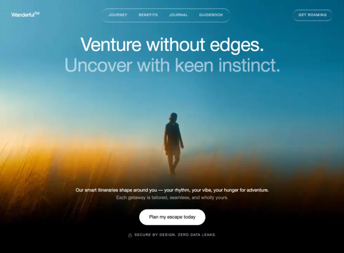 Wanderful Hero
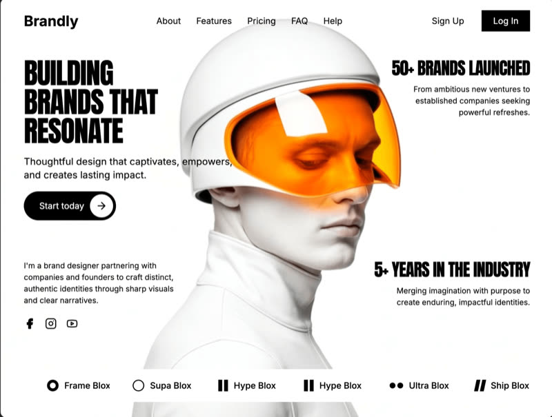 xPortfolio Hero
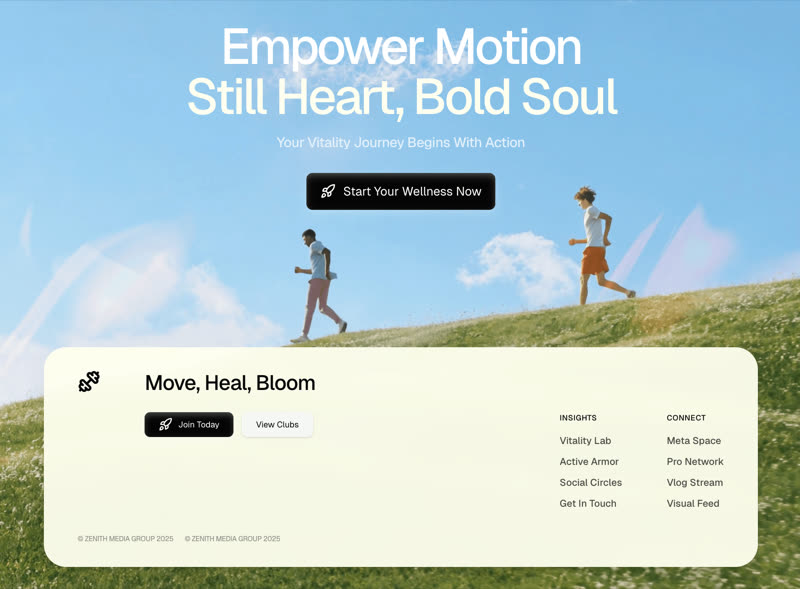 Zenith Footer
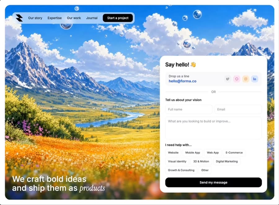 Build With Us
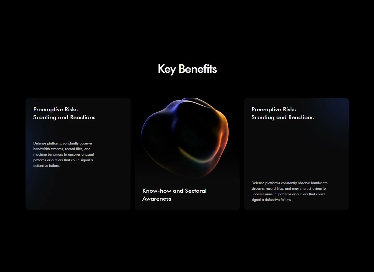 Guardnet Benefits
 Solace sign-in
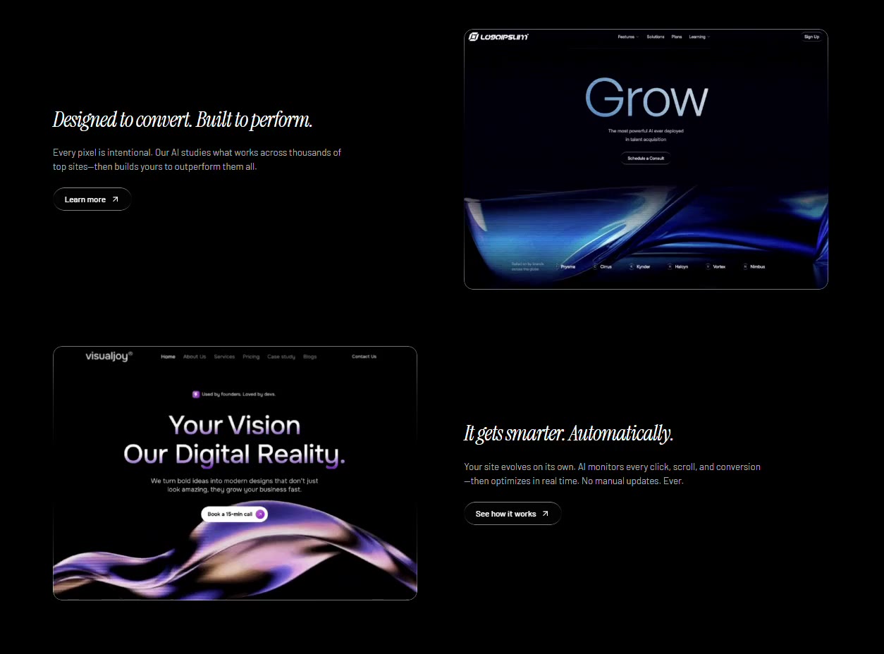 Liquid Glass Features
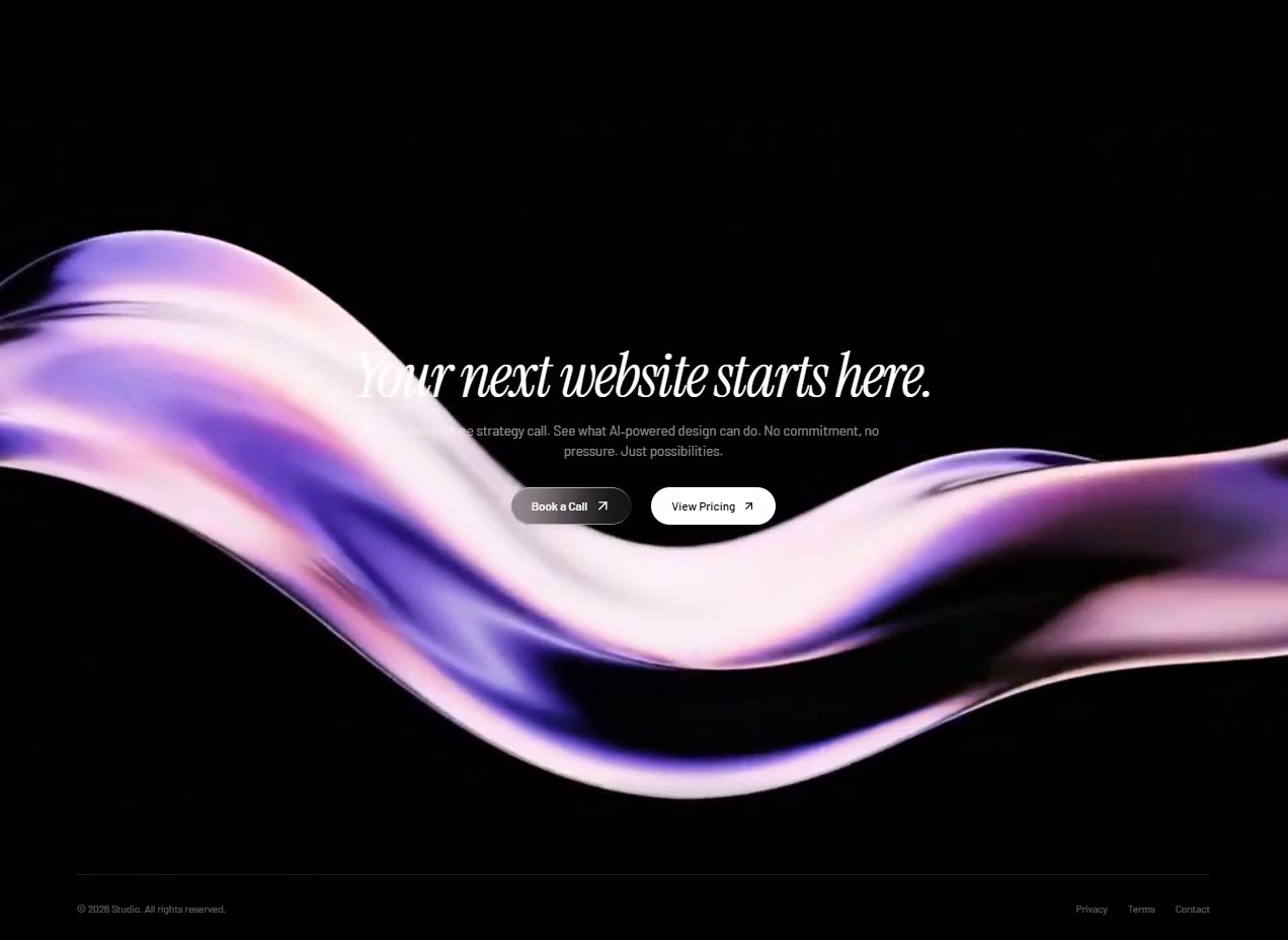 Liquid Glass CTA
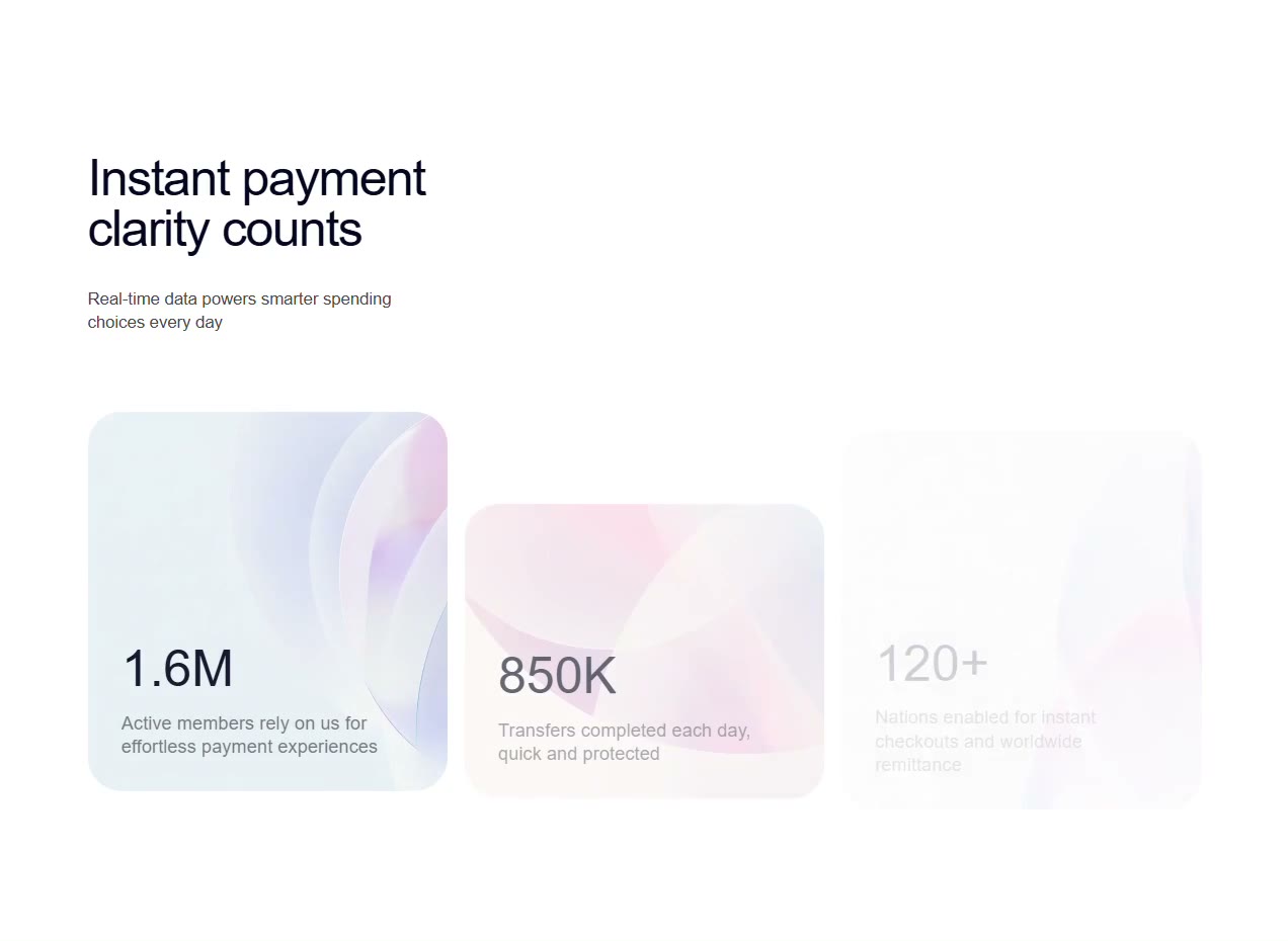 Veloce Cards
 Arceage Contact Us
 Arceage Testimonial
 Arceage Services
 Arceage Stats
 NexaCore Results
 NexaCore Process
 NexaCore Control
 Guardnet Demo
 Vision Reveal
 Halo Use Case
 Halo Benefits
 Projects Catalog
 Agency Services
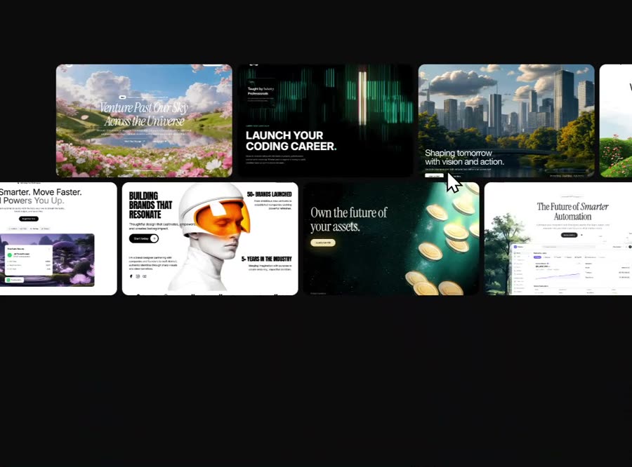 Scroll Marquee
 Daisy Wild
 Daisy Sweet
 Nimbus Ops
 Nimbus Security
 NimBus Pricing
 Nimbus Sticky Cards
 Cognitra Offer
 Cognitra Feature
Browse & preview free Unlock everything — from $49/mo
Frequently asked questions
Do Meez prompts work with Webflow?
Yes. Every Meez prompt is a complete written spec — fonts, layout, color tokens, motion and asset URLs — so Webflow can build it in one paste. The 62 free prompts on this site work exactly like the premium ones; copy one above and try it.
What does Webflow generate from a prompt?
Webflow builds class-based, production-grade sites you refine in its visual Designer and host on Webflow — with real CMS collections when you need them. An AI-scaffolded start from a Meez spec lands as editable Designer elements, not a flattened template, so the art direction survives your refinements.
How do I use a Meez prompt in Webflow?
Copy the full prompt text and paste it into Webflow's AI site builder. Don't shorten it — the specificity is what keeps Webflow from producing a generic layout. Then iterate: swap the copy and point the asset URLs at your own media.
How many prompts are free?
62 prompts are free to copy in full, no account needed. The other 579 unlock with Unlimited — $49/mo, $149/yr, or $299 once for lifetime — along with all 285 motion backgrounds.
Also for: Lovable · Bolt · v0 · Cursor · Claude · Replit · Windsurf · Framer · ChatGPT · Figma Make · Gemini · GitHub Copilot · Wix
Not sure which tool? Lovable vs v0 vs Bolt vs Cursor, compared → · All free prompts on one page → · All prompt categories →