Meez.
Browse Prompts Backgrounds Pricing
Contact Sign in ·

Card · Free prompt

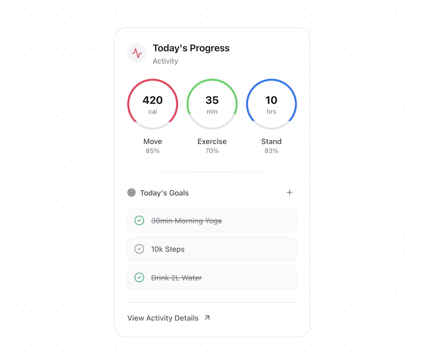
Activity Card

free · paste into Lovable, Bolt, v0, Cursor or Claude

Activity Card is a complete, paste-ready card build-prompt — a full art-direction spec for Lovable, Bolt, v0, Cursor and Claude. It's free: copy it below and paste it into your builder.

Activity Card preview

“A versatile card component for displaying fitness and activity tracking data with interactive goals and metrics visualization. Features - Metric Rings - Circular progress indicators - Percentage-based visualization - …”

Activity CardCard · free prompt · copy-paste

Prompt page

A versatile card component for displaying fitness and activity tracking data with interactive goals and metrics visualization.

Features

- Metric Rings
  - Circular progress indicators
  - Percentage-based visualization
  - Hover animations
  - Color-coded categories
  - Value and unit display

- Daily Goals
  - Interactive checkboxes
  - Completion status
  - Add new goals functionality
  - Visual feedback for completed items
  - Hover states

- Visual Elements
  - Category icon
  - Progress rings
  - Gradient dividers
  - Interactive buttons
  - Status indicators

— Install —
npx shadcn@latest add "https://21st.dev/r/activity-card"

— Component source (Activity Card.tsx) —

// components/ui/activity-card.tsx
"use client";

import { Activity, ArrowUpRight, Plus, Target, CheckCircle2 } from "lucide-react";
import Link from "next/link";
import { useState } from "react";
import { cn } from "@/lib/utils";

export interface Metric {
  label: string;
  value: string;
  trend: number;
  unit?: "cal" | "min" | "hrs";
}

export interface Goal {
  id: string;
  title: string;
  isCompleted: boolean;
}

interface ActivityCardProps {
  category?: string;
  title?: string;
  metrics?: Metric[];
  dailyGoals?: Goal[];
  onAddGoal?: () => void;
  onToggleGoal?: (goalId: string) => void;
  onViewDetails?: () => void;
  className?: string;
}

const METRIC_COLORS = {
  Move: "#FF2D55",
  Exercise: "#2CD758",
  Stand: "#007AFF",
} as const;

export function ActivityCard({
  category = "Activity",
  title = "Today's Progress",
  metrics = [],
  dailyGoals = [],
  onAddGoal,
  onToggleGoal,
  onViewDetails,
  className
}: ActivityCardProps) {
  const [isHovering, setIsHovering] = useState<string | null>(null);

  const handleGoalToggle = (goalId: string) => {
    onToggleGoal?.(goalId);
  };

  return (
    <div
      className={cn(
        "relative h-full rounded-3xl p-6",
        "bg-white dark:bg-black/5",
        "border border-zinc-200 dark:border-zinc-800",
        "hover:border-zinc-300 dark:hover:border-zinc-700",
        "transition-all duration-300",
        className
      )}
    >
      {/* Header */}
      <div className="flex items-center gap-3 mb-6">
        <div className="p-2 rounded-full bg-zinc-100 dark:bg-zinc-800/50">
          <Activity className="w-5 h-5 text-[#FF2D55]" />
        </div>
        <div>
          <h3 className="text-lg font-semibold text-zinc-900 dark:text-white">
            {title}
          </h3>
          <p className="text-sm text-zinc-500 dark:text-zinc-400">
            {category}
          </p>
        </div>
      </div>

      {/* Metrics Rings */}
      <div className="grid grid-cols-3 gap-4">
        {metrics.map((metric, index) => (
          <div
            key={metric.label}
            className="relative flex flex-col items-center"
            onMouseEnter={() => setIsHovering(metric.label)}
            onMouseLeave={() => setIsHovering(null)}
          >
            <div className="relative w-24 h-24">
              <div className="absolute inset-0 rounded-full border-4 border-zinc-200 dark:border-zinc-800/50" />
              <div
                className={cn(
                  "absolute inset-0 rounded-full border-4 transition-all duration-500",
                  isHovering === metric.label && "scale-105"
                )}
                style={{
                  borderColor: METRIC_COLORS[metric.label as keyof typeof METRIC_COLORS],
                  clipPath: `polygon(0 0, 100% 0, 100% ${metric.trend}%, 0 ${metric.trend}%)`,
                }}
              />
              <div className="absolute inset-0 flex flex-col items-center justify-center">
                <span className="text-xl font-bold text-zinc-900 dark:text-white">
                  {metric.value}
                </span>
                <span className="text-xs text-zinc-500 dark:text-zinc-400">
                  {metric.unit}
                </span>
              </div>
            </div>
            <span className="mt-3 text-sm font-medium text-zinc-700 dark:text-zinc-300">
              {metric.label}
            </span>
            <span className="text-xs text-zinc-500">
              {metric.trend}%
            </span>
          </div>
        ))}
      </div>

      {/* Goals Section */}
      <div className="mt-8 space-y-6">
        <div className="h-px bg-gradient-to-r from-transparent via-zinc-200 dark:via-zinc-800 to-transparent" />

        <div className="space-y-4">
          <div className="flex items-center justify-between">
            <h4 className="flex items-center gap-2 text-sm font-medium text-zinc-700 dark:text-zinc-300">
              <Target className="w-4 h-4" />
              Today's Goals
            </h4>
            <button
              type="button"
              onClick={onAddGoal}
              className="p-1.5 rounded-full hover:bg-zinc-100 dark:hover:bg-zinc-800 transition-colors"
            >
              <Plus className="w-4 h-4 text-zinc-500 dark:text-zinc-400" />
            </button>
          </div>

          <div className="space-y-2">
            {dailyGoals.map((goal) => (
              <button
                key={goal.id}
                onClick={() => handleGoalToggle(goal.id)}
                className={cn(
                  "w-full flex items-center gap-3 p-3 rounded-xl",
                  "bg-zinc-50 dark:bg-zinc-900/50",
                  "border border-zinc-200/50 dark:border-zinc-800/50",
                  "hover:border-zinc-300/50 dark:hover:border-zinc-700/50",
                  "transition-all"
                )}
              >
                <CheckCircle2
                  className={cn(
                    "w-5 h-5",
                    goal.isCompleted
                      ? "text-emerald-500"
                      : "text-zinc-400 dark:text-zinc-600"
                  )}
                />
                <span
                  className={cn(
                    "text-sm text-left",
                    goal.isCompleted
                      ? "text-zinc-500 dark:text-zinc-400 line-through"
                      : "text-zinc-700 dark:text-zinc-300"
                  )}
                >
                  {goal.title}
                </span>
              </button>
            ))}
          </div>
        </div>

        <div className="pt-4 border-t border-zinc-200 dark:border-zinc-800">
          <button
            onClick={onViewDetails}
            className="inline-flex items-center gap-2 text-sm font-medium
              text-zinc-600 hover:text-zinc-900 
              dark:text-zinc-400 dark:hover:text-white
              transition-colors duration-200"
          >
            View Activity Details
            <ArrowUpRight className="w-4 h-4" />
          </button>
        </div>
      </div>
    </div>
  );
}

Browse & preview free → Unlock everything — from $19/mo

More like this

Orbis Cards — Card website build-promptOrbis Cards Veloce Cards — Card website build-promptVeloce Cards Nimbus Security — Card website build-promptNimbus Security Nimbus Sticky Cards — Card website build-promptNimbus Sticky Cards Cognitra Offer — Card website build-promptCognitra Offer Display Cards — Card website build-promptDisplay Cards
Meez.

The biggest library of AI website build-prompts & motion backgrounds — at the lowest price.

Library
Browse all Prompts by category Section prompts Motion backgrounds Pricing
Learn & contact
How it works Why AI sites look generic Terms Privacy Contact Affiliates
© Meez — an open archive. Start free · Unlimited from $19/mo · cancel anytime.