Meez.
Browse Prompts Backgrounds Pricing
Contact Sign in ·

Testimonial · Free prompt

Link Preview

free · paste into Lovable, Bolt, v0, Cursor or Claude

Link Preview is a complete, paste-ready testimonial build-prompt — a full art-direction spec for Lovable, Bolt, v0, Cursor and Claude. It's free: copy it below and paste it into your builder.

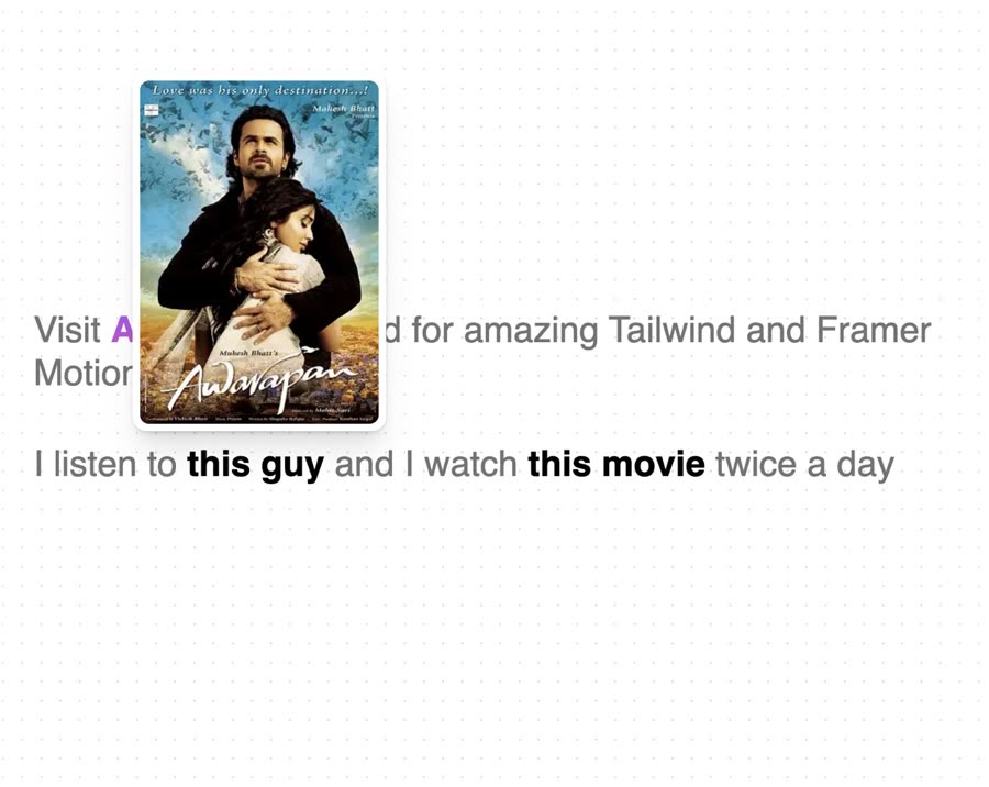
Link Preview preview

“Dynamic link previews for your anchor tags — Install — npx shadcn@latest add "https://21st.dev/r/link-preview" — Component source (Link Preview.tsx) — "use client"; import * as HoverCardPrimitive from …”

Link PreviewTestimonial · free prompt · copy-paste

Prompt page

Dynamic link previews for your anchor tags

— Install —
npx shadcn@latest add "https://21st.dev/r/link-preview"

— Component source (Link Preview.tsx) —

"use client";
import * as HoverCardPrimitive from "@radix-ui/react-hover-card";
import Image from "next/image";
import { encode } from "qss";
import React from "react";
import {
  AnimatePresence,
  motion,
  useMotionValue,
  useSpring,
} from "framer-motion";
import Link from "next/link";
import { cn } from "@/lib/utils";

type LinkPreviewProps = {
  children: React.ReactNode;
  url: string;
  className?: string;
  width?: number;
  height?: number;
  quality?: number;
  layout?: string;
} & (
  | { isStatic: true; imageSrc: string }
  | { isStatic?: false; imageSrc?: never }
);

export const LinkPreview = ({
  children,
  url,
  className,
  width = 200,
  height = 125,
  quality = 50,
  layout = "fixed",
  isStatic = false,
  imageSrc = "",
}: LinkPreviewProps) => {
  let src;
  if (!isStatic) {
    const params = encode({
      url,
      screenshot: true,
      meta: false,
      embed: "screenshot.url",
      colorScheme: "dark",
      "viewport.isMobile": true,
      "viewport.deviceScaleFactor": 1,
      "viewport.width": width * 3,
      "viewport.height": height * 3,
    });
    src = `https://api.microlink.io/?${params}`;
  } else {
    src = imageSrc;
  }

  const [isOpen, setOpen] = React.useState(false);

  const [isMounted, setIsMounted] = React.useState(false);

  React.useEffect(() => {
    setIsMounted(true);
  }, []);

  const springConfig = { stiffness: 100, damping: 15 };
  const x = useMotionValue(0);

  const translateX = useSpring(x, springConfig);

  const handleMouseMove = (event: any) => {
    const targetRect = event.target.getBoundingClientRect();
    const eventOffsetX = event.clientX - targetRect.left;
    const offsetFromCenter = (eventOffsetX - targetRect.width / 2) / 2; // Reduce the effect to make it subtle
    x.set(offsetFromCenter);
  };

  return (
    <>
      {isMounted ? (
        <div className="hidden">
          <Image
            src={src}
            width={width}
            height={height}
            quality={quality}
            layout={layout}
            priority={true}
            alt="hidden image"
          />
        </div>
      ) : null}

      <HoverCardPrimitive.Root
        openDelay={50}
        closeDelay={100}
        onOpenChange={(open) => {
          setOpen(open);
        }}
      >
        <HoverCardPrimitive.Trigger
          onMouseMove={handleMouseMove}
          className={cn("text-black dark:text-white", className)}
          href={url}
        >
          {children}
        </HoverCardPrimitive.Trigger>

        <HoverCardPrimitive.Content
          className="[transform-origin:var(--radix-hover-card-content-transform-origin)]"
          side="top"
          align="center"
          sideOffset={10}
        >
          <AnimatePresence>
            {isOpen && (
              <motion.div
                initial={{ opacity: 0, y: 20, scale: 0.6 }}
                animate={{
                  opacity: 1,
                  y: 0,
                  scale: 1,
                  transition: {
                    type: "spring",
                    stiffness: 260,
                    damping: 20,
                  },
                }}
                exit={{ opacity: 0, y: 20, scale: 0.6 }}
                className="shadow-xl rounded-xl"
                style={{
                  x: translateX,
                }}
              >
                <Link
                  href={url}
                  className="block p-1 bg-white border-2 border-transparent shadow rounded-xl hover:border-neutral-200 dark:hover:border-neutral-800"
                  style={{ fontSize: 0 }}
                >
                  <Image
                    src={isStatic ? imageSrc : src}
                    width={width}
                    height={height}
                    quality={quality}
                    layout={layout}
                    priority={true}
                    className="rounded-lg"
                    alt="preview image"
                  />
                </Link>
              </motion.div>
            )}
          </AnimatePresence>
        </HoverCardPrimitive.Content>
      </HoverCardPrimitive.Root>
    </>
  );
};

Browse & preview free → Unlock everything — from $19/mo

More like this

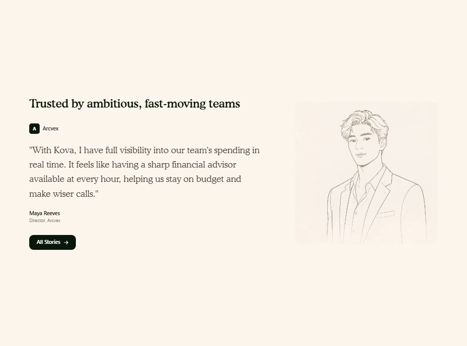
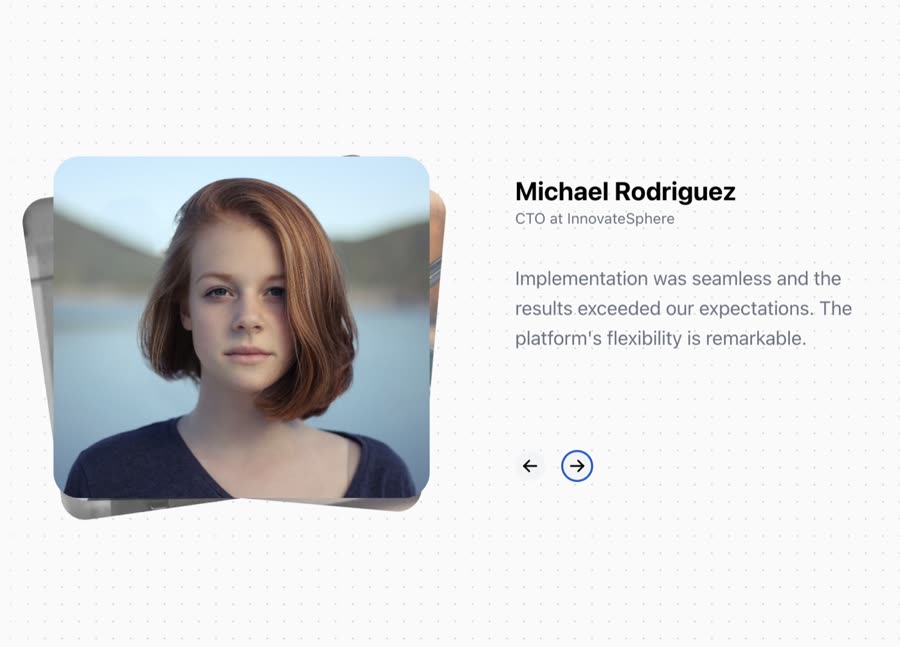
Kova Testimonial — Testimonial website build-promptKova Testimonial Animated Testimonials — Testimonial website build-promptAnimated Testimonials
Meez.

The biggest library of AI website build-prompts & motion backgrounds — at the lowest price.

Library
Browse all Prompts by category Section prompts Motion backgrounds Pricing
Learn & contact
How it works Why AI sites look generic Terms Privacy Contact Affiliates
© Meez — an open archive. Start free · Unlimited from $19/mo · cancel anytime.