Prompts · for Windsurf
AI website build-prompts for Windsurf
Paste a Meez prompt into Windsurf's agent panel and it builds the page across your project's files — components, Tailwind classes, fonts, color tokens and motion specs land where they belong, with the asset URLs already wired in. Because the prompt is a complete spec rather than a vague ask, the agent has little room to drift into a generic layout; you review the diff and ship.
How to use a Meez prompt in Windsurf
- Pick a prompt below (4 on this page are free) or browse the full library — every prompt is a complete art-direction spec: fonts, layout, color system, motion and real asset URLs.
- Copy the whole prompt and paste it into the agent panel in Windsurf (now Devin Desktop). Don’t trim it — the detail is what stops Windsurf from defaulting to a generic layout.
- Let it build, then iterate: swap the copy, point the asset URLs at your own media, and ship. The sites you build are yours, commercially.
Free prompts to try in Windsurf right now
Creative PortfolioHero Section · free prompt · copy-paste
626f6c742d63632d6167656e74Let me read all the relevant files to compile the full recreation prompt.
Here's the full recreation prompt:

---

## Prompt to Recreate This Hero Section

Build a full-screen hero section for a creative portfolio using React, Vite, Tailwind CSS, and the Figtree Google Font. The page has two components: a **Navbar** and a **Hero**. No additional packages beyond `lucide-react` (though it's not used here). The entire page is black background with white text.

---

### Setup

- **Font:** Figtree (400, 500, 600) from Google Fonts, loaded in `index.html`
- **Tailwind custom breakpoints (max-width based):**
  - `mobile`: max 809.98px
  - `md-tablet`: min 810px, max 1199.98px
- **CSS variable:** `--ease-spring: cubic-bezier(0.16, 1, 0.3, 1)`

---

### Video Background

Three full-screen looping videos (muted, autoPlay, playsInline, loop) stacked absolutely with crossfade switching. All three render simultaneously; only the active one has `opacity-100`, the others have `opacity-0` with `transition-opacity duration-[1200ms] ease-in-out`.

**Video URLs (CloudFront):**
1. `https://meez.design/web/media/bg-videos/ms-dark-flowers.mp4`
2. `https://meez.design/web/media/bg-videos/ms-energy.mp4`
3. `https://meez.design/web/media/bg-videos/ms-person.mp4`

**Preloading:** On mount, fetch all videos as blobs and create object URLs for instant playback. Fall back to original URL on failure.

A `bg-black/10` overlay sits above videos at `z-[1]`.

---

### Navbar (absolute positioned, z-10, on top of hero)

- **Layout:** Centered container, max-width 1340px, `py-9 px-[15px]`
- **Left side:** Navigation items formatted as `01 / Works`, `02 / Services`, `03 / About`, `04 / Contact`
  - Index number: `text-[8px] leading-3 tracking-[-0.08px] font-medium uppercase`
  - Label: `text-xs leading-4 tracking-[-0.12px] font-medium uppercase`
  - Each link has a `.nav-link-underline` effect (underline slides in from right on hover via `scaleX` transform)
- **Right side (aligned right):** Email `Davies@gmail.com` and live clock showing `CUP HH:MM:SS` (24h format, updates every second using `Intl.DateTimeFormat('en-GB')`)
- **Mobile:** Nav items hidden, replaced by a `Menu`/`Close` toggle button. Mobile panel uses CSS Grid `grid-rows-[0fr]`/`grid-rows-[1fr]` transition (420ms, spring ease) for smooth expand/collapse. Mobile nav links are large: `text-[28px] leading-8 tracking-[-0.84px]`

---

### Hero Content (z-[2], relative)

Container: `max-w-[1340px]`, full height, flex column, `justify-end items-end`, `gap-[150px]`, `pt-[190px] px-[15px]`

**Section 1 - Video Switcher + Availability (upper area):**
- Left column (`flex-[4]`): Three buttons labeled `01 / WATER WAVE`, `02 / GRIDWAVE`, `03 / LIGHT TUNNEL`. Active button is full opacity, inactive is `opacity-55` with `hover:opacity-75`. On click, sets `activeIndex` to crossfade videos. Each has a `.role-link` class that translates 4px right on hover.
- Right column (`flex-1`): Pulsing dot + "Available for work" text. Dot is 7px circle with glow shadow and infinite pulse animation (scale 1 to 1.45, opacity 1 to 0.45, 1.6s). On slide 1, dot is `#F598F2` pink with pink glow. On slides 2-3, dot is white with white glow.

**Section 2 - Name + CTA (bottom area, pb-[60px]):**
- Left column (`flex-[2]`): Giant name "Viktor." in `text-[200px] leading-[81%] tracking-[-6px] font-medium uppercase`. The period is accent-colored: pink `#F598F2` on slide 1, white on slides 2-3. Animate in with `revealUp` (translateY 80px to 0, 0.9s spring ease).
- Right column (`flex-1`, `pl-[50px]`): Paragraph text ("I craft bold brands and modern websites with purpose...") at `text-base leading-6 tracking-[-0.16px] font-medium`. Below it, a "start a project" button (lowercase) with white border. Button has a fill-up hover effect: `::before` pseudo-element with `#F598F2` background that translateY from 101% to 0 on hover, text turns black, border turns pink. Both animate in with `revealRight` (translateX 100px to 0, 0.9s spring ease), button delayed by 0.08s.

**Reveal animations** trigger once via IntersectionObserver at 0.35 threshold.

---

### Responsive Tablet (810px-1199px)
- Navbar: `py-[30px] px-[18px]`, nav gaps shrink to `gap-4`
- Hero name: `text-[129.6px] leading-[113.4px] tracking-[-7.7px]`
- Bottom section: gap 28px, pb 52px, left padding 24px

### Responsive Mobile (<810px)
- Navbar: `py-6 px-[18px]`, desktop nav hidden, hamburger menu shown
- Hero content: `justify-end items-start gap-[72px] pt-[140px] px-[18px]`
- Switcher + availability stack vertically with `gap-7`
- Bottom section: column layout, `gap-8 pb-11`
- Name: `text-[clamp(68px,21vw,80px)] leading-[96px] tracking-[-4.8px]`
- Paragraph: `max-w-[420px]`

---

### Custom CSS Animations

```css
@keyframes videoFadeIn { from { opacity: 0 } to { opacity: 1 } }
@keyframes revealUp { from { opacity: 0; transform: translateY(80px) } to { opacity: 1; transform: translateY(0) } }
@keyframes revealRight { from { opacity: 0; transform: translateX(100px) } to { opacity: 1; transform: translateX(0) } }
@keyframes dotPulse { 0%,100% { opacity:1; transform:scale(1) } 50% { opacity:0.45; transform:scale(1.45) } }
```

### Accessibility
- `prefers-reduced-motion: reduce` disables all animations
- Semantic landmarks: `<header>`, `<main>`, `<nav>`, `<section>`
- ARIA labels on navigation regions and status elements
- Videos are `aria-hidden="true"`

---

## Source Code

<!DOCTYPE html>
<html lang="en">
<head>
  <meta charset="UTF-8" />
  <meta name="viewport" content="width=device-width, initial-scale=1.0" />
  <title>Viktor Hero</title>
  <link rel="preconnect" href="https://fonts.googleapis.com" />
  <link rel="preconnect" href="https://fonts.gstatic.com" crossorigin />
  <link href="https://fonts.googleapis.com/css2?family=Figtree:wght@400;500;600&display=swap" rel="stylesheet" />
  <style>
    *, *::before, *::after { margin: 0; padding: 0; box-sizing: border-box; }

    :root {
      --ease-spring: cubic-bezier(0.16, 1, 0.3, 1);
      --pink: #F598F2;
    }

    html, body {
      min-height: 100%;
      background: #000;
      font-family: "Figtree", sans-serif;
      overflow-x: hidden;
    }

    /* Animations */
    @keyframes revealUp {
      from { opacity: 0; transform: translateY(80px); }
      to { opacity: 1; transform: translateY(0); }
    }
    @keyframes revealRight {
      from { opacity: 0; transform: translateX(100px); }
      to { opacity: 1; transform: translateX(0); }
    }
    @keyframes dotPulse {
      0%, 100% { opacity: 1; transform: scale(1); }
      50% { opacity: 0.45; transform: scale(1.45); }
    }

    .animate-reveal-up { animation: revealUp 0.9s var(--ease-spring) 0.01s forwards; }
    .animate-reveal-right { animation: revealRight 0.9s var(--ease-spring) 0.01s forwards; }
    .animate-reveal-right-delayed { animation: revealRight 0.9s var(--ease-spring) 0.08s forwards; }
    .animate-dot-pulse { animation: dotPulse 1.6s ease-in-out infinite; }

    .hidden-before-reveal { opacity: 0; }
    .hidden-translate-y { transform: translateY(80px); }
    .hidden-translate-x { transform: translateX(100px); }

    /* Hero button */
    .hero-button {
      position: relative;
      isolation: isolate;
      display: inline-flex;
      justify-content: center;
      align-items: center;
      padding: 14px 18px;
      border: 1px solid #fff;
      color: #fff;
      background: transparent;
      overflow: hidden;
      font-family: "Figtree", sans-serif;
      font-size: 12px;
      line-height: 16px;
      letter-spacing: -0.12px;
      font-weight: 500;
      text-transform: lowercase;
      text-decoration: none;
      transition: color 260ms ease;
      cursor: pointer;
    }
    .hero-button::before {
      content: "";
      position: absolute;
      inset: 0;
      background: var(--pink);
      transform: translateY(101%);
      transition: transform 360ms var(--ease-spring);
      z-index: -1;
    }
    .hero-button:hover { color: #000; border-color: var(--pink); }
    .hero-button:hover::before { transform: translateY(0); }

    /* Role links */
    .role-link {
      font-family: "Figtree", sans-serif;
      font-size: 12px;
      line-height: 16px;
      letter-spacing: -0.12px;
      font-weight: 500;
      text-transform: uppercase;
      color: #fff;
      background: transparent;
      border: 0;
      padding: 0;
      cursor: pointer;
      transition: opacity 220ms ease, transform 220ms ease;
    }
    .role-link:hover { opacity: 1 !important; transform: translateX(4px); }
    .role-link.active { opacity: 1; }
    .role-link.inactive { opacity: 0.55; }
    .role-link.inactive:hover { opacity: 0.75; }

    /* Nav link underline */
    .nav-link-underline {
      position: relative;
      text-decoration: none;
      color: #fff;
      transition: opacity 220ms var(--ease-spring), transform 220ms var(--ease-spring);
    }
    .nav-link-underline::after {
      content: "";
      position: absolute;
      left: 0;
      bottom: -2px;
      width: 100%;
      height: 1px;
      background: currentColor;
      transform: scaleX(0);
      transform-origin: right;
      transition: transform 320ms var(--ease-spring);
    }
    .nav-link-underline:hover { opacity: 0.72; }
    .nav-link-underline:hover::after { transform: scaleX(1); transform-origin: left; }

    /* Videos */
    .video-bg {
      position: absolute;
      inset: 0;
      width: 100%;
      height: 100%;
      object-fit: cover;
      z-index: 0;
      transition: opacity 1200ms ease-in-out;
    }
    .video-bg.hidden-video { opacity: 0; }
    .video-bg.visible-video { opacity: 1; }

    /* Layout */
    .hero-main {
      position: relative;
      width: 100%;
      height: 100vh;
      overflow: hidden;
      display: flex;
      flex-direction: column;
      justify-content: center;
      align-items: center;
      background: #000;
      color: #fff;
    }
    .overlay {
      position: absolute;
      inset: 0;
      background: rgba(0,0,0,0.1);
      z-index: 1;
      pointer-events: none;
    }
    .content {
      position: relative;
      z-index: 2;
      width: 100%;
      max-width: 1340px;
      height: 100vh;
      display: flex;
      flex-direction: column;
      justify-content: flex-end;
      align-items: flex-end;
      gap: 150px;
      padding: 190px 15px 0;
    }

    /* Middle row */
    .middle-row {
      width: 100%;
      display: flex;
      flex-direction: row;
      justify-content: space-between;
      align-items: center;
      padding: 0 6px;
    }
    .roles-nav {
      flex: 4;
      display: flex;
      flex-direction: column;
      justify-content: center;
      align-items: flex-start;
      gap: 4px;
      position: relative;
      z-index: 2;
    }
    .availability {
      flex: 1;
      display: flex;
      justify-content: center;
      align-items: center;
      gap: 12px;
      position: relative;
      z-index: 2;
    }
    .dot {
      width: 7px;
      height: 7px;
      border-radius: 50%;
      flex-shrink: 0;
    }
    .dot.pink {
      background: var(--pink);
      box-shadow: 0 0 16px rgba(245, 152, 242, 0.85);
    }
    .dot.white {
      background: #fff;
      box-shadow: 0 0 16px rgba(255, 255, 255, 0.85);
    }
    .availability-text {
      font-size: 12px;
      line-height: 16px;
      letter-spacing: -0.12px;
      font-weight: 500;
      text-transform: uppercase;
      color: #fff;
      white-space: nowrap;
    }

    /* Banner row */
    .banner-row {
      width: 100%;
      display: flex;
      flex-direction: row;
      justify-content: space-between;
      align-items: flex-end;
      gap: 37px;
      padding-bottom: 60px;
      position: relative;
      z-index: 2;
    }
    .name-col {
      flex: 2;
      display: flex;
      justify-content: flex-end;
      align-items: flex-end;
      min-width: 0;
    }
    .name-col h1 {
      width: 100%;
      margin: 0;
      font-family: "Figtree", sans-serif;
      font-size: 200px;
      line-height: 81%;
      letter-spacing: -6px;
      font-weight: 500;
      text-transform: uppercase;
      color: #fff;
      text-align: left;
      white-space: nowrap;
    }
    .name-col h1 .accent { transition: color 400ms ease; }
    .name-col h1 .accent.pink { color: var(--pink); }
    .name-col h1 .accent.white { color: #fff; }

    .info-col {
      flex: 1;
      min-width: 0;
      display: flex;
      flex-direction: row;
      justify-content: center;
      align-items: center;
      gap: 10px;
      padding-left: 50px;
    }
    .info-inner {
      flex: 1;
      min-width: 0;
      display: flex;
      flex-direction: column;
      justify-content: flex-start;
      align-items: flex-start;
      gap: 40px;
    }
    .info-inner p {
      margin: 0;
      width: 100%;
      font-family: "Figtree", sans-serif;
      font-size: 16px;
      line-height: 24px;
      letter-spacing: -0.16px;
      font-weight: 500;
      text-align: left;
      color: #fff;
    }

    /* Navbar */
    .navbar {
      position: absolute;
      top: 0;
      left: 0;
      width: 100%;
      z-index: 10;
      display: flex;
      flex-direction: column;
      align-items: center;
      justify-content: flex-start;
      gap: 10px;
      padding: 36px 15px;
      overflow: hidden;
      color: #fff;
    }
    .navbar-inner {
      width: 100%;
      max-width: 1340px;
      display: flex;
      flex-direction: row;
      align-items: flex-start;
      justify-content: flex-start;
      gap: 10px;
      overflow: hidden;
    }
    .nav-left {
      flex: 2;
      min-width: 0;
      display: flex;
      flex-direction: row;
      align-items: flex-start;
      justify-content: flex-start;
      gap: 77px;
      padding-left: 6px;
      overflow: hidden;
    }
    .nav-links {
      flex: 1;
      min-width: 0;
      display: flex;
      flex-direction: row;
      align-items: flex-start;
      justify-content: flex-start;
      gap: 20px;
      overflow: hidden;
    }
    .nav-item {
      display: flex;
      flex-direction: row;
      align-items: flex-start;
      justify-content: flex-start;
      gap: 4px;
      white-space: nowrap;
    }
    .nav-item .index {
      font-family: "Figtree", sans-serif;
      font-size: 8px;
      line-height: 12px;
      letter-spacing: -0.08px;
      font-weight: 500;
      text-transform: uppercase;
      color: #fff;
    }
    .nav-item a {
      font-family: "Figtree", sans-serif;
      font-size: 12px;
      line-height: 16px;
      letter-spacing: -0.12px;
      font-weight: 500;
      text-transform: uppercase;
      white-space: nowrap;
    }
    .nav-right {
      flex: 1;
      min-width: 0;
      display: flex;
      flex-direction: row;
      align-items: flex-start;
      justify-content: flex-end;
      gap: 10px;
      padding-right: 6px;
      padding-bottom: 8px;
      overflow: hidden;
    }
    .nav-right-inner {
      flex: 1;
      min-width: 0;
      display: flex;
      flex-direction: column;
      align-items: flex-end;
      justify-content: flex-start;
      gap: 4px;
      overflow: hidden;
    }
    .nav-right-inner a {
      font-family: "Figtree", sans-serif;
      font-size: 12px;
      line-height: 16px;
      letter-spacing: -0.12px;
      font-weight: 500;
      text-transform: uppercase;
      white-space: nowrap;
    }
    .time-row {
      display: flex;
      flex-direction: row;
      align-items: center;
      justify-content: center;
      gap: 4px;
      white-space: nowrap;
    }
    .time-row span {
      font-family: "Figtree", sans-serif;
      font-size: 12px;
      line-height: 16px;
      letter-spacing: -0.12px;
      font-weight: 500;
      text-transform: uppercase;
      color: #fff;
      font-variant-numeric: tabular-nums;
    }

    /* Mobile menu button */
    .menu-btn {
      display: none;
      border: 0;
      padding: 0;
      background: transparent;
      appearance: none;
      font-family: "Figtree", sans-serif;
      font-size: 12px;
      line-height: 16px;
      letter-spacing: -0.12px;
      font-weight: 500;
      text-transform: uppercase;
      color: #fff;
      white-space: nowrap;
      cursor: pointer;
    }

    /* Mobile panel */
    .mobile-panel {
      display: none;
      width: 100%;
      max-width: 1340px;
      overflow: hidden;
      transition: grid-template-rows 420ms var(--ease-spring);
    }
    .mobile-panel.open { grid-template-rows: 1fr; }
    .mobile-panel.closed { grid-template-rows: 0fr; }
    .mobile-panel-inner {
      min-height: 0;
      overflow: hidden;
    }
    .mobile-nav {
      display: flex;
      flex-direction: column;
      gap: 12px;
      padding-top: 28px;
    }
    .mobile-nav .nav-item a {
      font-size: 28px;
      line-height: 32px;
      letter-spacing: -0.84px;
    }
    .mobile-nav .nav-item .index { padding-top: 3px; }
    .mobile-info {
      display: flex;
      flex-direction: column;
      gap: 4px;
      padding-top: 28px;
    }

    /* Tablet: 810px - 1199px */
    @media (max-width: 1199.98px) and (min-width: 810px) {
      .navbar { padding: 30px 18px; }
      .nav-left { gap: 48px; }
      .nav-links { gap: 16px; }
      .content { gap: 120px; padding-top: 170px; padding-left: 24px; padding-right: 24px; }
      .banner-row { gap: 28px; padding-bottom: 52px; }
      .info-col { padding-left: 24px; }
      .name-col h1 { font-size: 129.6px; line-height: 113.4px; letter-spacing: -7.7px; }
      .info-inner p { font-size: 15px; line-height: 23px; }
    }

    /* Mobile: <810px */
    @media (max-width: 809.98px) {
      .navbar { padding: 24px 18px; overflow: visible; }
      .navbar-inner { justify-content: space-between; overflow: visible; }
      .nav-left { flex: 1; gap: 0; padding-left: 0; }
      .nav-links { display: none; }
      .nav-right { flex: initial; width: auto; padding: 0; overflow: visible; }
      .nav-right-inner { display: none; }
      .menu-btn { display: inline-flex; }
      .mobile-panel { display: grid; }

      .content {
        justify-content: flex-end;
        align-items: flex-start;
        gap: 72px;
        padding: 140px 18px 0;
      }
      .middle-row {
        flex-direction: column;
        align-items: flex-start;
        justify-content: flex-start;
        gap: 28px;
        padding: 0;
      }
      .availability { justify-content: flex-start; }
      .banner-row {
        flex-direction: column;
        align-items: flex-start;
        justify-content: flex-end;
        gap: 32px;
        padding-bottom: 44px;
      }
      .name-col { width: 100%; flex: initial; }
      .name-col h1 {
        font-size: clamp(68px, 21vw, 80px);
        line-height: 96px;
        letter-spacing: -4.8px;
      }
      .info-col {
        width: 100%;
        flex: initial;
        flex-direction: column;
        align-items: flex-start;
        justify-content: flex-start;
        gap: 22px;
        padding-left: 0;
      }
      .info-inner { width: 100%; flex: initial; gap: 28px; }
      .info-inner p { max-width: 420px; }
    }

    @media (prefers-reduced-motion: reduce) {
      *, *::before, *::after {
        animation-duration: 1ms !important;
        animation-iteration-count: 1 !important;
        scroll-behavior: auto !important;
        transition-duration: 1ms !important;
      }
    }
  </style>
</head>
<body>

  <!-- Navbar -->
  <header class="navbar">
    <div class="navbar-inner">
      <div class="nav-left">
        <nav class="nav-links" aria-label="Primary navigation">
          <div class="nav-item">
            <span class="index">01 /</span>
            <a href="/" class="nav-link-underline">Works</a>
          </div>
          <div class="nav-item">
            <span class="index">02 /</span>
            <a href="/" class="nav-link-underline">Services</a>
          </div>
          <div class="nav-item">
            <span class="index">03 /</span>
            <a href="/" class="nav-link-underline">About</a>
          </div>
          <div class="nav-item">
            <span class="index">04 /</span>
            <a href="/" class="nav-link-underline">Contact</a>
          </div>
        </nav>
      </div>
      <div class="nav-right">
        <div class="nav-right-inner">
          <a href="mailto:Viktor@gmail.com" class="nav-link-underline">Viktor@gmail.com</a>
          <div class="time-row" aria-label="Current time">
            <span>CUP</span>
            <span id="clock">00:00:00</span>
          </div>
        </div>
        <button class="menu-btn nav-link-underline" type="button" id="menuBtn">Menu</button>
      </div>
    </div>
    <div class="mobile-panel closed" id="mobilePanel">
      <div class="mobile-panel-inner">
        <nav class="mobile-nav" aria-label="Mobile navigation">
          <div class="nav-item">
            <span class="index">01 /</span>
            <a href="/" class="nav-link-underline">Works</a>
          </div>
          <div class="nav-item">
            <span class="index">02 /</span>
            <a href="/" class="nav-link-underline">Services</a>
          </div>
          <div class="nav-item">
            <span class="index">03 /</span>
            <a href="/" class="nav-link-underline">About</a>
          </div>
          <div class="nav-item">
            <span class="index">04 /</span>
            <a href="/" class="nav-link-underline">Contact</a>
          </div>
        </nav>
        <div class="mobile-info">
          <a href="mailto:Viktor@gmail.com" class="nav-link-underline" style="font-family:'Figtree',sans-serif;font-size:12px;line-height:16px;letter-spacing:-0.12px;font-weight:500;text-transform:uppercase;white-space:nowrap;">Viktor@gmail.com</a>
          <div class="time-row" style="width:fit-content;">
            <span>CUP</span>
            <span id="clockMobile">00:00:00</span>
          </div>
        </div>
      </div>
    </div>
  </header>

  <!-- Hero -->
  <main class="hero-main" id="heroMain" aria-label="Portfolio hero">
    <video class="video-bg visible-video" id="video0" src="https://meez.design/web/media/bg-videos/ms-nature-nice.mp4" autoplay muted loop playsinline preload="auto" aria-hidden="true"></video>
    <video class="video-bg hidden-video" id="video1" src="https://meez.design/web/media/bg-videos/ms-3d.mp4" autoplay muted loop playsinline preload="auto" aria-hidden="true"></video>
    <video class="video-bg hidden-video" id="video2" src="https://meez.design/web/media/bg-videos/ms-nature.mp4" autoplay muted loop playsinline preload="auto" aria-hidden="true"></video>

    <div class="overlay" aria-hidden="true"></div>

    <section class="content">
      <!-- Middle: roles + availability -->
      <div class="middle-row">
        <nav class="roles-nav" aria-label="Hero variants">
          <button class="role-link active" type="button" data-index="0">01 / WATER WAVE</button>
          <button class="role-link inactive" type="button" data-index="1">02 / GRIDWAVE</button>
          <button class="role-link inactive" type="button" data-index="2">03 / LIGHT TUNNEL</button>
        </nav>
        <div class="availability" aria-label="Availability status">
          <span class="dot pink animate-dot-pulse" id="statusDot" aria-hidden="true"></span>
          <span class="availability-text">Available for work</span>
        </div>
      </div>

      <!-- Banner: name + copy -->
      <div class="banner-row">
        <div class="name-col hidden-before-reveal hidden-translate-y" id="nameCol">
          <h1>Viktor<span class="accent pink" id="accentDot">.</span></h1>
        </div>
        <div class="info-col">
          <div class="info-inner">
            <p class="hidden-before-reveal hidden-translate-x" id="infoParagraph">I shape digital experiences that feel as good as they look. Every choice is intentional, blending beauty with purpose. Crafted to grow with you.</p>
            <a href="/" class="hero-button hidden-before-reveal hidden-translate-x" id="heroBtn">start a project</a>
          </div>
        </div>
      </div>
    </section>
  </main>

  <script>
    (function() {
      // Clock
      function updateClock() {
        const now = new Date();
        const time = new Intl.DateTimeFormat('en-GB', {
          hour: '2-digit', minute: '2-digit', second: '2-digit', hour12: false
        }).format(now);
        document.getElementById('clock').textContent = time;
        const mobile = document.getElementById('clockMobile');
        if (mobile) mobile.textContent = time;
      }
      updateClock();
      setInterval(updateClock, 1000);

      // Mobile menu
      const menuBtn = document.getElementById('menuBtn');
      const mobilePanel = document.getElementById('mobilePanel');
      let menuOpen = false;
      menuBtn.addEventListener('click', function() {
        menuOpen = !menuOpen;
        menuBtn.textContent = menuOpen ? 'Close' : 'Menu';
        mobilePanel.classList.toggle('open', menuOpen);
        mobilePanel.classList.toggle('closed', !menuOpen);
      });

      // Video switching
      let activeIndex = 0;
      const videos = [
        document.getElementById('video0'),
        document.getElementById('video1'),
        document.getElementById('video2')
      ];
      const roleButtons = document.querySelectorAll('.role-link');
      const statusDot = document.getElementById('statusDot');
      const accentDot = document.getElementById('accentDot');

      function setActive(index) {
        if (index === activeIndex) return;
        activeIndex = index;

        videos.forEach(function(v, i) {
          v.classList.toggle('visible-video', i === activeIndex);
          v.classList.toggle('hidden-video', i !== activeIndex);
        });

        roleButtons.forEach(function(btn, i) {
          btn.classList.toggle('active', i === activeIndex);
          btn.classList.toggle('inactive', i !== activeIndex);
        });

        if (activeIndex === 0) {
          statusDot.classList.add('pink');
          statusDot.classList.remove('white');
          accentDot.classList.add('pink');
          accentDot.classList.remove('white');
        } else {
          statusDot.classList.remove('pink');
          statusDot.classList.add('white');
          accentDot.classList.remove('pink');
          accentDot.classList.add('white');
        }
      }

      roleButtons.forEach(function(btn) {
        btn.addEventListener('click', function() {
          setActive(parseInt(btn.getAttribute('data-index')));
        });
      });

      // Reveal on scroll (IntersectionObserver)
      const heroMain = document.getElementById('heroMain');
      const nameCol = document.getElementById('nameCol');
      const infoParagraph = document.getElementById('infoParagraph');
      const heroBtn = document.getElementById('heroBtn');

      const observer = new IntersectionObserver(function(entries) {
        entries.forEach(function(entry) {
          if (entry.isIntersecting) {
            nameCol.classList.remove('hidden-before-reveal', 'hidden-translate-y');
            nameCol.classList.add('animate-reveal-up');

            infoParagraph.classList.remove('hidden-before-reveal', 'hidden-translate-x');
            infoParagraph.classList.add('animate-reveal-right');

            heroBtn.classList.remove('hidden-before-reveal', 'hidden-translate-x');
            heroBtn.classList.add('animate-reveal-right-delayed');

            observer.unobserve(entry.target);
          }
        });
      }, { threshold: 0.35 });

      observer.observe(heroMain);

      // Preload videos as blobs for smoother playback
      var videoUrls = [
        'https://meez.design/web/media/bg-videos/222_1-1.mp4',
        'https://meez.design/web/media/bg-videos/224_1niceimage.mp4',
        'https://meez.design/web/media/bg-videos/225_38.mp4'
      ];
      videoUrls.forEach(function(url, i) {
        fetch(url).then(function(res) { return res.blob(); }).then(function(blob) {
          videos[i].src = URL.createObjectURL(blob);
        }).catch(function() {});
      });
    })();
  </script>
</body>
</html>
AI Workflow AgentsSaaS · free prompt · copy-paste
Build a single-page hero landing page for a product called "Axon" — a platform that deploys digital workers for mundane workflows. The page is a full-viewport hero section with a looping background video and overlaid content.

**Fonts:**
- Load Google Fonts: `Instrument Serif` (regular + italic) and `Inter` (weights 400, 500, 600).
- Body font: `Inter`, color `#1B133C`.
- Heading font: `Instrument Serif`.

**Page structure (single full-screen section, 100vh):**

1. **Navigation bar** — centered at the top with `pt-4 md:pt-6` padding. A horizontal nav pill with `bg-white/70 backdrop-blur-md rounded-xl px-4 md:px-6 py-3 shadow-sm`. Contains:
   - A custom SVG logo (two geometric arrow/chevron shapes in `#1B133C`, 24x24px). The SVG paths are: `M 256 256 L 128 256 L 0 128 L 128 128 Z` and `M 256 128 L 128 128 L 0 0 L 128 0 Z` inside a 256x256 viewBox.
   - Navigation links (hidden on mobile, shown `sm:` and up): "Features", "Plans", "Security", "About" — styled as `text-sm font-medium text-[#1B133C]/80` with hover transition to full opacity.

2. **Hero content** — centered below nav with `mt-8 md:mt-16`, stacked vertically:
   - **Badge**: `mb-6`, inline-flex pill with `rounded-xl border border-[#1B133C]/10 bg-white/70 backdrop-blur-sm px-4 py-2 text-sm font-medium`. Contains an orange square icon (`bg-orange-500 rounded w-5 h-5`) with a bold white "Y" letter, followed by text "Funded by Y Combinator".
   - **Heading**: `font-['Instrument_Serif'] text-4xl sm:text-5xl md:text-7xl lg:text-8xl leading-[0.95] tracking-tight text-[#1B133C] max-w-4xl`. Two lines:
     - "Deploy digital workers"
     - "for mundane workflows"
   - **Subtitle**: `mt-5 sm:mt-6 max-w-3xl text-xs sm:text-sm md:text-base leading-relaxed text-[#1B133C]/70`. Text: "Eliminate your tedious browser work and 10x your team's capacity. Put intelligent agents on every routine process so you grow faster and deliver more for clients — effortlessly."
   - **CTA button**: `mt-7 sm:mt-8`, styled as `rounded-xl bg-[#FEFEFE] px-6 sm:px-8 py-3 sm:py-3.5 text-sm font-semibold text-[#1B133C] shadow-[0px_4px_12px_rgba(0,0,0,0.15)]` with hover shadow `shadow-[0px_6px_16px_rgba(0,0,0,0.2)]` and `transition-all duration-300`. Text: "Get Early Access".

3. **Background video** — absolutely positioned (`absolute inset-0 z-0`) behind all content. The video element uses:
   - URL: `https://meez.design/web/media/prompt-media/v/7fa839c57321f171.mp4`
   - Attributes: `autoPlay muted loop playsInline`
   - Styling: `w-full h-[130%] object-cover object-top` — full width, 130% height so it overflows vertically, with the focal point anchored to the top.

**CSS reset in index.css:**
```
body { font-family: 'Inter', sans-serif; color: #1B133C; }
```

**Key details:**
- The hero section uses `relative h-screen w-full overflow-hidden flex flex-col`.
- All content elements are `relative z-10` to sit above the video (`z-0`).
- No other sections or pages — just this single hero.
- Color palette: deep navy `#1B133C` for text, white/translucent for glass elements, orange-500 for the Y Combinator badge accent.
- Page title: "Axon — Digital Workers for Mundane Workflows"
Mind-Body HealingLanding Page · free prompt · copy-paste
Build a single-page hero landing page for a holistic wellness brand called "Vibrant Wellness." Use React, TypeScript, Tailwind CSS, and Lucide React icons. Load Google Fonts "Inter" (weights 300, 400, 500, 600, 700) via link tags in the HTML head. The entire page is a full-screen (100vh) section with a looping background video and liquid glass UI elements overlaid on top.

**BACKGROUND VIDEO**

Full-viewport autoplaying, looping, muted, playsInline video with `object-cover`, positioned absolute inset-0. Use this exact URL:
`https://meez.design/web/media/prompt-media/v/f1830aceec29bfc0.mp4`

**LIQUID GLASS EFFECT**

Create a `.liquid-glass` CSS class applied to the nav pill, avatar circles, badge, and CTA button:
- `background: rgba(255,255,255,0.01)` with `background-blend-mode: luminosity`
- `backdrop-filter: blur(4px)` (with -webkit prefix)
- No border
- `box-shadow: inset 0 1px 1px rgba(255,255,255,0.1)`
- `position: relative; overflow: hidden`
- `::before` pseudo-element creating a gradient border: absolute inset-0, border-radius inherit, padding 1.4px, background is a vertical linear-gradient from rgba(255,255,255,0.45) at 0%, to 0.15 at 20%, transparent at 40-60%, back to 0.15 at 80% and 0.45 at 100%. Use the mask-composite exclude trick (`-webkit-mask: linear-gradient(#fff 0 0) content-box, linear-gradient(#fff 0 0); -webkit-mask-composite: xor; mask-composite: exclude`) so the gradient only shows as a border. Set `pointer-events: none`.

**NAVIGATION (z-20, top)**

Flex row, justify-between, padding px-5 pt-6 / sm:px-8 sm:pt-8 / md:px-16 lg:px-20.
- Left: custom SVG logo (32x32, md:36x36), white fill, viewBox 0 0 256 256, path: `M 128 128 C 198.692 128 256 185.308 256 256 L 151.883 256 C 149.812 220.307 120.213 192 84 192 C 47.787 192 18.188 220.307 16.117 256 L 0 256 C 0 185.308 57.308 128 128 128 Z M 104.117 0 C 106.188 35.694 135.787 64 172 64 C 208.213 64 237.812 35.694 239.883 0 L 256 0 C 256 70.692 198.692 128 128 128 C 57.308 128 0 70.692 0 0 Z`
- Center (desktop only, hidden on mobile): liquid-glass rounded-full pill (px-8 py-3) with three links — "Home" (text-white), "Our Approach" and "Healing Methods" (text-white/70, hover:opacity-100). All text-sm font-medium.
- Right (desktop only): liquid-glass circle (h-10 w-10 rounded-full) containing Lucide `CircleUserRound` (h-5 w-5, text-white/80, strokeWidth 1.5).
- Right (mobile only, md:hidden): liquid-glass circle button (h-10 w-10 rounded-full, z-50). Animated icon swap between Lucide `Menu` and `X` using absolute positioning with rotate-90 scale-0 opacity-0 transitions (duration-300) toggled by a `menuOpen` state.

**MOBILE MENU OVERLAY (z-10, fixed inset-0, md:hidden)**

Toggle visibility with 500ms ease-out opacity transition. Background: black/80 with backdrop-blur-xl. Centered flex column (gap-8) with the same three nav links at text-2xl font-medium. Below links: liquid-glass avatar circle + "Account" text (text-sm font-light text-white/60). Links close the menu on click. Content slides from -translate-y-8 to 0.

**MAIN CONTENT (z-10)**

Flex column, justify-between, fills remaining viewport height. On mobile, fades to opacity-0 and pointer-events-none when menu is open.

Top block (mt-14 sm:mt-20 md:mt-28, max-w-2xl):
1. Badge — liquid-glass pill (rounded-full, inline-flex, gap-2.5 sm:gap-3, px-3 py-1.5 sm:px-4 sm:py-2, mb-5 sm:mb-6). Contains 4 overlapping avatars (flex -space-x-2, each h-5 w-5 sm:h-6 sm:w-6, rounded-full, border-2 border-white/20, object-cover) using these Pexels URLs:
   - `https://images.pexels.com/photos/774909/pexels-photo-774909.jpeg?auto=compress&cs=tinysrgb&w=100`
   - `https://images.pexels.com/photos/1222271/pexels-photo-1222271.jpeg?auto=compress&cs=tinysrgb&w=100`
   - `https://images.pexels.com/photos/1239291/pexels-photo-1239291.jpeg?auto=compress&cs=tinysrgb&w=100`
   - `https://images.pexels.com/photos/697509/pexels-photo-697509.jpeg?auto=compress&cs=tinysrgb&w=100`
   Followed by text "our path to natural wellness" (text-xs sm:text-sm, font-light, text-white/80).
2. Heading — `<h1>` "Heal Your Body" + `<br/>` + "Naturally". Style: text-4xl sm:text-5xl md:text-6xl lg:text-7xl, font-normal, leading-[1.05], text-white, inline letterSpacing -0.05em.
3. Subtitle — `<p>` "Holistic wellness. Transformative results." mt-4 sm:mt-5, text-sm sm:text-base md:text-lg, font-light, text-white/70.
4. CTA button — liquid-glass, rounded-full, px-6 py-3 sm:px-7 sm:py-3.5, mt-6 sm:mt-8, text-sm font-medium text-white, transition duration-300, hover:bg-white/10. Text: "Begin Your Journey".

**BOTTOM STATS (flex, items-end, gap-6 sm:gap-10 md:gap-16)**

Two stat columns:
1. First: a small triangular dot-pattern icon built from 9 absolutely-positioned 2.5px white/60 squares inside a 20x20 box; value "48 Hours" (text-xl sm:text-2xl md:text-3xl, font-normal, text-white); label "Initial Consultation" (text-xs sm:text-sm, font-light, text-white/60).
2. Second: a 3x3 grid icon (grid-cols-3, gap-[2px]) of 4px rounded cells alternating bg-white/60 and bg-white/0 in a checkerboard; value "Initial Consultation" (same sizing); label "Healing Sessions" (text-xs sm:text-sm, font-light, text-white/60).
Innovation LabLanding Page · free prompt · copy-paste
Create a full-screen immersive landing page for a fictional creative-tech studio called "VortxLab Creations" (brand: "V O R T X"). The page features a looping background video, a glassmorphism-cut button aesthetic with octagonal clip-path shapes, and staggered fade-up entrance animations on every element.

### Tech Stack
- React + TypeScript + Vite
- Tailwind CSS (configured with `fontFamily.inter: ['Inter', 'sans-serif']`)
- `lucide-react` for icons (only `ArrowRight` used)
- Google Fonts: **Inter** weights 300–900, loaded via `<link>` in index.html with preconnect to fonts.googleapis.com and fonts.gstatic.com

### Global CSS (index.css)
- `@tailwind base/components/utilities`
- `body { font-family: 'Inter', sans-serif; background-color: #000000; }`
- Three octagonal clip-path button classes:

**`.btn-cut`** (large buttons, 12px cut):
```
clip-path: polygon(
  12px 0%, calc(100% - 12px) 0%, 100% 12px, 100% calc(100% - 12px),
  calc(100% - 12px) 100%, 12px 100%, 0% calc(100% - 12px), 0% 12px
);
```

**`.btn-cut-border`** (outline variant): `position: relative; background: white;` same clip-path as above. A `::before` pseudo-element with `inset: 1px; background: black;` and the same clip-path but offset by 1px (11px values), `z-index: 0`. Direct children get `position: relative; z-index: 1;` so text shows on black.

**`.btn-cut-sm`** (small social buttons, 8px cut): same polygon but with 8px values.

### Animations (in index.css)
```css
@keyframes fadeUp {
  from { opacity: 0; transform: translateY(24px); }
  to   { opacity: 1; transform: translateY(0); }
}
@keyframes fadeIn {
  from { opacity: 0; }
  to   { opacity: 1; }
}
.anim-stagger {
  opacity: 0;
  animation: fadeUp 0.8s cubic-bezier(0.16, 1, 0.3, 1) forwards;
}
.anim-fade {
  opacity: 0;
  animation: fadeIn 1s cubic-bezier(0.16, 1, 0.3, 1) forwards;
}
```

### Background Video
Use this exact CloudFront URL as the `<video src>`:
```
https://meez.design/web/media/prompt-media/v/b262bf61e731668b.mp4
```
Attributes: `autoPlay loop muted playsInline`, class `absolute inset-0 w-full h-full object-cover anim-fade` with `animationDelay: '0.2s'`.

### Layout Structure (App.tsx)

Root: `div.h-screen.w-full.bg-black.p-3.md:p-4.font-inter`
 → Inner: `div.w-full.h-full.rounded-2xl.flex.flex-col.overflow-hidden.relative.bg-black` (this is the liquid-glass container — rounded corners, overflow hidden, video absolute behind content)
   → `<video>` (absolute background, as above)

**Navbar** (`nav.relative.z-10.flex.items-center.justify-between.px-6.md:px-10.pt-6.md:pt-8`):
- **Logo block** (`.anim-stagger`, delay 0.1s): custom SVG logo (256×256 viewBox, white fill, four quarter-circle shapes forming a vortex/plus pattern), sized `w-14 h-14 md:w-16 md:h-16`. Below it: `<span>` "V O R T X" — `text-white text-[10px] md:text-xs tracking-[0.4em] mt-1 font-light`.
- **Nav buttons** (`.anim-stagger`, delay 0.2s, `flex items-center gap-3`):
  - "Neural Synergy" — `hidden md:block px-5 py-2.5 text-white text-sm hover:bg-white/10 btn-cut-border` (text wrapped in `<span>`)
  - "Cyber Synthesis" — `hidden md:block px-5 py-2.5 bg-white text-black text-sm hover:bg-white/90 btn-cut`

**Main content** (`div.relative.z-10.flex-1.flex.flex-col.justify-between.px-6.md:px-10.pb-8.md:pb-10`):

*Top section* (`div.flex-1.flex.items-center.relative`):
- **Left column** (`.anim-stagger`, delay 0.4s) — `hidden lg:flex flex-col gap-6 absolute left-0 top-[18%]`:
  - Paragraph: `text-white/80 text-base leading-relaxed max-w-[220px]` — text "Come with us<br>exploring the<br>horizon"
  - Decorative group (`flex flex-col gap-2 mt-4`):
    - Two `4×4` circles: `rounded-full border border-white/40` in a `flex items-center gap-1` row
    - Row (`flex items-center gap-2 mt-2`): `<span>` "Perpetual<br>Immersion" (`text-white/70 text-xs`) + `<span>` "01" (`text-white/50 text-xs`)
- **Center heading** (`.anim-stagger`, delay 0.5s) — `div.w-full.text-center`:
  - `<h1>` `text-white text-3xl sm:text-4xl md:text-5xl lg:text-6xl xl:text-7xl font-normal leading-[1.1] tracking-[-0.04em]` with inline `textShadow: '0 2px 12px rgba(0,0,0,0.25)'`. Three lines:
    ```
    Forging Tomorrow
    Virtual Horizon
    VortxLab Creations
    ```

*Bottom row* (`div.grid.grid-cols-1.md:grid-cols-3.gap-6.items-center.mt-8`) — **3 columns; on mobile all center-aligned, on md+ outer columns right-aligned**:
- **Col 1** (`.anim-stagger`, delay 0.7s) — `flex items-center justify-center md:justify-end`:
  - `<p>` `text-white text-sm leading-relaxed max-w-[260px] text-center md:text-left md:ml-auto` — "We push past conventions, reshaping the virtual terrain with next-level technologies."
- **Col 2** (`.anim-stagger`, delay 0.85s) — `flex flex-col items-center gap-8 md:gap-24` (smaller gap on mobile, large gap on desktop):
  - `<span>` `text-white text-2xl md:text-3xl font-medium` — "Net Dynamics"
  - `<button>` `w-full max-w-[280px] py-3.5 bg-white flex items-center justify-center gap-2 text-black hover:bg-white/90 transition-colors group btn-cut`:
    - `<span>` `text-sm font-medium` — "Discover Now"
    - `<ArrowRight className="w-4 h-4 group-hover:translate-x-1 transition-transform" />`
- **Col 3** (`.anim-stagger`, delay 1s) — `flex items-center justify-center md:justify-end gap-3`:
  - Three social buttons, each `w-10 h-10 bg-white flex items-center justify-center text-black hover:bg-white/90 transition-colors btn-cut-sm`, containing custom inline SVGs (`w-4 h-4 fill="currentColor"`, viewBox `0 0 24 24`): **X (Twitter)**, **LinkedIn**, **Facebook** — standard brand path data.

### Staggered Animation Delays (summary)
| Element | Class | Delay |
|---|---|---|
| Background video | `anim-fade` | 0.2s |
| Logo + brand | `anim-stagger` | 0.1s |
| Nav buttons | `anim-stagger` | 0.2s |
| Left column | `anim-stagger` | 0.4s |
| Center heading | `anim-stagger` | 0.5s |
| Bottom col 1 | `anim-stagger` | 0.7s |
| Bottom col 2 | `anim-stagger` | 0.85s |
| Bottom col 3 | `anim-stagger` | 1s |

### Responsive Rules
- Page padding: `p-3` mobile / `md:p-4` desktop
- Nav and content horizontal padding: `px-6` / `md:px-10`
- Left column: hidden below `lg`
- Nav buttons: hidden below `md`
- Heading scales: `text-3xl → sm:4xl → md:5xl → lg:6xl → xl:7xl`
- Bottom row: single column on mobile, 3 columns from `md` up
- On mobile: bottom-row columns 1 & 3 are **center-aligned** (`justify-center`); on `md+` they're `justify-end`
- Column 2 gap: `gap-8` mobile / `md:gap-24` desktop
- Social button text and description text: `text-center` on mobile, `md:text-left` (with `md:ml-auto`)

### index.html
- `<title>VortxLab Creations</title>`
- Google Fonts Inter link: `https://fonts.googleapis.com/css2?family=Inter:wght@300;400;500;600;700;800;900&display=swap`

### Tailwind config
```js
theme: { extend: { fontFamily: { inter: ['Inter', 'sans-serif'] } } }
```

---
From the library
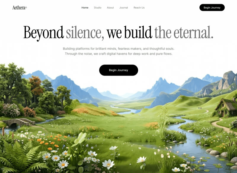 Aethera Studio
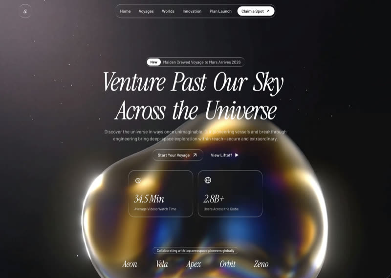 Aetheris Voyage
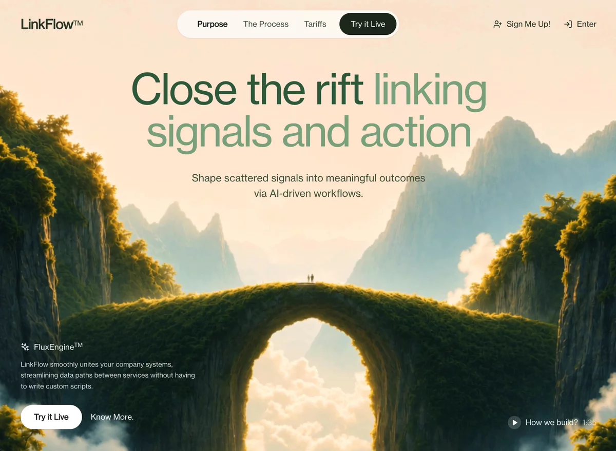 AI Workflow Hero
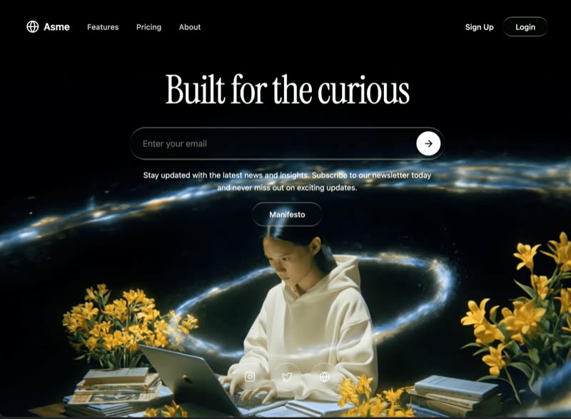 Asme
Asme
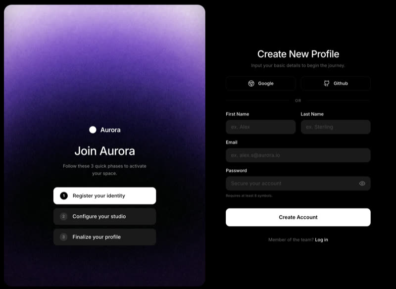 Aurora Onboard
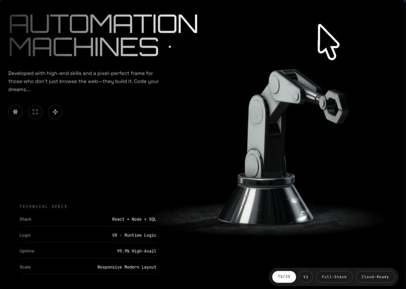 Automation Machines
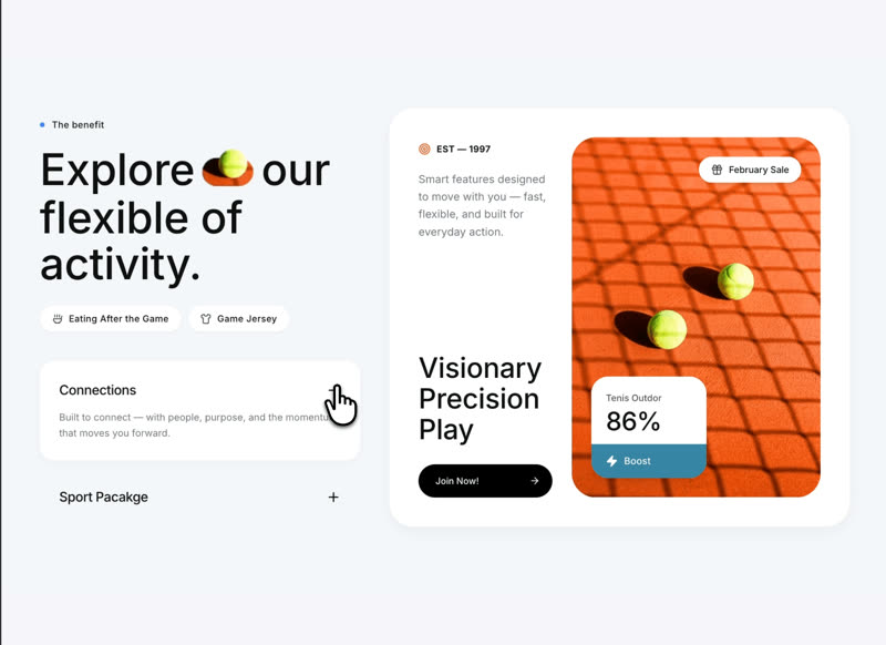 Benefits Features
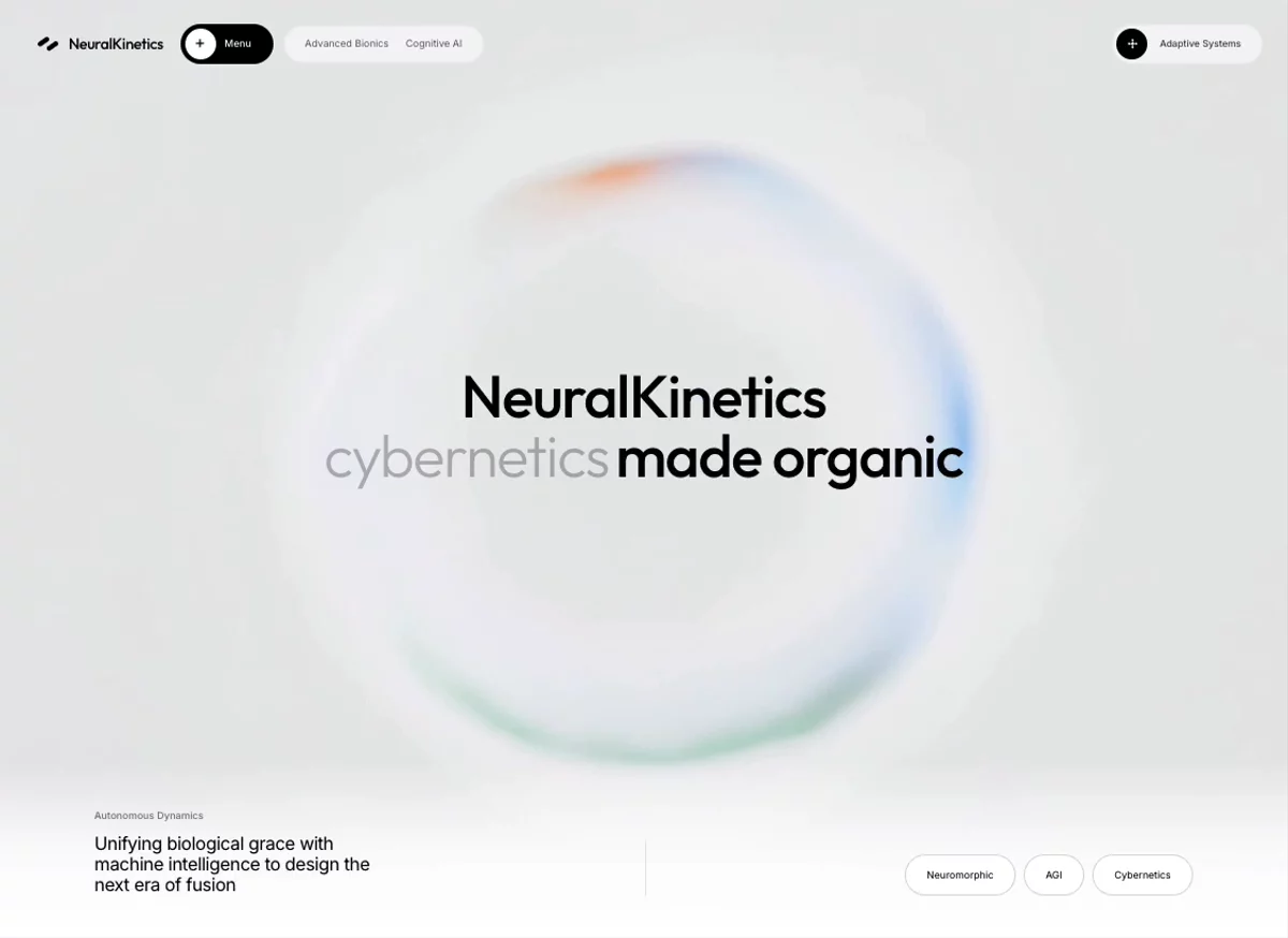 Bio-Digital
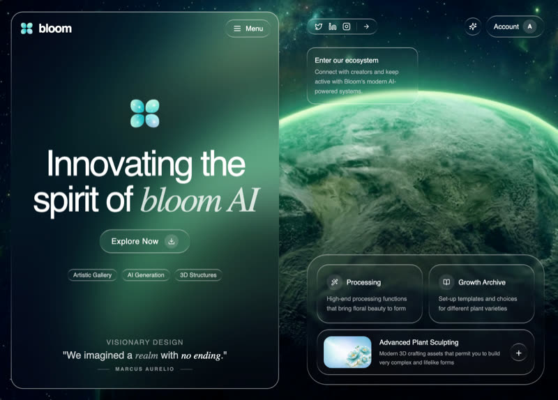 Bloom AI
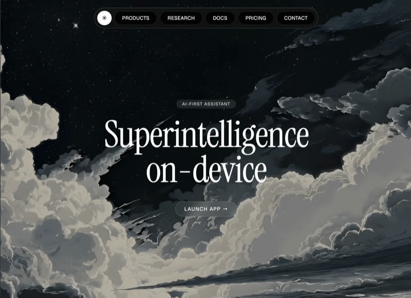 Celestia
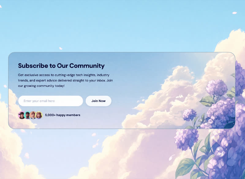 Community CTA
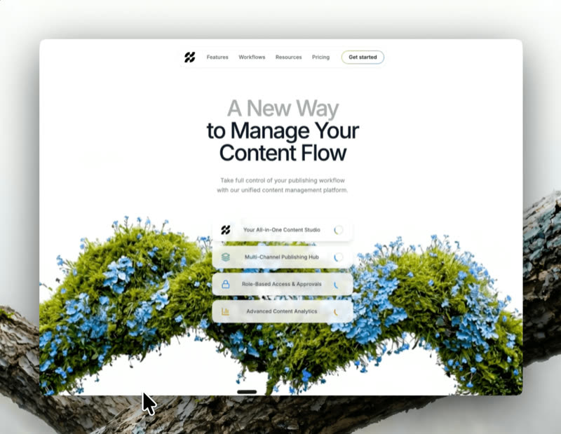 Crypto Wealth
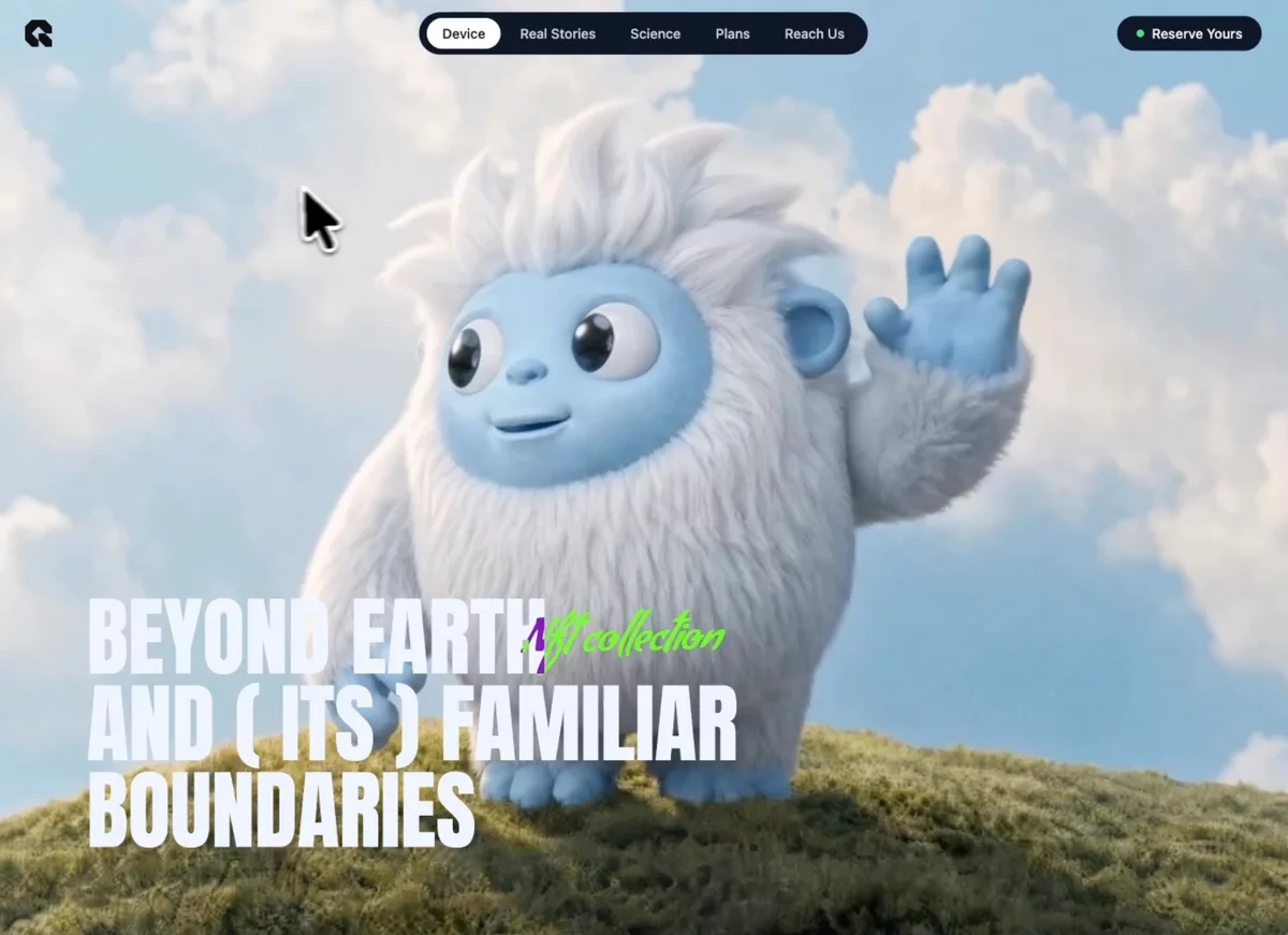 Cursor Follow
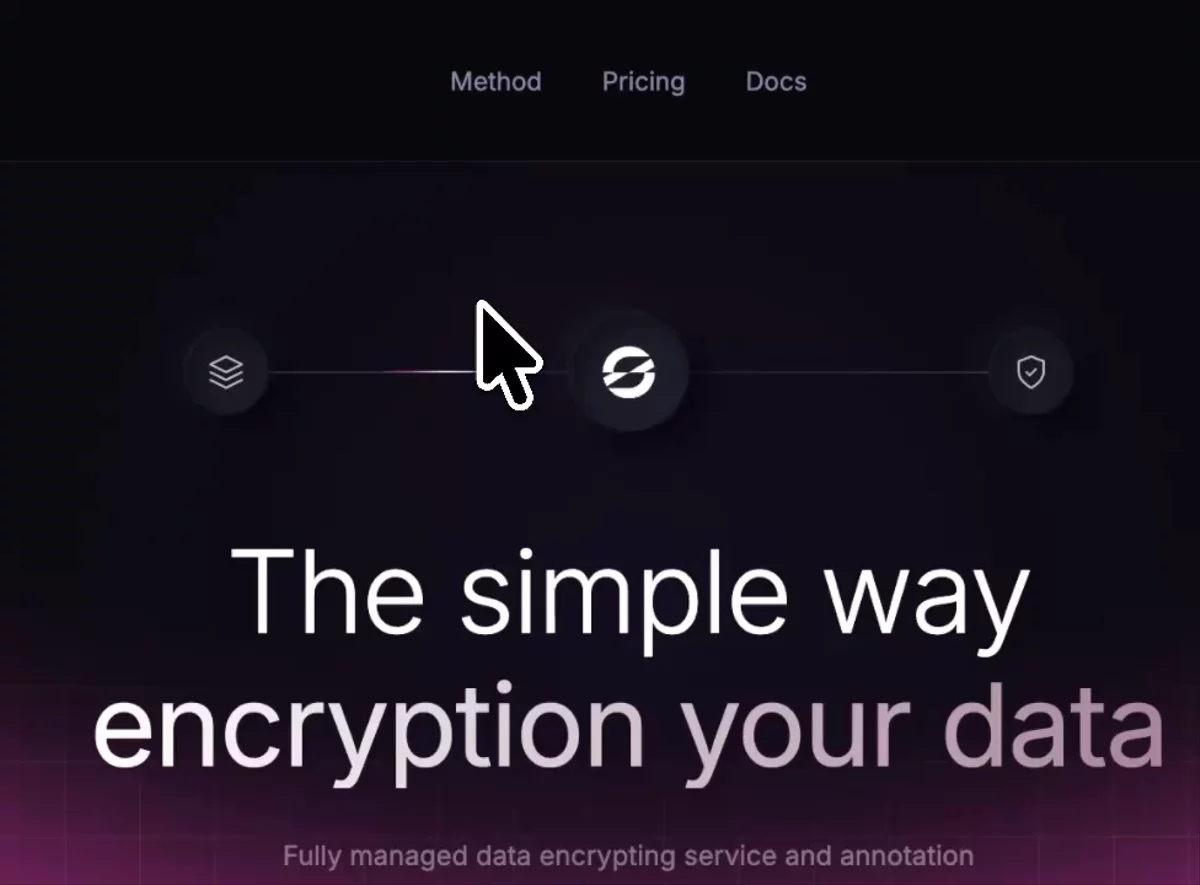 Cybersecurity Hero
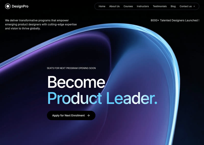 DesignPro Academy
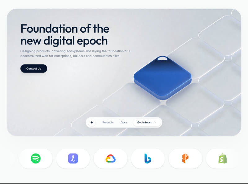 Digital Epoch
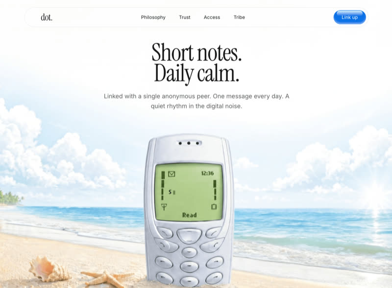 Dot
Dot
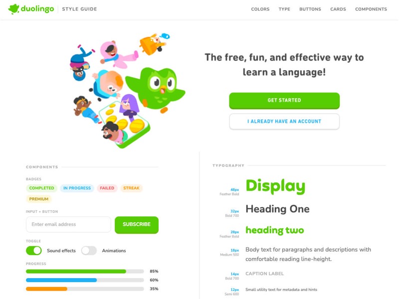 Duolingo Styleguide
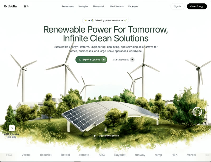 EcoVolta
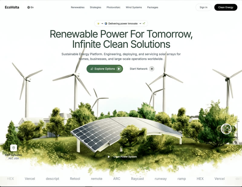 EcoVolta V2
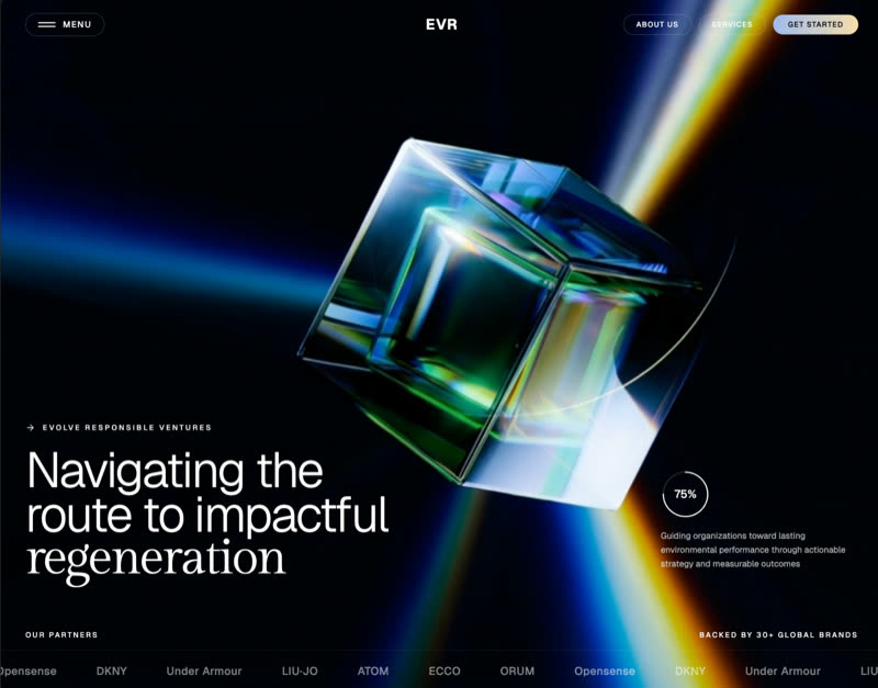 EVR Ventures
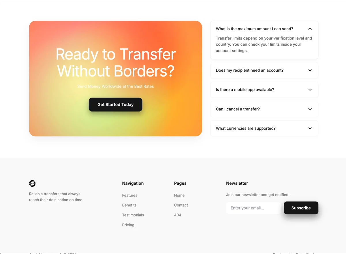 FAQ CTA
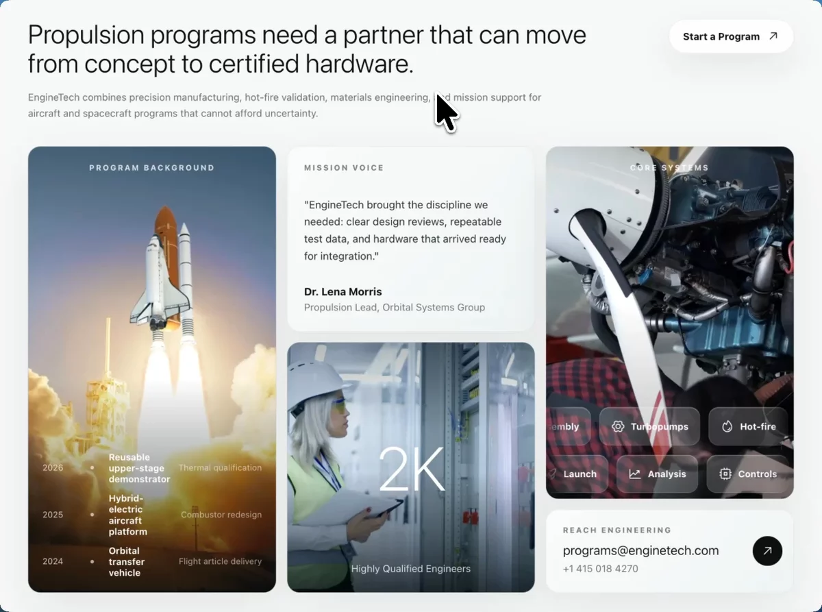 Capabilities Overview
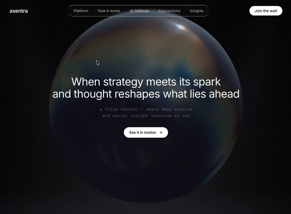 Futuristic Cinematic
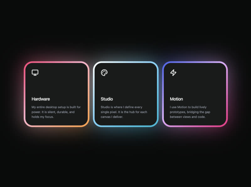 Glow Features
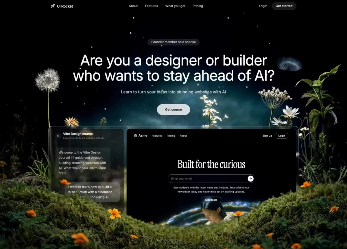 Growth Marketing SaaS
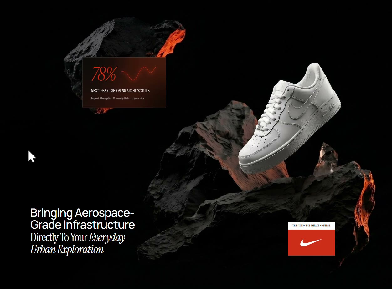 Nike Hover
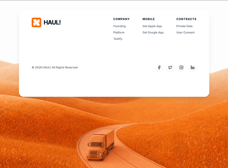 HAUL!
HAUL!
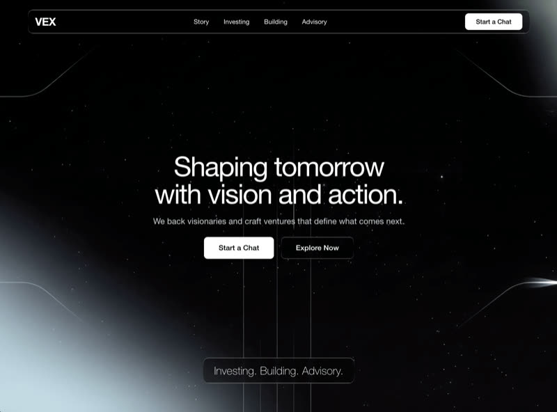 Impressive Hero
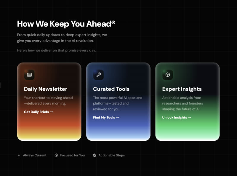 Keep Ahead Features
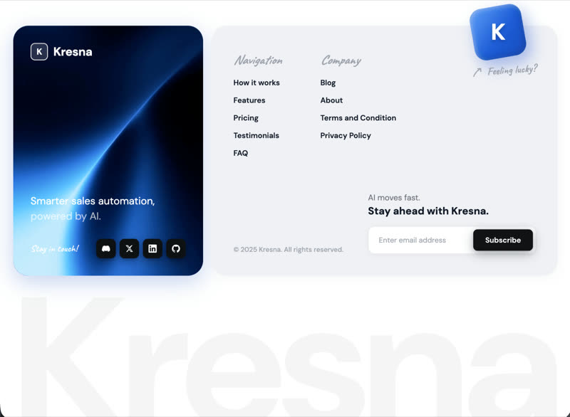 Kresna Footer
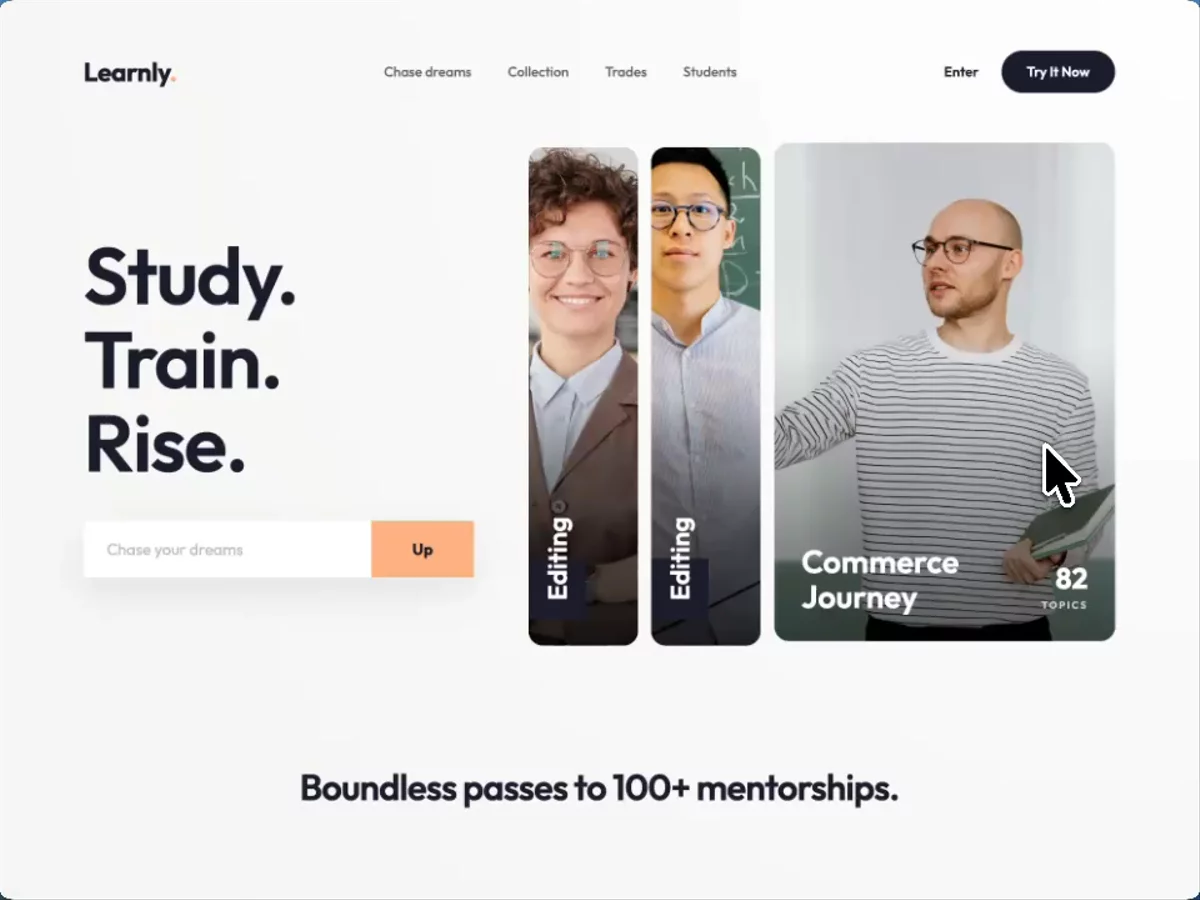 Learnly
Browse & preview free Unlock everything — from $49/mo
Frequently asked questions
Do Meez prompts work with Windsurf?
Yes. Every Meez prompt is a complete written spec — fonts, layout, color tokens, motion and asset URLs — so Windsurf can build it in one paste. The 62 free prompts on this site work exactly like the premium ones; copy one above and try it.
What does Windsurf generate from a prompt?
Windsurf was renamed Devin Desktop by Cognition in June 2026 — same product line: an agentic AI editor whose agent plans multi-file changes in your own repository, any framework, your existing codebase. A Meez prompt slots in as the design brief: the agent decomposes the spec into steps and you review the diff before anything ships.
How do I use a Meez prompt in Windsurf?
Copy the full prompt text and paste it into the agent panel in Windsurf (now Devin Desktop). Don't shorten it — the specificity is what keeps Windsurf from producing a generic layout. Then iterate: swap the copy and point the asset URLs at your own media.
How many prompts are free?
62 prompts are free to copy in full, no account needed. The other 579 unlock with Unlimited — $49/mo, $149/yr, or $299 once for lifetime — along with all 285 motion backgrounds.
Also for: Lovable · Bolt · v0 · Cursor · Claude · Replit · Framer · Webflow · ChatGPT · Figma Make · Gemini · GitHub Copilot · Wix
Not sure which tool? Lovable vs v0 vs Bolt vs Cursor, compared → · All free prompts on one page → · All prompt categories →