Prompts · for Bolt
AI website build-prompts for Bolt
Drop a Meez prompt into Bolt.new and it spins up the project in-browser — fonts, sections, color tokens and animation specs come through ready to preview and deploy. The detailed spec is what stops Bolt from defaulting to the same stock hero everyone ships: you start from a real design and iterate from there.
How to use a Meez prompt in Bolt
- Pick a prompt below (4 on this page are free) or browse the full library — every prompt is a complete art-direction spec: fonts, layout, color system, motion and real asset URLs.
- Copy the whole prompt and paste it into the prompt box on bolt.new. Don’t trim it — the detail is what stops Bolt from defaulting to a generic layout.
- Let it build, then iterate: swap the copy, point the asset URLs at your own media, and ship. The sites you build are yours, commercially.
Free prompts to try in Bolt right now
Cargo GroupHero Section · free prompt · copy-paste
Create a full-viewport hero section for "CARGOX GROUP" logistics company using React, Tailwind CSS, Framer Motion (`motion` package from npm - import from `motion/react`), and `lucide-react` for the hamburger icon.

## Tech Stack
- React 18 + TypeScript + Vite
- Tailwind CSS 3
- `motion` package (v12+) - import `{ motion, AnimatePresence }` from `motion/react`
- `lucide-react` for Menu/X icons
- Google Font: `Barlow Condensed` weight 800 (imported in CSS via `@import url('https://fonts.googleapis.com/css2?family=Barlow+Condensed:wght@800&display=swap')`)

## Global CSS
```css
@import url('https://fonts.googleapis.com/css2?family=Barlow+Condensed:wght@800&display=swap');
@tailwind base;
@tailwind components;
@tailwind utilities;

* { margin: 0; padding: 0; box-sizing: border-box; }
html, body, #root { height: 100%; overflow: hidden; }
body { font-family: Helvetica, Arial, sans-serif; -webkit-font-smoothing: antialiased; -moz-osx-font-smoothing: grayscale; }
```

## Layout Structure
Single full-viewport (`min-height: 100vh`) flex column with `overflow: hidden` and dark fallback `backgroundColor: '#1a1a2e'`. All content is layered above a fullscreen video background.

## Video Background
- Absolute positioned, `inset-0`, `object-cover`, `z-0`
- Attributes: `autoPlay`, `muted`, `loop`, `playsInline`
- URL: `https://meez.design/web/media/bg-videos/269_iz5u1fq9w8.mp4`
- On `onCanPlay`, set a `videoReady` state to `true`
- All content below is wrapped in `<AnimatePresence>` and only renders when `videoReady === true`, fading in with `opacity: 0 -> 1` over 0.3s. The wrapper div uses `className="flex flex-col flex-1 w-full"`.

## Easing
Use a shared constant: `const EXPO_OUT: [number, number, number, number] = [0.16, 1, 0.3, 1];`

## Header (z-50, relative)
- Padding: `clamp(16px, 4vh, 40px) clamp(16px, 3vw, 48px) 0`
- **Logo** (left): Two lines stacked - "CARGOX" in white, "GROUP" in `#ffda00`. Font: `"Barlow Condensed"`, weight 800, size `clamp(22px, min(3.15vh, 2.32vw), 32px)`, line-height 0.9, uppercase, letter-spacing -0.01em. Animates from `opacity:0, y:-20` to visible with EXPO_OUT, duration 0.6.
- **Desktop Nav** (hidden on mobile, flex on md+): Items "Services", "Industries", "Company" each with a chevron-down SVG. Gap: `clamp(20px, 3.8vw, 52px)`. White text, size `clamp(15px, min(1.97vh, 1.45vw), 20px)`, letter-spacing -0.02em. Each item fades in staggered. On hover: color shifts to `#ffda00` with `x: 2`.
- **Mobile Hamburger** (md:hidden): lucide-react `Menu`/`X` icon, white, size 28, toggles a mobile menu overlay.

## Mobile Menu Overlay
- Absolute `inset-0`, z-40, centered flex column, bg `#6682c2`
- Same nav items as buttons, font-size 24px, white, staggered fade-in

## Main Content (z-10, relative)
- `flex-1`, grid: 1 col on mobile, `grid-cols-[2.17fr_1fr]` on lg+
- Padding: `clamp(24px, 8vh, 120px) clamp(16px, 3vw, 48px) 0`
- Gap: `clamp(20px, 4vh, 48px)`

### Left Column - Giant Headline
- Container: `overflow: clip`
- Font: `"Barlow Condensed"`, weight 800, size `clamp(86px, min(14vh, 11vw), 220px)`, line-height 0.78, uppercase, letter-spacing -0.01em
- Three lines with slide-in animations:
  1. "BEYOND" - white, slides from `x: -900` with duration 0.85, delay 0
  2. "BORDERS" - color `#002a35`, `marginLeft: 0.524em`, slides from `x: 900` with duration 0.85, delay 0.13
  3. "AND LIMITS" - white, slides from `x: -900` with duration 0.85, delay 0.26
- All use EXPO_OUT easing

### Right Column
- Flex column, gap: `clamp(16px, 2.66vh, 32px)`

#### Tagline Text
- Font: Helvetica, size `clamp(24px, min(4vh, 3vw), 52px)`, line-height 0.9, letter-spacing -0.02em, color `#002a35`
- Three lines with word-by-word reveal animation (each word slides up from `y:'100%'` with rotateX 45deg):
  1. "Logistics" - marginLeft 0, delay 0.3
  2. "shaped by scale" - marginLeft 1.5em, delay 0.5
  3. "powered by precision" - marginLeft 0, delay 0.7
- Each word has 0.08s stagger, duration 0.6, easing `[0.16, 1, 0.3, 1]`

#### Map Section
- Container: relative, `aspectRatio: '435 / 263'`
- **Map image**: absolute, inset-0, object-contain
  - URL: `https://meez.design/web/bg-previews/109_Motion-Background-101331.jpg`

- **Route Lines SVG Overlay**: absolute, pointer-events-none, positioned at `left: 13.8%`, `top: 24.3%`, `width: 68.7%`, aspectRatio `299/143`
  - SVG viewBox: `0 0 299.037 142.509`, overflow visible
  - 4 animated bezier curve paths in `#FFDA00`, strokeWidth 2.5:
    ```
    M128.161 74.6764C79.9989 130.001 71.9994 46.0005 20.9815 111.737
    M216.999 9.99985C260.499 12.4998 222.499 71.9998 291.999 58.9998
    M130.102 70.9998C144.499 -32.0002 183.852 70.2739 219.999 3.99985
    M14.4999 16.9998C111 20.9998 -53.0003 73.4998 21.4999 107
    ```
  - Each path animates `pathLength: 0->1` with duration 1.1, staggered delay starting at 0.55 + i*0.12
  - Animated arrow polygons (triangles `0,-4 8,0 0,4`) move along each path using `<animateMotion>` with `rotate="auto"`, duration `2.5 + i*0.3`s, infinite repeat
  - 5 stop dots at coordinates: `[9.519, 15.519]`, `[289.519, 59.518]`, `[220.519, 9.519]`, `[125.518, 78.519]`, `[19.519, 104.519]`. Each is a yellow circle (r=9.519, fill `#FFDA00`) with a smaller dark center circle (r=3.389, fill `#002A35`). Spring animation with stiffness 420, damping 14.

- **Transport Icons**: 3 circular white icons absolutely positioned on the map:
  - Ship: `left: 26.0%, top: 28.9%`, delay 2.1, URL: `https://meez.design/web/bg-previews/110_Gradient.jpg`
  - Car: `left: 70.8%, top: 15.6%`, delay 2.2, rotate `9.73deg`, URL: `https://meez.design/web/bg-previews/111_Velvet-Wave.jpg`
  - Plane: `left: 55.2%, top: 52.1%`, delay 2.3, rotate `180deg scaleY(-1)`, URL: `https://meez.design/web/bg-previews/112_Pastel-Mist.jpg`
  - Each icon: `width: 14.9%`, aspect-ratio 1, rounded-full, bg-white, box-shadow `0 4px 12px rgba(0,0,0,0.15)`. On hover: scale 1.12, translateY -4px, enhanced shadow. Spring animation: stiffness 220, damping 16.

- **Map description text**: absolute, hidden on mobile (`hidden sm:block`), positioned `left: 55.6%, top: 89%, width: 44%`. Text: "We ensure full transparency at every stage to build trust and drive results." Size `clamp(12px, min(1.6vh, 1.2vw), 20px)`, color `#002a35`, fades in at delay 2.4.

## Footer (z-10, relative)
- Flex row (column on mobile), space-between, padding: `clamp(12px, 3vh, 32px) clamp(16px, 3vw, 48px) clamp(16px, 5vh, 66px)`

### Left - Stat Block
- Animates from `opacity:0, y:24` with delay 0.45, duration 0.65, EXPO_OUT
- "3M+" in `"Barlow Condensed"` weight 800, size `clamp(52px, min(8vh, 6vw), 98px)`, color `#ffda00`, uppercase
- Description: "tons of cargo / successfully delivered / without delays" - size `clamp(16px, min(1.6vh, 1.2vw), 20px)`, white, line-height 1.25
- Small cargo icon in white circle: `clamp(40px, min(5.5vh, 4vw), 67px)` diameter, URL: `https://meez.design/web/bg-previews/113_Neon-Flux.jpg`

### Right - CTA Button
- Custom SVG pill shape with a circle cutout on the right. Fill `#ffda00`. The full SVG path:
  ```
  M316 0C329.08 0 340.435 7.38674 346.121 18.2162C348.618 22.9736 353.086 26.8535 358.459 26.8535H359.252C364.667 26.8535 369.155 22.9169 371.63 18.1007C377.159 7.34039 388.205 0.00015843 400.931 0C419.195 0 434.001 15.1191 434.001 33.7695L433.99 34.6416C433.537 52.8891 418.909 67.5391 400.931 67.5391C387.96 67.5389 376.734 59.9132 371.317 48.8128C368.923 43.9077 364.427 39.873 358.969 39.873C353.492 39.873 348.986 43.9356 346.589 48.8605C341.074 60.1913 329.449 68 316 68H34.001C15.2233 68 0 52.7777 0 34C0 15.2223 15.2233 0 34.001 0H316ZM400.931 2.44141C384.063 2.44163 370.303 16.419 370.303 33.7695C370.303 51.1201 384.063 65.0974 400.931 65.0977C417.798 65.0977 431.56 51.1202 431.56 33.7695C431.56 16.4189 417.798 2.44141 400.931 2.44141Z
  ```
- ViewBox: `0 0 434.001 68`, preserveAspectRatio `none`
- Size: full-width on mobile (h-56px), on sm+: `h-[clamp(48px,min(6vh,4.5vw),68px)]` with `aspect-[434/68]`
- **Arrow** in the circle cutout: SVG arrow (`viewBox="0 0 16.89 20.37"`, white stroke, strokeWidth 2.2) that rotates from `-135deg` to `-90deg` on hover with 0.35s transition
- **Label**: "Get in touch", centered in the pill area (excluding circle), color `#002a35`, size `clamp(14px, min(1.6vh, 1.2vw), 20px)`
- Animates in from `opacity:0, x:60` with delay 0.5. whileHover: scale 1.08, y:-2. whileTap: scale 0.97.

## Color Palette
- Primary dark: `#002a35`
- White: `#ffffff`
- Accent yellow: `#ffda00`
- Fallback bg: `#1a1a2e`
- Mobile menu bg: `#6682c2`

## Key Behaviors
1. All animations are gated behind `videoReady` state - nothing animates until the video fires `onCanPlay`
2. The entire content fades in once the video is ready
3. All content (header, main, footer) uses `relative z-10` or `z-50` to layer above the video (z-0)
4. Fully responsive: single column on mobile, 2-column grid on lg+
5. Mobile hamburger menu with overlay on md breakpoint

---

## Source Code

<!DOCTYPE html>
<html lang="en">
<head>
  <meta charset="UTF-8" />
  <meta name="viewport" content="width=device-width, initial-scale=1.0" />
  <title>CARGOX Group - Beyond Borders and Limits</title>
  <link href="https://fonts.googleapis.com/css2?family=Barlow+Condensed:wght@800&display=swap" rel="stylesheet">
  <style>
    *, *::before, *::after { margin: 0; padding: 0; box-sizing: border-box; }
    html, body { height: 100%; overflow: hidden; }
    body { font-family: Helvetica, Arial, sans-serif; -webkit-font-smoothing: antialiased; -moz-osx-font-smoothing: grayscale; }

    .hero-wrapper {
      width: 100%;
      display: flex;
      flex-direction: column;
      position: relative;
      min-height: 100vh;
      overflow: hidden;
      font-family: Helvetica, Arial, sans-serif;
      background-color: #1a1a2e;
    }

    .video-bg {
      position: absolute;
      inset: 0;
      width: 100%;
      height: 100%;
      object-fit: cover;
      z-index: 0;
    }

    .content-wrapper {
      display: flex;
      flex-direction: column;
      flex: 1;
      width: 100%;
      opacity: 0;
      transition: opacity 0.3s ease;
    }
    .content-wrapper.visible { opacity: 1; }

    /* Header */
    .header {
      display: flex;
      align-items: center;
      justify-content: space-between;
      flex-shrink: 0;
      position: relative;
      z-index: 50;
      padding: clamp(16px, 4vh, 40px) clamp(16px, 3vw, 48px) 0;
    }

    .logo {
      font-family: "Barlow Condensed", sans-serif;
      font-weight: 800;
      font-size: clamp(22px, min(3.15vh, 2.32vw), 32px);
      line-height: 0.9;
      letter-spacing: -0.01em;
      text-transform: uppercase;
      opacity: 0;
      transform: translateY(-20px);
      transition: opacity 0.6s cubic-bezier(0.16, 1, 0.3, 1), transform 0.6s cubic-bezier(0.16, 1, 0.3, 1);
    }
    .logo.animate { opacity: 1; transform: translateY(0); }
    .logo-white { color: #ffffff; }
    .logo-yellow { color: #ffda00; }

    .nav {
      display: flex;
      align-items: center;
      gap: clamp(20px, 3.8vw, 52px);
      opacity: 0;
      transform: translateY(-20px);
      transition: opacity 0.6s cubic-bezier(0.16, 1, 0.3, 1) 0.08s, transform 0.6s cubic-bezier(0.16, 1, 0.3, 1) 0.08s;
    }
    .nav.animate { opacity: 1; transform: translateY(0); }

    .nav-item {
      display: flex;
      align-items: center;
      gap: 4px;
      background: transparent;
      border: none;
      cursor: pointer;
      color: #ffffff;
      font-size: clamp(15px, min(1.97vh, 1.45vw), 20px);
      letter-spacing: -0.02em;
      font-family: Helvetica, Arial, sans-serif;
      opacity: 0;
      transition: opacity 0.4s ease, color 0.1s ease, transform 0.1s ease;
    }
    .nav-item.animate { opacity: 1; }
    .nav-item:hover { color: #ffda00; transform: translateX(2px); }
    .nav-item svg { width: 0.9em; height: 0.9em; }

    .hamburger {
      display: none;
      align-items: center;
      justify-content: center;
      background: transparent;
      border: none;
      cursor: pointer;
      color: #ffffff;
      width: 40px;
      height: 40px;
    }

    /* Main */
    .main-content {
      flex: 1;
      overflow: hidden;
      display: grid;
      grid-template-columns: 2.17fr 1fr;
      position: relative;
      z-index: 10;
      padding: clamp(24px, 8vh, 120px) clamp(16px, 3vw, 48px) 0;
      gap: clamp(20px, 4vh, 48px);
    }

    /* Headline */
    .headline-container { overflow: clip; }
    .headline {
      font-family: "Barlow Condensed", sans-serif;
      font-weight: 800;
      font-size: clamp(86px, min(14vh, 11vw), 220px);
      line-height: 0.78;
      letter-spacing: -0.01em;
      text-transform: uppercase;
    }
    .headline-line {
      opacity: 0;
      transition: transform 0.85s cubic-bezier(0.16, 1, 0.3, 1), opacity 0.85s cubic-bezier(0.16, 1, 0.3, 1);
    }
    .headline-line.line-1 { color: #ffffff; transform: translateX(-900px); }
    .headline-line.line-2 { color: #002a35; margin-left: 0.524em; transform: translateX(900px); }
    .headline-line.line-3 { color: #ffffff; transform: translateX(-900px); }
    .headline-line.animate { opacity: 1; transform: translateX(0); }

    /* Right column */
    .right-col {
      display: flex;
      flex-direction: column;
      gap: clamp(16px, 2.66vh, 32px);
    }

    /* Tagline */
    .tagline {
      font-family: Helvetica, Arial, sans-serif;
      font-size: clamp(24px, min(4vh, 3vw), 52px);
      line-height: 0.9;
      letter-spacing: -0.02em;
      color: #002a35;
    }
    .tagline-line { white-space: nowrap; overflow: visible; }
    .tagline-line + .tagline-line { margin-top: 0.3em; }
    .tagline-line-2 { margin-left: 1.5em; }

    .tagline-word {
      display: inline-block;
      margin-right: 0.25em;
      opacity: 0;
      transform: translateY(100%) perspective(600px) rotateX(45deg);
      transition: transform 0.6s cubic-bezier(0.16, 1, 0.3, 1), opacity 0.6s cubic-bezier(0.16, 1, 0.3, 1);
    }
    .tagline-word.animate { opacity: 1; transform: translateY(0) perspective(600px) rotateX(0deg); }

    /* Map */
    .map-container { position: relative; width: 100%; aspect-ratio: 435 / 263; }
    .map-img { position: absolute; inset: 0; width: 100%; height: 100%; object-fit: contain; }

    .routes-overlay {
      position: absolute;
      pointer-events: none;
      left: 13.8%;
      top: 24.3%;
      width: 68.7%;
      aspect-ratio: 299 / 143;
    }
    .routes-svg { width: 100%; height: 100%; overflow: visible; }

    .route-path {
      stroke: #FFDA00;
      stroke-width: 2.5;
      fill: none;
      stroke-dasharray: 1000;
      stroke-dashoffset: 1000;
      opacity: 0;
    }
    .route-path.animate { opacity: 1; animation: drawPath 1.1s ease-in-out forwards; }
    @keyframes drawPath { to { stroke-dashoffset: 0; } }

    .transport-icon {
      position: absolute;
      width: 14.9%;
      aspect-ratio: 1;
      border-radius: 50%;
      background: white;
      display: flex;
      align-items: center;
      justify-content: center;
      overflow: hidden;
      cursor: pointer;
      box-shadow: 0 4px 12px rgba(0,0,0,0.15);
      transform: scale(0);
      opacity: 0;
      transition: transform 0.5s cubic-bezier(0.34, 1.56, 0.64, 1), opacity 0.3s ease, box-shadow 0.2s ease;
    }
    .transport-icon.animate { transform: scale(1); opacity: 1; }
    .transport-icon:hover { transform: scale(1.12) translateY(-4px) !important; box-shadow: 0 8px 24px rgba(0,0,0,0.25); }
    .transport-icon img { width: 80%; height: 80%; object-fit: cover; }

    .stop-dot { transform-box: fill-box; transform-origin: center; transform: scale(0); }
    .stop-dot.animate { animation: popIn 0.4s cubic-bezier(0.34, 1.56, 0.64, 1) forwards; }
    @keyframes popIn { to { transform: scale(1); } }

    .map-desc {
      position: absolute;
      left: 55.6%;
      top: 89%;
      width: 44%;
      font-family: Helvetica, Arial, sans-serif;
      font-size: clamp(12px, min(1.6vh, 1.2vw), 20px);
      line-height: 1.25;
      letter-spacing: -0.02em;
      color: #002a35;
      opacity: 0;
      transition: opacity 0.6s ease;
    }
    .map-desc.animate { opacity: 1; }

    /* Footer */
    .footer {
      display: flex;
      align-items: center;
      justify-content: space-between;
      flex-shrink: 0;
      position: relative;
      z-index: 10;
      padding: clamp(12px, 3vh, 32px) clamp(16px, 3vw, 48px) clamp(16px, 5vh, 66px);
    }

    .stat-block {
      display: flex;
      align-items: center;
      gap: 0.9em;
      opacity: 0;
      transform: translateY(24px);
      transition: opacity 0.65s cubic-bezier(0.16, 1, 0.3, 1), transform 0.65s cubic-bezier(0.16, 1, 0.3, 1);
    }
    .stat-block.animate { opacity: 1; transform: translateY(0); }

    .stat-number {
      font-family: "Barlow Condensed", sans-serif;
      font-weight: 800;
      font-size: clamp(52px, min(8vh, 6vw), 98px);
      line-height: 1;
      color: #ffda00;
      text-transform: uppercase;
      letter-spacing: -0.01em;
    }
    .stat-text {
      font-size: clamp(16px, min(1.6vh, 1.2vw), 20px);
      line-height: 1.25;
      letter-spacing: -0.02em;
      color: #ffffff;
    }
    .stat-icon {
      position: relative;
      flex-shrink: 0;
      border-radius: 50%;
      background: white;
      overflow: hidden;
      width: clamp(40px, min(5.5vh, 4vw), 67px);
      aspect-ratio: 1;
    }
    .stat-icon img { position: absolute; inset: 0; width: 100%; height: 100%; object-fit: contain; padding: 10%; }

    /* CTA */
    .cta-btn {
      position: relative;
      cursor: pointer;
      border: none;
      background: transparent;
      padding: 0;
      height: clamp(48px, min(6vh, 4.5vw), 68px);
      aspect-ratio: 434 / 68;
      opacity: 0;
      transform: translateX(60px);
      transition: opacity 0.7s cubic-bezier(0.16, 1, 0.3, 1), transform 0.7s cubic-bezier(0.16, 1, 0.3, 1);
    }
    .cta-btn.animate { opacity: 1; transform: translateX(0); }
    .cta-btn:hover { transform: scale(1.08) translateY(-2px); }
    .cta-btn:active { transform: scale(0.97) translateY(0); }
    .cta-btn svg.cta-shape { position: absolute; inset: 0; width: 100%; height: 100%; }

    .cta-arrow-wrap {
      position: absolute;
      right: 0;
      top: 3.59%;
      width: clamp(42px, 14.43%, 62px);
      height: 92.15%;
      display: flex;
      align-items: center;
      justify-content: center;
    }
    .cta-arrow {
      width: 40%;
      transform: rotate(-135deg);
      transition: transform 0.35s cubic-bezier(0.25, 0.46, 0.45, 0.94);
    }
    .cta-btn:hover .cta-arrow { transform: rotate(-90deg); }

    .cta-label {
      position: absolute;
      left: 0;
      right: 14.43%;
      top: 50%;
      transform: translateY(-50%);
      text-align: center;
      font-family: Helvetica, Arial, sans-serif;
      font-size: clamp(14px, min(1.6vh, 1.2vw), 20px);
      color: #002a35;
      letter-spacing: 0.01em;
      white-space: nowrap;
      pointer-events: none;
    }

    /* Mobile */
    @media (max-width: 767px) {
      .nav { display: none !important; }
      .hamburger { display: flex; }
      .main-content { grid-template-columns: 1fr; }
      .footer { flex-direction: column; gap: 16px; }
      .cta-btn { width: 100%; height: 56px; aspect-ratio: unset; }
      .map-desc { display: none; }
    }
    @media (min-width: 768px) {
      .hamburger { display: none; }
    }

    /* Mobile overlay */
    .mobile-overlay {
      display: none;
      position: absolute;
      inset: 0;
      z-index: 40;
      flex-direction: column;
      align-items: center;
      justify-content: center;
      background-color: #6682c2;
    }
    .mobile-overlay.open { display: flex; }
    .mobile-overlay button {
      background: transparent;
      border: none;
      cursor: pointer;
      padding: 16px;
      color: #ffffff;
      font-size: 24px;
      letter-spacing: -0.02em;
      font-family: Helvetica, Arial, sans-serif;
    }
  </style>
</head>
<body>
  <div class="hero-wrapper">
    <video class="video-bg" autoplay muted loop playsinline id="bgVideo"
      src="https://meez.design/web/media/bg-videos/273_jzl38mcglu.mp4">
    </video>

    <div class="content-wrapper" id="contentWrapper">
      <!-- Header -->
      <header class="header">
        <div class="logo" id="logo">
          <div class="logo-white">CARGOX</div>
          <div class="logo-yellow">GROUP</div>
        </div>

        <nav class="nav" id="nav">
          <button class="nav-item" style="transition-delay: 0.1s">
            Services
            <svg width="24" height="24" viewBox="0 0 24 24" fill="none"><path d="M6 9L12 15L18 9" stroke="currentColor" stroke-width="1.5" stroke-linecap="square" stroke-linejoin="round"/></svg>
          </button>
          <button class="nav-item" style="transition-delay: 0.16s">
            Industries
            <svg width="24" height="24" viewBox="0 0 24 24" fill="none"><path d="M6 9L12 15L18 9" stroke="currentColor" stroke-width="1.5" stroke-linecap="square" stroke-linejoin="round"/></svg>
          </button>
          <button class="nav-item" style="transition-delay: 0.22s">
            Company
            <svg width="24" height="24" viewBox="0 0 24 24" fill="none"><path d="M6 9L12 15L18 9" stroke="currentColor" stroke-width="1.5" stroke-linecap="square" stroke-linejoin="round"/></svg>
          </button>
        </nav>

        <button class="hamburger" id="hamburgerBtn">
          <svg width="28" height="28" viewBox="0 0 24 24" fill="none" stroke="currentColor" stroke-width="2" stroke-linecap="round" stroke-linejoin="round"><line x1="3" y1="6" x2="21" y2="6"/><line x1="3" y1="12" x2="21" y2="12"/><line x1="3" y1="18" x2="21" y2="18"/></svg>
        </button>
      </header>

      <!-- Mobile overlay -->
      <div class="mobile-overlay" id="mobileOverlay">
        <button>Services</button>
        <button>Industries</button>
        <button>Company</button>
      </div>

      <!-- Main -->
      <main class="main-content">
        <!-- Left headline -->
        <div class="headline-container">
          <div class="headline">
            <div class="headline-line line-1" id="hl1">BEYOND</div>
            <div class="headline-line line-2" id="hl2">BORDERS</div>
            <div class="headline-line line-3" id="hl3">AND LIMITS</div>
          </div>
        </div>

        <!-- Right column -->
        <div class="right-col">
          <!-- Tagline -->
          <div class="tagline">
            <div class="tagline-line">
              <span class="tagline-word" style="transition-delay: 0.3s">Logistics</span>
            </div>
            <div class="tagline-line tagline-line-2">
              <span class="tagline-word" style="transition-delay: 0.5s">shaped</span>
              <span class="tagline-word" style="transition-delay: 0.58s">by</span>
              <span class="tagline-word" style="transition-delay: 0.66s">scale</span>
            </div>
            <div class="tagline-line">
              <span class="tagline-word" style="transition-delay: 0.7s">powered</span>
              <span class="tagline-word" style="transition-delay: 0.78s">by</span>
              <span class="tagline-word" style="transition-delay: 0.86s">precision</span>
            </div>
          </div>

          <!-- Map -->
          <div class="map-container">
            <img class="map-img" src="https://meez.design/web/bg-previews/114_Soft-Horizon.jpg" alt="World map" />

            <!-- Route lines -->
            <div class="routes-overlay">
              <svg class="routes-svg" viewBox="0 0 299.037 142.509" fill="none">
                <!-- Path 1 -->
                <path class="route-path" id="rp0" d="M128.161 74.6764C79.9989 130.001 71.9994 46.0005 20.9815 111.737"/>
                <!-- Path 2 -->
                <path class="route-path" id="rp1" d="M216.999 9.99985C260.499 12.4998 222.499 71.9998 291.999 58.9998"/>
                <!-- Path 3 -->
                <path class="route-path" id="rp2" d="M130.102 70.9998C144.499 -32.0002 183.852 70.2739 219.999 3.99985"/>
                <!-- Path 4 -->
                <path class="route-path" id="rp3" d="M14.4999 16.9998C111 20.9998 -53.0003 73.4998 21.4999 107"/>

                <!-- Animated arrows -->
                <g id="arrows" style="opacity: 0">
                  <polygon points="0,-4 8,0 0,4" fill="#FFDA00">
                    <animateMotion dur="2.5s" repeatCount="indefinite" rotate="auto" path="M128.161 74.6764C79.9989 130.001 71.9994 46.0005 20.9815 111.737"/>
                  </polygon>
                  <polygon points="0,-4 8,0 0,4" fill="#FFDA00">
                    <animateMotion dur="2.8s" repeatCount="indefinite" rotate="auto" path="M216.999 9.99985C260.499 12.4998 222.499 71.9998 291.999 58.9998"/>
                  </polygon>
                  <polygon points="0,-4 8,0 0,4" fill="#FFDA00">
                    <animateMotion dur="3.1s" repeatCount="indefinite" rotate="auto" path="M130.102 70.9998C144.499 -32.0002 183.852 70.2739 219.999 3.99985"/>
                  </polygon>
                  <polygon points="0,-4 8,0 0,4" fill="#FFDA00">
                    <animateMotion dur="3.4s" repeatCount="indefinite" rotate="auto" path="M14.4999 16.9998C111 20.9998 -53.0003 73.4998 21.4999 107"/>
                  </polygon>
                </g>

                <!-- Stop dots -->
                <circle class="stop-dot" id="sd0" cx="9.519" cy="15.519" r="9.519" fill="#FFDA00"/>
                <circle class="stop-dot" id="sd0i" cx="9.447" cy="15.447" r="3.389" fill="#002A35"/>
                <circle class="stop-dot" id="sd1" cx="289.519" cy="59.518" r="9.519" fill="#FFDA00"/>
                <circle class="stop-dot" id="sd1i" cx="289.447" cy="59.446" r="3.389" fill="#002A35"/>
                <circle class="stop-dot" id="sd2" cx="220.519" cy="9.519" r="9.519" fill="#FFDA00"/>
                <circle class="stop-dot" id="sd2i" cx="220.447" cy="9.447" r="3.389" fill="#002A35"/>
                <circle class="stop-dot" id="sd3" cx="125.518" cy="78.519" r="9.519" fill="#FFDA00"/>
                <circle class="stop-dot" id="sd3i" cx="125.446" cy="78.447" r="3.389" fill="#002A35"/>
                <circle class="stop-dot" id="sd4" cx="19.519" cy="104.519" r="9.519" fill="#FFDA00"/>
                <circle class="stop-dot" id="sd4i" cx="19.447" cy="104.447" r="3.389" fill="#002A35"/>
              </svg>
            </div>

            <!-- Transport icons -->
            <div class="transport-icon" id="ti0" style="left: 26.0%; top: 28.9%;">
              <img src="https://meez.design/web/bg-previews/115_Background-064209.jpg" alt="Ship"/>
            </div>
            <div class="transport-icon" id="ti1" style="left: 70.8%; top: 15.6%;">
              <img src="https://meez.design/web/bg-previews/116_Background-064122.jpg" alt="Car" style="transform: rotate(9.73deg)"/>
            </div>
            <div class="transport-icon" id="ti2" style="left: 55.2%; top: 52.1%;">
              <img src="https://meez.design/web/bg-previews/117_Background-01.jpg" alt="Plane" style="transform: rotate(180deg) scaleY(-1)"/>
            </div>

            <!-- Map description -->
            <p class="map-desc" id="mapDesc">We ensure full transparency at every stage to build trust and drive results.</p>
          </div>
        </div>
      </main>

      <!-- Footer -->
      <footer class="footer">
        <div class="stat-block" id="statBlock">
          <div class="stat-number">3M+</div>
          <div class="stat-text">
            <div>tons of cargo</div>
            <div>successfully delivered</div>
            <div>without delays</div>
          </div>
          <div class="stat-icon">
            <img src="https://meez.design/web/bg-previews/118_Background-02.jpg" alt="Cargo"/>
          </div>
        </div>

        <button class="cta-btn" id="ctaBtn">
          <svg class="cta-shape" viewBox="0 0 434.001 68" preserveAspectRatio="none" fill="#ffda00" fill-rule="evenodd">
            <path d="M316 0C329.08 0 340.435 7.38674 346.121 18.2162C348.618 22.9736 353.086 26.8535 358.459 26.8535H359.252C364.667 26.8535 369.155 22.9169 371.63 18.1007C377.159 7.34039 388.205 0.00015843 400.931 0C419.195 0 434.001 15.1191 434.001 33.7695L433.99 34.6416C433.537 52.8891 418.909 67.5391 400.931 67.5391C387.96 67.5389 376.734 59.9132 371.317 48.8128C368.923 43.9077 364.427 39.873 358.969 39.873C353.492 39.873 348.986 43.9356 346.589 48.8605C341.074 60.1913 329.449 68 316 68H34.001C15.2233 68 0 52.7777 0 34C0 15.2223 15.2233 0 34.001 0H316ZM400.931 2.44141C384.063 2.44163 370.303 16.419 370.303 33.7695C370.303 51.1201 384.063 65.0974 400.931 65.0977C417.798 65.0977 431.56 51.1202 431.56 33.7695C431.56 16.4189 417.798 2.44141 400.931 2.44141Z"/>
          </svg>
          <div class="cta-arrow-wrap">
            <svg class="cta-arrow" viewBox="0 0 16.89 20.37" fill="none">
              <path d="M8.44473 1.0994V18.8164M1.55479 11.9264L8.44473 18.8164L15.3347 11.9264" stroke="white" stroke-linecap="square" stroke-width="2.2"/>
            </svg>
          </div>
          <span class="cta-label">Get in touch</span>
        </button>
      </footer>
    </div>
  </div>

  <script>
    const video = document.getElementById('bgVideo');
    const content = document.getElementById('contentWrapper');

    function initAnimations() {
      content.classList.add('visible');

      // Header
      setTimeout(() => document.getElementById('logo').classList.add('animate'), 0);
      setTimeout(() => document.getElementById('nav').classList.add('animate'), 80);
      document.querySelectorAll('.nav-item').forEach((item, i) => {
        setTimeout(() => item.classList.add('animate'), 100 + i * 60);
      });

      // Headlines
      setTimeout(() => document.getElementById('hl1').classList.add('animate'), 0);
      setTimeout(() => document.getElementById('hl2').classList.add('animate'), 130);
      setTimeout(() => document.getElementById('hl3').classList.add('animate'), 260);

      // Tagline words
      document.querySelectorAll('.tagline-word').forEach(word => {
        const delay = parseFloat(word.style.transitionDelay) * 1000;
        setTimeout(() => word.classList.add('animate'), delay);
      });

      // Route paths
      const paths = document.querySelectorAll('.route-path');
      paths.forEach((path, i) => {
        const len = path.getTotalLength();
        path.style.strokeDasharray = len;
        path.style.strokeDashoffset = len;
        setTimeout(() => {
          path.classList.add('animate');
          path.style.strokeDashoffset = '0';
          path.style.transition = `stroke-dashoffset 1.1s ease-in-out, opacity 0.01s`;
        }, 550 + i * 120);
      });

      // Arrows
      setTimeout(() => document.getElementById('arrows').style.opacity = '1', 1600);

      // Stop dots
      for (let i = 0; i < 5; i++) {
        setTimeout(() => {
          document.getElementById('sd' + i).classList.add('animate');
        }, 1650 + i * 90);
        setTimeout(() => {
          document.getElementById('sd' + i + 'i').classList.add('animate');
        }, 1720 + i * 90);
      }

      // Transport icons
      setTimeout(() => document.getElementById('ti0').classList.add('animate'), 2100);
      setTimeout(() => document.getElementById('ti1').classList.add('animate'), 2200);
      setTimeout(() => document.getElementById('ti2').classList.add('animate'), 2300);

      // Map description
      setTimeout(() => document.getElementById('mapDesc').classList.add('animate'), 2400);

      // Footer
      setTimeout(() => document.getElementById('statBlock').classList.add('animate'), 450);
      setTimeout(() => document.getElementById('ctaBtn').classList.add('animate'), 500);
    }

    video.addEventListener('canplay', function handler() {
      video.removeEventListener('canplay', handler);
      initAnimations();
    });

    // Fallback if video is already cached
    if (video.readyState >= 3) {
      initAnimations();
    }

    // Mobile menu toggle
    const hamburgerBtn = document.getElementById('hamburgerBtn');
    const mobileOverlay = document.getElementById('mobileOverlay');
    hamburgerBtn.addEventListener('click', () => {
      mobileOverlay.classList.toggle('open');
    });
  </script>
</body>
</html>
Wellness BalanceHero Section · free prompt · copy-paste
Create a single-page hero landing for a wellness/supplements brand called "TerraElix" using React + Tailwind CSS + Lucide React icons. The page is a full-viewport hero with a background image, navbar, headline with word-by-word reveal animations, CTA section, and a 3-panel footer strip. It must be fully responsive (mobile, tablet, desktop).

---

## Fonts

Import from Google Fonts:
- **DM Sans** (weights 400, 500) -- used for brand name, nav links, headline, panel 1 text
- **Inter** (weights 400, 500) -- used for buttons, body text, panel 2/3 text

---

## Background

Full-screen background image covering the entire viewport:
```
url: https://meez.design/web/bg-previews/190_Blue-Purple-Glow.jpg
background-size: cover; background-position: center; background-repeat: no-repeat;
```

---

## Layout Structure

```
<div> (min-h-screen, flex flex-col, relative, overflow-hidden)
  <nav> -- navbar
  <section> -- hero content (flex-1, flex col, justify-center)
  <div> -- mobile/tablet product image (visible below lg)
  <div> -- 3-panel grid footer
  <img> -- desktop floating product image (absolute, hidden below lg)
</div>
```

---

## Navbar

- **Left:** Brand name "TerraElix" -- white, DM Sans 500, 30px, letter-spacing -0.05em
- **Center (desktop only, hidden on mobile):** Nav links "About", "Products", "Promotions", "Contact" -- DM Sans 500, 18px, text-white/90, gap 10 (lg)
- **Right:** Row of icon buttons + avatar + mobile menu toggle
  - Search icon (Lucide `Search`, size 20, strokeWidth 1.5)
  - Shopping bag icon (Lucide `ShoppingBag`, size 20, strokeWidth 1.5)
  - Return icon (Lucide `CornerUpLeft`, size 20, strokeWidth 1.5)
  - Round avatar image (w-8 h-8, lg:w-10 lg:h-10, rounded-full, object-cover):
    ```
    https://meez.design/web/bg-previews/191_Motion-Background-2.jpg
    ```
  - Hamburger menu button (md:hidden, Lucide `Menu` / `X` toggle)

- **Mobile overlay menu:** fixed inset-0 bg-black/90 z-30 with centered nav links (text-2xl, white)

Padding: px-5 sm:px-8 lg:px-10, py-4 lg:py-5

---

## Hero Headline

Font: DM Sans, weight 400, letter-spacing -0.05em

Responsive sizes:
- Base: 48px/50px line-height
- sm: 80px/72px
- md: 110px/95px
- lg: 130px/110px
- xl: 155px/125px

Text layout (3 lines):
```
Line 1: "The" (white) "Power" (white) "of" (white/45 -- dimmed)
Line 2: "Nature" (dimmed) "in" (dimmed) "Every" (white)
Line 3: "Capsule" (white) + inline image
```

Each word is wrapped in a container with overflow-hidden, and the inner span animates with `wordReveal` (translateY 100% + blur to visible). Staggered delays: 0.3s, 0.4s, 0.5s, 0.6s, 0.7s, 0.8s, 0.9s.

**Inline image** after "Capsule" (hidden on mobile, sm:inline-block, align-middle, ml-2 lg:ml-4):
```
https://meez.design/web/bg-previews/194_Motion-Background-10.jpg
height: clamp(60px, 10vw, 160px); width: auto;
```

---

## CTA Section

Below the headline, mt-8 sm:mt-12 lg:mt-[75px]. Flex row on sm+, column on mobile. Gap: 5 (mobile), 8 (sm), 50px (lg).

- **Button:** "Explore Now" + ArrowUpRight icon. bg-black text-white rounded-md. Sizes: w-full sm:w-[240px] md:w-[280px] lg:w-[310px], h-14 sm:h-16 lg:h-[72px]. Font: Inter 500, responsive text (base to 2xl), letter-spacing -0.03em.
- **Paragraph:** "Discover our new plant-based supplements for daily balance and clean energy." -- white, max-w-[310px], Inter 400, text-sm sm:text-base lg:text-lg, line-height 1.45, letter-spacing -0.03em.

---

## Mobile/Tablet Product Image (lg:hidden)

Visible below lg breakpoint. Oversized, bleeding off edges:
```
https://meez.design/web/bg-previews/195_Motion-Background-6.jpg
w-[180%] sm:w-[151%] max-w-[1296px], object-contain, mx-auto, drop-shadow-2xl
margin-bottom: -180px sm:-220px (overlaps panels below)
```

---

## Bottom 3-Panel Grid

`grid grid-cols-1 md:grid-cols-[2fr_1fr_2fr]`, relative z-10.

### Panel 1 (bg-[#ECEDEC])
- Text: "Start your personalized path to natural balance" -- DM Sans 400, text-2xl sm:text-[28px] lg:text-[35px], leading-[1.1], letter-spacing -0.05em, max-w-[350px]
- Link: "Personal Assessment" -- underline, Inter 400, text-base lg:text-lg, letter-spacing -0.03em
- Decorative image (absolute right-0 bottom-0, h-full, mix-blend-multiply):
  ```
  https://meez.design/web/bg-previews/197_Motion-Background-12.jpg
  ```

### Panel 2 (bg-[#FEFDF9]) -- Auto-rotating card carousel
4 cards cycling every 3500ms with fade/slide transition:
1. FlaskConical icon, bg-black circle: "Experience our newly enhanced natural formula"
2. Leaf icon, bg-emerald-800 circle: "Pure organic ingredients sourced sustainably"
3. Droplets icon, bg-cyan-800 circle: "Advanced bioavailability for maximum absorption"
4. Sun icon, bg-amber-700 circle: "Clinically tested for daily energy & vitality"

Each card: icon in a 40px (sm:48px) round colored circle + text (Inter 400, text-sm sm:text-base lg:text-lg, text-black/80, line-height 1.2, letter-spacing -0.03em).

Active card: opacity-100 translate-y-0. Inactive: opacity-0 translate-y-4 absolute.

Bottom dots: 4 thin bars (h-0.5, flex-1, rounded-full). Active: bg-black. Inactive: bg-black/20.

### Panel 3 (bg-black)
- Left: Product image (w-[120px] h-[82px] sm:w-[160px] h-[110px] lg:w-[208px] h-[142px]):
  ```
  https://meez.design/web/bg-previews/198_Ember-Glow.jpg
  ```
- Right: "+14K" (white, Inter 400, text-2xl sm:text-3xl lg:text-[35px], letter-spacing -0.05em) + "People have already optimized their wellness" (text-white/60, Inter 400, text-sm sm:text-base lg:text-lg, line-height 1.2)

---

## Desktop Floating Product (lg+ only)

Same image as mobile product, but absolutely positioned for desktop:
```
https://meez.design/web/bg-previews/199_Background-04.jpg
position: absolute; z-0; hidden lg:block;
width: clamp(600px, 80vw, 1412px); height: auto;
bottom: -10%; right: clamp(-400px, -20vw, -100px);
```

---

## Animations (CSS keyframes)

```css
@keyframes fadeUp {
  from { opacity: 0; transform: translateY(30px); }
  to { opacity: 1; transform: translateY(0); }
}
@keyframes fadeIn {
  from { opacity: 0; }
  to { opacity: 1; }
}
@keyframes slideInLeft {
  from { opacity: 0; transform: translateX(-40px); }
  to { opacity: 1; transform: translateX(0); }
}
@keyframes slideInRight {
  from { opacity: 0; transform: translateX(40px); }
  to { opacity: 1; transform: translateX(0); }
}
@keyframes scaleIn {
  from { opacity: 0; transform: scale(0.9); }
  to { opacity: 1; transform: scale(1); }
}
@keyframes wordReveal {
  from { opacity: 0; transform: translateY(100%); filter: blur(4px); }
  to { opacity: 1; transform: translateY(0); filter: blur(0px); }
}
```

All use `cubic-bezier(0.16, 1, 0.3, 1)` easing with `both` fill mode.

**Classes and their animations:**
- `.animate-fade-up` -- fadeUp 0.8s
- `.animate-fade-in` -- fadeIn 0.7s
- `.animate-slide-left` -- slideInLeft 0.8s
- `.animate-slide-right` -- slideInRight 0.8s
- `.animate-scale-in` -- scaleIn 1s
- `.animate-word-reveal > span` -- wordReveal 0.7s

**Delay classes:** .delay-200 through .delay-1100 (increments of 0.1s)

**Animation assignments:**
- Navbar container: animate-fade-in
- Brand name: animate-slide-left delay-200
- Nav links: animate-fade-in delay-400
- Right icons: animate-slide-right delay-300
- CTA row: animate-fade-up delay-600
- Desktop product image: animate-scale-in delay-700
- Mobile product image: animate-scale-in delay-800
- Panel 1: animate-fade-up delay-900
- Panel 2: animate-fade-up delay-1000
- Panel 3: animate-fade-up delay-1100
- Inline capsule image: animate-scale-in delay-1000

---

## Source Code

<!DOCTYPE html>
<html lang="en">
<head>
  <meta charset="UTF-8" />
  <meta name="viewport" content="width=device-width, initial-scale=1.0" />
  <title>TerraElix</title>
  <script src="https://cdn.tailwindcss.com"></script>
  <link rel="preconnect" href="https://fonts.googleapis.com" />
  <link rel="preconnect" href="https://fonts.gstatic.com" crossorigin />
  <link href="https://fonts.googleapis.com/css2?family=DM+Sans:wght@400;500&family=Inter:wght@400;500&display=swap" rel="stylesheet" />
  <style>
    @keyframes fadeUp {
      from { opacity: 0; transform: translateY(30px); }
      to { opacity: 1; transform: translateY(0); }
    }
    @keyframes fadeIn {
      from { opacity: 0; }
      to { opacity: 1; }
    }
    @keyframes slideInLeft {
      from { opacity: 0; transform: translateX(-40px); }
      to { opacity: 1; transform: translateX(0); }
    }
    @keyframes slideInRight {
      from { opacity: 0; transform: translateX(40px); }
      to { opacity: 1; transform: translateX(0); }
    }
    @keyframes scaleIn {
      from { opacity: 0; transform: scale(0.9); }
      to { opacity: 1; transform: scale(1); }
    }
    @keyframes wordReveal {
      from { opacity: 0; transform: translateY(100%); filter: blur(4px); }
      to { opacity: 1; transform: translateY(0); filter: blur(0px); }
    }
    .animate-fade-up { animation: fadeUp 0.8s cubic-bezier(0.16, 1, 0.3, 1) both; }
    .animate-fade-in { animation: fadeIn 0.7s cubic-bezier(0.16, 1, 0.3, 1) both; }
    .animate-slide-left { animation: slideInLeft 0.8s cubic-bezier(0.16, 1, 0.3, 1) both; }
    .animate-slide-right { animation: slideInRight 0.8s cubic-bezier(0.16, 1, 0.3, 1) both; }
    .animate-scale-in { animation: scaleIn 1s cubic-bezier(0.16, 1, 0.3, 1) both; }
    .animate-word-reveal { display: inline-block; overflow: hidden; }
    .animate-word-reveal > span { display: inline-block; animation: wordReveal 0.7s cubic-bezier(0.16, 1, 0.3, 1) both; }
    .delay-200 { animation-delay: 0.2s; }
    .delay-300 { animation-delay: 0.3s; }
    .delay-400 { animation-delay: 0.4s; }
    .delay-600 { animation-delay: 0.6s; }
    .delay-700 { animation-delay: 0.7s; }
    .delay-800 { animation-delay: 0.8s; }
    .delay-900 { animation-delay: 0.9s; }
    .delay-1000 { animation-delay: 1.0s; }
    .delay-1100 { animation-delay: 1.1s; }
  </style>
</head>
<body class="m-0 p-0">
  <div
    class="min-h-screen font-sans flex flex-col relative overflow-hidden"
    style="background-image: url('https://meez.design/web/bg-previews/200_97.jpg'); background-size: cover; background-position: center; background-repeat: no-repeat;"
  >
    <!-- Navbar -->
    <nav class="flex items-center justify-between px-5 sm:px-8 lg:px-10 py-4 lg:py-5 relative z-20 animate-fade-in">
      <span class="text-white animate-slide-left delay-200" style="font-family: 'DM Sans', sans-serif; font-size: 30px; line-height: 38px; letter-spacing: -0.05em; font-weight: 500;">TerraElix</span>

      <!-- Desktop nav -->
      <ul class="hidden md:flex gap-6 lg:gap-10 text-white/90 animate-fade-in delay-400 list-none m-0 p-0" style="font-family: 'DM Sans', sans-serif; font-size: 18px; line-height: 120%; letter-spacing: -0.01em; font-weight: 500;">
        <li class="cursor-pointer hover:text-white transition-colors">About</li>
        <li class="cursor-pointer hover:text-white transition-colors">Products</li>
        <li class="cursor-pointer hover:text-white transition-colors">Promotions</li>
        <li class="cursor-pointer hover:text-white transition-colors">Contact</li>
      </ul>

      <div class="flex items-center gap-3 lg:gap-4 animate-slide-right delay-300">
        <button class="text-white/80 hover:text-white transition-colors bg-transparent border-none cursor-pointer">
          <svg xmlns="http://www.w3.org/2000/svg" width="20" height="20" viewBox="0 0 24 24" fill="none" stroke="currentColor" stroke-width="1.5" stroke-linecap="round" stroke-linejoin="round"><circle cx="11" cy="11" r="8"/><path d="m21 21-4.3-4.3"/></svg>
        </button>
        <button class="text-white/80 hover:text-white transition-colors bg-transparent border-none cursor-pointer">
          <svg xmlns="http://www.w3.org/2000/svg" width="20" height="20" viewBox="0 0 24 24" fill="none" stroke="currentColor" stroke-width="1.5" stroke-linecap="round" stroke-linejoin="round"><path d="M6 2 3 6v14a2 2 0 0 0 2 2h14a2 2 0 0 0 2-2V6l-3-4Z"/><path d="M3 6h18"/><path d="M16 10a4 4 0 0 1-8 0"/></svg>
        </button>
        <button class="text-white/80 hover:text-white transition-colors bg-transparent border-none cursor-pointer">
          <svg xmlns="http://www.w3.org/2000/svg" width="20" height="20" viewBox="0 0 24 24" fill="none" stroke="currentColor" stroke-width="1.5" stroke-linecap="round" stroke-linejoin="round"><polyline points="9 14 4 9 9 4"/><path d="M20 20v-7a4 4 0 0 0-4-4H4"/></svg>
        </button>
        <img src="https://meez.design/web/bg-previews/202_79.jpg" class="w-8 h-8 lg:w-10 lg:h-10 rounded-full object-cover" alt="Avatar" />

        <!-- Mobile menu button -->
        <button id="menuBtn" class="md:hidden text-white/80 hover:text-white transition-colors ml-2 bg-transparent border-none cursor-pointer">
          <svg xmlns="http://www.w3.org/2000/svg" width="24" height="24" viewBox="0 0 24 24" fill="none" stroke="currentColor" stroke-width="2" stroke-linecap="round" stroke-linejoin="round"><line x1="4" x2="20" y1="12" y2="12"/><line x1="4" x2="20" y1="6" y2="6"/><line x1="4" x2="20" y1="18" y2="18"/></svg>
        </button>
      </div>
    </nav>

    <!-- Mobile menu overlay -->
    <div id="mobileMenu" class="fixed inset-0 bg-black/90 z-30 flex-col items-center justify-center gap-8 md:hidden" style="display: none;">
      <button id="closeMenuBtn" class="absolute top-5 right-5 text-white bg-transparent border-none cursor-pointer">
        <svg xmlns="http://www.w3.org/2000/svg" width="28" height="28" viewBox="0 0 24 24" fill="none" stroke="currentColor" stroke-width="2" stroke-linecap="round" stroke-linejoin="round"><path d="M18 6 6 18"/><path d="m6 6 12 12"/></svg>
      </button>
      <ul class="flex flex-col gap-6 text-white text-2xl font-medium text-center list-none m-0 p-0">
        <li class="cursor-pointer hover:text-white/70 transition-colors">About</li>
        <li class="cursor-pointer hover:text-white/70 transition-colors">Products</li>
        <li class="cursor-pointer hover:text-white/70 transition-colors">Promotions</li>
        <li class="cursor-pointer hover:text-white/70 transition-colors">Contact</li>
      </ul>
    </div>

    <!-- Hero -->
    <section class="px-5 sm:px-8 lg:px-10 flex-1 relative overflow-visible z-10 flex flex-col justify-center">
      <h1
        class="text-[48px] leading-[50px] sm:text-[80px] sm:leading-[72px] md:text-[110px] md:leading-[95px] lg:text-[130px] lg:leading-[110px] xl:text-[155px] xl:leading-[125px] m-0"
        style="font-family: 'DM Sans', sans-serif; font-weight: 400; letter-spacing: -0.05em;"
      >
        <span class="animate-word-reveal"><span class="text-white" style="animation-delay: 0.3s;">The</span></span>
        <span class="animate-word-reveal"><span class="text-white" style="animation-delay: 0.4s;">Power</span></span>
        <span class="animate-word-reveal"><span class="text-white/45" style="animation-delay: 0.5s;">of</span></span>
        <br />
        <span class="animate-word-reveal"><span class="text-white/45" style="animation-delay: 0.6s;">Nature</span></span>
        <span class="animate-word-reveal"><span class="text-white/45" style="animation-delay: 0.7s;">in</span></span>
        <span class="animate-word-reveal"><span class="text-white" style="animation-delay: 0.8s;">Every</span></span>
        <br />
        <span class="animate-word-reveal"><span class="text-white" style="animation-delay: 0.9s;">Capsule</span></span>
        <img
          src="https://meez.design/web/bg-previews/104_Motion-Background-031045.jpg"
          alt=""
          class="hidden sm:inline-block align-middle ml-2 lg:ml-4 animate-scale-in delay-1000"
          style="height: clamp(60px, 10vw, 160px); width: auto;"
        />
      </h1>

      <div class="flex flex-col sm:flex-row sm:items-center mt-8 sm:mt-12 lg:mt-[75px] gap-5 sm:gap-8 lg:gap-[50px] animate-fade-up delay-600">
        <button
          class="flex items-center justify-center gap-2 sm:gap-3 bg-black text-white rounded-md hover:bg-neutral-900 transition-colors flex-shrink-0 w-full sm:w-[240px] md:w-[280px] lg:w-[310px] h-14 sm:h-16 lg:h-[72px] text-base sm:text-lg md:text-xl lg:text-2xl border-none cursor-pointer"
          style="font-family: 'Inter', sans-serif; font-weight: 500; letter-spacing: -0.03em;"
        >
          Explore Now
          <svg xmlns="http://www.w3.org/2000/svg" width="24" height="24" viewBox="0 0 24 24" fill="none" stroke="currentColor" stroke-width="2" stroke-linecap="round" stroke-linejoin="round"><path d="M7 7h10v10"/><path d="M7 17 17 7"/></svg>
        </button>
        <p
          class="text-white max-w-[310px] text-sm sm:text-base lg:text-lg m-0"
          style="font-family: 'Inter', sans-serif; font-weight: 400; line-height: 1.45; letter-spacing: -0.03em;"
        >
          Discover our new plant-based supplements for daily balance and clean energy.
        </p>
      </div>
    </section>

    <!-- Mobile/Tablet product image -->
    <div class="relative z-10 flex items-center justify-center pt-0 sm:pt-2 pb-0 sm:block lg:hidden overflow-visible mb-[-180px] sm:mb-[-220px] animate-scale-in delay-800">
      <img
        src="https://meez.design/web/bg-previews/193_Motion-Background-3.jpg"
        alt="Product capsules"
        class="w-[180%] sm:w-[151%] max-w-[1296px] h-auto object-contain mx-auto drop-shadow-2xl"
      />
    </div>

    <!-- Bottom panels -->
    <div class="grid grid-cols-1 md:grid-cols-[2fr_1fr_2fr] relative z-10">
      <!-- Panel 1 -->
      <div class="bg-[#ECEDEC] px-5 sm:px-8 py-6 sm:py-8 flex flex-col justify-between relative overflow-hidden min-h-[180px] sm:min-h-[200px] animate-fade-up delay-900">
        <p
          class="relative z-10 text-black max-w-[350px] text-2xl sm:text-[28px] lg:text-[35px] leading-[1.1] m-0"
          style="font-family: 'DM Sans', sans-serif; font-weight: 400; letter-spacing: -0.05em;"
        >
          Start your personalized path to natural balance
        </p>
        <span
          class="relative z-10 text-black underline underline-offset-2 cursor-pointer hover:opacity-70 transition-opacity mt-4 text-base lg:text-lg"
          style="font-family: 'Inter', sans-serif; font-weight: 400; letter-spacing: -0.03em;"
        >
          Personal Assessment
        </span>
        <img
          src="https://meez.design/web/bg-previews/136_Motion-Background-17.jpg"
          alt=""
          class="absolute right-0 bottom-0 h-full w-auto object-contain pointer-events-none z-0"
          style="mix-blend-mode: multiply;"
        />
      </div>

      <!-- Panel 2 - Gallery -->
      <div class="bg-[#FEFDF9] px-5 sm:px-8 py-6 sm:py-8 flex flex-col justify-between min-h-[150px] sm:min-h-[180px] animate-fade-up delay-1000 overflow-hidden">
        <div class="relative flex-1" id="cardContainer">
          <!-- Cards injected by JS -->
        </div>
        <div class="flex gap-2 mt-6" id="cardDots"></div>
      </div>

      <!-- Panel 3 -->
      <div class="bg-black px-5 sm:px-8 py-6 sm:py-8 flex items-center gap-4 sm:gap-6 min-h-[150px] sm:min-h-[180px] animate-fade-up delay-1100">
        <div class="flex-shrink-0">
          <img
            src="https://meez.design/web/bg-previews/097_Background-5.jpg"
            alt=""
            class="object-contain w-[120px] h-[82px] sm:w-[160px] sm:h-[110px] lg:w-[208px] lg:h-[142px]"
          />
        </div>
        <div>
          <p
            class="text-white text-2xl sm:text-3xl lg:text-[35px] leading-tight m-0"
            style="font-family: 'Inter', sans-serif; font-weight: 400; letter-spacing: -0.05em;"
          >
            +14K
          </p>
          <p
            class="text-white/60 mt-1 text-sm sm:text-base lg:text-lg m-0"
            style="font-family: 'Inter', sans-serif; font-weight: 400; line-height: 1.2; letter-spacing: -0.03em;"
          >
            People have already optimized their wellness
          </p>
        </div>
      </div>
    </div>

    <!-- Background decorative image - desktop only -->
    <img
      src="https://meez.design/web/bg-previews/206_Transit-Flow.jpg"
      alt=""
      class="absolute pointer-events-none z-0 hidden lg:block animate-scale-in delay-700"
      style="width: clamp(600px, 80vw, 1412px); height: auto; bottom: -10%; right: clamp(-400px, -20vw, -100px);"
    />
  </div>

  <script>
    // Mobile menu toggle
    const menuBtn = document.getElementById('menuBtn');
    const mobileMenu = document.getElementById('mobileMenu');
    const closeMenuBtn = document.getElementById('closeMenuBtn');

    menuBtn.addEventListener('click', () => {
      mobileMenu.style.display = 'flex';
    });
    closeMenuBtn.addEventListener('click', () => {
      mobileMenu.style.display = 'none';
    });

    // Card carousel
    const cards = [
      { icon: '<svg xmlns="http://www.w3.org/2000/svg" width="18" height="18" viewBox="0 0 24 24" fill="none" stroke="currentColor" stroke-width="1.5" stroke-linecap="round" stroke-linejoin="round"><path d="M10 2v7.527a2 2 0 0 1-.211.896L4.72 20.55a1 1 0 0 0 .9 1.45h12.76a1 1 0 0 0 .9-1.45l-5.069-10.127A2 2 0 0 1 14 9.527V2"/><path d="M8.5 2h7"/><path d="M7 16h10"/></svg>', text: 'Experience our newly enhanced natural formula', color: 'bg-black' },
      { icon: '<svg xmlns="http://www.w3.org/2000/svg" width="18" height="18" viewBox="0 0 24 24" fill="none" stroke="currentColor" stroke-width="1.5" stroke-linecap="round" stroke-linejoin="round"><path d="M11 20A7 7 0 0 1 9.8 6.9C15.5 4.9 17 3.5 17 3.5s1.5 0 2.8 1.3c1 .9 1.1 2.2 1.1 2.2s-1.5 1.5-3.5 7.2A7 7 0 0 1 11 20Z"/><path d="M2 21c0-3 1.9-5.6 4.4-6.3"/><path d="M12.3 7.4C14.2 5.5 17 4.5 17 4.5"/></svg>', text: 'Pure organic ingredients sourced sustainably', color: 'bg-emerald-800' },
      { icon: '<svg xmlns="http://www.w3.org/2000/svg" width="18" height="18" viewBox="0 0 24 24" fill="none" stroke="currentColor" stroke-width="1.5" stroke-linecap="round" stroke-linejoin="round"><path d="M7 16.3c2.2 0 4-1.83 4-4.05 0-1.16-.57-2.26-1.71-3.19S7.29 6.75 7 5.3c-.29 1.45-1.14 2.84-2.29 3.76S3 11.1 3 12.25c0 2.22 1.8 4.05 4 4.05z"/><path d="M12.56 6.6A10.97 10.97 0 0 0 14 3.02c.5 2.5 2 4.9 4 6.5s3 3.5 3 5.5a6.98 6.98 0 0 1-11.91 4.97"/></svg>', text: 'Advanced bioavailability for maximum absorption', color: 'bg-cyan-800' },
      { icon: '<svg xmlns="http://www.w3.org/2000/svg" width="18" height="18" viewBox="0 0 24 24" fill="none" stroke="currentColor" stroke-width="1.5" stroke-linecap="round" stroke-linejoin="round"><circle cx="12" cy="12" r="4"/><path d="M12 2v2"/><path d="M12 20v2"/><path d="m4.93 4.93 1.41 1.41"/><path d="m17.66 17.66 1.41 1.41"/><path d="M2 12h2"/><path d="M20 12h2"/><path d="m6.34 17.66-1.41 1.41"/><path d="m19.07 4.93-1.41 1.41"/></svg>', text: 'Clinically tested for daily energy & vitality', color: 'bg-amber-700' },
    ];

    let activeCard = 0;
    const container = document.getElementById('cardContainer');
    const dotsContainer = document.getElementById('cardDots');

    function renderCards() {
      container.innerHTML = cards.map((card, i) => `
        <div class="flex items-start gap-4 transition-all duration-500 ease-out ${i === activeCard ? 'opacity-100 translate-y-0' : 'opacity-0 translate-y-4 absolute inset-0'}">
          <div class="w-10 h-10 sm:w-12 sm:h-12 rounded-full ${card.color} flex items-center justify-center flex-shrink-0 transition-colors duration-500 text-white">
            ${card.icon}
          </div>
          <p class="text-black/80 mt-1 text-sm sm:text-base lg:text-lg m-0" style="font-family: 'Inter', sans-serif; font-weight: 400; line-height: 1.2; letter-spacing: -0.03em;">
            ${card.text}
          </p>
        </div>
      `).join('');

      dotsContainer.innerHTML = cards.map((_, i) => `
        <button data-index="${i}" class="h-0.5 flex-1 rounded-full transition-all duration-500 border-none cursor-pointer ${i === activeCard ? 'bg-black' : 'bg-black/20 hover:bg-black/40'}"></button>
      `).join('');
    }

    dotsContainer.addEventListener('click', (e) => {
      const btn = e.target.closest('button');
      if (btn && btn.dataset.index !== undefined) {
        activeCard = parseInt(btn.dataset.index);
        renderCards();
      }
    });

    renderCards();
    setInterval(() => {
      activeCard = (activeCard + 1) % cards.length;
      renderCards();
    }, 3500);
  </script>
</body>
</html>
CozyPawsHero Section · free prompt · copy-paste
## Prompt to Recreate CozyPaws Hero Section

**Build a single-page "CozyPaws" pet store hero section using React, Tailwind CSS, and Lucide React icons. The layout is viewport-height (h-screen), no scroll, with three responsive breakpoints (mobile, tablet md, desktop lg+). Use Vite + TypeScript.**

---

### Fonts (Google Fonts)
- **Inter** (weights: 400, 500, 600) — body/UI text
- **DM Serif Display** (weight: 400) — hero heading only

Load via `<link>` in `index.html`:
```
https://fonts.googleapis.com/css2?family=DM+Serif+Display&family=Inter:wght@400;500;600&display=swap
```

Apply with CSS utility class `.font-serif-display { font-family: 'DM Serif Display', serif; }` and `body { font-family: 'Inter', sans-serif; }`

---

### Color Palette
- Background: `#EFFDF0` (light mint green)
- Primary dark green: `#1a3d1a`
- Hover green: `#2a5a2a`
- Orange accent: `#E86A10`
- Orange hover: `#d45e0d`

---

### Asset URLs (all external, do not download)

| Asset | URL |
|-------|-----|
| Logo SVG | `https://meez.design/web/media/ext/ab0d6bb118afd817.svg` |
| Avatar | `https://meez.design/web/media/ext/e1bfa0032b38f8ac.png` |
| Product card (Cat House) | `https://meez.design/web/media/ext/1cd4210c98104a0f.png` |
| Video card (TikTok/YouTube) | `https://meez.design/web/media/ext/4dd3e255a6ec95c0.png` |
| Bottom left image | `https://meez.design/web/media/ext/3d988fce282cf6c2.png` |
| Bottom center image (tallest) | `https://meez.design/web/media/ext/9f19000c199d73da.png` |
| Bottom right image | `https://meez.design/web/media/ext/a1ca55f91181f111.png` |

---

### Header
- Full-width, `px-12` on desktop, `py-4`, relative z-30
- **Left:** Logo image (205x52px desktop, 130x33px mobile)
- **Center nav (hidden below md):** Links "Home" (text-gray-900), "Shop", "Delivery and payment", "Brands", "Blog" (text-gray-600), text-sm font-medium, gap-8
- **Right:** Search button (circle, border, hidden below sm), Favorites button (orange circle, white star icon, badge "4"), Cart button (circle, border, cart icon, badge "1"), Avatar (circle, 40x40)
- Badges: absolute -top-1 -right-1, 20x20, bg-orange, border-2 border-background, white text 10px bold

---

### Desktop Hero Layout (lg+)

**Text layer (z-5):** Centered, `px-12 pt-[5.4rem]`
- Heading: `font-serif-display`, color `#1a3d1a`, `text-[clamp(60px,7.5vw,110px)]`, `leading-[0.95]`, tracking-tight
- Text reads: "Everything" (line 1), "Your Pets Love" (line 2)
- Each word is an `inline-block` with staggered `animate-word-pop` animation

**Left product card:** Absolutely positioned `top-[50px] left-12`
- Width: `clamp(160px,14vw,260px)`
- Image: aspect-ratio 260/257, rounded-2xl, overflow-hidden
- Arrow button bottom-right corner (dark green circle, ArrowUpRight icon)
- Text below: "Cozy Cat House" in gray-700, "$49.99" in dark green bold
- Responsive font sizes via clamp

**Right video card:** Absolutely positioned `top-[50px] right-12`
- Width: `clamp(120px,10vw,177px)`
- Image: aspect-ratio 177/287, rounded-2xl
- Play button (dark green circle) centered near bottom
- Text below play button: "Watch Product Reviews on TikTok and YouTube"

**Bottom 3 images:** Absolutely positioned `bottom-0 left-0 right-0`, z-10, flex items-end, no gaps
- Left image: `flex-1`, max-height `min(70vh, 55vw)`
- Center image: `flex-[1.265]` (wider), max-height `min(85vh, 70vw)`
- Right image: `flex-1`, max-height `min(70vh, 55vw)`
- All images: `w-full h-auto block`

**Overlays on bottom images:**
- Left: "98K+" stat with avatar stack (avatar + green circle with Plus icon)
- Center: "Best Products for Your Pet" white heading + "Explore Products" orange pill button with ArrowRight icon
- Right: "4.6" rating with orange filled Star icon
- All positioned with `bottom: clamp(20px, 4vh, 50px)`

---

### Tablet Layout (md to lg) — Similar to desktop but smaller
- Heading: text-7xl
- Side cards at `top-[80px]`, left-4/right-4, smaller fixed widths (160px/120px)
- Bottom images: same 3-panel flex, maxHeight 60vh/75vh/60vh

---

### Mobile Layout (below md)
- Top section: centered title (36px), subtitle, "Explore Products" button
- Two cards side-by-side (flex, gap-3): product card (aspect-square) + video card (aspect-3/4)
- Stats row: "98K+" with avatars left, divider, "4.6" star right
- Bottom images: same 3-panel flex, no max-height constraint

---

### Animations (CSS keyframes, custom classes)

| Class | Keyframe | Duration | Easing |
|-------|----------|----------|--------|
| `.animate-fade-up` | 0→30px translateY, 0→1 opacity | 0.8s | cubic-bezier(0.16, 1, 0.3, 1) |
| `.animate-fade-in` | 0→1 opacity | 0.6s | ease-out |
| `.animate-slide-up` | 0→60px translateY | 0.9s | cubic-bezier(0.16, 1, 0.3, 1) |
| `.animate-slide-in-left` | -40px→0 translateX | 0.8s | cubic-bezier(0.16, 1, 0.3, 1) |
| `.animate-slide-in-right` | 40px→0 translateX | 0.8s | cubic-bezier(0.16, 1, 0.3, 1) |
| `.animate-text-reveal` | translateY(40px) skewY(3deg) blur(4px) → none | 1s | cubic-bezier(0.16, 1, 0.3, 1) |
| `.animate-word-pop` | translateY(60px) scale(0.7) rotate(-4deg) blur(8px) → bounce overshoot → settle | 0.9s | cubic-bezier(0.34, 1.56, 0.64, 1) |
| `.animate-scale-in` | scale(0.85)→1 | 0.7s | cubic-bezier(0.16, 1, 0.3, 1) |
| `.animate-photo-reveal` | translateY(80px) scale(1.02) → normal | 1.1s | cubic-bezier(0.16, 1, 0.3, 1) |

All use `animation-fill-mode: both`. `.animate-word-pop` starts with `opacity: 0`.

**Delay classes:** `.delay-100` through `.delay-1200` in 100ms increments.

---

### Stagger Order
1. Header fades in (100-300ms)
2. Hero heading words pop in (200-600ms stagger)
3. Side cards slide in (600-700ms)
4. Bottom photos reveal upward (600-900ms stagger, center first)
5. Overlay stats/buttons pop in (1000-1200ms)

---

### Key Technical Details
- Container: `h-screen flex flex-col overflow-hidden` (no scrolling)
- Header: `shrink-0`
- Hero section: `flex-1 flex flex-col overflow-hidden`
- All responsive layouts use show/hide (`hidden lg:flex`, etc.), not CSS-only media queries
- Extensive use of `clamp()` for fluid typography and spacing
- Lucide icons used: Search, ShoppingCart, Star, ArrowUpRight, Play, ArrowRight, Plus
Creative PortfolioHero Section · free prompt · copy-paste
626f6c742d63632d6167656e74Let me read all the relevant files to compile the full recreation prompt.
Here's the full recreation prompt:

---

## Prompt to Recreate This Hero Section

Build a full-screen hero section for a creative portfolio using React, Vite, Tailwind CSS, and the Figtree Google Font. The page has two components: a **Navbar** and a **Hero**. No additional packages beyond `lucide-react` (though it's not used here). The entire page is black background with white text.

---

### Setup

- **Font:** Figtree (400, 500, 600) from Google Fonts, loaded in `index.html`
- **Tailwind custom breakpoints (max-width based):**
  - `mobile`: max 809.98px
  - `md-tablet`: min 810px, max 1199.98px
- **CSS variable:** `--ease-spring: cubic-bezier(0.16, 1, 0.3, 1)`

---

### Video Background

Three full-screen looping videos (muted, autoPlay, playsInline, loop) stacked absolutely with crossfade switching. All three render simultaneously; only the active one has `opacity-100`, the others have `opacity-0` with `transition-opacity duration-[1200ms] ease-in-out`.

**Video URLs (CloudFront):**
1. `https://meez.design/web/media/bg-videos/ms-dark-flowers.mp4`
2. `https://meez.design/web/media/bg-videos/ms-energy.mp4`
3. `https://meez.design/web/media/bg-videos/ms-person.mp4`

**Preloading:** On mount, fetch all videos as blobs and create object URLs for instant playback. Fall back to original URL on failure.

A `bg-black/10` overlay sits above videos at `z-[1]`.

---

### Navbar (absolute positioned, z-10, on top of hero)

- **Layout:** Centered container, max-width 1340px, `py-9 px-[15px]`
- **Left side:** Navigation items formatted as `01 / Works`, `02 / Services`, `03 / About`, `04 / Contact`
  - Index number: `text-[8px] leading-3 tracking-[-0.08px] font-medium uppercase`
  - Label: `text-xs leading-4 tracking-[-0.12px] font-medium uppercase`
  - Each link has a `.nav-link-underline` effect (underline slides in from right on hover via `scaleX` transform)
- **Right side (aligned right):** Email `Davies@gmail.com` and live clock showing `CUP HH:MM:SS` (24h format, updates every second using `Intl.DateTimeFormat('en-GB')`)
- **Mobile:** Nav items hidden, replaced by a `Menu`/`Close` toggle button. Mobile panel uses CSS Grid `grid-rows-[0fr]`/`grid-rows-[1fr]` transition (420ms, spring ease) for smooth expand/collapse. Mobile nav links are large: `text-[28px] leading-8 tracking-[-0.84px]`

---

### Hero Content (z-[2], relative)

Container: `max-w-[1340px]`, full height, flex column, `justify-end items-end`, `gap-[150px]`, `pt-[190px] px-[15px]`

**Section 1 - Video Switcher + Availability (upper area):**
- Left column (`flex-[4]`): Three buttons labeled `01 / WATER WAVE`, `02 / GRIDWAVE`, `03 / LIGHT TUNNEL`. Active button is full opacity, inactive is `opacity-55` with `hover:opacity-75`. On click, sets `activeIndex` to crossfade videos. Each has a `.role-link` class that translates 4px right on hover.
- Right column (`flex-1`): Pulsing dot + "Available for work" text. Dot is 7px circle with glow shadow and infinite pulse animation (scale 1 to 1.45, opacity 1 to 0.45, 1.6s). On slide 1, dot is `#F598F2` pink with pink glow. On slides 2-3, dot is white with white glow.

**Section 2 - Name + CTA (bottom area, pb-[60px]):**
- Left column (`flex-[2]`): Giant name "Viktor." in `text-[200px] leading-[81%] tracking-[-6px] font-medium uppercase`. The period is accent-colored: pink `#F598F2` on slide 1, white on slides 2-3. Animate in with `revealUp` (translateY 80px to 0, 0.9s spring ease).
- Right column (`flex-1`, `pl-[50px]`): Paragraph text ("I craft bold brands and modern websites with purpose...") at `text-base leading-6 tracking-[-0.16px] font-medium`. Below it, a "start a project" button (lowercase) with white border. Button has a fill-up hover effect: `::before` pseudo-element with `#F598F2` background that translateY from 101% to 0 on hover, text turns black, border turns pink. Both animate in with `revealRight` (translateX 100px to 0, 0.9s spring ease), button delayed by 0.08s.

**Reveal animations** trigger once via IntersectionObserver at 0.35 threshold.

---

### Responsive Tablet (810px-1199px)
- Navbar: `py-[30px] px-[18px]`, nav gaps shrink to `gap-4`
- Hero name: `text-[129.6px] leading-[113.4px] tracking-[-7.7px]`
- Bottom section: gap 28px, pb 52px, left padding 24px

### Responsive Mobile (<810px)
- Navbar: `py-6 px-[18px]`, desktop nav hidden, hamburger menu shown
- Hero content: `justify-end items-start gap-[72px] pt-[140px] px-[18px]`
- Switcher + availability stack vertically with `gap-7`
- Bottom section: column layout, `gap-8 pb-11`
- Name: `text-[clamp(68px,21vw,80px)] leading-[96px] tracking-[-4.8px]`
- Paragraph: `max-w-[420px]`

---

### Custom CSS Animations

```css
@keyframes videoFadeIn { from { opacity: 0 } to { opacity: 1 } }
@keyframes revealUp { from { opacity: 0; transform: translateY(80px) } to { opacity: 1; transform: translateY(0) } }
@keyframes revealRight { from { opacity: 0; transform: translateX(100px) } to { opacity: 1; transform: translateX(0) } }
@keyframes dotPulse { 0%,100% { opacity:1; transform:scale(1) } 50% { opacity:0.45; transform:scale(1.45) } }
```

### Accessibility
- `prefers-reduced-motion: reduce` disables all animations
- Semantic landmarks: `<header>`, `<main>`, `<nav>`, `<section>`
- ARIA labels on navigation regions and status elements
- Videos are `aria-hidden="true"`

---

## Source Code

<!DOCTYPE html>
<html lang="en">
<head>
  <meta charset="UTF-8" />
  <meta name="viewport" content="width=device-width, initial-scale=1.0" />
  <title>Viktor Hero</title>
  <link rel="preconnect" href="https://fonts.googleapis.com" />
  <link rel="preconnect" href="https://fonts.gstatic.com" crossorigin />
  <link href="https://fonts.googleapis.com/css2?family=Figtree:wght@400;500;600&display=swap" rel="stylesheet" />
  <style>
    *, *::before, *::after { margin: 0; padding: 0; box-sizing: border-box; }

    :root {
      --ease-spring: cubic-bezier(0.16, 1, 0.3, 1);
      --pink: #F598F2;
    }

    html, body {
      min-height: 100%;
      background: #000;
      font-family: "Figtree", sans-serif;
      overflow-x: hidden;
    }

    /* Animations */
    @keyframes revealUp {
      from { opacity: 0; transform: translateY(80px); }
      to { opacity: 1; transform: translateY(0); }
    }
    @keyframes revealRight {
      from { opacity: 0; transform: translateX(100px); }
      to { opacity: 1; transform: translateX(0); }
    }
    @keyframes dotPulse {
      0%, 100% { opacity: 1; transform: scale(1); }
      50% { opacity: 0.45; transform: scale(1.45); }
    }

    .animate-reveal-up { animation: revealUp 0.9s var(--ease-spring) 0.01s forwards; }
    .animate-reveal-right { animation: revealRight 0.9s var(--ease-spring) 0.01s forwards; }
    .animate-reveal-right-delayed { animation: revealRight 0.9s var(--ease-spring) 0.08s forwards; }
    .animate-dot-pulse { animation: dotPulse 1.6s ease-in-out infinite; }

    .hidden-before-reveal { opacity: 0; }
    .hidden-translate-y { transform: translateY(80px); }
    .hidden-translate-x { transform: translateX(100px); }

    /* Hero button */
    .hero-button {
      position: relative;
      isolation: isolate;
      display: inline-flex;
      justify-content: center;
      align-items: center;
      padding: 14px 18px;
      border: 1px solid #fff;
      color: #fff;
      background: transparent;
      overflow: hidden;
      font-family: "Figtree", sans-serif;
      font-size: 12px;
      line-height: 16px;
      letter-spacing: -0.12px;
      font-weight: 500;
      text-transform: lowercase;
      text-decoration: none;
      transition: color 260ms ease;
      cursor: pointer;
    }
    .hero-button::before {
      content: "";
      position: absolute;
      inset: 0;
      background: var(--pink);
      transform: translateY(101%);
      transition: transform 360ms var(--ease-spring);
      z-index: -1;
    }
    .hero-button:hover { color: #000; border-color: var(--pink); }
    .hero-button:hover::before { transform: translateY(0); }

    /* Role links */
    .role-link {
      font-family: "Figtree", sans-serif;
      font-size: 12px;
      line-height: 16px;
      letter-spacing: -0.12px;
      font-weight: 500;
      text-transform: uppercase;
      color: #fff;
      background: transparent;
      border: 0;
      padding: 0;
      cursor: pointer;
      transition: opacity 220ms ease, transform 220ms ease;
    }
    .role-link:hover { opacity: 1 !important; transform: translateX(4px); }
    .role-link.active { opacity: 1; }
    .role-link.inactive { opacity: 0.55; }
    .role-link.inactive:hover { opacity: 0.75; }

    /* Nav link underline */
    .nav-link-underline {
      position: relative;
      text-decoration: none;
      color: #fff;
      transition: opacity 220ms var(--ease-spring), transform 220ms var(--ease-spring);
    }
    .nav-link-underline::after {
      content: "";
      position: absolute;
      left: 0;
      bottom: -2px;
      width: 100%;
      height: 1px;
      background: currentColor;
      transform: scaleX(0);
      transform-origin: right;
      transition: transform 320ms var(--ease-spring);
    }
    .nav-link-underline:hover { opacity: 0.72; }
    .nav-link-underline:hover::after { transform: scaleX(1); transform-origin: left; }

    /* Videos */
    .video-bg {
      position: absolute;
      inset: 0;
      width: 100%;
      height: 100%;
      object-fit: cover;
      z-index: 0;
      transition: opacity 1200ms ease-in-out;
    }
    .video-bg.hidden-video { opacity: 0; }
    .video-bg.visible-video { opacity: 1; }

    /* Layout */
    .hero-main {
      position: relative;
      width: 100%;
      height: 100vh;
      overflow: hidden;
      display: flex;
      flex-direction: column;
      justify-content: center;
      align-items: center;
      background: #000;
      color: #fff;
    }
    .overlay {
      position: absolute;
      inset: 0;
      background: rgba(0,0,0,0.1);
      z-index: 1;
      pointer-events: none;
    }
    .content {
      position: relative;
      z-index: 2;
      width: 100%;
      max-width: 1340px;
      height: 100vh;
      display: flex;
      flex-direction: column;
      justify-content: flex-end;
      align-items: flex-end;
      gap: 150px;
      padding: 190px 15px 0;
    }

    /* Middle row */
    .middle-row {
      width: 100%;
      display: flex;
      flex-direction: row;
      justify-content: space-between;
      align-items: center;
      padding: 0 6px;
    }
    .roles-nav {
      flex: 4;
      display: flex;
      flex-direction: column;
      justify-content: center;
      align-items: flex-start;
      gap: 4px;
      position: relative;
      z-index: 2;
    }
    .availability {
      flex: 1;
      display: flex;
      justify-content: center;
      align-items: center;
      gap: 12px;
      position: relative;
      z-index: 2;
    }
    .dot {
      width: 7px;
      height: 7px;
      border-radius: 50%;
      flex-shrink: 0;
    }
    .dot.pink {
      background: var(--pink);
      box-shadow: 0 0 16px rgba(245, 152, 242, 0.85);
    }
    .dot.white {
      background: #fff;
      box-shadow: 0 0 16px rgba(255, 255, 255, 0.85);
    }
    .availability-text {
      font-size: 12px;
      line-height: 16px;
      letter-spacing: -0.12px;
      font-weight: 500;
      text-transform: uppercase;
      color: #fff;
      white-space: nowrap;
    }

    /* Banner row */
    .banner-row {
      width: 100%;
      display: flex;
      flex-direction: row;
      justify-content: space-between;
      align-items: flex-end;
      gap: 37px;
      padding-bottom: 60px;
      position: relative;
      z-index: 2;
    }
    .name-col {
      flex: 2;
      display: flex;
      justify-content: flex-end;
      align-items: flex-end;
      min-width: 0;
    }
    .name-col h1 {
      width: 100%;
      margin: 0;
      font-family: "Figtree", sans-serif;
      font-size: 200px;
      line-height: 81%;
      letter-spacing: -6px;
      font-weight: 500;
      text-transform: uppercase;
      color: #fff;
      text-align: left;
      white-space: nowrap;
    }
    .name-col h1 .accent { transition: color 400ms ease; }
    .name-col h1 .accent.pink { color: var(--pink); }
    .name-col h1 .accent.white { color: #fff; }

    .info-col {
      flex: 1;
      min-width: 0;
      display: flex;
      flex-direction: row;
      justify-content: center;
      align-items: center;
      gap: 10px;
      padding-left: 50px;
    }
    .info-inner {
      flex: 1;
      min-width: 0;
      display: flex;
      flex-direction: column;
      justify-content: flex-start;
      align-items: flex-start;
      gap: 40px;
    }
    .info-inner p {
      margin: 0;
      width: 100%;
      font-family: "Figtree", sans-serif;
      font-size: 16px;
      line-height: 24px;
      letter-spacing: -0.16px;
      font-weight: 500;
      text-align: left;
      color: #fff;
    }

    /* Navbar */
    .navbar {
      position: absolute;
      top: 0;
      left: 0;
      width: 100%;
      z-index: 10;
      display: flex;
      flex-direction: column;
      align-items: center;
      justify-content: flex-start;
      gap: 10px;
      padding: 36px 15px;
      overflow: hidden;
      color: #fff;
    }
    .navbar-inner {
      width: 100%;
      max-width: 1340px;
      display: flex;
      flex-direction: row;
      align-items: flex-start;
      justify-content: flex-start;
      gap: 10px;
      overflow: hidden;
    }
    .nav-left {
      flex: 2;
      min-width: 0;
      display: flex;
      flex-direction: row;
      align-items: flex-start;
      justify-content: flex-start;
      gap: 77px;
      padding-left: 6px;
      overflow: hidden;
    }
    .nav-links {
      flex: 1;
      min-width: 0;
      display: flex;
      flex-direction: row;
      align-items: flex-start;
      justify-content: flex-start;
      gap: 20px;
      overflow: hidden;
    }
    .nav-item {
      display: flex;
      flex-direction: row;
      align-items: flex-start;
      justify-content: flex-start;
      gap: 4px;
      white-space: nowrap;
    }
    .nav-item .index {
      font-family: "Figtree", sans-serif;
      font-size: 8px;
      line-height: 12px;
      letter-spacing: -0.08px;
      font-weight: 500;
      text-transform: uppercase;
      color: #fff;
    }
    .nav-item a {
      font-family: "Figtree", sans-serif;
      font-size: 12px;
      line-height: 16px;
      letter-spacing: -0.12px;
      font-weight: 500;
      text-transform: uppercase;
      white-space: nowrap;
    }
    .nav-right {
      flex: 1;
      min-width: 0;
      display: flex;
      flex-direction: row;
      align-items: flex-start;
      justify-content: flex-end;
      gap: 10px;
      padding-right: 6px;
      padding-bottom: 8px;
      overflow: hidden;
    }
    .nav-right-inner {
      flex: 1;
      min-width: 0;
      display: flex;
      flex-direction: column;
      align-items: flex-end;
      justify-content: flex-start;
      gap: 4px;
      overflow: hidden;
    }
    .nav-right-inner a {
      font-family: "Figtree", sans-serif;
      font-size: 12px;
      line-height: 16px;
      letter-spacing: -0.12px;
      font-weight: 500;
      text-transform: uppercase;
      white-space: nowrap;
    }
    .time-row {
      display: flex;
      flex-direction: row;
      align-items: center;
      justify-content: center;
      gap: 4px;
      white-space: nowrap;
    }
    .time-row span {
      font-family: "Figtree", sans-serif;
      font-size: 12px;
      line-height: 16px;
      letter-spacing: -0.12px;
      font-weight: 500;
      text-transform: uppercase;
      color: #fff;
      font-variant-numeric: tabular-nums;
    }

    /* Mobile menu button */
    .menu-btn {
      display: none;
      border: 0;
      padding: 0;
      background: transparent;
      appearance: none;
      font-family: "Figtree", sans-serif;
      font-size: 12px;
      line-height: 16px;
      letter-spacing: -0.12px;
      font-weight: 500;
      text-transform: uppercase;
      color: #fff;
      white-space: nowrap;
      cursor: pointer;
    }

    /* Mobile panel */
    .mobile-panel {
      display: none;
      width: 100%;
      max-width: 1340px;
      overflow: hidden;
      transition: grid-template-rows 420ms var(--ease-spring);
    }
    .mobile-panel.open { grid-template-rows: 1fr; }
    .mobile-panel.closed { grid-template-rows: 0fr; }
    .mobile-panel-inner {
      min-height: 0;
      overflow: hidden;
    }
    .mobile-nav {
      display: flex;
      flex-direction: column;
      gap: 12px;
      padding-top: 28px;
    }
    .mobile-nav .nav-item a {
      font-size: 28px;
      line-height: 32px;
      letter-spacing: -0.84px;
    }
    .mobile-nav .nav-item .index { padding-top: 3px; }
    .mobile-info {
      display: flex;
      flex-direction: column;
      gap: 4px;
      padding-top: 28px;
    }

    /* Tablet: 810px - 1199px */
    @media (max-width: 1199.98px) and (min-width: 810px) {
      .navbar { padding: 30px 18px; }
      .nav-left { gap: 48px; }
      .nav-links { gap: 16px; }
      .content { gap: 120px; padding-top: 170px; padding-left: 24px; padding-right: 24px; }
      .banner-row { gap: 28px; padding-bottom: 52px; }
      .info-col { padding-left: 24px; }
      .name-col h1 { font-size: 129.6px; line-height: 113.4px; letter-spacing: -7.7px; }
      .info-inner p { font-size: 15px; line-height: 23px; }
    }

    /* Mobile: <810px */
    @media (max-width: 809.98px) {
      .navbar { padding: 24px 18px; overflow: visible; }
      .navbar-inner { justify-content: space-between; overflow: visible; }
      .nav-left { flex: 1; gap: 0; padding-left: 0; }
      .nav-links { display: none; }
      .nav-right { flex: initial; width: auto; padding: 0; overflow: visible; }
      .nav-right-inner { display: none; }
      .menu-btn { display: inline-flex; }
      .mobile-panel { display: grid; }

      .content {
        justify-content: flex-end;
        align-items: flex-start;
        gap: 72px;
        padding: 140px 18px 0;
      }
      .middle-row {
        flex-direction: column;
        align-items: flex-start;
        justify-content: flex-start;
        gap: 28px;
        padding: 0;
      }
      .availability { justify-content: flex-start; }
      .banner-row {
        flex-direction: column;
        align-items: flex-start;
        justify-content: flex-end;
        gap: 32px;
        padding-bottom: 44px;
      }
      .name-col { width: 100%; flex: initial; }
      .name-col h1 {
        font-size: clamp(68px, 21vw, 80px);
        line-height: 96px;
        letter-spacing: -4.8px;
      }
      .info-col {
        width: 100%;
        flex: initial;
        flex-direction: column;
        align-items: flex-start;
        justify-content: flex-start;
        gap: 22px;
        padding-left: 0;
      }
      .info-inner { width: 100%; flex: initial; gap: 28px; }
      .info-inner p { max-width: 420px; }
    }

    @media (prefers-reduced-motion: reduce) {
      *, *::before, *::after {
        animation-duration: 1ms !important;
        animation-iteration-count: 1 !important;
        scroll-behavior: auto !important;
        transition-duration: 1ms !important;
      }
    }
  </style>
</head>
<body>

  <!-- Navbar -->
  <header class="navbar">
    <div class="navbar-inner">
      <div class="nav-left">
        <nav class="nav-links" aria-label="Primary navigation">
          <div class="nav-item">
            <span class="index">01 /</span>
            <a href="/" class="nav-link-underline">Works</a>
          </div>
          <div class="nav-item">
            <span class="index">02 /</span>
            <a href="/" class="nav-link-underline">Services</a>
          </div>
          <div class="nav-item">
            <span class="index">03 /</span>
            <a href="/" class="nav-link-underline">About</a>
          </div>
          <div class="nav-item">
            <span class="index">04 /</span>
            <a href="/" class="nav-link-underline">Contact</a>
          </div>
        </nav>
      </div>
      <div class="nav-right">
        <div class="nav-right-inner">
          <a href="mailto:Viktor@gmail.com" class="nav-link-underline">Viktor@gmail.com</a>
          <div class="time-row" aria-label="Current time">
            <span>CUP</span>
            <span id="clock">00:00:00</span>
          </div>
        </div>
        <button class="menu-btn nav-link-underline" type="button" id="menuBtn">Menu</button>
      </div>
    </div>
    <div class="mobile-panel closed" id="mobilePanel">
      <div class="mobile-panel-inner">
        <nav class="mobile-nav" aria-label="Mobile navigation">
          <div class="nav-item">
            <span class="index">01 /</span>
            <a href="/" class="nav-link-underline">Works</a>
          </div>
          <div class="nav-item">
            <span class="index">02 /</span>
            <a href="/" class="nav-link-underline">Services</a>
          </div>
          <div class="nav-item">
            <span class="index">03 /</span>
            <a href="/" class="nav-link-underline">About</a>
          </div>
          <div class="nav-item">
            <span class="index">04 /</span>
            <a href="/" class="nav-link-underline">Contact</a>
          </div>
        </nav>
        <div class="mobile-info">
          <a href="mailto:Viktor@gmail.com" class="nav-link-underline" style="font-family:'Figtree',sans-serif;font-size:12px;line-height:16px;letter-spacing:-0.12px;font-weight:500;text-transform:uppercase;white-space:nowrap;">Viktor@gmail.com</a>
          <div class="time-row" style="width:fit-content;">
            <span>CUP</span>
            <span id="clockMobile">00:00:00</span>
          </div>
        </div>
      </div>
    </div>
  </header>

  <!-- Hero -->
  <main class="hero-main" id="heroMain" aria-label="Portfolio hero">
    <video class="video-bg visible-video" id="video0" src="https://meez.design/web/media/bg-videos/ms-nature-nice.mp4" autoplay muted loop playsinline preload="auto" aria-hidden="true"></video>
    <video class="video-bg hidden-video" id="video1" src="https://meez.design/web/media/bg-videos/ms-3d.mp4" autoplay muted loop playsinline preload="auto" aria-hidden="true"></video>
    <video class="video-bg hidden-video" id="video2" src="https://meez.design/web/media/bg-videos/ms-nature.mp4" autoplay muted loop playsinline preload="auto" aria-hidden="true"></video>

    <div class="overlay" aria-hidden="true"></div>

    <section class="content">
      <!-- Middle: roles + availability -->
      <div class="middle-row">
        <nav class="roles-nav" aria-label="Hero variants">
          <button class="role-link active" type="button" data-index="0">01 / WATER WAVE</button>
          <button class="role-link inactive" type="button" data-index="1">02 / GRIDWAVE</button>
          <button class="role-link inactive" type="button" data-index="2">03 / LIGHT TUNNEL</button>
        </nav>
        <div class="availability" aria-label="Availability status">
          <span class="dot pink animate-dot-pulse" id="statusDot" aria-hidden="true"></span>
          <span class="availability-text">Available for work</span>
        </div>
      </div>

      <!-- Banner: name + copy -->
      <div class="banner-row">
        <div class="name-col hidden-before-reveal hidden-translate-y" id="nameCol">
          <h1>Viktor<span class="accent pink" id="accentDot">.</span></h1>
        </div>
        <div class="info-col">
          <div class="info-inner">
            <p class="hidden-before-reveal hidden-translate-x" id="infoParagraph">I shape digital experiences that feel as good as they look. Every choice is intentional, blending beauty with purpose. Crafted to grow with you.</p>
            <a href="/" class="hero-button hidden-before-reveal hidden-translate-x" id="heroBtn">start a project</a>
          </div>
        </div>
      </div>
    </section>
  </main>

  <script>
    (function() {
      // Clock
      function updateClock() {
        const now = new Date();
        const time = new Intl.DateTimeFormat('en-GB', {
          hour: '2-digit', minute: '2-digit', second: '2-digit', hour12: false
        }).format(now);
        document.getElementById('clock').textContent = time;
        const mobile = document.getElementById('clockMobile');
        if (mobile) mobile.textContent = time;
      }
      updateClock();
      setInterval(updateClock, 1000);

      // Mobile menu
      const menuBtn = document.getElementById('menuBtn');
      const mobilePanel = document.getElementById('mobilePanel');
      let menuOpen = false;
      menuBtn.addEventListener('click', function() {
        menuOpen = !menuOpen;
        menuBtn.textContent = menuOpen ? 'Close' : 'Menu';
        mobilePanel.classList.toggle('open', menuOpen);
        mobilePanel.classList.toggle('closed', !menuOpen);
      });

      // Video switching
      let activeIndex = 0;
      const videos = [
        document.getElementById('video0'),
        document.getElementById('video1'),
        document.getElementById('video2')
      ];
      const roleButtons = document.querySelectorAll('.role-link');
      const statusDot = document.getElementById('statusDot');
      const accentDot = document.getElementById('accentDot');

      function setActive(index) {
        if (index === activeIndex) return;
        activeIndex = index;

        videos.forEach(function(v, i) {
          v.classList.toggle('visible-video', i === activeIndex);
          v.classList.toggle('hidden-video', i !== activeIndex);
        });

        roleButtons.forEach(function(btn, i) {
          btn.classList.toggle('active', i === activeIndex);
          btn.classList.toggle('inactive', i !== activeIndex);
        });

        if (activeIndex === 0) {
          statusDot.classList.add('pink');
          statusDot.classList.remove('white');
          accentDot.classList.add('pink');
          accentDot.classList.remove('white');
        } else {
          statusDot.classList.remove('pink');
          statusDot.classList.add('white');
          accentDot.classList.remove('pink');
          accentDot.classList.add('white');
        }
      }

      roleButtons.forEach(function(btn) {
        btn.addEventListener('click', function() {
          setActive(parseInt(btn.getAttribute('data-index')));
        });
      });

      // Reveal on scroll (IntersectionObserver)
      const heroMain = document.getElementById('heroMain');
      const nameCol = document.getElementById('nameCol');
      const infoParagraph = document.getElementById('infoParagraph');
      const heroBtn = document.getElementById('heroBtn');

      const observer = new IntersectionObserver(function(entries) {
        entries.forEach(function(entry) {
          if (entry.isIntersecting) {
            nameCol.classList.remove('hidden-before-reveal', 'hidden-translate-y');
            nameCol.classList.add('animate-reveal-up');

            infoParagraph.classList.remove('hidden-before-reveal', 'hidden-translate-x');
            infoParagraph.classList.add('animate-reveal-right');

            heroBtn.classList.remove('hidden-before-reveal', 'hidden-translate-x');
            heroBtn.classList.add('animate-reveal-right-delayed');

            observer.unobserve(entry.target);
          }
        });
      }, { threshold: 0.35 });

      observer.observe(heroMain);

      // Preload videos as blobs for smoother playback
      var videoUrls = [
        'https://meez.design/web/media/bg-videos/222_1-1.mp4',
        'https://meez.design/web/media/bg-videos/224_1niceimage.mp4',
        'https://meez.design/web/media/bg-videos/225_38.mp4'
      ];
      videoUrls.forEach(function(url, i) {
        fetch(url).then(function(res) { return res.blob(); }).then(function(blob) {
          videos[i].src = URL.createObjectURL(blob);
        }).catch(function() {});
      });
    })();
  </script>
</body>
</html>
From the library
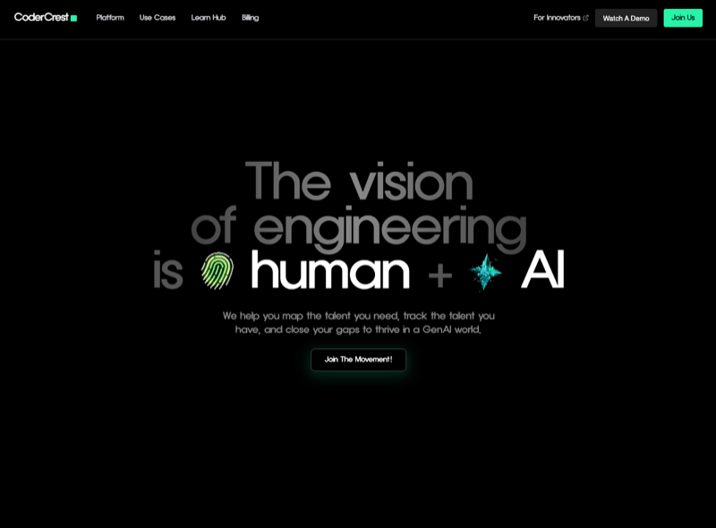 CoderCrest
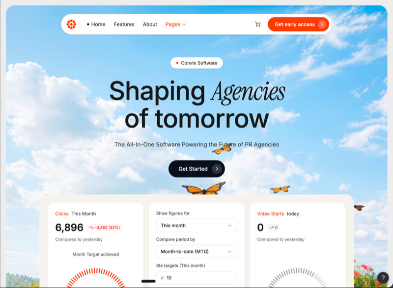 SAAS Software
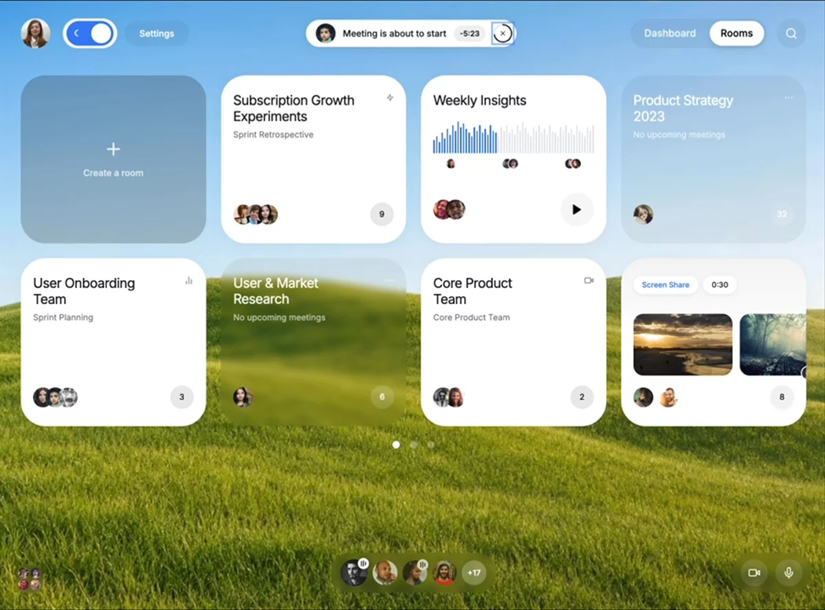 Dashboard UI
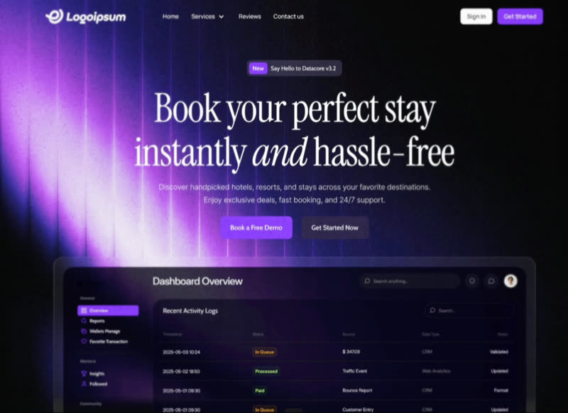 Datacore Booking
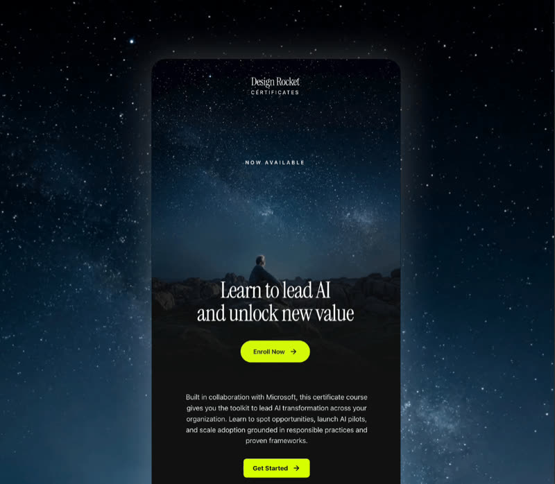 Email Marketing
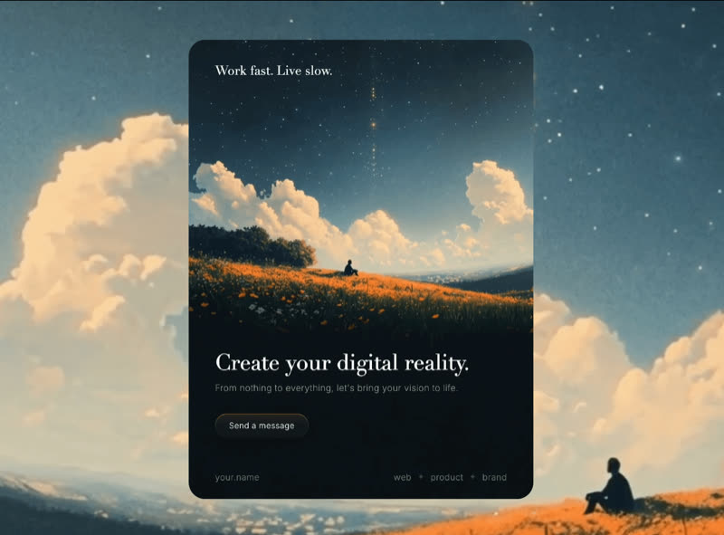 Digital Reality
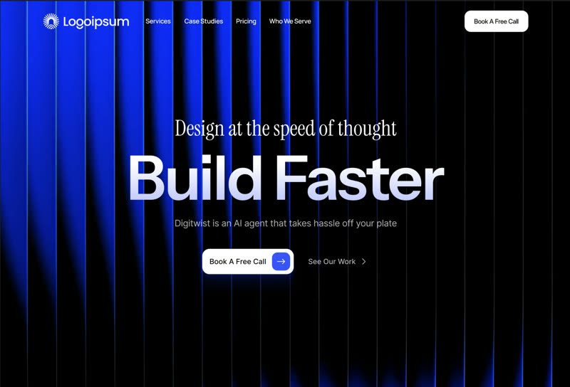 Digitwist AI Builder
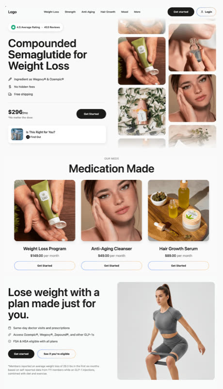 E-commerce Website
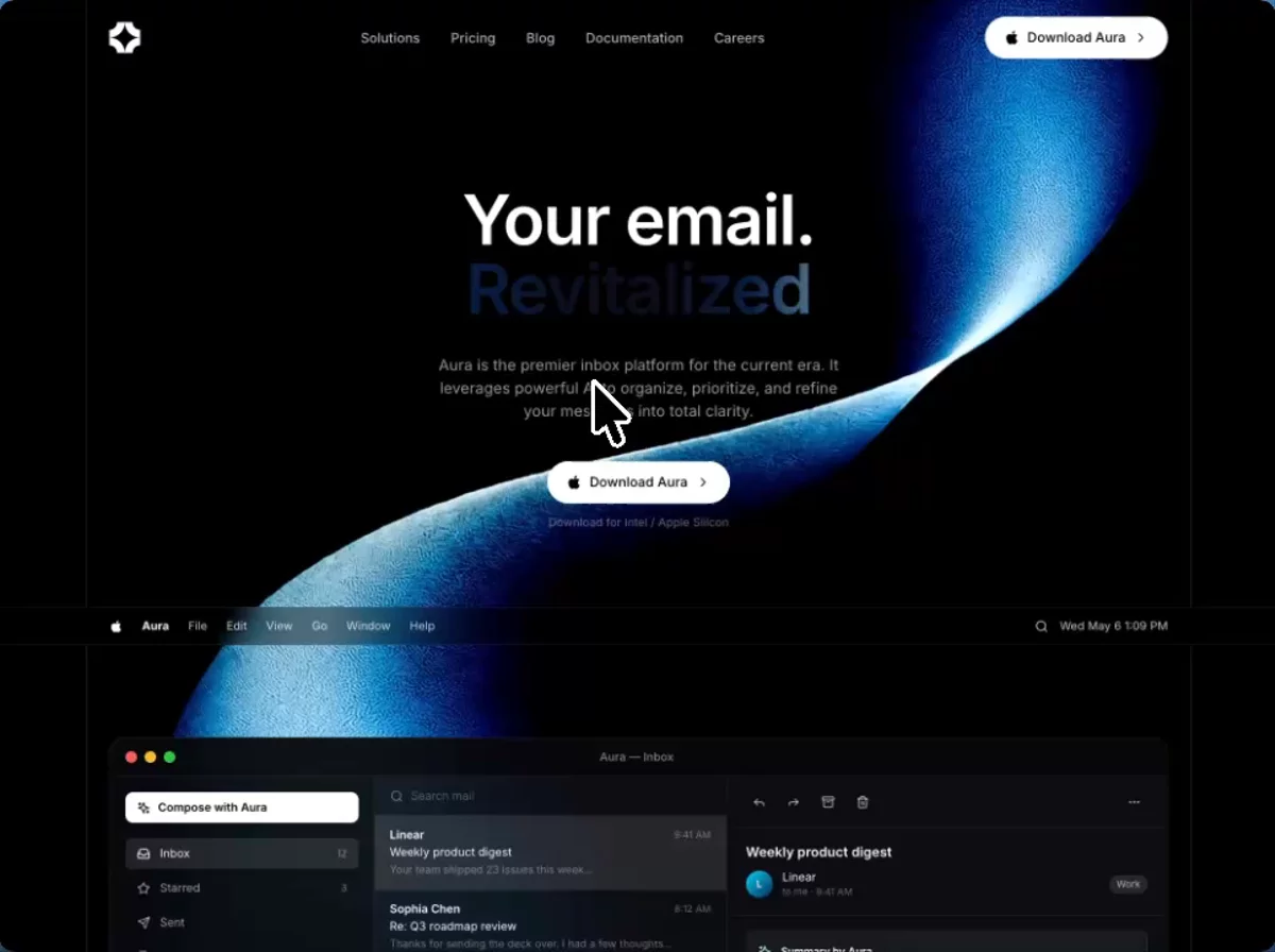 Email Landing Page
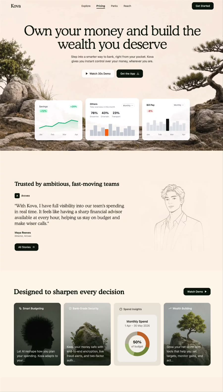 Evergreen Finance
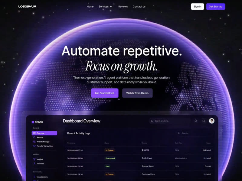 Finlytic AI Agent
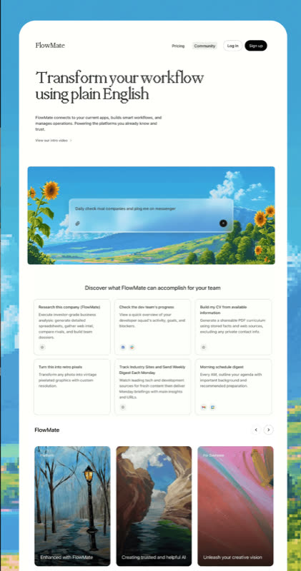 FlowMate
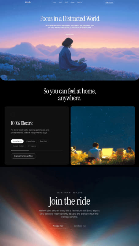 Focus AI
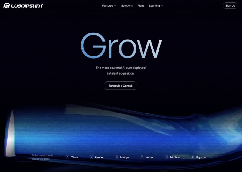 Grow AI Talent Platform
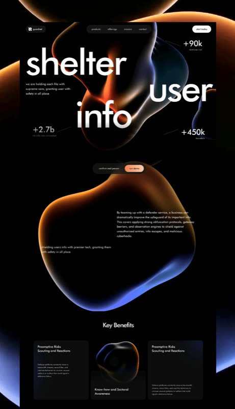 Guardnet
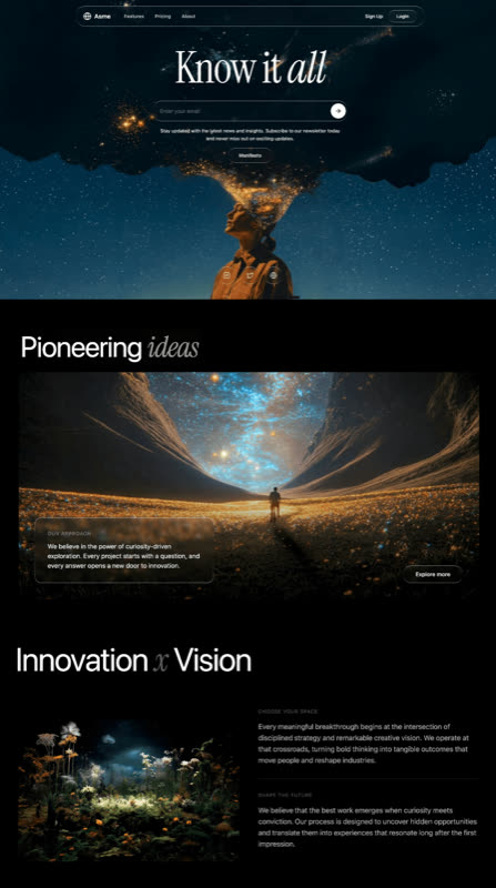 Innovation
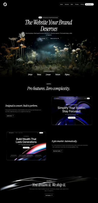 Liquid Glass Agency
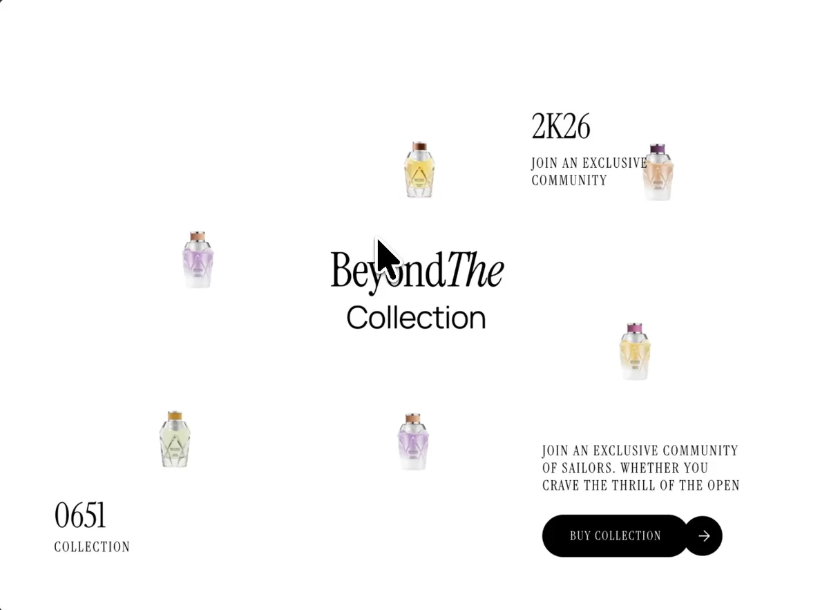 Luxury Botanical
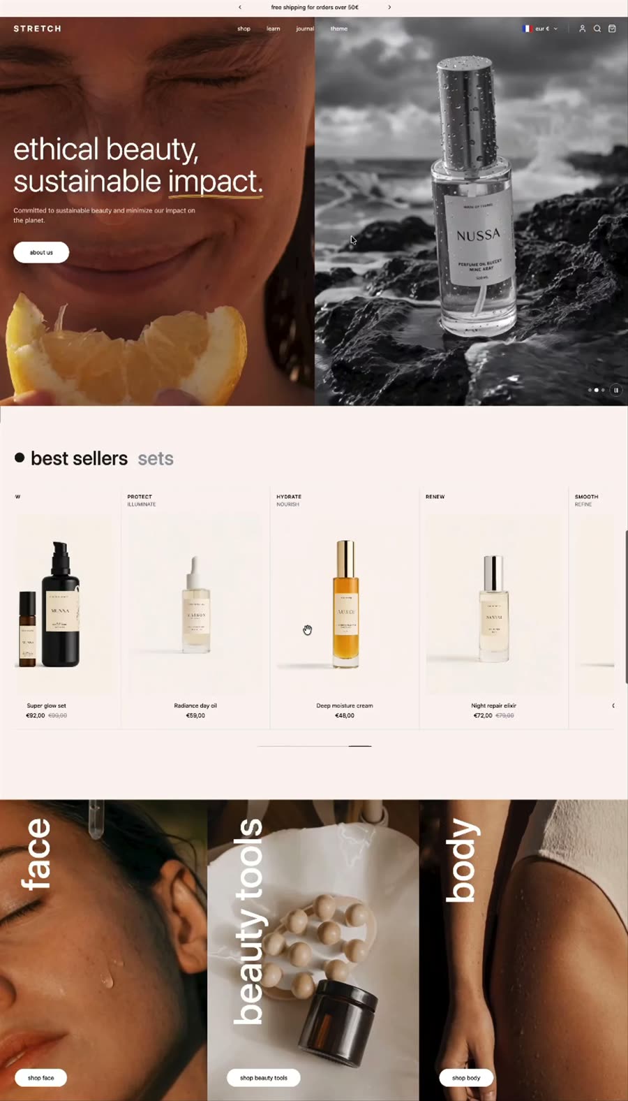 Luxury Ecommerce Design
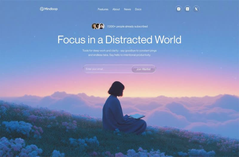 Mindloop
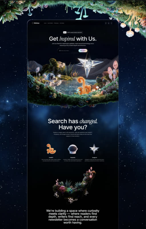 Mindloop Landing
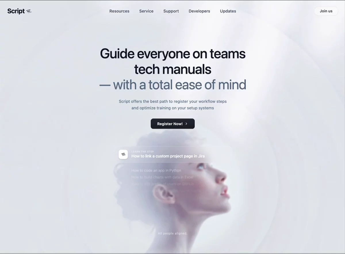 Minimal Workflow SaaS
 Modern Agency
 Mythic Naturecore
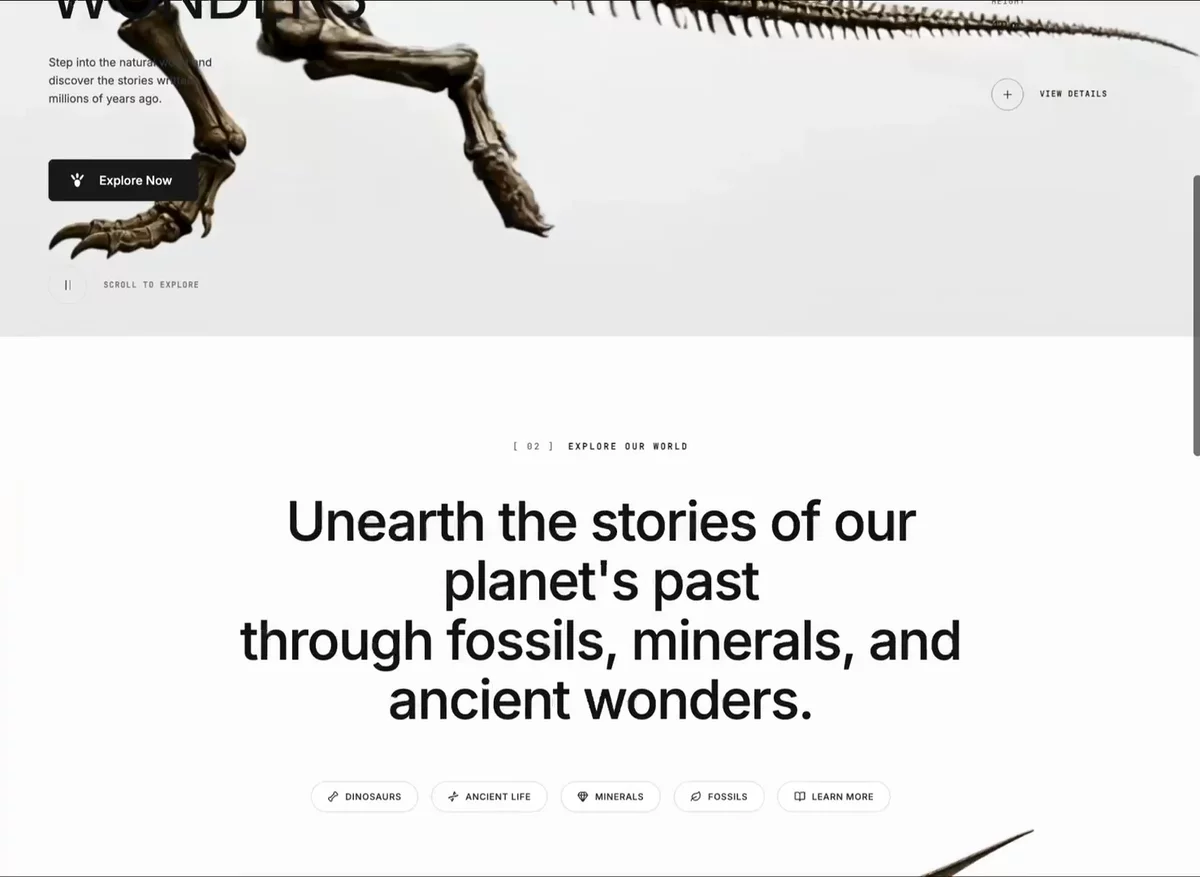 Neo Museum
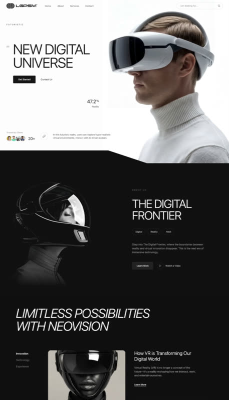 NeoVision
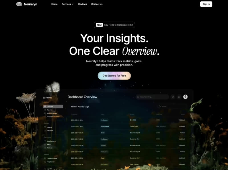 Neuralyn
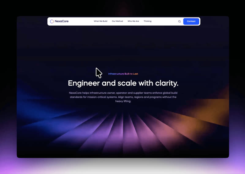 NexaCore
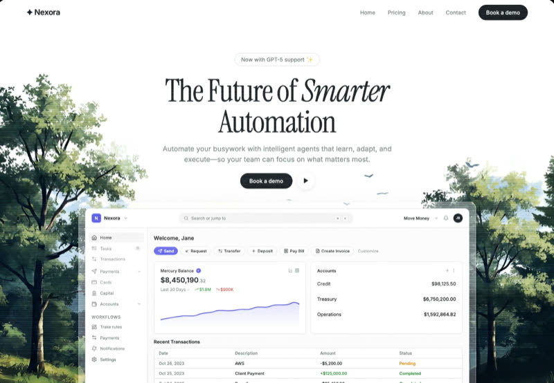 Nexora Automation
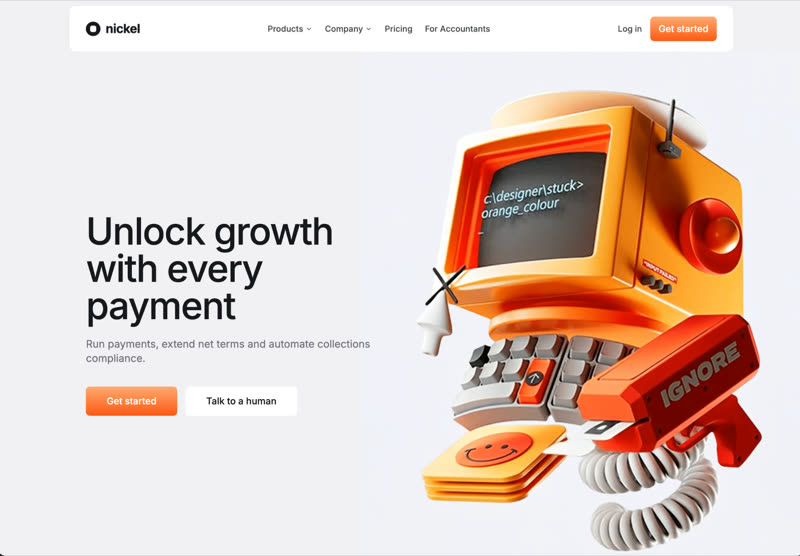 Nickel Payments
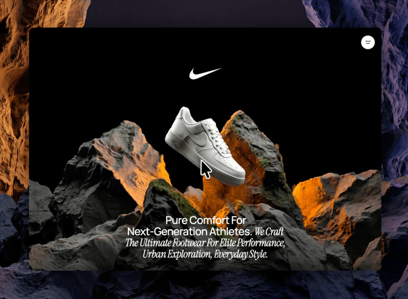 Nike Premium Landing
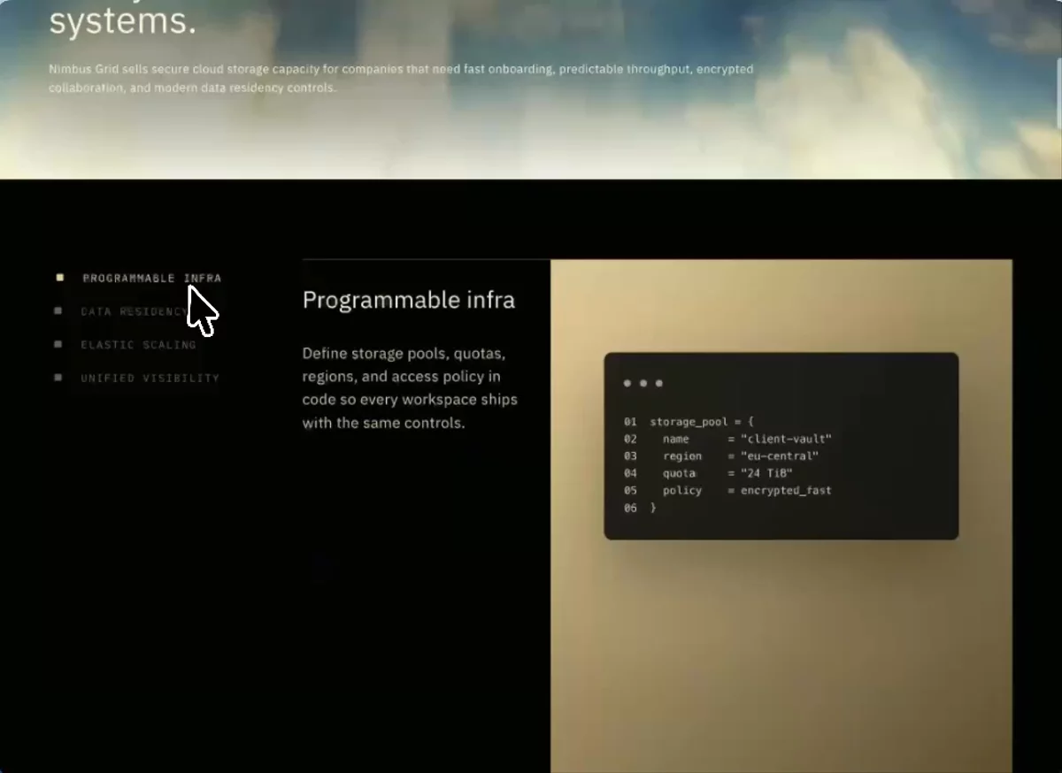 Nimbus Grid
Browse & preview free Unlock everything — from $49/mo
Frequently asked questions
Do Meez prompts work with Bolt?
Yes. Every Meez prompt is a complete written spec — fonts, layout, color tokens, motion and asset URLs — so Bolt can build it in one paste. The 62 free prompts on this site work exactly like the premium ones; copy one above and try it.
What does Bolt generate from a prompt?
Bolt (by StackBlitz) runs a full dev environment in your browser tab and can scaffold React, Next.js, Astro, Vue and more — you watch the site assemble live and can edit any file it wrote, so a Meez spec becomes a real editable codebase instantly, no local setup.
How do I use a Meez prompt in Bolt?
Copy the full prompt text and paste it into the prompt box on bolt.new. Don't shorten it — the specificity is what keeps Bolt from producing a generic layout. Then iterate: swap the copy and point the asset URLs at your own media.
How many prompts are free?
62 prompts are free to copy in full, no account needed. The other 579 unlock with Unlimited — $49/mo, $149/yr, or $299 once for lifetime — along with all 285 motion backgrounds.
Also for: Lovable · v0 · Cursor · Claude · Replit · Windsurf · Framer · Webflow · ChatGPT · Figma Make · Gemini · GitHub Copilot · Wix
Not sure which tool? Lovable vs v0 vs Bolt vs Cursor, compared → · All free prompts on one page → · All prompt categories →