Meez.
Browse Prompts Backgrounds Pricing
Contact Sign in ·

Form · Free prompt

Dotted Dialog

free · paste into Lovable, Bolt, v0, Cursor or Claude

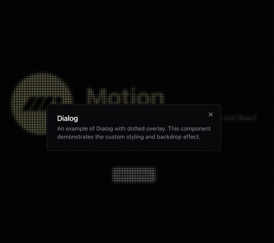
Dotted Dialog is a complete, paste-ready form build-prompt — a full art-direction spec for Lovable, Bolt, v0, Cursor and Claude. It's free: copy it below and paste it into your builder.

Dotted Dialog preview

“A customized dialog component based on shadcn/ui Dialog with a dotted background pattern inspired by Motion.dev website. Features: • Dotted background pattern with blur effect • Dark/light theme support • Fully …”

Dotted DialogForm · free prompt · copy-paste

Prompt page

A customized dialog component based on shadcn/ui Dialog with a dotted background pattern inspired by Motion.dev website.

Features:
	•	Dotted background pattern with blur effect
	•	Dark/light theme support
	•	Fully accessible (based on Radix UI)
	•	Smooth animations for open and close states
	•	Responsive design
	•	Includes all standard dialog components (header, footer, title, description)

— Install —
npx shadcn@latest add "https://21st.dev/r/dotted-dialog"

— Component source (Dotted Dialog.tsx) —

"use client"

import * as React from "react"
import * as DialogPrimitive from "@radix-ui/react-dialog"
import { Cross2Icon } from "@radix-ui/react-icons"
import { cn } from "@/lib/utils"

const Dialog = DialogPrimitive.Root

const DialogTrigger = DialogPrimitive.Trigger

const DialogPortal = DialogPrimitive.Portal

const DialogClose = DialogPrimitive.Close

const DialogOverlay = React.forwardRef<
  React.ElementRef<typeof DialogPrimitive.Overlay>,
  React.ComponentPropsWithoutRef<typeof DialogPrimitive.Overlay>
>(({ className, ...props }, ref) => (
  <DialogPrimitive.Overlay
    ref={ref}
    className={cn(
      "fixed inset-0 z-50",
      "bg-dots-pattern dark:bg-dots-pattern-dark",
      "[background-size:4px_4px]",
      "[backdrop-filter:brightness(1.2)_blur(3px)]",
      "data-[state=open]:animate-in data-[state=closed]:animate-out",
      "data-[state=closed]:fade-out-0 data-[state=open]:fade-in-0",
      className
    )}
    {...props}
  />
))
DialogOverlay.displayName = DialogPrimitive.Overlay.displayName

const DialogContent = React.forwardRef<
  React.ElementRef<typeof DialogPrimitive.Content>,
  React.ComponentPropsWithoutRef<typeof DialogPrimitive.Content>
>(({ className, children, ...props }, ref) => (
  <DialogPortal>
    <DialogOverlay />
    <DialogPrimitive.Content
      ref={ref}
      className={cn(
        "fixed left-[50%] top-[50%] z-50 grid w-full max-w-lg translate-x-[-50%] translate-y-[-50%] gap-4 border bg-background p-6 shadow-lg duration-200 data-[state=open]:animate-in data-[state=closed]:animate-out data-[state=closed]:fade-out-0 data-[state=open]:fade-in-0 data-[state=closed]:zoom-out-95 data-[state=open]:zoom-in-95 data-[state=closed]:slide-out-to-left-1/2 data-[state=closed]:slide-out-to-top-[48%] data-[state=open]:slide-in-from-left-1/2 data-[state=open]:slide-in-from-top-[48%] sm:rounded-lg",
        className
      )}
      {...props}
    >
      {children}
      <DialogPrimitive.Close className="absolute right-4 top-4 rounded-sm opacity-70 ring-offset-background transition-opacity hover:opacity-100 focus:outline-none focus:ring-2 focus:ring-ring focus:ring-offset-2 disabled:pointer-events-none data-[state=open]:bg-accent data-[state=open]:text-muted-foreground">
        <Cross2Icon className="h-4 w-4" />
        <span className="sr-only">Close</span>
      </DialogPrimitive.Close>
    </DialogPrimitive.Content>
  </DialogPortal>
))
DialogContent.displayName = DialogPrimitive.Content.displayName

const DialogHeader = ({
  className,
  ...props
}: React.HTMLAttributes<HTMLDivElement>) => (
  <div
    className={cn(
      "flex flex-col space-y-1.5 text-center sm:text-left",
      className
    )}
    {...props}
  />
)
DialogHeader.displayName = "DialogHeader"

const DialogFooter = ({
  className,
  ...props
}: React.HTMLAttributes<HTMLDivElement>) => (
  <div
    className={cn(
      "flex flex-col-reverse sm:flex-row sm:justify-end sm:space-x-2",
      className
    )}
    {...props}
  />
)
DialogFooter.displayName = "DialogFooter"

const DialogTitle = React.forwardRef<
  React.ElementRef<typeof DialogPrimitive.Title>,
  React.ComponentPropsWithoutRef<typeof DialogPrimitive.Title>
>(({ className, ...props }, ref) => (
  <DialogPrimitive.Title
    ref={ref}
    className={cn(
      "text-lg font-semibold leading-none tracking-tight",
      className
    )}
    {...props}
  />
))
DialogTitle.displayName = DialogPrimitive.Title.displayName

const DialogDescription = React.forwardRef<
  React.ElementRef<typeof DialogPrimitive.Description>,
  React.ComponentPropsWithoutRef<typeof DialogPrimitive.Description>
>(({ className, ...props }, ref) => (
  <DialogPrimitive.Description
    ref={ref}
    className={cn("text-sm text-muted-foreground", className)}
    {...props}
  />
))
DialogDescription.displayName = DialogPrimitive.Description.displayName

export {
  Dialog,
  DialogPortal,
  DialogOverlay,
  DialogTrigger,
  DialogClose,
  DialogContent,
  DialogHeader,
  DialogFooter,
  DialogTitle,
  DialogDescription,
}

Browse & preview free → Unlock everything — from $19/mo

More like this

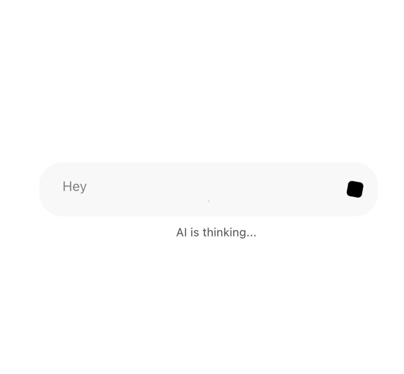
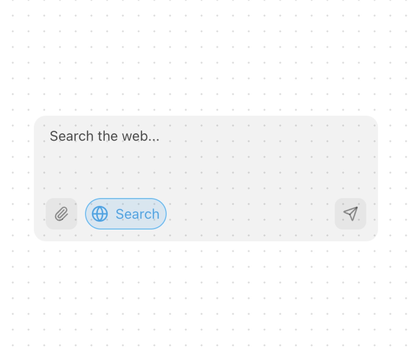
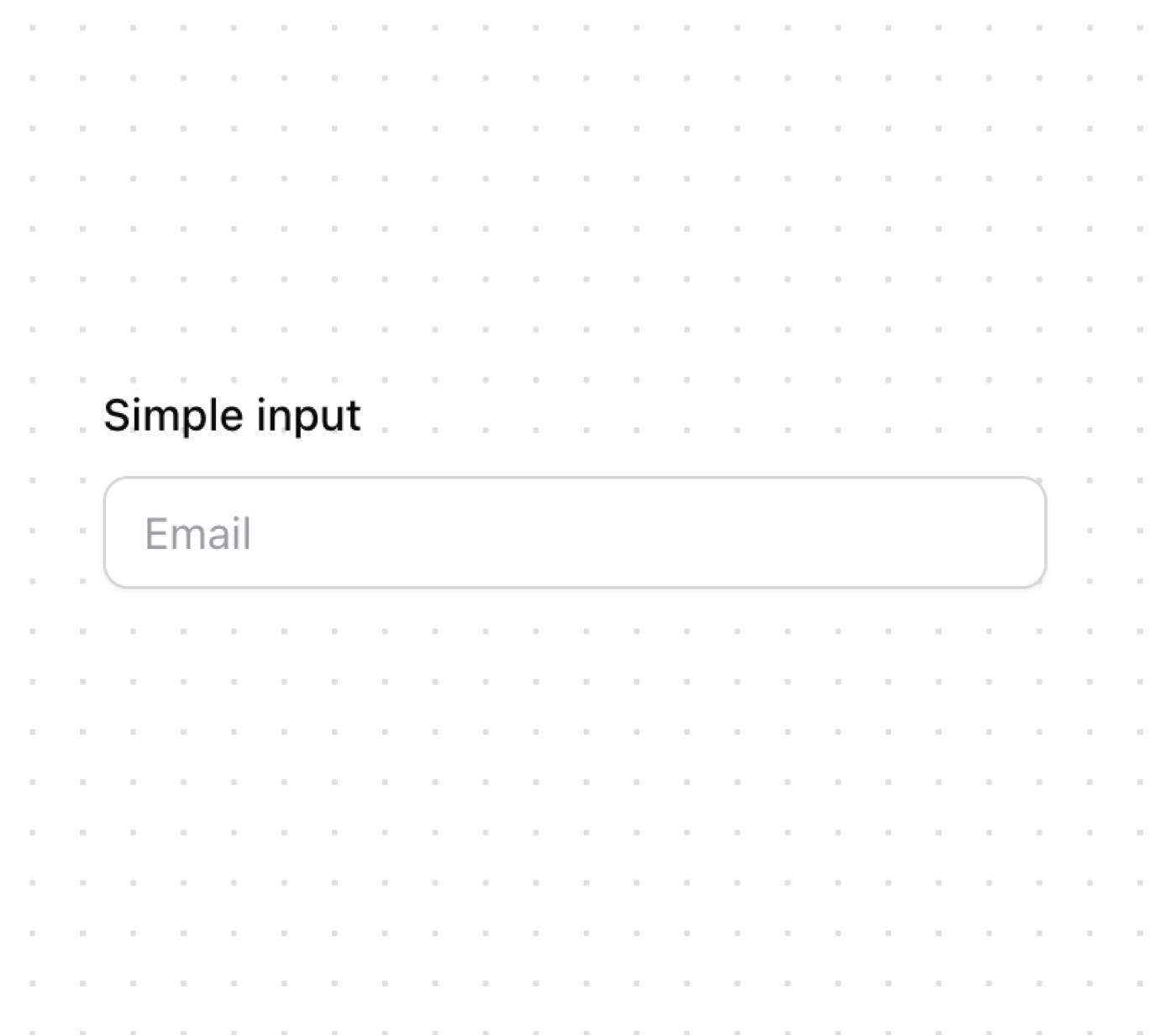
Arceage Contact Us — Form website build-promptArceage Contact Us Dialog — Form website build-promptDialog AI Voice Input — Form website build-promptAI Voice Input AI Input With Loading — Form website build-promptAI Input With Loading AI Input With Search — Form website build-promptAI Input With Search Input — Form website build-promptInput
Meez.

The biggest library of AI website build-prompts & motion backgrounds — at the lowest price.

Library
Browse all Prompts by category Section prompts Motion backgrounds Pricing
Learn & contact
How it works Why AI sites look generic Terms Privacy Contact Affiliates
© Meez — an open archive. Start free · Unlimited from $19/mo · cancel anytime.