Meez.
Browse Prompts Backgrounds Pricing
Contact Sign in ·

Component · Free prompt

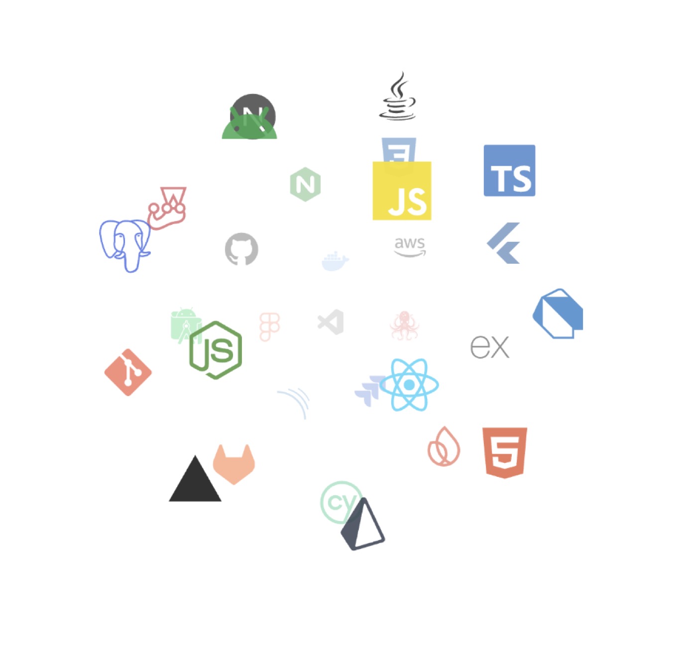
Interactive Icon Cloud

free · paste into Lovable, Bolt, v0, Cursor or Claude

Interactive Icon Cloud is a complete, paste-ready component build-prompt — a full art-direction spec for Lovable, Bolt, v0, Cursor and Claude. It's free: copy it below and paste it into your builder.

Interactive Icon Cloud preview

“An interactive 3D tag cloud component — Install — npx shadcn@latest add "https://21st.dev/r/interactive-icon-cloud" — Component source (Interactive Icon Cloud.tsx) — "use client" import { useEffect, useMemo, useState …”

Interactive Icon CloudComponent · free prompt · copy-paste

Prompt page

An interactive 3D tag cloud component

— Install —
npx shadcn@latest add "https://21st.dev/r/interactive-icon-cloud"

— Component source (Interactive Icon Cloud.tsx) —

"use client"

import { useEffect, useMemo, useState } from "react"
import { useTheme } from "next-themes"
import {
  Cloud,
  fetchSimpleIcons,
  ICloud,
  renderSimpleIcon,
  SimpleIcon,
} from "react-icon-cloud"

export const cloudProps: Omit<ICloud, "children"> = {
  containerProps: {
    style: {
      display: "flex",
      justifyContent: "center",
      alignItems: "center",
      width: "100%",
      paddingTop: 40,
    },
  },
  options: {
    reverse: true,
    depth: 1,
    wheelZoom: false,
    imageScale: 2,
    activeCursor: "default",
    tooltip: "native",
    initial: [0.1, -0.1],
    clickToFront: 500,
    tooltipDelay: 0,
    outlineColour: "#0000",
    maxSpeed: 0.04,
    minSpeed: 0.02,
    // dragControl: false,
  },
}

export const renderCustomIcon = (icon: SimpleIcon, theme: string) => {
  const bgHex = theme === "light" ? "#f3f2ef" : "#080510"
  const fallbackHex = theme === "light" ? "#6e6e73" : "#ffffff"
  const minContrastRatio = theme === "dark" ? 2 : 1.2

  return renderSimpleIcon({
    icon,
    bgHex,
    fallbackHex,
    minContrastRatio,
    size: 42,
    aProps: {
      href: undefined,
      target: undefined,
      rel: undefined,
      onClick: (e: any) => e.preventDefault(),
    },
  })
}

export type DynamicCloudProps = {
  iconSlugs: string[]
}

type IconData = Awaited<ReturnType<typeof fetchSimpleIcons>>

export function IconCloud({ iconSlugs }: DynamicCloudProps) {
  const [data, setData] = useState<IconData | null>(null)
  const { theme } = useTheme()

  useEffect(() => {
    fetchSimpleIcons({ slugs: iconSlugs }).then(setData)
  }, [iconSlugs])

  const renderedIcons = useMemo(() => {
    if (!data) return null

    return Object.values(data.simpleIcons).map((icon) =>
      renderCustomIcon(icon, theme || "light"),
    )
  }, [data, theme])

  return (
    // @ts-ignore
    <Cloud {...cloudProps}>
      <>{renderedIcons}</>
    </Cloud>
  )
}

Browse & preview free → Unlock everything — from $19/mo

More like this

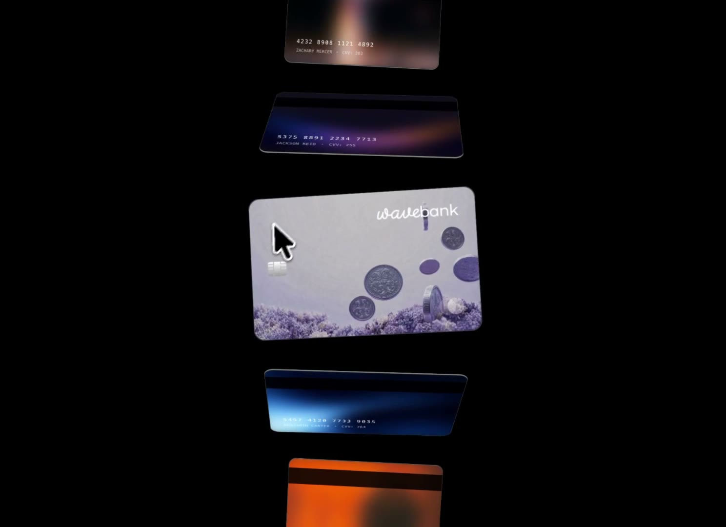
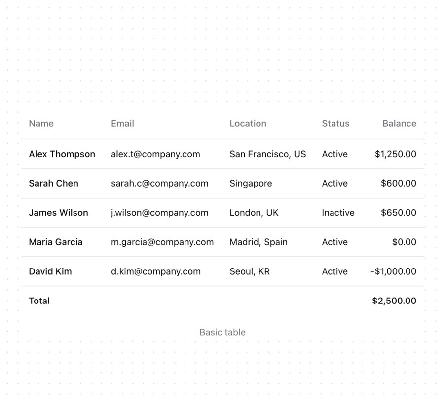
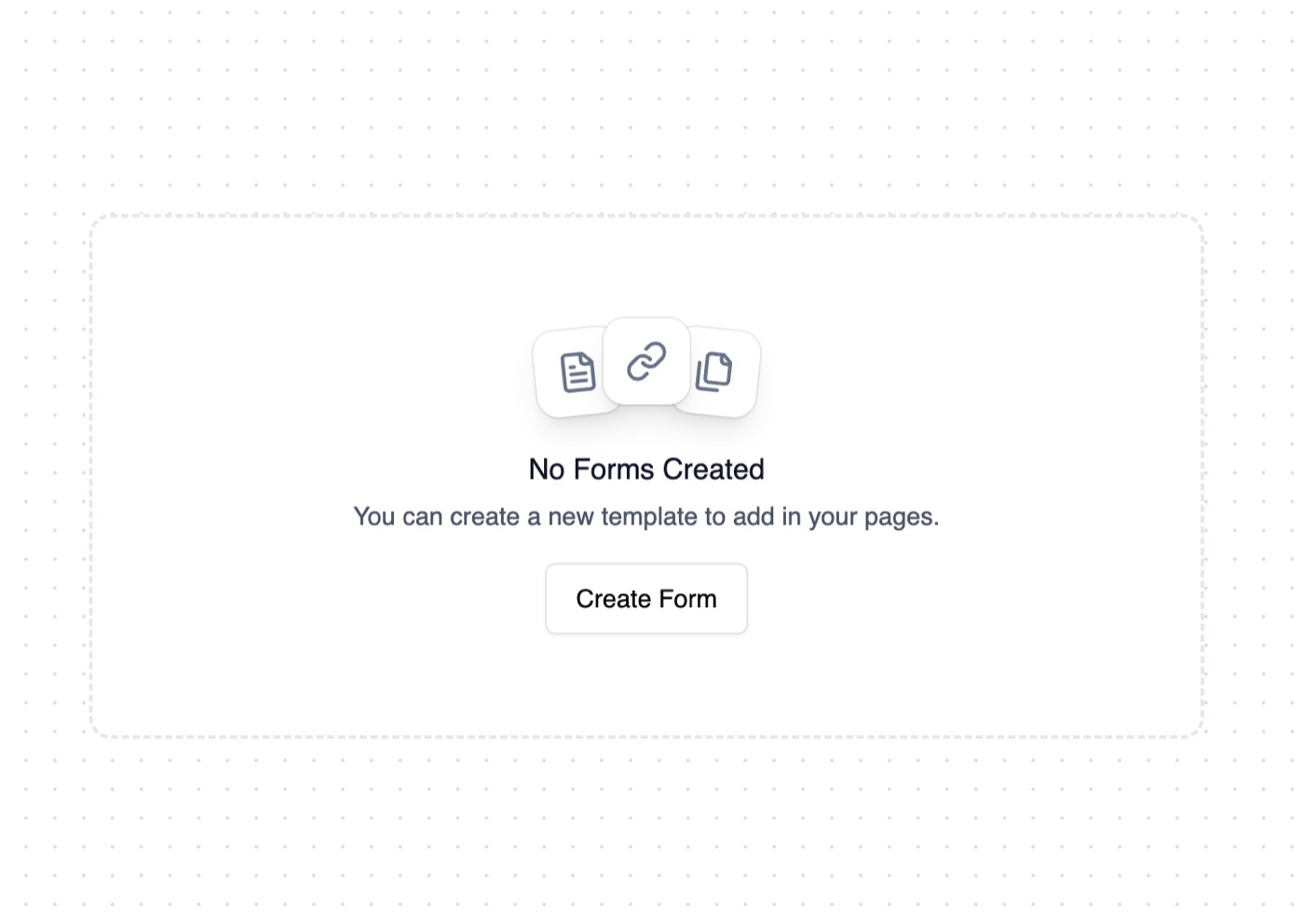
Animated Cards — Component website build-promptAnimated Cards Table — Component website build-promptTable Empty State — Component website build-promptEmpty State Feature Section with hover effects — Component website build-promptFeature Section with hover effects Lamp — Component website build-promptLamp World Map — Component website build-promptWorld Map
Meez.

The biggest library of AI website build-prompts & motion backgrounds — at the lowest price.

Library
Browse all Prompts by category Section prompts Motion backgrounds Pricing
Learn & contact
How it works Why AI sites look generic Terms Privacy Contact Affiliates
© Meez — an open archive. Start free · Unlimited from $19/mo · cancel anytime.