Prompts · for Framer
AI website build-prompts for Framer
Feed a Meez prompt to Framer's AI and it lays out the sections, type scale and color system you specified — then you refine it visually and publish to a live URL in minutes. Starting from a detailed spec is what keeps Framer from defaulting to the same template every other site ships: you get a real design to iterate on, not a blank canvas.
How to use a Meez prompt in Framer
- Pick a prompt below (4 on this page are free) or browse the full library — every prompt is a complete art-direction spec: fonts, layout, color system, motion and real asset URLs.
- Copy the whole prompt and paste it into Framer's AI page generator. Don’t trim it — the detail is what stops Framer from defaulting to a generic layout.
- Let it build, then iterate: swap the copy, point the asset URLs at your own media, and ship. The sites you build are yours, commercially.
Free prompts to try in Framer right now
Celestial RenewalWellness · free prompt · copy-paste
**Build a React + Vite + Tailwind CSS landing page with two full-screen sections for a luxury beauty/wellness brand called "Serene". Use TypeScript.**

---

### Fonts (loaded via Google Fonts in index.html)

Load these three font families from Google Fonts:
- **Dancing Script** (weights: 400, 500, 600, 700) -- used for the brand logo
- **Instrument Serif** (italic: 0, 1) -- used for the hero heading and the quote text
- **Inter** (weights: 300, 400, 500, 600, 700, 800, 900) -- used for body text, navbar links, and buttons

```html
<link rel="preconnect" href="https://fonts.googleapis.com" />
<link rel="preconnect" href="https://fonts.gstatic.com" crossorigin />
<link href="https://fonts.googleapis.com/css2?family=Dancing+Script:wght@400;500;600;700&family=Instrument+Serif:ital@0;1&family=Inter:wght@300;400;500;600;700;800;900&display=swap" rel="stylesheet" />
```

---

### Global CSS (index.css)

```css
@tailwind base;
@tailwind components;
@tailwind utilities;

* {
  margin: 0;
  padding: 0;
  box-sizing: border-box;
}

body {
  font-family: 'Inter', sans-serif;
  background: #0a0a0c;
  overflow-x: hidden;
}

.font-inter {
  font-family: 'Inter', sans-serif;
}

.font-instrument {
  font-family: 'Instrument Serif', serif;
}

.scrollbar-hide::-webkit-scrollbar {
  display: none;
}
.scrollbar-hide {
  -ms-overflow-style: none;
  scrollbar-width: none;
}

.liquid-glass {
  background: rgba(255, 255, 255, 0.01);
  background-blend-mode: luminosity;
  backdrop-filter: blur(4px);
  -webkit-backdrop-filter: blur(4px);
  border: none;
  box-shadow: inset 0 1px 1px rgba(255, 255, 255, 0.1);
  position: relative;
  overflow: hidden;
}

.liquid-glass::before {
  content: '';
  position: absolute;
  inset: 0;
  border-radius: inherit;
  padding: 1.4px;
  background: linear-gradient(180deg,
    rgba(255,255,255,0.45) 0%, rgba(255,255,255,0.15) 20%,
    rgba(255,255,255,0) 40%, rgba(255,255,255,0) 60%,
    rgba(255,255,255,0.15) 80%, rgba(255,255,255,0.45) 100%);
  -webkit-mask: linear-gradient(#fff 0 0) content-box, linear-gradient(#fff 0 0);
  -webkit-mask-composite: xor;
  mask-composite: exclude;
  pointer-events: none;
}

.text-glow {
  text-shadow: 0 0 40px rgba(255, 255, 255, 0.4), 0 0 80px rgba(255, 255, 255, 0.2), 0 0 120px rgba(255, 255, 255, 0.1);
}

.button-glow {
  box-shadow: 0 0 20px rgba(255, 255, 255, 0.3), 0 0 40px rgba(255, 255, 255, 0.1);
}
```

---

### App Layout (App.tsx)

The wrapper div has `bg-[#0a0608]`. It renders `<Hero />` followed by `<QuoteSection />`.

---

### SECTION 1: Hero

A full-viewport (`h-screen`) section with:

1. **Background video** -- autoplays, muted, loops, playsInline, covers the full section with `object-cover`:
   ```
   https://meez.design/web/media/ext/54f99e047eb75657.mp4
   ```

2. **Dark overlay** -- `absolute inset-0 bg-black/20`

3. **Fixed Navbar** -- `fixed top-0 left-0 right-0 z-50`, flex row, space-between, `px-6 md:px-12 py-5`:
   - **Left**: Brand name "Serene" in Dancing Script cursive, white, `text-2xl md:text-3xl`
   - **Center (desktop only, hidden on mobile)**: Navigation links -- "About", "Services", "Journal", "Contact" -- `text-white/80 hover:text-white text-sm tracking-wide`, spaced `gap-12`
   - **Right (desktop)**: White pill button "Book a consultation"
   - **Right (mobile)**: Hamburger icon (3 lines, animated to X on open). Uses cubic-bezier(0.22,1,0.36,1) easing. On open: top line rotates 45deg + translates down 9px; middle line fades/scales to 0; bottom line rotates -45deg + translates up 9px.
   - **Mobile menu**: Slide-in panel from right, `w-[85%] max-w-[340px]`, `bg-[#0a0608]/95 backdrop-blur-xl border-l border-white/10`. Links stagger-animate in (opacity + translateX, 75ms delay between each, starting at 150ms). Button at bottom with 450ms delay.

4. **Center content** -- absolutely positioned, flex column, centered, with `-mt-[120px]` to shift up:
   - **Heading**: `font-instrument text-white text-[36px] md:text-7xl lg:text-[110px] leading-[0.9] tracking-tight text-center text-glow` -- text: "Gentle touch. Radiant presence."
   - **Subtext**: `text-white/70 text-sm md:text-base text-center mt-5 md:mt-7 max-w-xl` -- text: "Expert beauty and holistic wellness, delivered with warmth and intention."
   - **CTA Button**: White pill button "Begin your renewal", `mt-6 md:mt-9`

5. **Sound indicator (desktop only)** -- bottom-left corner (`bottom-8 left-8`), a 40px circle with `border border-white/20` containing a small horizontal bar, next to two lines of text: "Experience" / "with sound" in `text-white/60 text-xs`

**Button component**: `bg-white text-black px-8 py-3.5 rounded-full font-medium text-sm tracking-wide hover:bg-white/90 transition-all duration-300 button-glow`

---

### SECTION 2: Quote Section (with parallax scroll animations)

A full-viewport (`h-screen`) section with:

**Background**: CSS linear-gradient top to bottom:
```
#010A17 0% -> #0A4267 30% -> #20658E 60% -> #6BADC4 100%
```

**Animated layers (requestAnimationFrame-based parallax with lerp smoothing):**

The animation uses a `progress` value (0 to 1) based on how far the section has scrolled through the viewport:
```
progress = clamp(0, 1, (windowHeight - rect.top) / (windowHeight + rect.height))
```

1. **Rainbow image** -- full-width, positioned `absolute inset-x-0 top-0 z-30`. Parallax: moves vertically from +120px to -160px based on scroll progress. Lerp factor: 0.06.
   ```
   https://meez.design/web/media/ext/7ec95e7fa7e81bbe.png
   ```

2. **Left cloud** -- `absolute left-0 bottom-[10%] z-10`, hidden on mobile (`hidden sm:block`). Width: `w-[500px] md:w-[650px]`. Has `marginLeft: '-50%'` to let it overflow left. Slides in from -200px on X when in view (progress 0.12-0.92), slides back out when not. Also drifts up (cloudY = progress * -50). Opacity tied to X distance. Lerp factor: 0.04.
   ```
   https://meez.design/web/media/ext/0d654f08e102decb.png
   ```

3. **Right cloud** -- same image as left but `scale-x-[-1]` (flipped), `absolute right-0 bottom-[15%] z-10`. Has `marginRight: '-75%'`. Slides in from +200px. Same lerp/timing as left cloud.

4. **Quote content** -- centered, `z-20`, `max-w-4xl`:
   - **Quote text**: `font-instrument text-white text-xl sm:text-2xl md:text-4xl lg:text-[42px] leading-[1.45] md:leading-[1.5]` -- text: "Serene was founded on a belief in beauty that honors your nature. We pursue refined outcomes, considered approaches, and lasting vitality. We spend time learning what matters to you before deciding what serves you best. No rushing, no excess -- just support that lets you feel radiant." (wrapped in curly quotes)
   - **Attribution**: `mt-6 md:mt-8 text-white/80 text-sm md:text-base tracking-wide` -- text: "Dr. Mia Callahan -- Founder"

**Key animation implementation detail**: All transforms use `translate3d` for GPU acceleration with `will-change-transform`. Initial cloud state is `opacity: 0` and translated off-screen. The lerp function smoothly interpolates current values toward targets each frame: `current + (target - current) * factor`.

---

### Tailwind Config

Default Tailwind config with no extensions -- all custom styling handled via CSS utility classes in index.css.
Wellness DeviceLanding Page · free prompt · copy-paste
Build a single-page hero section for a product called "Measured" — a health/wellness wearable device landing page. The page is fullscreen (100vh), dark/moody aesthetic with layered imagery, a cursor-following spotlight reveal effect, and a frosted-glass navigation. Use React + Vite + Tailwind CSS + TypeScript.

---

## Fonts

1. **Google Fonts — Inter** (weights 300-700): Used as the global default font on all elements (`* { font-family: 'Inter', sans-serif; }`)
2. **Google Fonts — Instrument Serif** (regular + italic): Used for the hero heading "Measured". Load via `<link>` in index.html: `https://fonts.googleapis.com/css2?family=Instrument+Serif:ital@0;1&display=swap`
3. **Helvetica Neue Roman** (self-hosted woff2/woff in `/public/fonts/`): Applied via a `.font-helvetica-neue` class on the hero section wrapper. Declare with `@font-face`.

---

## Asset URLs (exact)

- **Background Image (BG_IMAGE_1):** `https://meez.design/web/media/ext/b3101a323e5a3897.webp`
- **Front Video (FRONT_VIDEO):** `https://meez.design/web/media/prompt-media/v/eecd18ba5aa24812.mp4`
- **Overlay Image (OVERLAY_IMAGE):** `https://meez.design/web/media/ext/204e1738460ecf88.png`

---

## Page Structure & Layers (z-index order)

### Navigation (z-50, fixed)
- **Logo (top-left):** Custom SVG geometric logo (white, 28x28), resembling angular interlocking shapes. The exact SVG path: `M 256 64 L 256 128 L 192.5 128 L 160 95 L 128 64 L 96 95 L 63.5 128 L 64 128 L 128 192 L 128 256 L 64.5 256 L 32 223 L 0 192 L 0 64 L 64 0 L 192 0 Z M 256 192 L 256 256 L 192.5 256 L 160 223 L 128 192 L 128 128 L 192 128 Z` (viewBox 0 0 256 256, fill white)
- **Desktop center pill nav (hidden on mobile):** Fixed horizontally centered, contains buttons: "Device", "Real Stories", "Science", "Plans", "Reach Us". Uses `.liquid-glass` styling (frosted glass). Buttons are `text-white/70`, `text-sm`, `font-medium`, rounded-full, hover to white.
- **Desktop CTA (top-right, hidden on mobile):** `.liquid-glass` pill button with a small green dot (w-2 h-2 rounded-full bg-green-400) and text "Reserve Yours", white text-sm font-medium.
- **Mobile hamburger (top-right, hidden md+):** `.liquid-glass` rounded-full pill, contains two white lines (w-5 h-[1.5px] and w-3.5 h-[1.5px]).

### Mobile Fullscreen Menu (z-55)
- Background: `#0a0a0a` solid
- Close button: top-right, `.liquid-glass` rounded-full with X made of two rotated white lines (+45deg, -45deg)
- Nav items stacked vertically, centered, `text-3xl sm:text-4xl`, white/90, font-medium
- "Reserve Yours" CTA at bottom with green dot, `.liquid-glass` pill
- Staggered entry animations: each item slides up from 24px with opacity 0->1, delays incremented by 60ms starting at 100ms. Uses `cubic-bezier(0.77, 0, 0.18, 1)` easing. Close button rotates in from -90deg with scale 0.8.

### Hero Section (100vh, overflow hidden)

**Layer 1 — Grid Background (z-0, opacity 0.1):**
- SVG with a repeating pattern of 48px cells. Pattern draws an L-shaped path (`M 48 0 L 0 0 0 48`), stroke `#64748b`, strokeWidth 0.6, no fill.
- The grid subtly parallax-shifts based on cursor position (offset calculated as cursor position relative to section center * 16, eased at 0.06 factor).

**Layer 2 — Background Image (z-10):**
- `BG_IMAGE_1` displayed as `background-image`, `bg-center bg-cover bg-no-repeat`, absolutely positioned inset-0.

**Layer 3 — Hero Text (z-20):**
- The word "Measured" in huge uppercase text
- Font: `'Instrument Serif', serif`
- Sizes: `text-[4.5rem]` default, `xs:text-[5.5rem]`, `sm:text-[10rem]`, `md:text-[13rem]`, `lg:text-[16rem]`
- `leading-[0.9]`, white, centered, positioned `top-20 sm:top-28 md:top-32`

**Layer 4 — Overlay Image (z-25):**
- `OVERLAY_IMAGE` as an `<img>` tag, absolutely positioned inset-0, `w-full h-full object-cover`, pointer-events-none. This is a semi-transparent PNG that sits on top of the background to add depth/atmosphere.

**Layer 5 — Spotlight Reveal (z-30):**
- A cursor-following radial reveal mask that shows a video underneath only where the cursor hovers.
- **Radius:** 260px
- **Mask gradient stops:** center full white (0-40%), then feathers out: 60% at 0.75 alpha, 75% at 0.4, 88% at 0.12, 100% at 0 (fully transparent).
- **Implementation:** A hidden `<canvas>` draws the radial gradient at the smoothed cursor position. The canvas is exported as a dataURL and applied as a CSS mask (`-webkit-mask-image` / `mask-image`) on a div that contains the video.
- **Cursor smoothing:** Uses `requestAnimationFrame` loop with lerp factor 0.1 (`smooth += (target - smooth) * 0.1`).
- **Video placement:** The video (`FRONT_VIDEO`) is clipped to the bottom 60% of the viewport using `clipPath: 'inset(40% 0 0 0)'`. It autoplays, loops, is muted, and uses playsInline.

---

## Liquid Glass CSS Effect (`.liquid-glass`)

```css
.liquid-glass {
  background: rgba(255, 255, 255, 0.01);
  background-blend-mode: luminosity;
  backdrop-filter: blur(4px);
  -webkit-backdrop-filter: blur(4px);
  border: none;
  box-shadow: inset 0 1px 1px rgba(255, 255, 255, 0.1);
  position: relative;
  overflow: hidden;
}
.liquid-glass::before {
  content: '';
  position: absolute;
  inset: 0;
  border-radius: inherit;
  padding: 1.4px;
  background: linear-gradient(180deg,
    rgba(255,255,255,0.45) 0%, rgba(255,255,255,0.15) 20%,
    rgba(255,255,255,0) 40%, rgba(255,255,255,0) 60%,
    rgba(255,255,255,0.15) 80%, rgba(255,255,255,0.45) 100%);
  -webkit-mask: linear-gradient(#fff 0 0) content-box, linear-gradient(#fff 0 0);
  -webkit-mask-composite: xor;
  mask-composite: exclude;
  pointer-events: none;
}
```

This creates a near-invisible frosted glass background with a subtle gradient border using the mask-composite trick (border-only gradient).

---

## Key Behaviors

1. **Body overflow locks** when mobile menu is open
2. **No scrolling** — single viewport hero only
3. **Background is white** on the root container (`bg-white`), but the hero section fills the entire viewport with dark imagery
4. **The reveal effect only shows video in the bottom 60%** of the screen (the top 40% is masked out via clipPath), so hovering over the top portion shows nothing extra — just the base layers

---

## Summary of the Visual Effect

The user sees a dark, atmospheric product shot (wearable device on a wrist) with "Measured" in giant serif text overlaid. A semi-transparent overlay adds haze/depth. As the user moves their cursor, a soft spotlight circle reveals an underlying looping video (showing the product in motion) — but only in the lower portion of the screen. The grid background subtly shifts with parallax. Navigation uses an elegant frosted-glass pill aesthetic.
Church CommunityMobile App · free prompt · copy-paste
Create a mobile app showcase page displaying 3 iPhone mockups for "Christ Family Church" -- a church website mobile design. Use React Native with Expo Router, react-native-reanimated, and Manrope font (weights: Light, Regular, Medium).

**General layout:**
- Background color: `#5A4C41`
- 3 iPhone frames shown side by side on desktop (horizontal scroll), stacked vertically on mobile (<900px) with scale-to-fit
- Desktop: 40px padding, 48px gap between phones
- Mobile: 20px padding, 32px gap, phones scale down to fit screen width
- Each phone frame: 375x812 artboard inside a black rounded frame (borderRadius 50, borderWidth 2, borderColor `#2a2a2a`), with dynamic island notch (126x36, black, borderRadius 18) and home indicator bar (134x5, white 30% opacity)
- Soft shadow on frames: `shadowColor: #000, offset: {0, 12}, opacity: 0.3, radius: 24`

**Assets (all from our CDN):**
- Portrait photo: `https://meez.design/web/media/ext/a48cb56bb7c165fb.png`
- Logo (cross icon): `https://meez.design/web/media/ext/9c92417d3cd1ae53.png`
- Quote mark icon: `https://meez.design/web/media/ext/8bf0eae040f2e969.png`
- Star/compass decorative icon: `https://meez.design/web/media/ext/512a309ede976899.png`
- Hero image (hands raised worship): `https://meez.design/web/media/ext/d73c0ce69a6957dd.png`
- Avatars row: `https://meez.design/web/media/ext/e10b38cafd253935.png`
- Arrow icon: `https://meez.design/web/media/ext/45c106e2d5aa9422.png`
- Screen 3 hero (preacher): `https://meez.design/web/media/ext/e825edc63e4b9ced.png`
- Play button icon: `https://meez.design/web/media/ext/ca4555fb83ce7262.png`

**Color palette:**
- Dark background: `rgb(29, 25, 26)`
- Cream/gold accent: `rgb(241, 229, 198)` / `#F1E5C6`
- White: `#FFFFFF`
- Light text on dark: `rgba(255, 255, 255, 0.77)`, `rgba(255, 255, 255, 0.6)`, `rgba(255, 255, 255, 0.5)`, `rgba(255, 255, 255, 0.3)`
- Off-white: `#F5F0E8`

**Typography (all Manrope):**
- Brand name in header: 17px Regular, white, lineHeight 20
- Rotated sidebar text: 14px, Medium (name) and Regular (role), letterSpacing 1.2, half-transparent white
- Quote text: 20px Regular, lineHeight 27, `rgba(255,255,255,0.77)`
- Event card title: 36px Medium, letterSpacing -0.5, color `#1a1a1a`
- Event card date: 17px Regular, `#888888`
- Hero headline (Screen 2): 52px Light, lineHeight 52, letterSpacing -2.5, cream color `#F1E5C6`
- Hero subtext: 21px Regular, lineHeight 27, white 60% opacity
- CTA button text: 21px Medium, dark color
- Section title "Upcoming" (Screen 3): 38px Regular, letterSpacing -0.8, white
- Event list titles: 21px Regular, lineHeight 26
- Event times: 17px Regular, `#999999`
- Date card day: 34px Medium
- Date card month: 18px Regular
- Menu links: 36px Light, letterSpacing -0.8, white

**Animations:**
- Each iPhone frame fades in with `FadeIn.duration(600)` using react-native-reanimated
- All text uses a typewriter effect (characters appear one by one) with configurable delay and speed
- Menu overlay fades in with `FadeIn.duration(200)`

**Screen 1 - Testimonial:**
- Dark background (`rgb(29, 25, 26)`)
- Header: logo (46x46) + "Christ Family Church" text on left, hamburger menu (3 lines, 2 long + 1 short) on right, paddingTop 48, paddingHorizontal 19
- Rotated text on left side: "Anna Miller" / "Community Member" rotated -90deg, positioned at left: -44, top: 115, translateX: -60
- Portrait photo: positioned at top: 120, left: 125, size 240x300
- Quote icon (28x24) at left: 19, top: 395
- Quote text at left: 19, top: 440, width: 336: "We want to be a family where people can connect and benefit from friendships in Christ."
- White card at bottom (height 245): contains "Sunday Worship Service" (36px), "Dec 7th, 10-11:30am", "Learn more" with arrow, star icon (48x48) bottom-right

**Screen 2 - Hero/Landing:**
- Full hero image covering top 472px with dark overlay (15% black)
- Same header as Screen 1
- Avatars image (149x53) at left: 19, top: 442
- Headline at top: 520: "Take a step toward the light"
- Subtext: "Discover faith, hope, and a home for your soul"
- Cream CTA button at bottom (height 52, bottom: 32): "Join us" with arrow icon

**Screen 3 - Sermons/Events:**
- Hero image at top: covers 345px height (width: 415, offset left: -20), with 30% black overlay
- Play button (65x65 circle, cream background) centered at top: 175
- White body section starting at top: 343
- Dark band inside body (height 220, `rgb(29, 25, 26)`) behind "Upcoming" title
- Events list with date cards (68x90):
  - 14 Dec: "Luke 1 | A Story From Zechariah" - 6:30 - 8:00 pm (white date card)
  - 21 Dec: "Romans 15 | Living For Christ Alone" - 8:30 - 10:00 am (cream date card)
  - 28 Dec: "Romans 9 | The Sovereignty Of God" - 5:30 - 7:00 pm (cream date card)
  - 4 Jan: "John 3 | Born Again" (partial/faded at 50% opacity, cream date card)
- Gap between event rows: 22px

**Menu overlay (shared across all screens):**
- Full-screen dark overlay (`rgb(29, 25, 26)`), z-index 100
- Header with logo + brand name and X close button (two rotated lines)
- Navigation links: Home, About, Events, Sermons, Contact (36px Light)
- Gap between links: 22px
- Cream CTA "Join us" button at bottom (bottom: 36)
- Hamburger button on each screen opens the menu; close button dismisses it
ADHD PlannerLanding Page · free prompt · copy-paste
Build a single-page landing site for "Drift" -- a calm, ADHD-friendly planner app. Use React + Vite + TypeScript + Tailwind CSS + lucide-react for icons. No other UI libraries.

### Fonts

Import via Google Fonts in `index.css`:
- **Inter** (weights 400, 500, 600) -- used as base body font
- **Instrument Serif** (italic only) -- used for the italic word "the stress" in the hero heading

```css
@import url('https://fonts.googleapis.com/css2?family=Instrument+Serif:ital@1&family=Inter:wght@400;500;600&display=swap');
```

Body: `font-family: 'Inter', sans-serif;` with antialiased rendering. `overflow-x: clip` on body.

### Color Palette

- Hero overlay: `bg-black/20`
- About section background: `#F6E4CF`
- Dark text / icons in About: `#321C04`
- Light cream (button backgrounds in About): `#FFF9F2`
- Muted accent (divider, secondary button bg): `#D9C4AA`
- Secondary button hover: `#CEBA9E`
- Dark button hover: `#1F1003`

### Tailwind Config

Add a custom keyframe `fade-in-down` (0%: opacity 0, translateY -8px; 100%: opacity 1, translateY 0) with 0.2s ease-out animation.

---

### SECTION 1: HERO (full viewport height)

- Full-screen section (`h-screen`, `overflow-hidden`, `mb-[-25px]` negative bottom margin so the next section overlaps it slightly)
- **Background video** (autoPlay, muted, loop, playsInline, object-cover, absolute inset-0):
  ```
  https://meez.design/web/media/prompt-media/v/73dbfd8ef105173b.mp4
  ```
- **Semi-transparent overlay**: `absolute inset-0 bg-black/20`

#### Navbar (centered floating pill)
- Positioned `absolute top-6 left-1/2 -translate-x-1/2 z-50`
- White rounded-full pill with shadow-lg containing:
  - Brand text "Drift." (text-lg, font-bold, tracking-tight, text-black)
  - Animated hamburger icon (two lines that animate to an X on click using rotate-45/-rotate-45 with cubic-bezier(0.77,0,0.175,1) easing, 300ms)
- Dropdown (below the pill): white rounded-2xl container with links "Features", "Drift AI", "FAQ". Animated with opacity/scale/translate transitions. Hidden by default, pointer-events-none when closed.

#### Hero Content (bottom-aligned)
- Flex column, `justify-end`, padding bottom 12 (md:16)
- **Heading** (centered):
  - Line 1: "Own your time" -- text-5xl / sm:text-7xl / md:text-8xl / lg:text-[96px], font-normal, text-white, leading-[1.1], tracking-tight
  - Line 2: "without *the stress*" -- same sizing. The words "the stress" are rendered in Instrument Serif italic via inline style `fontFamily: "'Instrument Serif', serif", fontStyle: 'italic'` inside an `<em>` tag with className `not-italic`
- **Subtitle**: "Drift is a calm, ADHD-friendly planner that turns scattered ideas into a clear path" -- text-white/80, text-sm md:text-base, font-medium, max-w-[420px], centered
- **CTA Bar** (centered below heading with gap):
  - Container: `bg-black/25 backdrop-blur-md rounded-xl`, flex row, items-center, pl-6 pr-1 py-1
  - Desktop text: "No noise. No complicated systems. Just your day, gently sorted." (text-white, text-sm, font-medium, hidden on mobile)
  - Mobile text (sm:hidden): "No noise. Just your day, gently sorted."
  - Button: "Start for free" -- bg-white, text-black, text-sm, font-medium, px-5, py-2.5, rounded-xl, hover:bg-white/90

---

### SECTION 2: ABOUT SECTION

- Background: `bg-[#F6E4CF]`
- **Rounded top corners**: `rounded-t-[25px]` with `relative z-10` (overlaps hero by 25px)
- Padding: py-20 md:py-32, px-6

#### Top Area (centered, max-w-3xl)
- Paragraph: "We craft tools that move with your rhythm, not over it. Designed for ease, presence, and flow." -- text-[#321C04], text-base md:text-lg, text-center, leading-relaxed, max-w-lg
- Two buttons (flex-wrap, centered, gap-4):
  1. **"Say hello"** -- dark pill button (`bg-[#321C04]`, `text-[#FFF9F2]`, rounded-full). Has a white circle on the left containing a Mail icon (lucide-react, size 16). Text is uppercase, tracking-wide, font-medium.
  2. **"Stay informed"** -- muted pill button (`bg-[#D9C4AA]`, `text-[#321C04]`, rounded-full). Has a white circle on the left containing a Plus icon. Same text styling.

#### Decorative Divider
- Full-width flex row with: small circle (w-2 h-2 rounded-full bg-[#D9C4AA]) + 2px gap + horizontal line (flex-1 h-[2px] bg-[#D9C4AA]) + 2px gap + small circle

#### Bottom Area (max-w-6xl, flex-col md:flex-row)
- Left: Custom SVG logo (40x40, viewBox 0 0 256 256, abstract geometric shape with rounded quadrants, fill #321C04) + label "Calm / Amplified" (text-xs, uppercase, tracking-widest, font-semibold, line break between words)
- Right: Large paragraph: "We make AI tools and assistants. But, most importantly, we help you remember what gentle productivity looks like when software moves with you, not over you. We create systems that carry the cognitive weight, so you can attend to what truly counts." -- text-2xl / sm:text-3xl / md:text-4xl / lg:text-[42px], leading-[1.3], font-normal, text-[#321C04]

---

### SECTION 3: FEATURES SECTION (scroll-driven cards)

- **Fixed background image** (behind content, -z-10):
  ```
  https://meez.design/web/media/ext/6d946368c80a4d1f.webp
  ```
- Padding: px-5 md:px-10 lg:px-16, py-20 md:py-40 lg:py-48

#### Layout: CSS Grid on lg+ (400px / xl:460px left column, 1fr right column, gap-24 / xl:gap-48)

#### Left Column (sticky on desktop)
- `lg:sticky lg:top-0 lg:h-screen lg:flex lg:flex-col lg:justify-between lg:py-32`
- Heading: "Software that flows with your mind, not over it" -- text-white, text-2xl / sm:text-3xl / lg:text-[46px], leading-[1.2], font-normal
- Feature nav buttons (hidden below lg): list of feature titles as buttons. Active state: `bg-black/20 text-white`. Inactive: `bg-black/20 text-white/40`. Clicking scrolls to card (smooth, block: center).
- Bottom CTA (hidden below lg): "No noise. No complicated systems. Just your day, gently sorted." + "Start for free" button (same style as hero)

#### Right Column (scrolling cards)
- 3 feature cards with IntersectionObserver:
  - **Active detection** (threshold 0.6): highlights corresponding nav button
  - **Reveal animation** (threshold 0.15): cards slide in from right (translate-x-16 to translate-x-0, opacity 0 to 1, duration-700, ease-out). Once revealed, stays visible.

Each card (`bg-black/20 backdrop-blur-sm rounded-3xl p-6 md:p-10`):
- Same SVG logo (40x40, fill rgba(255,255,255,0.8))
- Title (text-white, text-xl md:text-2xl, font-medium)
- Video (aspect-video, rounded-2xl, overflow-hidden, bg-black/30, autoPlay/muted/loop/playsInline)
- Description (text-white/60, font-medium, text-sm md:text-base, leading-relaxed)

**Feature data:**

1. Title: "Built for ease, not urgency"
   Description: "Drift strips away the noise that makes organizing feel draining. Every surface is made to be soft, quiet, and intuitive so you can move forward, not get stuck decoding."
   Video: `https://meez.design/web/media/prompt-media/v/7d15c4a1e6be1c22.mp4`

2. Title: "The gentlest way to start"
   Description: "Beginning your day should feel natural, not daunting. Drift eases you into motion with subtle cues and a quiet view of what deserves your energy right now."
   Video: `https://meez.design/web/media/prompt-media/v/64f44b8d061529bd.mp4`

3. Title: "Deep, undivided focus"
   Description: "No interruptions, no clutter. Drift holds you in the present task with a stripped-back layout that softens all else until you are truly ready to shift."
   Video: `https://meez.design/web/media/prompt-media/v/4ad0621c3e472f88.mp4`

---

### SVG Logo (used in About + Feature cards)

```svg
<svg xmlns="http://www.w3.org/2000/svg" width="40" height="40" viewBox="0 0 256 256" fill="none">
  <path d="M 256 256 L 178 256 C 150.386 256 128 233.614 128 206 L 128 256 L 0 256 L 0 192 C 0 156.654 28.654 128 64 128 C 99.346 128 128 156.654 128 192 L 128 128 L 256 128 Z M 78 0 C 105.614 0 128 22.386 128 50 L 128 0 L 256 0 L 256 64 C 256 99.346 227.346 128 192 128 C 156.654 128 128 99.346 128 64 L 128 128 L 0 128 L 0 0 Z" fill="#321C04" />
</svg>
```

---

### File Structure

```
src/
  App.tsx          -- Hero section + renders AboutSection + FeaturesSection
  main.tsx         -- ReactDOM render
  index.css        -- Font imports + Tailwind directives + body styles
  components/
    Navbar.tsx     -- Floating pill navbar with animated hamburger
    AboutSection.tsx -- Cream-colored about section
    FeaturesSection.tsx -- Dark features with sticky left + scrolling cards
```
From the library
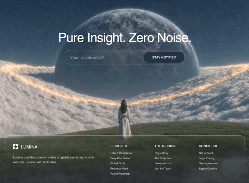 Lumina
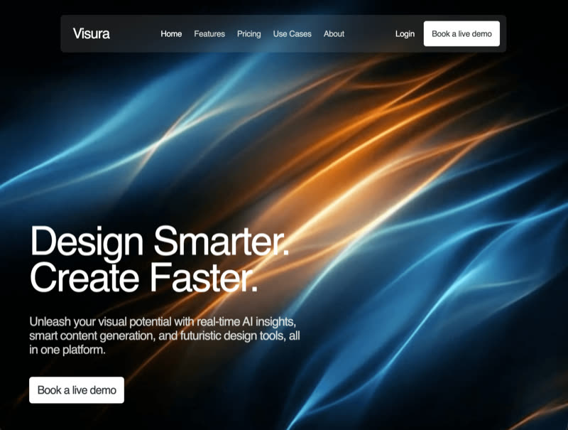 Luminex
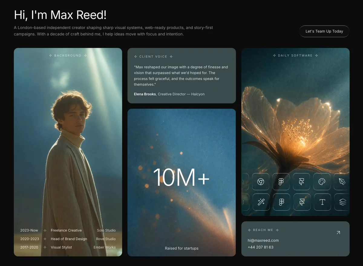 Max Reed Portfolio
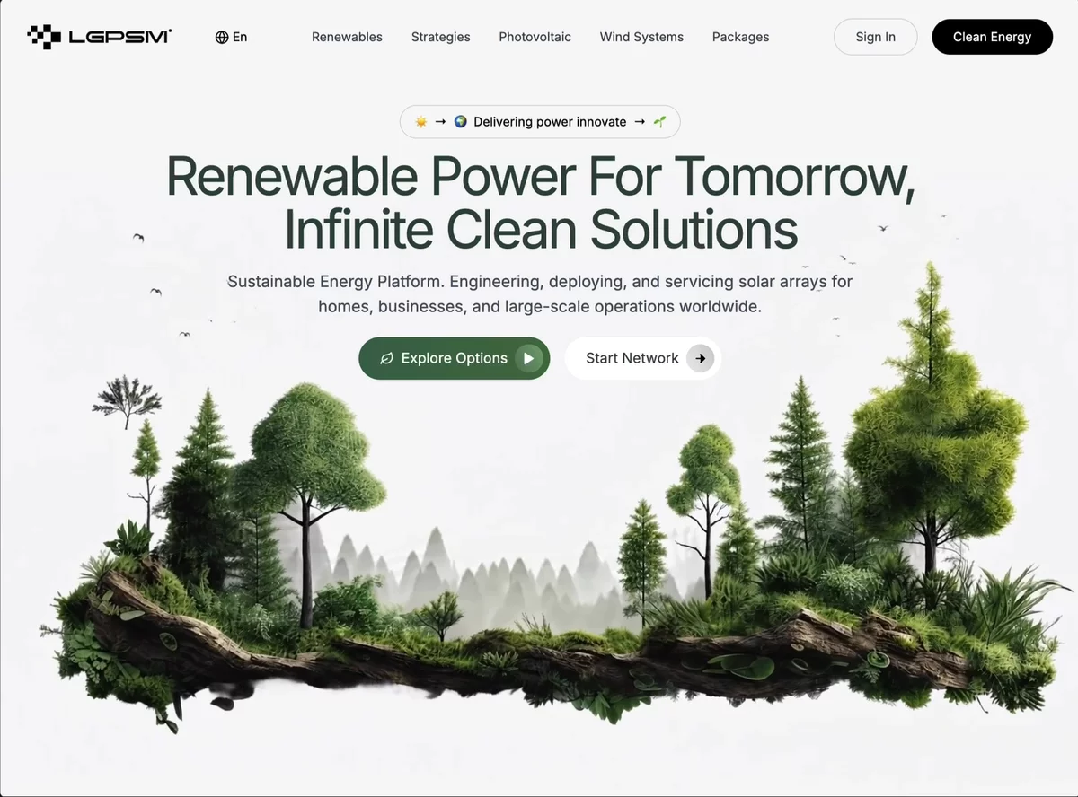 Naturecore SaaS
 Nex Max Upgrade
 Nexar
Nexar
 Nexora Features
 Nexus IT Solutions
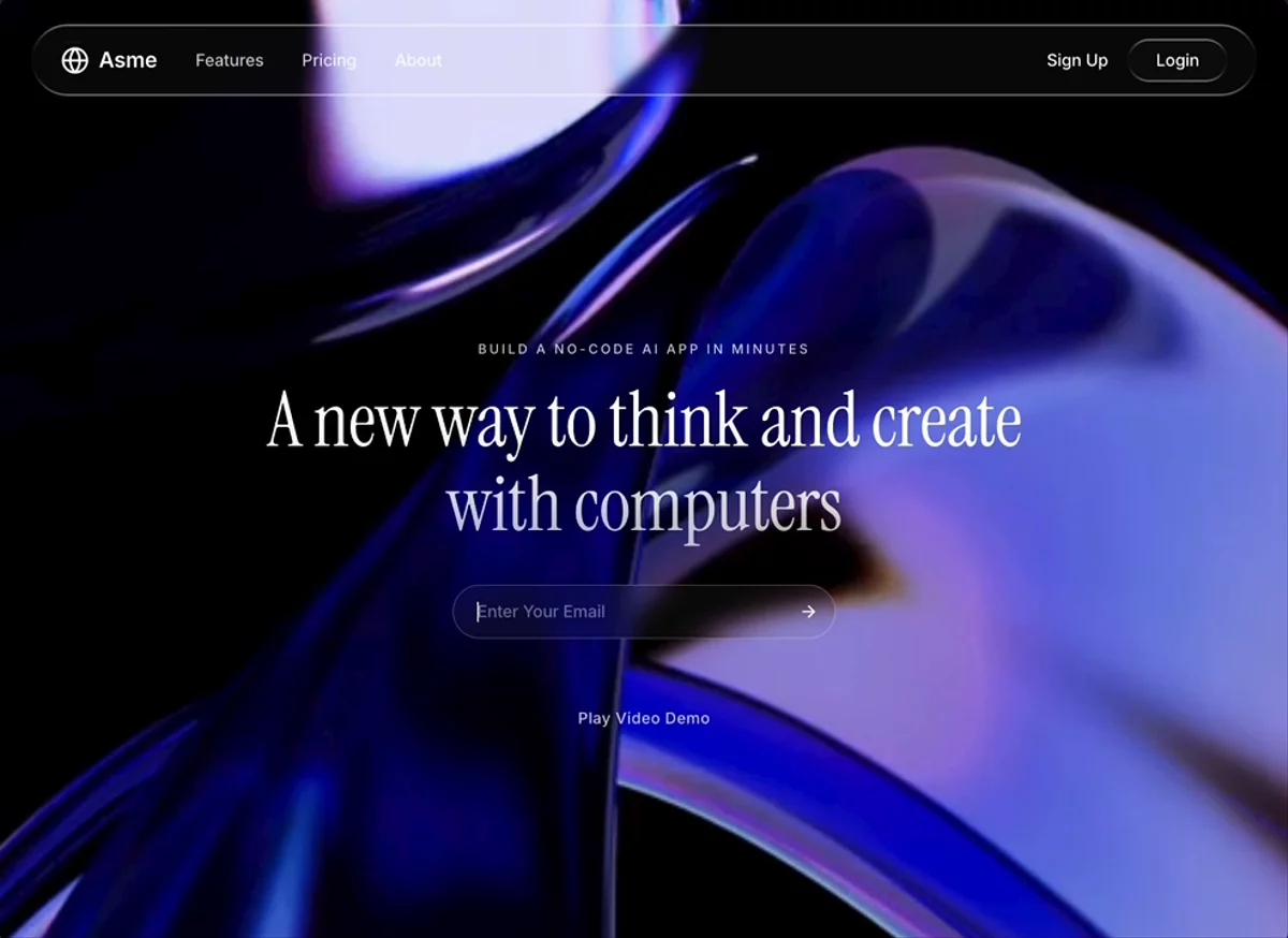 No-Code Waitlist
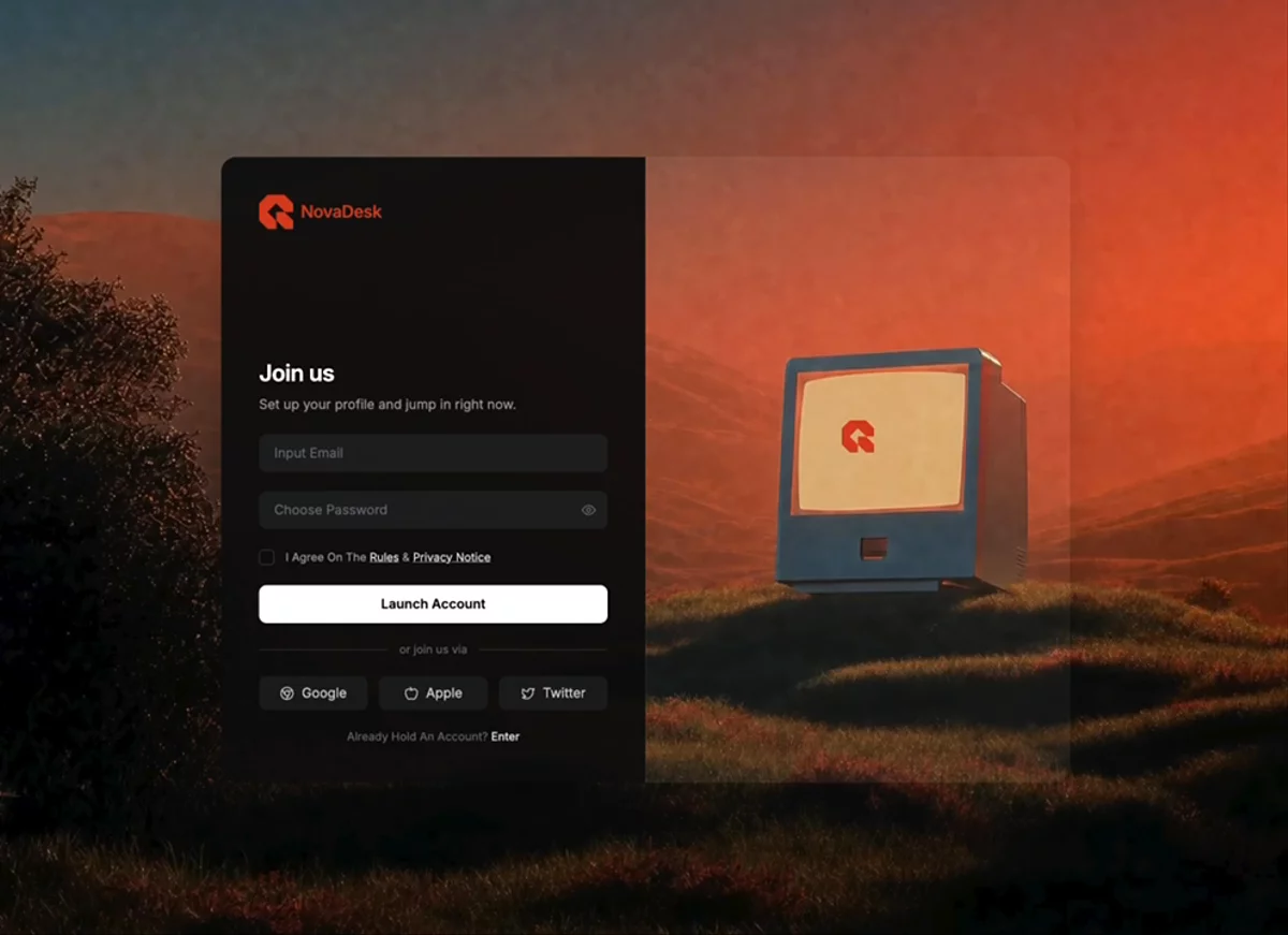 NovaDesk Signup
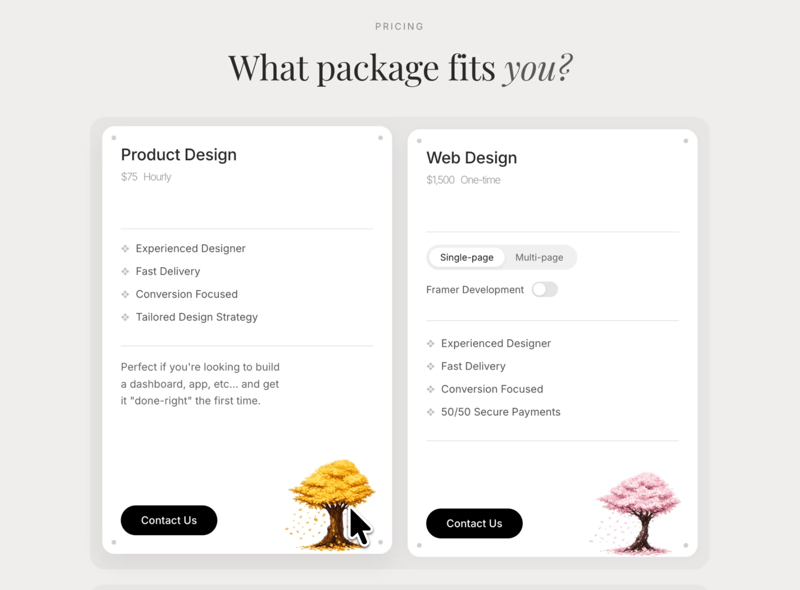 What Package Fits You
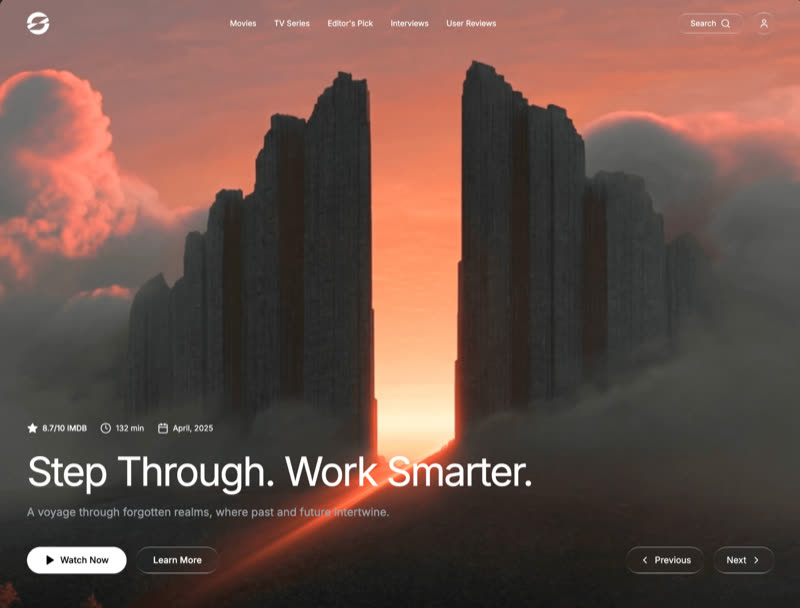 Portal
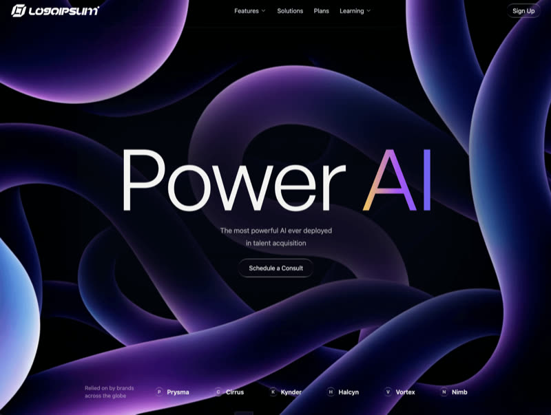 Power AI
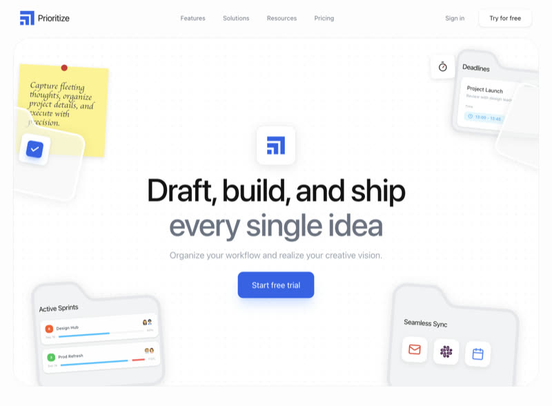 Prioritize
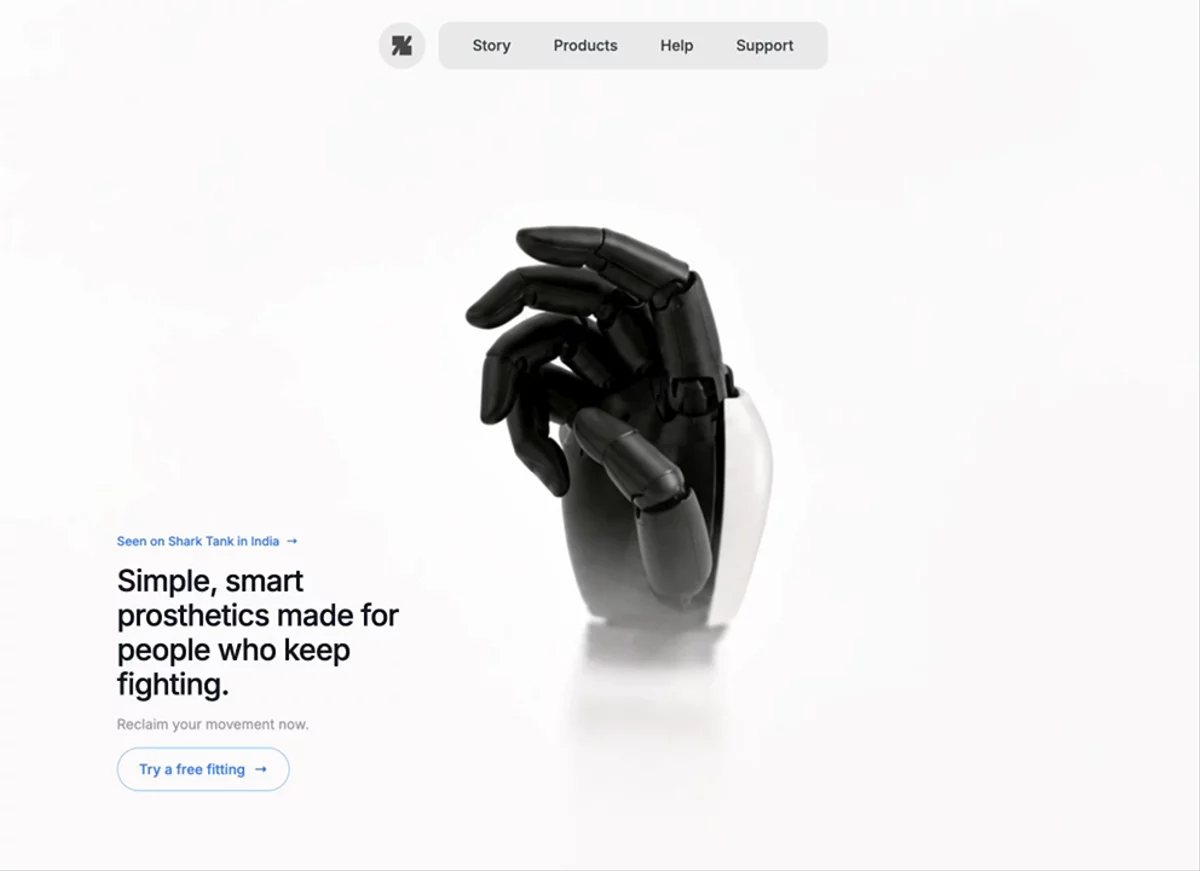 Prosthetics Hero
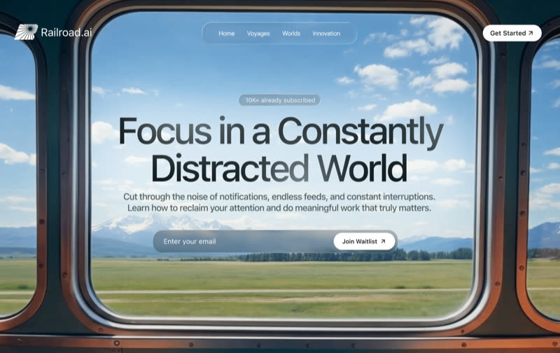 Railroad.ai
 Reveal Hero
 RIVR
RIVR
 Scroll Landing Page
 Sentinel AI
 Shamoni
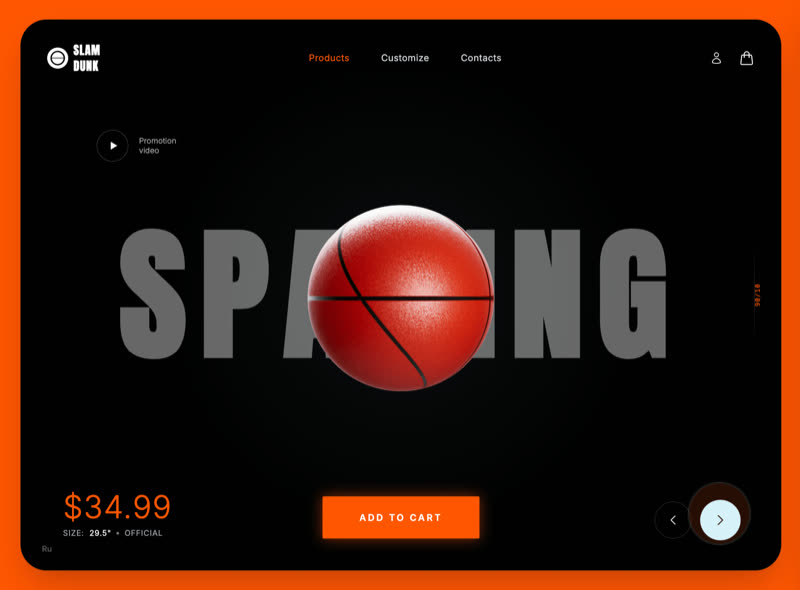 Slam Dunk
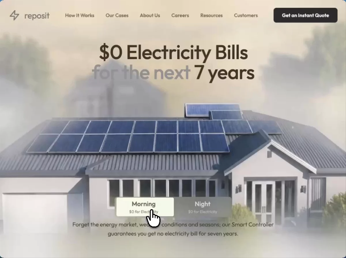 Solar Energy Hero
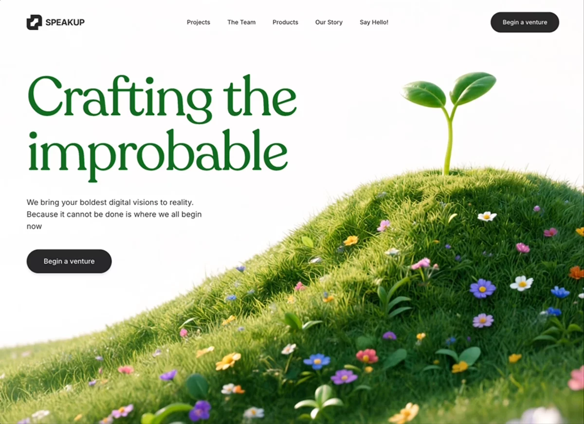 SpeakUp Venture Hero
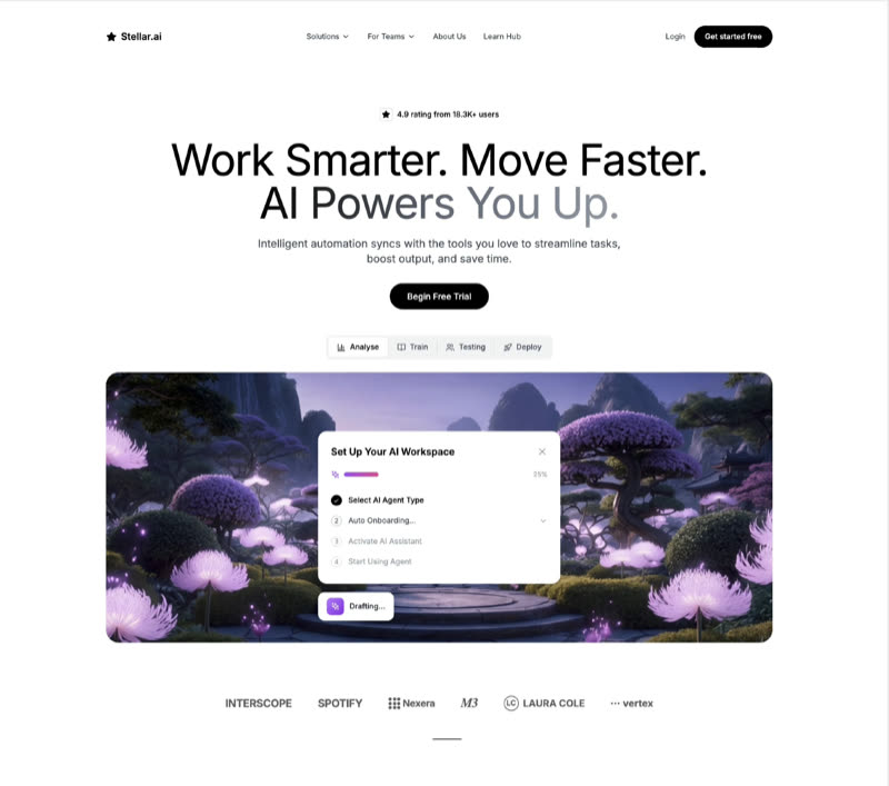 Stellar AI
 Sync AI
 Taskly
 Transform Data
 VaultShield
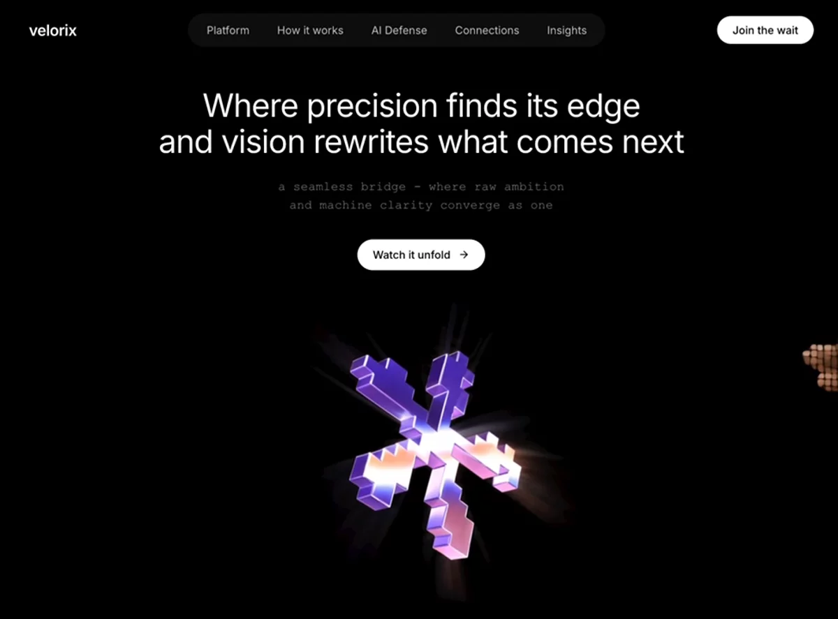 Velorix IIC
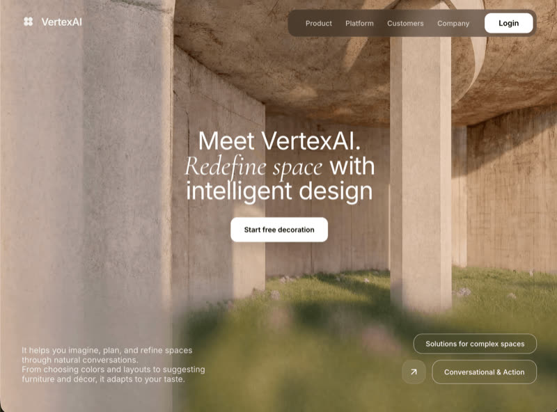 VertexAI Hero
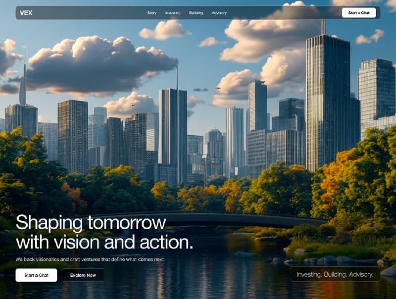 VEX Ventures
Browse & preview free Unlock everything — from $49/mo
Frequently asked questions
Do Meez prompts work with Framer?
Yes. Every Meez prompt is a complete written spec — fonts, layout, color tokens, motion and asset URLs — so Framer can build it in one paste. The 62 free prompts on this site work exactly like the premium ones; copy one above and try it.
What does Framer generate from a prompt?
Framer generates a visually editable, hosted marketing site — no code export needed to ship. Its AI turns a written spec into real sections on the canvas, so a Meez prompt's type scale, palette and layout become directly draggable, tweakable elements you publish from Framer itself.
How do I use a Meez prompt in Framer?
Copy the full prompt text and paste it into Framer's AI page generator. Don't shorten it — the specificity is what keeps Framer from producing a generic layout. Then iterate: swap the copy and point the asset URLs at your own media.
How many prompts are free?
62 prompts are free to copy in full, no account needed. The other 579 unlock with Unlimited — $49/mo, $149/yr, or $299 once for lifetime — along with all 285 motion backgrounds.
Also for: Lovable · Bolt · v0 · Cursor · Claude · Replit · Windsurf · Webflow · ChatGPT · Figma Make · Gemini · GitHub Copilot · Wix
Not sure which tool? Lovable vs v0 vs Bolt vs Cursor, compared → · All free prompts on one page → · All prompt categories →