Component · Free prompt
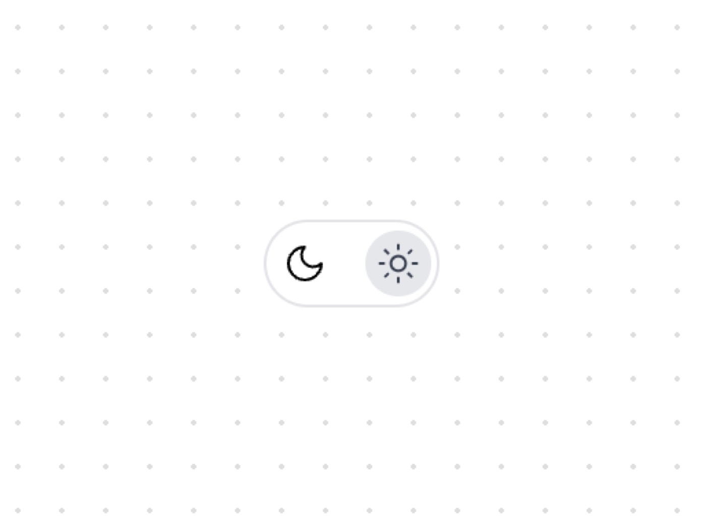
Theme Toggle
Theme Toggle is a complete, paste-ready component build-prompt — a full art-direction spec for Lovable, Bolt, v0, Cursor and Claude. It's free: copy it below and paste it into your builder.

Theme ToggleComponent · free prompt · copy-paste
Cool Toggles with framer motion animations that you can copy-paste into your apps.
— Install —
npx shadcn@latest add "https://21st.dev/r/theme-toggle"
— Component source (Theme Toggle.tsx) —
"use client"
import { useState } from "react"
import { Moon, Sun } from "lucide-react"
import { cn } from "@/lib/utils"
interface ThemeToggleProps {
className?: string
}
export function ThemeToggle({ className }: ThemeToggleProps) {
const [isDark, setIsDark] = useState(true)
// next-themes
// const { resolvedTheme, setTheme } = useTheme()
// const isDark = resolvedTheme === "dark"
// onClick={() => setTheme(isDark ? "light" : "dark")}
return (
<div
className={cn(
"flex w-16 h-8 p-1 rounded-full cursor-pointer transition-all duration-300",
isDark
? "bg-zinc-950 border border-zinc-800"
: "bg-white border border-zinc-200",
className
)}
onClick={() => setIsDark(!isDark)}
role="button"
tabIndex={0}
>
<div className="flex justify-between items-center w-full">
<div
className={cn(
"flex justify-center items-center w-6 h-6 rounded-full transition-transform duration-300",
isDark
? "transform translate-x-0 bg-zinc-800"
: "transform translate-x-8 bg-gray-200"
)}
>
{isDark ? (
<Moon
className="w-4 h-4 text-white"
strokeWidth={1.5}
/>
) : (
<Sun
className="w-4 h-4 text-gray-700"
strokeWidth={1.5}
/>
)}
</div>
<div
className={cn(
"flex justify-center items-center w-6 h-6 rounded-full transition-transform duration-300",
isDark
? "bg-transparent"
: "transform -translate-x-8"
)}
>
{isDark ? (
<Sun
className="w-4 h-4 text-gray-500"
strokeWidth={1.5}
/>
) : (
<Moon
className="w-4 h-4 text-black"
strokeWidth={1.5}
/>
)}
</div>
</div>
</div>
)
}
Browse & preview free Unlock everything — from $19/mo