Meez.
Browse Prompts Backgrounds Pricing
Contact Sign in ·

Component · Free prompt

Filters

free · paste into Lovable, Bolt, v0, Cursor or Claude

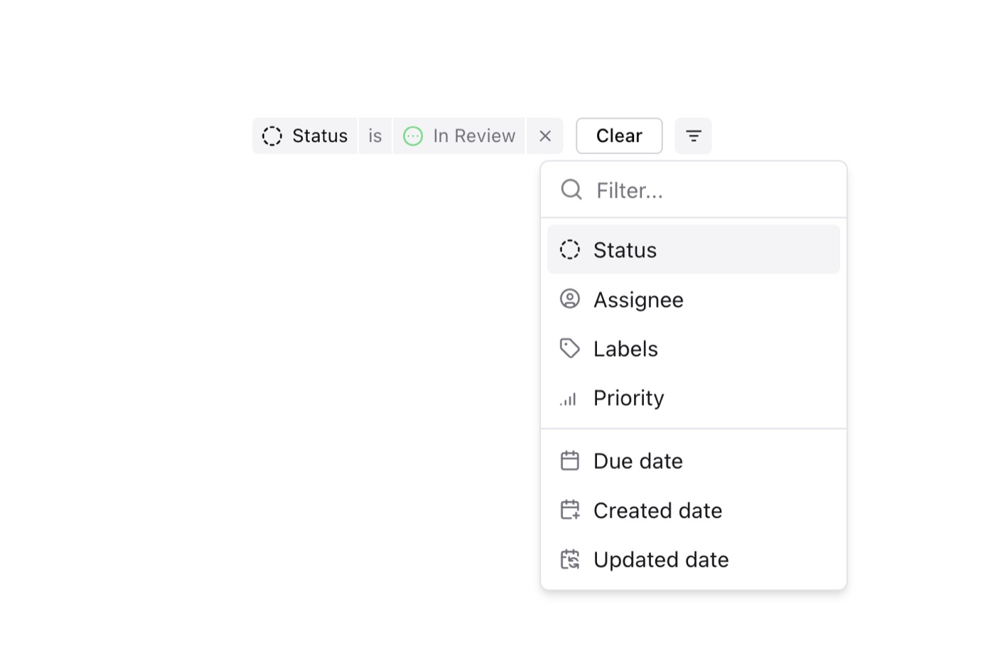
Filters is a complete, paste-ready component build-prompt — a full art-direction spec for Lovable, Bolt, v0, Cursor and Claude. It's free: copy it below and paste it into your builder.

Filters preview

“A Linear inspired component to add / edit filters — Install — npx shadcn@latest add "https://21st.dev/r/filters" — Component source (Filters.tsx) — import { Checkbox } from "@/components/ui/checkbox"; import { …”

FiltersComponent · free prompt · copy-paste

Prompt page

A Linear inspired component to add / edit filters

— Install —
npx shadcn@latest add "https://21st.dev/r/filters"

— Component source (Filters.tsx) —

import { Checkbox } from "@/components/ui/checkbox";
import {
  Command,
  CommandEmpty,
  CommandGroup,
  CommandInput,
  CommandItem,
  CommandList,
  CommandSeparator,
} from "@/components/ui/command";
import {
  DropdownMenu,
  DropdownMenuContent,
  DropdownMenuItem,
  DropdownMenuTrigger,
} from "@/components/ui/dropdown-menu";
import {
  Popover,
  PopoverContent,
  PopoverTrigger,
} from "@/components/ui/popover";
import { cn } from "@/lib/utils";
import {
  Calendar,
  CalendarPlus,
  CalendarSync,
  Check,
  Circle,
  CircleAlert,
  CircleCheck,
  CircleDashed,
  CircleDotDashed,
  CircleEllipsis,
  CircleX,
  SignalHigh,
  SignalLow,
  SignalMedium,
  Tag,
  UserCircle,
  X,
} from "lucide-react";
import { Dispatch, SetStateAction, useRef, useState, useEffect } from "react";
import { Avatar, AvatarFallback } from "@/components/ui/avatar";
import { Button } from "@/components/ui/button";
import { AnimatePresence, motion } from "motion/react";

interface AnimateChangeInHeightProps {
  children: React.ReactNode;
  className?: string;
}

export const AnimateChangeInHeight: React.FC<AnimateChangeInHeightProps> = ({
  children,
  className,
}) => {
  const containerRef = useRef<HTMLDivElement | null>(null);
  const [height, setHeight] = useState<number | "auto">("auto");

  useEffect(() => {
    if (containerRef.current) {
      const resizeObserver = new ResizeObserver((entries) => {
        // We only have one entry, so we can use entries[0].
        const observedHeight = entries[0].contentRect.height;
        setHeight(observedHeight);
      });

      resizeObserver.observe(containerRef.current);

      return () => {
        // Cleanup the observer when the component is unmounted
        resizeObserver.disconnect();
      };
    }
  }, []);

  return (
    <motion.div
      className={cn(className, "overflow-hidden")}
      style={{ height }}
      animate={{ height }}
      transition={{ duration: 0.1, dampping: 0.2, ease: "easeIn" }}
    >
      <div ref={containerRef}>{children}</div>
    </motion.div>
  );
};

export enum FilterType {
  STATUS = "Status",
  ASSIGNEE = "Assignee",
  LABELS = "Labels",
  PRIORITY = "Priority",
  DUE_DATE = "Due date",
  CREATED_DATE = "Created date",
  UPDATED_DATE = "Updated date",
}

export enum FilterOperator {
  IS = "is",
  IS_NOT = "is not",
  IS_ANY_OF = "is any of",
  INCLUDE = "include",
  DO_NOT_INCLUDE = "do not include",
  INCLUDE_ALL_OF = "include all of",
  INCLUDE_ANY_OF = "include any of",
  EXCLUDE_ALL_OF = "exclude all of",
  EXCLUDE_IF_ANY_OF = "exclude if any of",
  BEFORE = "before",
  AFTER = "after",
}

export enum Status {
  BACKLOG = "Backlog",
  TODO = "Todo",
  IN_PROGRESS = "In Progress",
  IN_REVIEW = "In Review",
  DONE = "Done",
  CANCELLED = "Cancelled",
}

export enum Assignee {
  ANDREW_LUO = "Andrew Luo",
  NO_ASSIGNEE = "No assignee",
}

export enum Labels {
  BUG = "Bug",
  FEATURE = "Feature",
  HOTFIX = "Hotfix",
  RELEASE = "Release",
}

export enum Priority {
  URGENT = "Urgent",
  HIGH = "High",
  MEDIUM = "Medium",
  LOW = "Low",
}

export enum DueDate {
  IN_THE_PAST = "in the past",
  IN_24_HOURS = "24 hours from now",
  IN_3_DAYS = "3 days from now",
  IN_1_WEEK = "1 week from now",
  IN_1_MONTH = "1 month from now",
  IN_3_MONTHS = "3 months from now",
}

export type FilterOption = {
  name: FilterType | Status | Assignee | Labels | Priority | DueDate;
  icon: React.ReactNode | undefined;
  label?: string;
};

export type Filter = {
  id: string;
  type: FilterType;
  operator: FilterOperator;
  value: string[];
};

const FilterIcon = ({
  type,
}: {
  type: FilterType | Status | Assignee | Labels | Priority;
}) => {
  switch (type) {
    case Assignee.ANDREW_LUO:
      return (
        <Avatar className="size-3.5 rounded-full text-[9px] text-white">
          <AvatarFallback className="bg-orange-300">AL</AvatarFallback>
        </Avatar>
      );
    case Assignee.NO_ASSIGNEE:
      return <UserCircle className="size-3.5" />;
    case FilterType.STATUS:
      return <CircleDashed className="size-3.5" />;
    case FilterType.ASSIGNEE:
      return <UserCircle className="size-3.5" />;
    case FilterType.LABELS:
      return <Tag className="size-3.5" />;
    case FilterType.PRIORITY:
      return <SignalHigh className="size-3.5" />;
    case FilterType.DUE_DATE:
      return <Calendar className="size-3.5" />;
    case FilterType.CREATED_DATE:
      return <CalendarPlus className="size-3.5" />;
    case FilterType.UPDATED_DATE:
      return <CalendarSync className="size-3.5" />;
    case Status.BACKLOG:
      return <CircleDashed className="size-3.5 text-muted-foreground" />;
    case Status.TODO:
      return <Circle className="size-3.5 text-primary" />;
    case Status.IN_PROGRESS:
      return <CircleDotDashed className="size-3.5 text-yellow-400" />;
    case Status.IN_REVIEW:
      return <CircleEllipsis className="size-3.5 text-green-400" />;
    case Status.DONE:
      return <CircleCheck className="size-3.5 text-blue-400" />;
    case Status.CANCELLED:
      return <CircleX className="size-3.5 text-muted-foreground" />;
    case Priority.URGENT:
      return <CircleAlert className="size-3.5" />;
    case Priority.HIGH:
      return <SignalHigh className="size-3.5" />;
    case Priority.MEDIUM:
      return <SignalMedium className="size-3.5" />;
    case Priority.LOW:
      return <SignalLow className="size-3.5" />;
    case Labels.BUG:
      return <div className="bg-red-400 rounded-full size-2.5" />;
    case Labels.FEATURE:
      return <div className="bg-blue-400 rounded-full size-2.5" />;
    case Labels.HOTFIX:
      return <div className="bg-amber-400 rounded-full size-2.5" />;
    case Labels.RELEASE:
      return <div className="bg-green-400 rounded-full size-2.5" />;
  }
};

export const filterViewOptions: FilterOption[][] = [
  [
    {
      name: FilterType.STATUS,
      icon: <FilterIcon type={FilterType.STATUS} />,
    },
    {
      name: FilterType.ASSIGNEE,
      icon: <FilterIcon type={FilterType.ASSIGNEE} />,
    },
    {
      name: FilterType.LABELS,
      icon: <FilterIcon type={FilterType.LABELS} />,
    },
    {
      name: FilterType.PRIORITY,
      icon: <FilterIcon type={FilterType.PRIORITY} />,
    },
  ],
  [
    {
      name: FilterType.DUE_DATE,
      icon: <FilterIcon type={FilterType.DUE_DATE} />,
    },
    {
      name: FilterType.CREATED_DATE,
      icon: <FilterIcon type={FilterType.CREATED_DATE} />,
    },
    {
      name: FilterType.UPDATED_DATE,
      icon: <FilterIcon type={FilterType.UPDATED_DATE} />,
    },
  ],
];

export const statusFilterOptions: FilterOption[] = Object.values(Status).map(
  (status) => ({
    name: status,
    icon: <FilterIcon type={status} />,
  })
);

export const assigneeFilterOptions: FilterOption[] = Object.values(
  Assignee
).map((assignee) => ({
  name: assignee,
  icon: <FilterIcon type={assignee} />,
}));

export const labelFilterOptions: FilterOption[] = Object.values(Labels).map(
  (label) => ({
    name: label,
    icon: <FilterIcon type={label} />,
  })
);

export const priorityFilterOptions: FilterOption[] = Object.values(
  Priority
).map((priority) => ({
  name: priority,
  icon: <FilterIcon type={priority} />,
}));

export const dateFilterOptions: FilterOption[] = Object.values(DueDate).map(
  (date) => ({
    name: date,
    icon: undefined,
  })
);

export const filterViewToFilterOptions: Record<FilterType, FilterOption[]> = {
  [FilterType.STATUS]: statusFilterOptions,
  [FilterType.ASSIGNEE]: assigneeFilterOptions,
  [FilterType.LABELS]: labelFilterOptions,
  [FilterType.PRIORITY]: priorityFilterOptions,
  [FilterType.DUE_DATE]: dateFilterOptions,
  [FilterType.CREATED_DATE]: dateFilterOptions,
  [FilterType.UPDATED_DATE]: dateFilterOptions,
};

const filterOperators = ({
  filterType,
  filterValues,
}: {
  filterType: FilterType;
  filterValues: string[];
}) => {
  switch (filterType) {
    case FilterType.STATUS:
    case FilterType.ASSIGNEE:
    case FilterType.PRIORITY:
      if (Array.isArray(filterValues) && filterValues.length > 1) {
        return [FilterOperator.IS_ANY_OF, FilterOperator.IS_NOT];
      } else {
        return [FilterOperator.IS, FilterOperator.IS_NOT];
      }
    case FilterType.LABELS:
      if (Array.isArray(filterValues) && filterValues.length > 1) {
        return [
          FilterOperator.INCLUDE_ANY_OF,
          FilterOperator.INCLUDE_ALL_OF,
          FilterOperator.EXCLUDE_ALL_OF,
          FilterOperator.EXCLUDE_IF_ANY_OF,
        ];
      } else {
        return [FilterOperator.INCLUDE, FilterOperator.DO_NOT_INCLUDE];
      }
    case FilterType.DUE_DATE:
    case FilterType.CREATED_DATE:
    case FilterType.UPDATED_DATE:
      if (filterValues?.includes(DueDate.IN_THE_PAST)) {
        return [FilterOperator.IS, FilterOperator.IS_NOT];
      } else {
        return [FilterOperator.BEFORE, FilterOperator.AFTER];
      }
    default:
      return [];
  }
};

const FilterOperatorDropdown = ({
  filterType,
  operator,
  filterValues,
  setOperator,
}: {
  filterType: FilterType;
  operator: FilterOperator;
  filterValues: string[];
  setOperator: (operator: FilterOperator) => void;
}) => {
  const operators = filterOperators({ filterType, filterValues });
  return (
    <DropdownMenu>
      <DropdownMenuTrigger className="bg-muted hover:bg-muted/50 px-1.5 py-1 text-muted-foreground hover:text-primary transition shrink-0">
        {operator}
      </DropdownMenuTrigger>
      <DropdownMenuContent align="start" className="w-fit min-w-fit">
        {operators.map((operator) => (
          <DropdownMenuItem
            key={operator}
            onClick={() => setOperator(operator)}
          >
            {operator}
          </DropdownMenuItem>
        ))}
      </DropdownMenuContent>
    </DropdownMenu>
  );
};

const FilterValueCombobox = ({
  filterType,
  filterValues,
  setFilterValues,
}: {
  filterType: FilterType;
  filterValues: string[];
  setFilterValues: (filterValues: string[]) => void;
}) => {
  const [open, setOpen] = useState(false);
  const [commandInput, setCommandInput] = useState("");
  const commandInputRef = useRef<HTMLInputElement>(null);
  const nonSelectedFilterValues = filterViewToFilterOptions[filterType]?.filter(
    (filter) => !filterValues.includes(filter.name)
  );
  return (
    <Popover
      open={open}
      onOpenChange={(open) => {
        setOpen(open);
        if (!open) {
          setTimeout(() => {
            setCommandInput("");
          }, 200);
        }
      }}
    >
      <PopoverTrigger
        className="rounded-none px-1.5 py-1 bg-muted hover:bg-muted/50 transition
  text-muted-foreground hover:text-primary shrink-0"
      >
        <div className="flex gap-1.5 items-center">
          {filterType !== FilterType.PRIORITY && (
            <div
              className={cn(
                "flex items-center flex-row",
                filterType === FilterType.LABELS ? "-space-x-1" : "-space-x-1.5"
              )}
            >
              <AnimatePresence mode="popLayout">
                {filterValues?.slice(0, 3).map((value) => (
                  <motion.div
                    key={value}
                    initial={{ opacity: 0, x: -10 }}
                    animate={{ opacity: 1, x: 0 }}
                    exit={{ opacity: 0, x: -10 }}
                    transition={{ duration: 0.2 }}
                  >
                    <FilterIcon type={value as FilterType} />
                  </motion.div>
                ))}
              </AnimatePresence>
            </div>
          )}
          {filterValues?.length === 1
            ? filterValues?.[0]
            : `${filterValues?.length} selected`}
        </div>
      </PopoverTrigger>
      <PopoverContent className="w-[200px] p-0">
        <AnimateChangeInHeight>
          <Command>
            <CommandInput
              placeholder={filterType}
              className="h-9"
              value={commandInput}
              onInputCapture={(e) => {
                setCommandInput(e.currentTarget.value);
              }}
              ref={commandInputRef}
            />
            <CommandList>
              <CommandEmpty>No results found.</CommandEmpty>
              <CommandGroup>
                {filterValues.map((value) => (
                  <CommandItem
                    key={value}
                    className="group flex gap-2 items-center"
                    onSelect={() => {
                      setFilterValues(filterValues.filter((v) => v !== value));
                      setTimeout(() => {
                        setCommandInput("");
                      }, 200);
                      setOpen(false);
                    }}
                  >
                    <Checkbox checked={true} />
                    <FilterIcon type={value as FilterType} />
                    {value}
                  </CommandItem>
                ))}
              </CommandGroup>
              {nonSelectedFilterValues?.length > 0 && (
                <>
                  <CommandSeparator />
                  <CommandGroup>
                    {nonSelectedFilterValues.map((filter: FilterOption) => (
                      <CommandItem
                        className="group flex gap-2 items-center"
                        key={filter.name}
                        value={filter.name}
                        onSelect={(currentValue: string) => {
                          setFilterValues([...filterValues, currentValue]);
                          setTimeout(() => {
                            setCommandInput("");
                          }, 200);
                          setOpen(false);
                        }}
                      >
                        <Checkbox
                          checked={false}
                          className="opacity-0 group-data-[selected=true]:opacity-100"
                        />
                        {filter.icon}
                        <span className="text-accent-foreground">
                          {filter.name}
                        </span>
                        {filter.label && (
                          <span className="text-muted-foreground text-xs ml-auto">
                            {filter.label}
                          </span>
                        )}
                      </CommandItem>
                    ))}
                  </CommandGroup>
                </>
              )}
            </CommandList>
          </Command>
        </AnimateChangeInHeight>
      </PopoverContent>
    </Popover>
  );
};

const FilterValueDateCombobox = ({
  filterType,
  filterValues,
  setFilterValues,
}: {
  filterType: FilterType;
  filterValues: string[];
  setFilterValues: (filterValues: string[]) => void;
}) => {
  const [open, setOpen] = useState(false);
  const [commandInput, setCommandInput] = useState("");
  const commandInputRef = useRef<HTMLInputElement>(null);
  return (
    <Popover
      open={open}
      onOpenChange={(open) => {
        setOpen(open);
        if (!open) {
          setTimeout(() => {
            setCommandInput("");
          }, 200);
        }
      }}
    >
      <PopoverTrigger
        className="rounded-none px-1.5 py-1 bg-muted hover:bg-muted/50 transition
  text-muted-foreground hover:text-primary shrink-0"
      >
        {filterValues?.[0]}
      </PopoverTrigger>
      <PopoverContent className="w-fit p-0">
        <AnimateChangeInHeight>
          <Command>
            <CommandInput
              placeholder={filterType}
              className="h-9"
              value={commandInput}
              onInputCapture={(e) => {
                setCommandInput(e.currentTarget.value);
              }}
              ref={commandInputRef}
            />
            <CommandList>
              <CommandEmpty>No results found.</CommandEmpty>
              <CommandGroup>
                {filterViewToFilterOptions[filterType].map(
                  (filter: FilterOption) => (
                    <CommandItem
                      className="group flex gap-2 items-center"
                      key={filter.name}
                      value={filter.name}
                      onSelect={(currentValue: string) => {
                        setFilterValues([currentValue]);
                        setTimeout(() => {
                          setCommandInput("");
                        }, 200);
                        setOpen(false);
                      }}
                    >
                      <span className="text-accent-foreground">
                        {filter.name}
                      </span>
                      <Check
                        className={cn(
                          "ml-auto",
                          filterValues.includes(filter.name)
                            ? "opacity-100"
                            : "opacity-0"
                        )}
                      />
                    </CommandItem>
                  )
                )}
              </CommandGroup>
            </CommandList>
          </Command>
        </AnimateChangeInHeight>
      </PopoverContent>
    </Popover>
  );
};

export default function Filters({
  filters,
  setFilters,
}: {
  filters: Filter[];
  setFilters: Dispatch<SetStateAction<Filter[]>>;
}) {
  return (
    <div className="flex gap-2">
      {filters
        .filter((filter) => filter.value?.length > 0)
        .map((filter) => (
          <div key={filter.id} className="flex gap-[1px] items-center text-xs">
            <div className="flex gap-1.5 shrink-0 rounded-l bg-muted px-1.5 py-1 items-center">
              <FilterIcon type={filter.type} />
              {filter.type}
            </div>
            <FilterOperatorDropdown
              filterType={filter.type}
              operator={filter.operator}
              filterValues={filter.value}
              setOperator={(operator) => {
                setFilters((prev) =>
                  prev.map((f) => (f.id === filter.id ? { ...f, operator } : f))
                );
              }}
            />
            {filter.type === FilterType.CREATED_DATE ||
            filter.type === FilterType.UPDATED_DATE ||
            filter.type === FilterType.DUE_DATE ? (
              <FilterValueDateCombobox
                filterType={filter.type}
                filterValues={filter.value}
                setFilterValues={(filterValues) => {
                  setFilters((prev) =>
                    prev.map((f) =>
                      f.id === filter.id ? { ...f, value: filterValues } : f
                    )
                  );
                }}
              />
            ) : (
              <FilterValueCombobox
                filterType={filter.type}
                filterValues={filter.value}
                setFilterValues={(filterValues) => {
                  setFilters((prev) =>
                    prev.map((f) =>
                      f.id === filter.id ? { ...f, value: filterValues } : f
                    )
                  );
                }}
              />
            )}
            <Button
              variant="ghost"
              size="icon"
              onClick={() => {
                setFilters((prev) => prev.filter((f) => f.id !== filter.id));
              }}
              className="bg-muted rounded-l-none rounded-r-sm h-6 w-6 text-muted-foreground hover:text-primary hover:bg-muted/50 transition shrink-0"
            >
              <X className="size-3" />
            </Button>
          </div>
        ))}
    </div>
  );
}

Browse & preview free → Unlock everything — from $19/mo

More like this

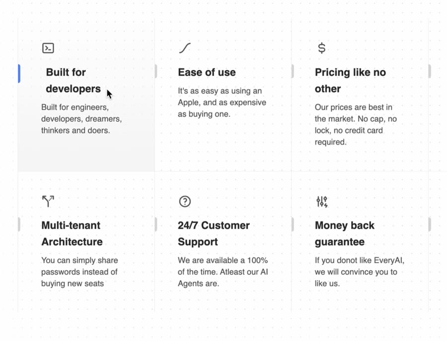
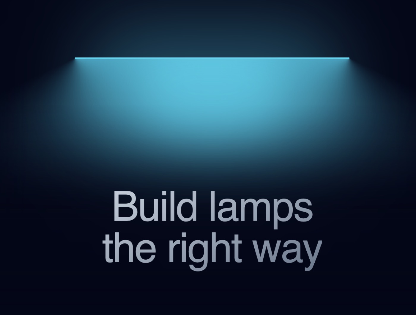
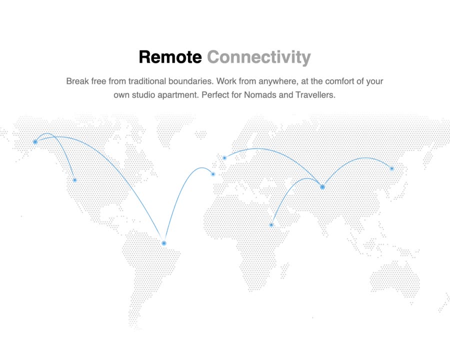
Animated Cards — Component website build-promptAnimated Cards Table — Component website build-promptTable Empty State — Component website build-promptEmpty State Feature Section with hover effects — Component website build-promptFeature Section with hover effects Lamp — Component website build-promptLamp World Map — Component website build-promptWorld Map
Meez.

The biggest library of AI website build-prompts & motion backgrounds — at the lowest price.

Library
Browse all Prompts by category Section prompts Motion backgrounds Pricing
Learn & contact
How it works Why AI sites look generic Terms Privacy Contact Affiliates
© Meez — an open archive. Start free · Unlimited from $19/mo · cancel anytime.