Prompts · for GitHub Copilot
AI website build-prompts for GitHub Copilot
Paste a Meez prompt into Copilot Chat (or drop it inline in your editor) and it builds the page across your files — components, Tailwind classes, fonts, color tokens and motion specs land where they belong, with the asset URLs already wired in. The structured spec keeps Copilot on-brief instead of autocompleting something generic; you review the diff and ship from your own repo.
How to use a Meez prompt in GitHub Copilot
- Pick a prompt below (4 on this page are free) or browse the full library — every prompt is a complete art-direction spec: fonts, layout, color system, motion and real asset URLs.
- Copy the whole prompt and paste it into Copilot Chat in your editor. Don’t trim it — the detail is what stops GitHub Copilot from defaulting to a generic layout.
- Let it build, then iterate: swap the copy, point the asset URLs at your own media, and ship. The sites you build are yours, commercially.
Free prompts to try in GitHub Copilot right now
StillmindHero Section · free prompt · copy-paste
Create a fullscreen cinematic hero section for a mindfulness/focus app called "Lumora" using React, Tailwind CSS, and Lucide React icons.

## Font

Use **Instrument Serif** (Google Fonts, italic for the logo). Load it in index.html:
```
<link rel="preconnect" href="https://fonts.googleapis.com">
<link rel="preconnect" href="https://fonts.gstatic.com" crossorigin>
<link href="https://fonts.googleapis.com/css2?family=Instrument+Serif:ital@0;1&display=swap" rel="stylesheet">
```

Set `font-family: 'Instrument Serif', serif` on html/body. Use `system-ui, sans-serif` inline for body text (subtext, buttons, stats, video labels).

---

## Background Video Layer

Stack 4 fullscreen looping videos absolutely positioned. Only the active one has `opacity-100`; others have `opacity-0`. Transition opacity over 1000ms ease-in-out. Videos autoPlay, muted, loop, playsInline.

**Video URLs (in order):**
1. `https://meez.design/web/bg-previews/299_trainmove1.mp4`
2. `https://meez.design/web/media/ext/37c6543a9e3b1bac.mp4`
3. `https://meez.design/web/media/ext/a14ef13297c1a6d7.mp4`
4. `https://meez.design/web/media/ext/680d661e1cefa0b3.mp4`

**Labels:** Golden Hour, Still Water, Deep Woods, Quiet Dawn

---

## Transparent PNG Overlay (z-index 1)

Place this image over the videos as an absolutely positioned overlay covering the full viewport:
```
https://meez.design/web/media/ext/979624a2a689c9e3.png
```

Apply a continuous "train-bob" animation: translateY oscillates between 0 and -6px over 3s ease-in-out infinite, with a constant scale(1.03) to prevent edges from showing during the motion.

---

## Liquid Glass Effect (CSS class `.liquid-glass`)

```css
.liquid-glass {
  background: rgba(255, 255, 255, 0.01);
  background-blend-mode: luminosity;
  backdrop-filter: blur(4px);
  -webkit-backdrop-filter: blur(4px);
  border: none;
  box-shadow: inset 0 1px 1px rgba(255, 255, 255, 0.1);
  position: relative;
  overflow: hidden;
}
```

With a `::before` pseudo-element for a subtle gradient border:
```css
.liquid-glass::before {
  content: '';
  position: absolute;
  inset: 0;
  border-radius: inherit;
  padding: 1.4px;
  background: linear-gradient(180deg,
    rgba(255,255,255,0.45) 0%, rgba(255,255,255,0.15) 20%,
    rgba(255,255,255,0) 40%, rgba(255,255,255,0) 60%,
    rgba(255,255,255,0.15) 80%, rgba(255,255,255,0.45) 100%);
  -webkit-mask: linear-gradient(#fff 0 0) content-box, linear-gradient(#fff 0 0);
  -webkit-mask-composite: xor;
  mask-composite: exclude;
  pointer-events: none;
}
```

---

## Content Layer (z-index 2) - Flex Column Full Height

### Navigation (top)
- Left: "Lumora" in white, italic, text-xl (sm:text-2xl)
- Right (desktop md+): A `.liquid-glass` pill containing nav links ("How It Works", "Features", "Pricing", "Community") in white/90 text-sm with hover to white, plus a solid white "Get Started" button at the end
- Right (mobile): A `.liquid-glass` rounded hamburger button using Lucide `Menu`/`X` icons with a crossfade rotation animation (300ms). The Menu icon rotates out 90deg and scales to 75%; the X icon rotates in from -90deg

### Mobile Menu Overlay (fixed, z-50)
- Backdrop: `bg-black/60 backdrop-blur-sm`
- Centered fullscreen panel with staggered entrance (each link delays 50ms more: 100ms, 150ms, 200ms, 250ms, 300ms)
- Links: white text-3xl, translate-y-4 to 0 on open
- "Get Started" button at bottom with scale animation
- Cubic-bezier easing: `cubic-bezier(0.4,0,0.2,1)`, duration 500ms

### Hero Content (centered, below nav)
- **Badge**: `.liquid-glass` rounded-full pill with text "Over 10,000 minds already finding their clarity"
- **Heading**: "Clarity in an Endlessly / Noisy Universe" (line break after "Endlessly"). Sizes: text-4xl / sm:text-5xl / md:text-7xl / lg:text-[5.5rem], leading-[1.1], max-w-4xl
- **Subtext**: "Rise above the chaos of pings, infinite scrolling, and relentless demands. Discover how to protect your presence and create with intention." max-w-xl, leading-relaxed
- **Email Input**: `.liquid-glass` rounded-full pill containing a text input ("Your Best Email") and a solid white "Get Early Access" button. Max-width 320px on mobile, sm:max-w-sm
- **Video Switcher**: Row of 4 text buttons with labels. Active button has solid color + bottom border. Inactive buttons are 50% opacity with transparent border, hover to 80%

### Dark Mode for "Deep Woods" (3rd video, index 2)
When the 3rd video is active, all hero content (badge, heading, subtext, input, video switcher) transitions to dark color `#182C41` with 700ms duration. The navbar and bottom stats remain white always.

### Bottom Stats (pushed to bottom via flex-1 spacer)
- Row of stats separated by `|` dividers (hidden on mobile): "60+ Deep Sessions", "12,000+ Creators", "4.8 User Satisfaction", "Intentional-First Design"
- text-white/70, text-xs sm:text-sm, system-ui font

---

## Video Switching Logic
- Track `activeVideo` state (default 0) and `isTransitioning` boolean
- On click, if not already active and not mid-transition, set new active video and start a 1000ms cooldown (matching the CSS crossfade duration)
- During cooldown, ignore additional clicks

---

## Responsive Behavior
- Mobile: Smaller text sizes, tighter padding, hamburger nav, stats wrap naturally
- Tablet/Desktop: Larger heading, more padding, inline nav pill, stats with pipe separators

---

## Section Container
```html
<section className="relative w-full h-screen overflow-hidden bg-black">
```

Black background prevents flash before videos load. Everything is a single viewport-height section with no scroll.

---

That's the complete specification. The entire app lives in a single `App.tsx` component with the CSS in `index.css`.
Quantum CoreData Intelligence · free prompt · copy-paste
# PROMPT — Recreate the "Apogee" Hero Section Exactly

Build a pixel-exact, fully mobile-responsive hero landing section called **"Apogee"**. Follow every specification below literally — exact hex values, exact pixel numbers, exact class names, exact animation delays, exact copy. Do not substitute, round, simplify, or "improve" any value. Where a bracketed Tailwind arbitrary value is given (e.g. `text-[15.5px]`), use that arbitrary value verbatim rather than the nearest Tailwind preset.

---

## 1. STACK & PROJECT SETUP

- **Vite 5** + **React 18.3** + **TypeScript 5.5** + **Tailwind CSS 3.4** + **PostCSS/Autoprefixer**
- Icons: **`lucide-react`** (v0.446) — use only `ChevronDown`, `Menu`, `X`
- `package.json` type: `"module"`. Scripts: `dev: vite`, `build: vite build`, `lint: eslint .`, `preview: vite preview`, `typecheck: tsc --noEmit -p tsconfig.app.json`

**`vite.config.ts`:**
```ts
import { defineConfig } from 'vite';
import react from '@vitejs/plugin-react';
import { fileURLToPath, URL } from 'node:url';

export default defineConfig({
  plugins: [react()],
  resolve: {
    alias: {
      '@': fileURLToPath(new URL('./src', import.meta.url)),
    },
  },
  optimizeDeps: {
    exclude: ['lucide-react'],
  },
});
```

**`tsconfig.app.json`** must include the matching path alias so `@/foo` resolves to `src/foo`:
```json
"baseUrl": ".",
"paths": { "@/*": ["src/*"] }
```

**`tailwind.config.js`** — stock, no theme extensions (all styling uses arbitrary values):
```js
/** @type {import('tailwindcss').Config} */
export default {
  content: ['./index.html', './src/**/*.{js,ts,jsx,tsx}'],
  theme: { extend: {} },
  plugins: [],
};
```

**File structure:**
```
index.html
src/main.tsx
src/App.tsx
src/index.css
src/components/Hero.tsx
```

`src/App.tsx` renders nothing but the hero:
```tsx
import Hero from '@/components/Hero';

function App() {
  return <Hero />;
}

export default App;
```

`src/main.tsx` uses `createRoot` + `<StrictMode>`, importing `./App.tsx` and `./index.css`.

---

## 2. `index.html` — FONT & HEAD

Page title: **`Apogee`**. Viewport meta: `width=device-width, initial-scale=1.0`.

Load the **Suisse Intl** webfont with this exact stylesheet link in `<head>`:
```html
<link href="(self-host this face — no free CDN; substitute a close match if unavailable)" rel="stylesheet">
```

Root div id is `root`; module script is `/src/main.tsx`.

---

## 3. `src/index.css` — GLOBAL CSS & KEYFRAMES

Exactly this file, in this order:

```css
@tailwind base;
@tailwind components;
@tailwind utilities;

* {
  margin: 0;
  padding: 0;
  box-sizing: border-box;
}

body {
  font-family: 'Suisse Intl', -apple-system, BlinkMacSystemFont, sans-serif;
  -webkit-font-smoothing: antialiased;
  -moz-osx-font-smoothing: grayscale;
}

@keyframes fade-up {
  from { opacity: 0; transform: translateY(24px); }
  to   { opacity: 1; transform: translateY(0); }
}

@keyframes fade-down {
  from { opacity: 0; transform: translateY(-16px); }
  to   { opacity: 1; transform: translateY(0); }
}

@keyframes fade-left {
  from { opacity: 0; transform: translateX(-20px); }
  to   { opacity: 1; transform: translateX(0); }
}

@keyframes fade-right {
  from { opacity: 0; transform: translateX(20px); }
  to   { opacity: 1; transform: translateX(0); }
}

@keyframes fade-scale {
  from { opacity: 0; transform: scale(0.92); }
  to   { opacity: 1; transform: scale(1); }
}

@keyframes bar-grow {
  from { transform: scaleY(0); opacity: 0; }
  to   { transform: scaleY(1); opacity: 1; }
}

.animate-fade-up    { animation: fade-up    0.8s cubic-bezier(0.16, 1, 0.3, 1) forwards; }
.animate-fade-down  { animation: fade-down  0.7s cubic-bezier(0.16, 1, 0.3, 1) forwards; }
.animate-fade-left  { animation: fade-left  0.8s cubic-bezier(0.16, 1, 0.3, 1) forwards; }
.animate-fade-right { animation: fade-right 0.8s cubic-bezier(0.16, 1, 0.3, 1) forwards; }
.animate-fade-scale { animation: fade-scale 0.9s cubic-bezier(0.16, 1, 0.3, 1) forwards; }

.animate-bar-grow {
  animation: bar-grow 0.6s cubic-bezier(0.16, 1, 0.3, 1) forwards;
  opacity: 0;
}
```

**Critical:** every animation uses `forwards` fill mode and the easing `cubic-bezier(0.16, 1, 0.3, 1)`. Elements start at `opacity-0` in markup and are revealed by the animation — never by JS state or IntersectionObserver.

---

## 4. `src/components/Hero.tsx`

Single file containing four things in this order: the `BAR_HEIGHTS` constant, the `Animate` helper, the `RevenueCard` component, the default-exported `Hero`, then the `Nav` component (function declarations, so hoisting allows `Nav` to be defined after `Hero`).

### 4.1 The `BAR_HEIGHTS` constant — use these 32 numbers exactly, in this order

```ts
const BAR_HEIGHTS = [
  23, 40, 53, 40, 33, 14, 7, 17, 75, 65,
  88, 75, 65, 47, 33, 88, 4, 7, 9, 14,
  95, 65, 79, 37, 7, 40, 17, 20, 62, 47,
  92, 72,
];
```

### 4.2 `Animate` — the reusable entrance-animation wrapper

Props: `children: React.ReactNode`, `delay?: number` (default `0`), `className?: string` (default `''`), `direction?: 'up' | 'down' | 'left' | 'right' | 'scale'` (default `'up'`).

It maps direction → class via a lookup object (`up: 'animate-fade-up'`, `down: 'animate-fade-down'`, `left: 'animate-fade-left'`, `right: 'animate-fade-right'`, `scale: 'animate-fade-scale'`) and renders:

```tsx
<div
  className={`opacity-0 ${directionClass} ${className}`}
  style={{ animationDelay: `${delay}ms` }}
>
  {children}
</div>
```

### 4.3 `Hero` — the outer section (default export)

```
<section class="relative w-full h-screen overflow-hidden bg-[#080A19]">
```

**Background video** — first child, absolutely positioned, covering, with this EXACT source URL:

```
https://meez.design/web/media/ext/8697de2ba28425a4.mp4
```

```tsx
<video
  className="absolute inset-0 w-full h-full object-cover"
  src="https://meez.design/web/media/ext/8697de2ba28425a4.mp4"
  autoPlay
  loop
  muted
  playsInline
/>
```
(It is a dark deep-blue/red nebula clip. There is **no** dark gradient overlay — the `#080A19` section background only shows while the video loads.)

**Content wrapper:** `<div className="relative z-10 h-full flex flex-col">` containing `<Nav />`, then:

```
<div class="flex-1 flex items-center py-8">
  <div class="w-full max-w-[1800px] mx-auto px-5 sm:px-8 md:px-[82px] flex flex-col lg:flex-row lg:items-center lg:justify-between gap-10 lg:gap-12">
    <div class="max-w-[593px]"> …copy block… </div>
    <RevenueCard />
  </div>
</div>
```

**Copy block (left column), in order:**

1. `<Animate delay={300} direction="up">` wrapping an `<h1>`:
   - classes: `text-white text-[36px] sm:text-[52px] md:text-[64px] lg:text-[72px] font-normal leading-[0.95] mb-5 sm:mb-8`
   - text: **`Elevate your essential data to new heights`**

2. `<Animate delay={500} direction="up">` wrapping a `<p>`:
   - classes: `text-white/80 text-[16px] sm:text-[18px] md:text-[20px] font-[450] leading-[1.3] max-w-[370px] mb-7 sm:mb-10`
   - text: **`Advanced reasoning systems and predictive models built for the unknown`**

3. `<Animate delay={700} direction="up">` wrapping `<div className="flex flex-wrap gap-3 sm:gap-4">` with two buttons:
   - **`Book a demo`** — `h-[46px] sm:h-[51px] px-5 sm:px-[27px] bg-[#E9E9E9] rounded-[12px] text-[#0A0707] text-[14px] sm:text-[15.5px] font-[450] leading-[15.5px] transition-opacity hover:opacity-90`
   - **`Talk with the team`** — `h-[46px] sm:h-[51px] px-5 sm:px-[27px] rounded-[12px] border border-white text-white text-[14px] sm:text-[15.5px] font-[450] leading-[15.5px] transition-opacity hover:opacity-80`

### 4.4 `RevenueCard` — the glassmorphic stat card (right column)

Wrapper: `<Animate delay={900} direction="scale" className="w-full max-w-[405px] mx-auto lg:mx-0">`
(so it is **centered on mobile, left-aligned in its column on `lg`**).

Card shell:
```
w-full rounded-[24px] sm:rounded-[33px] bg-[rgba(17,16,15,0.35)] backdrop-blur-[20px] p-5 sm:p-8 pb-5 sm:pb-6
```

**Contents, in order:**

1. Label `<p>`: **`Revenue Growth`** — `text-white text-[16px] sm:text-[20px] font-[450] leading-[20px] mb-3 sm:mb-4`

2. Amount `<p className="mb-2 sm:mb-3">` containing **two spans**, so the cents are dimmed:
   - `<span class="text-white text-[28px] sm:text-[46px] font-[450] leading-[1]">$14,205,890</span>`
   - `<span class="text-white/20 text-[28px] sm:text-[46px] font-[450] leading-[1]">.00</span>`

3. Delta row `<div className="flex items-center gap-[10px] mb-6 sm:mb-8">`:
   - badge span **`+32.4%`** — `px-[6px] py-[7px] bg-white/20 rounded-[6px] text-white text-[12px] sm:text-[14px] font-[450] leading-[14px]`
   - caption span **`vs. previous period ($10.7M)`** — `text-white/80 text-[12px] sm:text-[14px] font-[450] leading-[14px] opacity-70`

4. Chart block `<div className="relative">` with three children:

   **(a) Bars** — `<div className="flex items-end gap-[1.5px] h-[80px] sm:h-[100px]">`, mapping `BAR_HEIGHTS`. Compute `const maxHeight = Math.max(...BAR_HEIGHTS);` once at the top of the component (= `95`). For each bar at index `i`:
   - `const isProjected = i >= 28;`  ← the **last 4 bars** are the dimmed "projected" ones
   - `const heightPercent = (h / maxHeight) * 100;`
   - className: `flex-1 rounded-[0.5px] animate-bar-grow origin-bottom`
   - inline style:
     ```ts
     {
       height: `${heightPercent}%`,
       backgroundColor: isProjected ? 'rgba(255,255,255,0.1)' : 'white',
       animationDelay: `${1100 + i * 30}ms`,
     }
     ```
   - So bars stagger from **1100ms** to **2030ms** (`1100 + 31*30`), each growing from `scaleY(0)` about its bottom origin over 600ms.

   **(b) Vertical gridlines** — `<div className="absolute inset-0 pointer-events-none">` containing `[0,1,2,3,4].map(i => …)`:
   - className `absolute top-0 bottom-0 w-px bg-white/10`
   - style `{ left: `${((i + 1) / 5) * 100}%` }` → 20%, 40%, 60%, 80%, 100%

   **(c) Time axis** — `<div className="flex justify-between mt-3">` over `['10:00', '12:00', '14:00', '16:00', '16:00']` (yes, `16:00` is repeated as the final label — reproduce it):
   - className `text-[9px] sm:text-[10px] font-[450] leading-[10px] text-white/80`
   - style `{ opacity: i >= 3 ? 0.4 : 1 }` → the last two labels are dimmed

### 4.5 `Nav` — header + mobile menu

Holds `const [isOpen, setIsOpen] = useState(false);` and a `useEffect` that **locks body scroll** while the menu is open:

```tsx
useEffect(() => {
  if (isOpen) {
    document.body.style.overflow = 'hidden';
  } else {
    document.body.style.overflow = '';
  }
  return () => { document.body.style.overflow = ''; };
}, [isOpen]);
```

Returns a fragment `<>…</>` with the `<nav>` bar and the mobile overlay as siblings.

**Nav bar:**
```
<nav class="w-full max-w-[1800px] mx-auto px-5 sm:px-8 md:px-[82px] pt-[20px] sm:pt-[30px] flex items-center justify-between relative z-50">
```
(Note: the nav uses the same `max-w-[1800px]` + `px-5 sm:px-8 md:px-[82px]` rhythm as the hero body so the logo aligns with the headline.)

**(i) Logo** — `<Animate delay={0} direction="down">` → `<div className="flex items-center gap-2.5">`:

Inline SVG, `width="28" height="28" viewBox="0 0 256 256" fill="none" className="sm:w-[32px] sm:h-[32px]"`, single white path — use this exact `d`:

```
M 256 256 L 178 256 C 150.386 256 128 233.614 128 206 L 128 256 L 0 256 L 0 192 C 0 156.654 28.654 128 64 128 C 99.346 128 128 156.654 128 192 L 128 128 L 256 128 Z M 78 0 C 105.614 0 128 22.386 128 50 L 128 0 L 256 0 L 256 64 C 256 99.346 227.346 128 192 128 C 156.654 128 128 99.346 128 64 L 128 128 L 0 128 L 0 0 Z
```

Wordmark span: **`Apogee`** — `text-white text-[22px] sm:text-[26px] font-[450] leading-none tracking-[-0.02em]`

**(ii) Center nav pill** — `<Animate delay={100} direction="down" className="hidden lg:block">` → glass pill:
```
h-[52px] px-6 flex items-center gap-[30px] bg-[rgba(10,7,7,0.35)] rounded-[11px] backdrop-blur-[17px]
```
Items (all `text-white/80 text-[14px] font-[450] leading-[14px] hover:text-white transition-colors`):
- **`Platform`** — a `<button className="flex items-center gap-[5px] …">` with a trailing `<ChevronDown className="w-[10px] h-[10px] opacity-80" />`
- **`Pricing`**, **`Resources`**, **`Blog`** — plain `<span>`s with `cursor-pointer`

**(iii) Right auth pill** — `<Animate delay={200} direction="down" className="hidden lg:block">`:
```
h-[52px] p-[3px] bg-[rgba(0,0,0,0.35)] rounded-[13px] backdrop-blur-[17px] flex items-center gap-[5px]
```
- **`Login`** — `h-[46px] px-6 rounded-[11px] text-white text-[14px] font-[450] leading-[14px] hover:bg-white/5 transition-colors`
- **`Book a demo`** — `h-[46px] px-6 bg-[#E9E9E9] rounded-[11px] text-[#0A0707] text-[14px] font-[450] leading-[14px] hover:bg-white transition-colors`

**(iv) Mobile hamburger** — `<Animate delay={100} direction="down" className="lg:hidden">`:

Button: `w-[44px] h-[44px] flex items-center justify-center rounded-[11px] bg-[rgba(10,7,7,0.35)] backdrop-blur-[17px] transition-colors hover:bg-white/10`, `onClick={() => setIsOpen(!isOpen)}`, `aria-label="Toggle menu"`.

Inside, a `<div className="relative w-5 h-5">` with **both icons stacked absolutely** and cross-faded (never conditionally unmounted):
- `<Menu className={\`w-5 h-5 text-white absolute inset-0 transition-all duration-300 ease-out ${isOpen ? 'opacity-0 rotate-90 scale-75' : 'opacity-100 rotate-0 scale-100'}\`} />`
- `<X className={\`w-5 h-5 text-white absolute inset-0 transition-all duration-300 ease-out ${isOpen ? 'opacity-100 rotate-0 scale-100' : 'opacity-0 -rotate-90 scale-75'}\`} />`

**(v) Mobile menu overlay** (sibling of `<nav>`):

Container — visibility-toggled, never unmounted, so transitions play both ways:
```
lg:hidden fixed inset-0 z-40 transition-all duration-500 ease-[cubic-bezier(0.32,0.72,0,1)] + (isOpen ? 'visible' : 'invisible')
```

Backdrop (click closes the menu):
```
absolute inset-0 bg-[#080A19]/90 backdrop-blur-[24px] transition-opacity duration-500 + (isOpen ? 'opacity-100' : 'opacity-0')
```

Panel:
```
absolute top-[76px] sm:top-[86px] left-4 right-4 sm:left-6 sm:right-6
bg-[rgba(17,16,15,0.6)] backdrop-blur-[30px] rounded-[20px] border border-white/[0.06]
p-6 sm:p-8 transition-all duration-500 ease-[cubic-bezier(0.32,0.72,0,1)] origin-top
+ (isOpen ? 'opacity-100 translate-y-0 scale-100' : 'opacity-0 -translate-y-4 scale-[0.97]')
```

Panel links — `<div className="flex flex-col gap-1">` over `['Platform', 'Pricing', 'Resources', 'Blog']`, each an `<a href="#">`:
```
flex items-center justify-between px-4 py-4 rounded-[12px] text-white/90 text-[18px] font-[450]
hover:bg-white/[0.06] transition-all duration-300
+ (isOpen ? 'opacity-100 translate-x-0' : 'opacity-0 -translate-x-3')
```
with staggered `style={{ transitionDelay: isOpen ? `${100 + i * 50}ms` : '0ms' }}` (→ 100/150/200/250ms), and only the `Platform` item gets a trailing `<ChevronDown className="w-4 h-4 opacity-50" />`.

Divider: `<div className="h-px bg-white/10 my-5" />`

Panel CTAs — `<div className="flex flex-col gap-3 transition-all duration-300" style={{ transitionDelay: isOpen ? '350ms' : '0ms' }}>` with `isOpen ? 'opacity-100 translate-y-0' : 'opacity-0 translate-y-2'`:
- **`Book a demo`** — `w-full h-[50px] bg-[#E9E9E9] rounded-[12px] text-[#0A0707] text-[15px] font-[450] transition-colors hover:bg-white`
- **`Login`** — `w-full h-[50px] rounded-[12px] border border-white/30 text-white text-[15px] font-[450] transition-colors hover:bg-white/5`

---

## 5. EXACT SPACING / BOX-MODEL TABLE — CRITICAL, DO NOT ESTIMATE

**Read this before building.** Every number below is a literal pixel value taken from the source code. Do not eyeball proportions from the screenshot, do not round to "looks about right," and do not let auto-layout/AI defaults substitute their own padding. If a cell says `24px` padding, the rendered element must have 24px of empty space between its border and its text/icon on that side — verify by measuring, not by glancing. The most common failure mode when this gets rebuilt is buttons and pills getting little or no internal padding (text touching the edges) — every button/pill row below exists specifically to prevent that.

Format: **Property — base (<640px) → sm (≥640px) → md (≥768px) → lg (≥1024px)**. A dash (`—`) means "unchanged from the last stated breakpoint."

### 5.1 Page-level containers

| Element | Property | base | sm | md | lg |
|---|---|---|---|---|---|
| `<nav>` and hero content row | horizontal padding | `20px` | `32px` | `82px` | — |
| `<nav>` | top padding | `20px` | `30px` | — | — |
| `<nav>` | bottom padding | `0` (none — spacing to hero content comes from the `flex-1 items-center` centering below it, not nav padding) | | | |
| Hero content row (`flex-1`) | vertical padding | `32px` top and bottom (`py-8`) | — | — | — |
| Nav / content row | max width | `1800px`, centered (`mx-auto`) | — | — | — |
| Copy column ↔ Revenue card | gap between them | `40px` (stacked vertically, so this is vertical gap) | — | — | `48px` (horizontal gap, side by side) |
| Copy column | max width | `593px` | — | — | — |
| Revenue card wrapper | max width | `405px`, horizontally centered (`mx-auto`) | — | — | left-aligned (`mx-0`, no longer centered) |

### 5.2 Logo (top-left)

| Property | base | sm |
|---|---|---|
| Icon size | `28×28px` | `32×32px` |
| Gap between icon and "Apogee" text | `10px` | — |

### 5.3 Center nav pill ("Platform · Pricing · Resources · Blog") — desktop only, `≥1024px`

| Property | Value |
|---|---|
| Height | `52px` (fixed) |
| Horizontal padding (left + right) | `24px` each side |
| Vertical padding | none set — height is fixed at 52px and content is vertically centered via `flex items-center` |
| Gap between each nav item | `30px` |
| Gap between "Platform" text and its chevron | `5px` |
| Chevron icon size | `10×10px` |
| Border radius | `11px` |

**This pill must be wide enough that "Platform / Pricing / Resources / Blog" plus three 30px gaps plus 24px of padding on each side all fit on one line without wrapping or touching the rounded corners.**

### 5.4 Right auth pill ("Login / Book a demo") — desktop only, `≥1024px`

| Property | Value |
|---|---|
| Outer pill height | `52px` |
| Outer pill padding (all 4 sides) | `3px` — this is the thin gap between the outer pill edge and the two inner buttons |
| Gap between "Login" button and "Book a demo" button | `5px` |
| Outer pill border radius | `13px` |
| **Login button** height | `46px` (fills the 52px pill minus the 3px+3px padding) |
| **Login button** horizontal padding | `24px` each side |
| **Login button** border radius | `11px` |
| **Book a demo button** height | `46px` |
| **Book a demo button** horizontal padding | `24px` each side |
| **Book a demo button** border radius | `11px` |

### 5.5 Mobile hamburger button — `<1024px` only

| Property | Value |
|---|---|
| Button size | `44×44px` square |
| Icon size (Menu/X) | `20×20px`, centered in the button |
| Border radius | `11px` |

### 5.6 Headline, subhead, CTA row (left column)

| Element | Property | base | sm |
|---|---|---|---|
| `<h1>` | margin-bottom (space to subhead) | `20px` | `32px` |
| Subhead `<p>` | margin-bottom (space to CTA row) | `28px` | `40px` |
| Subhead `<p>` | max width (forces the line wrap seen in the mock) | `370px` | — |
| CTA button row | gap between the two buttons | `12px` | `16px` |

### 5.7 CTA buttons ("Book a demo" / "Talk with the team") — the two large hero buttons, NOT the nav ones

| Property | base | sm |
|---|---|---|
| Height | `46px` | `51px` |
| Horizontal padding (left + right) | `20px` each side | `27px` each side |
| Vertical padding | none set — height is fixed and text is vertically centered | — |
| Border radius | `12px` | — |
| "Talk with the team" border width | `1px` solid white | — |

**These are the two buttons that came out with almost no padding in your screenshot. At 20–27px of horizontal padding, there should be a visibly comfortable margin of empty space between the button's rounded edge and the first/last letter of the label — not text kissing the border.**

### 5.8 Revenue card shell

| Property | base | sm |
|---|---|---|
| Border radius | `24px` | `33px` |
| Padding — top | `20px` | `32px` |
| Padding — right | `20px` | `32px` |
| Padding — left | `20px` | `32px` |
| Padding — bottom (overridden, shallower than the other 3 sides) | `20px` | `24px` |

### 5.9 Revenue card internal spacing (top to bottom, in flow order)

| Property | base | sm |
|---|---|---|
| "Revenue Growth" label → margin-bottom | `12px` | `16px` |
| Amount line → margin-bottom | `8px` | `12px` |
| Delta row (badge + caption) → margin-bottom | `24px` | `32px` |
| Gap between badge and caption text, inside the delta row | `10px` | — |
| Badge ("+32.4%") internal padding — horizontal | `6px` each side | — |
| Badge ("+32.4%") internal padding — vertical | `7px` top and bottom | — |
| Badge border radius | `6px` | — |
| Chart height (bars) | `80px` | `100px` |
| Gap between individual bars | `1.5px` | — |
| Bar border radius | `0.5px` (barely rounded — near-square tops) | — |
| Time-axis row → margin-top (space above it, below the bars) | `12px` | — |

### 5.10 Mobile menu overlay panel — `<1024px` only, when hamburger is open

| Property | base | sm |
|---|---|---|
| Panel offset from top of screen | `76px` | `86px` |
| Panel offset from left/right screen edges | `16px` | `24px` |
| Panel internal padding (all 4 sides) | `24px` | `32px` |
| Panel border radius | `20px` | — |
| Panel border width | `1px`, color `white` at 6% opacity | — |
| Each nav link row — internal padding | `16px` all 4 sides | — |
| Each nav link row — border radius | `12px` | — |
| Gap between stacked nav link rows | `4px` (`gap-1`) | — |
| Divider line → vertical margin (above and below) | `20px` | — |
| Gap between the two bottom CTA buttons (stacked) | `12px` | — |
| Bottom CTA buttons — height | `50px` | — |

---

## 6. COMPLETE COLOR REFERENCE

| Token | Value | Used for |
|---|---|---|
| Section background | `#080A19` | Hero `<section>`, mobile backdrop at 90% |
| Light button fill | `#E9E9E9` | "Book a demo" (all instances) |
| Light button text | `#0A0707` | Text on `#E9E9E9` buttons |
| Nav pill glass | `rgba(10,7,7,0.35)` | Center nav pill, hamburger button |
| Auth pill glass | `rgba(0,0,0,0.35)` | Right auth pill |
| Card / panel glass | `rgba(17,16,15,0.35)` card · `rgba(17,16,15,0.6)` mobile panel | Revenue card, mobile menu panel |
| Projected bar | `rgba(255,255,255,0.1)` | Bars at index ≥ 28 |
| Active bar | `white` | Bars at index < 28 |
| Gridlines | `white/10` | 5 vertical chart lines |
| Panel border | `white/[0.06]` | Mobile menu panel |
| Cents dim | `white/20` | The `.00` span |
| Body/secondary text | `white/80` | Subhead, nav links, axis labels |

**Backdrop-blur scale:** `17px` (nav pills) · `20px` (revenue card) · `24px` (mobile backdrop) · `30px` (mobile panel).

---

## 7. COMPLETE ANIMATION TIMELINE (page load, ms)

| Delay | Element | Animation |
|---|---|---|
| 0 | Logo + wordmark | `fade-down` 700ms |
| 100 | Center nav pill (desktop) / hamburger (mobile) | `fade-down` 700ms |
| 200 | Right auth pill (desktop) | `fade-down` 700ms |
| 300 | `<h1>` headline | `fade-up` 800ms |
| 500 | Subheadline `<p>` | `fade-up` 800ms |
| 700 | CTA button row | `fade-up` 800ms |
| 900 | Revenue card | `fade-scale` 900ms |
| 1100 + i×30 | Chart bar `i` (0–31) | `bar-grow` 600ms, `origin-bottom` |

All use `cubic-bezier(0.16, 1, 0.3, 1)` with `forwards`. Total sequence resolves at ~2630ms.

---

## 8. RESPONSIVE BEHAVIOR (Tailwind defaults: `sm`=640px, `md`=768px, `lg`=1024px)

**Layout**
- `< lg`: single column — copy block stacked above the revenue card, `gap-10`; card is `mx-auto` (centered), capped at `405px`
- `≥ lg`: `flex-row`, `items-center`, `justify-between`, `gap-12`; card becomes `mx-0`
- Horizontal padding ramps `px-5` → `sm:px-8` → `md:px-[82px]`; content capped at `max-w-[1800px] mx-auto`
- Section is always `h-screen` with `overflow-hidden`; the inner row is `flex-1 flex items-center py-8` (vertically centered)

**Navigation**
- `≥ lg`: center nav pill + right auth pill visible, hamburger hidden
- `< lg`: both pills hidden (`hidden lg:block`), 44×44 hamburger shown, full overlay menu available; body scroll locks while open

**Typography scale**
| Element | base | sm | md | lg |
|---|---|---|---|---|
| h1 | 36px | 52px | 64px | 72px |
| Subhead | 16px | 18px | 20px | — |
| CTA buttons | 14px | 15.5px | — | — |
| Wordmark | 22px | 26px | — | — |
| Card label | 16px | 20px | — | — |
| Card amount | 28px | 46px | — | — |
| Delta row | 12px | 14px | — | — |
| Axis labels | 9px | 10px | — | — |

**Sizing shifts**
| Element | base | sm |
|---|---|---|
| Logo SVG | 28×28 | 32×32 |
| CTA height | 46px | 51px |
| CTA h-padding | 20px (`px-5`) | 27px |
| Card radius | 24px | 33px |
| Card padding | 20px (`p-5`, `pb-5`) | 32px (`p-8`), 24px bottom (`pb-6`) |
| Chart height | 80px | 100px |
| Nav top padding | 20px | 30px |
| Mobile panel top | 76px | 86px |
| Mobile panel insets | `left-4 right-4` | `left-6 right-6` |
| Mobile panel padding | 24px | 32px |

---

## 9. NON-NEGOTIABLES CHECKLIST

- [ ] Video `src` is the CloudFront URL above, character for character, with `autoPlay loop muted playsInline` (muted+playsInline are required for iOS autoplay)
- [ ] `BAR_HEIGHTS` has all 32 values in the given order; `maxHeight` derived with `Math.max(...)`, not hardcoded
- [ ] Bars 28–31 are `rgba(255,255,255,0.1)`; bars 0–27 are solid `white`
- [ ] The final time-axis label is `16:00` (duplicated), and labels at index ≥ 3 render at `opacity: 0.4`
- [ ] The `.00` in the amount is a separate `white/20` span
- [ ] `font-[450]` is used throughout (not `font-normal`/`font-medium`) except the `<h1>`, which is `font-normal`
- [ ] Mobile menu is visibility-toggled, not conditionally rendered, so close transitions animate
- [ ] Menu/X icons cross-fade with rotate+scale; they are never swapped by unmounting
- [ ] Body scroll lock on menu open, with cleanup on unmount
- [ ] Every animated element carries `opacity-0` in markup and is revealed only by the CSS animation's `forwards` fill
- [ ] No scroll-triggered animation, no IntersectionObserver, no animation library — pure CSS keyframes + `animationDelay`
- [ ] **Both hero CTA buttons have 20–27px of horizontal breathing room between their border and their label text — never text touching the edge** (see §5.7 — this was the exact defect in the last rebuild)
- [ ] The center desktop nav pill is sized to its content plus 24px of padding on each side, with the full 52px height — not a cramped box that clips or crowds the four nav links (see §5.3)
- [ ] The right auth pill has a visible 3px gap of outer padding between its rounded edge and the Login/Book-a-demo buttons inside it, not the buttons flush against the pill's border (see §5.4)
- [ ] Revenue card padding is 20px (mobile) / 32px (desktop) on top/right/left, with the bottom intentionally shallower at 20px / 24px — verify this asymmetry, don't make all four sides equal (see §5.8)
- [ ] Re-check every value in §5 against the rendered output before calling this done — if any padding number doesn't match, fix that value, don't approximate
Quantum LucidSaaS · free prompt · copy-paste
Build a SINGLE standalone file: index.html (inline CSS + JS, no frameworks, no extra files). Recreate this exact Quantum² marketing landing page pixel-for-pixel: one-screen hero, black pill nav, two-line headline, subcopy, Get Started, full-bleed cyan video band, and a fixed-geometry product mockup card sitting on the band. html lang="en". Title: Quantum² — Convert screen recording into clear, intelligent insights. Viewport: width=device-width, initial-scale=1, viewport-fit=cover.
════════════════════════════════════════
FONT (required)
════════════════════════════════════════
Use Figtree as a VARIABLE font, weight axis 100–900, font-display:block (never swap/synthesize bold). Load from Google Fonts:
https://fonts.googleapis.com/css2?family=Figtree:wght@100..900&display=block
Fallback stack: Figtree, -apple-system, BlinkMacSystemFont, 'Segoe UI', Helvetica, Arial, sans-serif.
Body: -webkit-font-smoothing:antialiased; -moz-osx-font-smoothing:grayscale; text-rendering:geometricPrecision.
Do NOT use Inter, SF Pro, or system UI as the primary face.
CSS variables on :root — use these EXACT tokens (fractional weights are real variable-font instances):
Family
--font-sans: 'Figtree', -apple-system, BlinkMacSystemFont, 'Segoe UI', Helvetica, Arial, sans-serif;
Type scale (desktop)
--fs-display : 55.7px; /* hero h1 */
--fs-title : calc(var(--dp) * 20); /* card title */
--fs-heading : calc(var(--dp) * 17); /* panel heading */
--fs-body : 16.1px; /* hero sub */
--fs-eyebrow : calc(var(--dp) * 15.8);
--fs-ui : 15px; /* nav links, buttons */
--fs-meta : calc(var(--dp) * 14.3);
--fs-item : calc(var(--dp) * 12.9);
--fs-caption : calc(var(--dp) * 12.2);
--fs-tab : calc(var(--dp) * 12.1);
--fs-sup : 11.4px; /* wordmark superscript */
--fs-wordmark: 17.1px;
Weights
--fw-light : 388;
--fw-regular : 470;
--fw-medium : 500;
--fw-semibold : 511;
--fw-bold : 577;
--fw-black : 783;
Tracking (tight throughout)
--tr-display : -0.0572em;
--tr-title : -0.0570em;
--tr-heading : -0.0200em;
--tr-body : -0.0475em;
--tr-eyebrow : -0.0293em;
--tr-ui : -0.0080em;
--tr-cta : -0.0200em;
--tr-meta : -0.0447em;
--tr-item : -0.0287em;
--tr-caption : -0.0295em;
--tr-tab : -0.0398em;
--tr-wordmark: -0.0075em;
Leading
--lh-display : 61px;
--lh-body : 20px;
--lh-flat : 1;
--lh-display-ratio : 1.1;
--lh-body-ratio : 1.45;
Ink / surfaces
--c-ink : #000000;
--c-ink-soft : #2e2e2e; /* active tab */
--c-muted : #b8b8b8; /* meta, idle tabs, owners */
--c-on-dark : #ffffff;
--c-on-light : #000000;
--c-surface-nav : #000000;
--c-surface-card : #f2f2f2;
--c-surface-panel : #ffffff;
--c-border-row : #ededed;
--c-accent : #38c6ec;
Typography utility classes (apply these, do not invent new type):
.t-display fs-display fw-regular tr-display lh-display color ink
.t-body fs-body fw-regular tr-body lh-body color ink
.t-title fs-title fw-light tr-title lh-flat color ink
.t-heading fs-heading fw-semibold tr-heading lh-flat color ink
.t-eyebrow fs-eyebrow fw-light tr-eyebrow lh-flat color ink
.t-meta fs-meta fw-light tr-meta lh-flat color muted
.t-item fs-item fw-medium tr-item lh-flat color ink
.t-caption fs-caption fw-light tr-caption lh-flat color muted
.navmenu__link : fs-ui fw-medium tr-ui lh-flat color on-dark, no underline
.navmenu__cta : fs-ui fw-bold tr-cta lh-flat color on-light, no underline
════════════════════════════════════════
MEDIA — USE THESE EXACT URLS (do not substitute)
════════════════════════════════════════
Band video (REQUIRED, this exact CloudFront URL):
src="https://meez.design/web/media/ext/54a766afa9db375f.mp4"
Poster (same origin):
poster="https://meez.design/web/media/ext/24c7552d4295810b.png"
<video class="band__video" autoplay muted loop playsinline> covering the band:
position absolute; inset 0; width/height 100%; object-fit:cover; object-position:center top; z-index:0.
Band fallback color #0db5ed. Do not use a static gradient or Unsplash in place of this video.
════════════════════════════════════════
PAGE SHELL
════════════════════════════════════════
*, *::before, *::after { box-sizing:border-box }
html, body { margin:0; padding:0; height:100%; overflow:hidden; background:#fff }
#viewport { position:fixed; inset:0; overflow:hidden; background:#fff }
#stage {
position:absolute; top:0; left:0;
width:1290px; height:860px;
transform-origin:0 0; background:#fff;
}
Two nested wrappers: #viewport > #stage > all content.
════════════════════════════════════════
COPY — EXACT STRINGS AND LINE BREAKS
════════════════════════════════════════
Wordmark: Quantum<sup>2</sup> (sup: fs-sup, fw-black, relative top:-5px left:1px)
Nav links (href="#"): Product, Pricing, Blog, FAQ
Nav CTA: Download Now
Hero CTA: Get Started
h1.hero-h1.t-display (white-space:pre-line — keep this exact two-line break):
Convert Screen recording into
clear, intelligent insights
p.hero-sub.t-body (white-space:pre-line — keep this exact break):
From screen recordings to searchable knowledge, powered by quantum AI.
Skip the manual work.
Card:
eyebrow: # Project Horizon 1742m/ Strategy Sync
title: Outcome Review
meta: Today at 10:30 a.m. • 45 mins • Aligned (use <span class="sep">•</span> with padding 0 calc(var(--dp)*10))
tabs: Outcomes (active), Decisions, Action Items, Open Questions
panel heading: Key Outcomes
row1 title: Agreed on success metrics for Q3 launch
row1 owner: Owner: Product Lead
row2 title: Refined the product positioning strategy pending final approval
row2 owner: Owner: Marketing Manager
════════════════════════════════════════
LOGO SVG (exact path, fill #38c6ec)
════════════════════════════════════════
<svg class="logo" viewBox="0 0 26 25" fill="none" aria-label="Quantum squared">
<path fill-rule="evenodd" d="M9.45 24.95 L7.07 24.09 L5.56 23.30 L3.33 21.03 L2.31 19.44 L0.74 16.05 L0.27 13.91 L0.29 11.25 L0.80 8.75 L1.95 6.20 L3.26 4.50 L5.15 2.67 L7.77 1.02 L9.91 0.18 L12.16 -0.20 L15.22 -0.16 L17.61 0.35 L19.30 1.06 L20.88 2.06 L22.23 3.37 L24.01 5.48 L24.76 6.58 L25.70 8.63 L26.00 10.35 L26.02 11.35 L25.54 12.12 L24.96 12.32 L22.35 12.36 L21.46 12.18 L20.78 11.85 L20.32 11.37 L19.45 9.56 L17.88 7.58 L16.59 6.60 L14.59 5.84 L13.24 5.69 L11.54 5.93 L10.47 6.44 L9.12 7.35 L7.92 8.50 L6.70 10.55 L6.26 12.65 L6.41 14.36 L7.14 15.86 L8.63 17.79 L12.57 20.70 L12.96 21.60 L13.13 22.82 L12.93 24.36 L12.65 24.86 L12.03 25.35 L11.27 25.42 L9.45 24.95 Z M24.55 25.53 L22.49 24.77 L19.56 23.18 L18.15 22.07 L16.63 20.48 L16.14 19.79 L15.63 18.71 L14.66 15.66 L14.59 14.50 L14.75 13.92 L15.12 13.45 L15.85 13.10 L16.91 12.88 L18.90 12.85 L19.49 13.04 L19.94 13.38 L20.25 13.88 L20.86 15.66 L21.97 17.30 L23.05 18.22 L25.00 19.43 L26.05 20.27 L26.34 20.66 L26.63 21.86 L26.51 23.68 L25.79 25.10 L25.35 25.42 L24.55 25.53 Z" fill="#38c6ec"/>
</svg>
Logo box: 26×25px, absolute left:9px top:13px.
════════════════════════════════════════
DESKTOP LAYOUT (≥940px) — ABSOLUTE STAGE 1290×860
════════════════════════════════════════
Everything is absolutely placed on #stage. Design reference 1290×860.
NAV .nav
position:absolute; left:calc(50% - 439px); top:43px; width:880px; height:52px;
background:#000; border-radius:26px;
.wordmark: absolute left:40px top:2px height:52px; flex align center; fs-wordmark fw-black tr-wordmark color white; nowrap.
Nav links .nav a.link: absolute top:0 height:52px; flex align center; transform:translateX(-50%); fs-ui fw-medium tr-ui color white; no underline; nowrap.
.link.l1{left:279px} /* Product */
.link.l2{left:386.5px} /* Pricing */
.link.l3{left:483px} /* Blog */
.link.l4{left:571px} /* FAQ */
Buttons .btn: absolute; border:0; border-radius:17px; height:34px; flex center; inherit font; fs-ui tr-cta lh-flat nowrap cursor pointer no underline.
.btn--nav: left:718px; top:9px; width:153px; background:#fff; color:#000; fw-bold. Text: Download Now
.btn--hero: left:calc(50% - 64px); top:calc(388px + var(--dsk-hero-dy, 0px)); width:129px; background:#000; color:#fff; fw-medium. Text: Get Started
HERO
.hero-h1: absolute left:0 right:0 top:calc(203px + var(--dsk-hero-dy, 0px)); margin:0; text-align:center; white-space:pre-line;
.hero-sub: absolute left:0 right:0 top:calc(333px + var(--dsk-hero-dy, 0px)); margin:0; text-align:center; white-space:pre-line;
BAND .band
position:absolute; left:0; right:0; top:calc(473px + var(--dsk-band-dy, 0px)); bottom:0;
border-radius:0; overflow:hidden; background-color:#0db5ed;
Full bleed — no 9px gutter, no top radius.
CARD GEOMETRY (cannot reflow — scale via --u / --dp)
:root {
--u : 548px;
--dp : calc(var(--u) / 548);
}
.card: absolute; left:calc(50% - 273px); top:calc(549px + var(--dsk-band-dy, 0px));
width:var(--u); height:calc(var(--dp)*340);
transform:scale(var(--dsk-card-s, 1)); transform-origin:top center;
background:#f2f2f2; border-radius:calc(var(--dp)*16); overflow:hidden;
box-shadow:
0 0 0 1px rgba(255,255,255,.6),
0 0 calc(var(--dp)*9) calc(var(--dp)*3) rgba(255,255,255,.5),
0 calc(var(--dp)*22) calc(var(--dp)*64) rgba(2,72,105,.16);
Inside the card EVERY length is a multiple of --dp (design pixels of a 548×340 mockup):
.eyebrow left 19 top 21 nowrap
.cardtitle left 18 top 47 nowrap
.meta left 15 top 81 height 28
.avatars left 0 top 0 height 28
.av 28×28 circle; border max(1px, calc(var(--dp)*2)) solid #fff; background-size cover
.av1 left 0; .av2 left 11; .av3 left 22 (overlapping stack)
.clockicon left 66 top 5 14×14
.metatext left 89 top -2 height 28 flex align center nowrap
Clock SVG 14×14:
circle cx=7 cy=7 r=7 fill #d9d9d9
path d="M7 3.6V7.2l2.3 1.4" stroke #f2f2f2 stroke-width 1.3 round
Three avatars as inline SVG data-URI background-image (simple person glyphs):
av1: bg #8d6a52, head #d9a882, body #3c3a44
av2: bg #b9b3ad, head #e8c4a0, body #786f66
av3: bg #a08b7a, head #dda882, body #6b4f3f
Each: 40×40 svg rect + circle r=9 at (20,16 or 15) + ellipse cy=38 rx=14 ry=13.
TABS .tabs: left 0 right 0 top 129 height 30
.tab: absolute top 0 height 30; flex align; inherit font; fs-tab fw-light tr-tab color muted; no border/bg/padding; nowrap
.tab.is-active: left 19; padding 0 18; fw-medium; color #2e2e2e; bg white; border-radius 8 8 0 0
.tab.is-active::after: accent underline 2px (max(1px, calc(var(--dp)*2))) at bottom, inset left 12 right 13, fill #38c6ec
.t2 left 148; .t3 left 239; .t4 left 341
Tabs are visual only (Outcomes stays active). Do not implement tab switching unless asked.
PANEL .panel: left 19 top 160 width 511 height 169; bg white; border-radius 0 8 8 8
.panel__heading left 12 top 10 nowrap
.row: left 13 width 485 height 46; bg white; border 1px solid #ededed; radius 8; box-shadow 0 1px calc(var(--dp)*2) rgba(0,0,0,.03)
.row1 top 36; .row2 top 87
.dot left 7 top 7 15×15
.rowtitle left 33 top 10 nowrap
.rowowner left 33 top 27 nowrap
Row1 check (green): circle fill #2a9a30; check path "M4.1 7.15 6.05 9.05 9.9 5.2" stroke #fff 1.5 round
Row2 question (amber): circle fill #f6a825; question-mark stroke #fff 1.25 + white dot r=0.78 at (6.97,10.05)
Burger + .navmenu exist in DOM at all widths but display:none on desktop.
════════════════════════════════════════
COMPACT / MOBILE @media (max-width:939.98px), (scripting: none)
════════════════════════════════════════
Swap the scaled stage for a real CSS Grid flow. Clear any JS transform.
:root inside this query:
--page-margin : clamp(16px, 3.4vw, 34px);
--fs-display-t : clamp(31px, 3.2vw + 1.6vh, 54px);
--fs-body-t : clamp(14px, 0.9vw + 0.5vh, 16.1px);
--gap-stack : clamp(14px, 2.4vh, 26px);
--card-inset : clamp(24px, 5.5vh, 76px);
--u : max(min(280px, 90vw), min(80vw, max(calc(1039px - 50.3vw), 60vh)));
--card-h : calc(var(--dp) * 340);
--band-h : min(calc(var(--card-inset) + var(--card-h) * .9), 52vh);
html,body { overflow:hidden }
#viewport { position:fixed; inset:0; overflow:hidden }
#stage {
position:static; width:100%; height:100dvh;
transform:none !important;
display:grid; grid-template-columns:100%;
grid-template-rows:
auto
minmax(clamp(20px, 3.5vh, 44px), 1fr)
auto auto auto
minmax(clamp(16px, 2.4vh, 30px), .85fr)
minmax(0, var(--band-h));
grid-template-areas: "nav" "." "head" "sub" "cta" "." "art";
padding-top: clamp(20px, 3.4vw, 43px);
}
NAV compact:
position:relative; grid-area:nav; left/top auto; height:52px;
width:min(calc(100% - 2 * var(--page-margin)), 820px); margin:0 auto;
display:flex; align-items:center; z-index:20;
Hide .nav a.link and .btn--nav.
.logo position static; margin-left:9px; flex:none
.wordmark position static; height auto; margin-left:6px
BURGER (shown only here):
display:flex; flex-direction:column; justify-content:center; gap:5px;
margin-left:auto; margin-right:9px; width:34px; height:34px; padding:0 7px;
background none; border 0; radius 17px; cursor pointer; tap-highlight transparent
.burger__bar: block; height 2px; width 100%; bg white; radius 1px; transition transform .22s ease, opacity .22s ease
focus-visible: outline 2px solid #38c6ec offset 2px
expanded: bar1 translateY(3.5px) rotate(45deg); bar2 translateY(-3.5px) rotate(-45deg)
aria-label Open menu / Close menu; aria-expanded; aria-controls="nav-menu"
NAV MENU .navmenu (dropdown from pill):
flex column; absolute top:calc(100% + 8px) right:0; min-width:216px; padding:10px;
bg #000; radius 20px; opacity 0; transform translateY(-6px);
transition opacity .2s ease, transform .2s ease; pointer-events none
.navmenu[hidden]{ display:flex } /* hidden attr drives state, not display */
.nav.is-open .navmenu { opacity:1; transform:none; pointer-events:auto }
.navmenu__link padding 11px 14px radius 12px; hover/focus bg rgba(255,255,255,.1)
.navmenu__cta margin-top 6px; padding 11px 14px; bg #fff; radius 17px; text-align center
Links: Product Pricing Blog FAQ + Download Now
HERO compact:
.hero-h1 grid-area head; position static; margin 0 page-margin then margin-inline auto;
max-width calc(100% - 2*page-margin); font-size --fs-display-t; line-height 1.1;
white-space:pre-line; text-wrap:balance
.hero-sub grid-area sub; position static; margin var(--gap-stack) auto 0;
max-width min(52ch, calc(100% - 2*page-margin)); font-size --fs-body-t; line-height 1.45;
letter-spacing --tr-body; white-space:NORMAL (release authored break so text-wrap:balance splits evenly)
.btn--hero grid-area cta; position static; justify-self center; margin-top calc(gap-stack * 1.4); left/top auto
BAND + CARD share grid-area:art
.band: position relative; left/right/top/bottom auto; margin 0; radius 0; min-height 0
KEEP the same video covering the band (object-fit cover, object-position center top). Do not replace video with a still image.
.card: position relative; justify-self center; align-self start; margin-top var(--card-inset); transform:none
Card still sizes from --u/--dp so internals stay proportional. Card is meant to overrun the band and clip at the viewport bottom (composition, not a bug). No page scrollbar on portrait phones.
@media (max-width:479.98px) {
.hero-h1 { white-space:normal; text-wrap:balance; } /* release two-line break */
}
@media (max-height:520px) { /* landscape phones: allow scroll so card is fully in the band */
:root { --band-h: calc(var(--card-h) + 2 * var(--card-inset)); }
html,body { height:auto; min-height:100%; overflow:visible }
#viewport { position:static; overflow:visible }
#stage { height:auto; min-height:100dvh }
}
@media (scripting: none) {
.nav:hover .navmenu, .nav:focus-within .navmenu { opacity:1; transform:none; pointer-events:auto }
}
@media (prefers-reduced-motion: reduce) {
* { animation:none !important; transition:none !important }
.navmenu, .burger__bar { transition:none }
}
════════════════════════════════════════
ENTRANCE ANIMATIONS (once on load)
════════════════════════════════════════
Motion tokens:
--ease-reveal : cubic-bezier(.22, 1, .36, 1);
--ease-settle : cubic-bezier(.16, 1, .30, 1);
--dur-nav : .62s;
--dur-navitem : .5s;
--dur-head : .92s;
--dur-copy : .62s;
--dur-cta : .58s;
--dur-panel : .94s;
CRITICAL: animate the independent `translate` property, NEVER `transform` (stage scale, link -50% centering, and card scale would be overwritten). Band/video does not animate.
Head script (before first paint, in <head> after CSS):
If prefers-reduced-motion:reduce, do nothing (page shows final state).
Else document.documentElement.setAttribute('data-enter','pending').
Initial [data-enter="pending"]:
.hero-h1 clip-path: inset(0 0 100% 0)
.nav opacity 0; translate 0 -10px
.hero-sub opacity 0; translate 0 14px
.btn--hero opacity 0; translate 0 14px
.card opacity 0; translate 0 22px
.logo, .wordmark, .nav a.link, .btn--nav opacity 0
Keyframes:
enter-wipe from clip-path inset(0 0 100% 0) to inset(0 0 0% 0)
enter-drop from opacity 0 translate 0 -10px to 1 / 0
enter-rise14 from opacity 0 translate 0 14px to 1 / 0
enter-rise22 from opacity 0 translate 0 22px to 1 / 0
enter-fade from opacity 0 to 1
Timeline [data-enter="run"] animation ... both:
.nav enter-drop dur-nav ease-settle delay .05s
.logo enter-fade dur-navitem ease-settle .18s
.wordmark enter-fade .22s
.link.l1 .26s
.link.l2 .30s
.link.l3 .34s
.link.l4 .38s
.btn--nav .42s
.hero-h1 enter-wipe dur-head ease-reveal .30s
.hero-sub enter-rise14 dur-copy ease-settle .62s
.btn--hero enter-rise14 dur-cta ease-settle .78s
.card enter-rise22 dur-panel ease-settle .88s
Body script: wait document.fonts.ready, then double rAF, then set data-enter="run". Fallback start at 1200ms. On .card animationend (once) OR 3000ms timeout, set data-enter="done" (drops all entrance styles so rest state is authored CSS). Only run once.
════════════════════════════════════════
DESKTOP FIT JS (min-width: 940px)
════════════════════════════════════════
Design width DW=1290, height DH=860, CARD_TOP=549, CARD_H=340, NAV_W=880, MINW=960, HERO_SHARE=0.55.
If below 940px: clear stage transform/width/height and return (CSS grid owns layout).
Else:
vw, vh = innerWidth, innerHeight
s = min(vh/DH, vw/MINW)
W = vw/s; H = vh/s
csMax = min(NAV_W, 0.80*W) / 548
cs = max(1, min((H - CARD_TOP)/CARD_H, csMax))
dy = max(0, H - CARD_TOP - CARD_H*cs)
heroDy = HERO_SHARE * dy
stage.style.width = W+'px'; height = H+'px'; transform = 'scale('+s+')'
Set CSS vars --dsk-card-s, --dsk-band-dy (px), --dsk-hero-dy (px)
Listen: resize, orientationchange, visualViewport.resize, pageshow, fonts.ready. On desktop, force-close the burger menu.
Burger JS: toggle .nav.is-open, aria-expanded, menu.hidden. Click outside closes. Escape closes and focuses burger. Clicking a menu link closes. stopPropagation on burger click.
════════════════════════════════════════
MARKUP ORDER inside #stage
════════════════════════════════════════
1. nav.nav
logo svg, .wordmark > .wordmark__lockup Quantum<sup>2</sup>
a.link.l1–l4, a.btn.btn--nav
button.burger (two .burger__bar spans)
#nav-menu.navmenu[hidden] with 4 links + .navmenu__cta
2. h1.hero-h1.t-display
3. p.hero-sub.t-body
4. a.btn.btn--hero
5. .band[role=presentation] > video.band__video (exact CloudFront src + poster)
6. .card with eyebrow, title, meta (avatars + clock + metatext), tabs, panel (heading + two rows)
════════════════════════════════════════
DO / DO NOT
════════════════════════════════════════
DO: one HTML file; Figtree variable; exact CloudFront video+poster; 1290×860 stage + JS fit on desktop; --dp card; grid compact below 940px; clip-path wipe on headline; independent translate for motion; card bleeds off bottom of band.
DO NOT: React/Next/Tailwind unless asked; Inter/system font as primary; replace the video URL; add extra sections (footer, logos row, pricing); round type sizes; use transform for entrance motion; stretch the nav into a full-width bar on mobile; show a scrollbar on portrait phones; invent new copy.
Match desktop 1290×860 and a ~390px phone as the two acceptance views.
---
## HTML Code
<!DOCTYPE html>
<html lang="en">
<head>
<meta charset="utf-8">
<meta name="viewport" content="width=device-width, initial-scale=1, viewport-fit=cover">
<title>Quantum² — Convert screen recording into clear, intelligent insights</title>
<link rel="preconnect" href="https://fonts.googleapis.com">
<link rel="preconnect" href="https://fonts.gstatic.com" crossorigin>
<link href="https://fonts.googleapis.com/css2?family=Figtree:wght@100..900&display=block" rel="stylesheet">
<style>
:root{
--font-sans:'Figtree',-apple-system,BlinkMacSystemFont,'Segoe UI',Helvetica,Arial,sans-serif;
--fs-display : 55.7px;
--fs-title : calc(var(--dp) * 20);
--fs-heading : calc(var(--dp) * 17);
--fs-body : 16.1px;
--fs-eyebrow : calc(var(--dp) * 15.8);
--fs-ui : 15px;
--fs-meta : calc(var(--dp) * 14.3);
--fs-item : calc(var(--dp) * 12.9);
--fs-caption : calc(var(--dp) * 12.2);
--fs-tab : calc(var(--dp) * 12.1);
--fs-sup : 11.4px;
--fs-wordmark: 17.1px;
--fw-light : 388;
--fw-regular : 470;
--fw-medium : 500;
--fw-semibold : 511;
--fw-bold : 577;
--fw-black : 783;
--tr-display : -0.0572em;
--tr-title : -0.0570em;
--tr-heading : -0.0200em;
--tr-body : -0.0475em;
--tr-eyebrow : -0.0293em;
--tr-ui : -0.0080em;
--tr-cta : -0.0200em;
--tr-meta : -0.0447em;
--tr-item : -0.0287em;
--tr-caption : -0.0295em;
--tr-tab : -0.0398em;
--tr-wordmark: -0.0075em;
--lh-display : 61px;
--lh-body : 20px;
--lh-flat : 1;
--lh-display-ratio : 1.1;
--lh-body-ratio : 1.45;
--c-ink : #000000;
--c-ink-soft : #2e2e2e;
--c-muted : #b8b8b8;
--c-on-dark : #ffffff;
--c-on-light : #000000;
--c-surface-nav : #000000;
--c-surface-card : #f2f2f2;
--c-surface-panel : #ffffff;
--c-border-row : #ededed;
--c-accent : #38c6ec;
--u : 548px;
--dp : calc(var(--u) / 548);
--ease-reveal : cubic-bezier(.22, 1, .36, 1);
--ease-settle : cubic-bezier(.16, 1, .30, 1);
--dur-nav : .62s;
--dur-navitem : .5s;
--dur-head : .92s;
--dur-copy : .62s;
--dur-cta : .58s;
--dur-panel : .94s;
}
.navmenu__link{
font-size:var(--fs-ui); font-weight:var(--fw-medium);
letter-spacing:var(--tr-ui); line-height:var(--lh-flat);
color:var(--c-on-dark); text-decoration:none;
}
.navmenu__cta{
font-size:var(--fs-ui); font-weight:var(--fw-bold);
letter-spacing:var(--tr-cta); line-height:var(--lh-flat);
color:var(--c-on-light); text-decoration:none;
}
.t-display{ font-size:var(--fs-display); font-weight:var(--fw-regular);
letter-spacing:var(--tr-display); line-height:var(--lh-display); color:var(--c-ink); }
.t-body { font-size:var(--fs-body); font-weight:var(--fw-regular);
letter-spacing:var(--tr-body); line-height:var(--lh-body); color:var(--c-ink); }
.t-title { font-size:var(--fs-title); font-weight:var(--fw-light);
letter-spacing:var(--tr-title); line-height:var(--lh-flat); color:var(--c-ink); }
.t-heading{ font-size:var(--fs-heading); font-weight:var(--fw-semibold);
letter-spacing:var(--tr-heading); line-height:var(--lh-flat); color:var(--c-ink); }
.t-eyebrow{ font-size:var(--fs-eyebrow); font-weight:var(--fw-light);
letter-spacing:var(--tr-eyebrow); line-height:var(--lh-flat); color:var(--c-ink); }
.t-meta { font-size:var(--fs-meta); font-weight:var(--fw-light);
letter-spacing:var(--tr-meta); line-height:var(--lh-flat); color:var(--c-muted); }
.t-item { font-size:var(--fs-item); font-weight:var(--fw-medium);
letter-spacing:var(--tr-item); line-height:var(--lh-flat); color:var(--c-ink); }
.t-caption{ font-size:var(--fs-caption); font-weight:var(--fw-light);
letter-spacing:var(--tr-caption); line-height:var(--lh-flat); color:var(--c-muted); }
*,*::before,*::after{box-sizing:border-box;}
html,body{margin:0;padding:0;height:100%;overflow:hidden;background:#fff;}
body{
font-family:var(--font-sans);
-webkit-font-smoothing:antialiased;-moz-osx-font-smoothing:grayscale;
text-rendering:geometricPrecision;
}
#viewport{position:fixed;inset:0;overflow:hidden;background:#fff;}
#stage{
position:absolute;top:0;left:0;
width:1290px;
height:860px;
transform-origin:0 0;
background:#fff;
}
.nav{
position:absolute;left:calc(50% - 439px);top:43px;width:880px;height:52px;
background:var(--c-surface-nav);border-radius:26px;
}
.logo{position:absolute;left:9px;top:13px;width:26px;height:25px;display:block;}
.wordmark{
position:absolute;left:40px;top:2px;height:52px;
display:flex;align-items:center;
font-size:var(--fs-wordmark);font-weight:var(--fw-black);
letter-spacing:var(--tr-wordmark);color:var(--c-on-dark);
line-height:var(--lh-flat);white-space:nowrap;
}
.wordmark sup{
font-size:var(--fs-sup);font-weight:var(--fw-black);
position:relative;top:-5px;left:1px;letter-spacing:0;vertical-align:baseline;
}
.nav a.link{
position:absolute;top:0;height:52px;display:flex;align-items:center;
transform:translateX(-50%);
font-size:var(--fs-ui);font-weight:var(--fw-medium);letter-spacing:var(--tr-ui);
color:var(--c-on-dark);line-height:var(--lh-flat);
text-decoration:none;white-space:nowrap;
}
.link.l1{left:279px;}
.link.l2{left:386.5px;}
.link.l3{left:483px;}
.link.l4{left:571px;}
.btn{
position:absolute;border:0;border-radius:17px;height:34px;
display:flex;align-items:center;justify-content:center;
font-family:inherit;font-size:var(--fs-ui);letter-spacing:var(--tr-cta);
line-height:var(--lh-flat);white-space:nowrap;cursor:pointer;text-decoration:none;
}
.btn--nav {left:718px;top:9px;width:153px;background:#fff;color:var(--c-on-light);
font-weight:var(--fw-bold);}
.btn--hero{left:calc(50% - 64px);top:calc(388px + var(--dsk-hero-dy, 0px));width:129px;background:#000;color:var(--c-on-dark);
font-weight:var(--fw-medium);}
.hero-h1 {position:absolute;left:0;right:0;top:calc(203px + var(--dsk-hero-dy, 0px));margin:0;text-align:center;white-space:pre-line;}
.hero-sub{position:absolute;left:0;right:0;top:calc(333px + var(--dsk-hero-dy, 0px));margin:0;text-align:center;white-space:pre-line;}
.band{
position:absolute;left:0;right:0;top:calc(473px + var(--dsk-band-dy, 0px));bottom:0;
border-radius:0;overflow:hidden;
background-color:#0db5ed;
background-repeat:no-repeat;
background-position:center top;
background-size:cover;
}
.band__video{
position:absolute;inset:0;width:100%;height:100%;
object-fit:cover;object-position:center top;z-index:0;
}
.card{
position:absolute;left:calc(50% - 273px);top:calc(549px + var(--dsk-band-dy, 0px));
width:var(--u);height:calc(var(--dp) * 340);
transform:scale(var(--dsk-card-s, 1));transform-origin:top center;
background:var(--c-surface-card);border-radius:calc(var(--dp) * 16);
box-shadow:0 0 0 1px rgba(255,255,255,.6),
0 0 calc(var(--dp) * 9) calc(var(--dp) * 3) rgba(255,255,255,.5),
0 calc(var(--dp) * 22) calc(var(--dp) * 64) rgba(2,72,105,.16);
overflow:hidden;
}
.eyebrow {position:absolute;left:calc(var(--dp) * 19);top:calc(var(--dp) * 21);margin:0;white-space:nowrap;}
.cardtitle{position:absolute;left:calc(var(--dp) * 18);top:calc(var(--dp) * 47);margin:0;white-space:nowrap;}
.meta{position:absolute;left:calc(var(--dp) * 15);top:calc(var(--dp) * 81);height:calc(var(--dp) * 28);}
.avatars{position:absolute;left:0;top:0;height:calc(var(--dp) * 28);}
.av{
position:absolute;top:0;width:calc(var(--dp) * 28);height:calc(var(--dp) * 28);border-radius:50%;
border:max(1px, calc(var(--dp) * 2)) solid #ffffff;background-size:cover;background-position:center;
}
.av1{left:0;} .av2{left:calc(var(--dp) * 11);} .av3{left:calc(var(--dp) * 22);}
.clockicon{position:absolute;left:calc(var(--dp) * 66);top:calc(var(--dp) * 5);width:calc(var(--dp) * 14);height:calc(var(--dp) * 14);}
.metatext{position:absolute;left:calc(var(--dp) * 89);top:calc(var(--dp) * -2);height:calc(var(--dp) * 28);display:flex;align-items:center;white-space:nowrap;}
.metatext .sep{padding:0 calc(var(--dp) * 10);}
.tabs{position:absolute;left:0;right:0;top:calc(var(--dp) * 129);height:calc(var(--dp) * 30);}
.tab{
position:absolute;top:0;height:calc(var(--dp) * 30);display:flex;align-items:center;
font-family:inherit;font-size:var(--fs-tab);font-weight:var(--fw-light);
letter-spacing:var(--tr-tab);line-height:var(--lh-flat);color:var(--c-muted);
white-space:nowrap;cursor:pointer;background:none;border:0;padding:0;
}
.tab.is-active{
left:calc(var(--dp) * 19);padding:0 calc(var(--dp) * 18);
font-weight:var(--fw-medium);color:var(--c-ink-soft);
background:var(--c-surface-panel);border-radius:calc(var(--dp) * 8) calc(var(--dp) * 8) 0 0;
}
.tab.is-active::after{
content:"";position:absolute;left:calc(var(--dp) * 12);right:calc(var(--dp) * 13);bottom:0;
height:max(1px, calc(var(--dp) * 2));background:var(--c-accent);
}
.t2{left:calc(var(--dp) * 148);} .t3{left:calc(var(--dp) * 239);} .t4{left:calc(var(--dp) * 341);}
.panel{
position:absolute;left:calc(var(--dp) * 19);top:calc(var(--dp) * 160);
width:calc(var(--dp) * 511);height:calc(var(--dp) * 169);
background:var(--c-surface-panel);border-radius:0 calc(var(--dp) * 8) calc(var(--dp) * 8) calc(var(--dp) * 8);
}
.panel__heading{position:absolute;left:calc(var(--dp) * 12);top:calc(var(--dp) * 10);margin:0;white-space:nowrap;}
.row{
position:absolute;left:calc(var(--dp) * 13);width:calc(var(--dp) * 485);height:calc(var(--dp) * 46);
background:var(--c-surface-panel);border:1px solid var(--c-border-row);
border-radius:calc(var(--dp) * 8);box-shadow:0 1px calc(var(--dp) * 2) rgba(0,0,0,.03);
}
.row1{top:calc(var(--dp) * 36);} .row2{top:calc(var(--dp) * 87);}
.dot{position:absolute;left:calc(var(--dp) * 7);top:calc(var(--dp) * 7);width:calc(var(--dp) * 15);height:calc(var(--dp) * 15);}
.rowtitle{position:absolute;left:calc(var(--dp) * 33);top:calc(var(--dp) * 10);white-space:nowrap;}
.rowowner{position:absolute;left:calc(var(--dp) * 33);top:calc(var(--dp) * 27);white-space:nowrap;}
@media (prefers-reduced-motion:reduce){*{animation:none!important;transition:none!important;}}
.burger,
.navmenu{ display:none; }
@media (max-width:939.98px), (scripting: none){
:root{
--page-margin : clamp(16px, 3.4vw, 34px);
--fs-display-t : clamp(31px, 3.2vw + 1.6vh, 54px);
--fs-body-t : clamp(14px, 0.9vw + 0.5vh, 16.1px);
--gap-stack : clamp(14px, 2.4vh, 26px);
--card-inset : clamp(24px, 5.5vh, 76px);
--u : max(min(280px, 90vw),
min(80vw,
max(calc(1039px - 50.3vw), 60vh)));
--card-h : calc(var(--dp) * 340);
--band-h : min(calc(var(--card-inset) + var(--card-h) * .9), 52vh);
}
html,body{ overflow:hidden; }
#viewport{ position:fixed; inset:0; overflow:hidden; }
#stage{
position:static;
width:100%;
height:100dvh;
transform:none !important;
display:grid;
grid-template-columns:100%;
grid-template-rows:
auto
minmax(clamp(20px, 3.5vh, 44px), 1fr)
auto auto auto
minmax(clamp(16px, 2.4vh, 30px), .85fr)
minmax(0, var(--band-h));
grid-template-areas:"nav" "." "head" "sub" "cta" "." "art";
padding-top:clamp(20px, 3.4vw, 43px);
}
.nav{
position:relative;
grid-area:nav;
left:auto; top:auto;
height:52px;
width:min(calc(100% - 2 * var(--page-margin)), 820px);
margin:0 auto;
display:flex; align-items:center;
z-index:20;
}
.nav a.link,
.btn--nav{ display:none; }
.logo{ position:static; margin-left:9px; flex:none; }
.wordmark{ position:static; height:auto; margin-left:6px; }
.burger{
display:flex; flex-direction:column; justify-content:center;
gap:5px;
margin-left:auto; margin-right:9px;
width:34px; height:34px;
padding:0 7px;
background:none; border:0; border-radius:17px;
cursor:pointer;
-webkit-tap-highlight-color:transparent;
}
.burger__bar{
display:block; height:2px; width:100%;
background:var(--c-on-dark); border-radius:1px;
transition:transform .22s ease, opacity .22s ease;
}
.burger:focus-visible{ outline:2px solid var(--c-accent); outline-offset:2px; }
.burger[aria-expanded="true"] .burger__bar:nth-child(1){ transform:translateY(3.5px) rotate(45deg); }
.burger[aria-expanded="true"] .burger__bar:nth-child(2){ transform:translateY(-3.5px) rotate(-45deg); }
.navmenu{
display:flex; flex-direction:column;
position:absolute; top:calc(100% + 8px); right:0;
min-width:216px;
padding:10px;
background:var(--c-surface-nav);
border-radius:20px;
opacity:0; transform:translateY(-6px);
transition:opacity .2s ease, transform .2s ease;
pointer-events:none;
}
.navmenu[hidden]{ display:flex; }
.nav.is-open .navmenu{ opacity:1; transform:none; pointer-events:auto; }
.navmenu__link{
padding:11px 14px;
border-radius:12px;
}
.navmenu__link:hover,
.navmenu__link:focus-visible{ background:rgba(255,255,255,.1); outline:none; }
.navmenu__cta{
margin-top:6px;
padding:11px 14px;
background:#fff;
border-radius:17px; text-align:center;
}
.hero-h1{
position:static; grid-area:head;
margin:0 var(--page-margin);
max-width:calc(100% - 2 * var(--page-margin));
margin-inline:auto;
font-size:var(--fs-display-t);
line-height:var(--lh-display-ratio);
white-space:pre-line;
text-wrap:balance;
}
.hero-sub{
position:static; grid-area:sub;
margin:var(--gap-stack) auto 0;
max-width:min(52ch, calc(100% - 2 * var(--page-margin)));
font-size:var(--fs-body-t);
line-height:var(--lh-body-ratio);
letter-spacing:var(--tr-body);
white-space:normal;
text-wrap:balance;
}
.btn--hero{
position:static; grid-area:cta;
justify-self:center;
margin-top:calc(var(--gap-stack) * 1.4);
left:auto; top:auto;
}
.band{
position:relative; grid-area:art;
left:auto; right:auto; top:auto; bottom:auto;
margin:0;
border-radius:0;
min-height:0;
}
.card{
position:relative; grid-area:art;
left:auto; top:auto;
justify-self:center; align-self:start;
margin-top:var(--card-inset);
transform:none;
}
@media (max-width:479.98px){
.hero-h1{
white-space:normal;
text-wrap:balance;
}
}
@media (max-height:520px){
:root{ --band-h: calc(var(--card-h) + 2 * var(--card-inset)); }
html,body{ height:auto; min-height:100%; overflow:visible; }
#viewport{ position:static; overflow:visible; }
#stage{ height:auto; min-height:100dvh; }
}
@media (scripting: none){
.nav:hover .navmenu,
.nav:focus-within .navmenu{ opacity:1; transform:none; pointer-events:auto; }
}
@media (prefers-reduced-motion:reduce){
.navmenu,.burger__bar{ transition:none; }
}
}
[data-enter="pending"] .hero-h1 { clip-path:inset(0 0 100% 0); }
[data-enter="pending"] .nav { opacity:0; translate:0 -10px; }
[data-enter="pending"] .hero-sub { opacity:0; translate:0 14px; }
[data-enter="pending"] .btn--hero { opacity:0; translate:0 14px; }
[data-enter="pending"] .card { opacity:0; translate:0 22px; }
[data-enter="pending"] .logo,
[data-enter="pending"] .wordmark,
[data-enter="pending"] .nav a.link,
[data-enter="pending"] .btn--nav { opacity:0; }
@keyframes enter-wipe { from{ clip-path:inset(0 0 100% 0); } to{ clip-path:inset(0 0 0% 0); } }
@keyframes enter-drop { from{ opacity:0; translate:0 -10px; } to{ opacity:1; translate:0 0; } }
@keyframes enter-rise14 { from{ opacity:0; translate:0 14px; } to{ opacity:1; translate:0 0; } }
@keyframes enter-rise22 { from{ opacity:0; translate:0 22px; } to{ opacity:1; translate:0 0; } }
@keyframes enter-fade { from{ opacity:0; } to{ opacity:1; } }
[data-enter="run"] .nav{
animation:enter-drop var(--dur-nav) var(--ease-settle) .05s both;
}
[data-enter="run"] .logo { animation:enter-fade var(--dur-navitem) var(--ease-settle) .18s both; }
[data-enter="run"] .wordmark { animation:enter-fade var(--dur-navitem) var(--ease-settle) .22s both; }
[data-enter="run"] .link.l1 { animation:enter-fade var(--dur-navitem) var(--ease-settle) .26s both; }
[data-enter="run"] .link.l2 { animation:enter-fade var(--dur-navitem) var(--ease-settle) .30s both; }
[data-enter="run"] .link.l3 { animation:enter-fade var(--dur-navitem) var(--ease-settle) .34s both; }
[data-enter="run"] .link.l4 { animation:enter-fade var(--dur-navitem) var(--ease-settle) .38s both; }
[data-enter="run"] .btn--nav { animation:enter-fade var(--dur-navitem) var(--ease-settle) .42s both; }
[data-enter="run"] .hero-h1 { animation:enter-wipe var(--dur-head) var(--ease-reveal) .30s both; }
[data-enter="run"] .hero-sub { animation:enter-rise14 var(--dur-copy) var(--ease-settle) .62s both; }
[data-enter="run"] .btn--hero { animation:enter-rise14 var(--dur-cta) var(--ease-settle) .78s both; }
[data-enter="run"] .card { animation:enter-rise22 var(--dur-panel) var(--ease-settle) .88s both; }
</style>
<script>
(function(){
try{
if (matchMedia('(prefers-reduced-motion: reduce)').matches) return;
document.documentElement.setAttribute('data-enter','pending');
}catch(e){}
})();
</script>
</head>
<body>
<div id="viewport">
<div id="stage">
<nav class="nav">
<svg class="logo" viewBox="0 0 26 25" fill="none" aria-label="Quantum squared">
<path fill-rule="evenodd" d="M9.45 24.95 L7.07 24.09 L5.56 23.30 L3.33 21.03 L2.31 19.44 L0.74 16.05 L0.27 13.91 L0.29 11.25 L0.80 8.75 L1.95 6.20 L3.26 4.50 L5.15 2.67 L7.77 1.02 L9.91 0.18 L12.16 -0.20 L15.22 -0.16 L17.61 0.35 L19.30 1.06 L20.88 2.06 L22.23 3.37 L24.01 5.48 L24.76 6.58 L25.70 8.63 L26.00 10.35 L26.02 11.35 L25.54 12.12 L24.96 12.32 L22.35 12.36 L21.46 12.18 L20.78 11.85 L20.32 11.37 L19.45 9.56 L17.88 7.58 L16.59 6.60 L14.59 5.84 L13.24 5.69 L11.54 5.93 L10.47 6.44 L9.12 7.35 L7.92 8.50 L6.70 10.55 L6.26 12.65 L6.41 14.36 L7.14 15.86 L8.63 17.79 L12.57 20.70 L12.96 21.60 L13.13 22.82 L12.93 24.36 L12.65 24.86 L12.03 25.35 L11.27 25.42 L9.45 24.95 Z M24.55 25.53 L22.49 24.77 L19.56 23.18 L18.15 22.07 L16.63 20.48 L16.14 19.79 L15.63 18.71 L14.66 15.66 L14.59 14.50 L14.75 13.92 L15.12 13.45 L15.85 13.10 L16.91 12.88 L18.90 12.85 L19.49 13.04 L19.94 13.38 L20.25 13.88 L20.86 15.66 L21.97 17.30 L23.05 18.22 L25.00 19.43 L26.05 20.27 L26.34 20.66 L26.63 21.86 L26.51 23.68 L25.79 25.10 L25.35 25.42 L24.55 25.53 Z" fill="#38c6ec"/>
</svg>
<div class="wordmark"><span class="wordmark__lockup">Quantum<sup>2</sup></span></div>
<a class="link l1" href="#">Product</a>
<a class="link l2" href="#">Pricing</a>
<a class="link l3" href="#">Blog</a>
<a class="link l4" href="#">FAQ</a>
<a class="btn btn--nav" href="#">Download Now</a>
<button class="burger" type="button" aria-label="Open menu"
aria-expanded="false" aria-controls="nav-menu">
<span class="burger__bar"></span>
<span class="burger__bar"></span>
</button>
<div class="navmenu" id="nav-menu" hidden>
<a class="navmenu__link" href="#">Product</a>
<a class="navmenu__link" href="#">Pricing</a>
<a class="navmenu__link" href="#">Blog</a>
<a class="navmenu__link" href="#">FAQ</a>
<a class="navmenu__cta" href="#">Download Now</a>
</div>
</nav>
<h1 class="hero-h1 t-display">Convert Screen recording into
clear, intelligent insights</h1>
<p class="hero-sub t-body">From screen recordings to searchable knowledge, powered by quantum AI.
Skip the manual work.</p>
<a class="btn btn--hero" href="#">Get Started</a>
<div class="band" role="presentation">
<video class="band__video" src="https://meez.design/web/media/ext/54a766afa9db375f.mp4" autoplay muted loop playsinline poster="https://meez.design/web/media/ext/24c7552d4295810b.png"></video>
</div>
<div class="card">
<p class="eyebrow t-eyebrow"># Project Horizon 1742m/ Strategy Sync</p>
<p class="cardtitle t-title">Outcome Review</p>
<div class="meta">
<div class="avatars">
<span class="av av1" style="background-image:url('data:image/svg+xml;utf8,<svg xmlns=%22http://www.w3.org/2000/svg%22 viewBox=%220 0 40 40%22><rect width=%2240%22 height=%2240%22 fill=%22%238d6a52%22/><circle cx=%2220%22 cy=%2216%22 r=%229%22 fill=%22%23d9a882%22/><ellipse cx=%2220%22 cy=%2238%22 rx=%2214%22 ry=%2213%22 fill=%22%233c3a44%22/></svg>')"></span>
<span class="av av2" style="background-image:url('data:image/svg+xml;utf8,<svg xmlns=%22http://www.w3.org/2000/svg%22 viewBox=%220 0 40 40%22><rect width=%2240%22 height=%2240%22 fill=%22%23b9b3ad%22/><circle cx=%2220%22 cy=%2215%22 r=%229%22 fill=%22%23e8c4a0%22/><ellipse cx=%2220%22 cy=%2238%22 rx=%2214%22 ry=%2213%22 fill=%22%23786f66%22/></svg>')"></span>
<span class="av av3" style="background-image:url('data:image/svg+xml;utf8,<svg xmlns=%22http://www.w3.org/2000/svg%22 viewBox=%220 0 40 40%22><rect width=%2240%22 height=%2240%22 fill=%22%23a08b7a%22/><circle cx=%2220%22 cy=%2216%22 r=%229%22 fill=%22%23dda882%22/><ellipse cx=%2220%22 cy=%2238%22 rx=%2214%22 ry=%2213%22 fill=%22%236b4f3f%22/></svg>')"></span>
</div>
<svg class="clockicon" viewBox="0 0 14 14" fill="none">
<circle cx="7" cy="7" r="7" fill="#d9d9d9"/>
<path d="M7 3.6V7.2l2.3 1.4" stroke="#f2f2f2" stroke-width="1.3" stroke-linecap="round" stroke-linejoin="round"/>
</svg>
<div class="metatext t-meta">Today at 10:30 a.m.<span class="sep">•</span>45 mins<span class="sep">•</span>Aligned</div>
</div>
<div class="tabs">
<button class="tab is-active">Outcomes</button>
<button class="tab t2">Decisions</button>
<button class="tab t3">Action Items</button>
<button class="tab t4">Open Questions</button>
</div>
<div class="panel">
<h3 class="panel__heading t-heading">Key Outcomes</h3>
<div class="row row1">
<svg class="dot" viewBox="0 0 14 14" fill="none">
<circle cx="7" cy="7" r="7" fill="#2a9a30"/>
<path d="M4.1 7.15 6.05 9.05 9.9 5.2" stroke="#fff" stroke-width="1.5" stroke-linecap="round" stroke-linejoin="round"/>
</svg>
<div class="rowtitle t-item">Agreed on success metrics for Q3 launch</div>
<div class="rowowner t-caption">Owner: Product Lead</div>
</div>
<div class="row row2">
<svg class="dot" viewBox="0 0 14 14" fill="none">
<circle cx="7" cy="7" r="7" fill="#f6a825"/>
<path d="M5.4 5.25c0-.9.72-1.55 1.62-1.55.92 0 1.6.6 1.6 1.45 0 .72-.4 1.1-1.02 1.5-.5.32-.63.55-.63 1.02v.3" stroke="#fff" stroke-width="1.25" stroke-linecap="round"/>
<circle cx="6.97" cy="10.05" r="0.78" fill="#fff"/>
</svg>
<div class="rowtitle t-item">Refined the product positioning strategy pending final approval</div>
<div class="rowowner t-caption">Owner: Marketing Manager</div>
</div>
</div>
</div>
</div>
</div>
<script>
(function(){
var root = document.documentElement;
if (root.getAttribute('data-enter') !== 'pending') return;
var started = false, finished = false;
function finish(){
if (finished) return;
finished = true;
root.setAttribute('data-enter','done');
}
function start(){
if (started) return;
started = true;
root.setAttribute('data-enter','run');
var last = document.querySelector('.card');
if (last) last.addEventListener('animationend', finish, {once:true});
setTimeout(finish, 3000);
}
var go = function(){ requestAnimationFrame(function(){ requestAnimationFrame(start); }); };
if (document.fonts && document.fonts.ready) document.fonts.ready.then(go, go);
else addEventListener('load', go);
setTimeout(start, 1200);
})();
(function(){
var DW = 1290;
var DH = 860;
var stage = document.getElementById('stage');
var desktop = window.matchMedia('(min-width:940px)');
var CARD_TOP = 549, CARD_H = 340;
var NAV_W = 880;
var MINW = 960;
var HERO_SHARE = 0.55;
function fit(){
if(!desktop.matches){
stage.style.transform = '';
stage.style.height = '';
stage.style.width = '';
return;
}
var vw = window.innerWidth, vh = window.innerHeight;
var s = Math.min(vh / DH, vw / MINW);
var W = vw / s;
var H = vh / s;
var csMax = Math.min(NAV_W, 0.80 * W) / 548;
var cs = Math.max(1, Math.min((H - CARD_TOP) / CARD_H, csMax));
var dy = Math.max(0, H - CARD_TOP - CARD_H * cs);
var heroDy = HERO_SHARE * dy;
stage.style.width = W + 'px';
stage.style.height = H + 'px';
stage.style.transform = 'scale(' + s + ')';
var root = document.documentElement.style;
root.setProperty('--dsk-card-s', String(cs));
root.setProperty('--dsk-band-dy', dy + 'px');
root.setProperty('--dsk-hero-dy', heroDy + 'px');
}
var nav = document.querySelector('.nav');
var burger = document.querySelector('.burger');
var menu = document.getElementById('nav-menu');
function setMenu(open){
nav.classList.toggle('is-open', open);
burger.setAttribute('aria-expanded', String(open));
burger.setAttribute('aria-label', open ? 'Close menu' : 'Open menu');
menu.hidden = !open;
}
if(burger){
burger.addEventListener('click', function(e){
e.stopPropagation();
setMenu(burger.getAttribute('aria-expanded') !== 'true');
});
document.addEventListener('click', function(e){
if(nav.classList.contains('is-open') && !nav.contains(e.target)) setMenu(false);
});
document.addEventListener('keydown', function(e){
if(e.key === 'Escape' && nav.classList.contains('is-open')){
setMenu(false); burger.focus();
}
});
menu.addEventListener('click', function(e){
if(e.target.closest('a')) setMenu(false);
});
}
function onResize(){
fit();
if(desktop.matches) setMenu(false);
}
onResize();
window.addEventListener('resize', onResize, {passive:true});
window.addEventListener('orientationchange', onResize, {passive:true});
if (window.visualViewport) window.visualViewport.addEventListener('resize', onResize, {passive:true});
window.addEventListener('pageshow', onResize, {passive:true});
if (document.fonts && document.fonts.ready) document.fonts.ready.then(onResize);
})();
</script>
</body>
</html>
Rare GalleryCurated · free prompt · copy-paste
Build a single-page luxury brand landing (navbar + full-viewport hero only). Stack: React 18 + TypeScript + Vite + Tailwind CSS 3. No extra UI kits. Use lucide-react only for the Flower2 icon. Page title: Aurevon. Root wrapper: bg-black. html, body { overflow-x: hidden }. Global reset: margin: 0; padding: 0; box-sizing: border-box.

Fonts Load Google Fonts exactly:

https://fonts.googleapis.com/css2?family=Instrument+Serif:ital@0;1&display=swap

Utility: .font-instrument { font-family: 'Instrument Serif', serif; }

Use Instrument Serif only for the hero H1 and overlay nav links. Logo, nav pill, body copy, and CTA use Tailwind’s default sans (ui-sans-serif, system-ui, …).

Easing (reuse everywhere)

Entrance: cubic-bezier(0.16, 1, 0.3, 1)
Menu overlay / hamburger morph: cubic-bezier(0.76, 0, 0.24, 1)
NAVBAR (fixed)
Fixed top-0 left-0 w-full z-50. Transparent until window.scrollY > 40, then bg-black/80 backdrop-blur-md. Transition: duration-500.

Inner bar: max-w-[1440px] mx-auto px-6 md:px-10 flex items-center justify-between h-16 md:h-20.

Left — logo
Text link “Aurevon”, text-white text-xl md:text-2xl font-semibold tracking-tight z-50.

Center — desktop only (hidden md:flex)
Pill button: px-5 py-2 rounded-full border border-white/20 text-white/90 text-sm hover:bg-white/10, items-center gap-2. Label Navigate when closed, Close when overlay is open. Toggles overlay.

Right — desktop only (hidden md:flex)
Flower2 from lucide-react: w-7 h-7 text-white/90.

Right — mobile (md:hidden)
Hamburger w-8 h-8, flex-col items-center justify-center gap-1.5, aria-label="Toggle menu". Two bars: w-6 h-[2px] bg-white. When open: top bar rotate-45 translate-y-[4px], bottom -rotate-45 -translate-y-[4px]. Morph duration-500 with overlay easing.

Navbar entrance (on load)
After 100ms, set mounted. Elements start opacity-0 -translate-y-4, end opacity-100 translate-y-0. duration-700 + entrance easing. Delays when mounted: logo 0ms, Navigate/hamburger 200ms, flower 400ms.

When overlay is open, set document.body.style.overflow = 'hidden'; restore on close.

FULL-SCREEN OVERLAY MENU
fixed inset-0 z-40 bg-black (under navbar z-50). Closed: opacity-0 invisible. Open: opacity-100 visible. Transition duration-700 + overlay easing. Center content: flex flex-col items-center justify-center.

Links, stacked gap-8, centered:

Home
Story
Collection
Inquire
Each: href="#", text-white font-instrument text-4xl md:text-6xl hover:opacity-60. Closed: opacity-0 translate-y-6. Open: opacity-100 translate-y-0. Duration 600ms, overlay easing. Stagger when opening: 150 + index * 80 ms (Home 150, Story 230, Collection 310, Inquire 390). Delay 0 when closing. Clicking a link closes the overlay.

HERO (full viewport)
<section class="relative w-full h-screen overflow-hidden flex items-end justify-center">

Background video (must be this exact URL)

https://meez.design/web/media/ext/098ffe06644e148a.mp4
Wrapper: absolute inset-0. Starts scale-105 opacity-0, after 300ms mounted becomes scale-100 opacity-100. Transition duration-[1400ms] + entrance easing.

<video>: that src, autoPlay muted loop playsInline, class="w-full h-full object-cover". No overlay gradient. Video is the only background.

Foreground (bottom-centered)
relative z-10 text-center px-6 pb-16 md:pb-24 max-w-4xl mx-auto

H1 (Instrument Serif):
font-instrument text-white text-[2.5rem] leading-[0.95] sm:text-5xl md:text-6xl lg:text-7xl mb-5 md:mb-6

Exact copy, with a line break only from sm up:

A carefully curated<br class="hidden sm:block" /> collection beyond compare
On mobile it is one wrapping line; from sm it is two lines: “A carefully curated” then “collection beyond compare”.

Subcopy
text-white/70 text-base md:text-lg mb-8 md:mb-10 max-w-md mx-auto
Copy: Reserve your place in our private gallery.

CTA
<a href="#"> “Join the waitlist”
inline-block px-8 py-3.5 bg-white text-black text-sm md:text-base font-medium rounded-full hover:bg-white/90

Hero text/CTA entrance
All three start opacity-0 translate-y-8, end opacity-100 translate-y-0. duration-900 + entrance easing. Mounted after 300ms, then delays: H1 400ms, subcopy 600ms, CTA 800ms. Delay 0 before mounted.

RESPONSIVE CHECKLIST (must match)
Breakpoint	Behavior
Default / mobile
Nav height 64px, padding-x 24px. Hamburger only (no Navigate pill, no flower). Hero padding-bottom 64px. H1 2.5rem / line-height 0.95, no forced H1 break. Subcopy text-base, CTA text-sm. Overlay links text-4xl.
sm (640px)
H1 text-5xl; H1 line break appears.
md (768px)
Nav height 80px, padding-x 40px. Desktop: logo | Navigate pill | flower. Overlay links text-6xl. Hero pb-24. H1 text-6xl, mb-6. Subcopy text-lg, mb-10. CTA text-base.
lg (1024px)
H1 text-7xl.
No other sections, footer, or extra chrome. No video controls, no poster, no extra color overlays. Recreate navbar + hero pixel-faithful to these classes, timings, copy, and the CloudFront URL above.

---

## HTML Code

<!DOCTYPE html>
<html lang="en">
<head>
  <meta charset="UTF-8" />
  <meta name="viewport" content="width=device-width, initial-scale=1.0" />
  <title>Aurevon</title>
  <link rel="preconnect" href="https://fonts.googleapis.com" />
  <link rel="preconnect" href="https://fonts.gstatic.com" crossorigin />
  <link href="https://fonts.googleapis.com/css2?family=Instrument+Serif:ital@0;1&display=swap" rel="stylesheet" />
  <style>
    *, *::before, *::after { margin: 0; padding: 0; box-sizing: border-box; }

    html, body { overflow-x: hidden; }

    body {
      background: #000;
      font-family: ui-sans-serif, system-ui, -apple-system, BlinkMacSystemFont, "Segoe UI", Roboto, "Helvetica Neue", Arial, sans-serif;
    }

    body.menu-open { overflow: hidden; }

    .font-instrument { font-family: "Instrument Serif", serif; }

    /* ——— Navbar ——— */
    .nav {
      position: fixed;
      top: 0;
      left: 0;
      width: 100%;
      z-index: 50;
      background: transparent;
      transition: background-color 500ms, backdrop-filter 500ms, -webkit-backdrop-filter 500ms;
    }

    .nav.scrolled {
      background: rgba(0, 0, 0, 0.8);
      backdrop-filter: blur(12px);
      -webkit-backdrop-filter: blur(12px);
    }

    .nav-inner {
      max-width: 1440px;
      margin: 0 auto;
      padding: 0 1.5rem;
      display: flex;
      align-items: center;
      justify-content: space-between;
      height: 4rem;
    }

    .logo {
      color: #fff;
      font-size: 1.25rem;
      font-weight: 600;
      letter-spacing: -0.025em;
      text-decoration: none;
      z-index: 50;
      opacity: 0;
      transform: translateY(-1rem);
      transition: opacity 700ms cubic-bezier(0.16, 1, 0.3, 1), transform 700ms cubic-bezier(0.16, 1, 0.3, 1);
    }

    .nav-mounted .logo {
      opacity: 1;
      transform: translateY(0);
    }

    .nav-pill {
      display: none;
      align-items: center;
      gap: 0.5rem;
      padding: 0.5rem 1.25rem;
      border-radius: 9999px;
      border: 1px solid rgba(255, 255, 255, 0.2);
      background: transparent;
      color: rgba(255, 255, 255, 0.9);
      font-size: 0.875rem;
      font-family: inherit;
      cursor: pointer;
      opacity: 0;
      transform: translateY(-1rem);
      transition: opacity 700ms cubic-bezier(0.16, 1, 0.3, 1), transform 700ms cubic-bezier(0.16, 1, 0.3, 1), background-color 700ms cubic-bezier(0.16, 1, 0.3, 1);
    }

    .nav-mounted .nav-pill {
      opacity: 1;
      transform: translateY(0);
      transition-delay: 200ms, 200ms, 0ms;
    }

    .nav-pill:hover { background: rgba(255, 255, 255, 0.1); }

    .nav-flower {
      display: none;
      align-items: center;
      z-index: 50;
      opacity: 0;
      transform: translateY(-1rem);
      transition: opacity 700ms cubic-bezier(0.16, 1, 0.3, 1), transform 700ms cubic-bezier(0.16, 1, 0.3, 1);
    }

    .nav-mounted .nav-flower {
      opacity: 1;
      transform: translateY(0);
      transition-delay: 400ms;
    }

    .nav-flower svg {
      width: 1.75rem;
      height: 1.75rem;
      color: rgba(255, 255, 255, 0.9);
    }

    .hamburger {
      display: flex;
      flex-direction: column;
      align-items: center;
      justify-content: center;
      gap: 0.375rem;
      width: 2rem;
      height: 2rem;
      z-index: 50;
      position: relative;
      background: none;
      border: none;
      cursor: pointer;
      opacity: 0;
      transform: translateY(-1rem);
      transition: opacity 700ms cubic-bezier(0.16, 1, 0.3, 1), transform 700ms cubic-bezier(0.16, 1, 0.3, 1);
    }

    .nav-mounted .hamburger {
      opacity: 1;
      transform: translateY(0);
      transition-delay: 200ms;
    }

    .hamburger span {
      display: block;
      width: 1.5rem;
      height: 2px;
      background: #fff;
      transition: transform 500ms cubic-bezier(0.76, 0, 0.24, 1);
    }

    .hamburger.open span:first-child { transform: rotate(45deg) translateY(4px); }
    .hamburger.open span:last-child { transform: rotate(-45deg) translateY(-4px); }

    /* ——— Overlay ——— */
    .overlay {
      position: fixed;
      inset: 0;
      z-index: 40;
      background: #000;
      display: flex;
      flex-direction: column;
      align-items: center;
      justify-content: center;
      opacity: 0;
      visibility: hidden;
      transition: opacity 700ms cubic-bezier(0.76, 0, 0.24, 1), visibility 700ms cubic-bezier(0.76, 0, 0.24, 1);
    }

    .overlay.open {
      opacity: 1;
      visibility: visible;
    }

    .overlay-links {
      display: flex;
      flex-direction: column;
      align-items: center;
      gap: 2rem;
    }

    .overlay-links a {
      color: #fff;
      font-family: "Instrument Serif", serif;
      font-size: 2.25rem;
      text-decoration: none;
      opacity: 0;
      transform: translateY(1.5rem);
      transition: opacity 600ms cubic-bezier(0.76, 0, 0.24, 1), transform 600ms cubic-bezier(0.76, 0, 0.24, 1), color 600ms cubic-bezier(0.76, 0, 0.24, 1);
    }

    .overlay-links a:hover { opacity: 0.6; }

    .overlay.open .overlay-links a {
      opacity: 1;
      transform: translateY(0);
    }

    .overlay.open .overlay-links a:nth-child(1) { transition-delay: 150ms; }
    .overlay.open .overlay-links a:nth-child(2) { transition-delay: 230ms; }
    .overlay.open .overlay-links a:nth-child(3) { transition-delay: 310ms; }
    .overlay.open .overlay-links a:nth-child(4) { transition-delay: 390ms; }
    .overlay.open .overlay-links a:hover { transition-delay: 150ms; opacity: 0.6; }
    .overlay.open .overlay-links a:nth-child(2):hover { transition-delay: 230ms; }
    .overlay.open .overlay-links a:nth-child(3):hover { transition-delay: 310ms; }
    .overlay.open .overlay-links a:nth-child(4):hover { transition-delay: 390ms; }

    /* ——— Hero ——— */
    .hero {
      position: relative;
      width: 100%;
      height: 100vh;
      overflow: hidden;
      display: flex;
      align-items: flex-end;
      justify-content: center;
    }

    .hero-video-wrap {
      position: absolute;
      inset: 0;
      transform: scale(1.05);
      opacity: 0;
      transition: transform 1400ms cubic-bezier(0.16, 1, 0.3, 1), opacity 1400ms cubic-bezier(0.16, 1, 0.3, 1);
    }

    .hero-mounted .hero-video-wrap {
      transform: scale(1);
      opacity: 1;
    }

    .hero-video-wrap video {
      width: 100%;
      height: 100%;
      object-fit: cover;
    }

    .hero-content {
      position: relative;
      z-index: 10;
      text-align: center;
      padding: 0 1.5rem 4rem;
      max-width: 56rem;
      margin: 0 auto;
    }

    .hero h1 {
      font-family: "Instrument Serif", serif;
      color: #fff;
      font-size: 2.5rem;
      line-height: 0.95;
      font-weight: 400;
      margin-bottom: 1.25rem;
      opacity: 0;
      transform: translateY(2rem);
      transition: opacity 900ms cubic-bezier(0.16, 1, 0.3, 1), transform 900ms cubic-bezier(0.16, 1, 0.3, 1);
    }

    .hero-mounted .hero h1 {
      opacity: 1;
      transform: translateY(0);
      transition-delay: 400ms;
    }

    .hero-br { display: none; }

    .hero p {
      color: rgba(255, 255, 255, 0.7);
      font-size: 1rem;
      line-height: 1.5;
      margin: 0 auto 2rem;
      max-width: 28rem;
      opacity: 0;
      transform: translateY(2rem);
      transition: opacity 900ms cubic-bezier(0.16, 1, 0.3, 1), transform 900ms cubic-bezier(0.16, 1, 0.3, 1);
    }

    .hero-mounted .hero p {
      opacity: 1;
      transform: translateY(0);
      transition-delay: 600ms;
    }

    .cta {
      display: inline-block;
      padding: 0.875rem 2rem;
      background: #fff;
      color: #000;
      font-size: 0.875rem;
      font-weight: 500;
      line-height: 1.25;
      text-decoration: none;
      border-radius: 9999px;
      opacity: 0;
      transform: translateY(2rem);
      transition: opacity 900ms cubic-bezier(0.16, 1, 0.3, 1), transform 900ms cubic-bezier(0.16, 1, 0.3, 1), background-color 900ms cubic-bezier(0.16, 1, 0.3, 1);
    }

    .hero-mounted .cta {
      opacity: 1;
      transform: translateY(0);
      transition-delay: 800ms, 800ms, 0ms;
    }

    .cta:hover { background: rgba(255, 255, 255, 0.9); }

    @media (min-width: 640px) {
      .hero h1 { font-size: 3rem; }
      .hero-br { display: block; }
    }

    @media (min-width: 768px) {
      .nav-inner {
        padding: 0 2.5rem;
        height: 5rem;
      }

      .logo { font-size: 1.5rem; }

      .nav-pill { display: flex; }
      .nav-flower { display: flex; }
      .hamburger { display: none; }

      .overlay-links a { font-size: 3.75rem; }

      .hero-content { padding-bottom: 6rem; }

      .hero h1 {
        font-size: 3.75rem;
        margin-bottom: 1.5rem;
      }

      .hero p {
        font-size: 1.125rem;
        margin-bottom: 2.5rem;
      }

      .cta { font-size: 1rem; }
    }

    @media (min-width: 1024px) {
      .hero h1 { font-size: 4.5rem; }
    }
  </style>
</head>
<body>
  <nav class="nav" id="nav">
    <div class="nav-inner">
      <a class="logo" href="#">Aurevon</a>

      <button class="nav-pill" id="navPill" type="button">
        <span id="navPillLabel">Navigate</span>
      </button>

      <div class="nav-flower" aria-hidden="true">
        <svg xmlns="http://www.w3.org/2000/svg" width="24" height="24" viewBox="0 0 24 24" fill="none" stroke="currentColor" stroke-width="2" stroke-linecap="round" stroke-linejoin="round">
          <path d="M12 5a3 3 0 1 1 3 3m-3-3a3 3 0 1 0-3 3m3-3v1M9 8a3 3 0 1 0 3 3M9 8h1m5 0a3 3 0 1 1-3 3m3-3h-1m-2 3v-1" />
          <circle cx="12" cy="8" r="2" />
          <path d="M12 10v12" />
          <path d="M12 22c4.2 0 7-1.667 7-5-4.2 0-7 1.667-7 5Z" />
          <path d="M12 22c-4.2 0-7-1.667-7-5 4.2 0 7 1.667 7 5Z" />
        </svg>
      </div>

      <button class="hamburger" id="hamburger" type="button" aria-label="Toggle menu">
        <span></span>
        <span></span>
      </button>
    </div>
  </nav>

  <div class="overlay" id="overlay">
    <div class="overlay-links">
      <a href="#">Home</a>
      <a href="#">Story</a>
      <a href="#">Collection</a>
      <a href="#">Inquire</a>
    </div>
  </div>

  <section class="hero" id="hero">
    <div class="hero-video-wrap">
      <video
        src="https://meez.design/web/media/ext/098ffe06644e148a.mp4"
        autoplay
        muted
        loop
        playsinline
      ></video>
    </div>

    <div class="hero-content">
      <h1>A carefully curated<br class="hero-br" /> collection beyond compare</h1>
      <p>Reserve your place in our private gallery.</p>
      <a class="cta" href="#">Join the waitlist</a>
    </div>
  </section>

  <script>
    (function () {
      var nav = document.getElementById("nav");
      var overlay = document.getElementById("overlay");
      var hamburger = document.getElementById("hamburger");
      var navPill = document.getElementById("navPill");
      var navPillLabel = document.getElementById("navPillLabel");
      var hero = document.getElementById("hero");
      var open = false;

      setTimeout(function () { nav.classList.add("nav-mounted"); }, 100);
      setTimeout(function () { hero.classList.add("hero-mounted"); }, 300);

      window.addEventListener("scroll", function () {
        nav.classList.toggle("scrolled", window.scrollY > 40);
      });

      function setOpen(next) {
        open = next;
        overlay.classList.toggle("open", open);
        hamburger.classList.toggle("open", open);
        navPillLabel.textContent = open ? "Close" : "Navigate";
        document.body.classList.toggle("menu-open", open);
      }

      hamburger.addEventListener("click", function () { setOpen(!open); });
      navPill.addEventListener("click", function () { setOpen(!open); });

      overlay.querySelectorAll("a").forEach(function (link) {
        link.addEventListener("click", function () { setOpen(false); });
      });
    })();
  </script>
</body>
</html>
From the library
 Animated Testimonials
 Lamp
Lamp
 Testimonials with Marquee
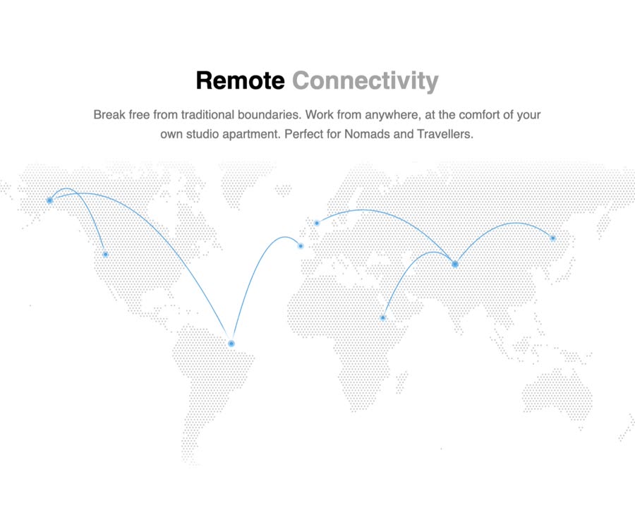 World Map
 Gooey Text Morphing
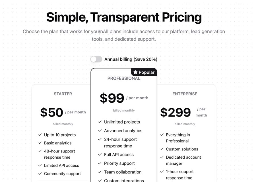 Pricing
 Star Border
 Globe
Globe
 Gravity
 Highlighter
 Glow Effect
 Feature Section
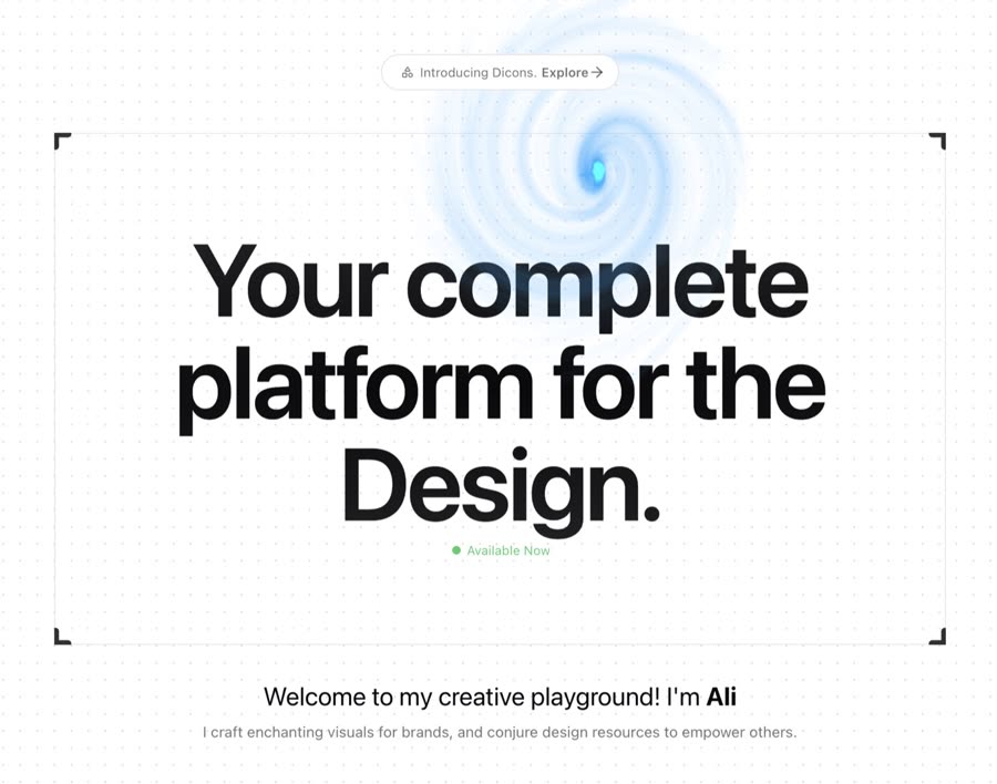 Canvas
 Gooey Filter
 Animated Tooltip
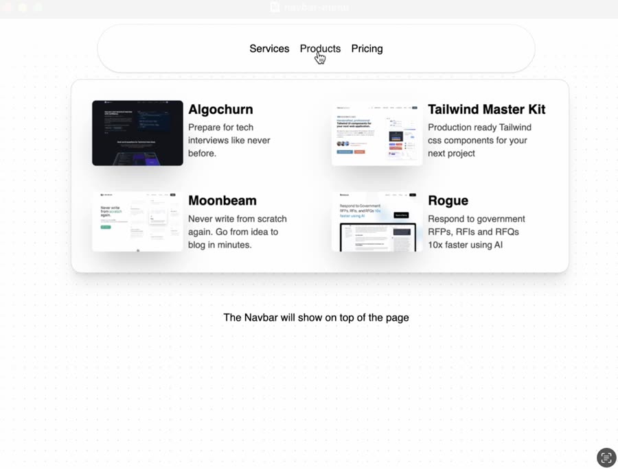 Navbar Menu
 Flickering Grid
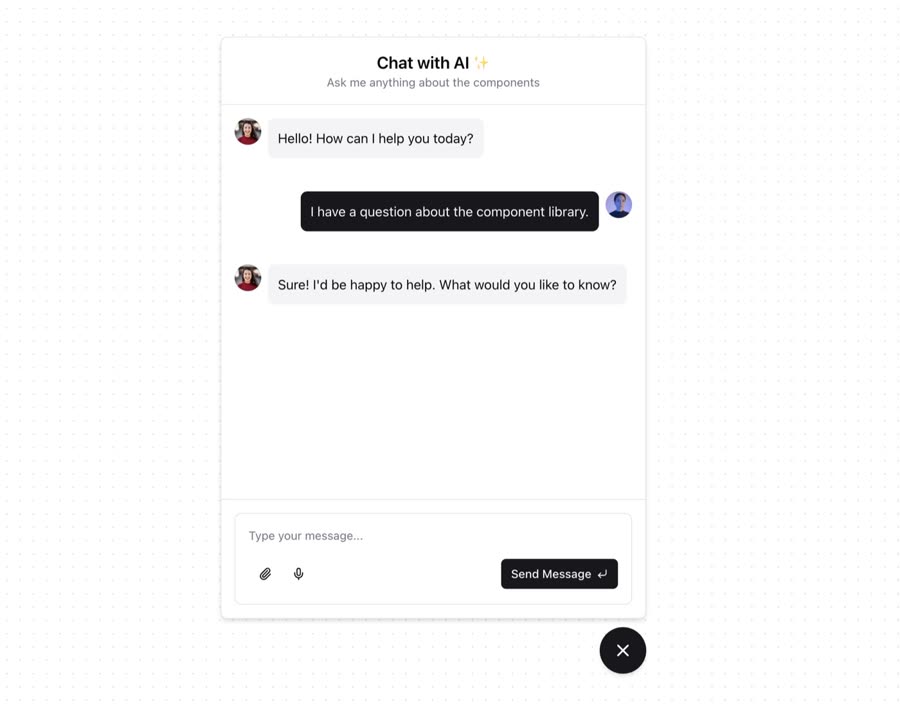 Expandable Chat
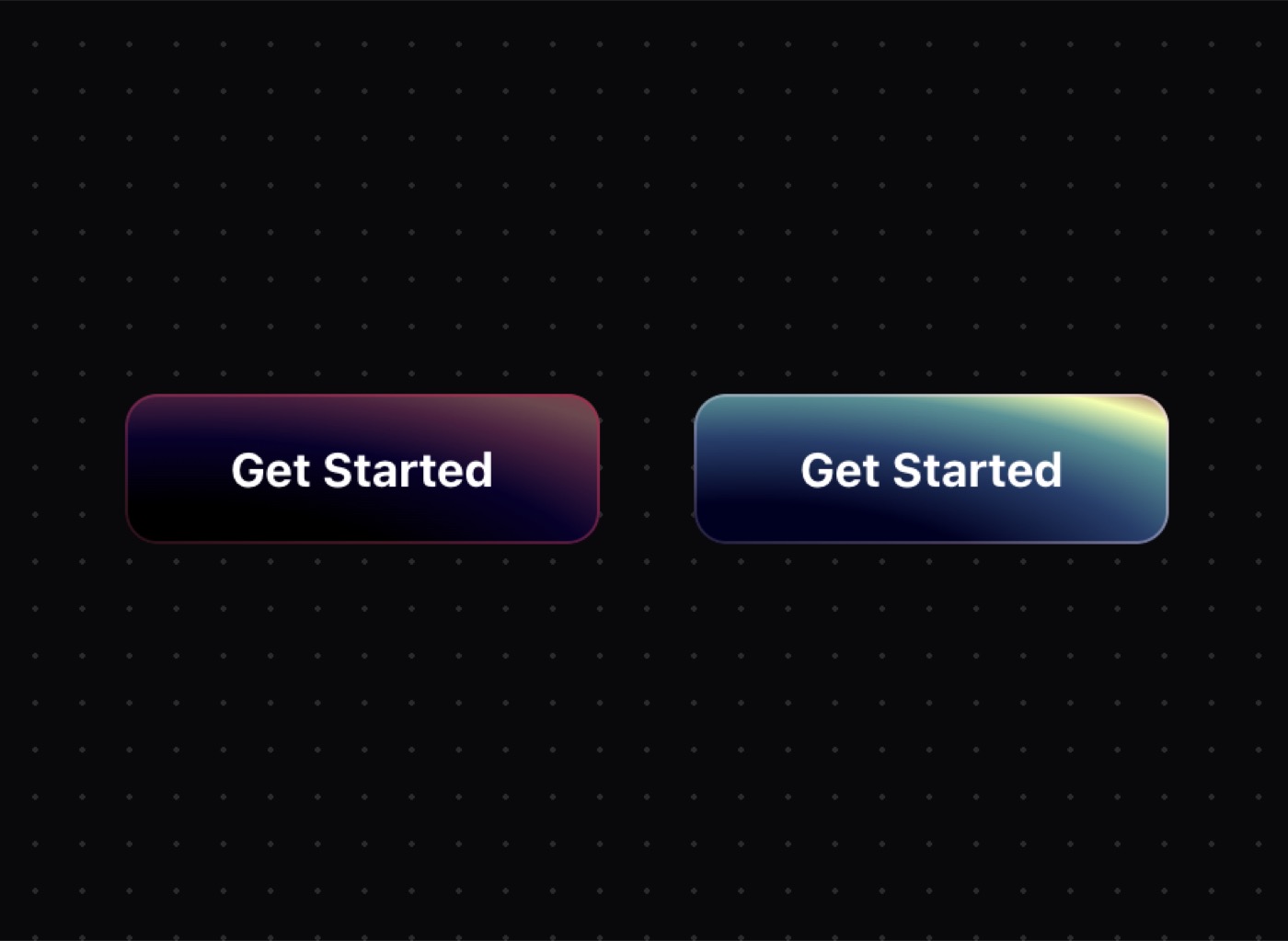 Gradient Button
 Button
 Moving Border
 Typewriter
 3D Carousel
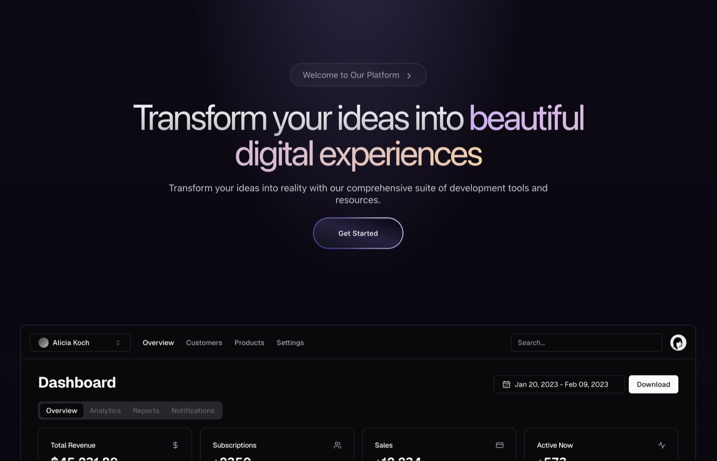 Hero Section Dark
 Text Shimmer
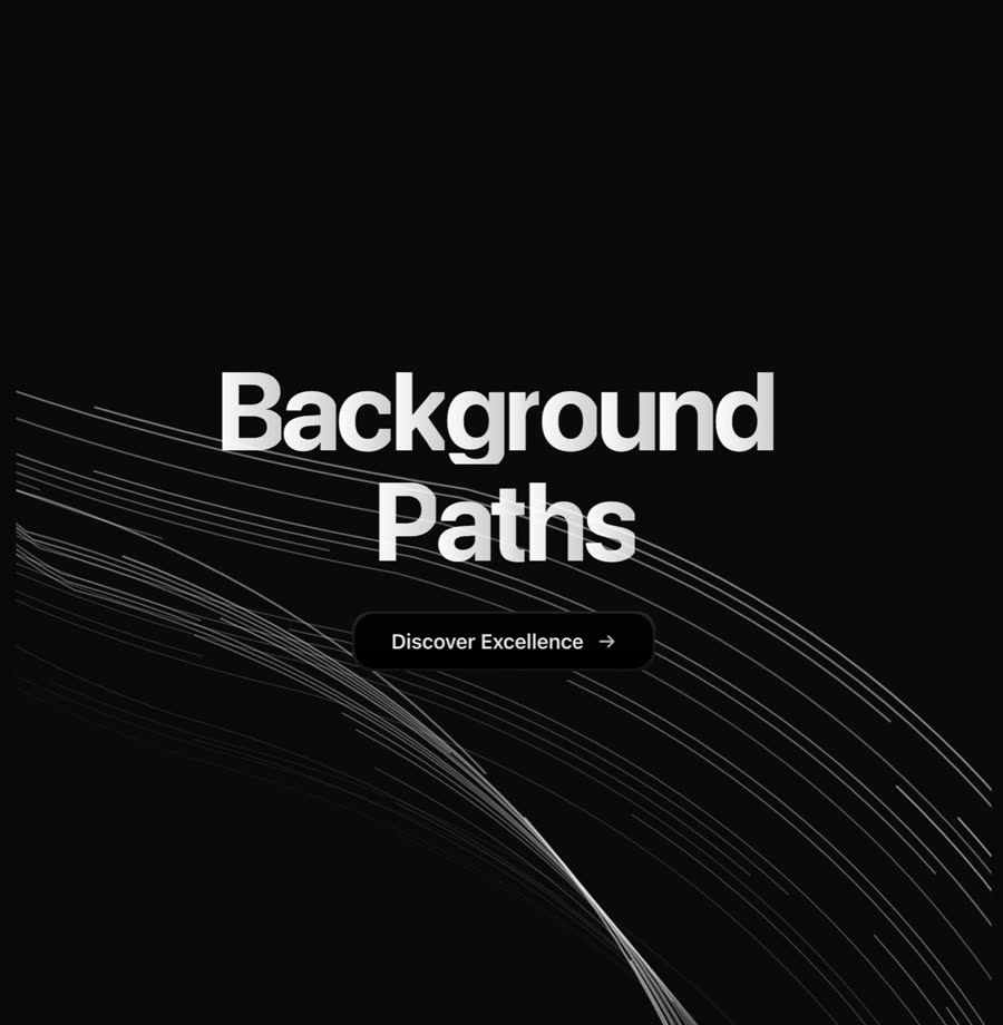 Background Paths
 Background Gradient Animation
 Interactive Hover Button
 Evervault Card
 Wavy Background
 Glowing Effect
 Sidebar News
Browse & preview free Unlock everything — from $49/mo
Frequently asked questions
Do Meez prompts work with GitHub Copilot?
Yes. Every Meez prompt is a complete written spec — fonts, layout, color tokens, motion and asset URLs — so GitHub Copilot can build it in one paste. The 62 free prompts on this site work exactly like the premium ones; copy one above and try it.
What does GitHub Copilot generate from a prompt?
GitHub Copilot lives in your editor (VS Code, JetBrains and others) and its chat/agent modes edit the repo you already have — any language, any framework. A Meez prompt works as the design brief for those edits, and everything lands as reviewable diffs in your own git history.
How do I use a Meez prompt in GitHub Copilot?
Copy the full prompt text and paste it into Copilot Chat in your editor. Don't shorten it — the specificity is what keeps GitHub Copilot from producing a generic layout. Then iterate: swap the copy and point the asset URLs at your own media.
How many prompts are free?
62 prompts are free to copy in full, no account needed. The other 579 unlock with Unlimited — $49/mo, $149/yr, or $299 once for lifetime — along with all 285 motion backgrounds.
Also for: Lovable · Bolt · v0 · Cursor · Claude · Replit · Windsurf · Framer · Webflow · ChatGPT · Figma Make · Gemini · Wix
Not sure which tool? Lovable vs v0 vs Bolt vs Cursor, compared → · All free prompts on one page → · All prompt categories →