Card · Free prompt
Expandable Card
Expandable Card is a complete, paste-ready card build-prompt — a full art-direction spec for Lovable, Bolt, v0, Cursor and Claude. It's free: copy it below and paste it into your builder.

Expandable CardCard · free prompt · copy-paste
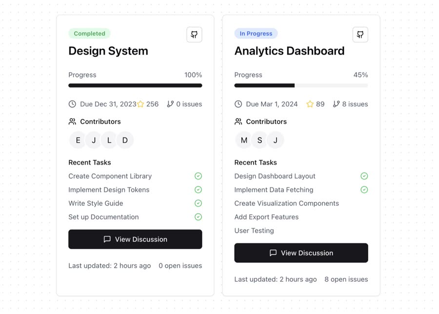
An interactive, expandable card component for displaying project status and details with smooth animations.
Notes:
• Built with Framer Motion for smooth animations
• Uses Lucide React for consistent iconography
• Responsive design with a mobile-first approach
• Interactive expand/collapse functionality
• TypeScript support with proper types
• Integrates with Shadcn UI components
• Supports custom styling and theming
• Optimised performance with proper hooks usage
Features:
• Smooth expand/collapse animations
• Progress tracking
• Contributor avatars with tooltips
• Task completion status
• GitHub integration display
• Interactive buttons and badges
• Responsive layout
• Accessibility features
— Install —
npx shadcn@latest add "https://21st.dev/r/expandable-card"
— Component source (Expandable Card.tsx) —
"use client";
import React, { useRef, useEffect } from "react";
import { motion, AnimatePresence } from "framer-motion";
import {
Clock,
GitBranch,
Github,
MessageSquare,
StepForwardIcon as Progress,
Star,
Users,
CheckCircle2,
} from "lucide-react";
import {
Card,
CardContent,
CardFooter,
CardHeader,
} from "@/components/ui/card";
import { Badge } from "@/components/ui/badge";
import { Button } from "@/components/ui/button";
import { Avatar, AvatarFallback, AvatarImage } from "@/components/ui/avatar";
import { Progress as ProgressBar } from "@/components/ui/progress";
import {
Tooltip,
TooltipContent,
TooltipProvider,
TooltipTrigger,
} from "@/components/ui/tooltip";
import { useExpandable } from "@/components/hooks/use-expandable";
interface ProjectStatusCardProps {
title: string;
progress: number;
dueDate: string;
contributors: Array<{ name: string; image?: string }>;
tasks: Array<{ title: string; completed: boolean }>;
githubStars: number;
openIssues: number;
}
export function ProjectStatusCard({
title,
progress,
dueDate,
contributors,
tasks,
githubStars,
openIssues,
}: ProjectStatusCardProps) {
const { isExpanded, toggleExpand, animatedHeight } = useExpandable();
const contentRef = useRef<HTMLDivElement>(null);
useEffect(() => {
if (contentRef.current) {
animatedHeight.set(isExpanded ? contentRef.current.scrollHeight : 0);
}
}, [isExpanded, animatedHeight]);
return (
<Card
className="w-full max-w-md cursor-pointer transition-all duration-300 hover:shadow-lg"
onClick={toggleExpand}
>
<CardHeader className="space-y-1">
<div className="flex justify-between items-start w-full">
<div className="space-y-2">
<Badge
variant="secondary"
className={
progress === 100
? "bg-green-100 text-green-600"
: "bg-blue-100 text-blue-600"
}
>
{progress === 100 ? "Completed" : "In Progress"}
</Badge>
<h3 className="text-2xl font-semibold">{title}</h3>
</div>
<TooltipProvider>
<Tooltip>
<TooltipTrigger asChild>
<Button size="icon" variant="outline" className="h-8 w-8">
<Github className="h-4 w-4" />
</Button>
</TooltipTrigger>
<TooltipContent>
<p>View on GitHub</p>
</TooltipContent>
</Tooltip>
</TooltipProvider>
</div>
</CardHeader>
<CardContent>
<div className="space-y-4">
<div className="space-y-2">
<div className="flex justify-between text-sm text-gray-600">
<span>Progress</span>
<span>{progress}%</span>
</div>
<ProgressBar value={progress} className="h-2" />
</div>
<motion.div
style={{ height: animatedHeight }}
transition={{ type: "spring", stiffness: 300, damping: 30 }}
className="overflow-hidden"
>
<div ref={contentRef}>
<AnimatePresence>
{isExpanded && (
<motion.div
initial={{ opacity: 0 }}
animate={{ opacity: 1 }}
exit={{ opacity: 0 }}
className="space-y-4 pt-2"
>
<div className="flex items-center justify-between text-sm text-gray-600">
<div className="flex items-center">
<Clock className="h-4 w-4 mr-2" />
<span>Due {dueDate}</span>
</div>
<div className="flex items-center gap-4">
<div className="flex items-center">
<Star className="h-4 w-4 mr-1 text-yellow-400" />
<span>{githubStars}</span>
</div>
<div className="flex items-center">
<GitBranch className="h-4 w-4 mr-1" />
<span>{openIssues} issues</span>
</div>
</div>
</div>
<div className="space-y-2">
<h4 className="font-medium text-sm flex items-center">
<Users className="h-4 w-4 mr-2" />
Contributors
</h4>
<div className="flex -space-x-2">
{contributors.map((contributor, index) => (
<TooltipProvider key={index}>
<Tooltip>
<TooltipTrigger asChild>
<Avatar className="border-2 border-white">
<AvatarImage
src={
contributor.image ||
`/placeholder.svg?height=32&width=32&text=${contributor.name[0]}`
}
alt={contributor.name}
/>
<AvatarFallback>
{contributor.name[0]}
</AvatarFallback>
</Avatar>
</TooltipTrigger>
<TooltipContent>
<p>{contributor.name}</p>
</TooltipContent>
</Tooltip>
</TooltipProvider>
))}
</div>
</div>
<div className="space-y-2">
<h4 className="font-medium text-sm">Recent Tasks</h4>
{tasks.map((task, index) => (
<div
key={index}
className="flex items-center justify-between text-sm"
>
<span className="text-gray-600">{task.title}</span>
{task.completed && (
<CheckCircle2 className="h-4 w-4 text-green-500" />
)}
</div>
))}
</div>
<div className="space-y-2">
<Button className="w-full">
<MessageSquare className="h-4 w-4 mr-2" />
View Discussion
</Button>
</div>
</motion.div>
)}
</AnimatePresence>
</div>
</motion.div>
</div>
</CardContent>
<CardFooter>
<div className="flex items-center justify-between w-full text-sm text-gray-600">
<span>Last updated: 2 hours ago</span>
<span>{openIssues} open issues</span>
</div>
</CardFooter>
</Card>
);
}
Browse & preview free Unlock everything — from $19/mo