Prompts · for Gemini
AI website build-prompts for Gemini
Hand a Meez prompt to Gemini (or the Gemini CLI) and it writes the full component — fonts, layout, gradients, sections and animation, matched to the spec on the first pass. A precise, structured brief is what keeps Gemini from defaulting to a generic layout: the more exact the prompt, the more faithful the build, and Meez prompts are about as exact as a website brief gets.
How to use a Meez prompt in Gemini
- Pick a prompt below (4 on this page are free) or browse the full library — every prompt is a complete art-direction spec: fonts, layout, color system, motion and real asset URLs.
- Copy the whole prompt and paste it into Gemini, or the Gemini CLI. Don’t trim it — the detail is what stops Gemini from defaulting to a generic layout.
- Let it build, then iterate: swap the copy, point the asset URLs at your own media, and ship. The sites you build are yours, commercially.
Free prompts to try in Gemini right now
Wellness CompanionMobile App · free prompt · copy-paste
Build a mobile wellness quiz screen inside a realistic phone frame mockup, centered on a white page. Use React with Tailwind CSS and Lucide React icons.

**Phone Frame:**
- Dimensions: 375px wide x 780px tall
- Border radius: 52px
- Background color: `#8a9aaa`
- Box shadow to simulate a real phone bezel: `inset 0 0 0 2px rgba(255,255,255,0.08), 0 0 0 1px rgba(0,0,0,0.6), 0 0 0 10px #1a1a1e, 0 0 0 11px rgba(255,255,255,0.06), 0 0 60px rgba(0,0,0,0.5)`
- A black pill-shaped Dynamic Island at the top center: 120px wide, 32px tall, fully rounded, z-index 50

**Background:**
- Full-bleed background image using this exact URL: `https://meez.design/web/media/ext/6034ecdbf191b497.webp`
- Apply `blur(12px)` and `scale(1.1)` to the background image
- Semi-transparent overlay: `#8a9aaa` at 30% opacity on top

**Font:**
- Load "Helvetica Now Var" from: `(self-host this face — no free CDN; substitute a close match if unavailable)`
- Fallback stack: 'Helvetica Neue', Helvetica, Arial, sans-serif
- Apply globally to all elements

**Content Layout (flex column, padding: 56px top, 24px sides, 24px bottom):**

1. **Header Badge** (top, with 40px margin-bottom):
   - Liquid glass pill with Timer icon (12px, white/80) + text "Vitaforge Daily" (12px, white/90, medium weight)
   - Padding: 10px vertical, 12px horizontal

2. **Title Section** (32px margin-bottom):
   - Subtitle: "Choose all that apply" - white/60, 14px
   - Heading: "What aspects of your wellness would you like to boost?" - white, 28px, normal weight, tight leading and tracking

3. **Selection Grid** (2 columns, 12px gap, pushes to fill available space):
   - 4 cards: "Sleep quality", "Stress", "Weight", "Skin"
   - Each card: rounded-[32px], 100px height, padding 16px
   - Shows a number label (01, 02, etc.) in white/50, 11px, medium weight
   - Option text in white, 16px, medium weight
   - "Stress" (id:2) and "Skin" (id:4) are pre-selected
   - Cards are toggleable on click

4. **Voice Button** (centered, 24px vertical margin):
   - Yellow/gold radial glow behind: `radial-gradient(ellipse at center, rgba(220,200,80,0.5) 0%, rgba(180,160,40,0.2) 40%, transparent 70%)`
   - 64px circular liquid glass button with a waveform SVG icon (white strokes, strokeWidth 2, strokeLinecap round) showing 5 vertical bars of varying heights
   - "voice" label below in white/70, 12px

5. **Slide-to-Confirm Button** (bottom, inside 24px horizontal padding):
   - Full-width rounded-full track, 56px tall, liquid glass style
   - White circular thumb (44px) on the left with ArrowRight icon (gray-800)
   - "Done" text centered in white/60, 14px, medium weight
   - 3 ChevronRight icons on the right (14px) at white/40, white/50, white/60 opacity
   - Draggable thumb with pointer events: snaps back if not dragged past 85%, snaps to end if past 85%

**Liquid Glass Effect (CSS classes):**

`.liquid-glass`:
- Background: `rgba(255,255,255,0.01)` with luminosity blend mode
- Backdrop filter: `blur(4px)`
- Box shadow: `inset 0 1px 1px rgba(255,255,255,0.1)`
- `::before` pseudo-element for gradient border: `linear-gradient(180deg, rgba(255,255,255,0.45) 0%, rgba(255,255,255,0.15) 20%, rgba(255,255,255,0) 40%, rgba(255,255,255,0) 60%, rgba(255,255,255,0.15) 80%, rgba(255,255,255,0.45) 100%)` with 1.4px padding and mask-composite exclude technique

`.liquid-glass-selected`:
- Same as above but background: `rgba(255,255,255,0.12)`, blur 8px, stronger box shadow (`inset 0 1px 2px rgba(255,255,255,0.2)`), and brighter gradient border (0.6 alpha at edges, 0.25 at 20%/80%)

**Animations:**
- Staggered fade-up animation on all elements
- Keyframes: from `opacity:0, translateY(16px)` to `opacity:1, translateY(0)`
- Duration: 0.5s, easing: `cubic-bezier(0.22, 1, 0.36, 1)`, fill: forwards
- Delays: header 0.1s, title 0.25s, grid cards 0.4s/0.48s/0.56s/0.64s, voice 0.7s, slider 0.85s

**Dependencies:**
- React 18, Tailwind CSS 3, Lucide React, Vite, TypeScript
Palomar LabsAI · free prompt · copy-paste
Build a standalone pixel-accurate recreation of the Palomar Labs marketing landing page: fixed navbar + full-viewport video hero only. No other sections. Match this spec exactly. Do not invent extra copy, buttons, gradients, overlays, or decorative blobs.
Stack
React + TypeScript + Vite
Tailwind CSS
lucide-react icons: ChevronDown, ArrowRight, Triangle
Single App.tsx with Navbar, Hero, TrustedBy
Exact assets and URLs (do not change)
Background video (must be this exact CloudFront URL):
https://meez.design/web/media/ext/4ee225aa17cc394a.mp4
Fonts in index.html:
<link href="(self-host this face — no free CDN; substitute a close match if unavailable)" rel="stylesheet">
<link href="https://fonts.googleapis.com/css2?family=Playfair+Display:wght@700&family=Oswald:wght@500&family=Montserrat:wght@700&family=Roboto+Slab:wght@600&family=Raleway:wght@700&display=swap" rel="stylesheet">
Page title: Palomar - One Unified System for LLMs
Color tokens (Tailwind theme.extend.colors.brand)
dark: #2d3a2e
green: #3d5a3e
light: #f5f3ef
cream: #faf8f5
Font families (Tailwind theme.extend.fontFamily)
helvetica-neue: "Helvetica Neue Light", Helvetica, Arial, sans-serif
playfair: "Playfair Display", serif
oswald: "Oswald", sans-serif
montserrat: "Montserrat", sans-serif
roboto-slab: "Roboto Slab", serif
raleway: "Raleway", sans-serif
Body: font-family: 'Helvetica Neue Light', Helvetica, Arial, sans-serif; with antialiasing. Global * { margin:0; padding:0; box-sizing:border-box; }. html { scroll-behavior: smooth; }. Root app wrapper: font-helvetica-neue. Background of the hero section: bg-brand-cream (#faf8f5).
Animations (global CSS, exact)
@keyframes fade-up {
  from { opacity: 0; transform: translateY(20px); }
  to   { opacity: 1; transform: translateY(0); }
}
@keyframes fade-down {
  from { opacity: 0; transform: translateY(-12px); }
  to   { opacity: 1; transform: translateY(0); }
}
.animate-fade-up   { animation: fade-up 0.8s cubic-bezier(0.16, 1, 0.3, 1) both; }
.animate-fade-down { animation: fade-down 0.7s cubic-bezier(0.16, 1, 0.3, 1) both; }
.stagger-1 { animation-delay: 0ms; }
.stagger-2 { animation-delay: 120ms; }
.stagger-3 { animation-delay: 240ms; }
.stagger-4 { animation-delay: 360ms; }
.stagger-5 { animation-delay: 480ms; }
.stagger-6 { animation-delay: 600ms; }
1) Navbar
Fixed top-0 left-0 right-0 z-50. Transition duration-300.
If window.scrollY > 20: bg-brand-cream/90 backdrop-blur-md shadow-sm
Else: bg-transparent
Inner container: max-w-7xl mx-auto px-6 lg:px-8. Bar: relative flex items-center h-16 md:h-20.
Desktop left links (hidden md:flex items-center gap-8, animate-fade-down stagger-1)
All: text-sm text-brand-dark tracking-wide uppercase hover:opacity-70 transition-opacity
Button: Solutions + ChevronDown w-3.5 h-3.5, flex items-center gap-1
Anchor: Plans
Anchor: News
Center logo (absolute centered)
absolute left-1/2 -translate-x-1/2 flex items-center gap-2 animate-fade-down stagger-2
Lucide Triangle: w-5 h-5 text-brand-dark fill-brand-dark
Text Palomar: text-xl text-brand-dark tracking-tight font-helvetica-neue
Desktop CTA (right)
hidden md:inline-flex items-center ml-auto px-5 py-2.5 bg-brand-dark text-white text-sm tracking-wide uppercase rounded-full hover:bg-brand-green transition-colors animate-fade-down stagger-3 Label: Try It Free
Mobile hamburger (md:hidden, ml-auto, z-50, w-10 h-10, aria-label="Toggle menu")
Two 2px bars (w-6 h-[2px] bg-brand-dark rounded) with transition-all duration-300 ease-[cubic-bezier(0.68,-0.6,0.32,1.6)]:
Top bar at top-[6px]. Open: rotate-45 translate-y-[5px]
Bottom bar at top-[13px]. Open: -rotate-45 When open, lock document.body.style.overflow = 'hidden'.
Mobile overlay (md:hidden)
fixed inset-0 bg-brand-cream z-40 Transition duration-500 ease-[cubic-bezier(0.22,1,0.36,1)]
Open: opacity-100 pointer-events-auto
Closed: opacity-0 pointer-events-none
Inner column: flex flex-col items-center justify-center h-full gap-8, same 500ms ease, delay-100
Open: translate-y-0 opacity-100
Closed: -translate-y-8 opacity-0
Links (each text-3xl text-brand-dark tracking-tight): Solutions, Plans, News CTA: mt-4 inline-flex items-center px-8 py-3.5 bg-brand-dark text-white text-lg tracking-wide rounded-full → Try It Free Clicking any item closes the menu.
No dropdown panel for Solutions — it is a button on desktop and a simple link on mobile.
2) Hero
section.relative.w-full.h-screen.min-h-[700px].overflow-hidden.bg-brand-cream
Video layer
div.absolute.inset-0 wrapping <video>:
src = the CloudFront URL above
autoPlay muted loop playsInline
class: w-full h-full object-cover object-bottom
No dark overlay, no gradient, no poster image
Content column (sits on top of video, left-aligned, not vertically centered)
relative z-10 flex flex-col items-start max-w-7xl mx-auto pt-28 md:pt-36 px-6 lg:px-8
Announcement pill
Anchor, inline-flex items-center gap-2 px-4 py-2 rounded-full border border-brand-dark/15 bg-white/60 backdrop-blur-sm hover:bg-white/80 transition-colors mb-5 md:mb-6 animate-fade-up stagger-3
Text text-sm text-brand-dark: Live for everyone today! Offering $1MM in credits.
ArrowRight w-3.5 h-3.5 text-brand-dark
Headline
h1 classes: text-left text-3xl sm:text-4xl md:text-5xl lg:text-6xl text-brand-dark leading-[1.05] tracking-tight max-w-4xl font-helvetica-neue animate-fade-up stagger-4
Exact copy with a line break only from sm and up:
One unified system to build,
test, ship, and observe LLMs
Implementation: first line, then <br className="hidden sm:block" />, then a space, then test, ship, and observe LLMs. On <640px it wraps naturally as one block.
No subtitle, no primary CTA in the hero body.
3) Trusted by (inside Hero, under headline)
Wrapper: w-full mt-8 md:mt-10 animate-fade-up stagger-5
Label: text-left text-xs tracking-[0.25em] uppercase text-brand-dark/50 mb-6 md:mb-8 font-helvetica-neue → Backed by
Logo row: flex flex-wrap items-center justify-start gap-6 md:gap-12 lg:gap-16 animate-fade-up stagger-6
Five wordmarks as text (not images), text-lg md:text-xl lg:text-2xl text-brand-dark/80 whitespace-nowrap:
Meridian — font-playfair (Playfair Display 700)
STELLEX — font-oswald uppercase (Oswald 500)
Luminar — font-montserrat (Montserrat 700)
OVERLAND — font-roboto-slab uppercase (Roboto Slab 600)
Kinetic — font-raleway (Raleway 700)
Responsive rules (must match)
< md (768px): hamburger + full-screen cream overlay; hide desktop links and CTA; nav height h-16; hero padding pt-28 px-6; logo gaps gap-6; headline text-3xl then sm:text-4xl
md+: three left links, centered logo, right pill CTA; nav h-20; hero pt-36; logo gaps md:gap-12
lg+: container px-8; headline lg:text-6xl; logo gaps lg:gap-16
Hero always h-screen with min-h-[700px]
Content always left-aligned (items-start, text-left, justify-start)
Video always object-cover object-bottom so the bottom of the footage stays framed
Visual character
Quiet, editorial, cream/forest. Light Helvetica Neue, not heavy Inter/SF. Centered triangle + Palomar wordmark. Frosted white pill over a full-bleed landscape video. Wordmark “logos” in mixed display fonts, not SVG brand files. Entrance: nav fades down (stagger 0 / 120 / 240ms); pill, headline, backed-by fade up (240 / 360 / 480 / 600ms).
Do not add
Footer, extra sections, search, language switcher, social icons, video controls, mute button, overlay scrim, second headline, hero “Get started” button, Solutions mega-menu content, or any other video URL.
Implement this as one working page that looks identical on desktop and mobile.

---

## HTML Code

<!DOCTYPE html>
<html lang="en">
<head>
  <meta charset="UTF-8" />
  <meta name="viewport" content="width=device-width, initial-scale=1.0" />
  <title>Palomar - One Unified System for LLMs</title>
  <link href="(self-host this face — no free CDN; substitute a close match if unavailable)" rel="stylesheet">
  <link href="https://fonts.googleapis.com/css2?family=Playfair+Display:wght@700&family=Oswald:wght@500&family=Montserrat:wght@700&family=Roboto+Slab:wght@600&family=Raleway:wght@700&display=swap" rel="stylesheet">
  <style>
    :root {
      --brand-dark: #2d3a2e;
      --brand-green: #3d5a3e;
      --brand-light: #f5f3ef;
      --brand-cream: #faf8f5;
    }

    * { margin: 0; padding: 0; box-sizing: border-box; }

    html { scroll-behavior: smooth; }

    body {
      font-family: "Helvetica Neue Light", Helvetica, Arial, sans-serif;
      -webkit-font-smoothing: antialiased;
      -moz-osx-font-smoothing: grayscale;
      background: var(--brand-cream);
      color: var(--brand-dark);
    }

    a { text-decoration: none; color: inherit; }

    button {
      font-family: inherit;
      background: none;
      border: none;
      cursor: pointer;
      color: inherit;
    }

    /* ---------- Animations ---------- */
    @keyframes fade-up {
      from { opacity: 0; transform: translateY(20px); }
      to   { opacity: 1; transform: translateY(0); }
    }
    @keyframes fade-down {
      from { opacity: 0; transform: translateY(-12px); }
      to   { opacity: 1; transform: translateY(0); }
    }

    .animate-fade-up {
      animation: fade-up 0.8s cubic-bezier(0.16, 1, 0.3, 1) both;
    }
    .animate-fade-down {
      animation: fade-down 0.7s cubic-bezier(0.16, 1, 0.3, 1) both;
    }
    .stagger-1 { animation-delay: 0ms; }
    .stagger-2 { animation-delay: 120ms; }
    .stagger-3 { animation-delay: 240ms; }
    .stagger-4 { animation-delay: 360ms; }
    .stagger-5 { animation-delay: 480ms; }
    .stagger-6 { animation-delay: 600ms; }

    /* ---------- Navbar ---------- */
    .nav {
      position: fixed;
      top: 0; left: 0; right: 0;
      z-index: 50;
      transition: background-color 0.3s, box-shadow 0.3s, backdrop-filter 0.3s;
    }
    .nav.scrolled {
      background: rgba(250, 248, 245, 0.9);
      backdrop-filter: blur(12px);
      -webkit-backdrop-filter: blur(12px);
      box-shadow: 0 1px 2px rgba(0, 0, 0, 0.05);
    }

    .nav-inner {
      max-width: 80rem;
      margin: 0 auto;
      padding: 0 1.5rem;
    }
    @media (min-width: 1024px) {
      .nav-inner { padding: 0 2rem; }
    }

    .nav-bar {
      position: relative;
      display: flex;
      align-items: center;
      height: 4rem;
    }
    @media (min-width: 768px) {
      .nav-bar { height: 5rem; }
    }

    .nav-left {
      display: none;
      align-items: center;
      gap: 2rem;
    }
    @media (min-width: 768px) {
      .nav-left { display: flex; }
    }

    .nav-link {
      display: flex;
      align-items: center;
      gap: 0.25rem;
      font-size: 0.875rem;
      letter-spacing: 0.025em;
      text-transform: uppercase;
      color: var(--brand-dark);
      transition: opacity 0.2s;
    }
    .nav-link:hover { opacity: 0.7; }

    .nav-link svg {
      width: 14px;
      height: 14px;
    }

    .logo {
      position: absolute;
      left: 50%;
      transform: translateX(-50%);
      display: flex;
      align-items: center;
      gap: 0.5rem;
    }
    .logo svg {
      width: 20px;
      height: 20px;
      fill: var(--brand-dark);
      color: var(--brand-dark);
    }
    .logo span {
      font-size: 1.25rem;
      letter-spacing: -0.025em;
      color: var(--brand-dark);
    }

    .nav-cta {
      display: none;
      margin-left: auto;
      align-items: center;
      padding: 0.625rem 1.25rem;
      background: var(--brand-dark);
      color: #fff;
      font-size: 0.875rem;
      letter-spacing: 0.025em;
      text-transform: uppercase;
      border-radius: 9999px;
      transition: background-color 0.2s;
    }
    .nav-cta:hover { background: var(--brand-green); }
    @media (min-width: 768px) {
      .nav-cta { display: inline-flex; }
    }

    .hamburger {
      position: relative;
      z-index: 50;
      width: 40px;
      height: 40px;
      margin-left: auto;
      display: flex;
      align-items: center;
      justify-content: center;
    }
    @media (min-width: 768px) {
      .hamburger { display: none; }
    }

    .hamburger-icon {
      position: relative;
      width: 24px;
      height: 24px;
    }
    .hamburger-icon span {
      position: absolute;
      left: 0;
      width: 24px;
      height: 2px;
      background: var(--brand-dark);
      border-radius: 9999px;
      transition: all 0.3s cubic-bezier(0.68, -0.6, 0.32, 1.6);
    }
    .hamburger-icon span:nth-child(1) { top: 6px; }
    .hamburger-icon span:nth-child(2) { top: 13px; }
    .nav.open .hamburger-icon span:nth-child(1) {
      transform: rotate(45deg) translateY(5px);
    }
    .nav.open .hamburger-icon span:nth-child(2) {
      transform: rotate(-45deg);
    }

    .mobile-overlay {
      position: fixed;
      inset: 0;
      background: var(--brand-cream);
      z-index: 40;
      display: flex;
      flex-direction: column;
      align-items: center;
      justify-content: center;
      gap: 2rem;
      opacity: 0;
      pointer-events: none;
      transition: all 0.5s cubic-bezier(0.22, 1, 0.36, 1);
    }
    @media (min-width: 768px) {
      .mobile-overlay { display: none; }
    }
    .nav.open .mobile-overlay {
      opacity: 1;
      pointer-events: auto;
    }

    .mobile-overlay-inner {
      display: flex;
      flex-direction: column;
      align-items: center;
      justify-content: center;
      gap: 2rem;
      transform: translateY(-2rem);
      opacity: 0;
      transition: all 0.5s cubic-bezier(0.22, 1, 0.36, 1);
      transition-delay: 100ms;
    }
    .nav.open .mobile-overlay-inner {
      transform: translateY(0);
      opacity: 1;
    }

    .mobile-link {
      font-size: 1.875rem;
      letter-spacing: -0.025em;
      color: var(--brand-dark);
    }

    .mobile-cta {
      margin-top: 1rem;
      display: inline-flex;
      align-items: center;
      padding: 0.875rem 2rem;
      background: var(--brand-dark);
      color: #fff;
      font-size: 1.125rem;
      letter-spacing: 0.025em;
      border-radius: 9999px;
    }

    /* ---------- Hero ---------- */
    .hero {
      position: relative;
      width: 100%;
      height: 100vh;
      min-height: 700px;
      overflow: hidden;
      background: var(--brand-cream);
    }

    .hero-video {
      position: absolute;
      inset: 0;
    }
    .hero-video video {
      width: 100%;
      height: 100%;
      object-fit: cover;
      object-position: bottom;
    }

    .hero-content {
      position: relative;
      z-index: 10;
      display: flex;
      flex-direction: column;
      align-items: flex-start;
      max-width: 80rem;
      margin: 0 auto;
      padding: 7rem 1.5rem 0;
    }
    @media (min-width: 768px) {
      .hero-content { padding-top: 9rem; }
    }
    @media (min-width: 1024px) {
      .hero-content { padding-left: 2rem; padding-right: 2rem; }
    }

    .pill {
      display: inline-flex;
      align-items: center;
      gap: 0.5rem;
      padding: 0.5rem 1rem;
      border-radius: 9999px;
      border: 1px solid rgba(45, 58, 46, 0.15);
      background: rgba(255, 255, 255, 0.6);
      backdrop-filter: blur(4px);
      -webkit-backdrop-filter: blur(4px);
      margin-bottom: 1.25rem;
      transition: background-color 0.2s;
    }
    .pill:hover { background: rgba(255, 255, 255, 0.8); }
    @media (min-width: 768px) {
      .pill { margin-bottom: 1.5rem; }
    }
    .pill span {
      font-size: 0.875rem;
      color: var(--brand-dark);
    }
    .pill svg {
      width: 14px;
      height: 14px;
      color: var(--brand-dark);
      flex-shrink: 0;
    }

    .headline {
      text-align: left;
      font-size: 1.875rem;
      line-height: 1.05;
      letter-spacing: -0.025em;
      color: var(--brand-dark);
      max-width: 56rem;
      font-weight: 400;
    }
    @media (min-width: 640px) {
      .headline { font-size: 2.25rem; }
      .headline .break { display: block; }
    }
    @media (min-width: 768px) {
      .headline { font-size: 3rem; }
    }
    @media (min-width: 1024px) {
      .headline { font-size: 3.75rem; }
    }
    .headline .break { display: none; }

    /* ---------- Trusted by ---------- */
    .trusted {
      width: 100%;
      margin-top: 2rem;
    }
    @media (min-width: 768px) {
      .trusted { margin-top: 2.5rem; }
    }

    .trusted-label {
      text-align: left;
      font-size: 0.75rem;
      letter-spacing: 0.25em;
      text-transform: uppercase;
      color: rgba(45, 58, 46, 0.5);
      margin-bottom: 1.5rem;
    }
    @media (min-width: 768px) {
      .trusted-label { margin-bottom: 2rem; }
    }

    .trusted-logos {
      display: flex;
      flex-wrap: wrap;
      align-items: center;
      justify-content: flex-start;
      gap: 1.5rem;
    }
    @media (min-width: 768px) {
      .trusted-logos { gap: 3rem; }
    }
    @media (min-width: 1024px) {
      .trusted-logos { gap: 4rem; }
    }

    .trusted-logos span {
      font-size: 1.125rem;
      color: rgba(45, 58, 46, 0.8);
      white-space: nowrap;
    }
    @media (min-width: 768px) {
      .trusted-logos span { font-size: 1.25rem; }
    }
    @media (min-width: 1024px) {
      .trusted-logos span { font-size: 1.5rem; }
    }

    .font-playfair { font-family: "Playfair Display", serif; font-weight: 700; }
    .font-oswald { font-family: "Oswald", sans-serif; font-weight: 500; text-transform: uppercase; }
    .font-montserrat { font-family: "Montserrat", sans-serif; font-weight: 700; }
    .font-roboto-slab { font-family: "Roboto Slab", serif; font-weight: 600; text-transform: uppercase; }
    .font-raleway { font-family: "Raleway", sans-serif; font-weight: 700; }

    body.menu-lock { overflow: hidden; }
  </style>
</head>
<body>
  <nav class="nav" id="nav">
    <div class="nav-inner">
      <div class="nav-bar">
        <div class="nav-left animate-fade-down stagger-1">
          <button class="nav-link" type="button">
            Solutions
            <svg xmlns="http://www.w3.org/2000/svg" width="14" height="14" viewBox="0 0 24 24" fill="none" stroke="currentColor" stroke-width="2" stroke-linecap="round" stroke-linejoin="round"><path d="m6 9 6 6 6-6"/></svg>
          </button>
          <a href="#" class="nav-link">Plans</a>
          <a href="#" class="nav-link">News</a>
        </div>

        <a href="#" class="logo animate-fade-down stagger-2">
          <svg xmlns="http://www.w3.org/2000/svg" width="20" height="20" viewBox="0 0 24 24" fill="currentColor" stroke="currentColor" stroke-width="2" stroke-linecap="round" stroke-linejoin="round"><path d="M13.73 4a2 2 0 0 0-3.46 0l-8 14A2 2 0 0 0 4 21h16a2 2 0 0 0 1.73-3Z"/></svg>
          <span>Palomar</span>
        </a>

        <a href="#" class="nav-cta animate-fade-down stagger-3">Try It Free</a>

        <button class="hamburger" type="button" aria-label="Toggle menu" id="hamburger">
          <div class="hamburger-icon">
            <span></span>
            <span></span>
          </div>
        </button>
      </div>
    </div>

    <div class="mobile-overlay" id="overlay">
      <div class="mobile-overlay-inner">
        <a href="#" class="mobile-link" data-close>Solutions</a>
        <a href="#" class="mobile-link" data-close>Plans</a>
        <a href="#" class="mobile-link" data-close>News</a>
        <a href="#" class="mobile-cta" data-close>Try It Free</a>
      </div>
    </div>
  </nav>

  <section class="hero">
    <div class="hero-video">
      <video
        src="https://meez.design/web/media/ext/4ee225aa17cc394a.mp4"
        autoplay
        muted
        loop
        playsinline
      ></video>
    </div>

    <div class="hero-content">
      <a href="#" class="pill animate-fade-up stagger-3">
        <span>Live for everyone today! Offering $1MM in credits.</span>
        <svg xmlns="http://www.w3.org/2000/svg" width="14" height="14" viewBox="0 0 24 24" fill="none" stroke="currentColor" stroke-width="2" stroke-linecap="round" stroke-linejoin="round"><path d="M5 12h14"/><path d="m12 5 7 7-7 7"/></svg>
      </a>

      <h1 class="headline animate-fade-up stagger-4">
        One unified system to build,<br class="break" />
        test, ship, and observe LLMs
      </h1>

      <div class="trusted animate-fade-up stagger-5">
        <p class="trusted-label">Backed by</p>
        <div class="trusted-logos animate-fade-up stagger-6">
          <span class="font-playfair">Meridian</span>
          <span class="font-oswald">STELLEX</span>
          <span class="font-montserrat">Luminar</span>
          <span class="font-roboto-slab">OVERLAND</span>
          <span class="font-raleway">Kinetic</span>
        </div>
      </div>
    </div>
  </section>

  <script>
    const nav = document.getElementById("nav");
    const hamburger = document.getElementById("hamburger");

    window.addEventListener("scroll", () => {
      nav.classList.toggle("scrolled", window.scrollY > 20);
    });

    hamburger.addEventListener("click", () => {
      const open = nav.classList.toggle("open");
      document.body.classList.toggle("menu-lock", open);
    });

    document.querySelectorAll("[data-close]").forEach((el) => {
      el.addEventListener("click", () => {
        nav.classList.remove("open");
        document.body.classList.remove("menu-lock");
      });
    });
  </script>
</body>
</html>
Pet DiagnosticsHealthcare · free prompt · copy-paste
Build a **single self-contained `index.html`** file. No build step, no framework, no external
JS, no local image files. All CSS in one `<style>` block in `<head>`; one small `<script>`
before `</body>`. Match every number below exactly — the layout is measurement-driven, not
eyeballed.
---
## 1. Assets (remote only — use these exact URLs)
**Hero video (desktop, autoplaying background) — 1928×1076, 8.04 s, H.264 MP4, silent:**
```
https://meez.design/web/media/ext/6812d4a9d0301d25.mp4
```
**Hero still (desktop) — doubles as the video's poster and the reduced-motion frame:**
```
https://meez.design/web/media/ext/fb817b7f0e340cc4.png
```
**Hero still (mobile, 9:16 portrait crop):**
```
https://meez.design/web/media/ext/65ba287728c496ef.png
```
**Open Graph share image:**
```
https://meez.design/web/media/ext/64e221fdd85cc4d9.png
```
All four depict the same scene: a golden retriever lying on a low dark-walnut dog bed on the
left third of frame, head turned toward camera; a person seen from behind on the right in a
ribbed olive-green knit sweater, seated on polished concrete; floor-to-ceiling black-framed
window behind them onto blurred golden hills; a palm houseplant at the far-left edge. Warm
late-afternoon grade.
---
## 2. Fonts
Google Fonts, loaded with `preconnect` to `fonts.googleapis.com` and `fonts.gstatic.com`
(the latter with `crossorigin`):
```html
<link href="https://fonts.googleapis.com/css2?family=Instrument+Serif:ital@0;1&family=Inter:wght@400;500;600&display=swap" rel="stylesheet">
```
- **Instrument Serif 400** — the headline only.
- **Inter 400 / 500 / 600** — everything else.
- Body font stack: `"Inter", -apple-system, BlinkMacSystemFont, "Segoe UI", Helvetica, Arial, sans-serif`
- Headline stack: `"Instrument Serif", Georgia, "Times New Roman", serif`
- Enable `-webkit-font-smoothing: antialiased` and `-moz-osx-font-smoothing: grayscale` on `body`.
---
## 3. Head
```
<title>Lume — 120+ health markers, read by top-tier vets.</title>
meta description: 120+ health markers read. Guidance from top-tier vets. Just $349 in total. Created alongside leading veterinary research specialists.
og:title: Lume — 120+ health markers read
og:description: Guidance from top-tier vets. Just $349 in total.
og:image: <OG url above>
viewport: width=device-width, initial-scale=1
```
---
## 4. Design tokens & global reset
```css
:root{ --cream:#eef0d0; --ink:#101010; }
*,*::before,*::after{ box-sizing:border-box; }
body{
background:#0d0d0d;
overflow-x:hidden;
color:var(--ink);
}
```
`#eef0d0` is the pale cream used for the highlighted brand column and the primary pill.
`#0d0d0d` is the near-black page ground visible below the hero band.
---
## 5. Section geometry — full-bleed, fluid measure
The page is **one full-bleed hero band**. There is no gray page frame, no max-width page
shell, no rounded corners, no drop shadow on the section.
```css
.hero{
position:relative;
width:100%;
height:min(92vh, 62vw);
min-height:600px;
overflow:hidden;
isolation:isolate;
}
```
Inside it, a **measure container** holds the headline and table. It is what every `cqw`
value below resolves against, and it grows with the monitor so type scales up on large
displays and down on small ones:
```css
.hero__inner{
position:absolute;
inset:0;
z-index:2;
width:100%;
max-width:min(100%, clamp(1080px, 82vw, 1700px));
margin-inline:auto;
container-type:inline-size;
}
```
**The nav is deliberately NOT inside `.hero__inner`** — it is a direct child of `.hero` so it
sits at the true page edges like a normal site header. Everything else lives inside the measure.
Resulting type scale (verify against these):
| Viewport | Measure | Headline | Pills | Table text |
|---|---|---|---|---|
| 1024 | 1024 | 20.8px | 10px | 9.4px |
| 1280 | 1080 | 21.9px | 10px | 9.9px |
| 1440 | 1181 | 24.0px | 10px | 10.9px |
| 1920 | 1574 | 32.0px | 12.4px | 14.5px |
| 2560+ | 1700 | 34.5px | 13.4px | 15.6px |
---
## 6. Media layer
Three stacked elements, all `.hero__media`, all absolutely positioned and covering:
```css
.hero__media{
position:absolute; inset:0;
width:100%; height:100%;
object-fit:cover;
object-position:50% 50%;
z-index:0;
filter:saturate(1.06) contrast(1.04) brightness(.97);
}
.hero__media--mobile{ display:none; }
```
Order in the DOM: desktop `<img>`, mobile `<img>`, then the `<video>` on top.
```html
<img class="hero__media hero__media--desktop" src="…193afe38….png"
alt="A person sitting beside their golden retriever in a sunlit living room"
fetchpriority="high" decoding="async">
<img class="hero__media hero__media--mobile" src="…44c2e930….png"
alt="" aria-hidden="true" decoding="async">
<video class="hero__media hero__media--desktop hero__video" src="…de4032ce….mp4"
autoplay muted loop playsinline preload="auto" aria-hidden="true" tabindex="-1"></video>
```
The video starts transparent and cross-fades in only once it can actually play, so a slow
connection shows the still rather than a black frame:
```css
.hero__video{ opacity:0; transition:opacity .9s ease; }
.hero__video.is-ready{ opacity:1; }
@media (prefers-reduced-motion:reduce){ .hero__video{ display:none; } }
```
---
## 7. Overlay gradients
A single `::after` on `.hero` at `z-index:1`, `pointer-events:none`, three layers stacked in
this order — two for text legibility, one warm tint to unify the grade:
```css
background:
linear-gradient(to bottom, rgba(0,0,0,.30) 0%, rgba(0,0,0,.09) 20%, rgba(0,0,0,0) 38%),
linear-gradient(to top, rgba(0,0,0,.18) 0%, rgba(0,0,0,0) 26%),
linear-gradient(120deg, rgba(120,64,18,.14), rgba(150,96,32,.10));
```
---
## 8. Nav
```css
.nav{
position:absolute; top:0; left:0; right:0;
z-index:4;
display:flex; align-items:center; justify-content:space-between;
padding:clamp(16px,2vw,34px) clamp(18px,3.2vw,56px);
}
.brand{
display:flex; align-items:center; gap:.42em;
color:#fff;
font-size:clamp(15px,1.15vw,23px);
font-weight:500;
letter-spacing:-.014em;
text-decoration:none;
}
.brand__mark{ width:1.02em; height:1.02em; flex:none; display:block; }
```
**Brandmark — a crescent moon** (fits the name "Lume"), 16×16 viewBox, `fill="currentColor"`
so it inherits white in the nav and near-black in the table header:
```html
<svg class="brand__mark" viewBox="0 0 16 16" fill="none" aria-hidden="true">
<path d="M11.35 1.55a7 7 0 1 0 0 12.9 7.65 7.65 0 0 1 0-12.9Z" fill="currentColor"/>
</svg>
```
Wordmark: `Lume`. Right side: one dark pill reading `Start today`.
---
## 9. Buttons
```css
.btn{
display:inline-flex; align-items:center; justify-content:center;
border:0; cursor:pointer; text-decoration:none; white-space:nowrap;
font-family:inherit; font-weight:500;
letter-spacing:-.006em;
border-radius:999px;
transition:background-color .18s ease, transform .18s ease;
}
.btn:active{ transform:translateY(1px); }
.btn--dark{ /* nav */
background:#0b0b0b; color:#fff;
font-size:clamp(12px,.88vw,18px);
padding:.86em 1.32em;
}
.btn--dark:hover{ background:#242424; }
.btn--cream{ /* primary, in hero */
background:var(--cream); color:#16160f;
font-size:1em; padding:.9em 1.35em;
}
.btn--cream:hover{ background:#f3f5da; }
.btn--glass{ /* secondary, in hero */
background:rgba(255,255,255,.19); color:#fff;
font-size:1em; padding:.9em 1.35em;
backdrop-filter:blur(14px) saturate(120%);
-webkit-backdrop-filter:blur(14px) saturate(120%);
box-shadow:inset 0 0 0 1px rgba(255,255,255,.15);
}
.btn--glass:hover{ background:rgba(255,255,255,.28); }
```
---
## 10. Headline block
```css
.hero__copy{
position:absolute; z-index:3;
left:50%; top:16.75%;
transform:translateX(-50%);
width:min(94%, 66cqw);
text-align:center;
color:#fff;
}
.hero__title{
margin:0;
font-family:"Instrument Serif",Georgia,"Times New Roman",serif;
font-weight:400;
font-size:max(17px, 2.03cqw);
line-height:1.15;
letter-spacing:.004em;
text-shadow:0 1px 14px rgba(0,0,0,.30);
}
.hero__actions{
display:flex; align-items:center; justify-content:center;
gap:.55cqw;
margin-top:1.66cqw;
font-size:max(10px, .79cqw);
}
```
The `max()` floors are load-bearing: without them the table text drops below 8px on narrow
desktops when the fluid measure shrinks. Do not replace them with plain `cqw`.
Two lines, split by an explicit `<br>` (not natural wrapping):
```html
<h1 class="hero__title">
120+ health markers read. Guidance from top-tier vets. Just $349 in total.<br>
Created alongside leading veterinary research specialists
</h1>
```
Then the pills: cream `Start today`, glass `Book a call with us`.
---
## 11. Comparison table — the layering trick
This is the fiddly part. The table is **not** a `<table>`. It is a CSS grid of loose `div`s
laid over three independently positioned background panels, so the cream brand column can
float *above* the frosted panels and *overhang* the header row.
```css
.compare{
--cols:1fr 16.5% 16.2%;
--pad-x:.85em;
--panel-top:3.2em;
--panel-bottom:4.9em;
--radius:1.4em;
position:absolute; z-index:3;
left:50%; transform:translateX(-50%);
bottom:16%;
width:54.8cqw;
color:#fff;
font-size:max(8.5px, .92cqw);
}
```
Column proportions are measured from the reference: feature column ≈67.3 %, brand 16.5 %,
comparison 16.2 %. The whole table is 54.8 % of the measure and horizontally centred.
**Layer 1 — frosted panels** (`z-index:0`, `pointer-events:none`), inset from the container
top/bottom by the two custom properties so they hug only the rows:
```css
.compare__panels{
position:absolute; left:0; right:0;
top:var(--panel-top); bottom:var(--panel-bottom);
display:grid; grid-template-columns:var(--cols);
z-index:0; pointer-events:none;
}
.panel{ border-radius:var(--radius); }
.panel--features{ /* spans columns 1–2 */
grid-column:1 / span 2;
background:linear-gradient(102deg, rgba(255,255,255,.19), rgba(255,255,255,.08));
backdrop-filter:blur(18px) saturate(115%);
-webkit-backdrop-filter:blur(18px) saturate(115%);
box-shadow:inset 0 0 0 1px rgba(255,255,255,.12);
}
.panel--vet{ /* column 3 only */
grid-column:3;
background:rgba(255,255,255,.12);
backdrop-filter:blur(18px) saturate(115%);
-webkit-backdrop-filter:blur(18px) saturate(115%);
box-shadow:inset 0 0 0 1px rgba(255,255,255,.11);
}
```
Note the features panel spans **two** columns so it passes *behind* the cream column — the
frosted glass is continuous underneath it.
**Layer 2 — the cream brand column** (`z-index:2`), which overhangs the header by `1.5em`
above and sits `0.2em` below the panels:
```css
.hugo-col{
position:absolute; z-index:2;
top:-1.5em;
bottom:calc(var(--panel-bottom) - .2em);
left:calc(100% - 32.7%);
width:16.5%;
background:var(--cream);
border-radius:var(--radius);
box-shadow:0 12px 34px -14px rgba(0,0,0,.45);
pointer-events:none;
}
```
**Layer 3 — the content grid** (`z-index:1`, cells bumped to `3` where they sit on cream):
```css
.compare__grid{ display:grid; grid-template-columns:var(--cols); align-items:stretch; }
.compare__head{ display:contents; } /* header spans become grid items directly */
.compare__head span{
font-size:1.02em; font-weight:500;
letter-spacing:-.012em;
height:calc(var(--panel-top) / 1.02);
display:flex; align-items:flex-start;
text-shadow:0 1px 8px rgba(0,0,0,.4);
}
.compare__head .h-feature{ padding-left:var(--pad-x); }
.compare__head .h-hugo,
.compare__head .h-vet{ justify-content:center; }
.compare__head .h-hugo{ /* sits on cream → dark ink, no shadow */
color:#1a1a12; text-shadow:none;
position:relative; z-index:3;
align-items:center; height:auto;
}
.row-label,.row-hugo,.row-vet{
display:flex; align-items:center;
height:3.6em;
position:relative; z-index:1;
}
.row-label{
padding-left:var(--pad-x); padding-right:1em;
letter-spacing:-.008em;
color:rgba(255,255,255,.95);
text-shadow:0 1px 6px rgba(0,0,0,.3);
}
.row-hugo{ justify-content:center; color:#20200f; z-index:3; }
.row-vet{ justify-content:center; color:rgba(255,255,255,.9); text-shadow:0 1px 6px rgba(0,0,0,.3); }
```
**Hairline dividers**, inset by `--pad-x` on the outer edge only, suppressed on the last row:
```css
.row-label::after{ content:""; position:absolute; left:var(--pad-x); right:0; bottom:0;
height:1px; background:rgba(255,255,255,.16); }
.row-vet::after { content:""; position:absolute; left:0; right:var(--pad-x); bottom:0;
height:1px; background:rgba(255,255,255,.14); }
.r-last::after{ display:none !important; }
```
Add class `r-last` to all three cells of the fourth row.
**Checkmark** (one per row, in the cream column), `1.1em` square:
```html
<svg class="check" viewBox="0 0 14 14" fill="none" aria-label="Included" role="img">
<path d="M2.4 7.4l3 3 6.2-7" stroke="currentColor" stroke-width="1.35"
stroke-linecap="round" stroke-linejoin="round"/>
</svg>
```
```css
.check{ width:1.1em; height:1.1em; display:block; }
```
---
## 12. Totals & footnote
```css
.totals{
display:grid; grid-template-columns:var(--cols); align-items:center;
margin-top:1.9em;
font-weight:600; font-size:1.02em;
letter-spacing:-.014em;
text-shadow:0 1px 8px rgba(0,0,0,.4);
}
.totals span:first-child{ padding-left:var(--pad-x); }
.totals span:nth-child(n+2){ text-align:center; }
.footnote{
margin:.8em 0 0 var(--pad-x);
font-size:.88em; font-style:italic; font-weight:400;
color:rgba(255,255,255,.8);
letter-spacing:-.004em;
text-shadow:0 1px 6px rgba(0,0,0,.4);
}
```
---
## 13. Exact copy (character counts are a hard constraint)
| Slot | String | Chars |
|---|---|---|
| Wordmark (nav + table header) | `Lume` | 4 |
| Nav pill | `Start today` | 11 |
| Headline line 1 | `120+ health markers read. Guidance from top-tier vets. Just $349 in total.` | 74 |
| Headline line 2 | `Created alongside leading veterinary research specialists` | 57 |
| Primary pill | `Start today` | 11 |
| Secondary pill | `Book a call with us` | 19 |
| Header col 1 | `Screening & Care` | 16 |
| Header col 3 | `Standard` | 8 |
| Row 1 | `Complete Laboratory Panel (Blood, Urine, Stool, Saliva)` | 55 |
| Row 2 | `Full Physical Exam & Vitals Scan` | 32 |
| Row 3 | `Diet & Daily Behaviour Breakdown` | 32 |
| Row 4 | `Written findings and a tailored care plan` | 41 |
| Prices | `$720` `$280` `$160` `$240` | 4 each |
| Totals | `Total price:` / `$349` / `*$1,400+` | 12 / 4 / 8 |
| Footnote | `*Typical yearly spend if each of these was booked one by one at a walk-in clinic.` | 81 |
Escape the ampersands as `&` in markup. British spelling in `Behaviour` is intentional.
---
## 14. Animations & motion
There are **no scroll, entrance, or decorative animations**. Total motion inventory:
1. **Hero video** — `autoplay muted loop playsinline`, 8.04 s seamless loop, silent.
2. **Video reveal** — `opacity 0 → 1` over `.9s ease`, triggered by the `is-ready` class.
3. **Button hover** — `background-color .18s ease`.
4. **Button press** — `transform:translateY(1px)`, `.18s ease`.
Global reduced-motion guard, plus the video is removed entirely under that preference:
```css
@media (prefers-reduced-motion:reduce){ *{ transition:none !important; } }
```
---
## 15. Responsive — single breakpoint at 820px
```css
@media (max-width:820px){
.hero{ height:100svh; min-height:620px; }
.hero__inner{ padding-inline:0; }
.hero__media--desktop{ display:none; } /* also hides the video */
.hero__media--mobile{ display:block; }
.nav{ padding:18px 18px; }
.brand{ font-size:16px; }
.btn--dark{ font-size:12px; }
.hero__copy{ top:11%; width:88%; }
.hero__title{ font-size:5.4cqw; line-height:1.24; }
.hero__actions{ font-size:3.2cqw; gap:2cqw; margin-top:5cqw; flex-wrap:wrap; }
.compare{ width:88cqw; bottom:6%; font-size:3.1cqw; --cols:1fr 20% 20%; }
.hugo-col{ left:calc(100% - 40%); width:20%; }
.row-label,.row-hugo,.row-vet{ height:4.1em; }
}
```
Because the video also carries `hero__media--desktop`, the same rule that swaps to the
portrait still also suppresses the video on phones — no separate mobile-video handling.
---
## 16. Script (the only JS on the page)
```html
<script>
(function () {
var v = document.querySelector('.hero__video');
if (!v) return;
if (matchMedia('(prefers-reduced-motion: reduce)').matches) return;
function reveal() { v.classList.add('is-ready'); }
if (v.readyState >= 3) reveal();
else v.addEventListener('canplay', reveal, { once: true });
v.addEventListener('loadeddata', function () {
var p = v.play();
if (p && p.catch) p.catch(function () {});
}, { once: true });
})();
</script>
```
---
## 17. Structure
```
body
└─ div.page ← inert wrapper, carries no CSS
└─ section.hero
├─ img.hero__media.hero__media--desktop
├─ img.hero__media.hero__media--mobile
├─ video.hero__media.hero__media--desktop.hero__video
├─ nav.nav ← OUTSIDE the measure, pinned to page edges
│ ├─ a.brand (svg.brand__mark + span "Lume")
│ └─ a.btn.btn--dark "Start today"
└─ div.hero__inner ← the cqw measure container
├─ div.hero__copy
│ ├─ h1.hero__title (two lines, explicit <br>)
│ └─ div.hero__actions (a.btn--cream, a.btn--glass)
└─ div.compare
├─ div.compare__panels (div.panel--features, div.panel--vet)
├─ div.hugo-col
├─ div.compare__grid
│ ├─ div.compare__head (span.h-feature, span.h-hugo, span.h-vet)
│ └─ 4 × (div.row-label, div.row-hugo, div.row-vet)
├─ div.totals (3 spans)
└─ p.footnote
```
---
## 18. Acceptance checks
- At 1440×900 the headline renders at **24px** and the table body text at **10.9px**.
- The cream column's top edge sits **above** the `Screening & Care` header baseline, and the
frosted features panel is visible continuing *behind* it.
- The video reports `readyState 4`, `paused=false`, `videoWidth 1928`, `duration 8.04`.
- No horizontal scrollbar at any width from 320px to 2560px.
- With `prefers-reduced-motion: reduce`, the `<video>` is absent from the render and the
desktop still is what's visible.
- Below 820px: portrait still, no video, table columns at `1fr 20% 20%`.
Planetary PulseScience · free prompt · copy-paste
Build a single-screen, non-scrolling hero landing page called **Terranova — Signals from the Deep Green**. It is a full-bleed looping background video with a real-time refractive "liquid glass" card floating over it, plus a slide-in fullscreen menu. Vanilla HTML/CSS/JS only — **no frameworks, no build step, no Three.js, no WebGL, no canvas 3D**. The glass effect is done entirely with an SVG filter plus a 2D canvas that re-draws the video every frame.

Produce exactly five files: `index.html`, `styles.css`, `glass-card.js`, `ui.js`, `serve.mjs`.

---

## 1. Global setup

### Fonts
In `<head>`, in this order:
```html
<link rel="preconnect" href="https://fonts.googleapis.com" />
<link rel="preconnect" href="https://fonts.gstatic.com" crossorigin />
<link rel="stylesheet" href="(self-host this face — no free CDN; substitute a close match if unavailable)" />
<link rel="stylesheet" href="./styles.css" />
```
Font stack on `html, body`:
`'Helvetica Neue Light', 'Helvetica Neue', Helvetica, Arial, sans-serif`
with `-webkit-font-smoothing: antialiased` and `-moz-osx-font-smoothing: grayscale`.

Page title: `Terranova — Signals from the Deep Green` (em dash).
`<html lang="en">`, `<meta charset="UTF-8">`, `<meta name="viewport" content="width=device-width, initial-scale=1.0">`.

### Reset
```css
html, body { width: 100%; height: 100%; overflow: hidden; background: #c2ccd3; color: #000; overflow-x: hidden; }
```
`#c2ccd3` is only a pre-load fallback behind the video. The page never scrolls.

Breakpoints follow Tailwind's: **sm 640px, md 768px, lg 1024px**, all `min-width` (mobile-first).

---

## 2. Background video

First element inside `<body>`:

```html
<video id="bg-video" class="bg-video" aria-hidden="true"
       autoplay muted loop playsinline preload="auto"
       src="https://meez.design/web/media/ext/e9ccabd4ebfb9505.mp4"></video>
```

That exact URL. The asset is 1920×1080, ~10.04s, a bright iridescent soap-bubble / glass-sphere loop on a near-white studio background.

**Do not set `crossorigin`.** The host serves no CORS headers; adding the attribute breaks loading outright. Without it the video plays and can still be drawn into a canvas — the canvas just becomes tainted, which is fine because nothing ever reads pixels back.

```css
.bg-video {
  position: fixed; top: 0; left: 0;
  display: block;
  width: 100%; height: 100%;
  object-fit: cover;
  z-index: 0;
  opacity: 1;
  pointer-events: none;
}
```

**100% opacity. No overlay, scrim, tint, gradient, or darkening layer of any kind over the video, at any breakpoint.**

---

## 3. The liquid-glass SVG filter

Immediately after the video, an off-screen SVG holding the filter def:

```html
<svg class="glass-defs" width="0" height="0" aria-hidden="true" focusable="false">
  <defs>
    <filter id="liquid-glass-refraction"
            x="-30%" y="-30%" width="160%" height="160%"
            color-interpolation-filters="sRGB">

      <feTurbulence type="fractalNoise" baseFrequency="0.012 0.015" numOctaves="3" result="noise" />

      <feColorMatrix in="SourceAlpha" type="matrix" result="boosted_alpha"
        values="0 0 0 0 0
                0 0 0 0 0
                0 0 0 0 0
                0 0 0 100 0" />

      <feGaussianBlur in="boosted_alpha" stdDeviation="45" result="blurred_alpha" />

      <feComponentTransfer in="blurred_alpha" result="edge_mask">
        <feFuncA type="linear" slope="-1.3" intercept="1" />
      </feComponentTransfer>

      <feComposite in="noise" in2="edge_mask" operator="arithmetic"
                   k1="1" k2="0" k3="0" k4="0" result="masked_noise" />

      <!-- chromatic dispersion: one displacement pass per channel -->
      <feDisplacementMap in="SourceGraphic" in2="masked_noise" scale="65"
                         xChannelSelector="R" yChannelSelector="G" result="red_displaced" />
      <feColorMatrix in="red_displaced" type="matrix" result="red"
        values="1 0 0 0 0
                0 0 0 0 0
                0 0 0 0 0
                0 0 0 1 0" />

      <feDisplacementMap in="SourceGraphic" in2="masked_noise" scale="56"
                         xChannelSelector="R" yChannelSelector="G" result="green_displaced" />
      <feColorMatrix in="green_displaced" type="matrix" result="green"
        values="0 0 0 0 0
                0 1 0 0 0
                0 0 0 0 0
                0 0 0 1 0" />

      <feDisplacementMap in="SourceGraphic" in2="masked_noise" scale="47"
                         xChannelSelector="R" yChannelSelector="G" result="blue_displaced" />
      <feColorMatrix in="blue_displaced" type="matrix" result="blue"
        values="0 0 0 0 0
                0 0 0 0 0
                0 0 1 0 0
                0 0 0 1 0" />

      <feBlend in="red" in2="green" mode="screen" result="rg" />
      <feBlend in="rg" in2="blue" mode="screen" result="chromatic_dispersion" />
    </filter>
  </defs>
</svg>
```

```css
.glass-defs { position: absolute; width: 0; height: 0; pointer-events: none; }
```

**How it works** — reproduce the reasoning, not just the values:
1. `feTurbulence` makes a static fractal-noise field: the refraction normal map.
2. `SourceAlpha` is pushed to full opacity (alpha row `0 0 0 100 0`), blurred by 45, then inverted by `feFuncA slope="-1.3" intercept="1"`. That yields an **edge mask** — near 0 in the element's interior, rising toward its borders.
3. The noise is multiplied by that mask (`feComposite` arithmetic, `k1=1`), so displacement is strong at the rim and near-nil in the middle. That is what reads as a thick glass bevel.
4. `SourceGraphic` is displaced **three times at different strengths — 65 / 56 / 47** — and each pass is masked down to a single channel (R, G, B), then recombined with two `screen` blends. The per-channel offset spread is the chromatic aberration / rainbow fringing.
5. The `-30% / 160%` filter region gives the blur and displacement room to work past the element bounds.

Scales `65 / 56 / 47`, `stdDeviation="45"`, `baseFrequency="0.012 0.015"`, `numOctaves="3"`, and `slope="-1.3"` are all tuned — keep them exact.

---

## 4. Page structure

```
<body>
  <video.bg-video>
  <svg.glass-defs>              ← filter def
  <main.hero>
    <div.rule.rule--left>       ← desktop-only vertical rule
    <div.rule.rule--right>
    <nav.nav>                   ← top bar
    <div.hero-bottom>
      <div.lede>                ← left column
      <aside.card[data-glass-card]>  ← right column, the glass card
  <div.menu#menu>               ← slide-in overlay
  <script type="module" src="./glass-card.js">
  <script type="module" src="./ui.js">
```

```css
.hero {
  position: relative; z-index: 10;
  display: flex; flex-direction: column;
  width: 100%; height: 100vh; height: 100dvh;
  color: #000;
  pointer-events: none;   /* only interactive children opt back in */
}
.icon { flex: none; }
```
Every interactive descendant re-enables `pointer-events: auto` individually.

---

## 5. Vertical rules (≥768px only)

Two identical decorative columns, `aria-hidden`, each containing five spans in order:
`seg--end`, `plus`, `seg--mid`, `plus`, `seg--end`, where each `plus` is a literal `+` character.

```css
.rule { position: absolute; top: 0; bottom: 0; display: none; flex-direction: column; align-items: center; }
.rule--left  { left: 1.25rem; }
.rule--right { right: 1.25rem; }
.rule__seg { width: 1px; background: rgba(0, 0, 0, 0.2); }
.rule__seg--end { height: 15%; }
.rule__seg--mid { flex: 1 1 0%; }
.rule__plus { font-size: 0.75rem; line-height: 1; color: rgba(0, 0, 0, 0.4); padding: 0.25rem 0; }
@media (min-width: 768px) { .rule { display: flex; } }
```

---

## 6. Navbar

Left: a `<button id="menu-open" aria-expanded="false" aria-controls="menu">` with a 20×20 three-line hamburger SVG + label **"Menu"**.
Right: an `<a href="#">` with an 8px black dot + label **"Book a call"**.

All icons in the page share one convention: `viewBox="0 0 24 24"`, `fill="none"`, `stroke="currentColor"`, `stroke-width="1.5"`, `stroke-linecap="round"`, `stroke-linejoin="round"`.
Hamburger = three `<line>`s at y = 6, 12, 18, x from 4 to 20.

```css
.nav { position: relative; z-index: 2; display: flex; align-items: center; justify-content: space-between; padding: 1.25rem; }
.nav__item {
  display: inline-flex; align-items: center; gap: 0.625rem;
  color: #000; background: none; border: 0; font: inherit; text-decoration: none;
  cursor: pointer; pointer-events: auto; transition: opacity 300ms;
}
.nav__item:hover { opacity: 0.6; }
.nav__label { font-size: 0.875rem; line-height: 1.25rem; letter-spacing: 0.025em; }
.nav__label--menu { display: none; }          /* hamburger is icon-only on mobile */
.nav__dot { width: 8px; height: 8px; border-radius: 9999px; background: #000; }

@media (min-width: 640px) { .nav { padding: 1.25rem 1.5rem; } .nav__label--menu { display: inline; } }
@media (min-width: 768px) { .nav { padding: 1.5rem 3rem; } }
```

---

## 7. Bottom row layout

```css
.hero-bottom {
  position: relative; z-index: 2;
  margin-top: auto;
  display: flex; flex-direction: column; gap: 1.5rem;
  padding: 0 1.25rem 1.5rem;     /* matches .nav so columns align with the navbar */
}
@media (min-width: 640px) { .hero-bottom { padding: 0 1.5rem 2rem; } }
@media (min-width: 768px) {
  .hero-bottom {
    flex: 1; margin-top: 0;
    flex-direction: row; align-items: stretch; justify-content: space-between;
    gap: 3rem; padding: 2rem 3rem 3rem;
  }
  .lede { align-self: flex-start; }   /* copy pinned top-left */
  .card { align-self: flex-end; }     /* card pinned bottom-right */
}
```
Below 768px it stacks vertically, pushed to the bottom by `margin-top: auto`. At ≥768px it becomes a full-height row with the copy top-left and the card bottom-right — the diagonal is the whole composition.

**No scrim / no `::before` overlay on `.hero-bottom`.** Text is dark at every width.

---

## 8. Left column — copy

```html
<div class="lede">
  <h1 class="lede__title">Signals from<br />the Deep Green</h1>
  <p class="lede__body">
    An open research collective mapping, decoding, and archiving the silent
    vibrations that bind our planet's ecological networks.
  </p>
  <a class="chamfer" href="#"> … </a>
</div>
```
Keep the `<br />` after "Signals from" and the curly apostrophe in "planet's".

```css
.lede { max-width: 24rem; }
.lede__title { font-size: 1.25rem; font-weight: 300; line-height: 1.25; letter-spacing: -0.025em; color: #000; }
.lede__body  { margin-top: 0.75rem; max-width: 280px; font-size: 0.75rem; line-height: 1.625; color: rgba(0, 0, 0, 0.6); }

@media (min-width: 640px)  { .lede__title { font-size: 1.5rem; }   .lede__body { font-size: 0.875rem; } }
@media (min-width: 768px)  { .lede__title { font-size: 1.875rem; } .lede__body { margin-top: 1rem; } }
@media (min-width: 1024px) { .lede__title { font-size: 2.25rem; } }
```
Title `#000` and body `rgba(0,0,0,0.6)` at **all** widths — mobile included. Only sizes change across breakpoints.

---

## 9. Chamfered "Start listening" button

Four stacked layers inside one `<a class="chamfer">`:

```html
<a class="chamfer" href="#">
  <span class="chamfer__glass" aria-hidden="true"></span>
  <svg class="chamfer__outline" viewBox="0 0 260 48" preserveAspectRatio="none" aria-hidden="true">
    <polygon points="14,0 260,0 260,34 246,48 0,48 0,14"
             fill="none" stroke="currentColor" stroke-width="1.5" vector-effect="non-scaling-stroke" />
  </svg>
  <span class="chamfer__label">Start listening</span>
  <svg class="icon" width="16" height="16" viewBox="0 0 24 24" fill="none" stroke="currentColor"
       stroke-width="1.5" stroke-linecap="round" stroke-linejoin="round" aria-hidden="true">
    <path d="M5 12h14" /><path d="m12 5 7 7-7 7" />
  </svg>
</a>
```

The silhouette is a rectangle with two opposite corners cut at 14px — **top-left and bottom-right**. `vector-effect="non-scaling-stroke"` keeps the 1.5px stroke even though `preserveAspectRatio="none"` stretches the viewBox.

```css
.chamfer {
  position: relative; display: flex; align-items: center; justify-content: space-between;
  width: 220px; height: 44px; margin-top: 1.5rem; padding: 0 1.25rem;
  color: #000; text-decoration: none; pointer-events: auto; transition: opacity 300ms;
}
.chamfer:hover { opacity: 0.7; }

/* mobile-only frosted backing, clipped to the same chamfer silhouette */
.chamfer__glass {
  position: absolute; inset: 0;
  background: rgba(255, 255, 255, 0.6);
  backdrop-filter: blur(12px); -webkit-backdrop-filter: blur(12px);
  border: 1px solid rgba(0, 0, 0, 0.2);
  clip-path: polygon(14px 0, 100% 0, 100% calc(100% - 14px), calc(100% - 14px) 100%, 0 100%, 0 14px);
}
.chamfer__outline { position: absolute; inset: 0; width: 100%; height: 100%; overflow: visible; }
.chamfer__label { position: relative; font-size: 0.75rem; letter-spacing: 0.025em; }
.chamfer .icon { position: relative; }

@media (min-width: 640px) {
  .chamfer { width: 260px; height: 48px; padding: 0 1.5rem; }
  .chamfer__label { font-size: 0.875rem; }
  .chamfer__glass { background: transparent; backdrop-filter: none; -webkit-backdrop-filter: none; border-color: transparent; }
}
@media (min-width: 768px) { .chamfer { margin-top: 2rem; } }
```
Note the inversion: the frosted fill exists **only below 640px**; at ≥640px it dissolves and just the hairline outline remains.

---

## 10. Right column — the liquid-glass card

```html
<aside class="card group" data-glass-card>
  <div id="dup-video-container"><canvas id="dup-image"></canvas></div>
  <div class="card__frost" aria-hidden="true"></div>

  <div class="card__head">
    <h2 class="card__title">Latest findings</h2>
    <span class="card__index">//02</span>
  </div>

  <div class="card__body">
    <div class="finding">
      <h3 class="finding__title">Canopy Pulse Analysis 09.17</h3>
      <p class="finding__text">Identified harmonic oscillation links between root mycelia networks and surrounding atmospheric moisture.</p>
    </div>
    <div class="finding">
      <h3 class="finding__title">Watershed Harmonic Index 11.06</h3>
      <p class="finding__text">Forecasting framework for ecosystem regeneration spanning six continents using over 2,400 sensor arrays.</p>
    </div>
  </div>

  <svg class="card__wave" viewBox="0 0 220 50" fill="none" aria-hidden="true">
    <path d="M0 30 C10 30 12 45 18 45 C24 45 26 10 34 10 C42 10 44 40 52 40 C60 40 62 5 70 5 C78 5 80 42 88 42 C96 42 98 15 106 15 C114 15 116 38 124 38 C132 38 134 20 142 20 C150 20 152 35 160 35 C168 35 170 22 178 22 C186 22 188 32 196 32 C204 32 210 28 220 28"
          stroke="black" stroke-width="1.8" stroke-linecap="round" fill="none" />
  </svg>
</aside>
```
The wave is a static hand-authored waveform — irregular amplitudes, decaying left to right. Copy the `d` verbatim.

Three stacking layers inside the card: refracted duplicate at `z-index: 0`, frost sheen at `1`, all text/wave at `2`.

```css
.card {
  position: relative;
  display: flex; flex-direction: column; justify-content: space-between;
  width: 340px; max-width: 100%; height: 460px;
  padding: 2rem;
  border-radius: 48px;
  overflow: hidden;                            /* clips the duplicate to the card */
  background: transparent;                     /* the refraction IS the fill */
  border: 1px solid rgba(47, 47, 47, 0.15);
  pointer-events: auto;
  animation: fade-slide-up-card 900ms cubic-bezier(0.16, 1, 0.3, 1) both;
}
@keyframes fade-slide-up-card {
  from { opacity: 0; transform: translateY(28px); }
  to   { opacity: 1; transform: translateY(0); }
}

/* full-viewport-aligned copy of the backdrop; left/top/width/height are written every frame by glass-card.js */
#dup-video-container { position: absolute; left: 0; top: 0; z-index: 0; overflow: hidden; pointer-events: none; }
#dup-image { position: absolute; inset: 0; width: 100%; height: 100%; filter: url(#liquid-glass-refraction); }

.card__frost {
  position: absolute; inset: 0; z-index: 1;
  border-radius: 48px; pointer-events: none;
  background: rgba(255, 255, 255, 0.05);
  box-shadow: inset 0 1.5px 2px rgba(255, 255, 255, 0.3),
              inset 0 -1px 2px rgba(0, 0, 0, 0.15);
  transition: background 400ms;
}
.card.group:hover .card__frost { background: rgba(255, 255, 255, 0.1); }

.card__head, .card__body, .card__wave { position: relative; z-index: 2; }

.card__head { display: flex; align-items: baseline; justify-content: space-between; gap: 1rem;
              padding-bottom: 0.75rem; border-bottom: 1px solid rgba(0, 0, 0, 0.1); }
.card__title { font-size: 1rem; font-weight: 500; letter-spacing: -0.025em; }
.card__index { font-size: 0.75rem; color: rgba(0, 0, 0, 0.4); }
.card__body { display: flex; flex-direction: column; gap: 1rem; margin-top: 1rem; }
.finding__title { font-size: 0.875rem; font-weight: 600; letter-spacing: -0.025em; }
.finding__text { margin-top: 0.25rem; font-size: 0.75rem; line-height: 1.625; color: rgba(0, 0, 0, 0.5); }
.card__wave { display: block; width: 100%; height: auto; margin-top: 1.25rem; }

@media (min-width: 640px) { .card__title { font-size: 1.125rem; } }
@media (min-width: 768px) {
  .card__head { padding-bottom: 1rem; }
  .card__title { font-size: 1.25rem; }
  .card__body { gap: 1.25rem; margin-top: 1.25rem; }
  .finding__title { font-size: 1rem; }
  .finding__text { font-size: 0.875rem; margin-top: 0.375rem; }
  .card__wave { margin-top: 1.5rem; }
}
```

---

## 11. `glass-card.js` — the frame sync

This is the load-bearing trick. **The card is a window onto a refracted duplicate of the background video.**

Each animation frame:
1. Measure the card with `getBoundingClientRect()`; bail if it has no size, or if `video.videoWidth/videoHeight` are still 0.
2. Position `#dup-video-container` at `left: -rect.left`, `top: -rect.top`, sized to `document.documentElement.clientWidth/clientHeight`. Because it is absolutely positioned inside the card, that negative offset lands it exactly over the viewport origin — its pixels line up 1:1 with the real video behind the card. The card's `overflow: hidden` + `border-radius: 48px` do all the clipping.
3. Resize `#dup-image` to viewport size at `DUP_PIXEL_RATIO = 1` (only when it actually changed).
4. Draw the current video frame into it, reproducing `object-fit: cover`:
   ```js
   const cover = Math.max(vw / video.videoWidth, vh / video.videoHeight);
   const sw = vw / cover, sh = vh / cover;
   const sx = (video.videoWidth - sw) / 2, sy = (video.videoHeight - sh) / 2;
   ctx.drawImage(video, sx, sy, sw, sh, 0, 0, w, h);
   ```
   Wrap in `try/catch` — a frame may not be decodable yet.
5. The canvas carries `filter: url(#liquid-glass-refraction)` in CSS, so the browser refracts it on composite.

Drive it with a self-starting `requestAnimationFrame` loop; the module runs itself, no exports needed.

**Two comments worth preserving, because both encode non-obvious decisions:**
- Sizing the duplicate to the **viewport** rather than to the card is deliberate. The filter shifts each colour channel by a different amount, so the filtered element's own leading edges show hard channel-separation bands. At viewport size those bands fall outside the card and only clean refraction shows.
- The duplicate stays at **1× even on retina**: the SVG filter's cost scales with pixel count, and what shows through is a soft refraction where 4× the filter work buys nothing.

---

## 12. `ui.js` — the menu

Markup: `#menu` > `#menu-backdrop` + `.menu__panel`, panel holding a `#menu-close` button (20×20 X icon, two paths `M18 6 6 18` and `m6 6 12 12`, label "Close"), a `.menu__nav` of five `.menu__link`s, and a `.menu__foot`.

Links, in order: **About, Research, Projects, Journal, Contact** — each a `.menu__linkText` span plus a 16×16 right-arrow (`M5 12h14` + `m12 5 7 7-7 7`) with class `menu__arrow icon`.
Foot: label **"Get in touch"** over `<a class="menu__mail" href="mailto:hello@terranova.earth">hello@terranova.earth</a>`.

Behaviour — a single `setMenu(open)` that toggles `.is-open` on `#menu`, mirrors it to `aria-expanded` on the open button, and moves focus (`{ preventScroll: true }`) to the close button on open / back to the open button on close. Wire: open button, close button, backdrop click, every link click (closes), and `Escape` — Escape only acts while open.

```css
.menu { position: fixed; inset: 0; z-index: 50; visibility: hidden; pointer-events: none;
        transition: visibility 0s linear 500ms; }
.menu.is-open { visibility: visible; pointer-events: auto; transition-delay: 0s; }

.menu__backdrop { position: absolute; inset: 0; background: rgba(0, 0, 0, 0.4);
                  backdrop-filter: blur(4px); -webkit-backdrop-filter: blur(4px);
                  opacity: 0; transition: opacity 500ms; }
.menu.is-open .menu__backdrop { opacity: 1; }

.menu__panel { position: absolute; top: 0; left: 0; display: flex; flex-direction: column;
               width: 100%; height: 100%; padding: 1.5rem 2rem; background: #f5f4f0;
               transform: translateX(-100%);
               transition: transform 500ms cubic-bezier(0.16, 1, 0.3, 1); }
.menu.is-open .menu__panel { transform: translateX(0); }
@media (min-width: 640px) { .menu__panel { width: 380px; padding: 1.5rem 2.5rem; } }

.menu__close { display: inline-flex; align-items: center; gap: 0.625rem; align-self: flex-start;
               margin-bottom: 3rem; background: none; border: 0; font: inherit; font-size: 0.875rem;
               color: #000; cursor: pointer; transition: opacity 300ms; }
.menu__close:hover { opacity: 0.6; }

.menu__nav { display: flex; flex-direction: column; }
.menu__link { display: flex; align-items: center; justify-content: space-between; padding: 1rem 0;
              border-bottom: 1px solid rgba(0, 0, 0, 0.1); color: #000; text-decoration: none;
              opacity: 0; transform: translateY(20px); transition: opacity 500ms, transform 500ms; }
.menu__linkText { font-size: 1.5rem; font-weight: 300; letter-spacing: -0.025em; transition: transform 300ms; }
.menu__link:hover .menu__linkText { transform: translateX(8px); }
.menu__arrow { opacity: 0; transform: translateX(8px); transition: opacity 300ms, transform 300ms; }
.menu__link:hover .menu__arrow { opacity: 1; transform: translateX(0); }
@media (min-width: 640px) { .menu__linkText { font-size: 1.875rem; } }

.menu.is-open .menu__link { opacity: 1; transform: translateY(0); }
.menu.is-open .menu__link:nth-child(1) { transition-delay: 150ms; }
.menu.is-open .menu__link:nth-child(2) { transition-delay: 225ms; }
.menu.is-open .menu__link:nth-child(3) { transition-delay: 300ms; }
.menu.is-open .menu__link:nth-child(4) { transition-delay: 375ms; }
.menu.is-open .menu__link:nth-child(5) { transition-delay: 450ms; }

.menu__foot { margin-top: auto; padding: 1.5rem 0 2rem; border-top: 1px solid rgba(0, 0, 0, 0.1);
              opacity: 0; transform: translateY(20px); transition: opacity 500ms, transform 500ms; }
.menu.is-open .menu__foot { opacity: 1; transform: translateY(0); transition-delay: 600ms; }
.menu__footLabel { display: block; margin-bottom: 0.75rem; font-size: 0.75rem; text-transform: uppercase;
                   letter-spacing: 0.025em; color: rgba(0, 0, 0, 0.4); }
.menu__mail { font-size: 0.875rem; color: rgba(0, 0, 0, 0.7); text-decoration: none; transition: color 300ms; }
.menu__mail:hover { color: #000; }
```

Panel is full-width below 640px, a 380px drawer above. The `visibility` transition is delayed 500ms on close so the slide-out finishes before the layer goes inert.

---

## 13. Complete animation inventory

| What | Trigger | Spec |
|---|---|---|
| Card entrance | page load | `fade-slide-up-card` 900ms `cubic-bezier(0.16, 1, 0.3, 1)` `both` — opacity 0→1, translateY 28px→0 |
| Live refraction | every rAF | canvas redraw + SVG filter |
| Card frost | hover on card | background `rgba(255,255,255,0.05)` → `0.1`, 400ms |
| Nav item | hover | opacity → 0.6, 300ms |
| Chamfer button | hover | opacity → 0.7, 300ms |
| Menu backdrop | open | opacity 0→1, 500ms |
| Menu panel | open | translateX -100%→0, 500ms `cubic-bezier(0.16, 1, 0.3, 1)` |
| Menu links | open | opacity + translateY 20px→0, 500ms, staggered 150 / 225 / 300 / 375 / 450ms |
| Menu foot | open | same, delay 600ms |
| Menu link text | hover | translateX 8px, 300ms |
| Menu link arrow | hover | opacity 0→1 + translateX 8px→0, 300ms |
| Menu close btn | hover | opacity → 0.6, 300ms |
| Menu mail | hover | color → `#000`, 300ms |

Close with:
```css
@media (prefers-reduced-motion: reduce) { * { transition-duration: 0.01ms !important; } }
```

---

## 14. `serve.mjs` — local static server

ES modules require HTTP; `file://` will not work. Write a dependency-free Node static server:

- `createServer` from `node:http`, `readFile` from `node:fs/promises`, `extname/join/normalize` from `node:path`.
- Resolve the root with **`fileURLToPath(new URL('.', import.meta.url))`**, *not* `.pathname` — `.pathname` leaves spaces percent-encoded and every request 404s if the folder name contains a space.
- MIME map for `.html .js .mjs .css .json .png .jpg .svg .mp4`, falling back to `application/octet-stream`.
- Map `/` → `/index.html`, decode the URL, `normalize`, and reject anything not starting with root (directory-traversal guard). Send `Cache-Control: no-store`. Any failure → 404 `not found`.
- Listen on `Number(process.env.PORT) || 8123` at `127.0.0.1`, logging the URL.

---

## 15. Acceptance checks

- Page fills the viewport, never scrolls, at 375px and at 1280px+.
- Video autoplays, loops seamlessly, no controls, and is **completely untinted** — no overlay element anywhere above it.
- The card shows a live, moving, chromatically-fringed refraction of the video that stays registered with the background as the viewport resizes.
- Card content is legible; the refraction sits behind the frost, which sits behind the text.
- Menu opens with staggered links, closes on X / backdrop / link / Escape, and returns focus to the hamburger.
- Console is clean. There must be zero references anywhere to Three.js, WebGPU, WebGL, TSL, lil-gui, or OrbitControls.

**One known artifact, inherent to the design — do not "fix" it by changing the filter:** at ≤640px the card is nearly viewport-width, so its left edge falls inside the filter's 45px edge-mask zone and a chromatic band shows as a blue stripe down the card's left edge. It is invisible at ≥768px where the card is narrow relative to the viewport.
From the library
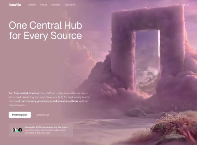 Integration SaaS
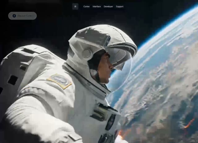 Cosmos Interface
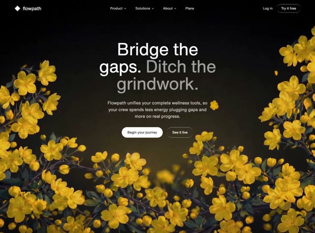 Wellbeing OS
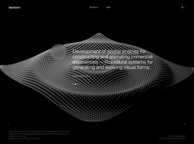 Innovation Studio
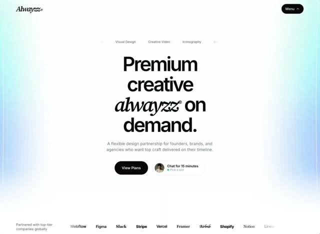 Subscription Agency
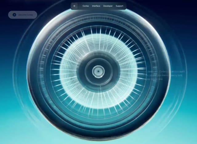 AI Interface
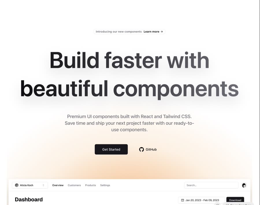 Hero Section
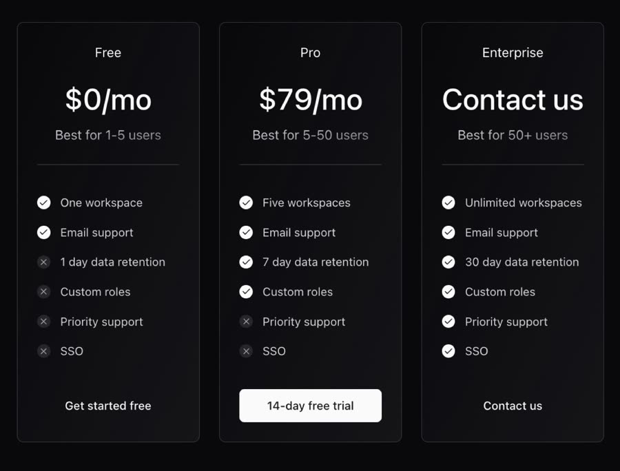 Dark Gradient Pricing
 Shape Landing Hero
 Sidebar
 Expandable Tabs
 Splash Cursor
 Spline Scene
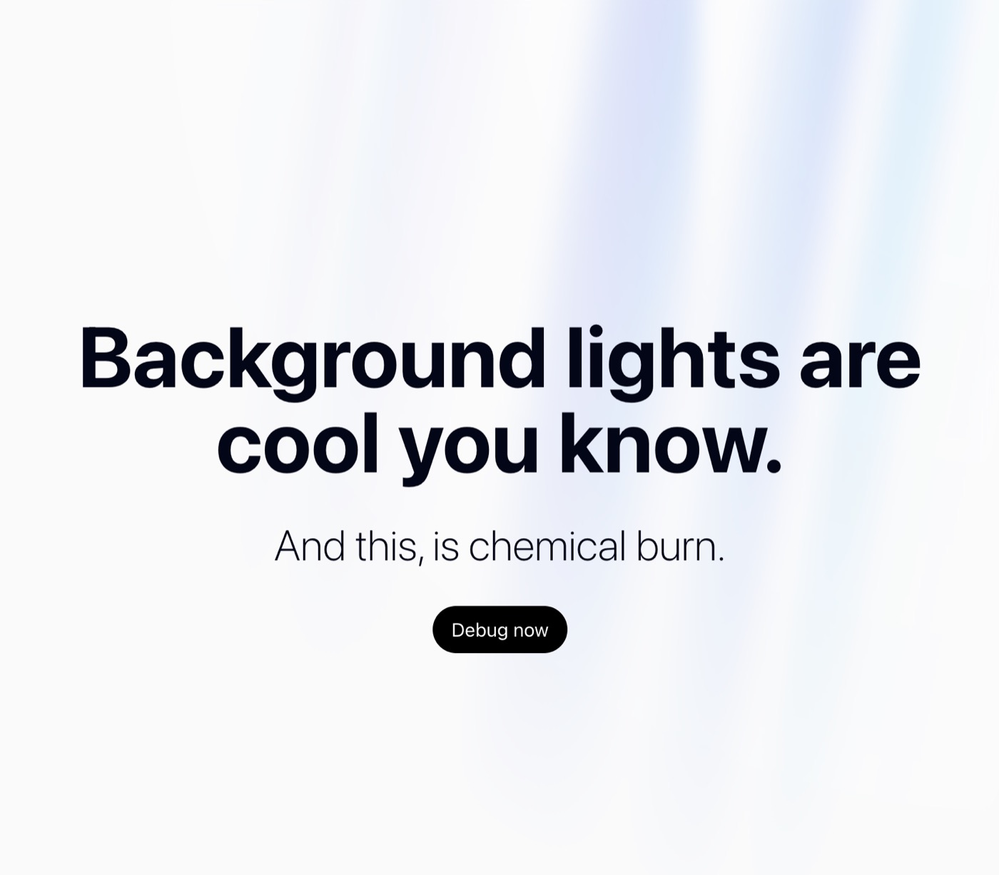 Aurora Background
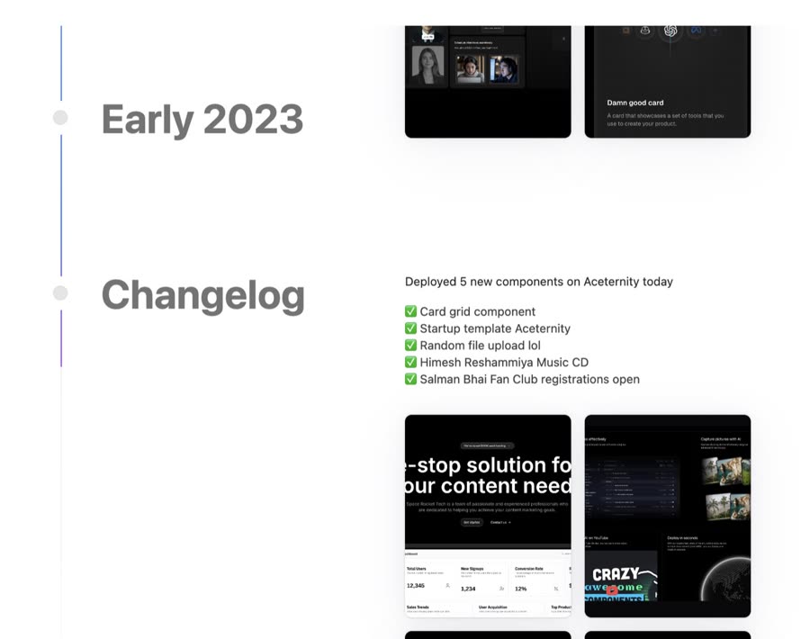 Timeline
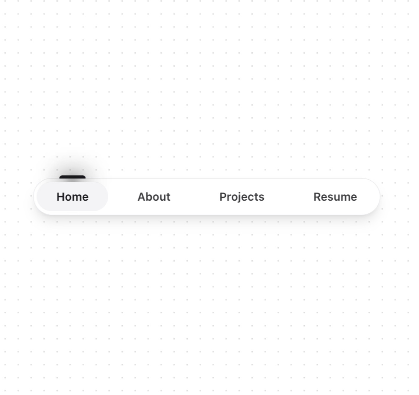 Tubelight Navbar
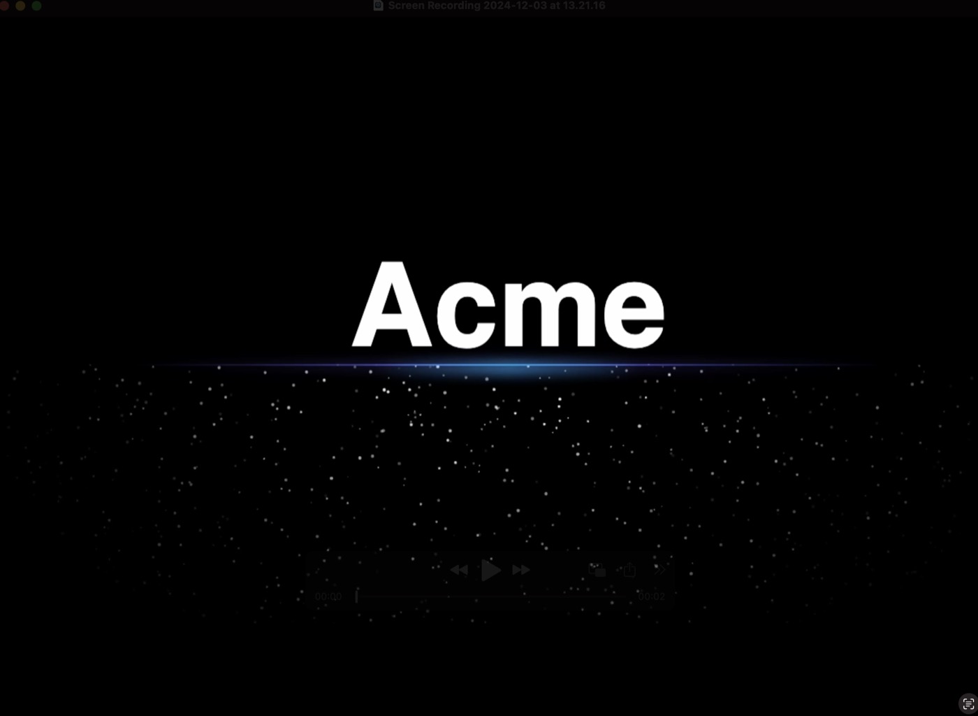 Sparkles
 Dock
Dock
 Container Scroll Animation
 Footer section
 Rainbow Button
 Text Rotate
 Animated hero
 Dialog
 Bento Grid
 AI Voice Input
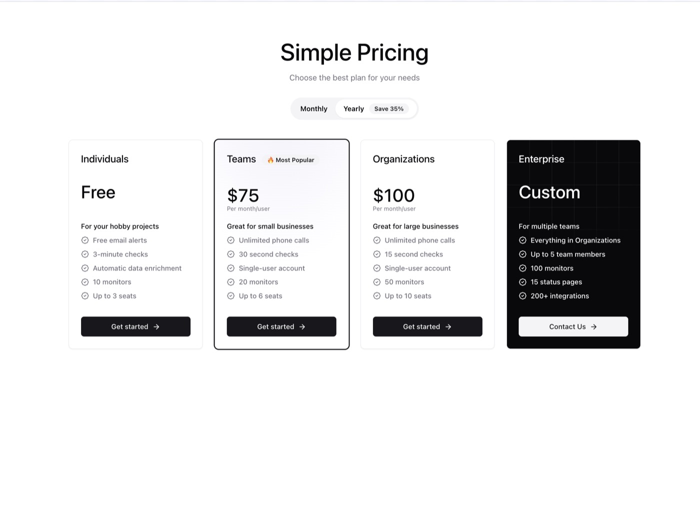 Pricing Section
 Display Cards
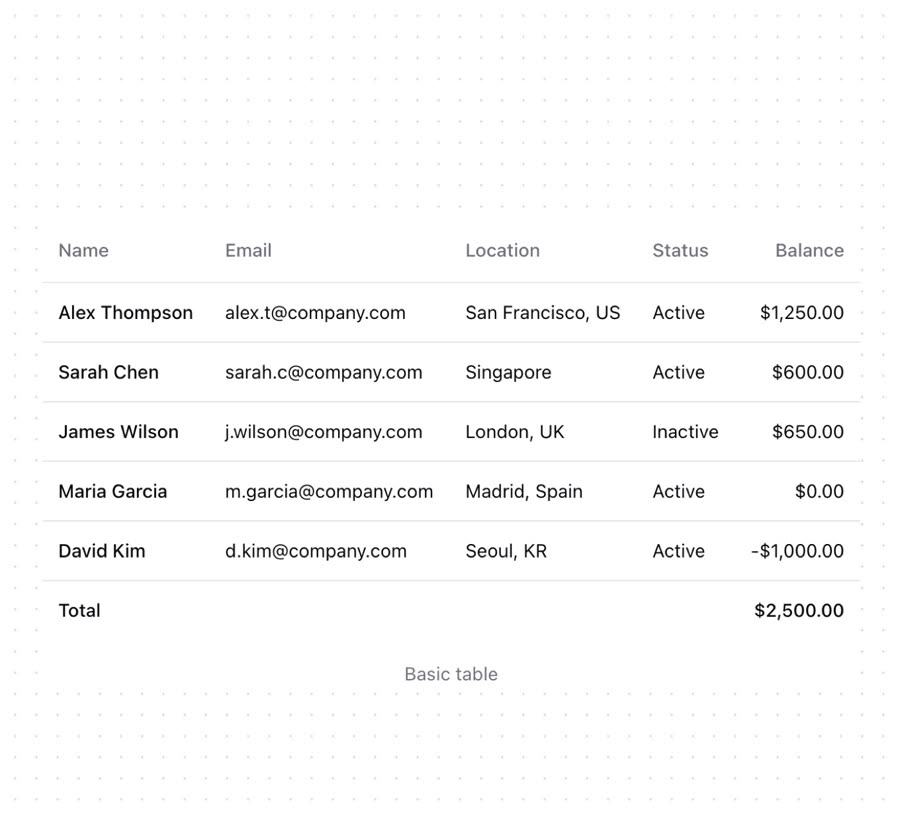 Table
Table
 Waves Background
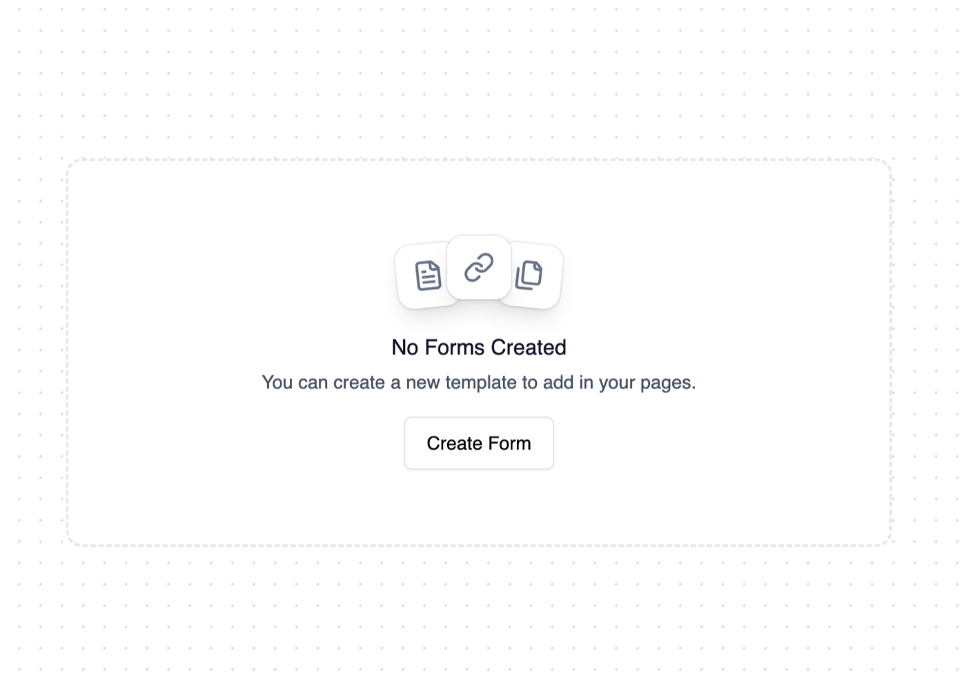 Empty State
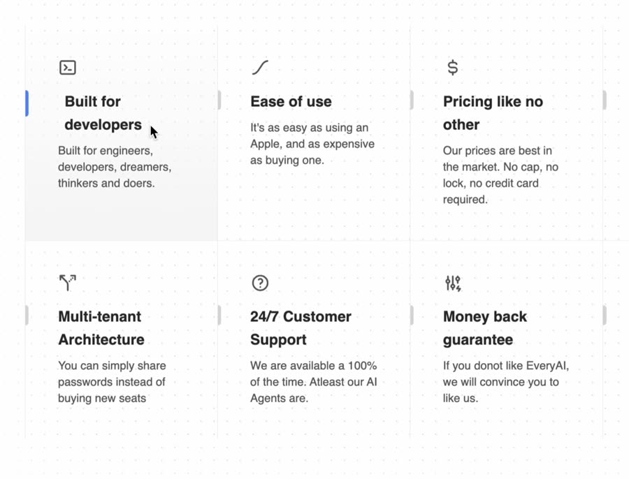 Feature Section with hover effects
Browse & preview free Unlock everything — from $49/mo
Frequently asked questions
Do Meez prompts work with Gemini?
Yes. Every Meez prompt is a complete written spec — fonts, layout, color tokens, motion and asset URLs — so Gemini can build it in one paste. The 62 free prompts on this site work exactly like the premium ones; copy one above and try it.
What does Gemini generate from a prompt?
Gemini generates code in-chat or agentically via the Gemini CLI in your own terminal and repo — any stack. In the CLI it reads and writes project files directly, so a full Meez spec pasted as the task brief produces the page in place, following the structured art direction closely.
How do I use a Meez prompt in Gemini?
Copy the full prompt text and paste it into Gemini, or the Gemini CLI. Don't shorten it — the specificity is what keeps Gemini from producing a generic layout. Then iterate: swap the copy and point the asset URLs at your own media.
How many prompts are free?
62 prompts are free to copy in full, no account needed. The other 579 unlock with Unlimited — $49/mo, $149/yr, or $299 once for lifetime — along with all 285 motion backgrounds.
Also for: Lovable · Bolt · v0 · Cursor · Claude · Replit · Windsurf · Framer · Webflow · ChatGPT · Figma Make · GitHub Copilot · Wix
Not sure which tool? Lovable vs v0 vs Bolt vs Cursor, compared → · All free prompts on one page → · All prompt categories →