Prompts · for Figma Make
AI website build-prompts for Figma Make
Paste a Meez prompt into Figma Make and it generates a working, editable design — sections, type scale, color system and motion laid out exactly as specified — then you refine it on the canvas you already know. Because the prompt is a complete art-direction spec rather than a vague ask, Make starts from a real design instead of a generic template, and you keep iterating in Figma rather than from a blank frame.
How to use a Meez prompt in Figma Make
- Pick a prompt below (4 on this page are free) or browse the full library — every prompt is a complete art-direction spec: fonts, layout, color system, motion and real asset URLs.
- Copy the whole prompt and paste it into Figma Make's prompt field. Don’t trim it — the detail is what stops Figma Make from defaulting to a generic layout.
- Let it build, then iterate: swap the copy, point the asset URLs at your own media, and ship. The sites you build are yours, commercially.
Free prompts to try in Figma Make right now
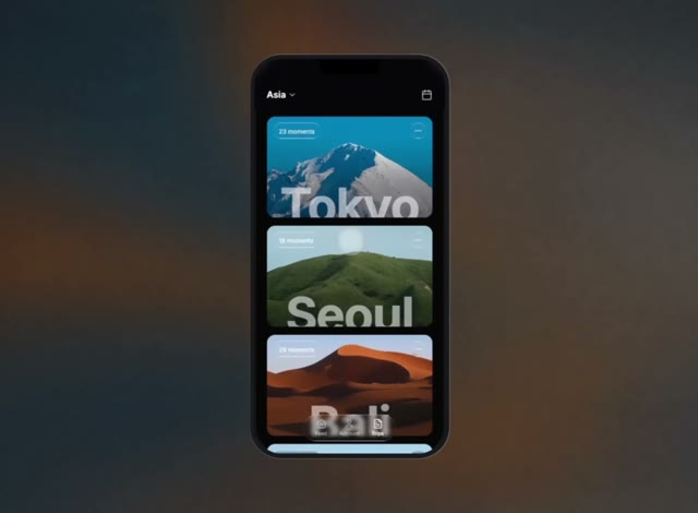
Travel JournalMobile App · free prompt · copy-paste
Create a mobile travel app UI mockup displayed inside a realistic iPhone-style phone frame, centered on a white webpage. Tech stack: React + TypeScript, Tailwind CSS, Lucide React icons, Vite. Font: Google Fonts "Inter" (weights 300-900).

---

**PAGE WRAPPER:**

Full viewport (`h-screen w-screen`), solid white background, flexbox centered, overflow hidden.

---

**PHONE FRAME:**

- Dimensions: 375px x 780px
- Background: `#0a0a0c`
- Border-radius: 52px
- Overflow: hidden
- Box-shadow (layered bezel effect):
  ```
  inset 0 0 0 2px rgba(255, 255, 255, 0.08),
  0 0 0 1px rgba(0, 0, 0, 0.6),
  0 0 0 10px #1a1a1e,
  0 0 0 11px rgba(255, 255, 255, 0.06),
  0 0 60px rgba(0, 0, 0, 0.5)
  ```

**Dynamic Island notch:** Absolute, top-0, centered horizontally, 120px wide, 28px tall, solid black, `rounded-b-2xl`, z-50.

---

**HEADER (absolute, top):**

- Z-index: 30
- `backdrop-filter: blur(12px)` with `background-color: rgba(10, 10, 12, 0.75)`
- Padding: `px-6 pt-14 pb-4`
- Left side: Button with "Asia" text (text-lg, font-semibold, white) + ChevronDown icon (size 18, text-white/70)
- Right side: Calendar icon button (size 22, text-white/70)

---

**SCROLLABLE CONTENT:**

- `overflow-y-auto` with hidden scrollbar
- Padding: `px-6 pt-28 pb-24`
- Vertical spacing: `space-y-4` (16px gap)

---

**DESTINATION CARDS (4 total):**

Each card:
- Full width, height 200px, rounded-2xl, overflow hidden, position relative
- Full-bleed background image (`absolute inset-0, object-cover`)
- Gradient overlay: `bg-gradient-to-t from-black/20 to-transparent`
- **Top-left:** liquid-glass pill (`rounded-full px-3 py-1`) with "{N} moments" text (text-white/90, text-xs, font-normal)
- **Top-right:** liquid-glass circle (w-8 h-8, rounded-full) with MoreHorizontal icon (size 16, text-white/80)
- **Bottom:** Destination name in 96px bold font, centered horizontally, clipped in an 80px tall container with `overflow: hidden`. Color: `rgba(255, 255, 255, 0.55)`, tracking-tight, leading-none, margin-top 2px

**Card data with exact image URLs:**

1. **Tokyo** - 23 moments
   `https://meez.design/web/media/ext/bf4221c9788892cc.webp`

2. **Seoul** - 18 moments
   `https://meez.design/web/media/ext/266bc9680f31a324.webp`

3. **Bali** - 29 moments
   `https://meez.design/web/media/ext/4111355756d31bad.webp`

4. **Rome** - 15 moments
   `https://meez.design/web/media/ext/17f0095a938bcda0.webp`

---

**FLOATING BOTTOM NAV BAR:**

- Absolute, bottom-6, centered horizontally, z-30
- liquid-glass pill (`rounded-full, flex, gap-6, px-6 py-2`)
- 3 nav items (flex-col, items-center, gap-0.5):
  - "Feed" + Home icon (size 20) -- inactive (`text-white/50`)
  - "Account" + User icon (size 20) -- inactive (`text-white/50`)
  - "Trips" + FileText icon (size 20) -- active (`text-white`)
- Label style: `text-[10px] font-medium`

---

**LIQUID-GLASS CSS:**

```css
.liquid-glass {
  background: rgba(255, 255, 255, 0.01);
  background-blend-mode: luminosity;
  backdrop-filter: blur(4px);
  -webkit-backdrop-filter: blur(4px);
  border: none;
  box-shadow: inset 0 1px 1px rgba(255, 255, 255, 0.1);
  position: relative;
  overflow: hidden;
}

.liquid-glass::before {
  content: '';
  position: absolute;
  inset: 0;
  border-radius: inherit;
  padding: 1.4px;
  background: linear-gradient(180deg,
    rgba(255,255,255,0.45) 0%, rgba(255,255,255,0.15) 20%,
    rgba(255,255,255,0) 40%, rgba(255,255,255,0) 60%,
    rgba(255,255,255,0.15) 80%, rgba(255,255,255,0.45) 100%);
  -webkit-mask: linear-gradient(#fff 0 0) content-box, linear-gradient(#fff 0 0);
  -webkit-mask-composite: xor;
  mask-composite: exclude;
  pointer-events: none;
}
```

---

**STAGGERED ENTRANCE ANIMATION:**

Each card starts at `opacity: 0` and `transform: translateY(24px)`. On component mount, a `setTimeout` triggers a state change that transitions to `opacity: 1` and `translateY(0)`. Transition: `transition-all duration-700 ease-out`. Stagger delay: first card 150ms, each subsequent +120ms (150, 270, 390, 510ms). Implemented with React `useState` + `useEffect`.

---

**SCROLLBAR HIDING:**

```css
.scrollbar-hide::-webkit-scrollbar { display: none; }
.scrollbar-hide { -ms-overflow-style: none; scrollbar-width: none; }
```

---

**GLOBAL:**

```css
* { font-family: 'Inter', sans-serif; }
```

Load in HTML head:
```html
<link rel="preconnect" href="https://fonts.googleapis.com" />
<link rel="preconnect" href="https://fonts.gstatic.com" crossorigin />
<link href="https://fonts.googleapis.com/css2?family=Inter:wght@300;400;500;600;700;800;900&display=swap" rel="stylesheet" />
```
Growth DecisionsSaaS · free prompt · copy-paste
**Recreate this exact single-page SaaS hero. Do not invent extra sections, extra pages, extra images, or extra copy. Implement only what is specified. Stack: one `index.html`, one `styles.css`, one `main.js`. No frameworks.**

### What this page is
A single full-viewport landing hero for **Meridian — Revenue Intelligence for SaaS**. No footer, no extra sections, no scroll on desktop. White page with a full-bleed looping background video of painterly navy/orange mountains. UI is sharp-cornered (radius `0` everywhere). Type is Inter. Layout is a 3-row column: top nav, left-aligned hero, bottom-left lede.

Page title: `Meridian — Revenue Intelligence for SaaS`
`html lang="en"`
`meta viewport width=device-width, initial-scale=1.0`

---

### Exact assets (use these URLs, do not substitute)

**Google Fonts — Inter only, weights 300, 400, 500, 600, 700:**
```
https://fonts.googleapis.com
https://fonts.gstatic.com (preconnect, crossorigin)
https://fonts.googleapis.com/css2?family=Inter:wght@300;400;500;600;700&display=swap
```

**Background video (mandatory CloudFront URL, do not replace):**
```
https://meez.design/web/media/ext/13b52ff7bdc5d6ce.mp4
```
`<video class="bg-video" autoplay muted loop playsinline>` with one `<source type="video/mp4">`. No poster. No controls.

There are **no other image/video assets**. Logo and arrows are inline SVG.

---

### Design tokens (`:root`)
```
--bg: #ffffff
--text: #0a0a0a
--muted: #1a1a1a
--blue: #006cd2
--blue-dark: #0053a3
--headline-muted: #6b7378
--glass: rgba(0, 0, 0, 0.13)
--glass-blur: 18px
--glass-light: rgba(255, 255, 255, 0.28)
--radius: 0
--font: "Inter", "Helvetica Neue", Helvetica, Arial, sans-serif
--pad-x: clamp(20px, 3.52vw, 64px)
--nav-top: clamp(16px, 2.05vw, 28px)
--btn-icon: 36px
--btn-pad-y: 12px
--btn-pad-x: 22px
```

Global: `box-sizing: border-box`, all margins/paddings 0.
`html, body { height: 100%; overflow: hidden }`
`body`: Inter, `--bg`, `--text`, `-webkit-font-smoothing: antialiased`, `-moz-osx-font-smoothing: grayscale`
Links inherit color, no underline. Buttons inherit font, no border, pointer cursor.

---

### Page shell
`.page` is `position: relative; width: 100%; height: 100vh; height: 100dvh; display: flex; flex-direction: column; overflow: hidden`
Padding: `var(--nav-top) var(--pad-x) clamp(28px, 4.9vw, 48px)`

`.bg` is `position: absolute; inset: 0; z-index: 0; background: #ffffff; pointer-events: none; overflow: hidden`
`.bg-video` is `position: absolute; inset: 0; width: 100%; height: 100%; object-fit: cover`

`.nav`, `.hero`, `.lede`, `.mobile-menu` are `position: relative; z-index: 1`

---

### Header / nav
3-column CSS grid: `1fr auto 1fr`, items vertically centered.

**Left — glass pill of links** (`.nav__links`, `aria-label="Primary"`):
- Links (all `href="#"`): `Platform` · `Solutions` · `Company` · `Pricing`
- Flex row, `gap: clamp(22px, 2.6vw, 32px)`, `justify-self: start`
- Padding `24px 34px`
- Background `var(--glass)`, `backdrop-filter: blur(18px)` (+ `-webkit-`), `border-radius: 0`
- Link type: `clamp(13px, 1.37vw, 15px)`, weight `500`, tracking `-0.01em`, color `#0a0a0a`, `line-height: 1`, nowrap, `padding-bottom: 2px`
- Hover: color `#006cd2`, `translateY(-2px)`, 0.22s `cubic-bezier(0.16, 1, 0.3, 1)`
- Underline bar `::after`: 3px tall, `#006cd2`, `bottom: -6px`, full width, `scaleX(0)` from left, hover `scaleX(1)`, 0.28s same easing

**Center — logo** (`<a class="logo" href="#" aria-label="Meridian">`):
Inline SVG, `viewBox="0 0 42 34"`, rendered width `clamp(30px, 3.2vw, 38px)`, `fill: currentColor` (`#0a0a0a`). Six parallelograms:

```
<polygon points="12,0 30,0 33.2,3.2 15.2,3.2" />
<polygon points="14.6,5.6 32.6,5.6 35.8,8.8 17.8,8.8" />
<polygon points="17.2,11.2 35.2,11.2 38.4,14.4 20.4,14.4" />
<polygon points="3.2,16.8 21.2,16.8 24.4,20 6.4,20" />
<polygon points="5.8,22.4 23.8,22.4 27,25.6 9,25.6" />
<polygon points="8.4,28 26.4,28 29.6,31.2 11.6,31.2" />
```

Hover: `scale(1.1)`, 0.35s `cubic-bezier(0.16, 1, 0.3, 1)`
Each polygon: `transform-box: fill-box; transform-origin: left center`
Entrance `mark-in` 0.5s same easing, `backwards`: from `opacity 0` + `translate3d(-12px, 8px, 0)`
Delays: 0.04 / 0.09 / 0.14 / 0.19 / 0.24 / 0.29s

**Right — nav Book Demo** (`.btn.btn--nav`, `justify-self: end`):
- Label `Book Demo` + 36×36 icon square
- Arrow SVG `viewBox="0 0 20 20"`, path `M4 10h10.2M10.4 5.6 15.2 10l-4.8 4.4`, stroke currentColor, width 1.7, round caps/joins, no fill. CSS sizes the svg to 14×14.
- Background `#006cd2`, text white
- Icon square `#0053a3`, white arrow
- Hover icon: white bg, blue arrow
- Hover wipe `::before` fill `#004a96` (see buttons)
- Entrance: `wipe-right` 0.65s, delay 0.16s, `backwards`

**Burger** (hidden on desktop, shown ≤820px):
- 36×36, 3 bars: 18×1.5px, `#0a0a0a`, gap 5px
- Hover: scale 1.08; bars turn `#006cd2`; first and third bars shrink to 14px
- `aria-label="Open menu"`, `aria-expanded="false"`, `aria-controls="mobile-menu"`
- JS toggles `.is-open`, `aria-expanded`, label Open/Close, and `hidden` on `#mobile-menu`. Escape and any menu link close it. There is **no X-transform CSS** for `.is-open` — bars stay 3 lines.

**Mobile menu** (`#mobile-menu`, `hidden` by default):
- Same 4 links + same Book Demo button
- Column, gap 1.25rem, padding `1.25rem 0 0.5rem`
- Links wrap: padding `16px 20px`, glass bg + 18px blur, column gap 0.9rem, font 1.05rem / 500

Nav link entrance (`link-in` 0.55s, `backwards`): from `opacity 0` + `translate3d(-16px, 0, 0)`
Delays: Platform 0.02s, Solutions 0.08s, Company 0.14s, Pricing 0.2s
Burger uses `link-in` 0.5s delay 0.16s

---

### Buttons (shared)
All `.btn`:
- `inline-flex`, align center, **height 58px**, `border-radius: 0`
- Padding `12px 10px 12px 22px`, gap 18px
- Font 16px / 500 / tracking `-0.015em` / line-height 1 / nowrap
- `::before` absolute inset 0, `scaleX(0)` from left, hover `scaleX(1)`, 0.4s `cubic-bezier(0.16, 1, 0.3, 1)`, `pointer-events: none`
- Label and icon `z-index: 1` above the wipe

**`.btn--nav`:** blue `#006cd2` / white; icon `#0053a3`; wipe `#004a96`
**`.btn--light`:** white bg / `#006cd2` text; icon `#006cd2` with white arrow; wipe `#e8f2fb`
**`.btn--ghost`:** padding `12px 26px` (no icon); color `#0a0a0a`; bg `rgba(255,255,255,0.55)`; blur 24px; wipe `rgba(255,255,255,0.78)` at z-index 0. Hover keeps same 0.55 white + 24px blur.

---

### Hero (left column, not centered)
`.hero { margin-top: clamp(52px, 10.15vh, 92px); max-width: none }`

**Badge** (`.badge.wipe`, `--d: 0.18s`):
- Text exactly: `Revenue Intelligence for SaaS`
- Left: 14×14 white square with `2px solid #006cd2` (empty, no glyph)
- `inline-flex`, gap 10px, height `clamp(34px, 3.6vw, 42px)`, padding `0 18px 0 14px`
- Bg `rgba(255,255,255,0.28)`, `1px solid rgba(0, 108, 210, 0.2)`, blur 18px
- Color `#1a1a1a`, `clamp(13px, 1.35vw, 15px)`, weight 500, tracking `-0.01em`

**Headline** (`h1.headline`):
```
Every revenue decision
starts with a better question.
```
Two masked lines (`.headline__mask` = `display:block; overflow:hidden`):

1. `--d: 0.26s` → `Every revenue decision` — color `#0a0a0a`
2. `--d: 0.4s` → `.headline__line` nowrap:
   - `.headline__muted` `starts with a` — color `#6b7378`, weight 600
   - `.headline__accent` `better question.` with `data-text="better question."`

Type: `font-size: calc(clamp(2.9rem, 5.9vw, 5rem) + 3px)`, weight 600, line-height 1.18, tracking `-0.038em`
`.headline` margin-top `clamp(22px, 2.8vw, 36px)`

Each `.headline__rise` uses `type-rise` 0.85s `cubic-bezier(0.16, 1, 0.3, 1)` `backwards`, delay `var(--d)`: from `translate3d(0, 118%, 0)` to 0.

**Accent paint-on (critical):**
Base `.headline__accent` is `#6b7378`. Two absolutely stacked copies via `content: attr(data-text)`:

- Soft left-to-right mask:
  `linear-gradient(90deg, #000 0%, #000 calc(100% - 72px), transparent 100%)`
  start `mask-size: 0% 100%`, no-repeat
- `::before` color `#7eb6ee`, `accent-fill` 1.05s `cubic-bezier(0.4, 0, 0.2, 1)` delay **0.7s** forwards
- `::after` color `#006cd2`, same animation delay **1.08s**
- End state: `mask-size: calc(100% + 72px) 100%`
This is a two-pass wipe: pale blue then brand blue, with a 72px soft leading edge.

**Actions** (flex, gap 12px, margin-top `clamp(28px, 3.4vw, 42px)`):
1. `.btn.btn--light.wipe` `--d: 0.56s` — `Book Demo` + same arrow icon
2. `.btn.btn--ghost.wipe` `--d: 0.66s` — `See Meridian in Action` (no icon)

`.wipe` = `wipe-left` 0.7s `cubic-bezier(0.16, 1, 0.3, 1)` `backwards`: `clip-path: inset(0 100% 0 0)` → `inset(0 0 0 0)`

---

### Bottom lede
Pinned with `margin-top: auto`, max-width **700px**, overflow hidden.
Color **`#ffffff`** (sits on the dark mountain).
`clamp(17px, 1.8vw, 20px)`, weight **300**, line-height 1.5, tracking `-0.01em`

Exact copy:
> Meridian continuously analyzes product usage, customer behavior and commercial data to identify expansion opportunities, predict revenue risk, and recommend the highest-impact actions for your team.

Inner `.lede__rise` `--d: 0.78s` uses `type-rise` 0.9s same easing `backwards`.

---

### Animation timeline (page load)
| t | what |
|---|---|
| 0.02s | Platform slides in from left |
| 0.04–0.29s | 6 logo bars stagger in from down-left |
| 0.08 / 0.14 / 0.20s | Solutions / Company / Pricing |
| 0.16s | Book Demo wipes in from the right; burger fades in |
| 0.18s | Badge wipes left→right |
| 0.26s | Line 1 rises from below mask |
| 0.40s | Line 2 rises |
| 0.56s | Light Book Demo wipes in |
| 0.66s | Ghost button wipes in |
| 0.70s | Pale-blue `#7eb6ee` starts filling “better question.” |
| 0.78s | Lede rises |
| 1.08s | Brand blue `#006cd2` overpaints the accent |

All entrance animations use `animation-fill-mode: backwards`.

**`prefers-reduced-motion: reduce`:** kill every listed animation; restore opacity/transform/clip-path; accent becomes solid `#006cd2` and `::before/::after` `content: none`.

---

### Responsive
**≤820px:**
- `html, body { overflow: auto }`
- `.page` height auto, `min-height: 100vh / 100dvh`
- Hide `.nav__links` and desktop `.btn--nav`
- Nav grid `auto 1fr auto`; logo `justify-self: start`; show burger
- Show `.mobile-menu` as flex column (still hidden via `[hidden]{display:none}`)
- Hero margin-top 48px
- Headline `calc(clamp(2.75rem, 10vw, 3.85rem) + 3px)`
- Actions wrap
- Lede width 100%, max 700px, margin-top 64px

**`max-height: 700px` and `min-width: 821px`:**
- Hero margin-top 36px
- Headline `calc(clamp(2.75rem, 7.2vh, 4.15rem) + 3px)`

---

### JS (`main.js`)
IIFE only. Query `.nav__burger` and `#mobile-menu`. Toggle open/closed as specified. No other JS. No video JS. No scroll libraries. No analytics.

---

### Do not
- Do not add more pages, sections, cards, testimonials, pricing tables, or a footer
- Do not round corners
- Do not swap Inter for another font
- Do not change the CloudFront mp4 URL
- Do not center the hero
- Do not make the lede dark text
- Do not add a poster image or grain overlay (grain is in the video)
- Do not use a different logo
- Do not add burger-to-X animation unless already specified (it is not)

Match this 1:1.
USD HaloLanding Page · free prompt · copy-paste
Build a premium, fintech-style landing page for a stablecoin product called "Halo / USD Halo" using React + TypeScript + Vite + Tailwind CSS, with lucide-react for icons. No other UI libraries. Background color of the page is #F5F5F5.

Global Setup
Use TT Norms Pro as the primary font, loaded via @font-face from /fonts/tt-norms-pro-regular.woff2 (weight 400) and /fonts/tt-norms-pro-semibold.woff2 (weight 600), with font-display: swap. Apply it to html, body, and inherit on *.
Tailwind base + components + utilities at the top of src/index.css.
Page wrapper: flex flex-col bg-[#F5F5F5]. The first section (Navbar + Hero) is wrapped in a h-screen flex flex-col overflow-hidden container.
Inner content max width across sections: max-w-[88rem] mx-auto.
Custom Logo Icon
Create an SVG component LogoIcon using currentColor, viewBox 0 0 256 256, with this path (a stylized "halo" mark made of two interlocking rounded squares):


M 128.005 191.173 C 128.448 156.208 156.93 128 192 128 L 192 64 L 128 64 C 128 99.346 99.346 128 64 128 L 64 192 L 128 192 Z M 192 256 L 64 256 C 28.654 256 0 227.346 0 192 L 0 64 L 64 64 L 64 0 L 192 0 C 227.346 0 256 28.654 256 64 L 256 192 L 192 192 Z
1. Navbar (absolute, transparent over hero)
nav is absolute top-0 left-0 right-0 z-20 px-6 py-5.
Inner row: flex items-center justify-between.
Left: LogoIcon (w-7 h-7, black) + word "Halo" (text-2xl font-medium tracking-tight text-black).
Center (hidden below md): links Network · Ecosystem · Rewards · Help · News, gap-8, text-base text-gray-700 hover:text-black font-medium transition-colors duration-200.
Right: black pill button "Open Wallet" — bg-black text-white text-base font-medium px-7 py-2.5 rounded-full hover:bg-gray-800 transition-colors duration-200.
2. Hero Section
Outer: flex-1 px-6 pt-20 pb-6 flex items-end.
Inner card: relative w-full rounded-2xl overflow-hidden, inline style height: calc(100vh - 96px).
Background video (autoplay, muted, loop, playsInline, object-cover absolute inset-0 w-full h-full):
https://meez.design/web/media/ext/96b0a69bacbd9f05.mp4

Content overlay: relative z-10 flex flex-col items-start justify-start h-full p-12 pt-36.
h1: "Your Wealth\nWorks" (with <br/>) — text-black text-5xl md:text-6xl font-medium leading-tight max-w-xl mb-4, inline letterSpacing: '-0.04em'.
p: "An automated, reward-powered digital dollar built for native passive earnings and effortless connection into DeFi." — text-black/70 text-base md:text-lg max-w-md mb-8 leading-relaxed, inline fontFamily: "'Inter', ui-sans-serif, system-ui, sans-serif".
Pill button "Join us" with arrow circle: inline-flex items-center gap-3 bg-black text-white text-base md:text-lg font-medium pl-8 pr-2 py-2 rounded-full hover:bg-gray-800. Trailing arrow inside bg-white rounded-full p-2, using ArrowRight w-5 h-5 text-black from lucide-react.
Followed by the Brand Marquee below.
Brand Marquee (inside hero, below button)
Container: mt-24 w-full max-w-md overflow-hidden.
Inject scoped <style> with keyframes marquee translating 0 → -50%, applied to .marquee-track { display:flex; width:max-content; animation: marquee 22s linear infinite; }.
Render the brand list twice (so it loops seamlessly).
Each item: mx-7 shrink-0 text-black/60 whitespace-nowrap with these inline styles:
Stripe — Georgia serif, weight 700, letterSpacing -0.02em, fontSize 15px
Coinbase — Arial sans, weight 900, letterSpacing 0.08em, fontSize 13px, uppercase
Uniswap — Trebuchet MS, weight 600, letterSpacing 0.01em, fontSize 15px, italic
Aave — Courier New monospace, weight 700, letterSpacing 0.12em, fontSize 13px, uppercase
Compound — Palatino, Book Antiqua, weight 400, letterSpacing -0.01em, fontSize 16px
MakerDAO — Impact, Arial Narrow, weight 400, letterSpacing 0.04em, fontSize 14px
Chainlink — Verdana, weight 700, letterSpacing -0.03em, fontSize 13px
3. Info Section ("Meet USD Halo.")
section bg-[#F5F5F5] px-6 py-24.
Row 1: 2-col grid (grid-cols-1 md:grid-cols-2 gap-12 mb-16 items-start).
Left: h2 "Meet USD Halo." — text-black text-4xl md:text-5xl font-medium leading-tight mb-8, letterSpacing -0.03em. Below it, black pill "Discover it" button with white arrow circle (same pattern as "Join us" but text-base).
Right: paragraph "USD Halo is a reward-earning dollar coin that lets your savings grow while remaining tied to the U.S. dollar." — text-black/70 text-2xl md:text-3xl leading-relaxed.
Row 2 — 4-col card grid (grid-cols-1 sm:grid-cols-2 lg:grid-cols-4 gap-4):
Card 1 (spans 2 cols on lg): rounded-2xl with background image:
https://meez.design/web/media/ext/1ff5172230c90957.png

 backgroundSize: cover; backgroundPosition: center. Inside: p-7 min-h-80 flex flex-col justify-between. Title (top): "Savings that bloom" — text-black text-2xl font-medium leading-snug letterSpacing -0.02em. Body (bottom): "Gain steady returns as your dollar tokens are routed into top-performing DeFi strategies." — text-black/70 text-base max-w-xs.
Card 2: solid #2B2644, rounded-2xl, p-7, min-h-80, flex-col-justify-between. White heading "Always fluid,\nalways pegged." text-2xl font-medium, body "Keep fully dollar-anchored with on-demand access to funds — no lockups or waits." text-white/60 text-base.
Card 3: same #2B2644 styling. Heading "Fully\nautomated". Body "Skip the task of tuning positions yourself. USD Halo runs in the background for you."
4. Backed By Section (marquee row)
section bg-[#F5F5F5] px-6 with inner max-w-[88rem] mx-auto grid grid-cols-1 md:grid-cols-4 gap-8 items-center.
Left col (1/4): text-black/70 text-base leading-relaxed — "Funded by premier partners\nand forward-thinking leaders."
Right col (3/4): infinite marquee (same pattern as hero marquee but 30s linear infinite, class .backers-track, keyframes backers-marquee). Items use mx-10 shrink-0 text-black/50 whitespace-nowrap with these inline styles:
Fundamental Labs — Times New Roman serif, 400, ls 0.02em, 14px
KUCOIN — Arial Black, 900, ls 0.08em, 16px
NGC — Impact, 700, ls 0.05em, 18px
NxGen — Georgia, 600, ls -0.02em, 17px
Matter Labs — Helvetica, 700, ls -0.01em, 15px
DEXTools — Verdana, 700, ls 0.06em, 14px, uppercase
NGRAVE — Courier New, 700, ls 0.18em, 14px
Polychain — Palatino, 500, ls 0.03em, 15px
Render brands twice for the loop.
5. Use Cases Section
section bg-[#F5F5F5] px-6 py-24. Inner: 2-col grid grid-cols-1 md:grid-cols-2 gap-8 items-start.
Left column (md:pr-12 md:pt-2):
Eyebrow: "USD Halo in Practice" — text-black/60 text-sm mb-2.
h2 "Use modes" — text-5xl md:text-6xl font-medium leading-none mb-6, ls -0.04em.
Paragraph: "USD Halo powers a wide range of modes for builders, companies and treasuries wanting safe and rewarding stablecoin integrations plus more" — text-black/60 text-base leading-relaxed max-w-sm.
Right column: large relative rounded-3xl overflow-hidden min-h-[720px] with background video (autoplay/muted/loop/playsInline, object-cover absolute inset-0):
https://meez.design/web/media/ext/6ca06be4279f8beb.mp4

Overlay content relative z-10 p-10 md:p-12:
h3 "Commerce" — text-4xl md:text-5xl font-medium leading-tight mb-5, ls -0.03em.
Paragraph: "Lift customer retention by offering USD Halo, a trusted dollar-backed stablecoin with strong yields, letting your patrons earn with zero effort on your platform." — text-black/70 text-base max-w-md mb-8.
Inline-flex link "Know more" with leading circular icon: w-9 h-9 rounded-full bg-white/80 backdrop-blur flex items-center justify-center group-hover:bg-white transition-colors containing ArrowRight w-4 h-4 text-black.
Animations & Interactions
Two CSS keyframe marquees (22s for hero brands, 30s for backers), both translating 0 → -50% on a duplicated track for seamless looping.
All buttons use transition-colors duration-200 with hover state hover:bg-gray-800 (or hover:bg-white for the white circle).
Nav links transition on hover from text-gray-700 to text-black.
Videos autoplay muted with playsInline for mobile compatibility.
Composition
App renders, in order:

h-screen overflow-hidden wrapper containing Navbar (absolute) + HeroSection.
InfoSection
BackedBySection
UseCasesSection
All section backgrounds are #F5F5F5. All headings use negative letter-spacing for the tight, modern fintech feel. Use font-medium (600) as the heaviest weight throughout.
Intelligence LayerTechnology · free prompt · copy-paste
Recreate a single-file dark cinematic AI-infrastructure landing page EXACTLY as specified. Deliver one self-contained index.html (inline CSS + JS, no build step). Pixel-faithful to a measured Figma-style comp. No cards, no purple, no glow orbs, no decorative abstract gradients as the main visual — the hero visual is a full-bleed looping video.

════════════════════════════════════════
PAGE META / IDENTITY
════════════════════════════════════════
- Document title: "The Next Layer of Intelligence"
- Brand: abstract geometric S-like mark (lightning/bolt geometry), NOT a wordmark in the header.
- Product vibe: premium AI infrastructure / “next layer of intelligence”; black void stage; restrained silver/white type; white pill CTAs.
- Viewport: fixed full-screen stage; html/body height 100%; overflow hidden; background #050505.
- Antialiased Manrope UI; text-rendering: geometricPrecision.

════════════════════════════════════════
FONTS (REQUIRED)
════════════════════════════════════════
1) Primary UI type: Manrope (variable / range font-weight 200–800), normal style.
   - Load via @font-face woff2 OR Google Fonts equivalent:
     https://fonts.google.com/specimen/Manrope
     weights covering 400, 500, 700 (variable 200–800 preferred).
   - body font-family: 'Manrope', system-ui, -apple-system, 'Segoe UI', sans-serif

2) Partner logo wordmark type: custom display face named "IpsumMark", weight 700.
   - Used ONLY on the four bottom “logoipsum” wordmarks.
   - If IpsumMark binary is unavailable, approximate with a bold geometric sans close to logoipsum marks (still set font-family stack: 'IpsumMark','Manrope',sans-serif) — do NOT use Inter/Roboto/Arial as primary.

════════════════════════════════════════
COLOR TOKENS (CSS VARIABLES)
════════════════════════════════════════
--ink: #fafafa          /* headline / primary text */
--muted: #a7a6a6        /* subcopy */
--nav: #b6b5b5          /* header links */
--strip: #8b8a8a        /* partner logos */
--pill: #ffffff         /* CTA fill */
--pill-ink: #050505     /* CTA text */
Stage / page black: #050505

════════════════════════════════════════
RESPONSIVE UNIT SYSTEM (CRITICAL — MATCH EXACTLY)
════════════════════════════════════════
Reference canvas: 1487 × 1058.

:root {
  --u: calc(100vh / 1058);                 /* 1 design px locked to HEIGHT */
  --uw: calc(100vw / 1487);
  --h: clamp(var(--u), calc(var(--u) * .65 + var(--uw) * .35), calc(var(--u) * 1.16));
}
@supports (height: 100dvh) { :root { --u: calc(100dvh / 1058); } }

Meaning:
- Vertical rhythm always fills the screen (nav ~27u, headline top ~230.5u, logos ~995u, baseline 1058u).
- Left column anchored ~75u from left; header CTA ~75–76u from right; nav + logo strip centered.
- --h grows type slightly on ultra-wide (max +16%), never shrinks below height-locked --u.

Portrait / narrow (max-aspect-ratio: 11/10):
- Switch to flow layout (flex column), unit --m: min(100vw/430, 1.34px); --u: var(--m)
- Tablet band (≥600px AND max-aspect-ratio 11/10):
  --m: min(100vw/860, 100vh/760, 1.25px)

════════════════════════════════════════
BACKGROUND — CLOUDFRONT VIDEO (MANDATORY URL)
════════════════════════════════════════
Exact video URL (must use this, not a substitute):
https://meez.design/web/media/ext/13c2dff571bad2e4.mp4

Markup inside absolute .plate covering the stage:
<video class="plate-video" autoplay muted loop playsinline preload="auto" aria-hidden="true">
  <source src="[URL ABOVE]" type="video/mp4">
</video>

Desktop video geometry (match photo-plate sizing):
- position absolute
- left: 50%; top: calc(1 * var(--u))
- width: calc(1492 * var(--u)); height: calc(1054 * var(--u))
- transform: translateX(calc(-50% - calc(0.5 * var(--u))))
- object-fit: cover; pointer-events: none

Portrait: inset 0; full width/height; transform none; object-fit cover; object-position 43% center
Tablet portrait: object-position 44% center

Video subject (for art direction fidelity): dark cinematic scene — silhouetted figure walking toward a tall glowing white vertical portal/door of light on misty ground, smoke/fog at base, pure black surroundings. Loop seamlessly.

FADE OVERLAYS on .plate::after (keep BOTH gradients):
Desktop:
1) Bottom fade:
linear-gradient(to bottom,
  rgba(5,5,5,0) 78.8%, rgba(5,5,5,.23) 79.6%, rgba(5,5,5,.45) 81.4%,
  rgba(5,5,5,.75) 83.3%, rgba(5,5,5,.84) 85.2%, rgba(5,5,5,.888) 88%,
  rgba(5,5,5,.905) 91%, rgba(5,5,5,.96) 95%, #050505 100%)
2) Side letterbox:
linear-gradient(to right,
  #050505 calc(50% - 746u),
  transparent calc(50% - 676u),
  transparent calc(50% + 676u),
  #050505 calc(50% + 746u))
  where u = var(--u)

Portrait overlays (replace desktop):
- to-right: rgba(5,5,5,.86)→.66@42%→.20@78%→.10@100%
- to-bottom: .72@0%→.34@24%→.34@56%→.80@82%→.97@94%→#050505
Tablet portrait slightly lighter side/top values (.84/.60/.16/.06 and .66/.28/.30/.78/.96).

════════════════════════════════════════
STRUCTURE (DOM ORDER)
════════════════════════════════════════
.stage
  .plate > video.plate-video
  header.topbar
    a.brand (aria-label Home) > brand SVG
    nav.links (aria-label Primary): About | Features | FAQ | Contact
    a.pill.pill-nav > span “Get Started”
    button.burger#burger (two <i> bars) — portrait only visually
  nav.menu#menu (mobile overlay)
    .menu-inner
      p.menu-eyebrow “Menu”
      ul.menu-list: About, Features, FAQ, Contact
      .menu-foot: pill “Get Started” + ghost “View Architecture”
  main.hero
    h1.headline: <span>The Next Layer</span> <span>of Intelligence</span>
    p.sub: <span>A unified infrastructure platform to help teams build,</span>
           <span>ship, and scale AI systems with confidence.</span>
    .actions
      a.pill.pill-cta > span “Get Started”
      a.ghost “View Architecture”
  .logos
    .lg.lg1 … .lg.lg4  (icon SVG + word “logoipsum”; lg2 has a tiny raised dot after the word)

════════════════════════════════════════
DESKTOP ABSOLUTE LAYOUT (in --u / --h units)
════════════════════════════════════════
Brand mark:
- left 75u, top 27u, size 31.5u × 48.5u

Nav links (.links):
- left 50%, top 51u, transform translate(-50%, -50%)
- font 19.0u / weight 400 / color --nav
- gaps between links ≈ 24.5u, 23.5u (3rd), 26.0u (4th)
- items: About, Features, FAQ, Contact — plain text links, no underlines

Header pill (.pill-nav):
- right 75.4u, top 27u, 175u × 49u
- white pill, radius 999px, text #050505, font 20.6u weight 500
- inner span translateY(1u) for optical centering
- label: “Get Started”

Headline (.headline):
- left 75.5u, top 230.5u
- font-size 71.6h, line-height 80.5h, weight 400, letter-spacing 0.3h
- color --ink; white-space nowrap; each span display:block (two lines):
  Line1: “The Next Layer”
  Line2: “of Intelligence”

Subcopy (.sub):
- left 75.5u
- top: 230.5u + 189.0h
- font 20.7h / lh 23.5h / weight 400 / word-spacing 1.8h / color --muted
- two nowrap lines as spans:
  “A unified infrastructure platform to help teams build,”
  “ship, and scale AI systems with confidence.”

Primary CTA (.pill-cta):
- left 74.9u
- top: 230.5u + 264.5h
- size 175.6h × 50h, font 20.6h
- label “Get Started”

Ghost link (.ghost):
- left: 74.9u + 220.6h
- top: 230.5u + 279.5h
- font 20.6h weight 500 letter-spacing 0.12h color #fff
- label “View Architecture” (no underline)

Partner strip (.logos):
- width 741u, left 50%, transform translateX(-50% + 20u)
- color --strip (#8b8a8a)
- Four marks, absolute positions:
  lg1: left -0.5u, top 994.7u; mark 30.5×31u; word left 37u top ~5.6u size 18.1u “logoipsum”
  lg2: left 206.5u, top 995.7u; mark 24.5×30u; word left 31u top ~7.3u size 18.5u “logoipsum” + .dot (inline 0.09em circle, vertical-align 0.62em, margin-left 0.06em)
  lg3: left 416.5u, top 996.7u; mark 28.5×28u; word left 35u top ~7.3u size 16.15u “logoipsum”
  lg4: left 620.5u, top 998.7u; mark 28.5×25.5u; word left 37u top ~8.3u size 15.3u “logoipsum”
- Wordmarks use font-family IpsumMark, weight 700

════════════════════════════════════════
BRAND SVG (exact geometry)
════════════════════════════════════════
viewBox="0 0 31.5 48.5"
- LinearGradient id bg1 from (8,0)→(34.1,28.9) stops:
  0 #9e9e9e, .28 #a6a6a6, .34 #a3a3a3, .40 #3a3a3a, .55 #414141,
  .60 #7a7a7a, .68 #8e8e8e, .80 #a9a9a9, .95 #c4c4c4, 1 #cccccc
- Path: M21.5 0 L21.5 19.5 L31.5 19.5 L31.5 29 L10 48.5 L10 28.5 L0.5 28.5 L0.5 18.5 Z fill url(#bg1)
- Rect 0.5,18.5 9×10 fill #fdfdfd
- Rect 22,19.5 9.5×9.5 fill #fdfdfd
Shape reads as a stylized angular “S” / bolt with two bright rectangular notches.

════════════════════════════════════════
PARTNER ICON SVGs (currentColor = --strip)
════════════════════════════════════════
1) viewBox 0 0 30 31 — square frame with circular bite (mask circle at 19.5,10.5 r5.1) + circle path
2) viewBox 0 0 25 30 — vertical bar + circle yin-yang mask split (classic logoipsum dual form)
3) viewBox 0 0 28 28 — circle stroke r12.35 sw 3.1 + two curved stroke paths (swirls)
4) viewBox 0 0 28 25.5 — filled wavy “mound” path + two stroked wave lines beneath (sw ~3.05)

(Use the exact path data from the source page if available; otherwise match these logoipsum silhouettes precisely.)

════════════════════════════════════════
ANIMATIONS (prefers-reduced-motion: no-preference ONLY)
════════════════════════════════════════
Easing: cubic-bezier(.22, 1, .36, 1)

@keyframes rise:
  from { opacity:0; transform: translateY(14u) }

@keyframes riseNav: (for centered nav — preserve translate(-50%,-50%) end state)
  from { opacity:0; transform: translate(-50% + 0u, -50% + 14u) }
  to   { opacity:1; transform: translate(-50% + 0u, -50%) }

@keyframes fade:
  from { opacity:0 }

Stagger on load:
- .brand, .links, .pill-nav → rise / riseNav, 0.8s, both
- .headline → rise 0.9s, delay 0.06s
- .sub → rise 0.9s, delay 0.14s
- .pill-cta, .ghost → rise 0.9s, delay 0.22s
- .lg → fade 1.1s, delay 0.34s, ease

Reduced motion: collapse menu/burger transitions to ~0.001s; skip entrance animations.

════════════════════════════════════════
PORTRAIT / MOBILE BEHAVIOR
════════════════════════════════════════
- Hide .links and .pill-nav; show frosted-glass pill burger (rgba white .06 / border .14, backdrop blur).
- Burger bars morph to X when .stage.is-open (rotate ±45deg with translateY ±4.3m).
- Overlay .menu: full-screen dark gradient blur, opacity/visibility transition 0.42s.
- Staggered menu reveal (eyebrow, each li, foot) opacity+translateY with delays .06/.10/.16/.22/.28/.34s.
- Menu links large (~31m, min 25px) with small chevron ::after.
- Headline wraps inline on phone; returns to two-line spans on tablet band.
- Logos: 2×2 grid on phone; single row of 4 on tablet ≥600px.
- Safe-area padding on stage.

════════════════════════════════════════
JS (minimal)
════════════════════════════════════════
Toggle .is-open on .stage via burger click; sync aria-expanded / aria-hidden / aria-label.
Close on Escape, on menu link click, and when resized to landscape aspect > 1.1.

════════════════════════════════════════
COMPOSITION RULES (DO NOT VIOLATE)
════════════════════════════════════════
- First viewport = ONE composition: brand mark + nav + one headline + one sub + CTA pair + full-bleed video + bottom partner strip. No stats, cards, badge chips, or secondary marketing blocks.
- Brand mark is a hero-level left signal, not tiny nav decoration only.
- Video is edge-to-edge background plane (not inset card/media).
- No overlays/stickers on the video except the measured edge/bottom fades.
- White fully-rounded pills for primary CTAs only; ghost text for secondary.
- Single HTML file; works desktop + mobile.

Build it so a 1487×1058 desktop screenshot matches this layout to the pixel, with the CloudFront MP4 looping behind the left typography column and the four gray logoipsum marks sitting in the bottom fade.
```

---
From the library
 Conversion
 Interactive Discovery
 Audio Showcase
 Obsidian Hero
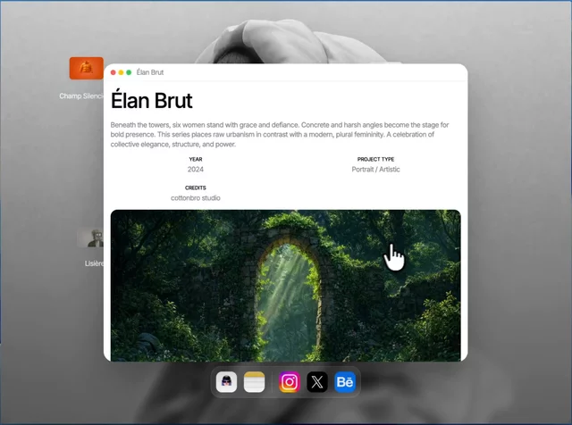 Interactive Portfolio
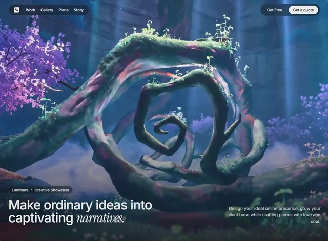 Luminara
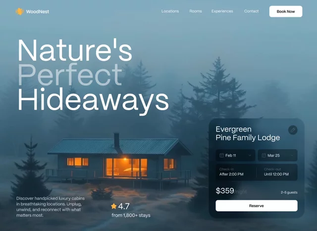 Unwind Hero
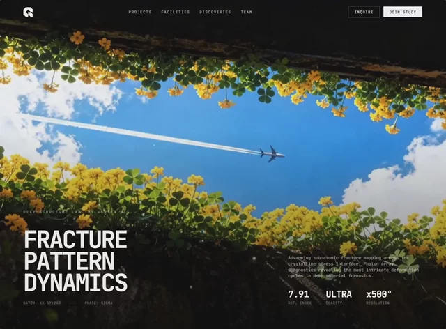 Vertex Sci
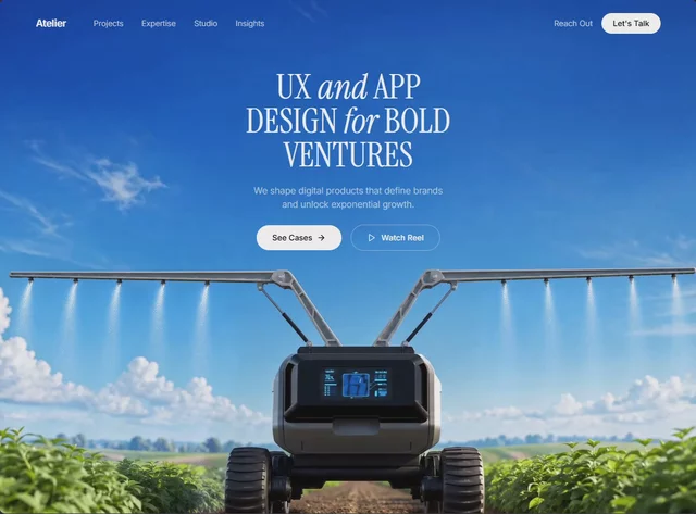 Impact Ventures
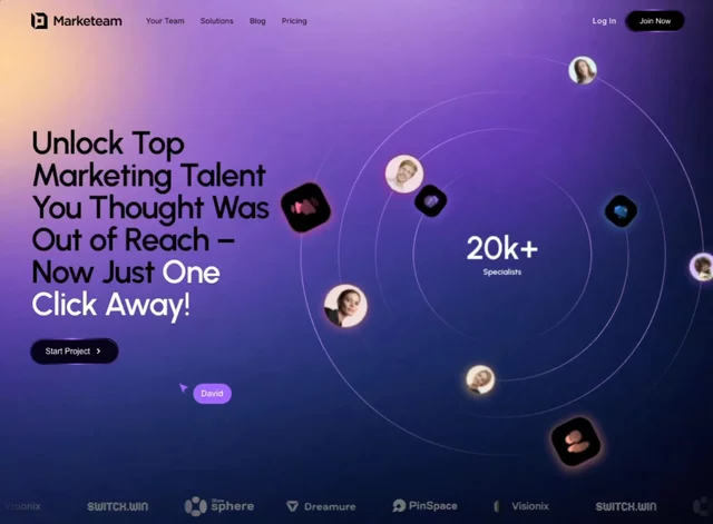 Network Hero
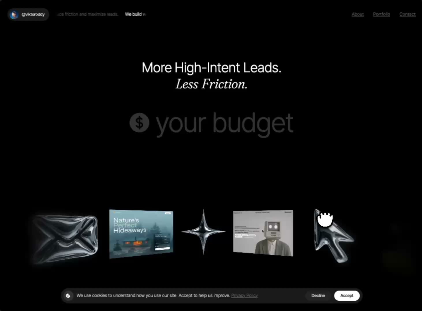 Lead Funnel
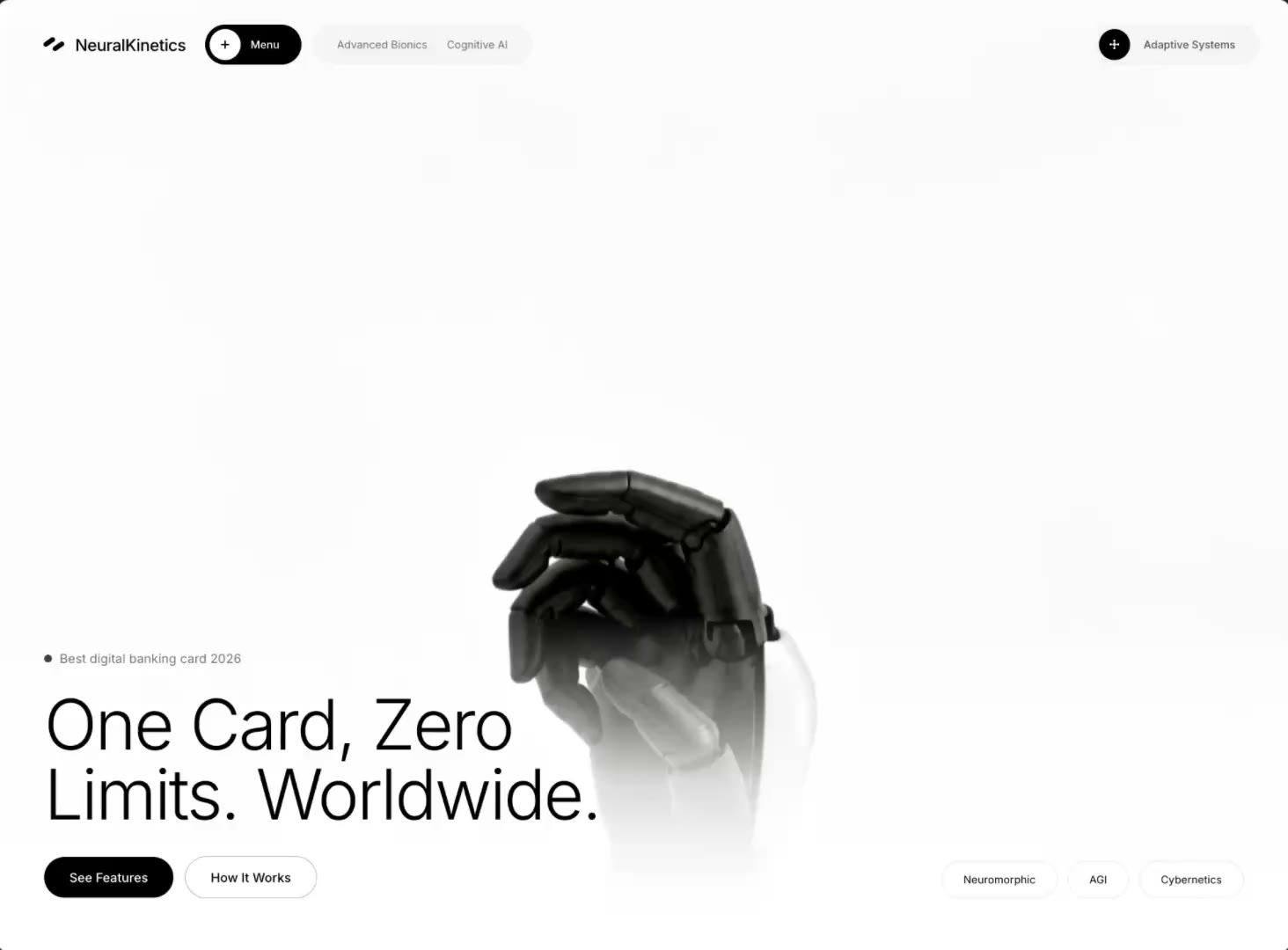 Tech-Forward
 Wellness Balance
 CozyPaws
 Creative Portfolio
 Equilibrium
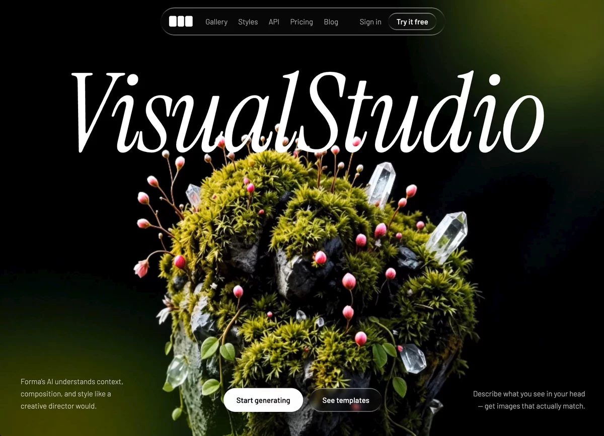 Visual Hero
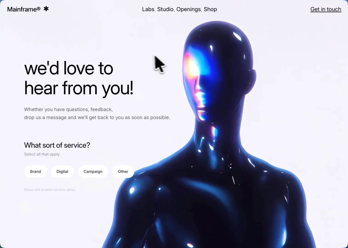 Contact Cybernetic
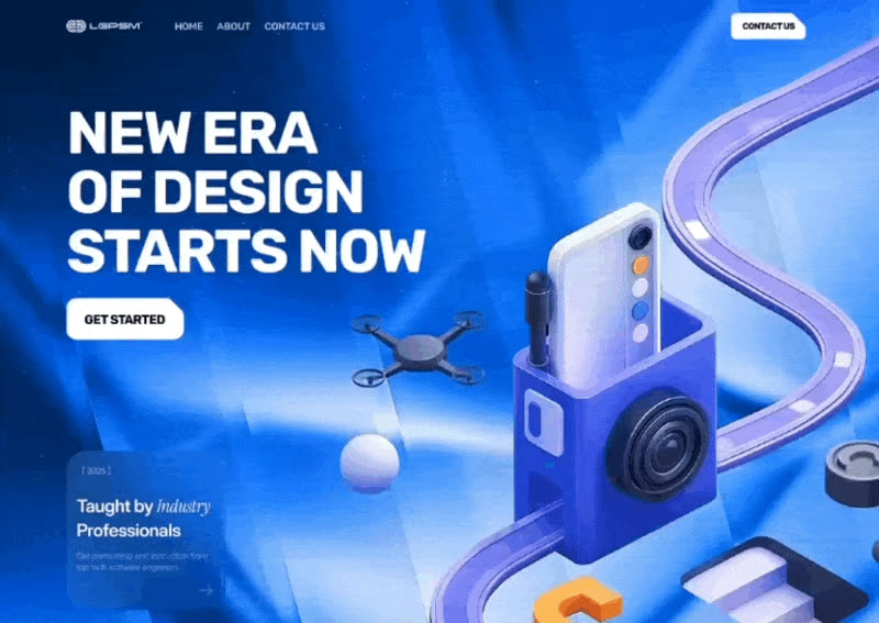 New Era Bold Hero
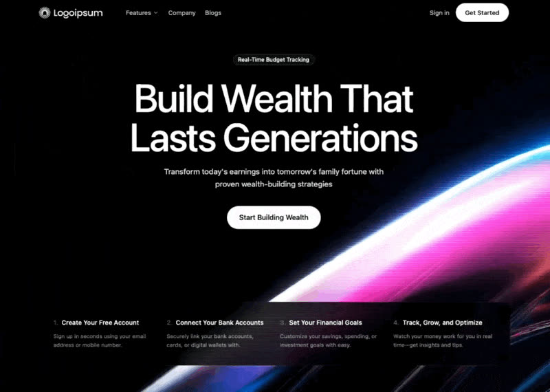 Wealth Video Hero
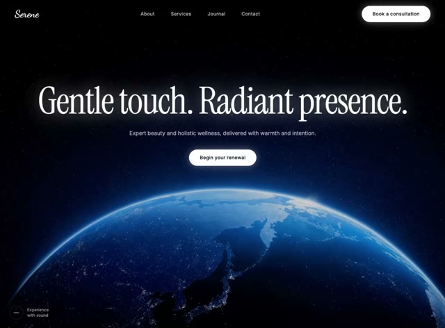 Celestial Renewal
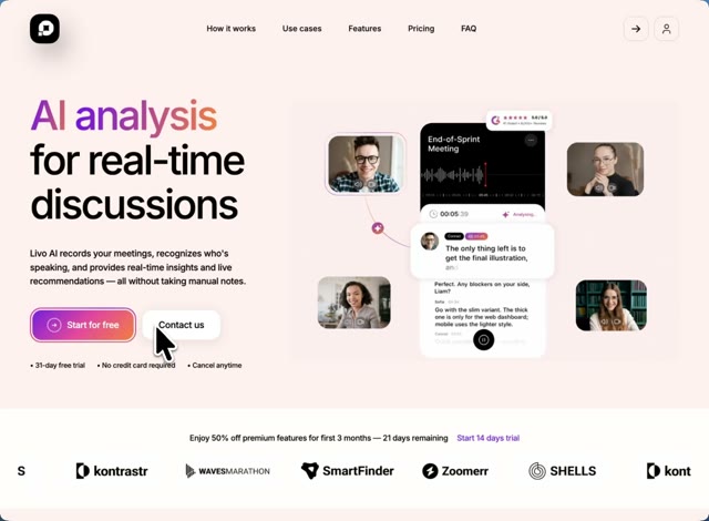 AI Meeting Notes
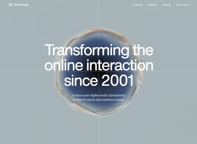 Product Studio
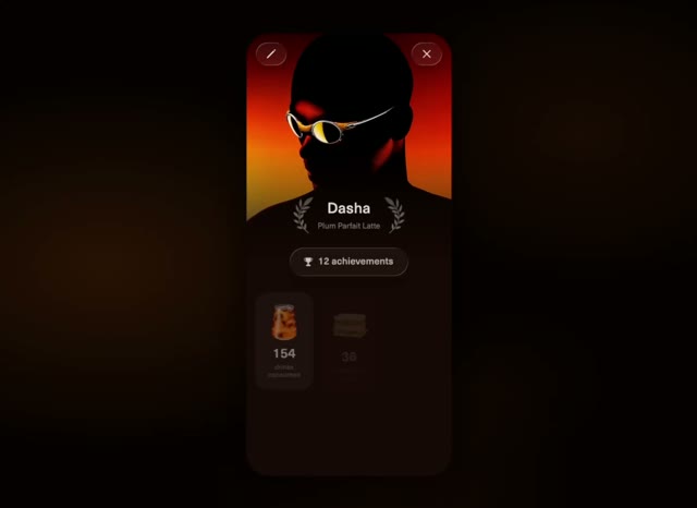 Coffee Rewards
 Sky Estate
 Outdoor Apparel
 Cross-Border
 Travel Journal
 Wellness Companion
 3D Studio Pricing
 CleanTech
 Stillmind
Browse & preview free Unlock everything — from $49/mo
Frequently asked questions
Do Meez prompts work with Figma Make?
Yes. Every Meez prompt is a complete written spec — fonts, layout, color tokens, motion and asset URLs — so Figma Make can build it in one paste. The 62 free prompts on this site work exactly like the premium ones; copy one above and try it.
What does Figma Make generate from a prompt?
Figma Make turns a written prompt into a working, code-backed prototype inside the Figma workspace — real layout, type and interactions — and you can copy a Make preview into Figma Design as fully editable layers. A Meez spec gives Make concrete type, color and grid decisions to execute instead of a vague vibe.
How do I use a Meez prompt in Figma Make?
Copy the full prompt text and paste it into Figma Make's prompt field. Don't shorten it — the specificity is what keeps Figma Make from producing a generic layout. Then iterate: swap the copy and point the asset URLs at your own media.
How many prompts are free?
62 prompts are free to copy in full, no account needed. The other 579 unlock with Unlimited — $49/mo, $149/yr, or $299 once for lifetime — along with all 285 motion backgrounds.
Also for: Lovable · Bolt · v0 · Cursor · Claude · Replit · Windsurf · Framer · Webflow · ChatGPT · Gemini · GitHub Copilot · Wix
Not sure which tool? Lovable vs v0 vs Bolt vs Cursor, compared → · All free prompts on one page → · All prompt categories →