Prompts · for Cursor
AI website build-prompts for Cursor
Paste a Meez prompt into Cursor's Composer (or Cmd-K) and it builds the page across your files — ideal when you want the generated site living in your own repo and stack. The structured spec keeps Cursor on-brief: real fonts, real layout, real asset URLs, no filler.
How to use a Meez prompt in Cursor
- Pick a prompt below (4 on this page are free) or browse the full library — every prompt is a complete art-direction spec: fonts, layout, color system, motion and real asset URLs.
- Copy the whole prompt and paste it into the Agent pane (Cmd-I) or Cmd-K in Cursor. Don’t trim it — the detail is what stops Cursor from defaulting to a generic layout.
- Let it build, then iterate: swap the copy, point the asset URLs at your own media, and ship. The sites you build are yours, commercially.
Free prompts to try in Cursor right now
Tech-ForwardHero Section · free prompt · copy-paste
Create a full-screen hero section landing page using React, Vite, and Framer Motion (`motion` package). Use plain CSS (no Tailwind). The font is Inter (weights 300, 400, 500, 600) from Google Fonts. The design is minimal black-and-white with a full-viewport background video.

**Stack:** React 19, Vite, `motion` (framer-motion), `lucide-react` (for the Plus icon).

**Layout:**
- Full viewport height (`min-height: 100vh`), white background, flex column with `justify-content: space-between`
- Fixed navbar at top (z-index 50, pointer-events none on the nav itself, auto on children)
- Absolutely positioned full-screen video behind everything (z-index 0)
- Footer content pinned to bottom (z-index 30) with a white gradient fade-up background

**Navbar (fixed, top):**
- Left side contains:
  1. Logo: custom SVG icon (two rotated rounded rectangles at -35deg, black fill) + brand text "NeuralKinetics" (hidden on mobile, shown on desktop 768px+)
  2. Menu button: black pill with white circle containing a Plus icon (lucide, size 12, strokeWidth 3) + "Menu" text (11px, white)
  3. Tags pill: light gray (#F4F4F6) rounded-full container with two text labels "Advanced Bionics" and "Cognitive AI" (hidden on mobile, shown on desktop)
- Right side contains:
  - A light gray pill with a black circle button (containing a 4-dot grid SVG icon) + label "Adaptive Systems" (hidden on mobile)

**Background Video:**
- URL: `https://meez.design/web/media/ext/a9e8d581015638ec.mp4`
- autoPlay, muted, playsInline, object-fit: cover
- On mobile: video wrapper is 80% width and 80% height (centered)
- On desktop (768px+): video wrapper is 100% width and 100% height

**Footer content (bottom, over gradient):**
- Background: `linear-gradient(to top, #ffffff 0%, rgba(255,255,255,0.8) 50%, transparent 100%)`
- On mobile: stacks vertically. On desktop: row layout, items aligned to bottom.
- Left block:
  1. Subtitle line: small black dot (8px circle) + "Best digital banking card 2026" (13px, 55% opacity black)
  2. Heading: "One Card, Zero / Limits. Worldwide." on two lines. Font-weight 300, clamp(2rem, 8vw, 4.5rem) on mobile, clamp(2.5rem, 5.5vw, 4.5rem) on desktop, letter-spacing -0.03em, line-height 1
  3. Two buttons: "See Features" (black pill, white text, 13px) and "How It Works" (transparent with dark border rgba(0,0,0,0.35), 13px)
- Right block: Three tag pills "Neuromorphic", "AGI", "Cybernetics" (white bg, light border rgba(0,0,0,0.12), 11px, rounded-full)

**Animations (using `motion` from 'motion/react'):**
- Navbar: slides down from y:-16, opacity 0 to visible. Duration 0.8s, ease [0.16, 1, 0.3, 1]
- Video: fades in from opacity 0 + scale 1.05 to opacity 1 + scale 1. Duration 1.8s
- Footer wrapper: slides up from y:20, delay 0.5s, duration 1s
- Subtitle: slides up from y:16, delay 0.6s, duration 0.8s
- Heading: slides up from y:20, delay 0.8s, duration 0.8s
- Buttons: slides up from y:16, delay 1.0s, duration 0.8s
- All use ease: [0.16, 1, 0.3, 1]

**Responsive (mobile-first, breakpoint at 768px):**
- Mobile: navbar padding 16px, smaller buttons (28px circles), brand text hidden, tags hidden, right label hidden, footer stacks vertically, video at 80% size
- Desktop (768px+): navbar padding 24px 32px, larger buttons (32px circles), all text/tags visible, footer is row layout, video fills 100%

### Source Code
<!DOCTYPE html>
<html lang="en">
<head>
  <meta charset="UTF-8" />
  <meta name="viewport" content="width=device-width, initial-scale=1.0" />
  <title>NeuralKinetics Hero</title>
  <link rel="preconnect" href="https://fonts.googleapis.com" />
  <link rel="preconnect" href="https://fonts.gstatic.com" crossorigin />
  <link href="https://fonts.googleapis.com/css2?family=Inter:wght@300;400;500;600&display=swap" rel="stylesheet" />
  <style>
    * { margin: 0; padding: 0; box-sizing: border-box; }

    body {
      background: #fff;
      color: #000;
      font-family: 'Inter', system-ui, -apple-system, sans-serif;
      -webkit-font-smoothing: antialiased;
    }

    ::selection { background: #000; color: #fff; }

    .page {
      position: relative;
      min-height: 100vh;
      width: 100%;
      display: flex;
      flex-direction: column;
      justify-content: space-between;
      overflow: hidden;
    }

    /* === NAVBAR === */
    .nav-bar {
      position: fixed;
      top: 0;
      left: 0;
      width: 100%;
      padding: 16px;
      display: flex;
      align-items: center;
      justify-content: space-between;
      z-index: 50;
      pointer-events: none;
      animation: slideDown 0.8s cubic-bezier(0.16, 1, 0.3, 1) forwards;
      opacity: 0;
    }

    @keyframes slideDown {
      from { transform: translateY(-16px); opacity: 0; }
      to { transform: translateY(0); opacity: 1; }
    }

    .nav-left {
      display: flex;
      align-items: center;
      gap: 8px;
      pointer-events: auto;
    }

    .nav-logo {
      display: flex;
      align-items: center;
      gap: 4px;
      cursor: pointer;
      padding: 4px 8px;
      border-radius: 8px;
    }

    .nav-logo-text {
      font-weight: 500;
      font-size: 15px;
      letter-spacing: -0.02em;
      color: #000;
      display: none;
    }

    .nav-menu-btn {
      display: flex;
      align-items: center;
      background-color: #000;
      color: #fff;
      border: 1px solid rgba(0,0,0,0.03);
      padding: 4px 16px 4px 4px;
      gap: 8px;
      border-radius: 9999px;
      cursor: pointer;
      font-family: inherit;
    }

    .nav-menu-icon {
      width: 28px;
      height: 28px;
      border-radius: 50%;
      background-color: #fff;
      color: #000;
      display: flex;
      align-items: center;
      justify-content: center;
    }

    .nav-menu-label {
      font-size: 11px;
      font-weight: 500;
      padding-right: 2px;
    }

    .nav-tags {
      display: none;
      align-items: center;
      background-color: #F4F4F6;
      border: 1px solid rgba(0,0,0,0.03);
      border-radius: 9999px;
      padding: 0 24px;
      height: 40px;
      font-size: 11px;
      font-weight: 400;
      color: rgba(0,0,0,0.55);
      gap: 20px;
      user-select: none;
    }

    .nav-right { pointer-events: auto; }

    .nav-right-pill {
      display: flex;
      align-items: center;
      background-color: #F4F4F6;
      border-radius: 9999px;
      padding: 4px 16px 4px 4px;
      gap: 10px;
      border: 1px solid rgba(0,0,0,0.03);
    }

    .nav-right-icon {
      width: 28px;
      height: 28px;
      border-radius: 50%;
      background-color: #000;
      color: #fff;
      display: flex;
      align-items: center;
      justify-content: center;
      border: none;
      cursor: pointer;
    }

    .nav-right-label {
      font-size: 11px;
      font-weight: 500;
      color: rgba(0,0,0,0.65);
      user-select: none;
      display: none;
    }

    /* === VIDEO === */
    .video-container {
      position: absolute;
      inset: 0;
      z-index: 0;
      pointer-events: none;
      display: flex;
      align-items: center;
      justify-content: center;
      overflow: hidden;
    }

    .video-wrapper {
      position: relative;
      width: 80%;
      height: 80%;
      animation: videoFadeIn 1.8s cubic-bezier(0.16, 1, 0.3, 1) forwards;
      opacity: 0;
    }

    @keyframes videoFadeIn {
      from { opacity: 0; transform: scale(1.05); }
      to { opacity: 1; transform: scale(1); }
    }

    .video-wrapper video {
      position: absolute;
      inset: 0;
      width: 100%;
      height: 100%;
      object-fit: cover;
      pointer-events: none;
    }

    /* === SPACER === */
    .spacer { flex: 1; position: relative; z-index: 10; }

    /* === FOOTER === */
    .bottom-footer {
      width: 100%;
      position: relative;
      z-index: 30;
      padding: 32px 20px 40px;
      background: linear-gradient(to top, #ffffff 0%, rgba(255,255,255,0.8) 50%, transparent 100%);
    }

    .footer-inner {
      width: 100%;
      display: flex;
      flex-direction: column;
      justify-content: space-between;
      align-items: flex-start;
      gap: 24px;
      animation: slideUp 1s cubic-bezier(0.16, 1, 0.3, 1) 0.5s forwards;
      opacity: 0;
    }

    @keyframes slideUp {
      from { transform: translateY(20px); opacity: 0; }
      to { transform: translateY(0); opacity: 1; }
    }

    .footer-left {
      display: flex;
      flex-direction: column;
      gap: 20px;
      max-width: 540px;
    }

    .footer-subtitle {
      display: flex;
      align-items: center;
      gap: 8px;
      animation: slideUpSmall 0.8s cubic-bezier(0.16, 1, 0.3, 1) 0.6s forwards;
      opacity: 0;
    }

    @keyframes slideUpSmall {
      from { transform: translateY(16px); opacity: 0; }
      to { transform: translateY(0); opacity: 1; }
    }

    .footer-subtitle .dot {
      width: 8px;
      height: 8px;
      border-radius: 50%;
      background-color: rgba(0,0,0,0.75);
      flex-shrink: 0;
    }

    .footer-subtitle span {
      font-size: 13px;
      color: rgba(0,0,0,0.55);
    }

    .footer-heading {
      font-size: clamp(2rem, 8vw, 4.5rem);
      font-weight: 300;
      line-height: 1;
      letter-spacing: -0.03em;
      color: #000;
      animation: slideUpMedium 0.8s cubic-bezier(0.16, 1, 0.3, 1) 0.8s forwards;
      opacity: 0;
    }

    @keyframes slideUpMedium {
      from { transform: translateY(20px); opacity: 0; }
      to { transform: translateY(0); opacity: 1; }
    }

    .footer-buttons {
      display: flex;
      align-items: center;
      gap: 12px;
      margin-top: 4px;
      animation: slideUpSmall 0.8s cubic-bezier(0.16, 1, 0.3, 1) 1.0s forwards;
      opacity: 0;
    }

    .btn-primary {
      padding: 12px 22px;
      background-color: #000;
      color: #fff;
      font-size: 13px;
      font-weight: 500;
      border-radius: 9999px;
      border: none;
      cursor: pointer;
      font-family: inherit;
    }

    .btn-outline {
      display: flex;
      align-items: center;
      gap: 8px;
      padding: 12px 22px;
      background-color: transparent;
      border: 1px solid rgba(0,0,0,0.35);
      color: #000;
      font-size: 13px;
      font-weight: 500;
      border-radius: 9999px;
      cursor: pointer;
      font-family: inherit;
    }

    .footer-tags {
      display: flex;
      flex-wrap: wrap;
      gap: 10px;
      align-items: flex-end;
    }

    .tag-button {
      padding: 10px 18px;
      border: 1px solid rgba(0,0,0,0.12);
      color: #000;
      font-size: 11px;
      font-weight: 400;
      border-radius: 9999px;
      background-color: #fff;
      cursor: pointer;
      font-family: inherit;
    }

    /* === DESKTOP 768px+ === */
    @media (min-width: 768px) {
      .nav-bar { padding: 24px 32px; }
      .nav-left { gap: 12px; }
      .nav-logo-text { display: inline; font-size: 17px; }
      .nav-menu-btn { padding: 4px 20px 4px 4px; gap: 10px; }
      .nav-menu-icon { width: 32px; height: 32px; }
      .nav-tags { display: flex; }
      .nav-right-pill { padding: 4px 24px 4px 4px; gap: 14px; }
      .nav-right-icon { width: 32px; height: 32px; }
      .nav-right-label { display: inline; }
      .video-wrapper { width: 100%; height: 100%; }
      .bottom-footer { padding: 40px 48px 56px; }
      .footer-inner { flex-direction: row; align-items: flex-end; gap: 32px; }
      .footer-left { gap: 24px; }
      .footer-heading { font-size: clamp(2.5rem, 5.5vw, 4.5rem); white-space: nowrap; }
      .btn-primary { padding: 13px 26px; }
      .btn-outline { padding: 13px 26px; }
      .tag-button { padding: 12px 22px; }
    }
  </style>
</head>
<body>
  <div class="page">

    <!-- Navbar -->
    <nav class="nav-bar">
      <div class="nav-left">
        <div class="nav-logo">
          <svg width="36" height="36" viewBox="0 0 40 40" fill="none" xmlns="http://www.w3.org/2000/svg">
            <rect x="7" y="19" width="15" height="5.5" rx="2.75" transform="rotate(-35 7 19)" fill="#000"/>
            <rect x="17.5" y="24" width="15" height="5.5" rx="2.75" transform="rotate(-35 17.5 24)" fill="#000"/>
          </svg>
          <span class="nav-logo-text">NeuralKinetics</span>
        </div>

        <button class="nav-menu-btn">
          <div class="nav-menu-icon">
            <svg width="12" height="12" viewBox="0 0 24 24" fill="none" stroke="currentColor" stroke-width="3" stroke-linecap="round" stroke-linejoin="round">
              <line x1="12" y1="5" x2="12" y2="19"/>
              <line x1="5" y1="12" x2="19" y2="12"/>
            </svg>
          </div>
          <span class="nav-menu-label">Menu</span>
        </button>

        <div class="nav-tags">
          <span>Advanced Bionics</span>
          <span>Cognitive AI</span>
        </div>
      </div>

      <div class="nav-right">
        <div class="nav-right-pill">
          <button class="nav-right-icon">
            <svg width="13" height="13" viewBox="0 0 24 24" fill="none">
              <circle cx="12" cy="5" r="2.2" fill="currentColor"/>
              <circle cx="12" cy="19" r="2.2" fill="currentColor"/>
              <circle cx="5" cy="12" r="2.2" fill="currentColor"/>
              <circle cx="19" cy="12" r="2.2" fill="currentColor"/>
              <path d="M12 7.5v9M7.5 12h9" stroke="currentColor" stroke-width="1.5" opacity="0.6"/>
            </svg>
          </button>
          <span class="nav-right-label">Adaptive Systems</span>
        </div>
      </div>
    </nav>

    <!-- Background Video -->
    <div class="video-container">
      <div class="video-wrapper">
        <video
          src="https://meez.design/web/media/ext/a9e8d581015638ec.mp4"
          autoplay
          muted
          playsinline
        ></video>
      </div>
    </div>

    <!-- Spacer -->
    <main class="spacer"></main>

    <!-- Footer Content -->
    <footer class="bottom-footer">
      <div class="footer-inner">
        <div class="footer-left">
          <div class="footer-subtitle">
            <div class="dot"></div>
            <span>Best digital banking card 2026</span>
          </div>

          <h2 class="footer-heading">
            <div>One Card, Zero</div>
            <div>Limits. Worldwide.</div>
          </h2>

          <div class="footer-buttons">
            <button class="btn-primary">See Features</button>
            <button class="btn-outline">How It Works</button>
          </div>
        </div>

        <div class="footer-tags">
          <button class="tag-button">Neuromorphic</button>
          <button class="tag-button">AGI</button>
          <button class="tag-button">Cybernetics</button>
        </div>
      </div>
    </footer>
  </div>
</body>
</html>
StillmindHero Section · free prompt · copy-paste
Create a fullscreen cinematic hero section for a mindfulness/focus app called "Lumora" using React, Tailwind CSS, and Lucide React icons.

## Font

Use **Instrument Serif** (Google Fonts, italic for the logo). Load it in index.html:
```
<link rel="preconnect" href="https://fonts.googleapis.com">
<link rel="preconnect" href="https://fonts.gstatic.com" crossorigin>
<link href="https://fonts.googleapis.com/css2?family=Instrument+Serif:ital@0;1&display=swap" rel="stylesheet">
```

Set `font-family: 'Instrument Serif', serif` on html/body. Use `system-ui, sans-serif` inline for body text (subtext, buttons, stats, video labels).

---

## Background Video Layer

Stack 4 fullscreen looping videos absolutely positioned. Only the active one has `opacity-100`; others have `opacity-0`. Transition opacity over 1000ms ease-in-out. Videos autoPlay, muted, loop, playsInline.

**Video URLs (in order):**
1. `https://meez.design/web/bg-previews/299_trainmove1.mp4`
2. `https://meez.design/web/media/ext/37c6543a9e3b1bac.mp4`
3. `https://meez.design/web/media/ext/a14ef13297c1a6d7.mp4`
4. `https://meez.design/web/media/ext/680d661e1cefa0b3.mp4`

**Labels:** Golden Hour, Still Water, Deep Woods, Quiet Dawn

---

## Transparent PNG Overlay (z-index 1)

Place this image over the videos as an absolutely positioned overlay covering the full viewport:
```
https://meez.design/web/media/ext/979624a2a689c9e3.png
```

Apply a continuous "train-bob" animation: translateY oscillates between 0 and -6px over 3s ease-in-out infinite, with a constant scale(1.03) to prevent edges from showing during the motion.

---

## Liquid Glass Effect (CSS class `.liquid-glass`)

```css
.liquid-glass {
  background: rgba(255, 255, 255, 0.01);
  background-blend-mode: luminosity;
  backdrop-filter: blur(4px);
  -webkit-backdrop-filter: blur(4px);
  border: none;
  box-shadow: inset 0 1px 1px rgba(255, 255, 255, 0.1);
  position: relative;
  overflow: hidden;
}
```

With a `::before` pseudo-element for a subtle gradient border:
```css
.liquid-glass::before {
  content: '';
  position: absolute;
  inset: 0;
  border-radius: inherit;
  padding: 1.4px;
  background: linear-gradient(180deg,
    rgba(255,255,255,0.45) 0%, rgba(255,255,255,0.15) 20%,
    rgba(255,255,255,0) 40%, rgba(255,255,255,0) 60%,
    rgba(255,255,255,0.15) 80%, rgba(255,255,255,0.45) 100%);
  -webkit-mask: linear-gradient(#fff 0 0) content-box, linear-gradient(#fff 0 0);
  -webkit-mask-composite: xor;
  mask-composite: exclude;
  pointer-events: none;
}
```

---

## Content Layer (z-index 2) - Flex Column Full Height

### Navigation (top)
- Left: "Lumora" in white, italic, text-xl (sm:text-2xl)
- Right (desktop md+): A `.liquid-glass` pill containing nav links ("How It Works", "Features", "Pricing", "Community") in white/90 text-sm with hover to white, plus a solid white "Get Started" button at the end
- Right (mobile): A `.liquid-glass` rounded hamburger button using Lucide `Menu`/`X` icons with a crossfade rotation animation (300ms). The Menu icon rotates out 90deg and scales to 75%; the X icon rotates in from -90deg

### Mobile Menu Overlay (fixed, z-50)
- Backdrop: `bg-black/60 backdrop-blur-sm`
- Centered fullscreen panel with staggered entrance (each link delays 50ms more: 100ms, 150ms, 200ms, 250ms, 300ms)
- Links: white text-3xl, translate-y-4 to 0 on open
- "Get Started" button at bottom with scale animation
- Cubic-bezier easing: `cubic-bezier(0.4,0,0.2,1)`, duration 500ms

### Hero Content (centered, below nav)
- **Badge**: `.liquid-glass` rounded-full pill with text "Over 10,000 minds already finding their clarity"
- **Heading**: "Clarity in an Endlessly / Noisy Universe" (line break after "Endlessly"). Sizes: text-4xl / sm:text-5xl / md:text-7xl / lg:text-[5.5rem], leading-[1.1], max-w-4xl
- **Subtext**: "Rise above the chaos of pings, infinite scrolling, and relentless demands. Discover how to protect your presence and create with intention." max-w-xl, leading-relaxed
- **Email Input**: `.liquid-glass` rounded-full pill containing a text input ("Your Best Email") and a solid white "Get Early Access" button. Max-width 320px on mobile, sm:max-w-sm
- **Video Switcher**: Row of 4 text buttons with labels. Active button has solid color + bottom border. Inactive buttons are 50% opacity with transparent border, hover to 80%

### Dark Mode for "Deep Woods" (3rd video, index 2)
When the 3rd video is active, all hero content (badge, heading, subtext, input, video switcher) transitions to dark color `#182C41` with 700ms duration. The navbar and bottom stats remain white always.

### Bottom Stats (pushed to bottom via flex-1 spacer)
- Row of stats separated by `|` dividers (hidden on mobile): "60+ Deep Sessions", "12,000+ Creators", "4.8 User Satisfaction", "Intentional-First Design"
- text-white/70, text-xs sm:text-sm, system-ui font

---

## Video Switching Logic
- Track `activeVideo` state (default 0) and `isTransitioning` boolean
- On click, if not already active and not mid-transition, set new active video and start a 1000ms cooldown (matching the CSS crossfade duration)
- During cooldown, ignore additional clicks

---

## Responsive Behavior
- Mobile: Smaller text sizes, tighter padding, hamburger nav, stats wrap naturally
- Tablet/Desktop: Larger heading, more padding, inline nav pill, stats with pipe separators

---

## Section Container
```html
<section className="relative w-full h-screen overflow-hidden bg-black">
```

Black background prevents flash before videos load. Everything is a single viewport-height section with no scroll.

---

That's the complete specification. The entire app lives in a single `App.tsx` component with the CSS in `index.css`.
Wellbeing OSHero Section · free prompt · copy-paste
Create a fullscreen hero section for a SaaS product called "flowpath" using React, Tailwind CSS, and Lucide React icons. The section should be a single `<section>` filling the viewport (`h-screen w-full overflow-hidden`).

**Background:**
- A looping, muted, autoplaying `<video>` element covering the full section with `object-cover`. Video URL: `https://meez.design/web/media/ext/00e8673d6c0cdef2.mp4`
- A subtle dark overlay on top of the video: `bg-black/10`

**Font:**
- Use "Helvetica Now Text" as the primary font, loaded from: `(self-host this face — no free CDN; substitute a close match if unavailable)`
- Fallback stack: `-apple-system, BlinkMacSystemFont, 'Segoe UI', Roboto, sans-serif`
- Applied globally via `* { font-family: ... }` in CSS

**Navigation (top, not fixed/sticky):**
- Full-width with responsive horizontal padding (`px-5 sm:px-6 md:px-12 lg:px-16`) and vertical padding (`py-4 sm:py-5`)
- Logo: An inline SVG diamond shape (28x28) with two overlapping diamond paths at 0.9 and 0.5 opacity, followed by the text "flowpath" in white, `text-lg sm:text-xl font-medium tracking-tight`
- Desktop nav (hidden on mobile): horizontal flex with items "Product" (dropdown: Connections, Workflows, Insights), "Solutions" (dropdown: Guides, Use cases, API reference), "About" (dropdown: Our story, Open roles, Reach us), "Plans" (no dropdown)
- Nav buttons: `text-white/90 hover:text-white text-sm font-medium`, with a `ChevronDown` icon (3.5x3.5) that rotates 180 degrees when dropdown is open
- Dropdowns open on hover (onMouseEnter/onMouseLeave), positioned `absolute top-full left-0`, using a custom `.liquid-glass` class, `rounded-xl py-3 px-2 min-w-[160px] shadow-xl`. Dropdown items: `text-white/80 hover:text-white text-sm rounded-lg hover:bg-white/5`
- Desktop CTA: "Log in" link (`text-white/90 hover:text-white text-sm font-medium`) and "Try it free" button using `.liquid-glass rounded-full px-5 py-2 text-white text-sm font-medium`
- Mobile menu button: animated toggle between `Menu` and `X` icons with rotation/scale/opacity transitions (duration-300)
- Mobile menu: absolutely positioned below nav, slides in with `cubic-bezier(0.16,1,0.3,1)` easing over 400ms. Background: `bg-[#2C221C]/95 backdrop-blur-xl rounded-2xl p-6`. Shows all nav items with sub-items indented, plus a bordered footer with Log in and Try it free

**Hero Content (below nav, top-aligned, not vertically centered):**
- Container: `flex-1 flex items-start justify-center` with `pt-16 sm:pt-20 md:pt-24` for spacing from the nav
- Text wrapper: `text-center max-w-3xl`
- Heading `<h1>`: `text-white text-3xl sm:text-4xl md:text-5xl lg:text-6xl xl:text-7xl leading-[1.05] tracking-[-0.02em]`
  - Content (with line breaks):
    ```
    Bridge the
    gaps. <span class="text-white/60">Ditch the</span>
    <span class="text-white/60">grindwork.</span>
    ```
- Subheading `<p>`: `text-white/80 text-sm sm:text-base md:text-lg leading-relaxed max-w-md mx-auto mt-6 sm:mt-8`
  - Text: "Flowpath unifies your complete wellness tools, so your crew spends less energy plugging gaps and more on real progress."
- Two CTA buttons side by side (`flex flex-wrap items-center justify-center gap-3 sm:gap-4 mt-6 sm:mt-8`):
  1. "Begin your journey" - solid white button: `px-5 sm:px-6 py-2.5 sm:py-3 bg-white text-gray-900 text-sm font-semibold rounded-full hover:bg-white/90`
  2. "See it live" - glass button: `px-5 sm:px-6 py-2.5 sm:py-3 liquid-glass rounded-full text-white text-sm font-semibold hover:bg-white/10`

**Custom CSS (`.liquid-glass` class):**
```css
.liquid-glass {
  background: rgba(255, 255, 255, 0.01);
  background-blend-mode: luminosity;
  backdrop-filter: blur(4px);
  -webkit-backdrop-filter: blur(4px);
  border: none;
  box-shadow: inset 0 1px 1px rgba(255, 255, 255, 0.1);
  position: relative;
  overflow: hidden;
}

.liquid-glass::before {
  content: '';
  position: absolute;
  inset: 0;
  border-radius: inherit;
  padding: 1.4px;
  background: linear-gradient(180deg,
    rgba(255,255,255,0.45) 0%, rgba(255,255,255,0.15) 20%,
    rgba(255,255,255,0) 40%, rgba(255,255,255,0) 60%,
    rgba(255,255,255,0.15) 80%, rgba(255,255,255,0.45) 100%);
  -webkit-mask: linear-gradient(#fff 0 0) content-box, linear-gradient(#fff 0 0);
  -webkit-mask-composite: xor;
  mask-composite: exclude;
  pointer-events: none;
}
```

**Additional CSS utilities:**
```css
@keyframes dropdown-in {
  from { opacity: 0; transform: translateY(-4px) scale(0.96); }
  to { opacity: 1; transform: translateY(0) scale(1); }
}
.animate-dropdown { animation: dropdown-in 0.2s ease-out; }
.duration-400 { transition-duration: 400ms; }
```

**Important notes:**
- Dropdown elements need `!absolute` (Tailwind important modifier) to override the `position: relative` from `.liquid-glass`
- The entire section is fully responsive with breakpoints at sm, md, lg, xl
- No external UI libraries beyond Lucide React for icons
- Tailwind config is default with no extensions
Subscription AgencyHero Section · free prompt · copy-paste
**Create a single-page landing hero section for a creative agency called "Alwayzz" with a React + Vite + Tailwind CSS setup. Use custom CSS (not Tailwind utilities) for all styling. The design should be minimal, clean, black-and-white, with tight negative letter-spacing throughout.**

---

### Fonts (loaded via Google Fonts in index.html)

```
Inter: weights 400, 500, 600, 700
Source Serif 4: weights 400, 600 (both normal and italic)
```

Preconnect to `fonts.googleapis.com` and `fonts.gstatic.com`.

---

### CSS Variables

```css
--bg: #ffffff;
--text: #0a0a0a;
--muted: #6b6b6b;
--button-bg: #0a0a0a;
--button-text: #ffffff;
--border-soft: rgba(0, 0, 0, 0.08);
--green: #17c964;
```

---

### Components

**1. Navbar (fixed top, z-index 100)**
- Padding: `19px 36px`, max-width `1200px` centered.
- Left: Logo text "Alwayzz" in `Source Serif 4`, 30px, weight 600, **italic**, letter-spacing `-0.08em`, with a registered trademark symbol in Inter 14px weight 600.
- Right: "Menu" pill button (black bg, white text, rounded-full, 14px weight 500, Inter) with a `ChevronUp` icon (16px) from lucide-react.
- Full-screen drawer overlay on click: white bg, fade transition 0.4s. Nav links centered vertically at 48px weight 500, letter-spacing `-0.04em`. Links: Projects, Plans, Team, FAQs, Get in Touch. Footer with copyright.

**2. Hero Section**
- Min-height: `850px`, padding: `160px 36px`, centered flex column.
- **Background image** (via `::before` pseudo-element, covers full section):
  ```
  https://meez.design/web/media/ext/883823797a81fd1e.webp
  ```
  Background-size: cover, background-position: center.

- **Curved line animations** (decorative):
  - 20 lines on left side, 20 on right side, absolutely positioned.
  - Each line is a tall rectangle with one-sided border-radius (80%) and `2.5px solid #FCFAF8` border.
  - Left lines: no left border, radius on right. Right lines: no right border, radius on left.
  - Staggered `animationDelay: i * 0.25s`, widths from 60px increasing by 10px per line.
  - Animation: `line-pulse` 5s ease-in-out infinite (fade in to 0.9 opacity, then back to 0 with slight scale).
  - On mobile (<810px): hide side lines, show top horizontal lines instead (same animation, horizontal orientation with bottom border-radius).

- **Ticker row** (max-width 500px, height 36px):
  - Horizontal marquee scrolling left over 30s, linear, infinite.
  - Items: "Brand Identity", "App Development", "Visual Design", "Creative Video", "Iconography"
  - Each item: 13px, weight 500, color `var(--muted)`, padding `6px 14px`, rounded-full, background `rgb(251, 251, 251)`.
  - Marquee has edge fade mask: `linear-gradient(90deg, transparent 0%, black 12%, black 88%, transparent 100%)`.
  - 4x duplicated rows for seamless loop.

- **Title**:
  ```
  Premium creative <span class="serif italic">alwayzz</span><sup style registered mark> on demand.
  ```
  - Max-width: 550px, font-size: 82px, line-height: 1.03, letter-spacing: `-0.07em`, weight 600, centered.
  - The word "alwayzz" uses `Source Serif 4`, italic, weight 600, letter-spacing `-0.08em`.
  - The registered mark: Inter, 24px, weight 600, vertical-align super.

- **Subtitle**:
  ```
  A flexible design partnership for founders, brands, and agencies who want top craft delivered on their timeline.
  ```
  - Max-width: 476px, 17px, line-height 1.45, weight 400, color `var(--muted)`, centered.

- **CTA row** (flex, gap 16px, centered):
  - **Primary button** "View Plans": height 56px, padding `18px 30px`, rounded-full, black bg, white text, 15px weight 600 Inter. Hover: translateY(-1px) + box-shadow `0 4px 20px rgba(0,0,0,0.12)`.
  - **Book button** "Chat for 15 minutes": white bg, `4px solid rgb(248,248,248)` border, rounded-full, padding `8px 24px 8px 8px`. Contains:
    - Avatar image (40px circle): `https://meez.design/web/media/ext/6be23d90a43b4ca1.png`
    - Text stack: primary "Chat for 15 minutes" (14px, weight 600, black) and secondary "Pick a slot" (12px, weight 500, `rgb(152,152,152)`) with a green dot (`rgb(29, 204, 93)`, 8px circle).

- **Progressive blur** at bottom: absolute, full width, height 178px, gradient from transparent to `rgba(255,255,255,0.4)` at 40% to solid white.

**3. TrustedBy Section**
- Padding: 36px, max-width 1200px centered.
- Left: label "Partnered with top-tier companies globally" (max-width 163px, 14px, weight 500, muted color).
- Right: horizontal marquee (30s) of company names styled as text logos (16px, weight 600, black, each with distinct font-family):
  - Airbnb (Cedarville Cursive, 700), Shopify (system-ui, 800), Notion (Georgia, 500), Linear (Inter, 600), Webflow (Inter, 700), Figma (system-ui, 600), Slack (Georgia, 700), Stripe (system-ui, 800), Vercel (Inter, 600), Framer (Source Serif 4, 600).
- Same edge-fade marquee mask as ticker.

---

### Responsive Breakpoints

- **< 1200px**: Hero padding `140px 32px`, title clamp(60px, 8vw, 72px), navbar padding 32px, drawer links 40px.
- **< 810px**: Hero min-height 760px, padding `120px 24px 96px`. Background image rotated 90deg to fill portrait viewport. Side curved lines hidden, top horizontal lines shown. Title clamp(44px, 13vw, 52px). CTA buttons stack vertically full-width (max 320px). Trusted section stacks vertically. Drawer links 32px. Navbar padding 20px.

---

### Key Animation Keyframes

```css
@keyframes marquee-left {
  from { transform: translateX(0); }
  to { transform: translateX(-50%); }
}

@keyframes line-pulse {
  0% { opacity: 0; transform: scale(1); }
  15% { opacity: 0.9; }
  70% { opacity: 0.4; }
  100% { opacity: 0; transform: scale(0.85); }
}
```

---

### CloudFront Video/Image URL

The hero background image URL (exact):
```
https://meez.design/web/media/ext/883823797a81fd1e.webp
```

The book button avatar URL (exact):
```
https://meez.design/web/media/ext/6be23d90a43b4ca1.png
```
]
From the library
 monopo saigon Design System
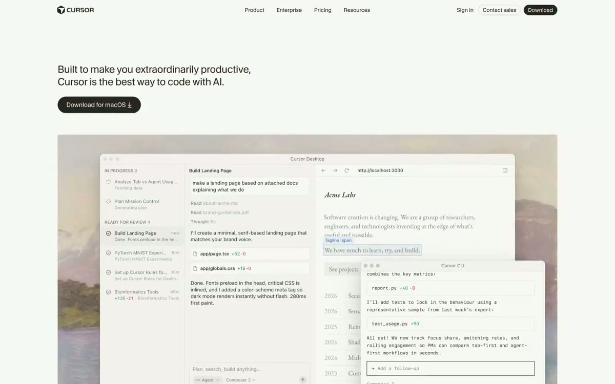 Cursor Design System
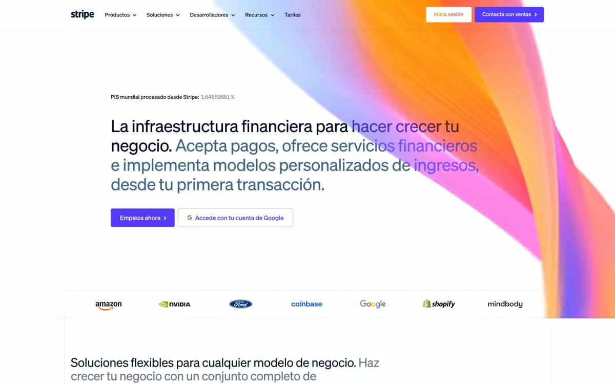 Stripe Design System
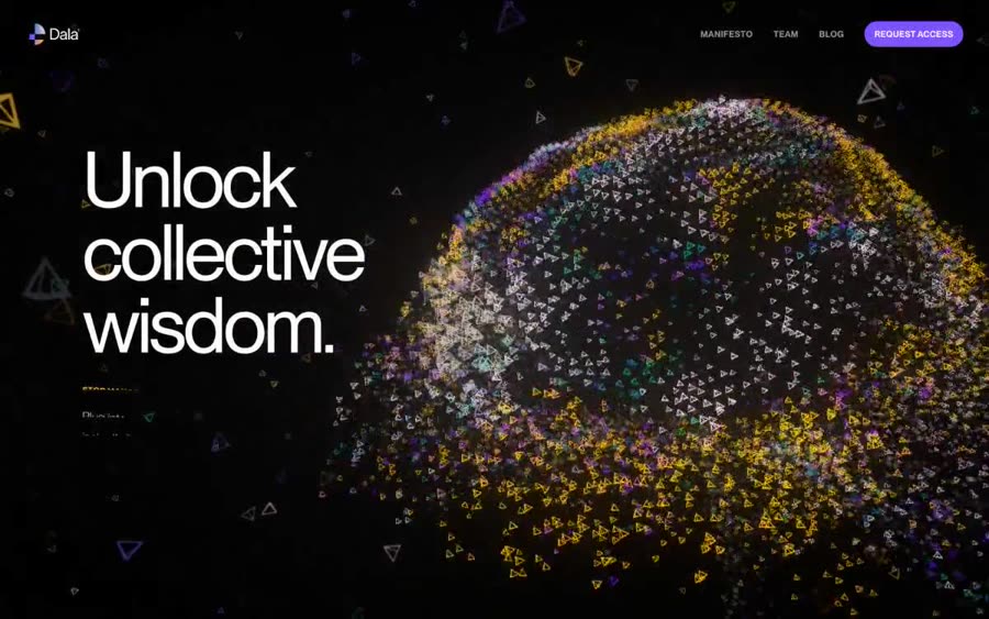 Your workplace has the answer. Just ask Dala for it. Design System
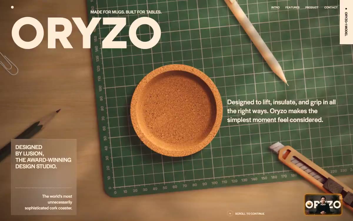 ORYZO AI Design System
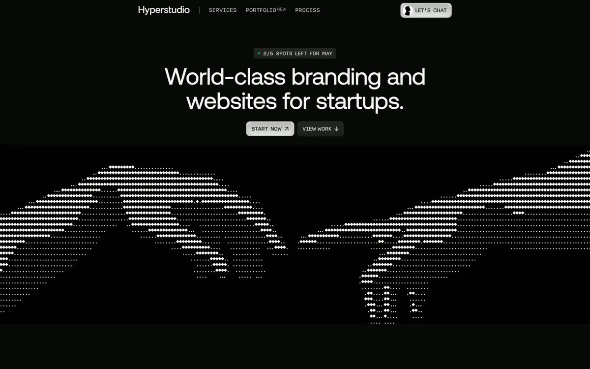 Hyperstudio Design System
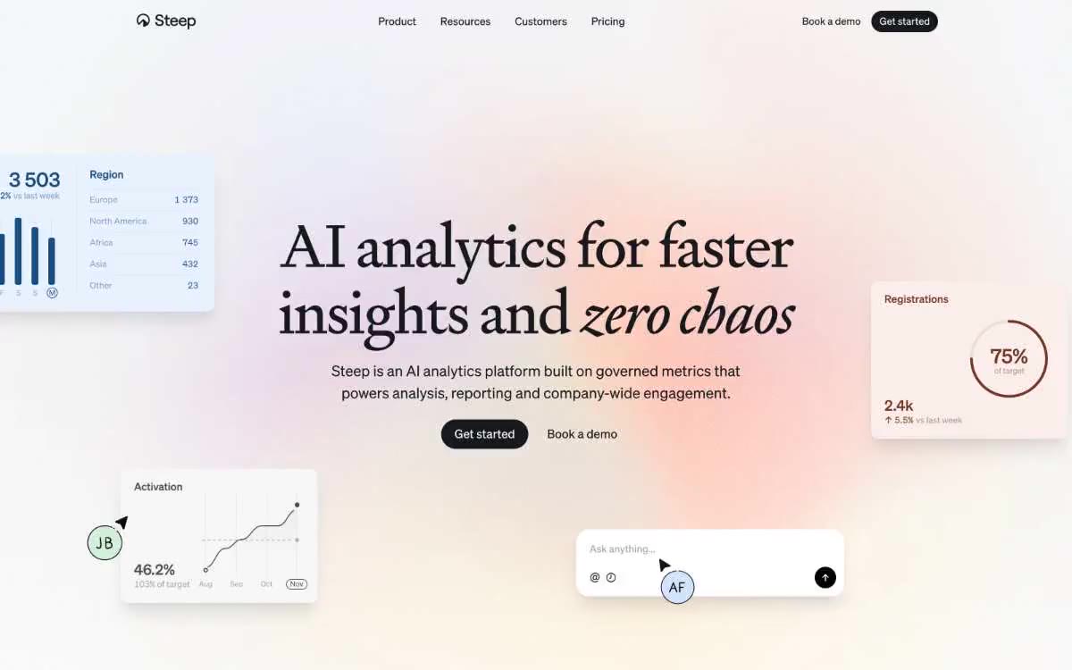 Steep Design System
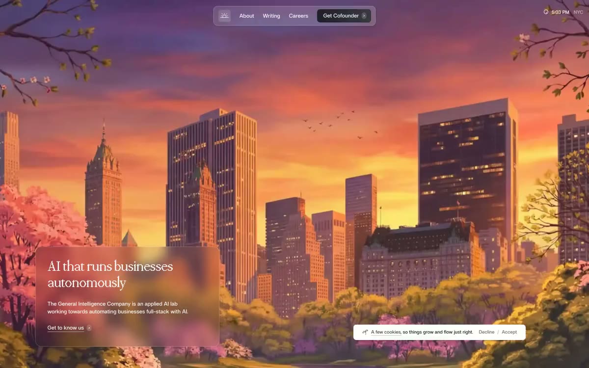 General Intelligence Company Design System
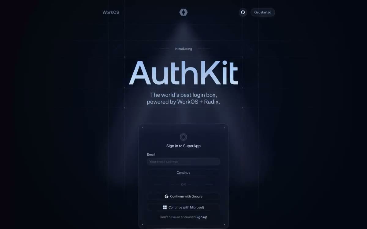 Authkit Design System
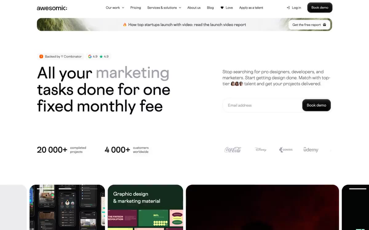 Awesomic Design System
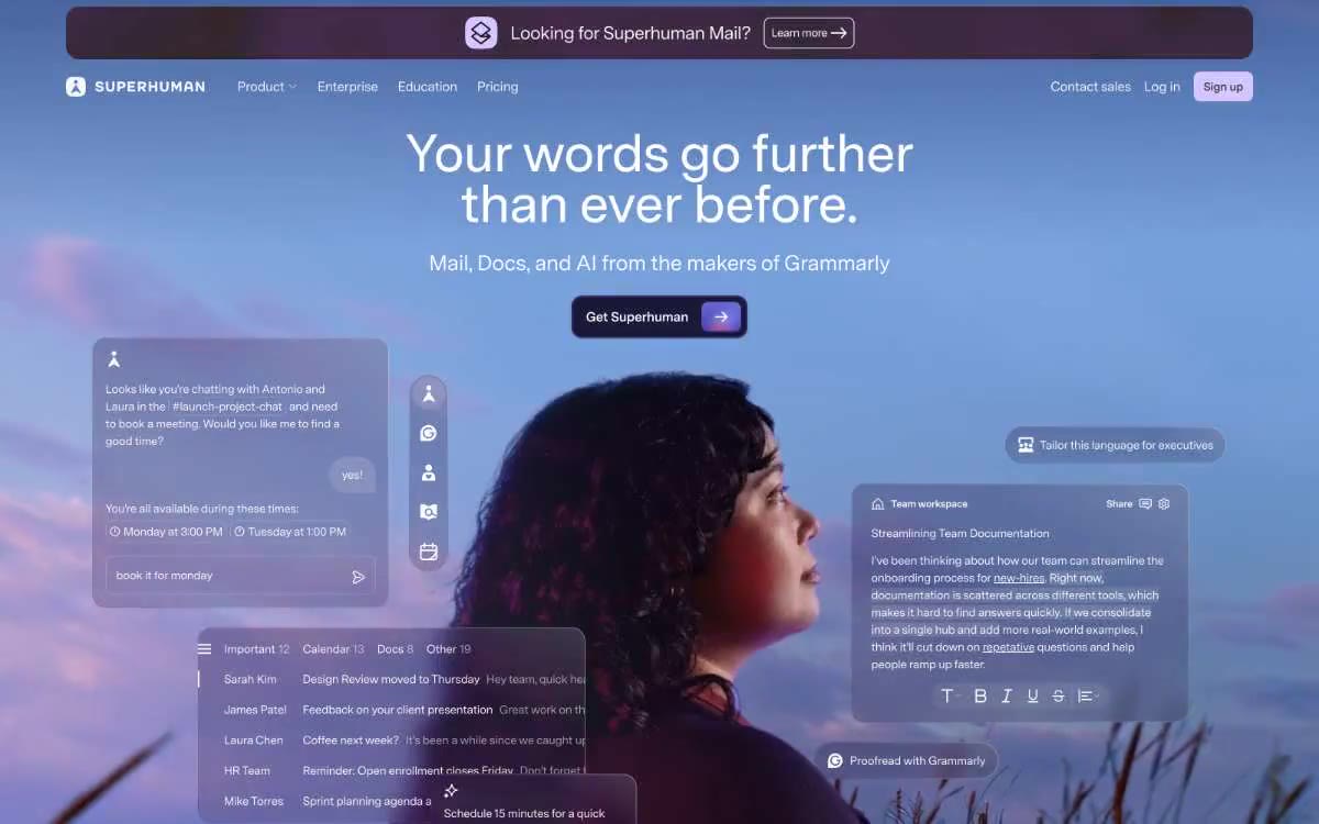 Superhuman Design System
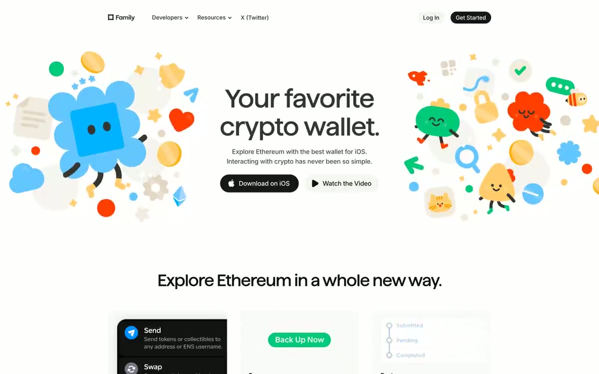 Family Design System
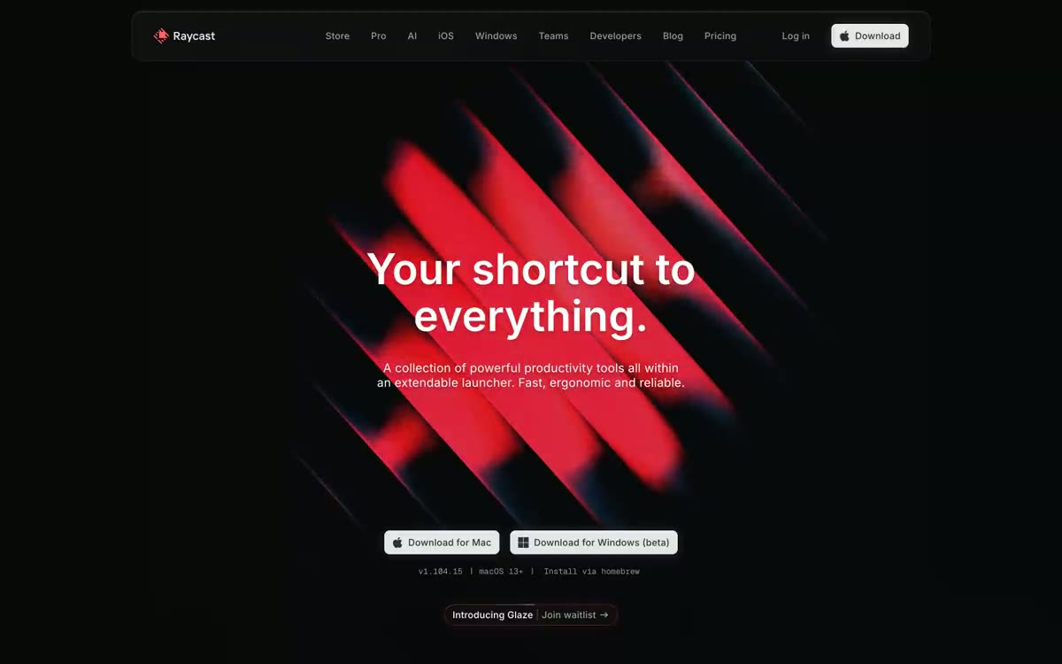 Raycast Design System
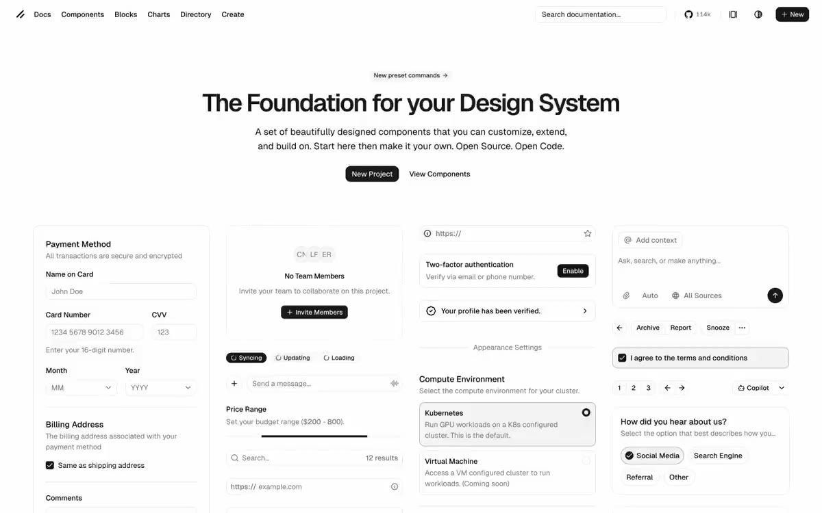 Ui Design System
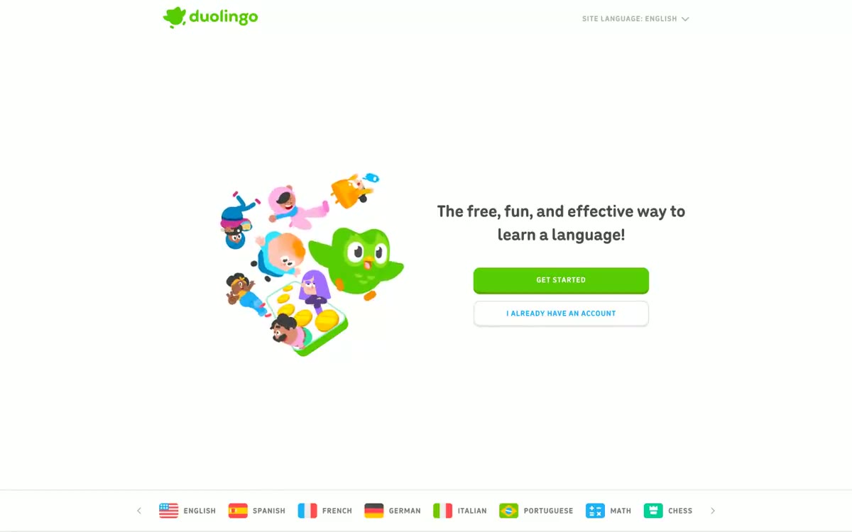 Duolingo Design System
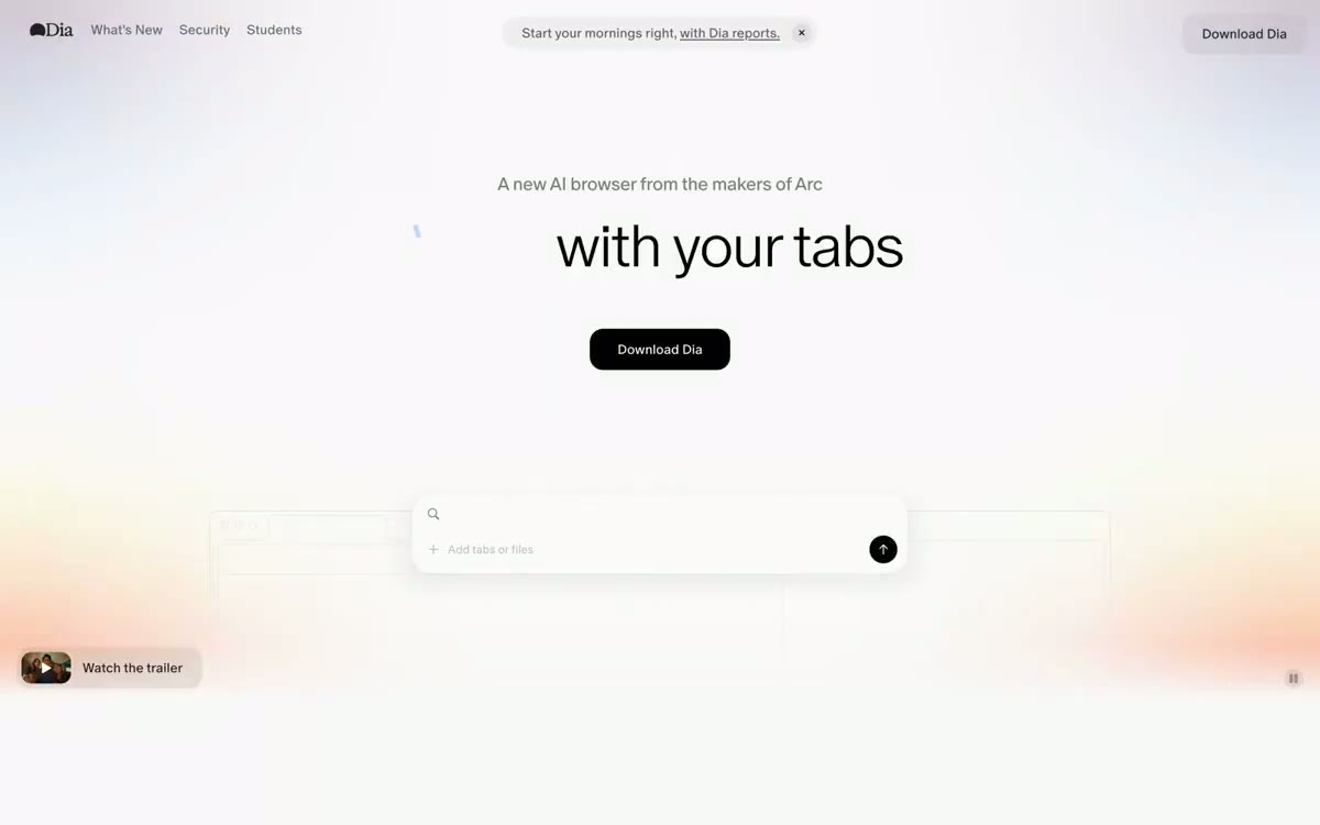 Dia Browser Design System
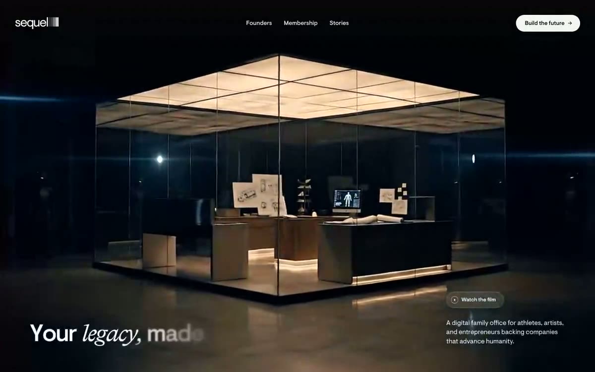 Sequel Design System
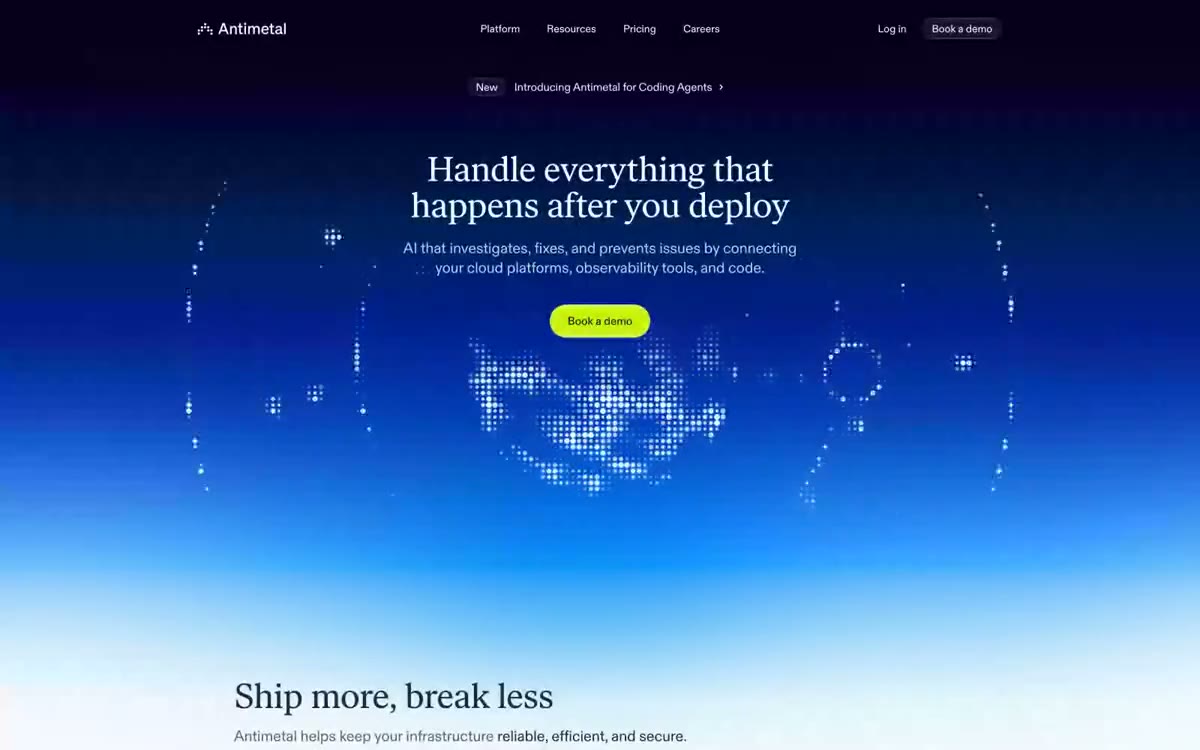 Antimetal Design System
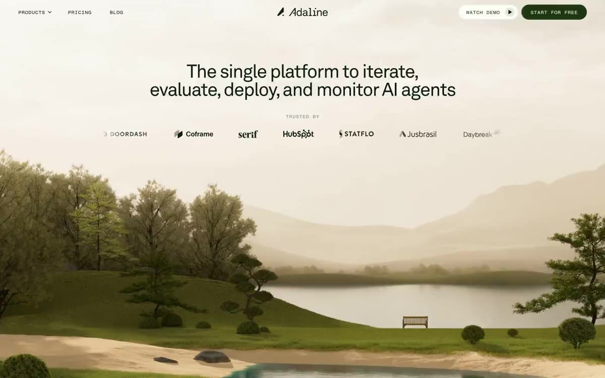 Adaline Design System
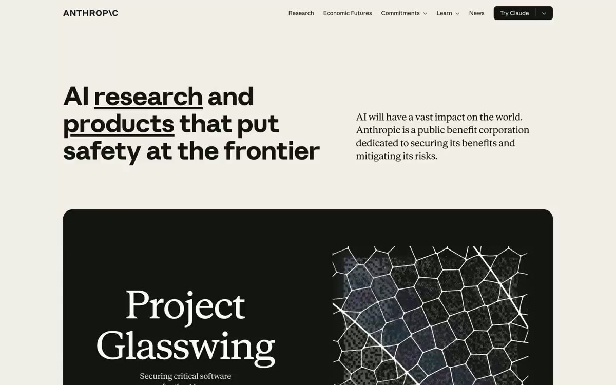 Anthropic Design System
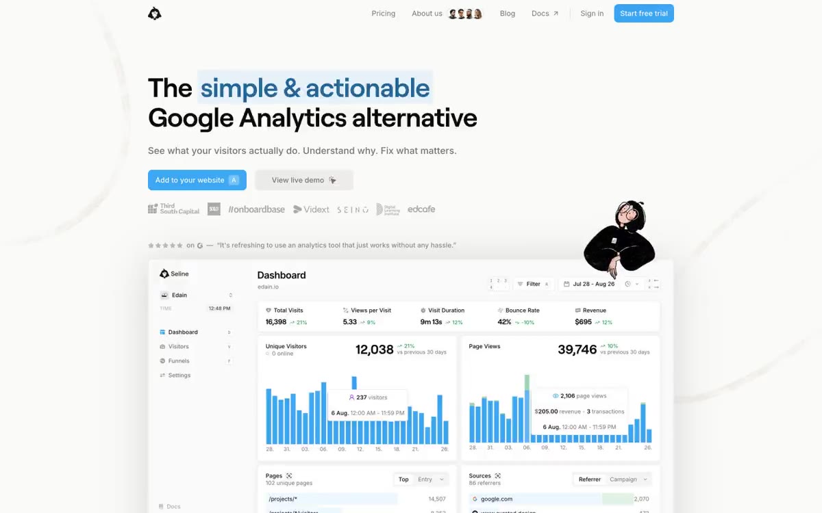 Seline Analytics Design System
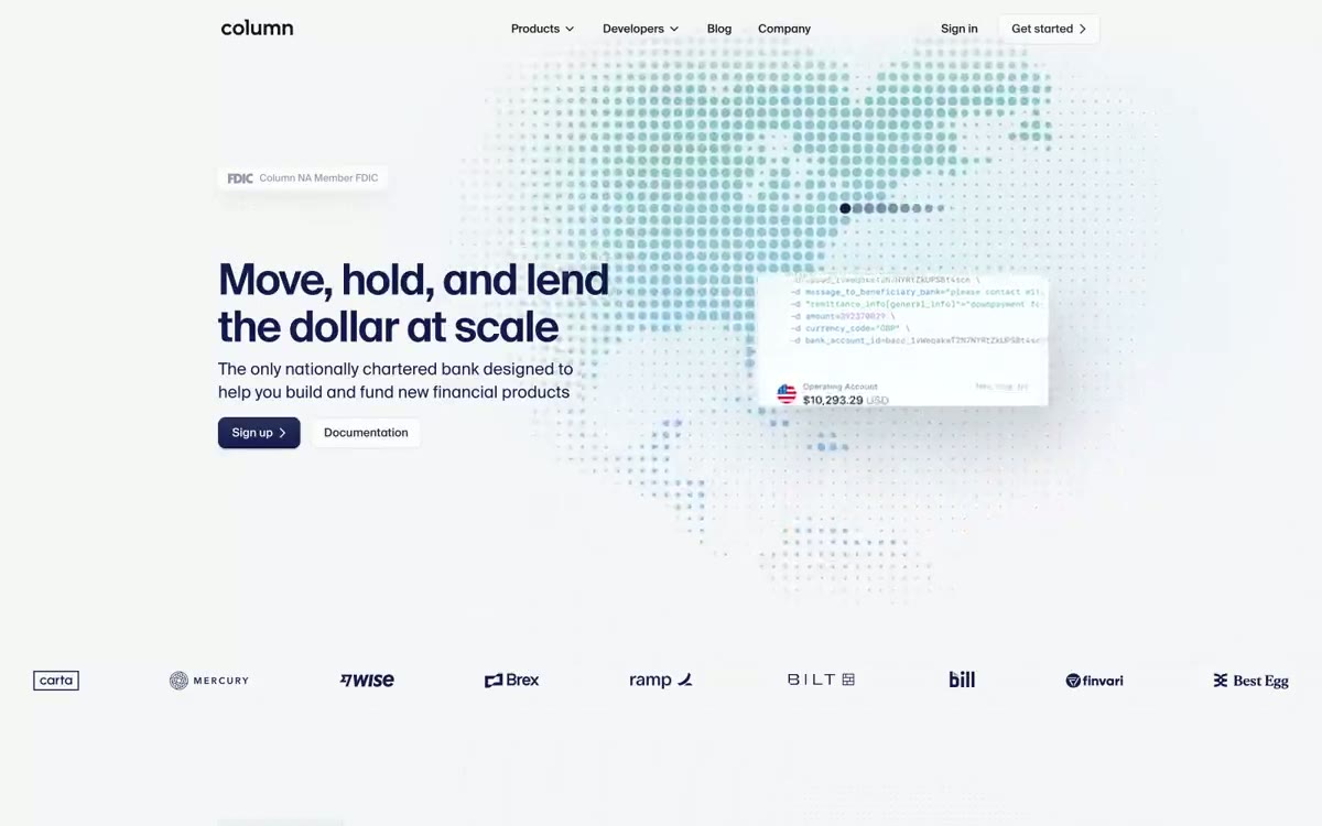 Column Design System
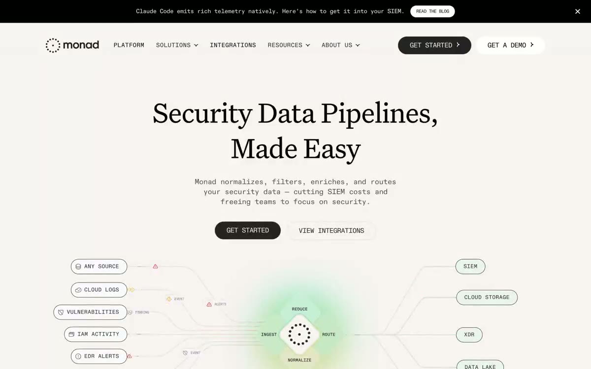 Monad Design System
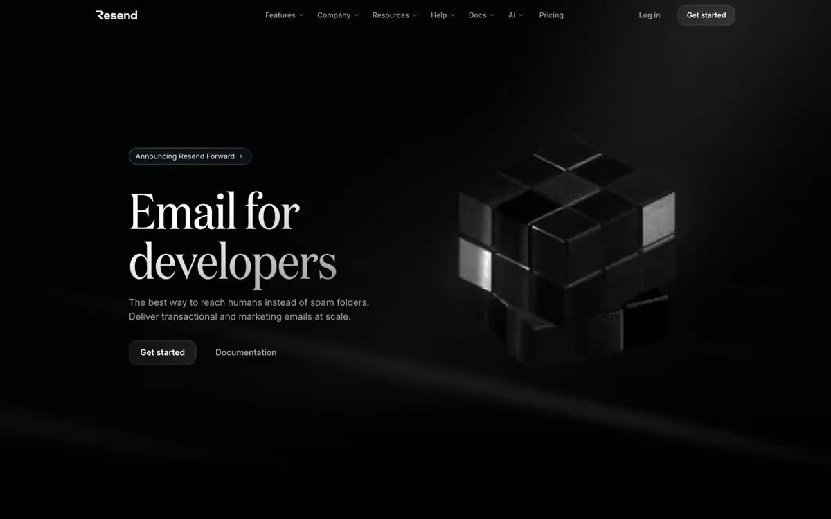 Resend Design System
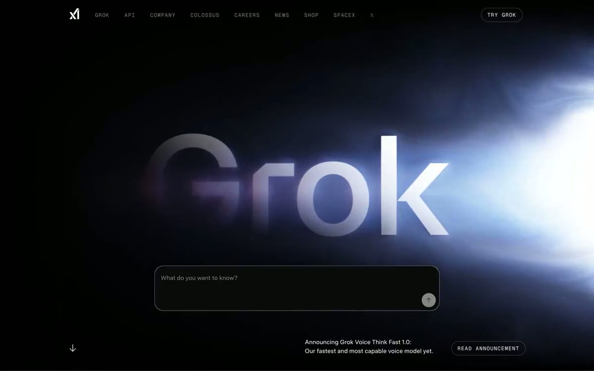 xAI Design System
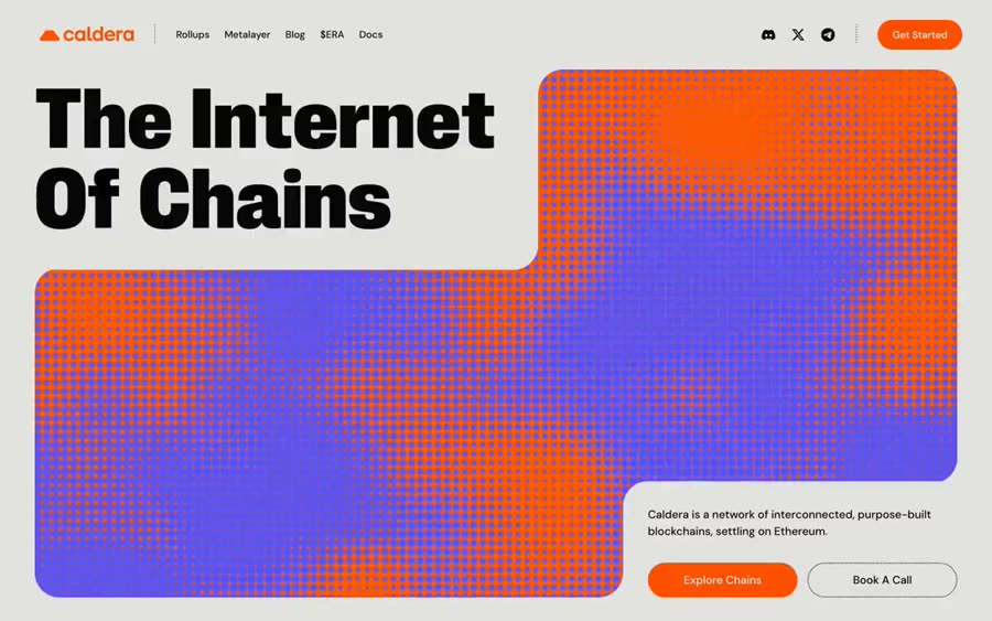 Caldera Design System
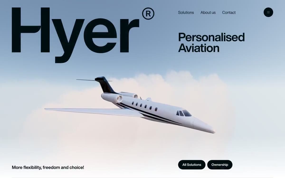 Hyer Aviation Design System
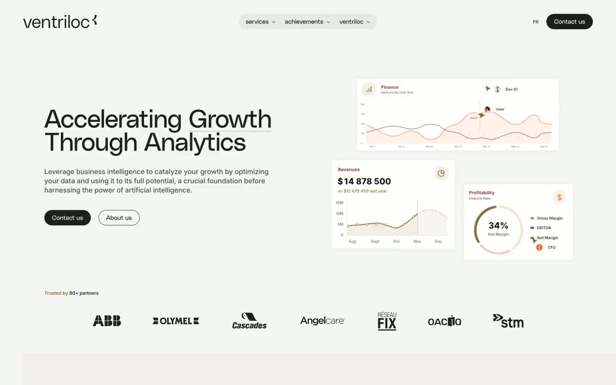 Ventriloc Design System
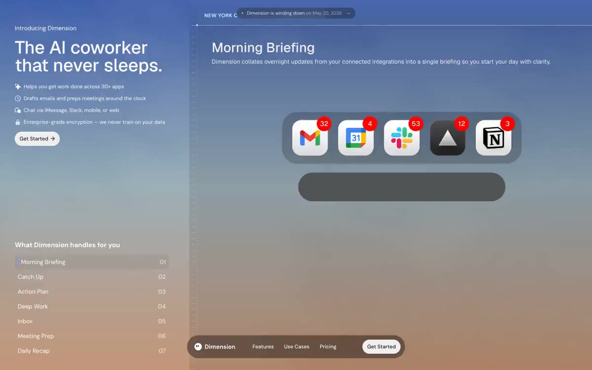 Dimension Design System
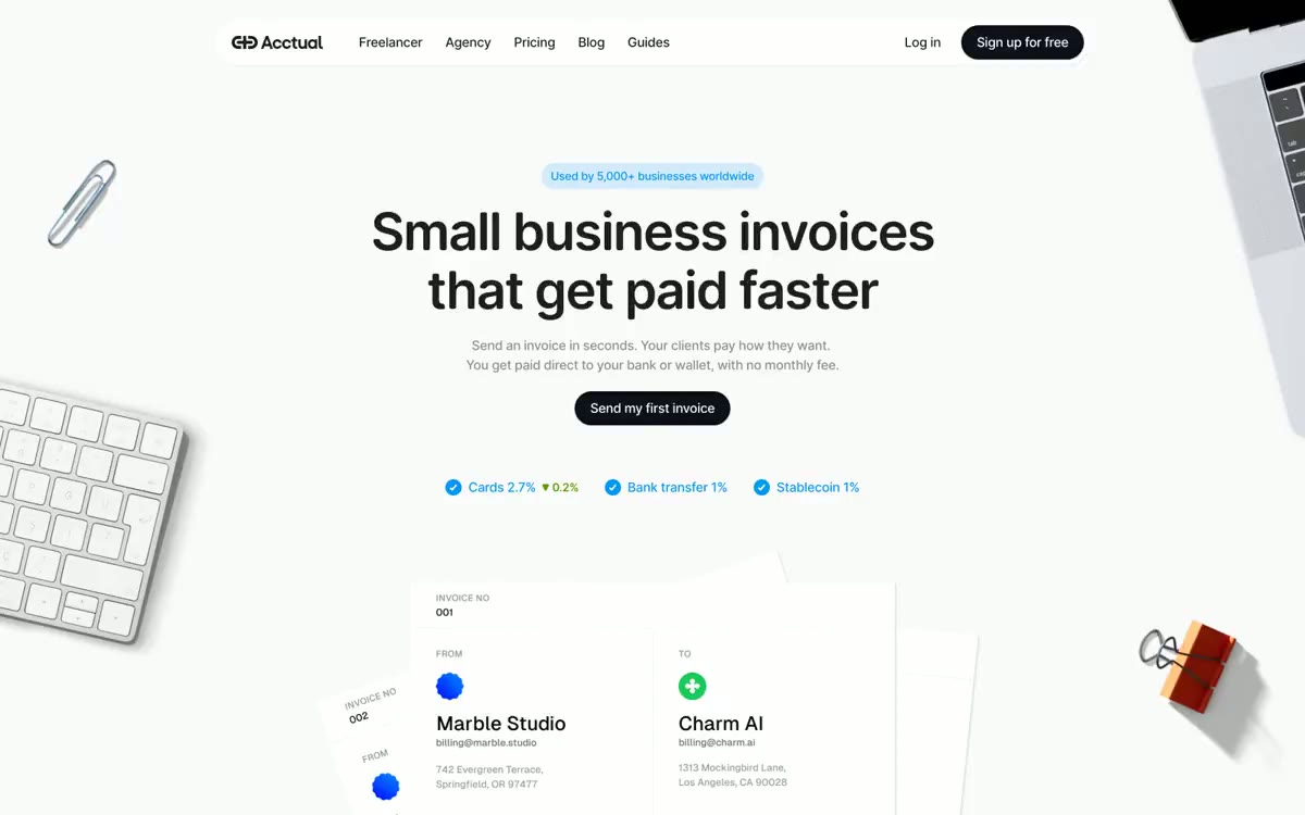 Acctual Design System
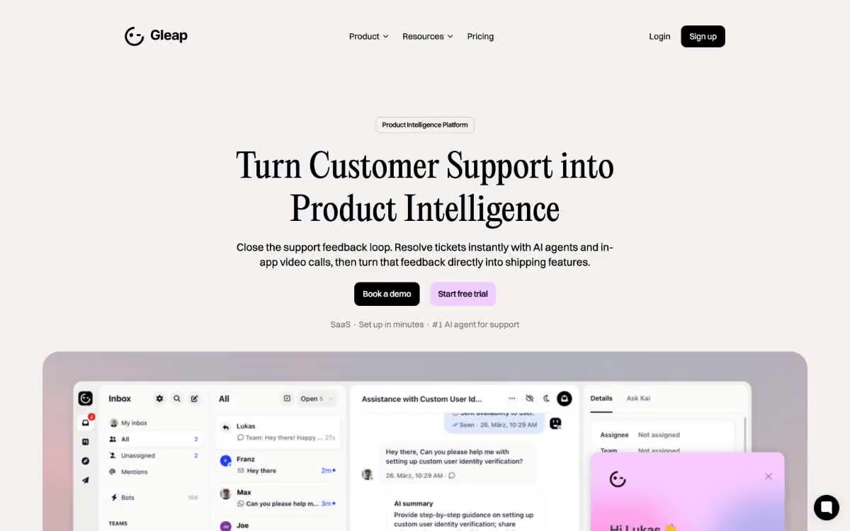 Gleap Design System
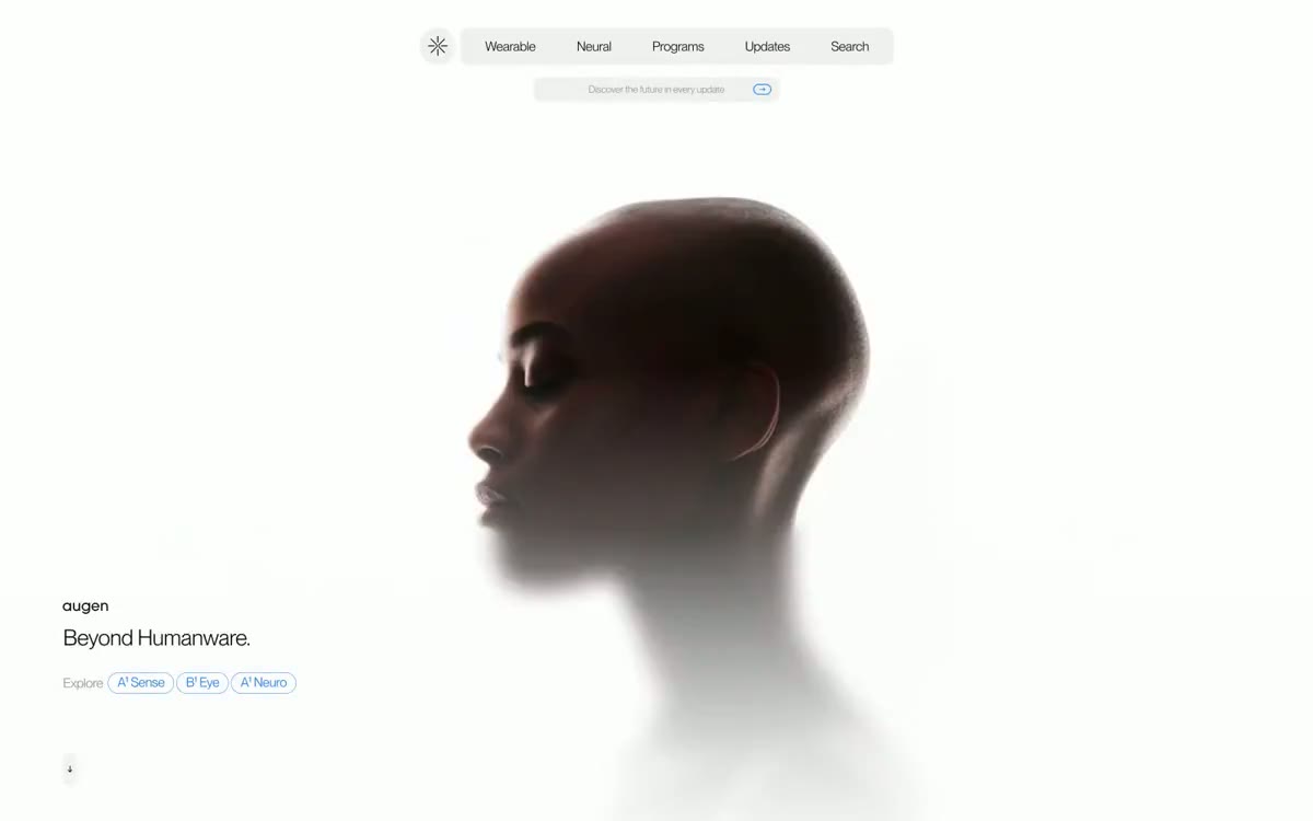 Augen Pro Design System
Browse & preview free Unlock everything — from $49/mo
Frequently asked questions
Do Meez prompts work with Cursor?
Yes. Every Meez prompt is a complete written spec — fonts, layout, color tokens, motion and asset URLs — so Cursor can build it in one paste. The 62 free prompts on this site work exactly like the premium ones; copy one above and try it.
What does Cursor generate from a prompt?
Cursor is an AI code editor (a VS Code fork), so it builds in YOUR repo with YOUR stack — React, Vue, Svelte, plain HTML, anything. A Meez prompt acts as the design brief for its agent: the spec drives the art direction while your existing conventions, components and deploy pipeline stay untouched.
How do I use a Meez prompt in Cursor?
Copy the full prompt text and paste it into the Agent pane (Cmd-I) or Cmd-K in Cursor. Don't shorten it — the specificity is what keeps Cursor from producing a generic layout. Then iterate: swap the copy and point the asset URLs at your own media.
How many prompts are free?
62 prompts are free to copy in full, no account needed. The other 579 unlock with Unlimited — $49/mo, $149/yr, or $299 once for lifetime — along with all 285 motion backgrounds.
Also for: Lovable · Bolt · v0 · Claude · Replit · Windsurf · Framer · Webflow · ChatGPT · Figma Make · Gemini · GitHub Copilot · Wix
Not sure which tool? Lovable vs v0 vs Bolt vs Cursor, compared → · All free prompts on one page → · All prompt categories →