Meez.
Browse Prompts Backgrounds Pricing
Contact Sign in ·

Card · Free prompt

Display Cards

free · paste into Lovable, Bolt, v0, Cursor or Claude

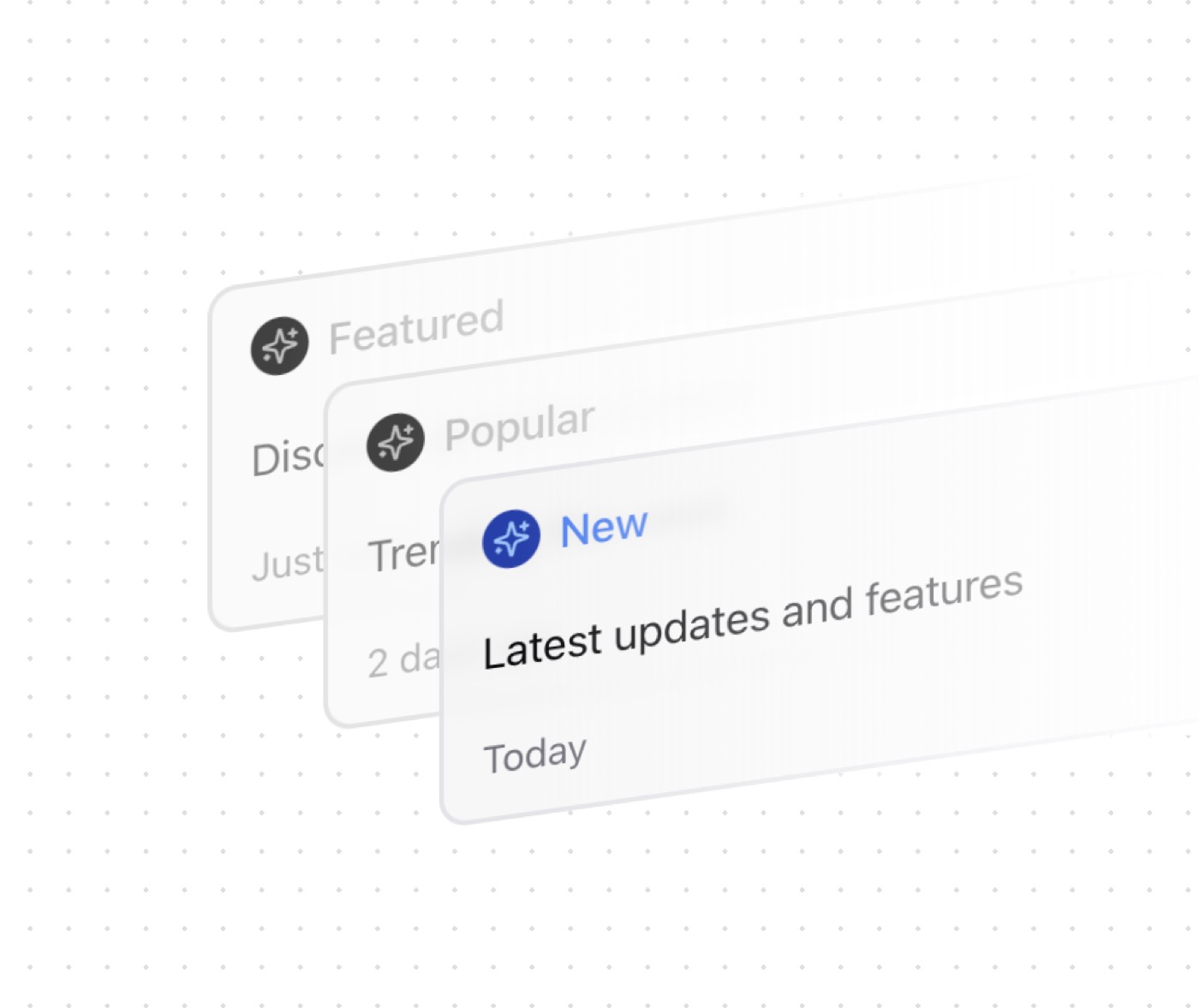
Display Cards is a complete, paste-ready card build-prompt — a full art-direction spec for Lovable, Bolt, v0, Cursor and Claude. It's free: copy it below and paste it into your builder.

Display Cards preview

“A visually appealing stacked card layout with hover animations and grayscale effects. Features: • Stacked card layout • Hover animations • Grayscale effects • Custom icons • Responsive design • Dark mode support • …”

Display CardsCard · free prompt · copy-paste

Prompt page

A visually appealing stacked card layout with hover animations and grayscale effects.

Features:
	•	Stacked card layout
	•	Hover animations
	•	Grayscale effects
	•	Custom icons
	•	Responsive design
	•	Dark mode support
	•	Customizable styles
	•	Accessible markup

Notes:
	•	Built with Tailwind CSS for responsive design
	•	Uses CSS Grid for stacking cards
	•	Implements smooth hover animations
	•	Supports custom icons from any library
	•	Includes grayscale hover effects
	•	Maintains consistent spacing
	•	Supports dark mode
	•	TypeScript support with proper types

— Install —
npx shadcn@latest add "https://21st.dev/r/display-cards"

— Component source (Display Cards.tsx) —

"use client";

import { cn } from "@/lib/utils";
import { Sparkles } from "lucide-react";

interface DisplayCardProps {
  className?: string;
  icon?: React.ReactNode;
  title?: string;
  description?: string;
  date?: string;
  iconClassName?: string;
  titleClassName?: string;
}

function DisplayCard({
  className,
  icon = <Sparkles className="size-4 text-blue-300" />,
  title = "Featured",
  description = "Discover amazing content",
  date = "Just now",
  iconClassName = "text-blue-500",
  titleClassName = "text-blue-500",
}: DisplayCardProps) {
  return (
    <div
      className={cn(
        "relative flex h-36 w-[22rem] -skew-y-[8deg] select-none flex-col justify-between rounded-xl border-2 bg-muted/70 backdrop-blur-sm px-4 py-3 transition-all duration-700 after:absolute after:-right-1 after:top-[-5%] after:h-[110%] after:w-[20rem] after:bg-gradient-to-l after:from-background after:to-transparent after:content-[''] hover:border-white/20 hover:bg-muted [&>*]:flex [&>*]:items-center [&>*]:gap-2",
        className
      )}
    >
      <div>
        <span className="relative inline-block rounded-full bg-blue-800 p-1">
          {icon}
        </span>
        <p className={cn("text-lg font-medium", titleClassName)}>{title}</p>
      </div>
      <p className="whitespace-nowrap text-lg">{description}</p>
      <p className="text-muted-foreground">{date}</p>
    </div>
  );
}

interface DisplayCardsProps {
  cards?: DisplayCardProps[];
}

export default function DisplayCards({ cards }: DisplayCardsProps) {
  const defaultCards = [
    {
      className: "[grid-area:stack] hover:-translate-y-10 before:absolute before:w-[100%] before:outline-1 before:rounded-xl before:outline-border before:h-[100%] before:content-[''] before:bg-blend-overlay before:bg-background/50 grayscale-[100%] hover:before:opacity-0 before:transition-opacity before:duration:700 hover:grayscale-0 before:left-0 before:top-0",
    },
    {
      className: "[grid-area:stack] translate-x-16 translate-y-10 hover:-translate-y-1 before:absolute before:w-[100%] before:outline-1 before:rounded-xl before:outline-border before:h-[100%] before:content-[''] before:bg-blend-overlay before:bg-background/50 grayscale-[100%] hover:before:opacity-0 before:transition-opacity before:duration:700 hover:grayscale-0 before:left-0 before:top-0",
    },
    {
      className: "[grid-area:stack] translate-x-32 translate-y-20 hover:translate-y-10",
    },
  ];

  const displayCards = cards || defaultCards;

  return (
    <div className="grid [grid-template-areas:'stack'] place-items-center opacity-100 animate-in fade-in-0 duration-700">
      {displayCards.map((cardProps, index) => (
        <DisplayCard key={index} {...cardProps} />
      ))}
    </div>
  );
}

Browse & preview free → Unlock everything — from $19/mo

More like this

Orbis Cards — Card website build-promptOrbis Cards Veloce Cards — Card website build-promptVeloce Cards Nimbus Security — Card website build-promptNimbus Security Nimbus Sticky Cards — Card website build-promptNimbus Sticky Cards Cognitra Offer — Card website build-promptCognitra Offer Evervault Card — Card website build-promptEvervault Card
Meez.

The biggest library of AI website build-prompts & motion backgrounds — at the lowest price.

Library
Browse all Prompts by category Section prompts Motion backgrounds Pricing
Learn & contact
How it works Why AI sites look generic Terms Privacy Contact Affiliates
© Meez — an open archive. Start free · Unlimited from $19/mo · cancel anytime.