Mobile App · Free prompt
Wellness Companion
Wellness Companion is a complete, paste-ready mobile app build-prompt — a full art-direction spec for Lovable, Bolt, v0, Cursor and Claude. It's free: copy it below and paste it into your builder.
Wellness CompanionMobile App · free prompt · copy-paste
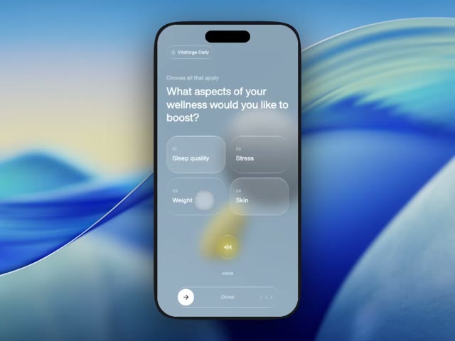
Build a mobile wellness quiz screen inside a realistic phone frame mockup, centered on a white page. Use React with Tailwind CSS and Lucide React icons.

**Phone Frame:**
- Dimensions: 375px wide x 780px tall
- Border radius: 52px
- Background color: `#8a9aaa`
- Box shadow to simulate a real phone bezel: `inset 0 0 0 2px rgba(255,255,255,0.08), 0 0 0 1px rgba(0,0,0,0.6), 0 0 0 10px #1a1a1e, 0 0 0 11px rgba(255,255,255,0.06), 0 0 60px rgba(0,0,0,0.5)`
- A black pill-shaped Dynamic Island at the top center: 120px wide, 32px tall, fully rounded, z-index 50

**Background:**
- Full-bleed background image using this exact URL: `https://meez.design/web/media/ext/6034ecdbf191b497.webp`
- Apply `blur(12px)` and `scale(1.1)` to the background image
- Semi-transparent overlay: `#8a9aaa` at 30% opacity on top

**Font:**
- Load "Helvetica Now Var" from: `(self-host this face — no free CDN; substitute a close match if unavailable)`
- Fallback stack: 'Helvetica Neue', Helvetica, Arial, sans-serif
- Apply globally to all elements

**Content Layout (flex column, padding: 56px top, 24px sides, 24px bottom):**

1. **Header Badge** (top, with 40px margin-bottom):
   - Liquid glass pill with Timer icon (12px, white/80) + text "Vitaforge Daily" (12px, white/90, medium weight)
   - Padding: 10px vertical, 12px horizontal

2. **Title Section** (32px margin-bottom):
   - Subtitle: "Choose all that apply" - white/60, 14px
   - Heading: "What aspects of your wellness would you like to boost?" - white, 28px, normal weight, tight leading and tracking

3. **Selection Grid** (2 columns, 12px gap, pushes to fill available space):
   - 4 cards: "Sleep quality", "Stress", "Weight", "Skin"
   - Each card: rounded-[32px], 100px height, padding 16px
   - Shows a number label (01, 02, etc.) in white/50, 11px, medium weight
   - Option text in white, 16px, medium weight
   - "Stress" (id:2) and "Skin" (id:4) are pre-selected
   - Cards are toggleable on click

4. **Voice Button** (centered, 24px vertical margin):
   - Yellow/gold radial glow behind: `radial-gradient(ellipse at center, rgba(220,200,80,0.5) 0%, rgba(180,160,40,0.2) 40%, transparent 70%)`
   - 64px circular liquid glass button with a waveform SVG icon (white strokes, strokeWidth 2, strokeLinecap round) showing 5 vertical bars of varying heights
   - "voice" label below in white/70, 12px

5. **Slide-to-Confirm Button** (bottom, inside 24px horizontal padding):
   - Full-width rounded-full track, 56px tall, liquid glass style
   - White circular thumb (44px) on the left with ArrowRight icon (gray-800)
   - "Done" text centered in white/60, 14px, medium weight
   - 3 ChevronRight icons on the right (14px) at white/40, white/50, white/60 opacity
   - Draggable thumb with pointer events: snaps back if not dragged past 85%, snaps to end if past 85%

**Liquid Glass Effect (CSS classes):**

`.liquid-glass`:
- Background: `rgba(255,255,255,0.01)` with luminosity blend mode
- Backdrop filter: `blur(4px)`
- Box shadow: `inset 0 1px 1px rgba(255,255,255,0.1)`
- `::before` pseudo-element for gradient border: `linear-gradient(180deg, rgba(255,255,255,0.45) 0%, rgba(255,255,255,0.15) 20%, rgba(255,255,255,0) 40%, rgba(255,255,255,0) 60%, rgba(255,255,255,0.15) 80%, rgba(255,255,255,0.45) 100%)` with 1.4px padding and mask-composite exclude technique

`.liquid-glass-selected`:
- Same as above but background: `rgba(255,255,255,0.12)`, blur 8px, stronger box shadow (`inset 0 1px 2px rgba(255,255,255,0.2)`), and brighter gradient border (0.6 alpha at edges, 0.25 at 20%/80%)

**Animations:**
- Staggered fade-up animation on all elements
- Keyframes: from `opacity:0, translateY(16px)` to `opacity:1, translateY(0)`
- Duration: 0.5s, easing: `cubic-bezier(0.22, 1, 0.36, 1)`, fill: forwards
- Delays: header 0.1s, title 0.25s, grid cards 0.4s/0.48s/0.56s/0.64s, voice 0.7s, slider 0.85s

**Dependencies:**
- React 18, Tailwind CSS 3, Lucide React, Vite, TypeScript
Browse & preview free Unlock everything — from $49/mo