Meez.
Browse Prompts Backgrounds Pricing
Contact Sign in ·

Navigation · Free prompt

Expandable Tabs

free · paste into Lovable, Bolt, v0, Cursor or Claude

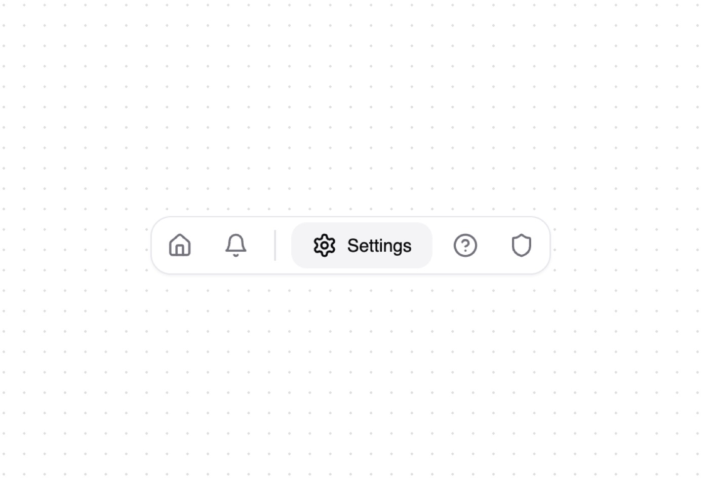
Expandable Tabs is a complete, paste-ready navigation build-prompt — a full art-direction spec for Lovable, Bolt, v0, Cursor and Claude. It's free: copy it below and paste it into your builder.

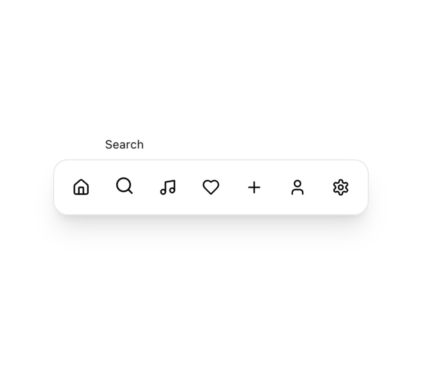
Expandable Tabs preview

“A set of expandable tabs that show both icon and text when selected. Tabs animate smoothly to expand or collapse on click, and clicking outside collapses any open tab. Features - Animated Expansion: Smooth animations …”

Expandable TabsNavigation · free prompt · copy-paste

Prompt page

A set of expandable tabs that show both icon and text when selected. Tabs animate smoothly to expand or collapse on click, and clicking outside collapses any open tab.

Features
- Animated Expansion: Smooth animations when revealing tab labels
- Space Efficient: Collapses to icons-only when not in use
- Click Outside: Automatically collapses when clicking outside
- Separator Support: Optional separators between tab groups
- Customizable: Supports custom colors and styling
- Shadcn/UI Theme: Fully integrated with shadcn/ui theming system
- Dark Mode: Built-in dark mode support
- Accessible: Keyboard navigation and screen reader friendly

Example Use Cases
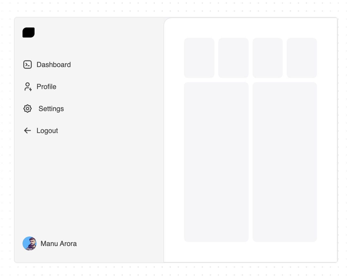
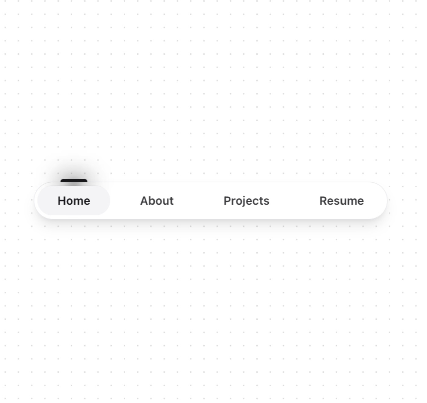
- Navigation Menus: Compact sidebar navigation
- Toolbars: Feature-rich toolbars that save space
- Mobile Interfaces: Touch-friendly navigation
- Settings Panels: Grouped settings controls
- Dashboard Controls: Quick access to main features

— Install —
npx shadcn@latest add "https://21st.dev/r/expandable-tabs"

— Component source (Expandable Tabs.tsx) —

"use client";

import * as React from "react";
import { AnimatePresence, motion } from "framer-motion";
import { useOnClickOutside } from "usehooks-ts";
import { cn } from "@/lib/utils";
import { LucideIcon } from "lucide-react";

interface Tab {
  title: string;
  icon: LucideIcon;
  type?: never;
}

interface Separator {
  type: "separator";
  title?: never;
  icon?: never;
}

type TabItem = Tab | Separator;

interface ExpandableTabsProps {
  tabs: TabItem[];
  className?: string;
  activeColor?: string;
  onChange?: (index: number | null) => void;
}

const buttonVariants = {
  initial: {
    gap: 0,
    paddingLeft: ".5rem",
    paddingRight: ".5rem",
  },
  animate: (isSelected: boolean) => ({
    gap: isSelected ? ".5rem" : 0,
    paddingLeft: isSelected ? "1rem" : ".5rem",
    paddingRight: isSelected ? "1rem" : ".5rem",
  }),
};

const spanVariants = {
  initial: { width: 0, opacity: 0 },
  animate: { width: "auto", opacity: 1 },
  exit: { width: 0, opacity: 0 },
};

const transition = { delay: 0.1, type: "spring", bounce: 0, duration: 0.6 };

export function ExpandableTabs({
  tabs,
  className,
  activeColor = "text-primary",
  onChange,
}: ExpandableTabsProps) {
  const [selected, setSelected] = React.useState<number | null>(null);
  const outsideClickRef = React.useRef(null);

  useOnClickOutside(outsideClickRef, () => {
    setSelected(null);
    onChange?.(null);
  });

  const handleSelect = (index: number) => {
    setSelected(index);
    onChange?.(index);
  };

  const Separator = () => (
    <div className="mx-1 h-[24px] w-[1.2px] bg-border" aria-hidden="true" />
  );

  return (
    <div
      ref={outsideClickRef}
      className={cn(
        "flex flex-wrap items-center gap-2 rounded-2xl border bg-background p-1 shadow-sm",
        className
      )}
    >
      {tabs.map((tab, index) => {
        if (tab.type === "separator") {
          return <Separator key={`separator-${index}`} />;
        }

        const Icon = tab.icon;
        return (
          <motion.button
            key={tab.title}
            variants={buttonVariants}
            initial={false}
            animate="animate"
            custom={selected === index}
            onClick={() => handleSelect(index)}
            transition={transition}
            className={cn(
              "relative flex items-center rounded-xl px-4 py-2 text-sm font-medium transition-colors duration-300",
              selected === index
                ? cn("bg-muted", activeColor)
                : "text-muted-foreground hover:bg-muted hover:text-foreground"
            )}
          >
            <Icon size={20} />
            <AnimatePresence initial={false}>
              {selected === index && (
                <motion.span
                  variants={spanVariants}
                  initial="initial"
                  animate="animate"
                  exit="exit"
                  transition={transition}
                  className="overflow-hidden"
                >
                  {tab.title}
                </motion.span>
              )}
            </AnimatePresence>
          </motion.button>
        );
      })}
    </div>
  );
}

Browse & preview free → Unlock everything — from $19/mo

More like this

Sidebar — Navigation website build-promptSidebar Tubelight Navbar — Navigation website build-promptTubelight Navbar Dock — Navigation website build-promptDock Navbar Menu — Navigation website build-promptNavbar Menu Sidebar News — Navigation website build-promptSidebar News Dock — Navigation website build-promptDock
Meez.

The biggest library of AI website build-prompts & motion backgrounds — at the lowest price.

Library
Browse all Prompts by category Section prompts Motion backgrounds Pricing
Learn & contact
How it works Why AI sites look generic Terms Privacy Contact Affiliates
© Meez — an open archive. Start free · Unlimited from $19/mo · cancel anytime.