Meez.
Browse Prompts Backgrounds Pricing
Contact Sign in ·

Component · Free prompt

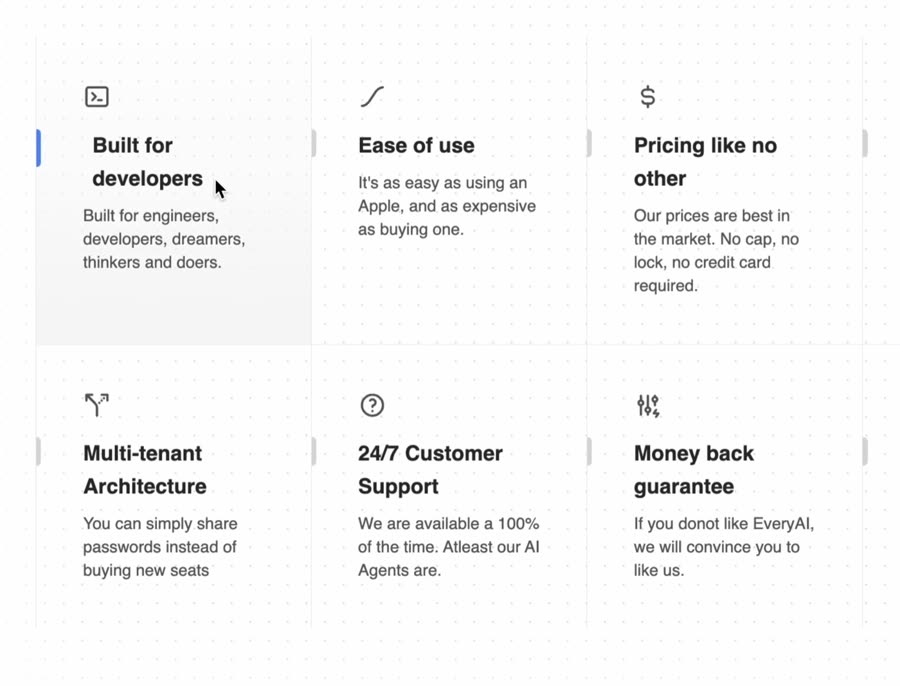
Feature Section with hover effects

free · paste into Lovable, Bolt, v0, Cursor or Claude

Feature Section with hover effects is a complete, paste-ready component build-prompt — a full art-direction spec for Lovable, Bolt, v0, Cursor and Claude. It's free: copy it below and paste it into your builder.

Feature Section with hover effects preview

“Feature Section with hover effects — Install — npx shadcn@latest add "https://21st.dev/r/feature-section-with-hover-effects" — Component source (Feature Section with hover effects.tsx) — import { cn } from …”

Feature Section with hover effectsComponent · free prompt · copy-paste

Prompt page

Feature Section with hover effects

— Install —
npx shadcn@latest add "https://21st.dev/r/feature-section-with-hover-effects"

— Component source (Feature Section with hover effects.tsx) —

import { cn } from "@/lib/utils";
import {
  IconAdjustmentsBolt,
  IconCloud,
  IconCurrencyDollar,
  IconEaseInOut,
  IconHeart,
  IconHelp,
  IconRouteAltLeft,
  IconTerminal2,
} from "@tabler/icons-react";

export function FeaturesSectionWithHoverEffects() {
  const features = [
    {
      title: "Built for developers",
      description:
        "Built for engineers, developers, dreamers, thinkers and doers.",
      icon: <IconTerminal2 />,
    },
    {
      title: "Ease of use",
      description:
        "It's as easy as using an Apple, and as expensive as buying one.",
      icon: <IconEaseInOut />,
    },
    {
      title: "Pricing like no other",
      description:
        "Our prices are best in the market. No cap, no lock, no credit card required.",
      icon: <IconCurrencyDollar />,
    },
    {
      title: "100% Uptime guarantee",
      description: "We just cannot be taken down by anyone.",
      icon: <IconCloud />,
    },
    {
      title: "Multi-tenant Architecture",
      description: "You can simply share passwords instead of buying new seats",
      icon: <IconRouteAltLeft />,
    },
    {
      title: "24/7 Customer Support",
      description:
        "We are available a 100% of the time. Atleast our AI Agents are.",
      icon: <IconHelp />,
    },
    {
      title: "Money back guarantee",
      description:
        "If you donot like EveryAI, we will convince you to like us.",
      icon: <IconAdjustmentsBolt />,
    },
    {
      title: "And everything else",
      description: "I just ran out of copy ideas. Accept my sincere apologies",
      icon: <IconHeart />,
    },
  ];
  return (
    <div className="grid grid-cols-1 md:grid-cols-2 lg:grid-cols-4  relative z-10 py-10 max-w-7xl mx-auto">
      {features.map((feature, index) => (
        <Feature key={feature.title} {...feature} index={index} />
      ))}
    </div>
  );
}

const Feature = ({
  title,
  description,
  icon,
  index,
}: {
  title: string;
  description: string;
  icon: React.ReactNode;
  index: number;
}) => {
  return (
    <div
      className={cn(
        "flex flex-col lg:border-r  py-10 relative group/feature dark:border-neutral-800",
        (index === 0 || index === 4) && "lg:border-l dark:border-neutral-800",
        index < 4 && "lg:border-b dark:border-neutral-800"
      )}
    >
      {index < 4 && (
        <div className="opacity-0 group-hover/feature:opacity-100 transition duration-200 absolute inset-0 h-full w-full bg-gradient-to-t from-neutral-100 dark:from-neutral-800 to-transparent pointer-events-none" />
      )}
      {index >= 4 && (
        <div className="opacity-0 group-hover/feature:opacity-100 transition duration-200 absolute inset-0 h-full w-full bg-gradient-to-b from-neutral-100 dark:from-neutral-800 to-transparent pointer-events-none" />
      )}
      <div className="mb-4 relative z-10 px-10 text-neutral-600 dark:text-neutral-400">
        {icon}
      </div>
      <div className="text-lg font-bold mb-2 relative z-10 px-10">
        <div className="absolute left-0 inset-y-0 h-6 group-hover/feature:h-8 w-1 rounded-tr-full rounded-br-full bg-neutral-300 dark:bg-neutral-700 group-hover/feature:bg-blue-500 transition-all duration-200 origin-center" />
        <span className="group-hover/feature:translate-x-2 transition duration-200 inline-block text-neutral-800 dark:text-neutral-100">
          {title}
        </span>
      </div>
      <p className="text-sm text-neutral-600 dark:text-neutral-300 max-w-xs relative z-10 px-10">
        {description}
      </p>
    </div>
  );
};

Browse & preview free → Unlock everything — from $19/mo

More like this

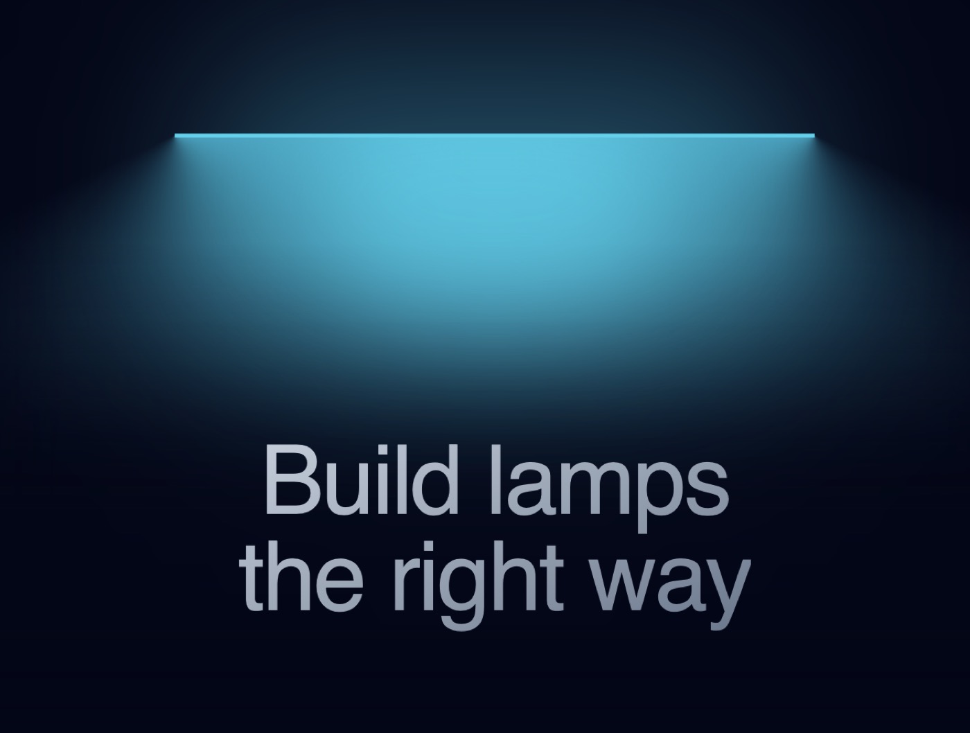
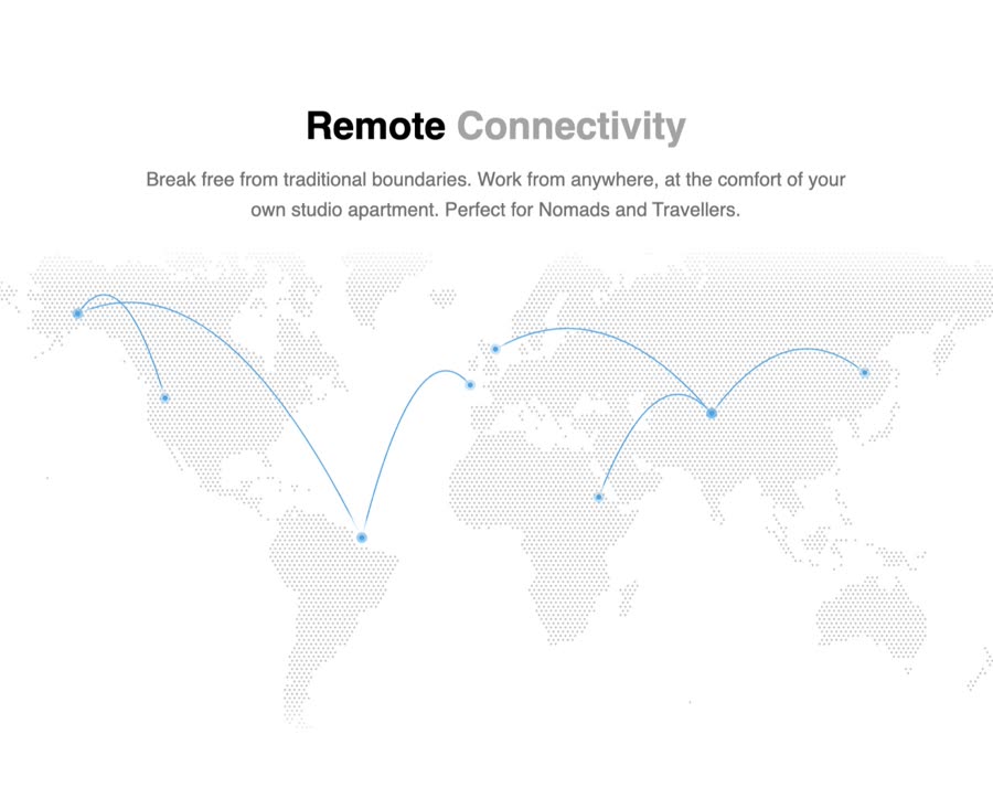
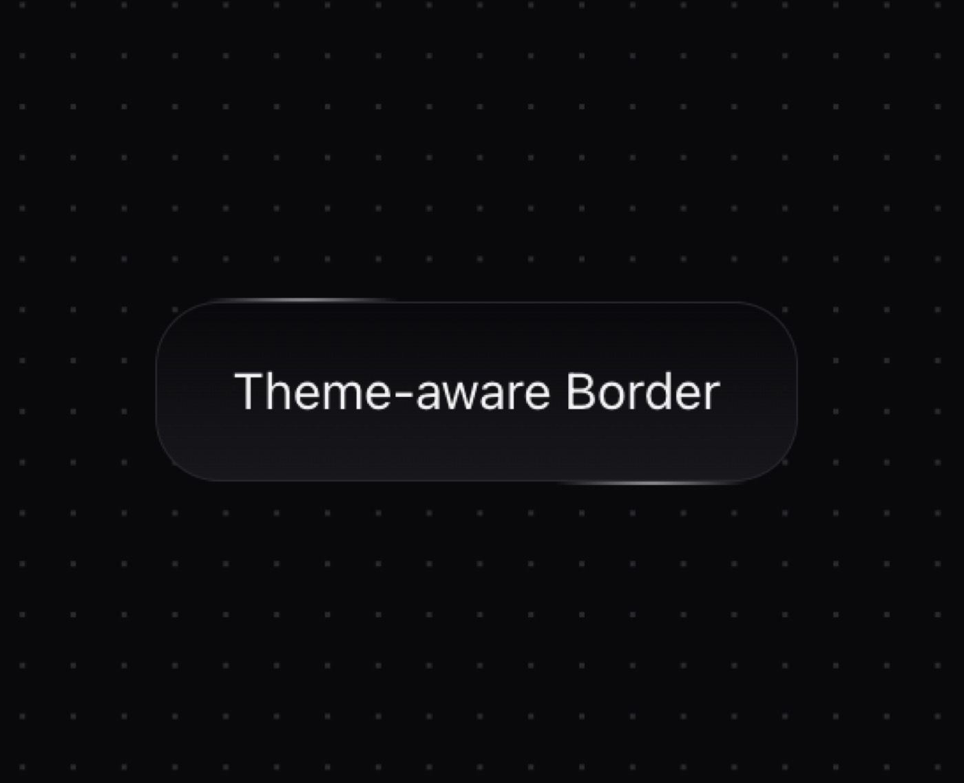
Animated Cards — Component website build-promptAnimated Cards Table — Component website build-promptTable Empty State — Component website build-promptEmpty State Lamp — Component website build-promptLamp World Map — Component website build-promptWorld Map Star Border — Component website build-promptStar Border
Meez.

The biggest library of AI website build-prompts & motion backgrounds — at the lowest price.

Library
Browse all Prompts by category Section prompts Motion backgrounds Pricing
Learn & contact
How it works Why AI sites look generic Terms Privacy Contact Affiliates
© Meez — an open archive. Start free · Unlimited from $19/mo · cancel anytime.