Navigation · Free prompt
Tubelight Navbar
Tubelight Navbar is a complete, paste-ready navigation build-prompt — a full art-direction spec for Lovable, Bolt, v0, Cursor and Claude. It's free: copy it below and paste it into your builder.

Tubelight NavbarNavigation · free prompt · copy-paste
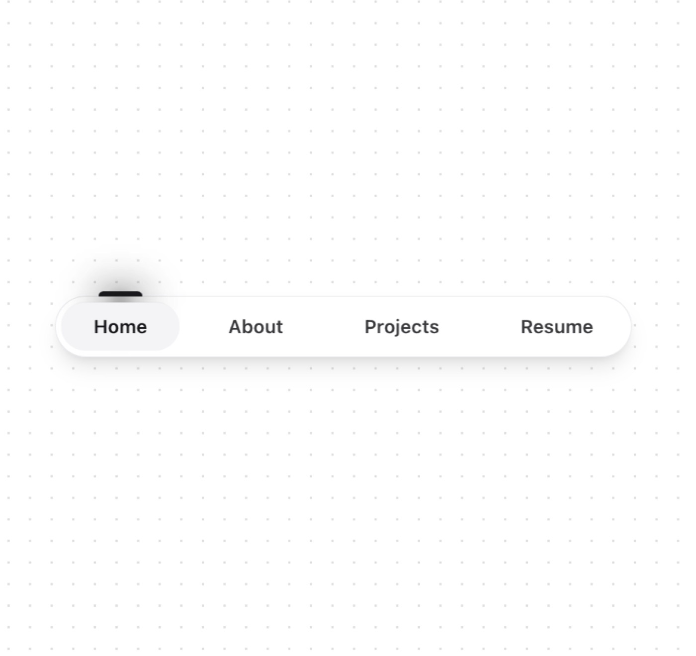
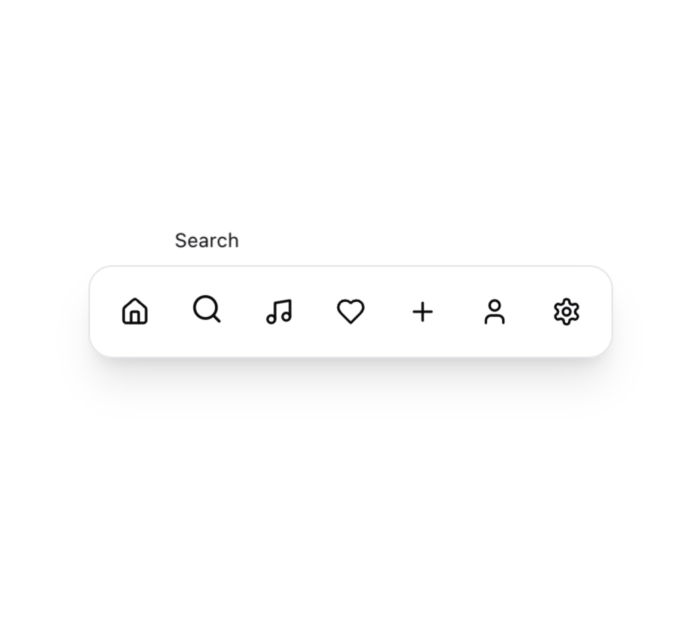
A sleek and modern navigation bar component with smooth animations and a dynamic indicator. Perfect for primary navigation in web applications.
Features
- Animated tab indicator with glowing effect
- Responsive design (mobile & desktop views)
- Icons for mobile view, text for desktop
- Dark/Light theme support
- Frosted glass effect for active state
- Smooth transitions between tabs
- Built with Framer Motion for fluid animations
— Install —
npx shadcn@latest add "https://21st.dev/r/tubelight-navbar"
— Component source (Tubelight Navbar.tsx) —
"use client"
import React, { useEffect, useState } from "react"
import { motion } from "framer-motion"
import Link from "next/link"
import { LucideIcon } from "lucide-react"
import { cn } from "@/lib/utils"
interface NavItem {
name: string
url: string
icon: LucideIcon
}
interface NavBarProps {
items: NavItem[]
className?: string
}
export function NavBar({ items, className }: NavBarProps) {
const [activeTab, setActiveTab] = useState(items[0].name)
const [isMobile, setIsMobile] = useState(false)
useEffect(() => {
const handleResize = () => {
setIsMobile(window.innerWidth < 768)
}
handleResize()
window.addEventListener("resize", handleResize)
return () => window.removeEventListener("resize", handleResize)
}, [])
return (
<div
className={cn(
"fixed bottom-0 sm:top-0 left-1/2 -translate-x-1/2 z-50 mb-6 sm:pt-6",
className,
)}
>
<div className="flex items-center gap-3 bg-background/5 border border-border backdrop-blur-lg py-1 px-1 rounded-full shadow-lg">
{items.map((item) => {
const Icon = item.icon
const isActive = activeTab === item.name
return (
<Link
key={item.name}
href={item.url}
onClick={() => setActiveTab(item.name)}
className={cn(
"relative cursor-pointer text-sm font-semibold px-6 py-2 rounded-full transition-colors",
"text-foreground/80 hover:text-primary",
isActive && "bg-muted text-primary",
)}
>
<span className="hidden md:inline">{item.name}</span>
<span className="md:hidden">
<Icon size={18} strokeWidth={2.5} />
</span>
{isActive && (
<motion.div
layoutId="lamp"
className="absolute inset-0 w-full bg-primary/5 rounded-full -z-10"
initial={false}
transition={{
type: "spring",
stiffness: 300,
damping: 30,
}}
>
<div className="absolute -top-2 left-1/2 -translate-x-1/2 w-8 h-1 bg-primary rounded-t-full">
<div className="absolute w-12 h-6 bg-primary/20 rounded-full blur-md -top-2 -left-2" />
<div className="absolute w-8 h-6 bg-primary/20 rounded-full blur-md -top-1" />
<div className="absolute w-4 h-4 bg-primary/20 rounded-full blur-sm top-0 left-2" />
</div>
</motion.div>
)}
</Link>
)
})}
</div>
</div>
)
}
Browse & preview free Unlock everything — from $19/mo