Component · Free prompt
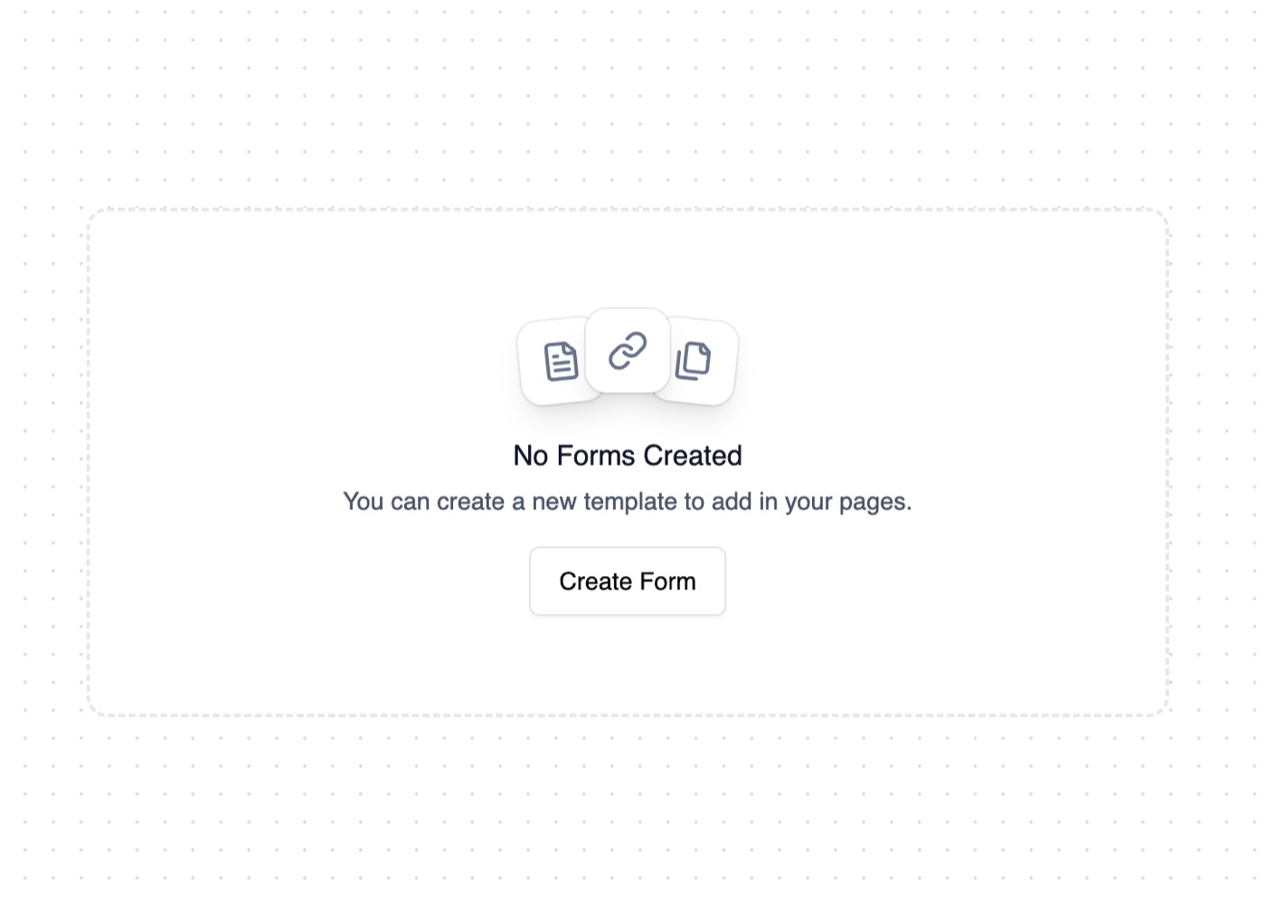
Empty State
Empty State is a complete, paste-ready component build-prompt — a full art-direction spec for Lovable, Bolt, v0, Cursor and Claude. It's free: copy it below and paste it into your builder.

Empty StateComponent · free prompt · copy-paste
Empty state card with shadcn/ui buttons.
Inspired by @AndyRyanWeir
— Install —
npx shadcn@latest add "https://21st.dev/r/empty-state"
— Component source (Empty State.tsx) —
import * as React from "react"
import { cn } from "@/lib/utils"
import { Button } from "@/components/ui/button"
import { LucideIcon } from "lucide-react"
interface EmptyStateProps {
title: string
description: string
icons?: LucideIcon[]
action?: {
label: string
onClick: () => void
}
className?: string
}
export function EmptyState({
title,
description,
icons = [],
action,
className
}: EmptyStateProps) {
return (
<div className={cn(
"bg-background border-border hover:border-border/80 text-center",
"border-2 border-dashed rounded-xl p-14 w-full max-w-[620px]",
"group hover:bg-muted/50 transition duration-500 hover:duration-200",
className
)}>
<div className="flex justify-center isolate">
{icons.length === 3 ? (
<>
<div className="bg-background size-12 grid place-items-center rounded-xl relative left-2.5 top-1.5 -rotate-6 shadow-lg ring-1 ring-border group-hover:-translate-x-5 group-hover:-rotate-12 group-hover:-translate-y-0.5 transition duration-500 group-hover:duration-200">
{React.createElement(icons[0], {
className: "w-6 h-6 text-muted-foreground"
})}
</div>
<div className="bg-background size-12 grid place-items-center rounded-xl relative z-10 shadow-lg ring-1 ring-border group-hover:-translate-y-0.5 transition duration-500 group-hover:duration-200">
{React.createElement(icons[1], {
className: "w-6 h-6 text-muted-foreground"
})}
</div>
<div className="bg-background size-12 grid place-items-center rounded-xl relative right-2.5 top-1.5 rotate-6 shadow-lg ring-1 ring-border group-hover:translate-x-5 group-hover:rotate-12 group-hover:-translate-y-0.5 transition duration-500 group-hover:duration-200">
{React.createElement(icons[2], {
className: "w-6 h-6 text-muted-foreground"
})}
</div>
</>
) : (
<div className="bg-background size-12 grid place-items-center rounded-xl shadow-lg ring-1 ring-border group-hover:-translate-y-0.5 transition duration-500 group-hover:duration-200">
{icons[0] && React.createElement(icons[0], {
className: "w-6 h-6 text-muted-foreground"
})}
</div>
)}
</div>
<h2 className="text-foreground font-medium mt-6">{title}</h2>
<p className="text-sm text-muted-foreground mt-1 whitespace-pre-line">{description}</p>
{action && (
<Button
onClick={action.onClick}
variant="outline"
className={cn(
"mt-4",
"shadow-sm active:shadow-none"
)}
>
{action.label}
</Button>
)}
</div>
)
}
Browse & preview free Unlock everything — from $19/mo