Meez.
Browse Prompts Backgrounds Pricing
Contact Sign in ·

Component · Free prompt

Expandable Chat

free · paste into Lovable, Bolt, v0, Cursor or Claude

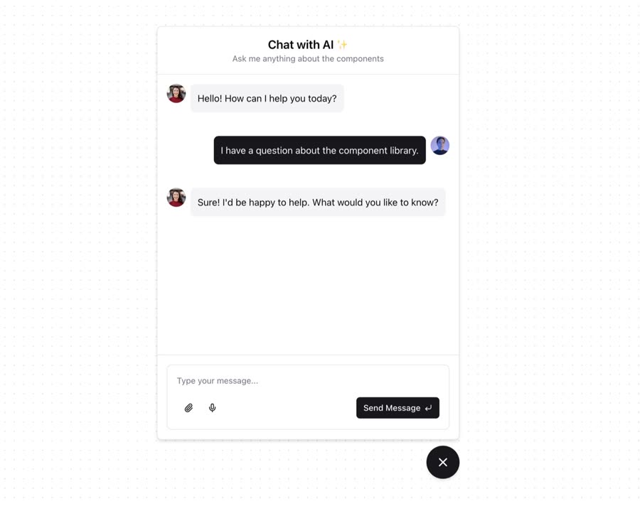
Expandable Chat is a complete, paste-ready component build-prompt — a full art-direction spec for Lovable, Bolt, v0, Cursor and Claude. It's free: copy it below and paste it into your builder.

Expandable Chat preview

“The ExpandableChat expandable-chat.tsx component gives an easily installable component for quickly creating a chat support ui feature. There's an example repository here that gives you a ready-to-use chatbot with …”

Expandable ChatComponent · free prompt · copy-paste

Prompt page

The ExpandableChat expandable-chat.tsx component gives an easily installable component for quickly creating a chat support ui feature.

There's an example repository here that gives you a ready-to-use chatbot with Vercel AI's SDK.

https://github.com/jakobhoeg/shadcn-chat/tree/master/examples/shadcn-chat-example-vercel-ai

— Install —
npx shadcn@latest add "https://21st.dev/r/expandable-chat"

— Component source (Expandable Chat.tsx) —

"use client";

import React, { useRef, useState } from "react";
import { X, MessageCircle } from "lucide-react";
import { cn } from "@/lib/utils";
import { Button } from "@/components/ui/button";

export type ChatPosition = "bottom-right" | "bottom-left";
export type ChatSize = "sm" | "md" | "lg" | "xl" | "full";

const chatConfig = {
  dimensions: {
    sm: "sm:max-w-sm sm:max-h-[500px]",
    md: "sm:max-w-md sm:max-h-[600px]",
    lg: "sm:max-w-lg sm:max-h-[700px]",
    xl: "sm:max-w-xl sm:max-h-[800px]",
    full: "sm:w-full sm:h-full",
  },
  positions: {
    "bottom-right": "bottom-5 right-5",
    "bottom-left": "bottom-5 left-5",
  },
  chatPositions: {
    "bottom-right": "sm:bottom-[calc(100%+10px)] sm:right-0",
    "bottom-left": "sm:bottom-[calc(100%+10px)] sm:left-0",
  },
  states: {
    open: "pointer-events-auto opacity-100 visible scale-100 translate-y-0",
    closed:
      "pointer-events-none opacity-0 invisible scale-100 sm:translate-y-5",
  },
};

interface ExpandableChatProps extends React.HTMLAttributes<HTMLDivElement> {
  position?: ChatPosition;
  size?: ChatSize;
  icon?: React.ReactNode;
}

const ExpandableChat: React.FC<ExpandableChatProps> = ({
  className,
  position = "bottom-right",
  size = "md",
  icon,
  children,
  ...props
}) => {
  const [isOpen, setIsOpen] = useState(false);
  const chatRef = useRef<HTMLDivElement>(null);

  const toggleChat = () => setIsOpen(!isOpen);

  return (
    <div
      className={cn(`fixed ${chatConfig.positions[position]} z-50`, className)}
      {...props}
    >
      <div
        ref={chatRef}
        className={cn(
          "flex flex-col bg-background border sm:rounded-lg shadow-md overflow-hidden transition-all duration-250 ease-out sm:absolute sm:w-[90vw] sm:h-[80vh] fixed inset-0 w-full h-full sm:inset-auto",
          chatConfig.chatPositions[position],
          chatConfig.dimensions[size],
          isOpen ? chatConfig.states.open : chatConfig.states.closed,
          className,
        )}
      >
        {children}
        <Button
          variant="ghost"
          size="icon"
          className="absolute top-2 right-2 sm:hidden"
          onClick={toggleChat}
        >
          <X className="h-4 w-4" />
        </Button>
      </div>
      <ExpandableChatToggle
        icon={icon}
        isOpen={isOpen}
        toggleChat={toggleChat}
      />
    </div>
  );
};

ExpandableChat.displayName = "ExpandableChat";

const ExpandableChatHeader: React.FC<React.HTMLAttributes<HTMLDivElement>> = ({
  className,
  ...props
}) => (
  <div
    className={cn("flex items-center justify-between p-4 border-b", className)}
    {...props}
  />
);

ExpandableChatHeader.displayName = "ExpandableChatHeader";

const ExpandableChatBody: React.FC<React.HTMLAttributes<HTMLDivElement>> = ({
  className,
  ...props
}) => <div className={cn("flex-grow overflow-y-auto", className)} {...props} />;

ExpandableChatBody.displayName = "ExpandableChatBody";

const ExpandableChatFooter: React.FC<React.HTMLAttributes<HTMLDivElement>> = ({
  className,
  ...props
}) => <div className={cn("border-t p-4", className)} {...props} />;

ExpandableChatFooter.displayName = "ExpandableChatFooter";

interface ExpandableChatToggleProps
  extends React.ButtonHTMLAttributes<HTMLButtonElement> {
  icon?: React.ReactNode;
  isOpen: boolean;
  toggleChat: () => void;
}

const ExpandableChatToggle: React.FC<ExpandableChatToggleProps> = ({
  className,
  icon,
  isOpen,
  toggleChat,
  ...props
}) => (
  <Button
    variant="default"
    onClick={toggleChat}
    className={cn(
      "w-14 h-14 rounded-full shadow-md flex items-center justify-center hover:shadow-lg hover:shadow-black/30 transition-all duration-300",
      className,
    )}
    {...props}
  >
    {isOpen ? (
      <X className="h-6 w-6" />
    ) : (
      icon || <MessageCircle className="h-6 w-6" />
    )}
  </Button>
);

ExpandableChatToggle.displayName = "ExpandableChatToggle";

export {
  ExpandableChat,
  ExpandableChatHeader,
  ExpandableChatBody,
  ExpandableChatFooter,
};

Browse & preview free → Unlock everything — from $19/mo

More like this

Animated Cards — Component website build-promptAnimated Cards Table — Component website build-promptTable Empty State — Component website build-promptEmpty State Feature Section with hover effects — Component website build-promptFeature Section with hover effects Lamp — Component website build-promptLamp World Map — Component website build-promptWorld Map
Meez.

The biggest library of AI website build-prompts & motion backgrounds — at the lowest price.

Library
Browse all Prompts by category Section prompts Motion backgrounds Pricing
Learn & contact
How it works Why AI sites look generic Terms Privacy Contact Affiliates
© Meez — an open archive. Start free · Unlimited from $19/mo · cancel anytime.