Meez.
Browse Prompts Backgrounds Pricing
Contact Sign in ·

Component · Free prompt

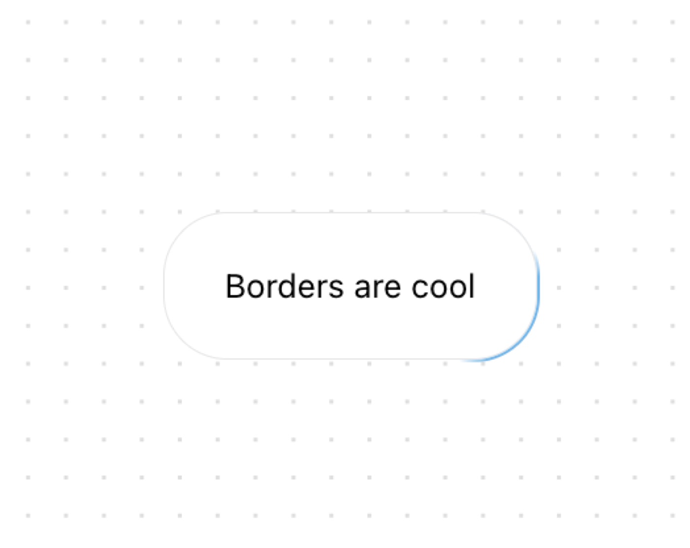
Moving Border

free · paste into Lovable, Bolt, v0, Cursor or Claude

Moving Border is a complete, paste-ready component build-prompt — a full art-direction spec for Lovable, Bolt, v0, Cursor and Claude. It's free: copy it below and paste it into your builder.

Moving Border preview

“A border that moves around the container. Perfect for making your buttons stand out. — Install — npx shadcn@latest add "https://21st.dev/r/moving-border" — Component source (Moving Border.tsx) — "use client"; import …”

Moving BorderComponent · free prompt · copy-paste

Prompt page

A border that moves around the container. Perfect for making your buttons stand out.

— Install —
npx shadcn@latest add "https://21st.dev/r/moving-border"

— Component source (Moving Border.tsx) —

"use client";
import React from "react";
import {
  motion,
  useAnimationFrame,
  useMotionTemplate,
  useMotionValue,
  useTransform,
} from "framer-motion";
import { useRef } from "react";
import { cn } from "@/lib/utils";

export function Button({
  borderRadius = "1.75rem",
  children,
  as: Component = "button",
  containerClassName,
  borderClassName,
  duration,
  className,
  ...otherProps
}: {
  borderRadius?: string;
  children: React.ReactNode;
  as?: any;
  containerClassName?: string;
  borderClassName?: string;
  duration?: number;
  className?: string;
  [key: string]: any;
}) {
  return (
    <Component
      className={cn(
        "bg-transparent relative text-xl  h-16 w-40 p-[1px] overflow-hidden ",
        containerClassName
      )}
      style={{
        borderRadius: borderRadius,
      }}
      {...otherProps}
    >
      <div
        className="absolute inset-0"
        style={{ borderRadius: `calc(${borderRadius} * 0.96)` }}
      >
        <MovingBorder duration={duration} rx="30%" ry="30%">
          <div
            className={cn(
              "h-20 w-20 opacity-[0.8] bg-[radial-gradient(var(--sky-500)_40%,transparent_60%)]",
              borderClassName
            )}
          />
        </MovingBorder>
      </div>

      <div
        className={cn(
          "relative bg-slate-900/[0.8] border border-slate-800 backdrop-blur-xl text-white flex items-center justify-center w-full h-full text-sm antialiased",
          className
        )}
        style={{
          borderRadius: `calc(${borderRadius} * 0.96)`,
        }}
      >
        {children}
      </div>
    </Component>
  );
}

export const MovingBorder = ({
  children,
  duration = 2000,
  rx,
  ry,
  ...otherProps
}: {
  children: React.ReactNode;
  duration?: number;
  rx?: string;
  ry?: string;
  [key: string]: any;
}) => {
  const pathRef = useRef<any>();
  const progress = useMotionValue<number>(0);

  useAnimationFrame((time) => {
    const length = pathRef.current?.getTotalLength();
    if (length) {
      const pxPerMillisecond = length / duration;
      progress.set((time * pxPerMillisecond) % length);
    }
  });

  const x = useTransform(
    progress,
    (val) => pathRef.current?.getPointAtLength(val).x
  );
  const y = useTransform(
    progress,
    (val) => pathRef.current?.getPointAtLength(val).y
  );

  const transform = useMotionTemplate`translateX(${x}px) translateY(${y}px) translateX(-50%) translateY(-50%)`;

  return (
    <>
      <svg
        xmlns="http://www.w3.org/2000/svg"
        preserveAspectRatio="none"
        className="absolute h-full w-full"
        width="100%"
        height="100%"
        {...otherProps}
      >
        <rect
          fill="none"
          width="100%"
          height="100%"
          rx={rx}
          ry={ry}
          ref={pathRef}
        />
      </svg>
      <motion.div
        style={{
          position: "absolute",
          top: 0,
          left: 0,
          display: "inline-block",
          transform,
        }}
      >
        {children}
      </motion.div>
    </>
  );
};

Browse & preview free → Unlock everything — from $19/mo

More like this

Animated Cards — Component website build-promptAnimated Cards Table — Component website build-promptTable Empty State — Component website build-promptEmpty State Feature Section with hover effects — Component website build-promptFeature Section with hover effects Lamp — Component website build-promptLamp World Map — Component website build-promptWorld Map
Meez.

The biggest library of AI website build-prompts & motion backgrounds — at the lowest price.

Library
Browse all Prompts by category Section prompts Motion backgrounds Pricing
Learn & contact
How it works Why AI sites look generic Terms Privacy Contact Affiliates
© Meez — an open archive. Start free · Unlimited from $19/mo · cancel anytime.