Hero Section · Free prompt
Creative Portfolio
Creative Portfolio is a complete, paste-ready hero section build-prompt — a full art-direction spec for Lovable, Bolt, v0, Cursor and Claude. It's free: copy it below and paste it into your builder.
Creative PortfolioHero Section · free prompt · copy-paste
626f6c742d63632d6167656e74Let me read all the relevant files to compile the full recreation prompt.
Here's the full recreation prompt:

---

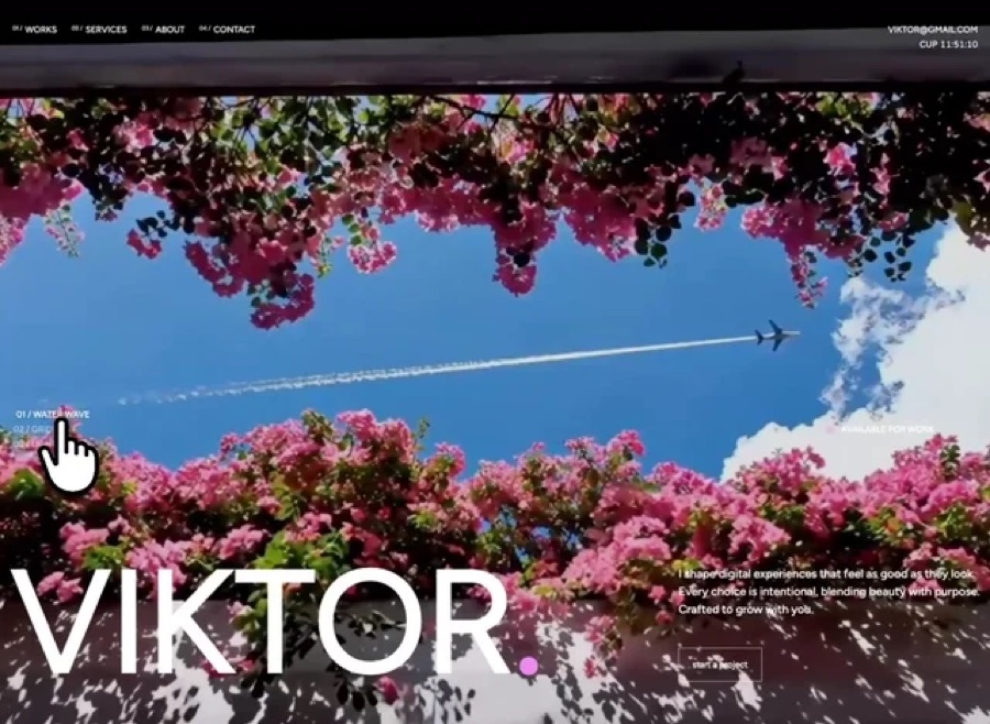
## Prompt to Recreate This Hero Section

Build a full-screen hero section for a creative portfolio using React, Vite, Tailwind CSS, and the Figtree Google Font. The page has two components: a **Navbar** and a **Hero**. No additional packages beyond `lucide-react` (though it's not used here). The entire page is black background with white text.

---

### Setup

- **Font:** Figtree (400, 500, 600) from Google Fonts, loaded in `index.html`
- **Tailwind custom breakpoints (max-width based):**
  - `mobile`: max 809.98px
  - `md-tablet`: min 810px, max 1199.98px
- **CSS variable:** `--ease-spring: cubic-bezier(0.16, 1, 0.3, 1)`

---

### Video Background

Three full-screen looping videos (muted, autoPlay, playsInline, loop) stacked absolutely with crossfade switching. All three render simultaneously; only the active one has `opacity-100`, the others have `opacity-0` with `transition-opacity duration-[1200ms] ease-in-out`.

**Video URLs (CloudFront):**
1. `https://meez.design/web/media/bg-videos/ms-dark-flowers.mp4`
2. `https://meez.design/web/media/bg-videos/ms-energy.mp4`
3. `https://meez.design/web/media/bg-videos/ms-person.mp4`

**Preloading:** On mount, fetch all videos as blobs and create object URLs for instant playback. Fall back to original URL on failure.

A `bg-black/10` overlay sits above videos at `z-[1]`.

---

### Navbar (absolute positioned, z-10, on top of hero)

- **Layout:** Centered container, max-width 1340px, `py-9 px-[15px]`
- **Left side:** Navigation items formatted as `01 / Works`, `02 / Services`, `03 / About`, `04 / Contact`
  - Index number: `text-[8px] leading-3 tracking-[-0.08px] font-medium uppercase`
  - Label: `text-xs leading-4 tracking-[-0.12px] font-medium uppercase`
  - Each link has a `.nav-link-underline` effect (underline slides in from right on hover via `scaleX` transform)
- **Right side (aligned right):** Email `Davies@gmail.com` and live clock showing `CUP HH:MM:SS` (24h format, updates every second using `Intl.DateTimeFormat('en-GB')`)
- **Mobile:** Nav items hidden, replaced by a `Menu`/`Close` toggle button. Mobile panel uses CSS Grid `grid-rows-[0fr]`/`grid-rows-[1fr]` transition (420ms, spring ease) for smooth expand/collapse. Mobile nav links are large: `text-[28px] leading-8 tracking-[-0.84px]`

---

### Hero Content (z-[2], relative)

Container: `max-w-[1340px]`, full height, flex column, `justify-end items-end`, `gap-[150px]`, `pt-[190px] px-[15px]`

**Section 1 - Video Switcher + Availability (upper area):**
- Left column (`flex-[4]`): Three buttons labeled `01 / WATER WAVE`, `02 / GRIDWAVE`, `03 / LIGHT TUNNEL`. Active button is full opacity, inactive is `opacity-55` with `hover:opacity-75`. On click, sets `activeIndex` to crossfade videos. Each has a `.role-link` class that translates 4px right on hover.
- Right column (`flex-1`): Pulsing dot + "Available for work" text. Dot is 7px circle with glow shadow and infinite pulse animation (scale 1 to 1.45, opacity 1 to 0.45, 1.6s). On slide 1, dot is `#F598F2` pink with pink glow. On slides 2-3, dot is white with white glow.

**Section 2 - Name + CTA (bottom area, pb-[60px]):**
- Left column (`flex-[2]`): Giant name "Viktor." in `text-[200px] leading-[81%] tracking-[-6px] font-medium uppercase`. The period is accent-colored: pink `#F598F2` on slide 1, white on slides 2-3. Animate in with `revealUp` (translateY 80px to 0, 0.9s spring ease).
- Right column (`flex-1`, `pl-[50px]`): Paragraph text ("I craft bold brands and modern websites with purpose...") at `text-base leading-6 tracking-[-0.16px] font-medium`. Below it, a "start a project" button (lowercase) with white border. Button has a fill-up hover effect: `::before` pseudo-element with `#F598F2` background that translateY from 101% to 0 on hover, text turns black, border turns pink. Both animate in with `revealRight` (translateX 100px to 0, 0.9s spring ease), button delayed by 0.08s.

**Reveal animations** trigger once via IntersectionObserver at 0.35 threshold.

---

### Responsive Tablet (810px-1199px)
- Navbar: `py-[30px] px-[18px]`, nav gaps shrink to `gap-4`
- Hero name: `text-[129.6px] leading-[113.4px] tracking-[-7.7px]`
- Bottom section: gap 28px, pb 52px, left padding 24px

### Responsive Mobile (<810px)
- Navbar: `py-6 px-[18px]`, desktop nav hidden, hamburger menu shown
- Hero content: `justify-end items-start gap-[72px] pt-[140px] px-[18px]`
- Switcher + availability stack vertically with `gap-7`
- Bottom section: column layout, `gap-8 pb-11`
- Name: `text-[clamp(68px,21vw,80px)] leading-[96px] tracking-[-4.8px]`
- Paragraph: `max-w-[420px]`

---

### Custom CSS Animations

```css
@keyframes videoFadeIn { from { opacity: 0 } to { opacity: 1 } }
@keyframes revealUp { from { opacity: 0; transform: translateY(80px) } to { opacity: 1; transform: translateY(0) } }
@keyframes revealRight { from { opacity: 0; transform: translateX(100px) } to { opacity: 1; transform: translateX(0) } }
@keyframes dotPulse { 0%,100% { opacity:1; transform:scale(1) } 50% { opacity:0.45; transform:scale(1.45) } }
```

### Accessibility
- `prefers-reduced-motion: reduce` disables all animations
- Semantic landmarks: `<header>`, `<main>`, `<nav>`, `<section>`
- ARIA labels on navigation regions and status elements
- Videos are `aria-hidden="true"`

---

## Source Code

<!DOCTYPE html>
<html lang="en">
<head>
  <meta charset="UTF-8" />
  <meta name="viewport" content="width=device-width, initial-scale=1.0" />
  <title>Viktor Hero</title>
  <link rel="preconnect" href="https://fonts.googleapis.com" />
  <link rel="preconnect" href="https://fonts.gstatic.com" crossorigin />
  <link href="https://fonts.googleapis.com/css2?family=Figtree:wght@400;500;600&display=swap" rel="stylesheet" />
  <style>
    *, *::before, *::after { margin: 0; padding: 0; box-sizing: border-box; }

    :root {
      --ease-spring: cubic-bezier(0.16, 1, 0.3, 1);
      --pink: #F598F2;
    }

    html, body {
      min-height: 100%;
      background: #000;
      font-family: "Figtree", sans-serif;
      overflow-x: hidden;
    }

    /* Animations */
    @keyframes revealUp {
      from { opacity: 0; transform: translateY(80px); }
      to { opacity: 1; transform: translateY(0); }
    }
    @keyframes revealRight {
      from { opacity: 0; transform: translateX(100px); }
      to { opacity: 1; transform: translateX(0); }
    }
    @keyframes dotPulse {
      0%, 100% { opacity: 1; transform: scale(1); }
      50% { opacity: 0.45; transform: scale(1.45); }
    }

    .animate-reveal-up { animation: revealUp 0.9s var(--ease-spring) 0.01s forwards; }
    .animate-reveal-right { animation: revealRight 0.9s var(--ease-spring) 0.01s forwards; }
    .animate-reveal-right-delayed { animation: revealRight 0.9s var(--ease-spring) 0.08s forwards; }
    .animate-dot-pulse { animation: dotPulse 1.6s ease-in-out infinite; }

    .hidden-before-reveal { opacity: 0; }
    .hidden-translate-y { transform: translateY(80px); }
    .hidden-translate-x { transform: translateX(100px); }

    /* Hero button */
    .hero-button {
      position: relative;
      isolation: isolate;
      display: inline-flex;
      justify-content: center;
      align-items: center;
      padding: 14px 18px;
      border: 1px solid #fff;
      color: #fff;
      background: transparent;
      overflow: hidden;
      font-family: "Figtree", sans-serif;
      font-size: 12px;
      line-height: 16px;
      letter-spacing: -0.12px;
      font-weight: 500;
      text-transform: lowercase;
      text-decoration: none;
      transition: color 260ms ease;
      cursor: pointer;
    }
    .hero-button::before {
      content: "";
      position: absolute;
      inset: 0;
      background: var(--pink);
      transform: translateY(101%);
      transition: transform 360ms var(--ease-spring);
      z-index: -1;
    }
    .hero-button:hover { color: #000; border-color: var(--pink); }
    .hero-button:hover::before { transform: translateY(0); }

    /* Role links */
    .role-link {
      font-family: "Figtree", sans-serif;
      font-size: 12px;
      line-height: 16px;
      letter-spacing: -0.12px;
      font-weight: 500;
      text-transform: uppercase;
      color: #fff;
      background: transparent;
      border: 0;
      padding: 0;
      cursor: pointer;
      transition: opacity 220ms ease, transform 220ms ease;
    }
    .role-link:hover { opacity: 1 !important; transform: translateX(4px); }
    .role-link.active { opacity: 1; }
    .role-link.inactive { opacity: 0.55; }
    .role-link.inactive:hover { opacity: 0.75; }

    /* Nav link underline */
    .nav-link-underline {
      position: relative;
      text-decoration: none;
      color: #fff;
      transition: opacity 220ms var(--ease-spring), transform 220ms var(--ease-spring);
    }
    .nav-link-underline::after {
      content: "";
      position: absolute;
      left: 0;
      bottom: -2px;
      width: 100%;
      height: 1px;
      background: currentColor;
      transform: scaleX(0);
      transform-origin: right;
      transition: transform 320ms var(--ease-spring);
    }
    .nav-link-underline:hover { opacity: 0.72; }
    .nav-link-underline:hover::after { transform: scaleX(1); transform-origin: left; }

    /* Videos */
    .video-bg {
      position: absolute;
      inset: 0;
      width: 100%;
      height: 100%;
      object-fit: cover;
      z-index: 0;
      transition: opacity 1200ms ease-in-out;
    }
    .video-bg.hidden-video { opacity: 0; }
    .video-bg.visible-video { opacity: 1; }

    /* Layout */
    .hero-main {
      position: relative;
      width: 100%;
      height: 100vh;
      overflow: hidden;
      display: flex;
      flex-direction: column;
      justify-content: center;
      align-items: center;
      background: #000;
      color: #fff;
    }
    .overlay {
      position: absolute;
      inset: 0;
      background: rgba(0,0,0,0.1);
      z-index: 1;
      pointer-events: none;
    }
    .content {
      position: relative;
      z-index: 2;
      width: 100%;
      max-width: 1340px;
      height: 100vh;
      display: flex;
      flex-direction: column;
      justify-content: flex-end;
      align-items: flex-end;
      gap: 150px;
      padding: 190px 15px 0;
    }

    /* Middle row */
    .middle-row {
      width: 100%;
      display: flex;
      flex-direction: row;
      justify-content: space-between;
      align-items: center;
      padding: 0 6px;
    }
    .roles-nav {
      flex: 4;
      display: flex;
      flex-direction: column;
      justify-content: center;
      align-items: flex-start;
      gap: 4px;
      position: relative;
      z-index: 2;
    }
    .availability {
      flex: 1;
      display: flex;
      justify-content: center;
      align-items: center;
      gap: 12px;
      position: relative;
      z-index: 2;
    }
    .dot {
      width: 7px;
      height: 7px;
      border-radius: 50%;
      flex-shrink: 0;
    }
    .dot.pink {
      background: var(--pink);
      box-shadow: 0 0 16px rgba(245, 152, 242, 0.85);
    }
    .dot.white {
      background: #fff;
      box-shadow: 0 0 16px rgba(255, 255, 255, 0.85);
    }
    .availability-text {
      font-size: 12px;
      line-height: 16px;
      letter-spacing: -0.12px;
      font-weight: 500;
      text-transform: uppercase;
      color: #fff;
      white-space: nowrap;
    }

    /* Banner row */
    .banner-row {
      width: 100%;
      display: flex;
      flex-direction: row;
      justify-content: space-between;
      align-items: flex-end;
      gap: 37px;
      padding-bottom: 60px;
      position: relative;
      z-index: 2;
    }
    .name-col {
      flex: 2;
      display: flex;
      justify-content: flex-end;
      align-items: flex-end;
      min-width: 0;
    }
    .name-col h1 {
      width: 100%;
      margin: 0;
      font-family: "Figtree", sans-serif;
      font-size: 200px;
      line-height: 81%;
      letter-spacing: -6px;
      font-weight: 500;
      text-transform: uppercase;
      color: #fff;
      text-align: left;
      white-space: nowrap;
    }
    .name-col h1 .accent { transition: color 400ms ease; }
    .name-col h1 .accent.pink { color: var(--pink); }
    .name-col h1 .accent.white { color: #fff; }

    .info-col {
      flex: 1;
      min-width: 0;
      display: flex;
      flex-direction: row;
      justify-content: center;
      align-items: center;
      gap: 10px;
      padding-left: 50px;
    }
    .info-inner {
      flex: 1;
      min-width: 0;
      display: flex;
      flex-direction: column;
      justify-content: flex-start;
      align-items: flex-start;
      gap: 40px;
    }
    .info-inner p {
      margin: 0;
      width: 100%;
      font-family: "Figtree", sans-serif;
      font-size: 16px;
      line-height: 24px;
      letter-spacing: -0.16px;
      font-weight: 500;
      text-align: left;
      color: #fff;
    }

    /* Navbar */
    .navbar {
      position: absolute;
      top: 0;
      left: 0;
      width: 100%;
      z-index: 10;
      display: flex;
      flex-direction: column;
      align-items: center;
      justify-content: flex-start;
      gap: 10px;
      padding: 36px 15px;
      overflow: hidden;
      color: #fff;
    }
    .navbar-inner {
      width: 100%;
      max-width: 1340px;
      display: flex;
      flex-direction: row;
      align-items: flex-start;
      justify-content: flex-start;
      gap: 10px;
      overflow: hidden;
    }
    .nav-left {
      flex: 2;
      min-width: 0;
      display: flex;
      flex-direction: row;
      align-items: flex-start;
      justify-content: flex-start;
      gap: 77px;
      padding-left: 6px;
      overflow: hidden;
    }
    .nav-links {
      flex: 1;
      min-width: 0;
      display: flex;
      flex-direction: row;
      align-items: flex-start;
      justify-content: flex-start;
      gap: 20px;
      overflow: hidden;
    }
    .nav-item {
      display: flex;
      flex-direction: row;
      align-items: flex-start;
      justify-content: flex-start;
      gap: 4px;
      white-space: nowrap;
    }
    .nav-item .index {
      font-family: "Figtree", sans-serif;
      font-size: 8px;
      line-height: 12px;
      letter-spacing: -0.08px;
      font-weight: 500;
      text-transform: uppercase;
      color: #fff;
    }
    .nav-item a {
      font-family: "Figtree", sans-serif;
      font-size: 12px;
      line-height: 16px;
      letter-spacing: -0.12px;
      font-weight: 500;
      text-transform: uppercase;
      white-space: nowrap;
    }
    .nav-right {
      flex: 1;
      min-width: 0;
      display: flex;
      flex-direction: row;
      align-items: flex-start;
      justify-content: flex-end;
      gap: 10px;
      padding-right: 6px;
      padding-bottom: 8px;
      overflow: hidden;
    }
    .nav-right-inner {
      flex: 1;
      min-width: 0;
      display: flex;
      flex-direction: column;
      align-items: flex-end;
      justify-content: flex-start;
      gap: 4px;
      overflow: hidden;
    }
    .nav-right-inner a {
      font-family: "Figtree", sans-serif;
      font-size: 12px;
      line-height: 16px;
      letter-spacing: -0.12px;
      font-weight: 500;
      text-transform: uppercase;
      white-space: nowrap;
    }
    .time-row {
      display: flex;
      flex-direction: row;
      align-items: center;
      justify-content: center;
      gap: 4px;
      white-space: nowrap;
    }
    .time-row span {
      font-family: "Figtree", sans-serif;
      font-size: 12px;
      line-height: 16px;
      letter-spacing: -0.12px;
      font-weight: 500;
      text-transform: uppercase;
      color: #fff;
      font-variant-numeric: tabular-nums;
    }

    /* Mobile menu button */
    .menu-btn {
      display: none;
      border: 0;
      padding: 0;
      background: transparent;
      appearance: none;
      font-family: "Figtree", sans-serif;
      font-size: 12px;
      line-height: 16px;
      letter-spacing: -0.12px;
      font-weight: 500;
      text-transform: uppercase;
      color: #fff;
      white-space: nowrap;
      cursor: pointer;
    }

    /* Mobile panel */
    .mobile-panel {
      display: none;
      width: 100%;
      max-width: 1340px;
      overflow: hidden;
      transition: grid-template-rows 420ms var(--ease-spring);
    }
    .mobile-panel.open { grid-template-rows: 1fr; }
    .mobile-panel.closed { grid-template-rows: 0fr; }
    .mobile-panel-inner {
      min-height: 0;
      overflow: hidden;
    }
    .mobile-nav {
      display: flex;
      flex-direction: column;
      gap: 12px;
      padding-top: 28px;
    }
    .mobile-nav .nav-item a {
      font-size: 28px;
      line-height: 32px;
      letter-spacing: -0.84px;
    }
    .mobile-nav .nav-item .index { padding-top: 3px; }
    .mobile-info {
      display: flex;
      flex-direction: column;
      gap: 4px;
      padding-top: 28px;
    }

    /* Tablet: 810px - 1199px */
    @media (max-width: 1199.98px) and (min-width: 810px) {
      .navbar { padding: 30px 18px; }
      .nav-left { gap: 48px; }
      .nav-links { gap: 16px; }
      .content { gap: 120px; padding-top: 170px; padding-left: 24px; padding-right: 24px; }
      .banner-row { gap: 28px; padding-bottom: 52px; }
      .info-col { padding-left: 24px; }
      .name-col h1 { font-size: 129.6px; line-height: 113.4px; letter-spacing: -7.7px; }
      .info-inner p { font-size: 15px; line-height: 23px; }
    }

    /* Mobile: <810px */
    @media (max-width: 809.98px) {
      .navbar { padding: 24px 18px; overflow: visible; }
      .navbar-inner { justify-content: space-between; overflow: visible; }
      .nav-left { flex: 1; gap: 0; padding-left: 0; }
      .nav-links { display: none; }
      .nav-right { flex: initial; width: auto; padding: 0; overflow: visible; }
      .nav-right-inner { display: none; }
      .menu-btn { display: inline-flex; }
      .mobile-panel { display: grid; }

      .content {
        justify-content: flex-end;
        align-items: flex-start;
        gap: 72px;
        padding: 140px 18px 0;
      }
      .middle-row {
        flex-direction: column;
        align-items: flex-start;
        justify-content: flex-start;
        gap: 28px;
        padding: 0;
      }
      .availability { justify-content: flex-start; }
      .banner-row {
        flex-direction: column;
        align-items: flex-start;
        justify-content: flex-end;
        gap: 32px;
        padding-bottom: 44px;
      }
      .name-col { width: 100%; flex: initial; }
      .name-col h1 {
        font-size: clamp(68px, 21vw, 80px);
        line-height: 96px;
        letter-spacing: -4.8px;
      }
      .info-col {
        width: 100%;
        flex: initial;
        flex-direction: column;
        align-items: flex-start;
        justify-content: flex-start;
        gap: 22px;
        padding-left: 0;
      }
      .info-inner { width: 100%; flex: initial; gap: 28px; }
      .info-inner p { max-width: 420px; }
    }

    @media (prefers-reduced-motion: reduce) {
      *, *::before, *::after {
        animation-duration: 1ms !important;
        animation-iteration-count: 1 !important;
        scroll-behavior: auto !important;
        transition-duration: 1ms !important;
      }
    }
  </style>
</head>
<body>

  <!-- Navbar -->
  <header class="navbar">
    <div class="navbar-inner">
      <div class="nav-left">
        <nav class="nav-links" aria-label="Primary navigation">
          <div class="nav-item">
            <span class="index">01 /</span>
            <a href="/" class="nav-link-underline">Works</a>
          </div>
          <div class="nav-item">
            <span class="index">02 /</span>
            <a href="/" class="nav-link-underline">Services</a>
          </div>
          <div class="nav-item">
            <span class="index">03 /</span>
            <a href="/" class="nav-link-underline">About</a>
          </div>
          <div class="nav-item">
            <span class="index">04 /</span>
            <a href="/" class="nav-link-underline">Contact</a>
          </div>
        </nav>
      </div>
      <div class="nav-right">
        <div class="nav-right-inner">
          <a href="mailto:Viktor@gmail.com" class="nav-link-underline">Viktor@gmail.com</a>
          <div class="time-row" aria-label="Current time">
            <span>CUP</span>
            <span id="clock">00:00:00</span>
          </div>
        </div>
        <button class="menu-btn nav-link-underline" type="button" id="menuBtn">Menu</button>
      </div>
    </div>
    <div class="mobile-panel closed" id="mobilePanel">
      <div class="mobile-panel-inner">
        <nav class="mobile-nav" aria-label="Mobile navigation">
          <div class="nav-item">
            <span class="index">01 /</span>
            <a href="/" class="nav-link-underline">Works</a>
          </div>
          <div class="nav-item">
            <span class="index">02 /</span>
            <a href="/" class="nav-link-underline">Services</a>
          </div>
          <div class="nav-item">
            <span class="index">03 /</span>
            <a href="/" class="nav-link-underline">About</a>
          </div>
          <div class="nav-item">
            <span class="index">04 /</span>
            <a href="/" class="nav-link-underline">Contact</a>
          </div>
        </nav>
        <div class="mobile-info">
          <a href="mailto:Viktor@gmail.com" class="nav-link-underline" style="font-family:'Figtree',sans-serif;font-size:12px;line-height:16px;letter-spacing:-0.12px;font-weight:500;text-transform:uppercase;white-space:nowrap;">Viktor@gmail.com</a>
          <div class="time-row" style="width:fit-content;">
            <span>CUP</span>
            <span id="clockMobile">00:00:00</span>
          </div>
        </div>
      </div>
    </div>
  </header>

  <!-- Hero -->
  <main class="hero-main" id="heroMain" aria-label="Portfolio hero">
    <video class="video-bg visible-video" id="video0" src="https://meez.design/web/media/bg-videos/ms-nature-nice.mp4" autoplay muted loop playsinline preload="auto" aria-hidden="true"></video>
    <video class="video-bg hidden-video" id="video1" src="https://meez.design/web/media/bg-videos/ms-3d.mp4" autoplay muted loop playsinline preload="auto" aria-hidden="true"></video>
    <video class="video-bg hidden-video" id="video2" src="https://meez.design/web/media/bg-videos/ms-nature.mp4" autoplay muted loop playsinline preload="auto" aria-hidden="true"></video>

    <div class="overlay" aria-hidden="true"></div>

    <section class="content">
      <!-- Middle: roles + availability -->
      <div class="middle-row">
        <nav class="roles-nav" aria-label="Hero variants">
          <button class="role-link active" type="button" data-index="0">01 / WATER WAVE</button>
          <button class="role-link inactive" type="button" data-index="1">02 / GRIDWAVE</button>
          <button class="role-link inactive" type="button" data-index="2">03 / LIGHT TUNNEL</button>
        </nav>
        <div class="availability" aria-label="Availability status">
          <span class="dot pink animate-dot-pulse" id="statusDot" aria-hidden="true"></span>
          <span class="availability-text">Available for work</span>
        </div>
      </div>

      <!-- Banner: name + copy -->
      <div class="banner-row">
        <div class="name-col hidden-before-reveal hidden-translate-y" id="nameCol">
          <h1>Viktor<span class="accent pink" id="accentDot">.</span></h1>
        </div>
        <div class="info-col">
          <div class="info-inner">
            <p class="hidden-before-reveal hidden-translate-x" id="infoParagraph">I shape digital experiences that feel as good as they look. Every choice is intentional, blending beauty with purpose. Crafted to grow with you.</p>
            <a href="/" class="hero-button hidden-before-reveal hidden-translate-x" id="heroBtn">start a project</a>
          </div>
        </div>
      </div>
    </section>
  </main>

  <script>
    (function() {
      // Clock
      function updateClock() {
        const now = new Date();
        const time = new Intl.DateTimeFormat('en-GB', {
          hour: '2-digit', minute: '2-digit', second: '2-digit', hour12: false
        }).format(now);
        document.getElementById('clock').textContent = time;
        const mobile = document.getElementById('clockMobile');
        if (mobile) mobile.textContent = time;
      }
      updateClock();
      setInterval(updateClock, 1000);

      // Mobile menu
      const menuBtn = document.getElementById('menuBtn');
      const mobilePanel = document.getElementById('mobilePanel');
      let menuOpen = false;
      menuBtn.addEventListener('click', function() {
        menuOpen = !menuOpen;
        menuBtn.textContent = menuOpen ? 'Close' : 'Menu';
        mobilePanel.classList.toggle('open', menuOpen);
        mobilePanel.classList.toggle('closed', !menuOpen);
      });

      // Video switching
      let activeIndex = 0;
      const videos = [
        document.getElementById('video0'),
        document.getElementById('video1'),
        document.getElementById('video2')
      ];
      const roleButtons = document.querySelectorAll('.role-link');
      const statusDot = document.getElementById('statusDot');
      const accentDot = document.getElementById('accentDot');

      function setActive(index) {
        if (index === activeIndex) return;
        activeIndex = index;

        videos.forEach(function(v, i) {
          v.classList.toggle('visible-video', i === activeIndex);
          v.classList.toggle('hidden-video', i !== activeIndex);
        });

        roleButtons.forEach(function(btn, i) {
          btn.classList.toggle('active', i === activeIndex);
          btn.classList.toggle('inactive', i !== activeIndex);
        });

        if (activeIndex === 0) {
          statusDot.classList.add('pink');
          statusDot.classList.remove('white');
          accentDot.classList.add('pink');
          accentDot.classList.remove('white');
        } else {
          statusDot.classList.remove('pink');
          statusDot.classList.add('white');
          accentDot.classList.remove('pink');
          accentDot.classList.add('white');
        }
      }

      roleButtons.forEach(function(btn) {
        btn.addEventListener('click', function() {
          setActive(parseInt(btn.getAttribute('data-index')));
        });
      });

      // Reveal on scroll (IntersectionObserver)
      const heroMain = document.getElementById('heroMain');
      const nameCol = document.getElementById('nameCol');
      const infoParagraph = document.getElementById('infoParagraph');
      const heroBtn = document.getElementById('heroBtn');

      const observer = new IntersectionObserver(function(entries) {
        entries.forEach(function(entry) {
          if (entry.isIntersecting) {
            nameCol.classList.remove('hidden-before-reveal', 'hidden-translate-y');
            nameCol.classList.add('animate-reveal-up');

            infoParagraph.classList.remove('hidden-before-reveal', 'hidden-translate-x');
            infoParagraph.classList.add('animate-reveal-right');

            heroBtn.classList.remove('hidden-before-reveal', 'hidden-translate-x');
            heroBtn.classList.add('animate-reveal-right-delayed');

            observer.unobserve(entry.target);
          }
        });
      }, { threshold: 0.35 });

      observer.observe(heroMain);

      // Preload videos as blobs for smoother playback
      var videoUrls = [
        'https://meez.design/web/media/bg-videos/222_1-1.mp4',
        'https://meez.design/web/media/bg-videos/224_1niceimage.mp4',
        'https://meez.design/web/media/bg-videos/225_38.mp4'
      ];
      videoUrls.forEach(function(url, i) {
        fetch(url).then(function(res) { return res.blob(); }).then(function(blob) {
          videos[i].src = URL.createObjectURL(blob);
        }).catch(function() {});
      });
    })();
  </script>
</body>
</html>
Browse & preview free Unlock everything — from $49/mo