Form · Free prompt
Tag Input
Tag Input is a complete, paste-ready form build-prompt — a full art-direction spec for Lovable, Bolt, v0, Cursor and Claude. It's free: copy it below and paste it into your builder.

Tag InputForm · free prompt · copy-paste
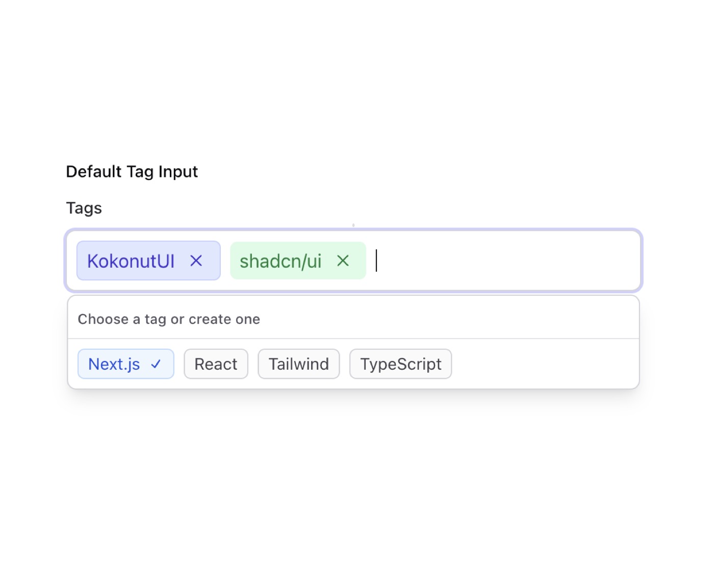
A sophisticated tag input component with suggestions, autocomplete, and custom styling. Built with React and Tailwind CSS, supporting both light and dark themes.
Features
- Tag Management
- Add/remove tags
- Maximum tags limit
- Custom tag colors
- Default tags support
- Tag suggestions
- Interactive UI
- Autocomplete dropdown
- Keyboard navigation
- Clear button for each tag
- Custom tag styling
- Smooth animations
— Install —
npx shadcn@latest add "https://21st.dev/r/tag-input"
— Component source (Tag Input.tsx) —
"use client";
import { useState, useRef } from "react";
import { cn } from "@/lib/utils";
import { useTags } from "@/components/hooks/use-tags";
import { useOnClickOutside } from "@/components/hooks/use-click-outside";
import { Cross2Icon, CheckIcon, PlusIcon } from "@radix-ui/react-icons";
interface Tag {
id: string;
label: string;
color?: string;
}
interface TagInputProps {
onChange?: (tags: Array<Tag>) => void;
defaultTags?: Array<Tag>;
suggestions?: Array<Tag>;
maxTags?: number;
label?: string;
placeholder?: string;
error?: string;
}
const defaultKokonutTag: Tag = {
id: "kokonut-ui",
label: "KokonutUI",
color:
"bg-indigo-100 text-indigo-700 border border-indigo-200 dark:bg-indigo-900/30 dark:text-indigo-300 dark:border-indigo-700/30",
};
const tagStyles = {
base: "inline-flex items-center gap-1.5 px-2 py-0.5 text-sm rounded-md transition-colors duration-150",
colors: {
blue: "bg-blue-50 text-blue-700 border border-blue-200 hover:border-blue-300 dark:bg-blue-900/30 dark:text-blue-300 dark:border-blue-700/30 dark:hover:border-blue-600/50",
purple:
"bg-purple-50 text-purple-700 border border-purple-200 hover:border-purple-300 dark:bg-purple-900/30 dark:text-purple-300 dark:border-purple-700/30 dark:hover:border-purple-600/50",
green:
"bg-green-50 text-green-700 border border-green-200 hover:border-green-300 dark:bg-green-900/30 dark:text-green-300 dark:border-green-700/30 dark:hover:border-green-600/50",
},
};
function TagInput({
onChange,
defaultTags = [defaultKokonutTag], // Set KokonutUI as default
suggestions = [
{ id: "nextjs", label: "Next.js" },
{ id: "react", label: "React" },
{ id: "tailwind", label: "Tailwind" },
],
maxTags = 10,
label = "Tags",
placeholder = "Add tags...",
error,
}: TagInputProps) {
const { tags, addTag, removeTag, removeLastTag } = useTags({
onChange,
defaultTags,
maxTags,
});
const [input, setInput] = useState("");
const [isOpen, setIsOpen] = useState(false);
const [selectedIndex, setSelectedIndex] = useState(0);
const inputRef = useRef<HTMLInputElement>(null);
const containerRef = useRef<HTMLDivElement>(null);
const filteredSuggestions = suggestions
.filter(
(suggestion: Tag) =>
typeof suggestion.label === "string" &&
typeof input === "string" &&
suggestion.label.toLowerCase().indexOf(input.toLowerCase()) >= 0 &&
!tags.some((tag: Tag) => tag.id === suggestion.id)
)
.slice(0, 5);
const canAddNewTag =
input.length > 0 &&
!suggestions.some((s) => s.label.toLowerCase() === input.toLowerCase());
function handleKeyDown(e: React.KeyboardEvent) {
if (e.key === "Backspace" && input === "" && tags.length > 0) {
removeLastTag();
} else if (e.key === "Enter" && input) {
e.preventDefault();
if (isOpen && filteredSuggestions[selectedIndex]) {
addTag(filteredSuggestions[selectedIndex]);
setInput("");
setIsOpen(false);
} else if (canAddNewTag) {
addTag({ id: input, label: input });
setInput("");
setIsOpen(false);
}
} else if (e.key === "Escape") {
setIsOpen(false);
}
}
useOnClickOutside(containerRef, () => setIsOpen(false));
return (
<div
className="w-full max-w-full sm:max-w-2xl space-y-2"
ref={containerRef}
>
{label && (
<label
className="text-sm font-medium text-zinc-800 dark:text-zinc-200"
htmlFor={label}
>
{label}
</label>
)}
<div
className={cn(
"min-h-[3rem] sm:min-h-[2.5rem] p-2 sm:p-1.5",
"rounded-lg border",
"border-zinc-300 dark:border-zinc-700",
"bg-white dark:bg-zinc-900",
"focus-within:ring-2 focus-within:ring-indigo-500/30 dark:focus-within:ring-indigo-400/30",
"flex items-center flex-row flex-wrap gap-2 sm:gap-1.5 relative"
)}
>
{tags.map((tag) => (
<span
key={tag.id}
className={cn(
tagStyles.base,
"text-base sm:text-sm py-1 sm:py-0.5",
tag.color || tagStyles.colors.blue
)}
>
{tag.label}
<button
type="button"
onClick={() => removeTag(tag.id)}
className={cn(
"text-current/60 hover:text-current transition-colors",
"p-1 sm:p-0"
)}
>
<Cross2Icon className="w-4 h-4 sm:w-3.5 sm:h-3.5" />
</button>
</span>
))}
<input
ref={inputRef}
type="text"
value={input}
onChange={(e) => {
setInput(e.target.value);
setIsOpen(true);
setSelectedIndex(0);
}}
onFocus={() => setIsOpen(true)}
onKeyDown={handleKeyDown}
placeholder={tags.length === 0 ? placeholder : ""}
className={cn(
"flex-1 min-w-[140px] sm:min-w-[120px] bg-transparent",
"h-8 sm:h-7",
"text-base sm:text-sm",
"text-zinc-900 dark:text-zinc-100",
"placeholder:text-zinc-500 dark:placeholder:text-zinc-400",
"focus:outline-none"
)}
/>
{isOpen && (input || filteredSuggestions.length > 0) && (
<div
className={cn(
"absolute left-0 right-0 top-full mt-1 z-50",
"max-h-[60vh] sm:max-h-[300px] overflow-y-auto",
"bg-white dark:bg-zinc-900",
"border border-zinc-300 dark:border-zinc-700",
"rounded-lg shadow-lg dark:shadow-zinc-950/50",
"overflow-hidden"
)}
>
<div className="px-2 py-1.5 border-b border-zinc-200 dark:border-zinc-800">
<span className="text-xs font-medium text-zinc-600 dark:text-zinc-300">
Choose a tag or create one
</span>
</div>
<div className="p-2 sm:p-1.5 flex flex-wrap gap-2 sm:gap-1.5">
{filteredSuggestions.map((suggestion, index) => (
<button
type="button"
key={suggestion.id}
onClick={() => {
addTag(suggestion);
setInput("");
setIsOpen(false);
}}
className={cn(
tagStyles.base,
selectedIndex === index
? tagStyles.colors.blue
: "bg-zinc-50 text-zinc-700 border border-zinc-300 hover:border-zinc-400 dark:bg-zinc-800/50 dark:text-zinc-300 dark:border-zinc-700 dark:hover:border-zinc-600"
)}
>
{suggestion.label}
{selectedIndex === index && (
<CheckIcon className="w-3.5 h-3.5" />
)}
</button>
))}
{canAddNewTag && (
<button
type="button"
onClick={() => {
const colorKeys = Object.keys(tagStyles.colors) as Array<
keyof typeof tagStyles.colors
>;
const randomColor =
tagStyles.colors[
colorKeys[Math.floor(Math.random() * colorKeys.length)]
];
addTag({
id: input,
label: input,
color: randomColor,
});
setInput("");
setIsOpen(false);
}}
className={cn(
tagStyles.base,
selectedIndex === filteredSuggestions.length
? tagStyles.colors.blue
: "bg-zinc-50 text-zinc-700 border border-zinc-300 hover:border-zinc-400 dark:bg-zinc-800/50 dark:text-zinc-300 dark:border-zinc-700 dark:hover:border-zinc-600"
)}
>
<PlusIcon className="w-3.5 h-3.5" />
Create "{input}"
</button>
)}
</div>
</div>
)}
</div>
{error && (
<p className="text-sm text-red-600 dark:text-red-400">{error}</p>
)}
</div>
);
}
export { TagInput };
Browse & preview free Unlock everything — from $19/mo