Meez.
Browse Prompts Backgrounds Pricing
Contact Sign in ·

Form · Free prompt

Nested Dialog

free · paste into Lovable, Bolt, v0, Cursor or Claude

Nested Dialog is a complete, paste-ready form build-prompt — a full art-direction spec for Lovable, Bolt, v0, Cursor and Claude. It's free: copy it below and paste it into your builder.

Nested Dialog preview

“A versatile and accessible nested dialog component that enables stacking multiple dialogs within each other. Perfect for complex user interactions like payment flows, multi-step forms, or any scenario requiring …”

Nested DialogForm · free prompt · copy-paste

Prompt page

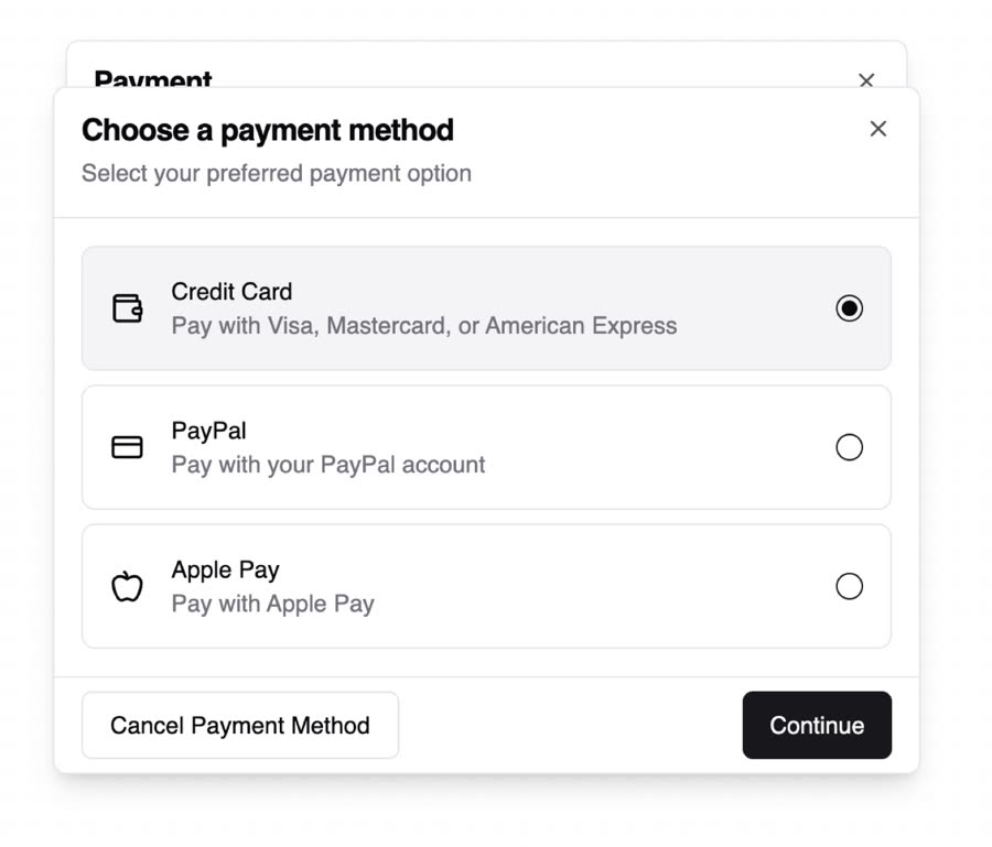
A versatile and accessible nested dialog component that enables stacking multiple dialogs within each other. Perfect for complex user interactions like payment flows, multi-step forms, or any scenario requiring hierarchical modal interfaces.

Features
- Nested Dialog Support: Stack multiple dialogs with proper focus management and keyboard navigation
- Responsive Design: Fully responsive layout that works seamlessly on mobile and desktop
- Keyboard Accessibility: Full keyboard navigation support with ESC key handling for nested dialogs
- Customizable Positioning: Support for different dialog positions (top, bottom, left, right)
- Shadcn/UI Integration: Built with shadcn/ui components for consistent styling
- Animation Support: Smooth enter/exit animations for both parent and child dialogs
- Type-Safe: Written in TypeScript with full type safety

Example Use Cases
- Payment Flows: Multi-step payment processes with method selection
- Settings Panels: Nested configuration options
- Form Wizards: Multi-step form processes
- Confirmation Dialogs: Nested confirmation within existing dialogs
- Detail Views: Showing detailed information without leaving the current context

— Install —
npx shadcn@latest add "https://21st.dev/r/nested-dialog"

— Component source (Nested Dialog.tsx) —

"use client";

import * as React from "react";
import * as DialogPrimitive from "@radix-ui/react-dialog";
import { X } from "lucide-react";
import { cn } from "@/lib/utils";

interface DialogContextValue {
  innerOpen: boolean;
  setInnerOpen: React.Dispatch<React.SetStateAction<boolean>>;
}

const DialogContext = React.createContext<DialogContextValue | undefined>(
  undefined
);

function Dialog({ children }: { children: React.ReactNode }) {
  const [outerOpen, setOuterOpen] = React.useState(false);
  const [innerOpen, setInnerOpen] = React.useState(false);
  return (
    <DialogContext.Provider value={{ innerOpen, setInnerOpen }}>
      <DialogPrimitive.Root open={outerOpen} onOpenChange={setOuterOpen}>
        {children}
      </DialogPrimitive.Root>
    </DialogContext.Provider>
  );
}

const DialogTrigger = DialogPrimitive.Trigger;
const DialogPortal = DialogPrimitive.Portal;
const DialogClose = DialogPrimitive.Close;
const DialogOverlay = React.forwardRef<
  React.ElementRef<typeof DialogPrimitive.Overlay>,
  React.ComponentPropsWithoutRef<typeof DialogPrimitive.Overlay>
>(({ className, ...props }, ref) => (
  <DialogPrimitive.Overlay
    ref={ref}
    className={cn(
      "fixed inset-0 z-50 bg-background/40 backdrop-blur-sm data-[state=open]:animate-in data-[state=closed]:animate-out data-[state=closed]:fade-out-0 data-[state=open]:fade-in-0",
      className
    )}
    {...props}
  />
));
DialogOverlay.displayName = DialogPrimitive.Overlay.displayName;

const DialogContent = React.forwardRef<
  React.ElementRef<typeof DialogPrimitive.Content>,
  React.ComponentPropsWithoutRef<typeof DialogPrimitive.Content>
>(({ className, children, ...props }, ref) => {
  const context = React.useContext(DialogContext);
  if (!context) throw new Error("DialogContent must be used within a Dialog");
  return (
    <DialogPortal>
      <DialogOverlay />
      <DialogPrimitive.Content
        ref={ref}
        className={cn(
          "fixed left-[50%] top-[50%] z-50 grid w-full max-w-lg translate-x-[-50%] translate-y-[-50%] gap-4 rounded-lg border bg-background p-6 shadow-lg duration-200 data-[state=open]:animate-in data-[state=closed]:animate-out data-[state=closed]:fade-out-0 data-[state=open]:fade-in-0 data-[state=closed]:zoom-out-95 data-[state=open]:zoom-in-95 data-[state=closed]:slide-out-to-left-1/2 data-[state=closed]:slide-out-to-top-[48%] data-[state=open]:slide-in-from-left-1/2 data-[state=open]:slide-in-from-top-[48%] sm:rounded-lg",
          context.innerOpen && "translate-y-[-55%] scale-[0.97]",
          className
        )}
        {...props}
      >
        {children}
        <DialogClose className="absolute right-4 top-4 rounded-sm opacity-70 ring-offset-background transition-opacity hover:opacity-100 focus:outline-none focus:ring-2 focus:ring-ring focus:ring-offset-2 disabled:pointer-events-none data-[state=open]:bg-accent data-[state=open]:text-muted-foreground">
          <X className="h-4 w-4" />
          <span className="sr-only">Close</span>
        </DialogClose>
      </DialogPrimitive.Content>
    </DialogPortal>
  );
});
DialogContent.displayName = DialogPrimitive.Content.displayName;

function InnerDialog({ children }: { children: React.ReactNode }) {
  const context = React.useContext(DialogContext);
  if (!context) throw new Error("InnerDialog must be used within a Dialog");
  React.useEffect(() => {
    const handleEscapeKeyDown = (event: KeyboardEvent) => {
      if (event.key === "Escape" && context.innerOpen) {
        context.setInnerOpen(false);
        event.stopPropagation();
      }
    };
    document.addEventListener("keydown", handleEscapeKeyDown);
    return () => {
      document.removeEventListener("keydown", handleEscapeKeyDown);
    };
  }, [context.innerOpen, context.setInnerOpen]);
  return (
    <DialogPrimitive.Root
      open={context.innerOpen}
      onOpenChange={context.setInnerOpen}
    >
      {children}
    </DialogPrimitive.Root>
  );
}

const InnerDialogTrigger = DialogPrimitive.Trigger;

interface InnerDialogContentProps
  extends React.ComponentPropsWithoutRef<typeof DialogPrimitive.Content> {
  position?: "default" | "bottom" | "top" | "left" | "right";
  draggable?: boolean;
}

const InnerDialogContent = React.forwardRef<
  React.ElementRef<typeof DialogPrimitive.Content>,
  InnerDialogContentProps
>(
  (
    { className, children, position = "default", draggable = false, ...props },
    ref
  ) => {
    const context = React.useContext(DialogContext);
    if (!context)
      throw new Error("InnerDialogContent must be used within a Dialog");
    const [isDragging, setIsDragging] = React.useState(false);
    const [startY, setStartY] = React.useState(0);
    const [currentY, setCurrentY] = React.useState(0);
    const [isClosingByDrag, setIsClosingByDrag] = React.useState(false);
    const contentRef = React.useRef<HTMLDivElement>(null);
    React.useEffect(() => {
      if (context.innerOpen) {
        setCurrentY(0);
        setIsClosingByDrag(false);
      }
    }, [context.innerOpen]);
    const handlePointerDown = (e: React.PointerEvent<HTMLDivElement>) => {
      if (!draggable) return;
      setIsDragging(true);
      setStartY(e.clientY - currentY);
      e.currentTarget.setPointerCapture(e.pointerId);
    };
    const handlePointerMove = (e: React.PointerEvent<HTMLDivElement>) => {
      if (!isDragging || !draggable) return;
      const newY = e.clientY - startY;
      setCurrentY(newY > 0 ? newY : 0);
    };
    const handlePointerUp = () => {
      if (!draggable) return;
      setIsDragging(false);
      if (currentY > (contentRef.current?.offsetHeight || 0) / 2) {
        setIsClosingByDrag(true);
        context.setInnerOpen(false);
      } else {
        setCurrentY(0);
      }
    };
    return (
      <DialogPortal>
        <DialogPrimitive.Content
          ref={ref}
          onPointerDown={handlePointerDown}
          onPointerMove={handlePointerMove}
          onPointerUp={handlePointerUp}
          style={{
            transform: `translate(-50%, calc(-50% + ${currentY}px))`,
            transition: isDragging ? "none" : "transform 0.3s ease-out",
          }}
          className={cn(
            "fixed left-[50%] top-[50%] z-[60] grid w-full max-w-lg translate-x-[-50%] translate-y-[-45%] gap-4 rounded-lg border bg-background p-6 shadow-lg duration-200",
            isClosingByDrag
              ? "data-[state=closed]:animate-none data-[state=closed]:fade-out-0"
              : "data-[state=open]:animate-in data-[state=closed]:animate-out data-[state=closed]:fade-out-0 data-[state=open]:fade-in-0 data-[state=closed]:zoom-out-95 data-[state=open]:zoom-in-95 data-[state=closed]:slide-out-to-left-1/2 data-[state=closed]:slide-out-to-top-[48%] data-[state=open]:slide-in-from-left-1/2 data-[state=open]:slide-in-from-top-[48%]",
            position === "default" &&
              "data-[state=closed]:slide-out-to-left-1/2 data-[state=closed]:slide-out-to-top-[48%] data-[state=open]:slide-in-from-left-1/2 data-[state=open]:slide-in-from-top-[48%]",
            position === "bottom" &&
              "data-[state=closed]:slide-out-to-bottom-full data-[state=open]:slide-in-from-bottom-full",
            position === "top" &&
              "data-[state=closed]:slide-out-to-top-full data-[state=open]:slide-in-from-top-full",
            position === "left" &&
              "data-[state=closed]:slide-out-to-left-full data-[state=open]:slide-in-from-left-full",
            position === "right" &&
              "data-[state=closed]:slide-out-to-right-full data-[state=open]:slide-in-from-right-full",
            draggable && "",
            className
          )}
          {...props}
        >
          <div ref={contentRef}>{children}</div>
          <DialogClose className="absolute right-4 top-4 rounded-sm opacity-70 ring-offset-background transition-opacity hover:opacity-100 focus:outline-none focus:ring-2 focus:ring-ring focus:ring-offset-2 disabled:pointer-events-none data-[state=open]:bg-accent data-[state=open]:text-muted-foreground">
            <X className="h-4 w-4" />
            <span className="sr-only">Close</span>
          </DialogClose>
        </DialogPrimitive.Content>
      </DialogPortal>
    );
  }
);
InnerDialogContent.displayName = "InnerDialogContent";

const InnerDialogHeader = ({
  className,
  ...props
}: React.HTMLAttributes<HTMLDivElement>) => (
  <div
    className={cn(
      "flex flex-col space-y-1.5 text-center sm:text-left",
      className
    )}
    {...props}
  />
);
InnerDialogHeader.displayName = "InnerDialogHeader";

const InnerDialogFooter = ({
  className,
  ...props
}: React.HTMLAttributes<HTMLDivElement>) => (
  <div
    className={cn("flex flex-col-reverse sm:flex-row sm:space-x-2", className)}
    {...props}
  />
);
InnerDialogFooter.displayName = "InnerDialogFooter";

const InnerDialogTitle = React.forwardRef<
  React.ElementRef<typeof DialogPrimitive.Title>,
  React.ComponentPropsWithoutRef<typeof DialogPrimitive.Title>
>(({ className, ...props }, ref) => (
  <DialogPrimitive.Title
    ref={ref}
    className={cn(
      "text-lg font-semibold leading-none tracking-tight",
      className
    )}
    {...props}
  />
));
InnerDialogTitle.displayName = "InnerDialogTitle";

const InnerDialogDescription = React.forwardRef<
  React.ElementRef<typeof DialogPrimitive.Description>,
  React.ComponentPropsWithoutRef<typeof DialogPrimitive.Description>
>(({ className, ...props }, ref) => (
  <DialogPrimitive.Description
    ref={ref}
    className={cn("text-sm text-muted-foreground", className)}
    {...props}
  />
));
InnerDialogDescription.displayName = "InnerDialogDescription";

const DialogHeader = ({
  className,
  ...props
}: React.HTMLAttributes<HTMLDivElement>) => (
  <div
    className={cn(
      "flex flex-col space-y-1.5 text-center sm:text-left",
      className
    )}
    {...props}
  />
);
DialogHeader.displayName = "DialogHeader";

const DialogFooter = ({
  className,
  ...props
}: React.HTMLAttributes<HTMLDivElement>) => (
  <div
    className={cn("flex flex-col-reverse sm:flex-row sm:space-x-2", className)}
    {...props}
  />
);
DialogFooter.displayName = "DialogFooter";

const DialogTitle = React.forwardRef<
  React.ElementRef<typeof DialogPrimitive.Title>,
  React.ComponentPropsWithoutRef<typeof DialogPrimitive.Title>
>(({ className, ...props }, ref) => (
  <DialogPrimitive.Title
    ref={ref}
    className={cn(
      "text-lg font-semibold leading-none tracking-tight",
      className
    )}
    {...props}
  />
));
DialogTitle.displayName = DialogPrimitive.Title.displayName;

const DialogDescription = React.forwardRef<
  React.ElementRef<typeof DialogPrimitive.Description>,
  React.ComponentPropsWithoutRef<typeof DialogPrimitive.Description>
>(({ className, ...props }, ref) => (
  <DialogPrimitive.Description
    ref={ref}
    className={cn("text-sm text-muted-foreground", className)}
    {...props}
  />
));
DialogDescription.displayName = DialogPrimitive.Description.displayName;

export type { InnerDialogContentProps };
export {
  Dialog,
  DialogTrigger,
  DialogContent,
  DialogHeader,
  DialogFooter,
  DialogTitle,
  DialogDescription,
  DialogClose,
  InnerDialog,
  InnerDialogTrigger,
  InnerDialogContent,
  InnerDialogHeader,
  InnerDialogFooter,
  InnerDialogTitle,
  InnerDialogDescription,
  DialogPortal,
  DialogOverlay,
};

Browse & preview free → Unlock everything — from $19/mo

More like this

Arceage Contact Us — Form website build-promptArceage Contact Us Dialog — Form website build-promptDialog AI Voice Input — Form website build-promptAI Voice Input AI Input With Loading — Form website build-promptAI Input With Loading AI Input With Search — Form website build-promptAI Input With Search Dotted Dialog — Form website build-promptDotted Dialog
Meez.

The biggest library of AI website build-prompts & motion backgrounds — at the lowest price.

Library
Browse all Prompts by category Section prompts Motion backgrounds Pricing
Learn & contact
How it works Why AI sites look generic Terms Privacy Contact Affiliates
© Meez — an open archive. Start free · Unlimited from $19/mo · cancel anytime.