Meez.
Browse Prompts Backgrounds Pricing
Contact Sign in ·

Component · Free prompt

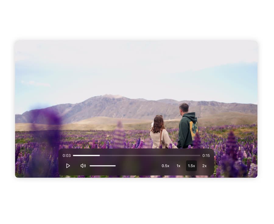
Video Player

free · paste into Lovable, Bolt, v0, Cursor or Claude

Video Player is a complete, paste-ready component build-prompt — a full art-direction spec for Lovable, Bolt, v0, Cursor and Claude. It's free: copy it below and paste it into your builder.

Video Player preview

“A video player component made with framer motion and tailwind css. — Install — npx shadcn@latest add "https://21st.dev/r/video-player" — Component source (Video Player.tsx) — "use client"; import React, { useRef …”

Video PlayerComponent · free prompt · copy-paste

Prompt page

A video player component made with framer motion and tailwind css.

— Install —
npx shadcn@latest add "https://21st.dev/r/video-player"

— Component source (Video Player.tsx) —

"use client";

import React, { useRef, useState } from "react";
import { Button } from "@/components/ui/button";
import { Play, Pause, Volume2, Volume1, VolumeX } from "lucide-react";
import { motion, AnimatePresence } from "framer-motion";
import { cn } from "@/lib/utils";

const formatTime = (seconds: number) => {
const minutes = Math.floor(seconds / 60);
const remainingSeconds = Math.floor(seconds % 60);
return `${minutes}:${remainingSeconds.toString().padStart(2, "0")}`;
};

const CustomSlider = ({
value,
onChange,
className,
}: {
value: number;
onChange: (value: number) => void;
className?: string;
}) => {
return (
  <motion.div
    className={cn(
      "relative w-full h-1 bg-white/20 rounded-full cursor-pointer",
      className
    )}
    onClick={(e) => {
      const rect = e.currentTarget.getBoundingClientRect();
      const x = e.clientX - rect.left;
      const percentage = (x / rect.width) * 100;
      onChange(Math.min(Math.max(percentage, 0), 100));
    }}
  >
    <motion.div
      className="absolute top-0 left-0 h-full bg-white rounded-full"
      style={{ width: `${value}%` }}
      initial={{ width: 0 }}
      animate={{ width: `${value}%` }}
      transition={{ type: "spring", stiffness: 300, damping: 30 }}
    />
  </motion.div>
);
};

const VideoPlayer = ({ src }: { src: string }) => {
const videoRef = useRef<HTMLVideoElement>(null);
const [isPlaying, setIsPlaying] = useState(false);
const [volume, setVolume] = useState(1);
const [progress, setProgress] = useState(0);
const [isMuted, setIsMuted] = useState(false);
const [playbackSpeed, setPlaybackSpeed] = useState(1);
const [showControls, setShowControls] = useState(false);
const [currentTime, setCurrentTime] = useState(0);
const [duration, setDuration] = useState(0);

const togglePlay = () => {
  if (videoRef.current) {
    if (isPlaying) {
      videoRef.current.pause();
    } else {
      videoRef.current.play();
    }
    setIsPlaying(!isPlaying);
  }
};

const handleVolumeChange = (value: number) => {
  if (videoRef.current) {
    const newVolume = value / 100;
    videoRef.current.volume = newVolume;
    setVolume(newVolume);
    setIsMuted(newVolume === 0);
  }
};

const handleTimeUpdate = () => {
  if (videoRef.current) {
    const progress =
      (videoRef.current.currentTime / videoRef.current.duration) * 100;
    setProgress(isFinite(progress) ? progress : 0);
    setCurrentTime(videoRef.current.currentTime);
    setDuration(videoRef.current.duration);
  }
};

const handleSeek = (value: number) => {
  if (videoRef.current && videoRef.current.duration) {
    const time = (value / 100) * videoRef.current.duration;
    if (isFinite(time)) {
      videoRef.current.currentTime = time;
      setProgress(value);
    }
  }
};

const toggleMute = () => {
  if (videoRef.current) {
    videoRef.current.muted = !isMuted;
    setIsMuted(!isMuted);
    if (!isMuted) {
      setVolume(0);
    } else {
      setVolume(1);
      videoRef.current.volume = 1;
    }
  }
};

const setSpeed = (speed: number) => {
  if (videoRef.current) {
    videoRef.current.playbackRate = speed;
    setPlaybackSpeed(speed);
  }
};

return (
  <motion.div
    className="relative w-full max-w-4xl mx-auto rounded-xl overflow-hidden bg-[#11111198] shadow-[0_0_20px_rgba(0,0,0,0.2)] backdrop-blur-sm"
    initial={{ opacity: 0, y: 20 }}
    animate={{ opacity: 1, y: 0 }}
    transition={{ duration: 0.5 }}
    onMouseEnter={() => setShowControls(true)}
    onMouseLeave={() => setShowControls(false)}
  >
    <video
      ref={videoRef}
      className="w-full"
      onTimeUpdate={handleTimeUpdate}
      src={src}
      onClick={togglePlay}
    />

    <AnimatePresence>
      {showControls && (
        <motion.div
          className="absolute bottom-0 mx-auto max-w-xl left-0 right-0 p-4 m-2 bg-[#11111198] backdrop-blur-md rounded-2xl"
          initial={{ y: 20, opacity: 0, filter: "blur(10px)" }}
          animate={{ y: 0, opacity: 1, filter: "blur(0px)" }}
          exit={{ y: 20, opacity: 0, filter: "blur(10px)" }}
          transition={{ duration: 0.6, ease: "circInOut", type: "spring" }}
        >
          <div className="flex items-center gap-2 mb-2">
            <span className="text-white text-sm">
              {formatTime(currentTime)}
            </span>
            <CustomSlider
              value={progress}
              onChange={handleSeek}
              className="flex-1"
            />
            <span className="text-white text-sm">{formatTime(duration)}</span>
          </div>

          <div className="flex items-center justify-between">
            <div className="flex items-center gap-4">
              <motion.div
                whileHover={{ scale: 1.1 }}
                whileTap={{ scale: 0.9 }}
              >
                <Button
                  onClick={togglePlay}
                  variant="ghost"
                  size="icon"
                  className="text-white hover:bg-[#111111d1] hover:text-white"
                >
                  {isPlaying ? (
                    <Pause className="h-5 w-5" />
                  ) : (
                    <Play className="h-5 w-5" />
                  )}
                </Button>
              </motion.div>
              <div className="flex items-center gap-x-1">
                <motion.div
                  whileHover={{ scale: 1.1 }}
                  whileTap={{ scale: 0.9 }}
                >
                  <Button
                    onClick={toggleMute}
                    variant="ghost"
                    size="icon"
                    className="text-white hover:bg-[#111111d1] hover:text-white"
                  >
                    {isMuted ? (
                      <VolumeX className="h-5 w-5" />
                    ) : volume > 0.5 ? (
                      <Volume2 className="h-5 w-5" />
                    ) : (
                      <Volume1 className="h-5 w-5" />
                    )}
                  </Button>
                </motion.div>

                <div className="w-24">
                  <CustomSlider
                    value={volume * 100}
                    onChange={handleVolumeChange}
                  />
                </div>
              </div>
            </div>

            <div className="flex items-center gap-2">
              {[0.5, 1, 1.5, 2].map((speed) => (
                <motion.div
                  whileHover={{ scale: 1.1 }}
                  whileTap={{ scale: 0.9 }}
                  key={speed}
                >
                  <Button
                    onClick={() => setSpeed(speed)}
                    variant="ghost"
                    size="icon"
                    className={cn(
                      "text-white hover:bg-[#111111d1] hover:text-white",
                      playbackSpeed === speed && "bg-[#111111d1]"
                    )}
                  >
                    {speed}x
                  </Button>
                </motion.div>
              ))}
            </div>
          </div>
        </motion.div>
      )}
    </AnimatePresence>
  </motion.div>
);
};

export default VideoPlayer;

Browse & preview free → Unlock everything — from $19/mo

More like this

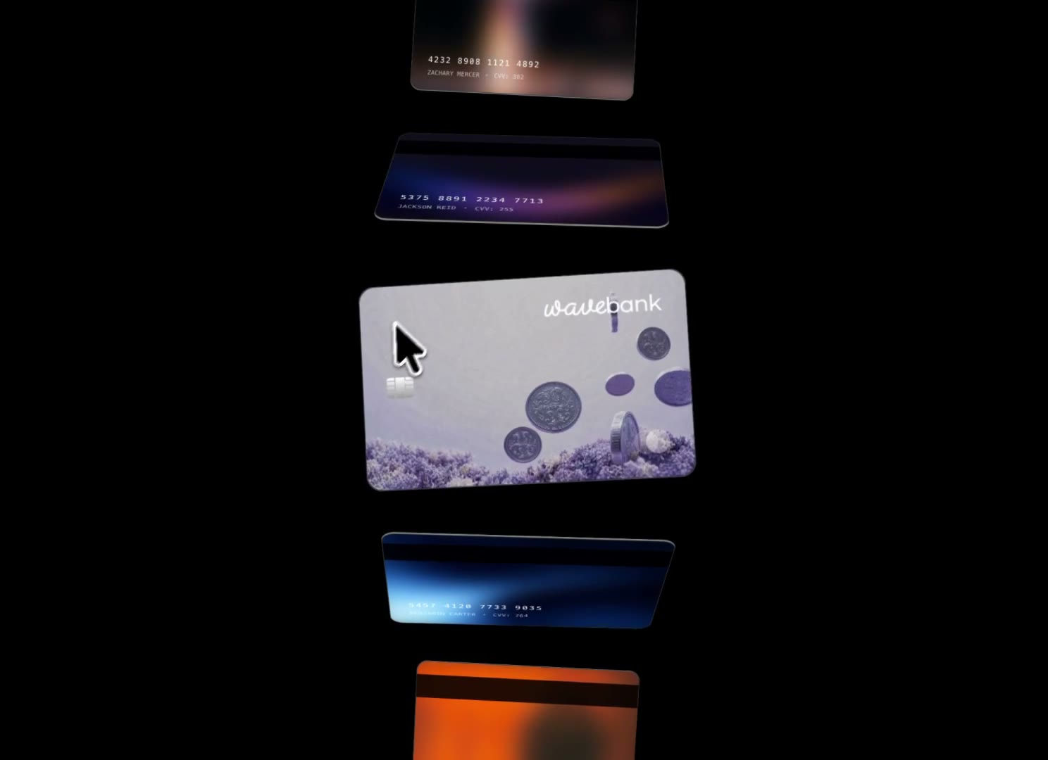
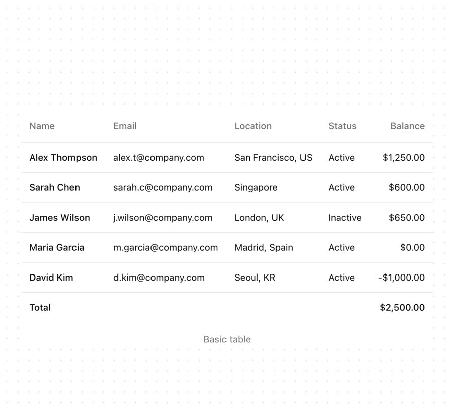
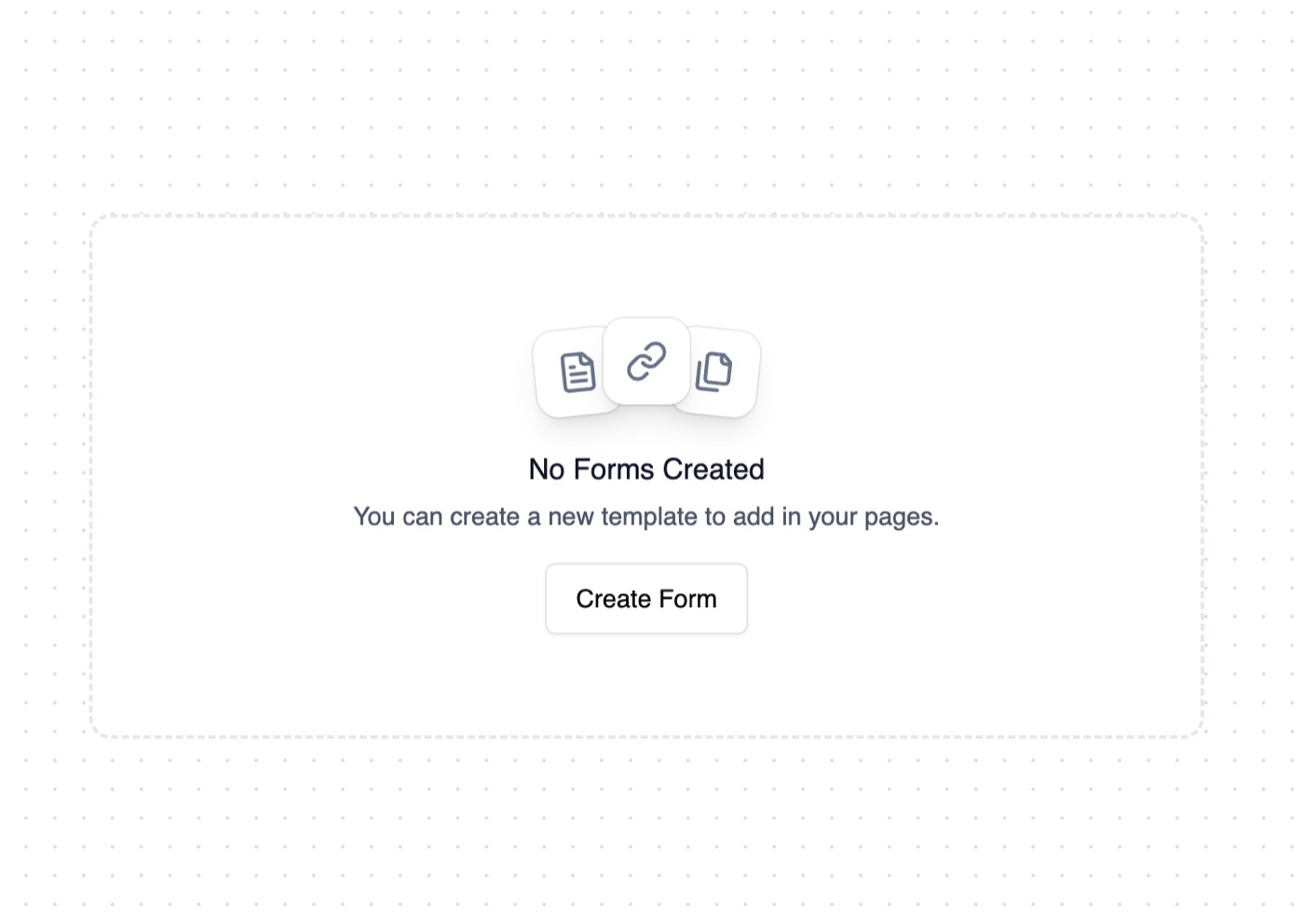
Animated Cards — Component website build-promptAnimated Cards Table — Component website build-promptTable Empty State — Component website build-promptEmpty State Feature Section with hover effects — Component website build-promptFeature Section with hover effects Lamp — Component website build-promptLamp World Map — Component website build-promptWorld Map
Meez.

The biggest library of AI website build-prompts & motion backgrounds — at the lowest price.

Library
Browse all Prompts by category Section prompts Motion backgrounds Pricing
Learn & contact
How it works Why AI sites look generic Terms Privacy Contact Affiliates
© Meez — an open archive. Start free · Unlimited from $19/mo · cancel anytime.