Component · Free prompt
Spinner
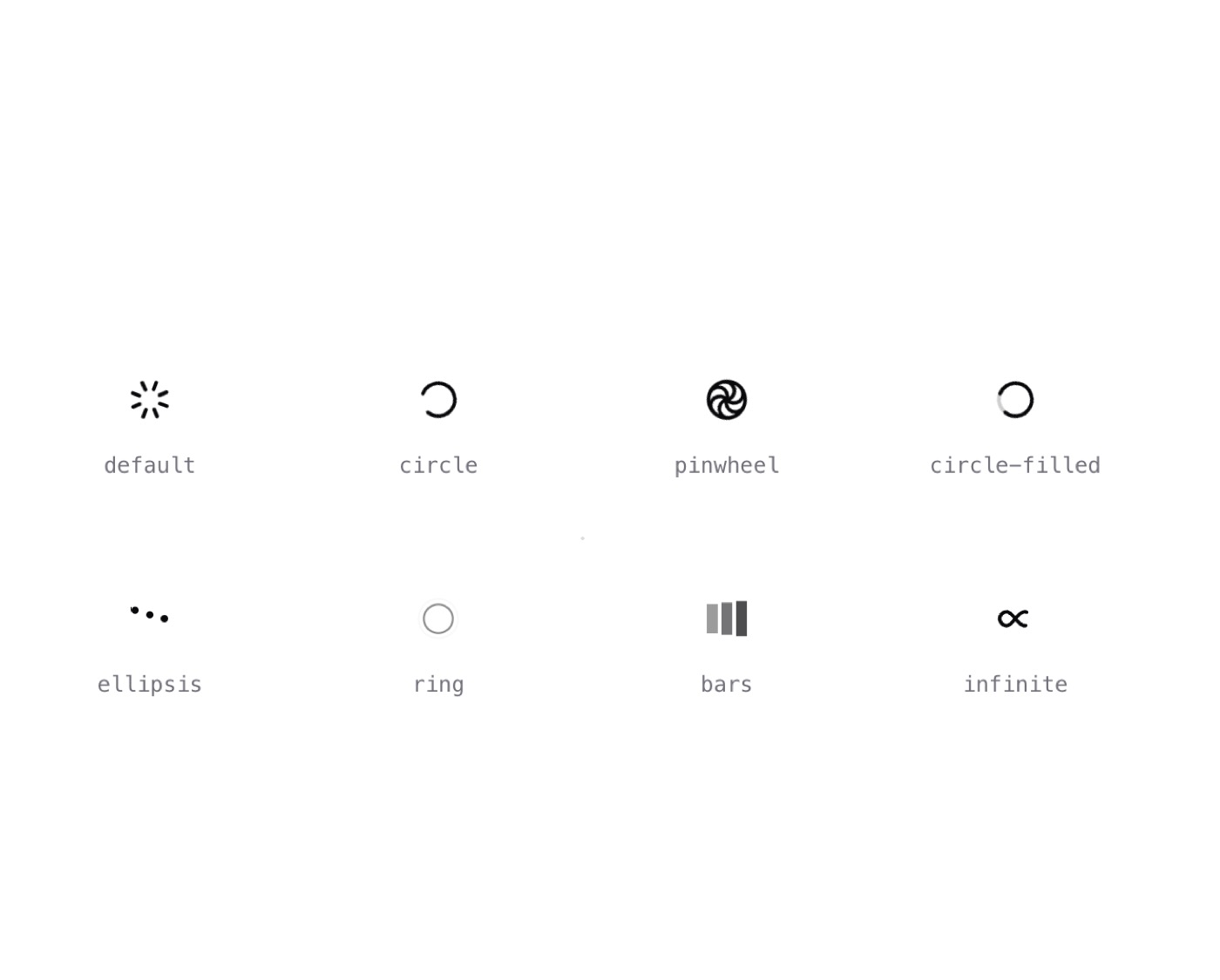
Spinner is a complete, paste-ready component build-prompt — a full art-direction spec for Lovable, Bolt, v0, Cursor and Claude. It's free: copy it below and paste it into your builder.

SpinnerComponent · free prompt · copy-paste
— Install —
npx shadcn@latest add "https://21st.dev/r/spinner"
— Component source (Spinner.tsx) —
import { cn } from '@/lib/utils';
import {
LoaderCircleIcon,
LoaderIcon,
LoaderPinwheelIcon,
type LucideProps,
} from 'lucide-react';
type SpinnerVariantProps = Omit<SpinnerProps, 'variant'>;
const Default = ({ className, ...props }: SpinnerVariantProps) => (
<LoaderIcon className={cn('animate-spin', className)} {...props} />
);
const Circle = ({ className, ...props }: SpinnerVariantProps) => (
<LoaderCircleIcon className={cn('animate-spin', className)} {...props} />
);
const Pinwheel = ({ className, ...props }: SpinnerVariantProps) => (
<LoaderPinwheelIcon className={cn('animate-spin', className)} {...props} />
);
const CircleFilled = ({
className,
size = 24,
...props
}: SpinnerVariantProps) => (
<div className="relative" style={{ width: size, height: size }}>
<div className="absolute inset-0 rotate-180">
<LoaderCircleIcon
className={cn('animate-spin', className, 'text-foreground opacity-20')}
size={size}
{...props}
/>
</div>
<LoaderCircleIcon
className={cn('relative animate-spin', className)}
size={size}
{...props}
/>
</div>
);
const Ellipsis = ({ size = 24, ...props }: SpinnerVariantProps) => {
return (
<svg
xmlns="http://www.w3.org/2000/svg"
width={size}
height={size}
viewBox="0 0 24 24"
{...props}
>
<title>Loading...</title>
<circle cx="4" cy="12" r="2" fill="currentColor">
<animate
id="ellipsis1"
begin="0;ellipsis3.end+0.25s"
attributeName="cy"
calcMode="spline"
dur="0.6s"
values="12;6;12"
keySplines=".33,.66,.66,1;.33,0,.66,.33"
/>
</circle>
<circle cx="12" cy="12" r="2" fill="currentColor">
<animate
begin="ellipsis1.begin+0.1s"
attributeName="cy"
calcMode="spline"
dur="0.6s"
values="12;6;12"
keySplines=".33,.66,.66,1;.33,0,.66,.33"
/>
</circle>
<circle cx="20" cy="12" r="2" fill="currentColor">
<animate
id="ellipsis3"
begin="ellipsis1.begin+0.2s"
attributeName="cy"
calcMode="spline"
dur="0.6s"
values="12;6;12"
keySplines=".33,.66,.66,1;.33,0,.66,.33"
/>
</circle>
</svg>
);
};
const Ring = ({ size = 24, ...props }: SpinnerVariantProps) => (
<svg
xmlns="http://www.w3.org/2000/svg"
width={size}
height={size}
viewBox="0 0 44 44"
stroke="currentColor"
{...props}
>
<title>Loading...</title>
<g fill="none" fillRule="evenodd" strokeWidth="2">
<circle cx="22" cy="22" r="1">
<animate
attributeName="r"
begin="0s"
dur="1.8s"
values="1; 20"
calcMode="spline"
keyTimes="0; 1"
keySplines="0.165, 0.84, 0.44, 1"
repeatCount="indefinite"
/>
<animate
attributeName="stroke-opacity"
begin="0s"
dur="1.8s"
values="1; 0"
calcMode="spline"
keyTimes="0; 1"
keySplines="0.3, 0.61, 0.355, 1"
repeatCount="indefinite"
/>
</circle>
<circle cx="22" cy="22" r="1">
<animate
attributeName="r"
begin="-0.9s"
dur="1.8s"
values="1; 20"
calcMode="spline"
keyTimes="0; 1"
keySplines="0.165, 0.84, 0.44, 1"
repeatCount="indefinite"
/>
<animate
attributeName="stroke-opacity"
begin="-0.9s"
dur="1.8s"
values="1; 0"
calcMode="spline"
keyTimes="0; 1"
keySplines="0.3, 0.61, 0.355, 1"
repeatCount="indefinite"
/>
</circle>
</g>
</svg>
);
const Bars = ({ size = 24, ...props }: SpinnerVariantProps) => (
<svg
xmlns="http://www.w3.org/2000/svg"
width={size}
height={size}
viewBox="0 0 24 24"
{...props}
>
<title>Loading...</title>
<style>{`
.spinner-bar {
animation: spinner-bars-animation .8s linear infinite;
animation-delay: -.8s;
}
.spinner-bars-2 {
animation-delay: -.65s;
}
.spinner-bars-3 {
animation-delay: -0.5s;
}
@keyframes spinner-bars-animation {
0% {
y: 1px;
height: 22px;
}
93.75% {
y: 5px;
height: 14px;
opacity: 0.2;
}
}
`}</style>
<rect
className="spinner-bar"
x="1"
y="1"
width="6"
height="22"
fill="currentColor"
/>
<rect
className="spinner-bar spinner-bars-2"
x="9"
y="1"
width="6"
height="22"
fill="currentColor"
/>
<rect
className="spinner-bar spinner-bars-3"
x="17"
y="1"
width="6"
height="22"
fill="currentColor"
/>
</svg>
);
const Infinite = ({ size = 24, ...props }: SpinnerVariantProps) => (
<svg
xmlns="http://www.w3.org/2000/svg"
width={size}
height={size}
viewBox="0 0 100 100"
preserveAspectRatio="xMidYMid"
{...props}
>
<title>Loading...</title>
<path
fill="none"
stroke="currentColor"
strokeWidth="10"
strokeDasharray="205.271142578125 51.317785644531256"
d="M24.3 30C11.4 30 5 43.3 5 50s6.4 20 19.3 20c19.3 0 32.1-40 51.4-40 C88.6 30 95 43.3 95 50s-6.4 20-19.3 20C56.4 70 43.6 30 24.3 30z"
strokeLinecap="round"
style={{
transform: 'scale(0.8)',
transformOrigin: '50px 50px',
}}
>
<animate
attributeName="stroke-dashoffset"
repeatCount="indefinite"
dur="2s"
keyTimes="0;1"
values="0;256.58892822265625"
/>
</path>
</svg>
);
export type SpinnerProps = LucideProps & {
variant?:
| 'default'
| 'circle'
| 'pinwheel'
| 'circle-filled'
| 'ellipsis'
| 'ring'
| 'bars'
| 'infinite';
};
export const Spinner = ({ variant, ...props }: SpinnerProps) => {
switch (variant) {
case 'circle':
return <Circle {...props} />;
case 'pinwheel':
return <Pinwheel {...props} />;
case 'circle-filled':
return <CircleFilled {...props} />;
case 'ellipsis':
return <Ellipsis {...props} />;
case 'ring':
return <Ring {...props} />;
case 'bars':
return <Bars {...props} />;
case 'infinite':
return <Infinite {...props} />;
default:
return <Default {...props} />;
}
};
Browse & preview free Unlock everything — from $19/mo