Meez.
Browse Prompts Backgrounds Pricing
Contact Sign in ·

Component · Free prompt

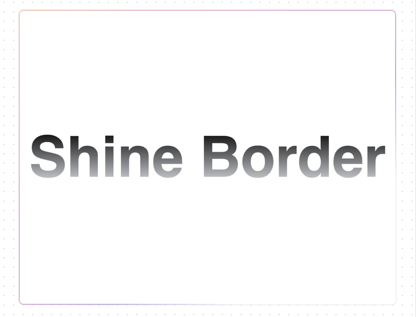
Shine Border

free · paste into Lovable, Bolt, v0, Cursor or Claude

Shine Border is a complete, paste-ready component build-prompt — a full art-direction spec for Lovable, Bolt, v0, Cursor and Claude. It's free: copy it below and paste it into your builder.

Shine Border preview

“Shine border is an animated background border effect. — Install — npx shadcn@latest add "https://21st.dev/r/shine-border" — Component source (Shine Border.tsx) — "use client" import { cn } from "@/lib/utils" type …”

Shine BorderComponent · free prompt · copy-paste

Prompt page

Shine border is an animated background border effect.

— Install —
npx shadcn@latest add "https://21st.dev/r/shine-border"

— Component source (Shine Border.tsx) —

"use client"

import { cn } from "@/lib/utils"

type TColorProp = string | string[]

interface ShineBorderProps {
  borderRadius?: number
  borderWidth?: number
  duration?: number
  color?: TColorProp
  className?: string
  children: React.ReactNode
}

/**
 * @name Shine Border
 * @description It is an animated background border effect component with easy to use and configurable props.
 * @param borderRadius defines the radius of the border.
 * @param borderWidth defines the width of the border.
 * @param duration defines the animation duration to be applied on the shining border
 * @param color a string or string array to define border color.
 * @param className defines the class name to be applied to the component
 * @param children contains react node elements.
 */
export function ShineBorder({
  borderRadius = 8,
  borderWidth = 1,
  duration = 14,
  color = "#000000",
  className,
  children,
}: ShineBorderProps) {
  return (
    <div
      style={
        {
          "--border-radius": `${borderRadius}px`,
        } as React.CSSProperties
      }
      className={cn(
        "min-h-[60px] w-fit min-w-[300px] place-items-center rounded-[--border-radius] bg-white p-3 text-black dark:bg-black dark:text-white",
        className,
      )}
    >
      <div
        style={
          {
            "--border-width": `${borderWidth}px`,
            "--border-radius": `${borderRadius}px`,
            "--duration": `${duration}s`,
            "--mask-linear-gradient": `linear-gradient(#fff 0 0) content-box, linear-gradient(#fff 0 0)`,
            "--background-radial-gradient": `radial-gradient(transparent,transparent, ${color instanceof Array ? color.join(",") : color},transparent,transparent)`,
          } as React.CSSProperties
        }
        className={`before:bg-shine-size before:absolute before:inset-0 before:aspect-square before:size-full before:rounded-[--border-radius] before:p-[--border-width] before:will-change-[background-position] before:content-[""] before:![-webkit-mask-composite:xor] before:![mask-composite:exclude] before:[background-image:--background-radial-gradient] before:[background-size:300%_300%] before:[mask:--mask-linear-gradient] motion-safe:before:animate-shine`}
      ></div>
      {children}
    </div>
  )
}

Browse & preview free → Unlock everything — from $19/mo

More like this

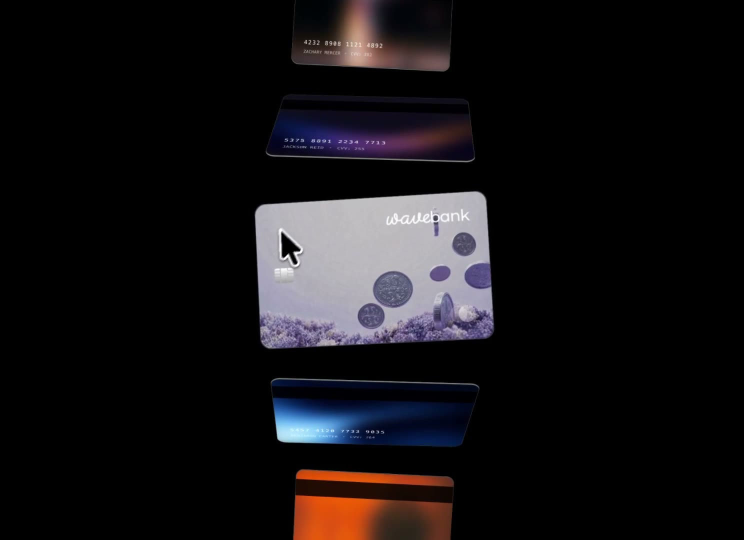
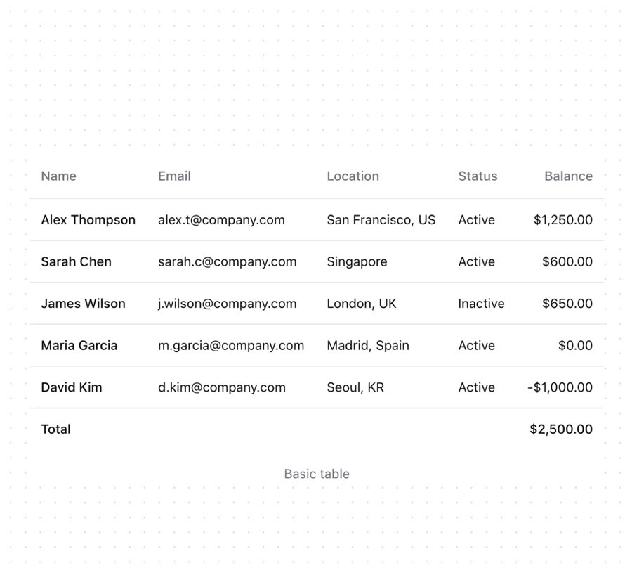
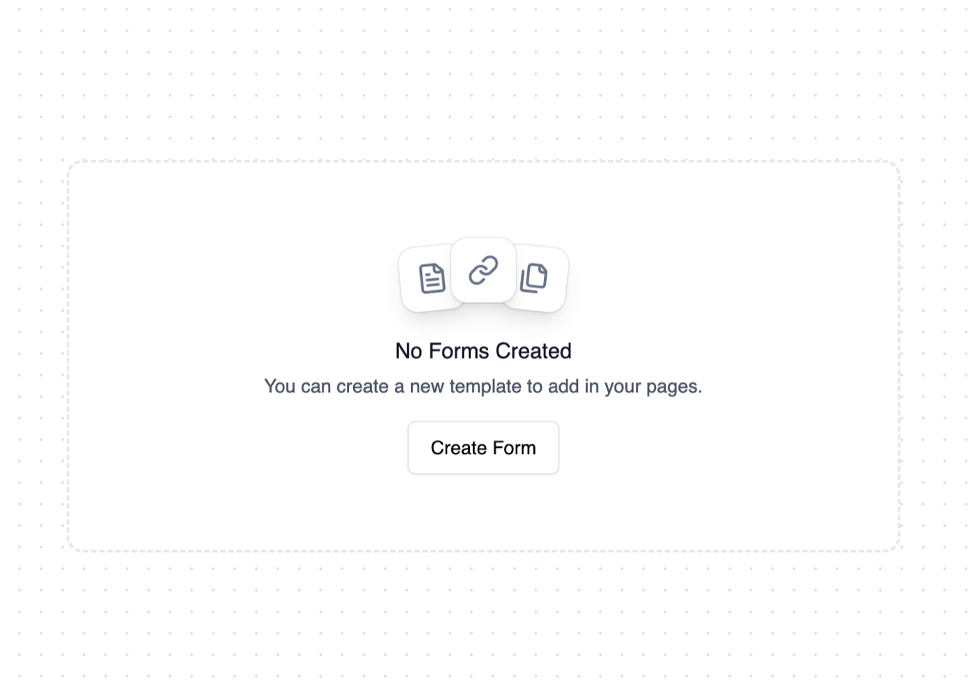
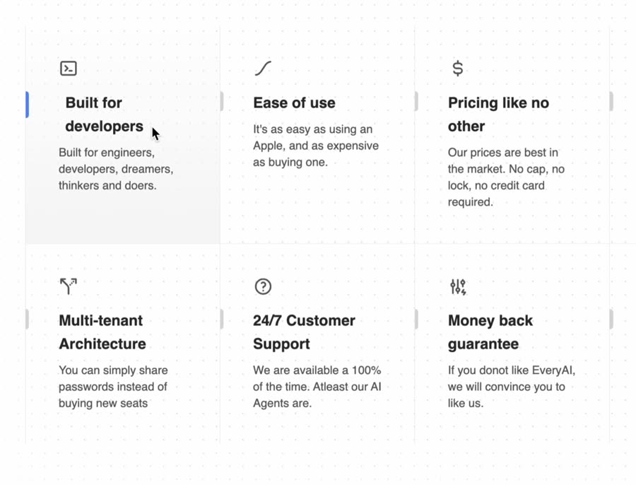
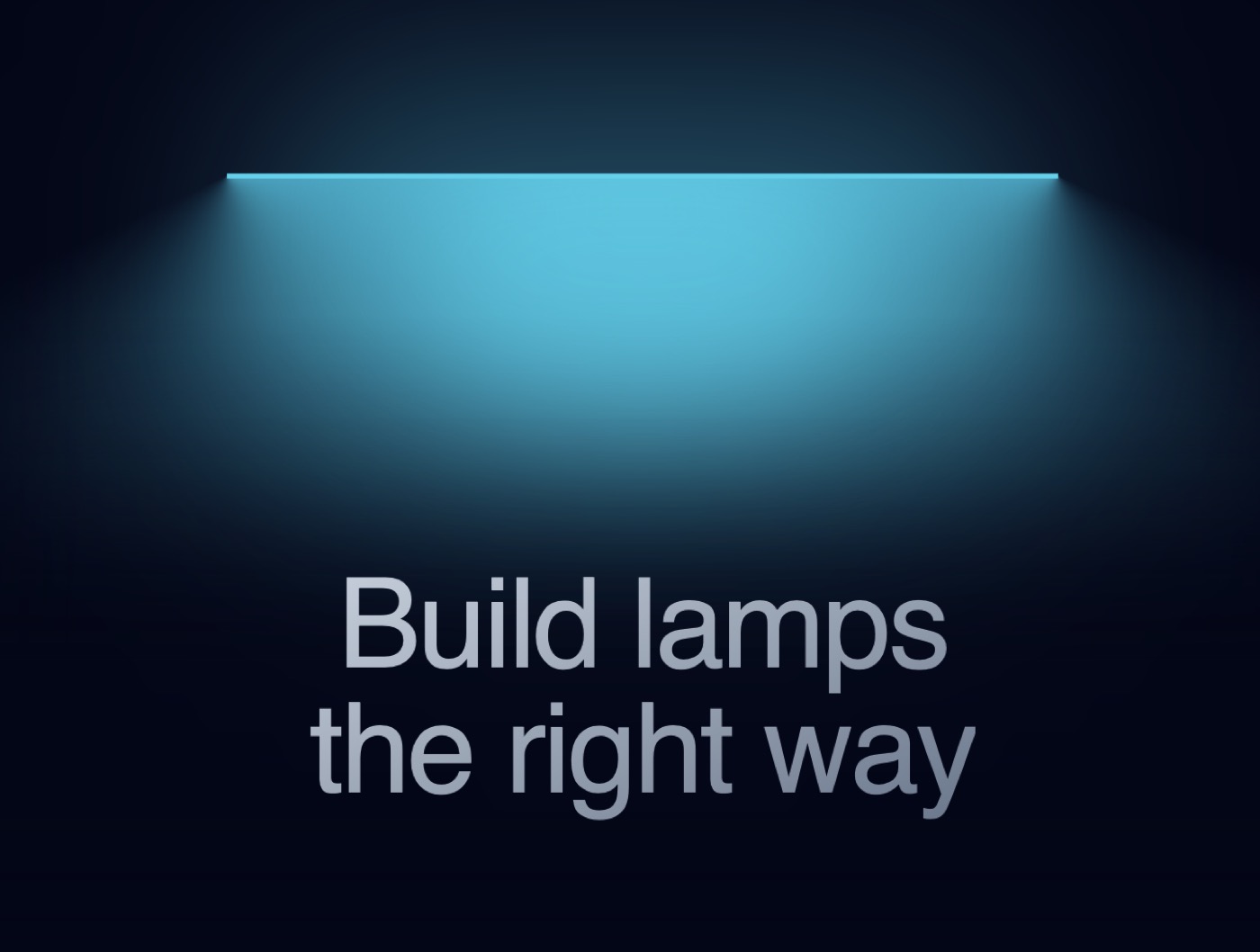
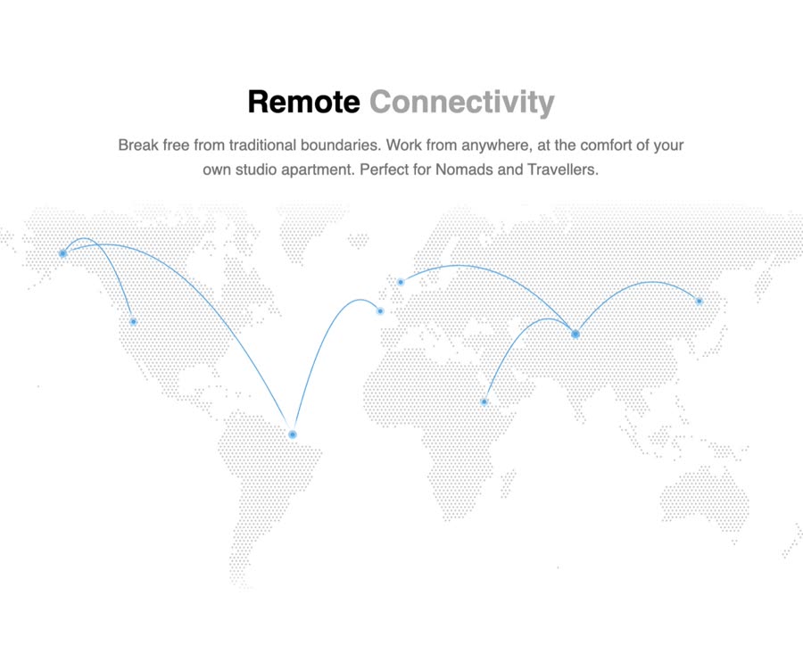
Animated Cards — Component website build-promptAnimated Cards Table — Component website build-promptTable Empty State — Component website build-promptEmpty State Feature Section with hover effects — Component website build-promptFeature Section with hover effects Lamp — Component website build-promptLamp World Map — Component website build-promptWorld Map
Meez.

The biggest library of AI website build-prompts & motion backgrounds — at the lowest price.

Library
Browse all Prompts by category Section prompts Motion backgrounds Pricing
Learn & contact
How it works Why AI sites look generic Terms Privacy Contact Affiliates
© Meez — an open archive. Start free · Unlimited from $19/mo · cancel anytime.