Meez.
Browse Prompts Backgrounds Pricing
Contact Sign in ·

Component · Free prompt

Calendar [React Day Picker]

free · paste into Lovable, Bolt, v0, Cursor or Claude

Calendar [React Day Picker] is a complete, paste-ready component build-prompt — a full art-direction spec for Lovable, Bolt, v0, Cursor and Claude. It's free: copy it below and paste it into your builder.

Calendar [React Day Picker] preview

“Calendar [React Day Picker] — Install — npx shadcn@latest add "https://21st.dev/r/calendar" — Component source (Calendar [React Day Picker].tsx) — "use client"; import { ChevronLeft, ChevronRight } from …”

Calendar [React Day Picker]Component · free prompt · copy-paste

Prompt page

Calendar [React Day Picker]

— Install —
npx shadcn@latest add "https://21st.dev/r/calendar"

— Component source (Calendar [React Day Picker].tsx) —

"use client";

import { ChevronLeft, ChevronRight } from "lucide-react";
import * as React from "react";
import { DayPicker } from "react-day-picker";

import { cn } from "@/lib/utils";
import { buttonVariants } from "@/components/ui/button";

export type CalendarProps = React.ComponentProps<typeof DayPicker>;

function Calendar({
  className,
  classNames,
  showOutsideDays = true,
  components: userComponents,
  ...props
}: CalendarProps) {
  const defaultClassNames = {
    months: "relative flex flex-col sm:flex-row gap-4",
    month: "w-full",
    month_caption: "relative mx-10 mb-1 flex h-9 items-center justify-center z-20",
    caption_label: "text-sm font-medium",
    nav: "absolute top-0 flex w-full justify-between z-10",
    button_previous: cn(
      buttonVariants({ variant: "ghost" }),
      "size-9 text-muted-foreground/80 hover:text-foreground p-0",
    ),
    button_next: cn(
      buttonVariants({ variant: "ghost" }),
      "size-9 text-muted-foreground/80 hover:text-foreground p-0",
    ),
    weekday: "size-9 p-0 text-xs font-medium text-muted-foreground/80",
    day_button:
      "relative flex size-9 items-center justify-center whitespace-nowrap rounded-lg p-0 text-foreground outline-offset-2 group-[[data-selected]:not(.range-middle)]:[transition-property:color,background-color,border-radius,box-shadow] group-[[data-selected]:not(.range-middle)]:duration-150 focus:outline-none group-data-[disabled]:pointer-events-none focus-visible:z-10 hover:bg-accent group-data-[selected]:bg-primary hover:text-foreground group-data-[selected]:text-primary-foreground group-data-[disabled]:text-foreground/30 group-data-[disabled]:line-through group-data-[outside]:text-foreground/30 group-data-[outside]:group-data-[selected]:text-primary-foreground focus-visible:outline focus-visible:outline-2 focus-visible:outline-ring/70 group-[.range-start:not(.range-end)]:rounded-e-none group-[.range-end:not(.range-start)]:rounded-s-none group-[.range-middle]:rounded-none group-data-[selected]:group-[.range-middle]:bg-accent group-data-[selected]:group-[.range-middle]:text-foreground",
    day: "group size-9 px-0 text-sm",
    range_start: "range-start",
    range_end: "range-end",
    range_middle: "range-middle",
    today:
      "*:after:pointer-events-none *:after:absolute *:after:bottom-1 *:after:start-1/2 *:after:z-10 *:after:size-[3px] *:after:-translate-x-1/2 *:after:rounded-full *:after:bg-primary [&[data-selected]:not(.range-middle)>*]:after:bg-background [&[data-disabled]>*]:after:bg-foreground/30 *:after:transition-colors",
    outside: "text-muted-foreground data-selected:bg-accent/50 data-selected:text-muted-foreground",
    hidden: "invisible",
    week_number: "size-9 p-0 text-xs font-medium text-muted-foreground/80",
  };

  const mergedClassNames: typeof defaultClassNames = Object.keys(defaultClassNames).reduce(
    (acc, key) => ({
      ...acc,
      [key]: classNames?.[key as keyof typeof classNames]
        ? cn(
            defaultClassNames[key as keyof typeof defaultClassNames],
            classNames[key as keyof typeof classNames],
          )
        : defaultClassNames[key as keyof typeof defaultClassNames],
    }),
    {} as typeof defaultClassNames,
  );

  const defaultComponents = {
    Chevron: (props: any) => {
      if (props.orientation === "left") {
        return <ChevronLeft size={16} strokeWidth={2} {...props} aria-hidden="true" />;
      }
      return <ChevronRight size={16} strokeWidth={2} {...props} aria-hidden="true" />;
    },
  };

  const mergedComponents = {
    ...defaultComponents,
    ...userComponents,
  };

  return (
    <DayPicker
      showOutsideDays={showOutsideDays}
      className={cn("w-fit", className)}
      classNames={mergedClassNames}
      components={mergedComponents}
      {...props}
    />
  );
}
Calendar.displayName = "Calendar";

export { Calendar };

Browse & preview free → Unlock everything — from $19/mo

More like this

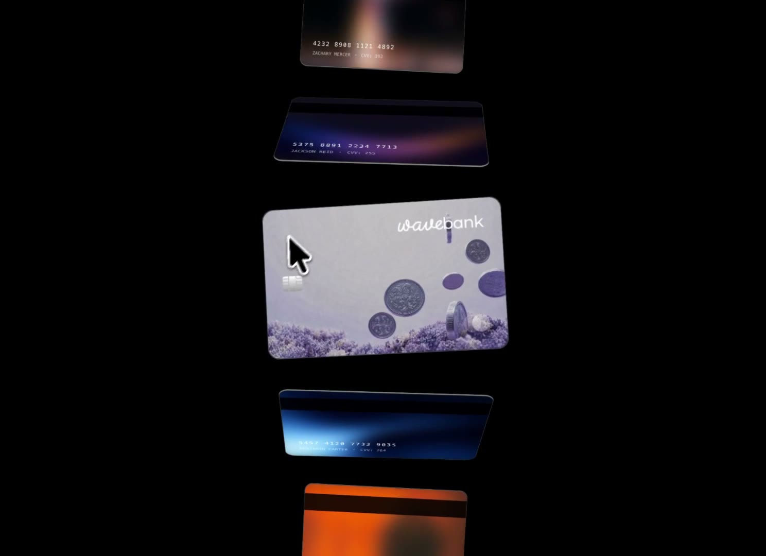
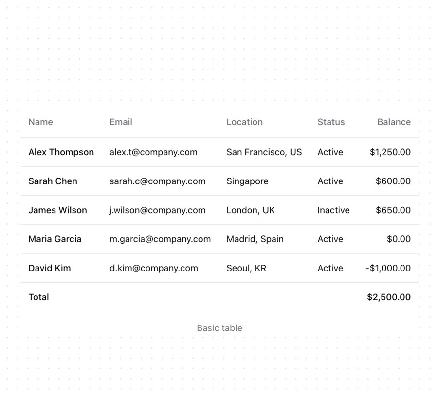
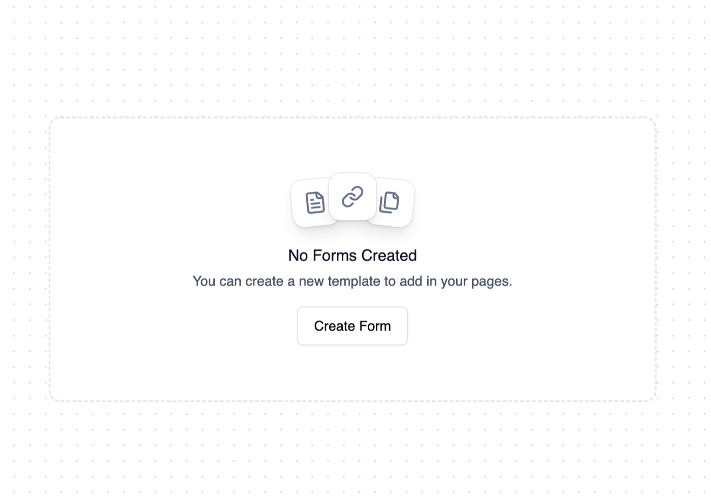
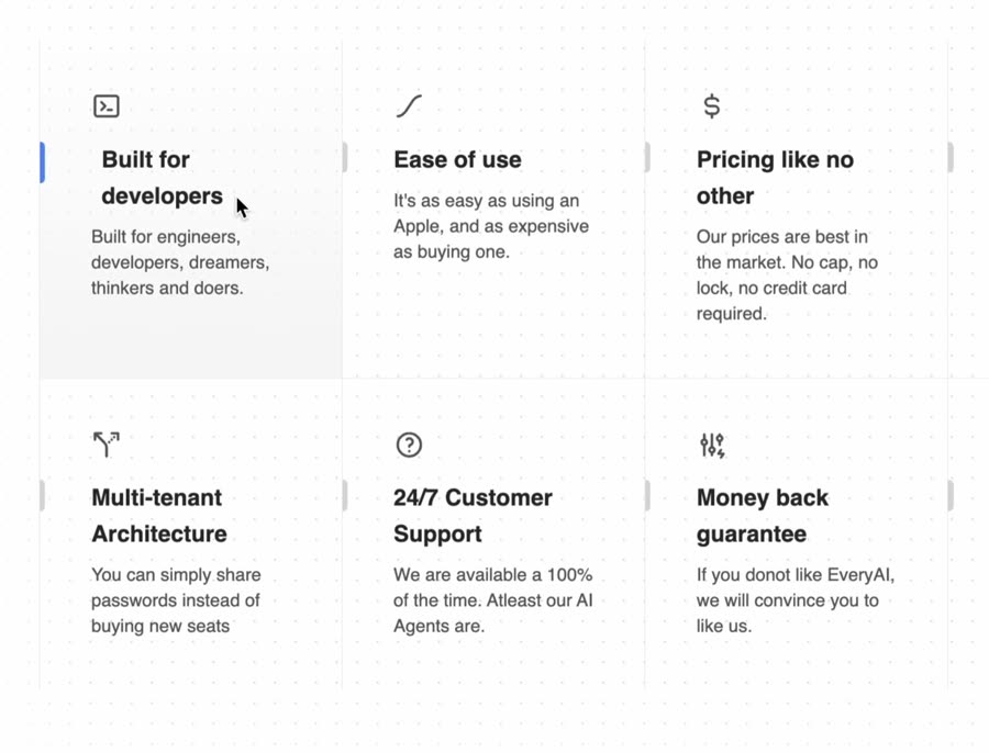
Animated Cards — Component website build-promptAnimated Cards Table — Component website build-promptTable Empty State — Component website build-promptEmpty State Feature Section with hover effects — Component website build-promptFeature Section with hover effects Lamp — Component website build-promptLamp World Map — Component website build-promptWorld Map
Meez.

The biggest library of AI website build-prompts & motion backgrounds — at the lowest price.

Library
Browse all Prompts by category Section prompts Motion backgrounds Pricing
Learn & contact
How it works Why AI sites look generic Terms Privacy Contact Affiliates
© Meez — an open archive. Start free · Unlimited from $19/mo · cancel anytime.