Landing Page · Free prompt
Fun 404 Page
Fun 404 Page is a complete, paste-ready landing page build-prompt — a full art-direction spec for Lovable, Bolt, v0, Cursor and Claude. It's free: copy it below and paste it into your builder.
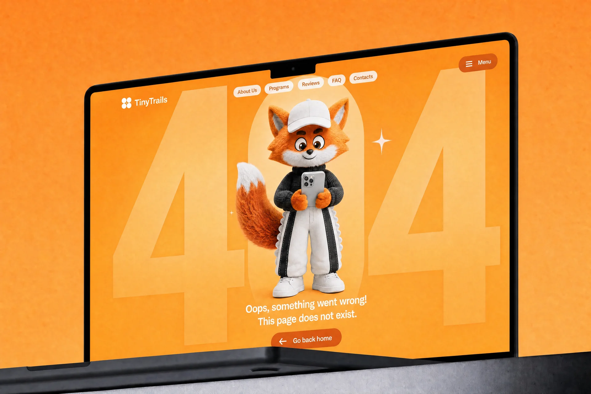
Fun 404 PageLanding Page · free prompt · copy-paste
Build a full-screen animated 404 error page for a children's brand called "TinyTrails" using React, Tailwind CSS, and Lucide React icons. The page must be a single `App.tsx` component. Use the Inter font (weights 400–900) loaded from Google Fonts. The page is a single viewport-height screen with no scrolling.

---

**LAYOUT & BACKGROUND:**

- The full page is `w-full h-screen overflow-hidden flex flex-col` with a CSS linear gradient background from `#FF8233` (top) to `#FDAC55` (bottom).

---

**BACKGROUND "404" TEXT EFFECT:**

- Behind everything, centered in the viewport, render the text "404" in white (`#FFFFFF`), `font-black`, `leading-none`, `tracking-tighter`, `whitespace-nowrap`.
- Font size: `clamp(200px, 48vw, 800px)`.
- The text is scaled horizontally by `1.15` and vertically dynamically: on mount (and resize), measure the text element's `offsetHeight`, divide `window.innerHeight` by that height, and multiply by `1.4` to get the Y scale. Apply via `transform: scale(1.15, ${scaleY * 1.4})`.
- Over the "404" text (same centered container), render a white (`#FFFFFF`) oval: a `div` with `rounded-full`, height `h-[22vh] sm:h-[26vh] md:h-[50vh]`, width `clamp(120px, 20vw, 400px)`, scaled vertically by the same dynamic `scaleY` value with `transformOrigin: center`.
- The entire background layer (text + oval) is wrapped in a container with `opacity: 0.8` and a CSS mask that fades to transparent at the bottom: `mask-image: linear-gradient(to bottom, black 40%, transparent 95%)` (with `-webkit-mask-image` for Safari).
- This layer is `absolute inset-0 pointer-events-none`.

---

**NAVIGATION BAR:**

- `relative z-20`, flex row, items centered, `justify-between`, padding `px-4 sm:px-6 md:px-12 py-4 sm:py-5`.
- **Logo (left):** A 2x2 grid of white circles (`grid-cols-2 gap-0.5`), each circle `w-2.5 h-2.5 sm:w-3 sm:h-3 bg-white rounded-full`. Next to it, the text "TinyTrails" in `text-white font-bold text-lg sm:text-xl ml-1`.
- **Desktop nav links (center/right):** Hidden on mobile (`hidden md:flex`), a row of pill buttons with `gap-1`. Items: "About Us", "Programs", "Reviews", "FAQ", "Contacts". Each is an `<a>` with `px-4 py-1.5 text-sm font-medium rounded-full bg-white` and text color `#F16524`, with `hover:opacity-90 transition-colors`.
- **Menu button (right):** A pill button with `px-4 py-2 sm:px-5 sm:py-2.5 rounded-full text-white` and background color `#F16524`. Contains a Lucide `Menu` icon (`w-4 h-4`) and the text "Menu" (`text-sm font-medium hidden sm:inline`). Has `hover:opacity-90 transition-colors`.

---

**MOBILE MENU OVERLAY:**

- Fixed fullscreen (`fixed inset-0 z-50`), with visibility toggled. Transition: `duration-500 ease-[cubic-bezier(0.16,1,0.3,1)]`.
- **Backdrop:** `absolute inset-0 bg-black/40 backdrop-blur-sm`, fades in/out with `opacity` transition over 500ms. Clicking it closes the menu.
- **Panel:** Slides in from right. `absolute top-0 right-0 h-full w-full sm:w-[380px]`, translates between `translate-x-full` (closed) and `translate-x-0` (open). Background: `linear-gradient(135deg, #FF6B1A 0%, #FF9642 100%)`.
  - **Panel header:** Same logo as nav (2x2 white dots + "TinyTrails" bold white text). Close button: `w-10 h-10 rounded-full bg-white/20 text-white hover:bg-white/30` with Lucide `X` icon (`w-5 h-5`).
  - **Menu items:** Staggered animation. Each item is `px-6 py-4 text-lg font-semibold text-white rounded-2xl bg-white/10 hover:bg-white/20 transition-all duration-300`. When open: `opacity-100 translate-y-0`; when closed: `opacity-0 translate-y-4`. Transition delay per item: `150 + i * 60`ms when opening, `0ms` when closing.
  - **Bottom CTA:** Absolutely positioned at bottom (`absolute bottom-0 left-0 right-0 p-6`). A pill link: `w-full py-4 rounded-full bg-white font-semibold text-base` with text color `#F16524`, `hover:scale-[1.02]`. Contains Lucide `ArrowLeft` icon + "Back to Home". Fades in with 450ms delay when opening.
- Body scroll is locked (`overflow: hidden`) when menu is open.

---

**CENTER VIDEO:**

- An absolutely positioned container (`absolute inset-0 flex items-center justify-center pointer-events-none`) with `margin-top: calc(-6vh - 40px)` to shift it upward.
- Inside, a responsive container: `w-[120vw] h-[85vh] sm:w-[70vw] sm:h-[70vh] md:w-[62vw] md:h-[78vh]`.
- Contains a `<video>` element with `autoPlay loop muted playsInline`, class `w-full h-full object-contain pointer-events-none mix-blend-darken`.
- **Video source URL:** `https://meez.design/web/media/prompt-media/v/118ba14fa3179a4f.mp4`

---

**BOTTOM CONTENT:**

- `relative z-30 mt-auto pb-8 sm:pb-16 flex flex-col items-center text-center px-4`.
- Heading: "Oops, something went wrong!" in `text-white text-lg sm:text-xl md:text-2xl font-medium mb-3 sm:mb-4`.
- Button/link: An `<a href="/">` pill with `inline-flex items-center gap-2 px-6 py-3 sm:px-8 sm:py-4 rounded-full text-white font-semibold text-sm sm:text-base` and background `#F16524`. Has `hover:scale-105 hover:shadow-lg transition-all`. Contains Lucide `ArrowLeft` icon (`w-4 h-4 sm:w-5 sm:h-5`) + "Back to Home".

---

**GLOBAL CSS (`index.css`):**

```css
@tailwind base;
@tailwind components;
@tailwind utilities;

* {
  margin: 0;
  padding: 0;
  box-sizing: border-box;
}

body {
  font-family: 'Inter', sans-serif;
  -webkit-font-smoothing: antialiased;
  -moz-osx-font-smoothing: grayscale;
}
```

---

**HTML HEAD:**

- Load Inter font from Google Fonts: `https://fonts.googleapis.com/css2?family=Inter:wght@400;500;600;700;800;900&display=swap` with preconnect to `fonts.googleapis.com` and `fonts.gstatic.com`.
- Title: "404 - Page Not Found".

---

**KEY COLOR PALETTE:**
- Page gradient: `#FF8233` to `#FDAC55`
- Accent/buttons: `#F16524`
- Text & shapes: `#FFFFFF`
- Menu gradient: `#FF6B1A` to `#FF9642`
- Menu overlay backdrop: `black/40` with `backdrop-blur-sm`
- Menu item backgrounds: `white/10`, `white/20` on hover

---

**DEPENDENCIES:** React, Tailwind CSS, Lucide React (`ArrowLeft`, `Menu`, `X` icons). Vite build system. No other libraries.

---

## Source Code

<!DOCTYPE html>
<html lang="en">
<head>
  <meta charset="UTF-8" />
  <meta name="viewport" content="width=device-width, initial-scale=1.0" />
  <title>404 - Page Not Found</title>
  <link rel="preconnect" href="https://fonts.googleapis.com" />
  <link rel="preconnect" href="https://fonts.gstatic.com" crossorigin />
  <link href="https://fonts.googleapis.com/css2?family=Inter:wght@400;500;600;700;800;900&display=swap" rel="stylesheet" />
  <style>
    * {
      margin: 0;
      padding: 0;
      box-sizing: border-box;
    }

    body {
      font-family: 'Inter', sans-serif;
      -webkit-font-smoothing: antialiased;
      -moz-osx-font-smoothing: grayscale;
      overflow: hidden;
    }

    .page {
      position: relative;
      width: 100%;
      height: 100vh;
      overflow: hidden;
      display: flex;
      flex-direction: column;
      background: linear-gradient(to bottom, #FF8233, #FDAC55);
    }

    /* Background 404 layer */
    .bg-layer {
      position: absolute;
      inset: 0;
      pointer-events: none;
      opacity: 0.8;
      -webkit-mask-image: linear-gradient(to bottom, black 40%, transparent 95%);
      mask-image: linear-gradient(to bottom, black 40%, transparent 95%);
    }

    .bg-text-container {
      position: absolute;
      inset: 0;
      display: flex;
      align-items: center;
      justify-content: center;
      overflow: hidden;
      user-select: none;
    }

    .bg-text {
      font-size: clamp(200px, 48vw, 800px);
      font-weight: 900;
      line-height: 1;
      letter-spacing: -0.05em;
      white-space: nowrap;
      color: #FFFFFF;
      -webkit-text-fill-color: #FFFFFF;
    }

    .bg-oval-container {
      position: absolute;
      inset: 0;
      display: flex;
      align-items: center;
      justify-content: center;
    }

    .bg-oval {
      width: clamp(120px, 20vw, 400px);
      height: 22vh;
      border-radius: 9999px;
      background: #FFFFFF;
      transform-origin: center;
    }

    /* Navigation */
    .nav {
      position: relative;
      z-index: 20;
      display: flex;
      align-items: center;
      justify-content: space-between;
      padding: 16px 16px;
    }

    .nav-left {
      display: flex;
      align-items: center;
      gap: 8px;
    }

    .logo-dots {
      display: grid;
      grid-template-columns: 1fr 1fr;
      gap: 2px;
    }

    .logo-dot {
      width: 10px;
      height: 10px;
      background: white;
      border-radius: 50%;
    }

    .logo-text {
      color: white;
      font-weight: 700;
      font-size: 18px;
      margin-left: 4px;
    }

    .nav-links {
      display: none;
      align-items: center;
      gap: 4px;
    }

    .nav-link {
      padding: 6px 16px;
      font-size: 14px;
      font-weight: 500;
      border-radius: 9999px;
      background: white;
      color: #F16524;
      text-decoration: none;
      transition: opacity 0.2s;
    }

    .nav-link:hover {
      opacity: 0.9;
    }

    .menu-btn {
      display: flex;
      align-items: center;
      gap: 8px;
      padding: 8px 16px;
      border-radius: 9999px;
      background: #F16524;
      color: white;
      border: none;
      cursor: pointer;
      font-family: inherit;
      transition: opacity 0.2s;
    }

    .menu-btn:hover {
      opacity: 0.9;
    }

    .menu-btn-text {
      font-size: 14px;
      font-weight: 500;
      display: none;
    }

    /* Menu Overlay */
    .menu-overlay {
      position: fixed;
      inset: 0;
      z-index: 50;
      visibility: hidden;
      transition: visibility 0s 0.5s;
    }

    .menu-overlay.open {
      visibility: visible;
      transition: visibility 0s 0s;
    }

    .menu-backdrop {
      position: absolute;
      inset: 0;
      background: rgba(0, 0, 0, 0.4);
      backdrop-filter: blur(4px);
      -webkit-backdrop-filter: blur(4px);
      opacity: 0;
      transition: opacity 0.5s;
    }

    .menu-overlay.open .menu-backdrop {
      opacity: 1;
    }

    .menu-panel {
      position: absolute;
      top: 0;
      right: 0;
      height: 100%;
      width: 100%;
      background: linear-gradient(135deg, #FF6B1A 0%, #FF9642 100%);
      transform: translateX(100%);
      transition: transform 0.5s cubic-bezier(0.16, 1, 0.3, 1);
    }

    .menu-overlay.open .menu-panel {
      transform: translateX(0);
    }

    .menu-header {
      display: flex;
      align-items: center;
      justify-content: space-between;
      padding: 20px 24px;
    }

    .menu-close-btn {
      width: 40px;
      height: 40px;
      display: flex;
      align-items: center;
      justify-content: center;
      border-radius: 50%;
      background: rgba(255, 255, 255, 0.2);
      color: white;
      border: none;
      cursor: pointer;
      transition: background 0.2s;
    }

    .menu-close-btn:hover {
      background: rgba(255, 255, 255, 0.3);
    }

    .menu-items {
      padding: 32px 24px 0;
      display: flex;
      flex-direction: column;
      gap: 8px;
    }

    .menu-item {
      display: block;
      padding: 16px 24px;
      font-size: 18px;
      font-weight: 600;
      color: white;
      text-decoration: none;
      border-radius: 16px;
      background: rgba(255, 255, 255, 0.1);
      transition: all 0.3s;
      opacity: 0;
      transform: translateY(16px);
    }

    .menu-item:hover {
      background: rgba(255, 255, 255, 0.2);
    }

    .menu-overlay.open .menu-item {
      opacity: 1;
      transform: translateY(0);
    }

    .menu-overlay.open .menu-item:nth-child(1) { transition-delay: 150ms; }
    .menu-overlay.open .menu-item:nth-child(2) { transition-delay: 210ms; }
    .menu-overlay.open .menu-item:nth-child(3) { transition-delay: 270ms; }
    .menu-overlay.open .menu-item:nth-child(4) { transition-delay: 330ms; }
    .menu-overlay.open .menu-item:nth-child(5) { transition-delay: 390ms; }

    .menu-bottom {
      position: absolute;
      bottom: 0;
      left: 0;
      right: 0;
      padding: 24px;
      opacity: 0;
      transform: translateY(24px);
      transition: all 0.5s;
    }

    .menu-overlay.open .menu-bottom {
      opacity: 1;
      transform: translateY(0);
      transition-delay: 450ms;
    }

    .menu-bottom-btn {
      display: flex;
      align-items: center;
      justify-content: center;
      gap: 8px;
      width: 100%;
      padding: 16px;
      border-radius: 9999px;
      background: white;
      color: #F16524;
      font-weight: 600;
      font-size: 16px;
      text-decoration: none;
      transition: transform 0.2s;
    }

    .menu-bottom-btn:hover {
      transform: scale(1.02);
    }

    /* Video */
    .video-container {
      position: absolute;
      inset: 0;
      display: flex;
      align-items: center;
      justify-content: center;
      pointer-events: none;
      margin-top: calc(-6vh - 40px);
    }

    .video-wrapper {
      width: 120vw;
      height: 85vh;
      position: relative;
    }

    .video-wrapper video {
      width: 100%;
      height: 100%;
      object-fit: contain;
      pointer-events: none;
      mix-blend-mode: darken;
    }

    /* Bottom content */
    .bottom-content {
      position: relative;
      z-index: 30;
      margin-top: auto;
      padding-bottom: 32px;
      display: flex;
      flex-direction: column;
      align-items: center;
      text-align: center;
      padding-left: 16px;
      padding-right: 16px;
    }

    .bottom-heading {
      color: white;
      font-size: 18px;
      font-weight: 500;
      margin-bottom: 12px;
    }

    .bottom-btn {
      display: inline-flex;
      align-items: center;
      gap: 8px;
      padding: 12px 24px;
      border-radius: 9999px;
      background: #F16524;
      color: white;
      font-weight: 600;
      font-size: 14px;
      text-decoration: none;
      transition: all 0.2s;
    }

    .bottom-btn:hover {
      transform: scale(1.05);
      box-shadow: 0 10px 15px -3px rgba(0, 0, 0, 0.1);
    }

    /* Responsive */
    @media (min-width: 640px) {
      .nav {
        padding: 20px 24px;
      }

      .logo-dot {
        width: 12px;
        height: 12px;
      }

      .logo-text {
        font-size: 20px;
      }

      .menu-btn {
        padding: 10px 20px;
      }

      .menu-btn-text {
        display: inline;
      }

      .menu-panel {
        width: 380px;
      }

      .video-wrapper {
        width: 70vw;
        height: 70vh;
      }

      .bg-oval {
        height: 26vh;
      }

      .bottom-content {
        padding-bottom: 64px;
      }

      .bottom-heading {
        font-size: 20px;
        margin-bottom: 16px;
      }

      .bottom-btn {
        padding: 16px 32px;
        font-size: 16px;
      }
    }

    @media (min-width: 768px) {
      .nav {
        padding: 20px 48px;
      }

      .nav-links {
        display: flex;
      }

      .video-wrapper {
        width: 62vw;
        height: 78vh;
      }

      .bg-oval {
        height: 50vh;
      }

      .bottom-heading {
        font-size: 24px;
      }
    }
  </style>
</head>
<body>
  <div class="page">
    <!-- Background 404 text + oval -->
    <div class="bg-layer">
      <div class="bg-text-container">
        <span class="bg-text" id="bgText">404</span>
      </div>
      <div class="bg-oval-container">
        <div class="bg-oval" id="bgOval"></div>
      </div>
    </div>

    <!-- Navigation -->
    <nav class="nav">
      <div class="nav-left">
        <div class="logo-dots">
          <div class="logo-dot"></div>
          <div class="logo-dot"></div>
          <div class="logo-dot"></div>
          <div class="logo-dot"></div>
        </div>
        <span class="logo-text">TinyTrails</span>
      </div>

      <div class="nav-links">
        <a href="#" class="nav-link">About Us</a>
        <a href="#" class="nav-link">Programs</a>
        <a href="#" class="nav-link">Reviews</a>
        <a href="#" class="nav-link">FAQ</a>
        <a href="#" class="nav-link">Contacts</a>
      </div>

      <button class="menu-btn" onclick="openMenu()">
        <svg xmlns="http://www.w3.org/2000/svg" width="16" height="16" viewBox="0 0 24 24" fill="none" stroke="currentColor" stroke-width="2" stroke-linecap="round" stroke-linejoin="round"><line x1="4" x2="20" y1="12" y2="12"/><line x1="4" x2="20" y1="6" y2="6"/><line x1="4" x2="20" y1="18" y2="18"/></svg>
        <span class="menu-btn-text">Menu</span>
      </button>
    </nav>

    <!-- Menu Overlay -->
    <div class="menu-overlay" id="menuOverlay">
      <div class="menu-backdrop" onclick="closeMenu()"></div>
      <div class="menu-panel">
        <div class="menu-header">
          <div class="nav-left">
            <div class="logo-dots">
              <div class="logo-dot"></div>
              <div class="logo-dot"></div>
              <div class="logo-dot"></div>
              <div class="logo-dot"></div>
            </div>
            <span class="logo-text">TinyTrails</span>
          </div>
          <button class="menu-close-btn" onclick="closeMenu()">
            <svg xmlns="http://www.w3.org/2000/svg" width="20" height="20" viewBox="0 0 24 24" fill="none" stroke="currentColor" stroke-width="2" stroke-linecap="round" stroke-linejoin="round"><path d="M18 6 6 18"/><path d="m6 6 12 12"/></svg>
          </button>
        </div>
        <div class="menu-items">
          <a href="#" class="menu-item">About Us</a>
          <a href="#" class="menu-item">Programs</a>
          <a href="#" class="menu-item">Reviews</a>
          <a href="#" class="menu-item">FAQ</a>
          <a href="#" class="menu-item">Contacts</a>
        </div>
        <div class="menu-bottom">
          <a href="/" class="menu-bottom-btn">
            <svg xmlns="http://www.w3.org/2000/svg" width="20" height="20" viewBox="0 0 24 24" fill="none" stroke="currentColor" stroke-width="2" stroke-linecap="round" stroke-linejoin="round"><path d="m12 19-7-7 7-7"/><path d="M19 12H5"/></svg>
            Back to Home
          </a>
        </div>
      </div>
    </div>

    <!-- Video -->
    <div class="video-container">
      <div class="video-wrapper">
        <video autoplay loop muted playsinline src="https://meez.design/web/media/prompt-media/v/118ba14fa3179a4f.mp4"></video>
      </div>
    </div>

    <!-- Bottom content -->
    <div class="bottom-content">
      <h2 class="bottom-heading">Oops, something went wrong!</h2>
      <a href="/" class="bottom-btn">
        <svg xmlns="http://www.w3.org/2000/svg" width="18" height="18" viewBox="0 0 24 24" fill="none" stroke="currentColor" stroke-width="2" stroke-linecap="round" stroke-linejoin="round"><path d="m12 19-7-7 7-7"/><path d="M19 12H5"/></svg>
        Back to Home
      </a>
    </div>
  </div>

  <script>
    const bgText = document.getElementById('bgText');
    const bgOval = document.getElementById('bgOval');
    const menuOverlay = document.getElementById('menuOverlay');

    function updateScale() {
      if (!bgText) return;
      const naturalHeight = bgText.offsetHeight;
      const viewportHeight = window.innerHeight;
      const scaleY = viewportHeight / naturalHeight;
      bgText.style.transform = `scale(1.15, ${scaleY * 1.4})`;
      bgOval.style.transform = `scaleY(${scaleY})`;
    }

    updateScale();
    window.addEventListener('resize', updateScale);

    function openMenu() {
      menuOverlay.classList.add('open');
      document.body.style.overflow = 'hidden';
    }

    function closeMenu() {
      menuOverlay.classList.remove('open');
      document.body.style.overflow = '';
    }
  </script>
</body>
</html>
Browse & preview free Unlock everything — from $49/mo