Portfolio · Free prompt
Digital Director
Digital Director is a complete, paste-ready portfolio build-prompt — a full art-direction spec for Lovable, Bolt, v0, Cursor and Claude. It's free: copy it below and paste it into your builder.
Digital DirectorPortfolio · free prompt · copy-paste
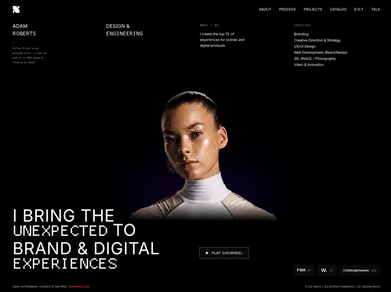
Recreate this exact full-viewport portfolio landing page — pixel-perfect match.
═══════════════════════════════════════
TECH / STACK
═══════════════════════════════════════
- React + TypeScript + Tailwind CSS + Vite
- Icons: lucide-react (`Play`, `Menu`, `X`)
- Single full-screen page: `h-screen w-full overflow-hidden`
- Root: `relative h-screen w-full overflow-hidden bg-black text-white`
═══════════════════════════════════════
FONTS (exact)
═══════════════════════════════════════
Load in <head>:
1) Inter (Google Fonts) — body/default:
<link rel="preconnect" href="https://fonts.googleapis.com">
<link rel="preconnect" href="https://fonts.gstatic.com" crossorigin>
<link href="https://fonts.googleapis.com/css2?family=Inter:wght@300;400;500;600;700;800;900&display=swap" rel="stylesheet">
2) basis33 (pixel/bitmap monospace) — for `.font-pixel`:
<link href="https://meez.design/web/media/ext/47a28c1e2fef21f6.woff2" rel="stylesheet">
CSS:
- body { font-family: 'Inter', sans-serif; -webkit-font-smoothing: antialiased; -moz-osx-font-smoothing: grayscale; }
- .font-pixel { font-family: 'basis33', monospace; }
Where basis33 (font-pixel) is used:
- "ROBERTS" under ADAM
- "ENGINEERING" under DESIGN &
- Brand blurb under name
- Labels "What I Do" and "Services"
- Words "UNEXPECTED" and "EXPERIENCES" inside the hero headline (1.25em size)
Where Inter is used:
- Everything else (nav, ADAM, DESIGN &, body copy, showreel button, awards, footer)
Page title: "Adam Roberts - Design & Engineering"
═══════════════════════════════════════
BACKGROUND VIDEO (exact URL — do not substitute)
═══════════════════════════════════════
Full-bleed background <video>:
src="https://meez.design/web/media/prompt-media/v/5198a3596261af2f.mp4"
Attributes: autoPlay muted loop playsInline
Classes: absolute inset-0 h-full w-full object-cover lg:scale-[1.2]
(On large screens, video is scaled 120% for a slight crop/zoom)
All UI sits above video at z-10. No dark overlay — white text over the video.
═══════════════════════════════════════
LOGO (exact SVG)
═══════════════════════════════════════
White geometric “GP / Grilled Pixels” mark, 28×28, viewBox="0 0 256 256":
<svg xmlns="http://www.w3.org/2000/svg" width="28" height="28" viewBox="0 0 256 256" fill="none">
<path d="M 160 88 L 194 34 L 216 0 L 256 0 L 256 40 L 221.5 93.5 L 200 128 L 256 128 L 256 256 L 96 256 L 96 168 L 64.246 220 L 40 256 L 0 256 L 0 216 L 34 162 L 56 128 L 0 128 L 0 0 L 160 0 Z" fill="white" />
</svg>
Used in top-left navbar AND inside the mobile menu header.
═══════════════════════════════════════
LAYOUT STRUCTURE (top → bottom)
═══════════════════════════════════════
Outer content wrapper (above video):
relative z-10 flex h-full flex-col px-5 sm:px-6 md:px-10 lg:px-14
── 1. NAVBAR ──
flex items-center justify-between py-6
Left: logo SVG
Right desktop (md+): horizontal links, gap-8, text-sm tracking-wide
ABOUT | PROCESS | PROJECTS | CATALOG | D.O.T | TALK
Each: href="#", hover:opacity-70 transition-opacity
Right mobile (<md): hamburger button (Menu icon size 24), p-2 hover:opacity-70
── 2. FOUR-COLUMN META GRID ──
mt-4 grid grid-cols-2 lg:grid-cols-4 gap-4 sm:gap-6 lg:gap-8
COL 1 (left):
h2 text-lg md:text-xl tracking-wide leading-tight
Line1: "ADAM" (font-normal Inter)
Line2: "ROBERTS" (font-pixel text-2xl md:text-3xl)
Then: * asterisk at text-[10px] text-white/50 mt-3
Then brand blurb font-pixel mt-1 text-xs text-white/60 leading-relaxed, line breaks EXACTLY:
Grilled Pixels is my
personal brand - I came up
with it in 2004 based on
"cooking up ideas"
COL 2 (text-right on mobile 2-col, text-left on lg):
h2 same sizing
Line1: "DESIGN &" (Inter font-normal)
Line2: "ENGINEERING" (font-pixel text-2xl md:text-3xl)
COL 3:
Label: "What I Do" — text-base tracking-widest text-white/50 uppercase mb-3 font-pixel
Body: text-sm text-white/90 leading-relaxed max-w-[220px]
"I create the top 1% of experiences for brands and digital products"
COL 4 (text-right on mobile 2-col, text-left on lg):
Label: "Services" — same label styles as What I Do
ul text-sm text-white/90 leading-relaxed space-y-0.5:
- Branding
- Creative Direction & Strategy
- UX/UI Design
- Web Development (React/Nextjs)
- 3D, WebGL / Photography
- Video & Animation
── 3. FLEX SPACER ──
<div className="flex-1" /> ← pushes bottom block to viewport bottom
── 4. BOTTOM SECTION (pb-4) ──
ROW A — grid grid-cols-1 lg:grid-cols-2 gap-4 sm:gap-6 items-end
LEFT — Hero headline:
h1: text-3xl sm:text-4xl md:text-5xl lg:text-[3.75rem] xl:text-[4.25rem]
tracking-wide uppercase font-normal
inline style: lineHeight: 0.72
Exact line breaks:
I BRING THE
UNEXPECTED TO ← "UNEXPECTED" is font-pixel font-normal text-[1.25em] inline-block leading-none align-baseline
BRAND & DIGITAL
EXPERIENCES ← "EXPERIENCES" same pixel treatment as UNEXPECTED
RIGHT — column flex flex-col gap-4 sm:gap-6 justify-end:
A) PLAY SHOWREEL button (self-start):
flex items-center gap-3
border border-white/30 px-6 py-3
backdrop-blur-sm bg-white/5
hover:bg-white/10 transition-colors
Play icon: lucide Play size={14} fill="white"
Label: text-sm tracking-wider "PLAY SHOWREEL"
B) Awards row (self-start on mobile, lg:self-end):
flex flex-wrap items-stretch gap-2 sm:gap-3 text-sm text-white/80
Three dark chips, each: bg-[#0B0B0B] px-3 sm:px-4 py-2, flex items-center gap-2
1) "FWA" font-bold text-sm sm:text-base tracking-tight + "x1" text-white/50 text-xs
2) "W." font-bold text-lg sm:text-xl + "x7" text-white/50 text-xs
3) "CSSDesignAwards" font-bold text-[10px] sm:text-xs tracking-tight + "x22" text-white/50 text-xs
ROW B — footer strip:
mt-4 sm:mt-5 grid grid-cols-1 sm:grid-cols-2 gap-2 sm:gap-4 pt-4
Left: text-xs text-white/60
"Open to freelance, contract or full-time. "
then link "Schedule a call" — text-red-500 hover:text-red-400 transition-colors href="#"
Right: text-xs text-white/60 sm:text-right
"5 full cases • 82 archive fragments • 22 catalog items"
(use • or • between parts)
═══════════════════════════════════════
MOBILE FULLSCREEN MENU
═══════════════════════════════════════
State: menuOpen boolean
Overlay: fixed inset-0 z-50 bg-black/95 backdrop-blur-md flex flex-col
Transition: transition-all duration-500 ease-[cubic-bezier(0.16,1,0.3,1)]
open: opacity-100 pointer-events-auto
closed: opacity-0 pointer-events-none
Header: flex items-center justify-between px-6 py-6
Left: same logo SVG
Right: X button (size 24) closes menu — p-2 hover:opacity-70
Nav: flex flex-col items-center justify-center flex-1 gap-8
Same 6 links as desktop, text-2xl tracking-widest
Staggered entrance when opening:
transition-all duration-500 ease-[cubic-bezier(0.16,1,0.3,1)]
open: opacity-100 translate-y-0
closed: opacity-0 translate-y-4
transitionDelay when open: `${100 + i * 60}ms` (i = 0..5) → 100,160,220,280,340,400ms
when closed: delay 0ms
Clicking a link closes the menu
═══════════════════════════════════════
ANIMATIONS / INTERACTIONS SUMMARY
═══════════════════════════════════════
1. Background video: continuous autoplay loop, muted
2. Nav link hover: opacity → 70%
3. Showreel button hover: bg white/5 → white/10
4. Schedule a call hover: red-500 → red-400
5. Mobile menu overlay: 500ms cubic-bezier(0.16,1,0.3,1) fade
6. Mobile menu links: staggered fade+slide-up (60ms steps, start 100ms)
7. Hamburger / close icon hover: opacity 70%
8. NO scroll (overflow-hidden, h-screen) — single locked viewport composition
9. NO page load entrance animation on desktop content (static on paint)
10. Video scales to 1.2× at lg breakpoint
═══════════════════════════════════════
COLOR TOKENS
═══════════════════════════════════════
- Page bg: #000000 (black)
- Primary text: #ffffff
- Muted: white/90, white/80, white/60, white/50
- Accent link: Tailwind red-500 (Schedule a call)
- Award chips: #0B0B0B
- Showreel button: border white/30, fill white/5, blur
- Mobile overlay: black/95 + backdrop blur
═══════════════════════════════════════
RESPONSIVE BREAKPOINTS (Tailwind defaults)
═══════════════════════════════════════
- < md: hamburger + 2-col meta grid; awards/showreel stack under headline
- md+: desktop nav links
- lg+: 4-col meta grid; 2-col bottom (headline | showreel+awards); video scale 1.2
- sm/md/lg/xl: progressive padding and headline size as listed above
═══════════════════════════════════════
DO NOT
═══════════════════════════════════════
- Do not add cards, purple gradients, cream backgrounds, or extra sections
- Do not change copy, award counts, or line breaks
- Do not replace the CloudFront video URL
- Do not use Inter for pixel words — must be basis33
- Do not add scrolling or a second viewport section
```
```
Browse & preview free Unlock everything — from $49/mo