Card · Free prompt
Bounce Cards
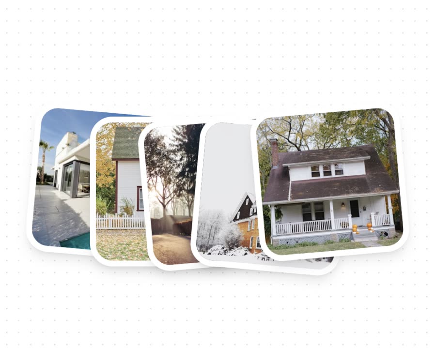
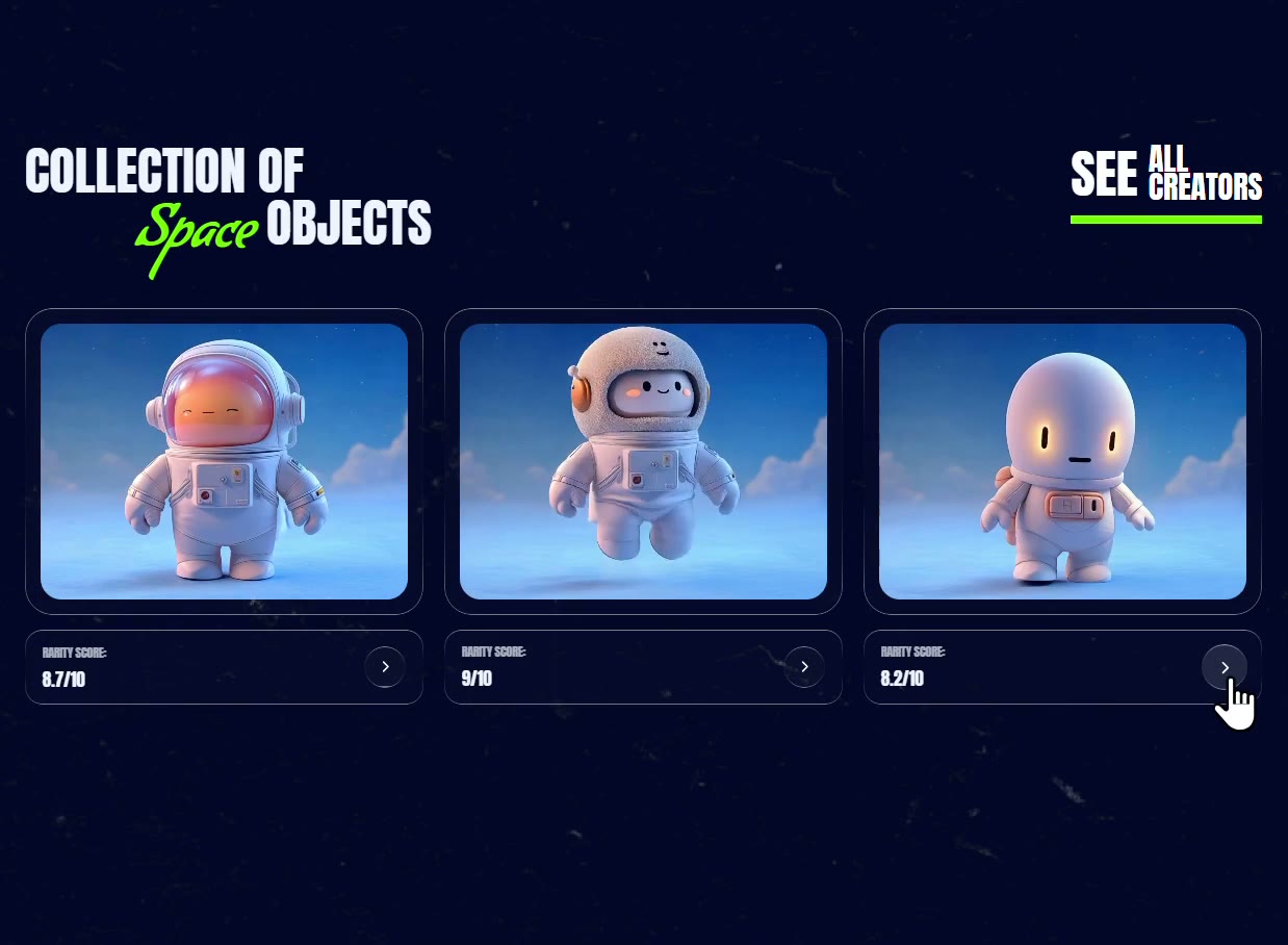
Bounce Cards is a complete, paste-ready card build-prompt — a full art-direction spec for Lovable, Bolt, v0, Cursor and Claude. It's free: copy it below and paste it into your builder.

Bounce CardsCard · free prompt · copy-paste
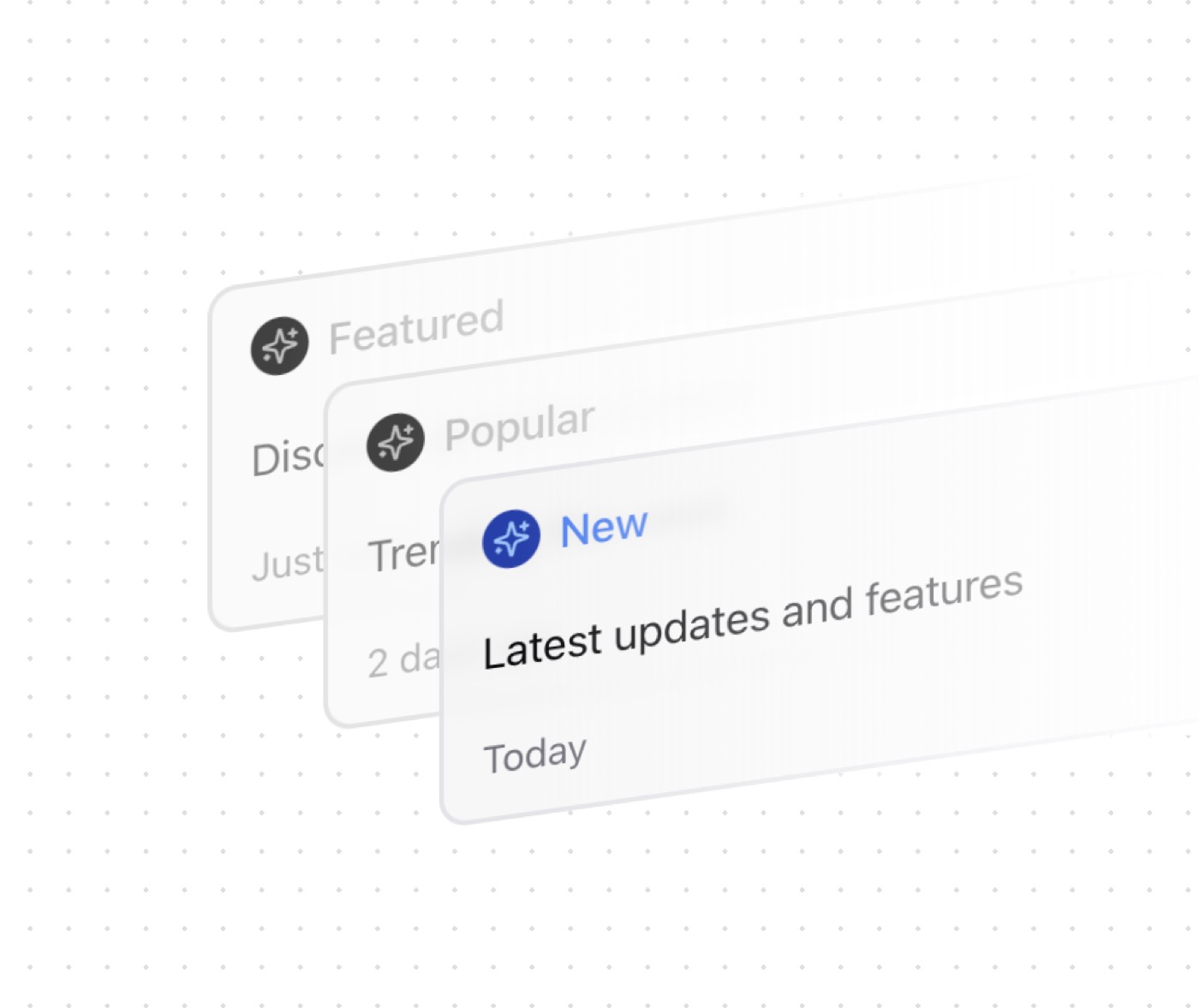
A dynamic card layout component with bouncing animations featuring staggered entrance effects and customizable card positioning. Built with GSAP for smooth animations, it supports both light and dark themes.
Features:
• GSAP-powered animations
• Staggered entrance effects
• Customizable positioning
• Responsive design
• Theme-aware styling
• Lazy image loading
• Configurable timing
• Elastic animations
— Install —
npx shadcn@latest add "https://21st.dev/r/bounce-cards"
— Component source (Bounce Cards.tsx) —
import { useEffect } from "react"
import { gsap } from "gsap"
import { cn } from "@/lib/utils"
interface BounceCardsProps {
/**
* Additional CSS classes for the container
*/
className?: string
/**
* Array of image URLs to display
*/
images?: string[]
/**
* Width of the container in pixels
*/
containerWidth?: number
/**
* Height of the container in pixels
*/
containerHeight?: number
/**
* Delay before animation starts (in seconds)
*/
animationDelay?: number
/**
* Delay between each card animation (in seconds)
*/
animationStagger?: number
/**
* GSAP easing function
*/
easeType?: string
/**
* Array of transform styles for each card
*/
transformStyles?: string[]
}
/**
* A component that displays a group of cards with a bouncing animation effect.
* Uses GSAP for smooth animations and supports custom positioning and timing.
*/
export function BounceCards({
className = "",
images = [],
containerWidth = 400,
containerHeight = 400,
animationDelay = 0.5,
animationStagger = 0.06,
easeType = "elastic.out(1, 0.8)",
transformStyles = [
"rotate(10deg) translate(-170px)",
"rotate(5deg) translate(-85px)",
"rotate(-3deg)",
"rotate(-10deg) translate(85px)",
"rotate(2deg) translate(170px)"
]
}: BounceCardsProps) {
useEffect(() => {
gsap.fromTo(
".card",
{ scale: 0 },
{
scale: 1,
stagger: animationStagger,
ease: easeType,
delay: animationDelay
}
)
}, [animationStagger, easeType, animationDelay])
return (
<div
className={cn("relative", className)}
style={{
width: containerWidth,
height: containerHeight
}}
>
{images.map((src, idx) => (
<div
key={idx}
className={cn(
"card absolute w-[200px] aspect-square rounded-[30px] overflow-hidden",
"border-8 border-white dark:border-white/90",
"shadow-lg dark:shadow-black/20"
)}
style={{
transform: transformStyles[idx] !== undefined ? transformStyles[idx] : "none"
}}
>
<img
className="w-full h-full object-cover"
src={src}
alt={`card-${idx}`}
loading="lazy"
/>
</div>
))}
</div>
)
}
Browse & preview free Unlock everything — from $19/mo